Big four bank satisfaction well behind mutuals

From Investor Daily.

Smaller banks continue to be significantly ahead of the big four banks when it comes to overall customer satisfaction, according to Roy Morgan.

Australia’s four largest banks are “well behind the smaller banks” when it comes to the proportion of ‘very satisfied’ customers, the company said.

Teachers Mutual Bank and Greater Bank had the highest number of ‘very satisfied’ customers, Roy Morgan found, with 62.3 per cent of Teachers Mutual Bank customers and 58.8 per cent of Greater Bank customers falling in to this category.

The big four banks on the other hand have only around a third of their customers feeling ‘very satisfied’, led by the Commonwealth Bank with 33.5 per cent of customers selecting this option.

Overall, general satisfaction with the big four banks has increased marginally in the six months to May 2017, climbing up 0.1 of a percentage point to 80.2 per cent, which Roy Morgan attributed to improvement in satisfaction among the banks’ home loan customers.

“Satisfaction among home-loan customers of the big four continues to be below that of their other customers, but over the last year they have narrowed the gap marginally,” the company said.

“The small overall improvement in satisfaction from last month was the result of minor gains among both home-loan and non-home loan customers.”

Lower interest rates reducing mortgage stress – Roy Morgan

New results from Roy Morgan’s mortgage stress data show that in the three months to April 2017, 16.8% or 666,000 mortgage holders can be considered to be ‘at risk’ or facing some degree of stress over their repayments. This compares favourably with 18.4% or 744,000
mortgage holders 12 months ago.

These are the latest findings from Roy Morgan’s Single Source survey of 50,000+ people pa, which includes more than 10,000 owner occupied mortgage holders.

Mortgage stress is much higher among the lower income groups (Under $60kpa) where it currently reaches 85.3% for those considered ‘at risk’ and 65% for ‘extremely at risk’.

Mortgage stress is based on the ability of home borrowers to meet the repayment guidelines currently provided by the major banks. The level of mortgage holders being currently considered ‘at risk’ is based on their ability to meet repayments on the original amount borrowed. This is currently 16.8%, which is well below the average over the last decade.

DFA comments – interesting findings, presumably looking at owner occupied mortgages? The basis of assessment is different. Also, current repayment guidelines are in our opinion too generous, given current income growth. We think underwriting standards need to be tighter, judging by overall household cash flow, which have been tracking in our mortgage stress analysis.

Finally, whether 666,000 households from Roy Morgan, or 794,000 from DFA, are both big numbers!


Mortgage Growth In Adelaide and Hobart

We finish our series on mortgage growth by looking at data from Adelaide and Hobart and plotting the relative change in volumes of loans between 2015 and 2017, by post code, drawing data from our core market models, and geo-mapping the results.

Here is Adelaide.

Here is Hobart.

The yellow shades show the areas with the largest growth in the number of mortgages, the red shades show a relative fall in volumes. You can click on the map to view full screen. This is a picture of mortgage counts, not value, we may look at this later.

Compare these pictures with those for Sydney, Melbourne, Brisbane and Perth and we see just how different these markets are!

Of course this is just one of the many potential views available from the 140+ fields which are contained in our Core Market Model.

What’s The Correlation Between Mortgage Stress And Loan Non Performance?

Last night DFA was involved in a flurry of tweets about the relationship between our rolling mortgage stress data and mortgage non-performance over time. The core questions revolved around our method of assessing mortgage stress, and the strength, or otherwise of the correlation.

We were also asked about our expectations as to when non-performing mortgage loans will more above 1% of portfolio, given the uptick in stress we are seeing at the moment.

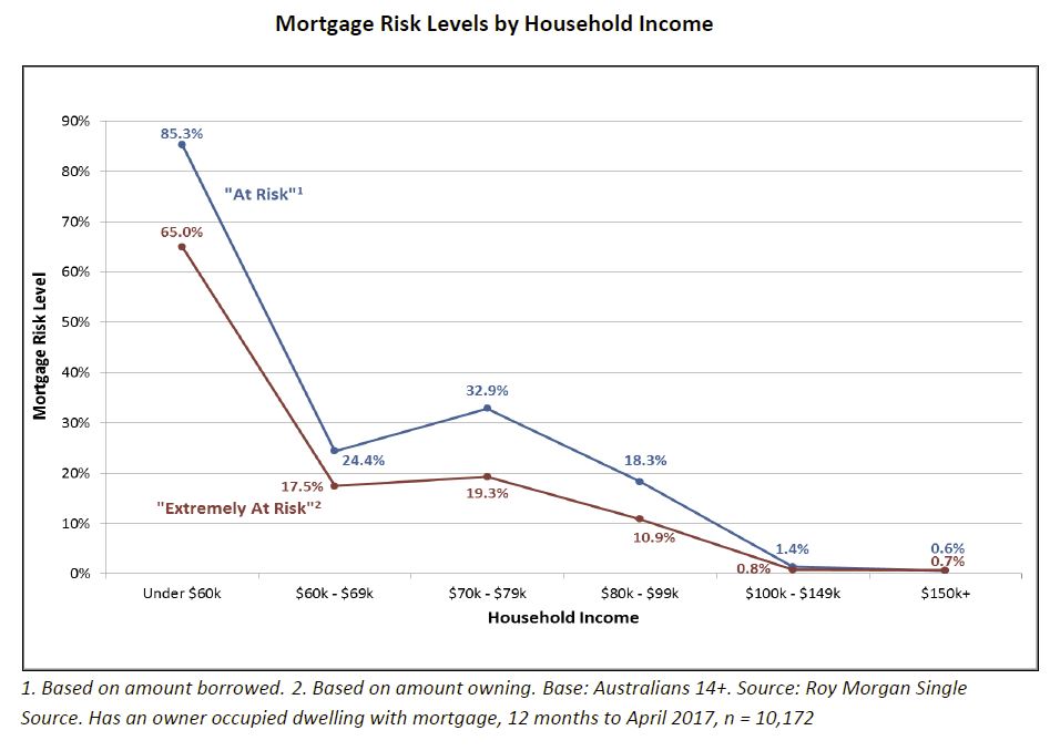
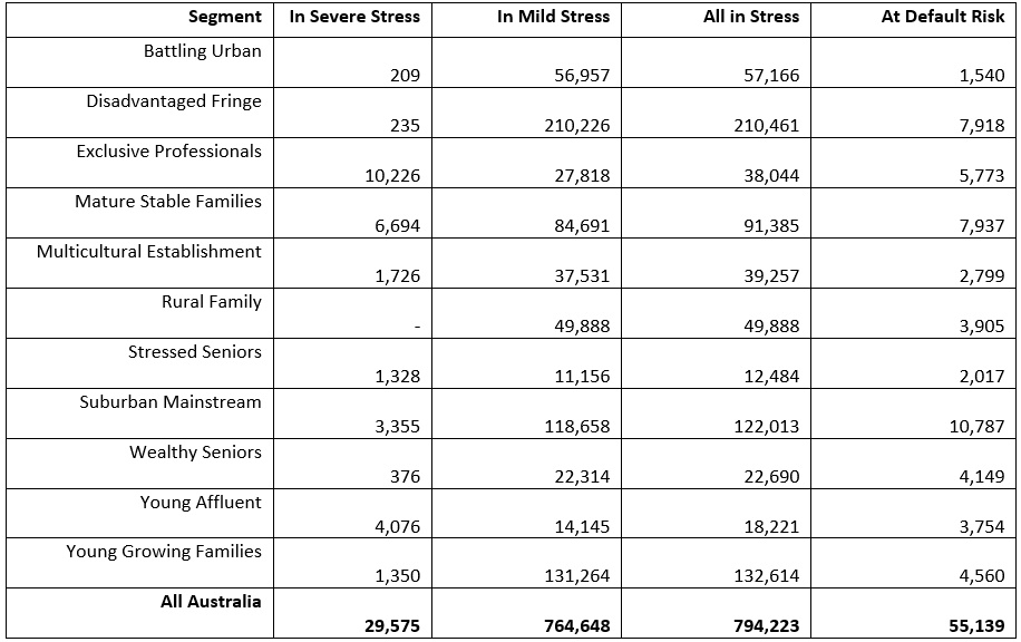
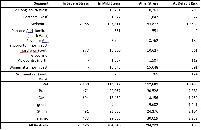
Our May 2017 data showed that across the nation, more than 794,000 households are now in mortgage stress (last month 767,000) with 30,000 of these in severe stress. This equates to 24.8% of households, up from 23.4% last month. We also estimate that nearly 55,000 households risk default in the next 12 months.

However, it got too late last night to try and explain our analysis in 140 characters. So here is more detail on our approach to mortgage stress, and importantly a chart which slows the relationship between stress data and mortgage non-performance.

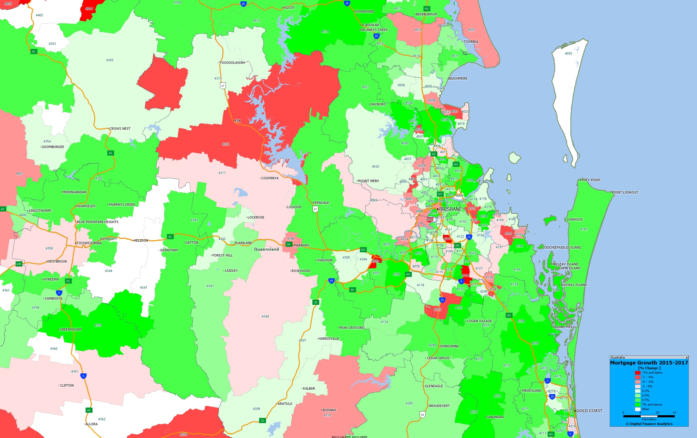
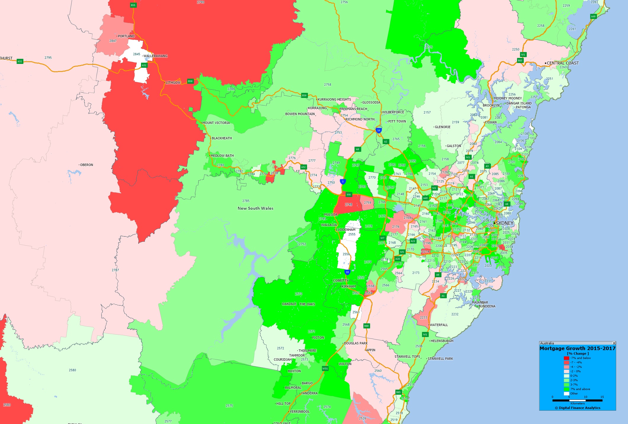
Our analysis uses our core market model which combines information from our 52,000 household surveys, public data from the RBA, ABS and APRA; and private data from lenders and aggregators. The data is current to end May 2017.

We analyse household cash flow based on real incomes, outgoings and mortgage repayments. Households are “stressed” when income does not cover ongoing costs, rather than identifying a set proportion of income, (such as 30%) going on the mortgage.

Those households in mild stress have little leeway in their cash flows, whereas those in severe stress are unable to meet repayments from current income. In both cases, households manage this deficit by cutting back on spending, putting more on credit cards and seeking to refinance, restructure or sell their home. Those in severe stress are more likely to be seeking hardship assistance and are often forced to sell.

We also make an estimate of predicated 30 day defaults in the year ahead (PD30) based on our stress data, and an economic overlay including expected mortgage rates, inflation, income growth and underemployment, at a post code level.

Here is the mapping between stress and non-performance of loans.

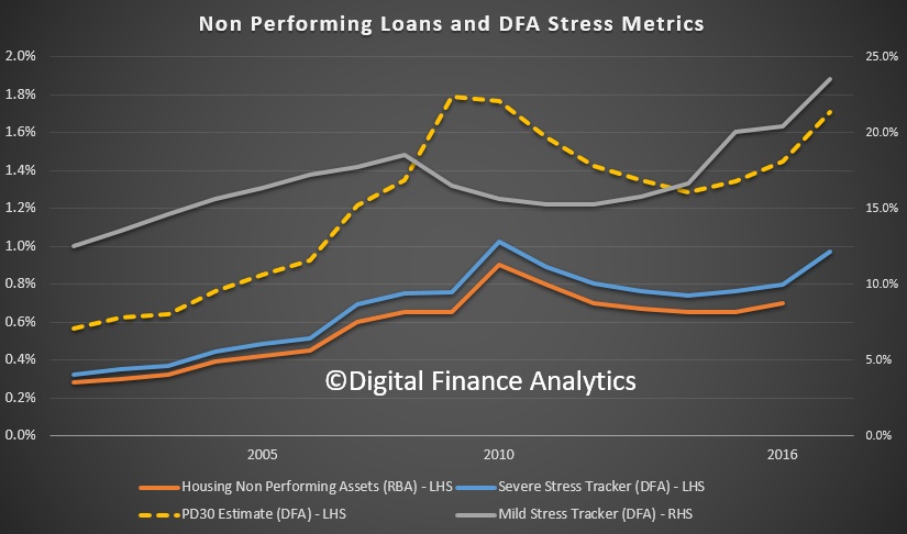
The red line is the data from the regulators on non-performing mortgage loans. In 2016 it sat around 0.7%. There was a peak following the 2007/8 financial crisis, after which interest rates and mortgage rates came down.

We show three additional lines on the chart. The first is our severe stress measure, the blue line, which is higher than the default rate, but follows the non-performance line quite well. The second line is the PD30 estimate, our prediction at the time of the expected level of default, in the year ahead. This is shown by the dotted yellow line, and tends to lead the actual level of defaults. Again there is a reasonable correlation.

The final line shows the mild stress household data. This is plotted on the right hand scale, and has a lower level of correlation, but nevertheless a reasonable level of shaping. After the GFC, rates cuts, plus the cash splash, helped households get out of trouble by in large, but since then the size of mortgages have grown, income in real terms is falling, living cost are rising as is underemployment. Plus mortgage rates have been rising, and the net impact in the past six months, with the RBA cash rate cut on one hand, and out of cycle rises by the banks on the other, is that mortgage repayments are higher today, than they were, for both owner occupied borrowers and investors. Interest only investors are the hardest hit.

Households are responding by cutting back on their spending, seeking to refinance and restructure their loans, and generally hunkering down. All not good for broader economic growth!

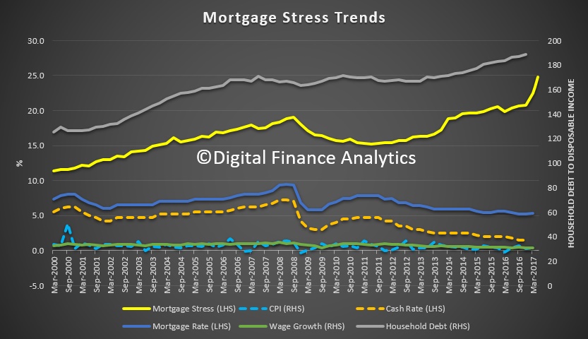
So, given the severe stress, mild stress and our PD30 estimates are all currently rising, we expect non-performing loans to rise above 1% of portfolio during 2018. Unless the RBA cuts, and the mortgage rates follow.


Mortgage Growth In Greater Perth

We continue our series on mortgage growth plotting the relative change in volumes of loans between 2015 and 2017, by post code, drawing data from our core market models, and geo-mapping the results.

Here is the Greater Perth picture.

The yellow shades show the areas with the largest growth in the number of mortgages, the red shades show a relative fall in volumes. You can click on the map to view full screen. This is a picture of mortgage counts, not value, we may look at this later.

Of course this is just one of the many potential views available from the 140+ fields which are contained in our Core Market Model.

Next time we will look at Adelaide and Hobart.

Mortgage Growth In Greater Brisbane

We continue our series on mortgage growth plotting the relative change in volumes of loans between 2015 and 2017, by post code, drawing data from our core market models, and geo-mapping the results.

Here is the Greater Brisbane picture.

The yellow shades show the areas with the largest growth in the number of mortgages, the red shades show a relative fall in volumes. You can click on the map to view full screen. This is a picture of mortgage counts, not value, we may look at this later.

Of course this is just one of the many potential views available from the 140+ fields which are contained in our Core Market Model.

Next time we will look at Perth.

Tracking Mortgage Growth In Great Melbourne

We continue our series on mortgage growth, plotting the relative change in volumes of loans between 2015 and 2017, by post code, drawing data from our core market models, and geo-mapping the results.

Here is the Greater Melbourne picture.

The yellow shades show the areas with the largest growth in the number of mortgages, the red shades show a relative fall in volumes. You can click on the map to view full screen. This is a picture of mortgage counts, not value, we may look at this later. Relative to other states, there was significant expansion over this period.

Of course this is just one of the many potential views available from the 140+ fields which are contained in our Core Market Model.

Next time we will look at Brisbane.


Where Is The Mortgage Growth In Greater Sydney?

One of the measures contained in the Digital Finance Analytics household surveys is the number of households with a mortgage in each post code across the country. By comparing our data from 2015, with 2017 we can spot some interesting growth trends, especially when we geo-map the data. Today we begin with Greater Sydney.

The yellow shades show the areas with the largest growth in the number of mortgages, the red shades show a relative fall in volumes. We see significant growth in western Sydney, where there has been significant residential development over this period. You can click on the map to view full screen.  This is a picture of mortgage counts, not value, we may look at this later.

Of course this is just one of the many potential views available from the 140+ fields which are contained in our Core Market Model.

Next time we will look at Melbourne.

Home Ownership and Work Redefined

In a new report, CBA says the Australian dream is still alive and well, as new goal posts emerge.

As the quarter acre block is becoming a threatened species and backyards are replaced by patios, just under half of Aussies (48 per cent) believe that the property dream is still alive and well, and for others (52 per cent), the Australian dream is being redefined.

In one of the largest national surveys since the Australian Census, with more than one million responses, the Commonwealth Bank has asked Australians about how they perceive their future, investigating attitudes around the property market, adapting to a changing workforce, and future proofing younger generations.

Partnering with demographer and futurist Claire Madden, the CommBank Connected Future Report examines national, economic and social trends that have emerged from the data.

According to Claire Madden, “The remarkable insights emerging from the CommBank ATM data overall is the resilience and tenacity Aussies have in the face of economic uncertainty. As a lead example, while the Australian property dream looks markedly different in 2017, the majority of Australians either fully own or are paying off their home. This has remained constant over the past five decades, so despite uncertainty, the Australian dream has clearly lived through time.”

The research shows while Millennials (Gen Y) are delaying traditional life markers like getting married or having a child, the average age of a first homebuyer has remained relatively constant over the last two decades, sitting at around 32 years of age.

The research has found that despite rapid digital disruption, increased global connectivity and the emergence of artificial intelligence, resilience seems to be a common trend amongst Australians. Almost half (49 per cent) believe our businesses are ready to face the future and 49 per cent believing our kids have the skills they need for tomorrow.

Key findings from the CommBank Connected Future Report include:

The architecturally designed dream

The Australian ‘dream home’ is no longer a weatherboard standalone house. It is an architecturally designed product, as the quality of dwellings has risen over time. Whilst 74 per cent of those living in cities and 81 per cent of those outside capital cities currently live in a stand alone house, 48 per cent of new residential approvals over the past year have been for medium or high density housing. CommBank data reveals 68 per cent of first home buyers purchased a house in the last year, 16 per cent desire to build their architectural dream home after purchasing vacant land, and 15 per cent purchased an apartment or townhouse.

Living in your state of optimism 

The data relating to the Australian property dream reveals that the state you live in impacts your state of optimism. The least optimistic were people residing in New South Wales (53 per cent) and Victoria (54 per cent), and this was significantly high with younger generations (57 per cent in both states). Those in Queensland (51 per cent), South Australia (53 per cent), Western Australia (54 per cent) and the Northern Territory (57 per cent) believe the dream is more attainable.

The ‘options’ Generation 

Gen Y have prioritised global travel, lifestyle experiences, stayed longer in formal education and attained the name KIPPERS (Kids in Parents’ Pockets Eroding Retirement Savings) for staying in the family home longer. Yet now they are in their prime career building and family forming years, they, like their predecessors, are finding a way to overcome the obstacles, respond to new realities, and see the (re)defined dream come alive. Even though the dream has taken a different form, the data reveals property ownership remains high on the aspirational list (average home buying age remains consistent at 32).

Gen Z and Gen Alpha 

According to the research, rapid digital disruption, increased global connectivity and the emergence of artificial intelligence are converging to reshape the business landscape and the way future generations define work. With high job mobility and the increased casualisation of the workforce, Gen Z (8-22 years old) will have 17 jobs across five careers in their lifetime.

As Gen Z and Gen Alpha (born 2010-2024) complete their schooling and enter the workforce, they will need to be adaptive and agile in order to integrate job roles with rapidly advancing automated systems and handle changing employment markets and organisational structures.

Women leading the way

Women are most optimistic about our kids being skilled up for the future with 52 per cent believing they are future ready, compared with 48 per cent of men. This is particularly evident amongst younger age groups, with the greatest gender gap amongst Gen Ys (25-39 year olds) with a 5 per cent differential between males and females.

Culture and society

With almost 3 in 10 Australians (29 per cent) born overseas1, and a quarter (27 per cent) of the population’s labour force born overseas2, immigration has significantly contributed to Australia’s workforce and economy. In the midst of this diversity, CommBank data reveals that almost half of Aussies (49 per cent) believe that our society truly embraces everyone.

Mortgage Stress Accelerates Further In May

Digital Finance Analytics has released mortgage stress and default modelling for Australian mortgage borrowers, to end May 2017.  Across the nation, more than 794,000 households are now in mortgage stress (last month 767,000) with 30,000 of these in severe stress. This equates to 24.8% of households, up from 23.4% last month. We also estimate that nearly 55,000 households risk default in the next 12 months.

The main drivers are rising mortgage rates and living costs whilst real incomes continue to fall and underemployment is on the rise.  This is a deadly combination and is touching households across the country,  not just in the mortgage belts.

This analysis uses our core market model which combines information from our 52,000 household surveys, public data from the RBA, ABS and APRA; and private data from lenders and aggregators. The data is current to end May 2017.

We analyse household cash flow based on real incomes, outgoings and mortgage repayments. Households are “stressed” when income does not cover ongoing costs, rather than identifying a set proportion of income, (such as 30%) going on the mortgage.

Those households in mild stress have little leeway in their cash flows, whereas those in severe stress are unable to meet repayments from current income. In both cases, households manage this deficit by cutting back on spending, putting more on credit cards and seeking to refinance, restructure or sell their home.  Those in severe stress are more likely to be seeking hardship assistance and are often forced to sell.

Martin North, Principal of Digital Finance Analytics said “Mortgage stress continues to rise as households experience rising living costs, higher mortgage rates and flat incomes. Risk of default is rising in areas of the country where underemployment, and unemployment are also rising. Expected future mortgage rate rises will add further pressure on households”.

“Stressed households are less likely to spend at the shops, which acts as a drag anchor on future growth. The number of households impacted are economically significant, especially as household debt continues to climb to new record levels. The latest housing debt to income ratio is at a record 188.7* so households will remain under pressure.”

“Analysis across our household segments highlights that stress is touching more affluent groups as well as those in traditional mortgage belts”.

*RBA E2 Household Finances – Selected Ratios Dec 2016.

Regional analysis shows that NSW has 216,836 (211,000 last month) households in stress, VIC 217,000 (209,000), QLD 145,970 (139,000) and WA 119,690 (109,000). The probability of default has also risen, with more than 10,000 in WA, 10,000 in QLD, 13,000 in VIC and 15,000 in NSW.

Probability of default extends the mortgage stress analysis by overlaying economic indicators such as employment, future wage growth and cpi changes.  Regional analysis is included in the table below.