Multiple Property Investors And Their Mortgages

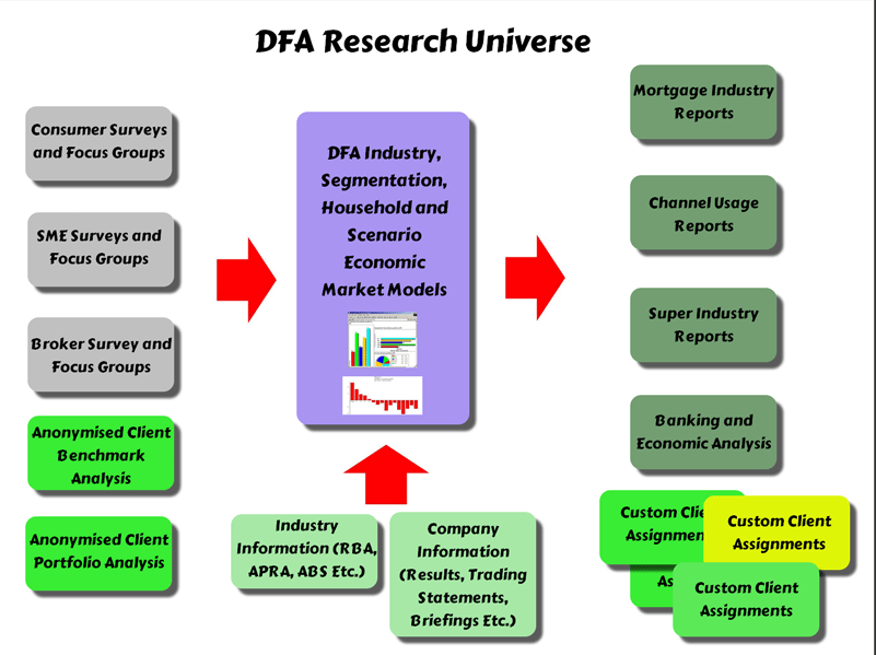
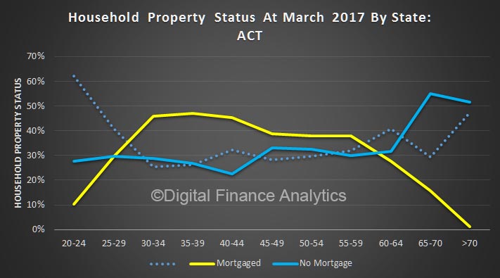
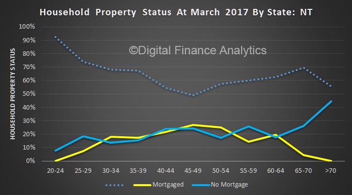
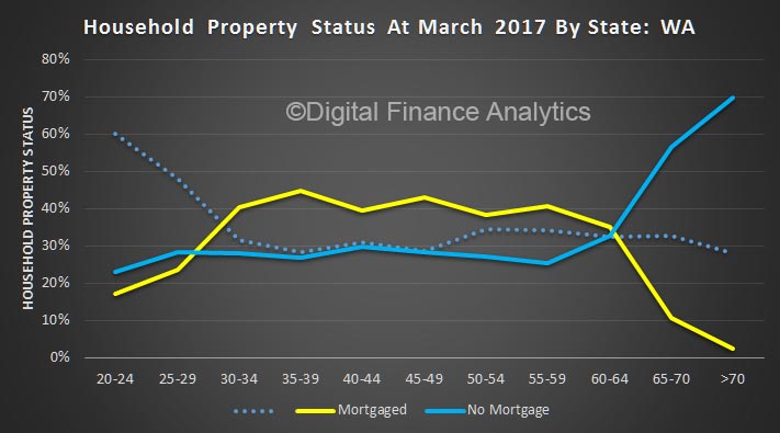
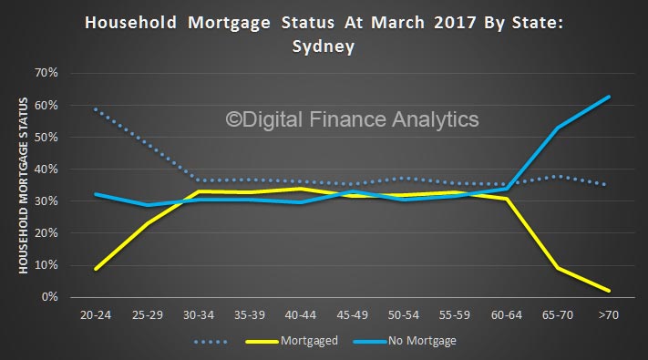
The Digital Finance Analytical core market model allows us to drill into the dynamics of households, their financial footprint and their property holdings.

We were manipulating the data recently, and found this interesting picture.

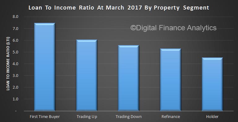
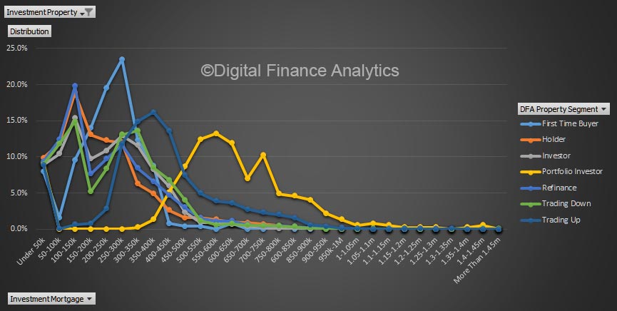
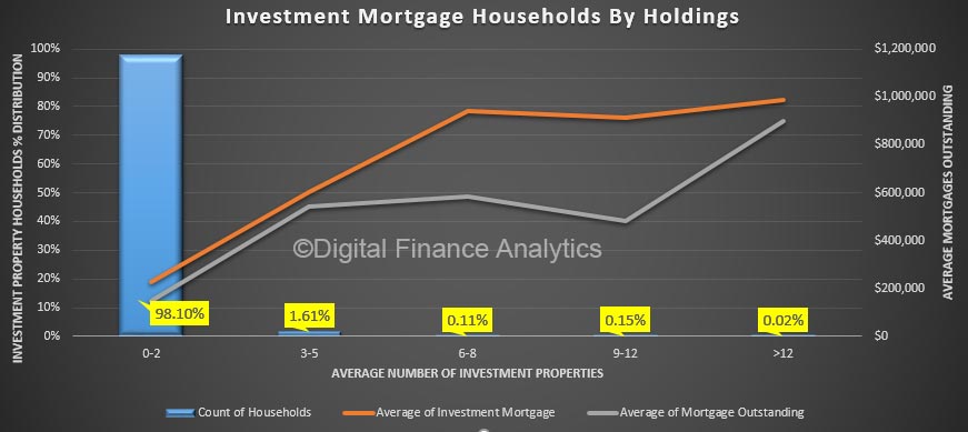
We started by looking at the average number of properties held by households as investment properties. The majority (98%) investors have just one or two properties. However, 1.6% have between 3 and 5, and a smaller number of households have even more. Many of these properties are lower-value units and houses, such as would appeal to first time buyers. This is interesting, because we know those with multiple properties are more active and account for a disproportionate amount of transactions and tax breaks. Indeed many first time buyers would simply be out-bid.

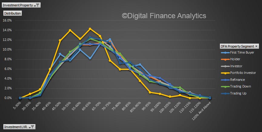
Next, we overlaid the average value of mortgages investor households have, some have total mortgages well above $1m, mostly negative geared.

Now some only have investment properties (we identify them as investors, or portfolio investors).  But others have BOTH investment and owner occupied property.

So finally, we added in the average owner occupied mortgage held by these same property investing households. One striking observation is just how leveraged up those with multiple properties are, and that they have a preference for investor loans over owner occupied loans.

If you wanted to trim back the tax breaks, you could impose a limit on the value of mortgages geared, or the value, or number of investment properties leveraged or with concessionary capital gains. We think a value cap would be better than the number of properties, else, we suspect investors would simply buy a smaller number of higher value properties.

Mortgage Stress Analysis Using the DFA Market Model

Following on from yesterday’s post where we explored some of the data in the Digital Finance Analytics Core Market Model, today we walk through the mortgage stress data contained in the model.

Mortgage stress has been featured in quite a few recent posts – see the link here for details – but now we examine in real time some of the interesting data contained in the model.

We look at data across the states, segments, and locations, and also look and the relative distribution of severe and mild stress.

Link that with the probability of default as we discussed previously and the model becomes powerfully predicative.

Note the data is for demonstration purposes only.

Exploring the DFA Mortgage Industry Model

Our latest video blog features a walk through of some of the features contained in our core mortgage industry model.

A quick reminder, the core market model ingests data from our surveys, focus groups and other private data, as well as information from various public sources.

The core model, working off a rolling sample of 52,000 household records enables us to analyse many aspects of the market. We have clients who take a range of outputs from the model.

In this video we walk through some of the key dimensions in the model, including segmentation, mortgage profiles and locations.

Note the data is for demonstration purposes only.

Mortgaged Households, Vital Statistics

We have pulled out the latest data on residential mortgaged households, incorporating the latest mortgage increases and market valuations. So today we run over the top-level vital statistics.

To explain, our market model replicates the industry, across all lenders banks and non-banks and looks beyond the performance of just the securitised mortgage pools (as some of the ratings agencies report). It is looking from a “household in” perspective, not a “lender out” point of view.

To start, we look at the average home price, and average mortgage outstanding across the states, plotted against the relative number of households borrowing.  NSW has the largest values, and thus mortgages, on average. But note that WA runs ahead of VIC though in the west prices are falling.

Next we look at average loan to value (LVR) marking the market value to market, and the latest loan outstanding data. NSW has the highest LVR on average, at ~75%. We also plot the average loan to income (LTI) and again NSW has the highest – at more than 6x income.

Then we look at debt servicing ratios, where again NSW leads the way on average at more than 23% of income, even at these low rates. VIC and WA are a little lower but still extended. Finally, we look at estimated probability of 30-day default, projecting forward to take account of expected economic conditions, interest rates and employment. WA has the highest score, followed by SA. NSW is a little lower, thanks to relatively buoyant economic conditions. That could all change quite quickly, and as highlighted the high leverage in NSW suggests that risks could become more elevated here.

We will update the market model again next month, and track movements across the states. Be warned, averages of course tell us something, but the relative spreads across segments and locations are more important. But that, as they say, is another story!

The Rule of Thirds

On average, according to our surveys, one third of households are living in rented accommodation, one third own their property outright, and one third have a mortgage. Actually the trend in recent years has been to take a mortgage later and hold it longer, and given the current insipid income growth trends this will continue to be the case. Essentially, more households than ever are confined to rental property, and more who do own a property will have a larger mortgage for longer.

Now, if we overlay age bands, we see that “peak mortgage” is around 40% from late 30’s onward, until it declines in later age groups. The dotted line is the rental segment, which attracts high numbers of younger households, and then remains relatively static.

But the mix varies though the age bands, and across locations. For example, in the CBD of our major cities, most people rent. Those who do own property will have a mortgage for longer and later in life.

Compare this with households on the urban fringe. Here more are mortgaged, earlier, less renting, and mortgage free ownership is higher in later life.

Different occupations have rather different profile. For example those employed in business and finance reach a peak mortgage 35-39 years, and then it falls away (thanks to relatively large incomes).

Compare this with those working in construction and maintenance.

Finally, across the states, the profiles vary. In the ACT more households get a mortgage between 30-34, thanks to predictable public sector wages.

Renting is much more likely for households in NT.

WA has a high penetration of mortgages among younger households (reflecting the demography there).

Most of the other states follow the trend in NSW, with the rule of thirds clearly visible.

Victoria, for example, has a higher penetration of mortgages, and smaller proportions of those renting.

We find these trends important, because it highlights local variations, as well as the tendency for mortgages to persist further in the journey to retirement. This explains why, as we highlighted yesterday, some older households still have a high loan to income ratio as they approach retirement. To underscore this, here is average mortgage outstanding by age bands.


Latest Loan To Income (LTI) Data

We have updated our core market model with household survey data this week. One interesting dynamic is the LTI metrics across the portfolio. We calculate the dynamic LTI, based on current income and loan outstanding.  This is not the same a Debt Servicing Ratio (DSR), and is less impacted by changes in mortgage rates. It is also a better measure of risk than Loan To Value (LVR)

LTI has started to become an important measure of how stretched households are. For example the Bank of England issued a recommendation to the PRA and the Financial Conduct Authority (FCA) advising that they should ‘ensure that mortgage lenders do not extend more than 15% of their total number of new residential mortgages at loan to income ratios at or greater than 4.5’.

In response, UK banks trimmed their offers. For example,

NatWest is lowering its loan-to-income ratio for some borrowers, which means they won’t be able to borrow as much to buy a home.

House buyers who stump up a deposit between 15 and 25 per cent will only be able to borrow up to 4.45 times their annual income, down from the previous maximum of 4.75 per cent.

The new multiple will apply to both single and joint earners.

The move suggests a rising number of borrowers are having to stretch themselves to be able to afford to buy a home as prices continue to rise.

Turning to Australia, we start with a state by state comparison.  The AVERAGE loan in NSW is sitting at close to 7, ahead of Victoria at over 5, and the others lower. This highlights the stress within the system for property purchasers in Sydney, with affordability a major barrier.

Across our household segments however, the three most exposed segments are the most affluent. Wealthy Seniors sits about 9, followed by Young Affluent at 8 and Exclusive Professionals at 7.5. On the other hand, Young Growing Families are at around 5.5 (still above the Bank of England threshold).

Looking at type of buyer, First Time Buyers are sitting at 7.5%, with those trading up at 6%. Holders are sitting at 4.5%

Finally, here is an average by age bands, and plotted against relative volumes of mortgages. Pressure is highest in the 60+ age groups, this is because incomes tend to fall as households move towards part-time or retirement, but these days more will still have a mortgage to manage.

The dip in volumes in the 25-29 group is explained by many in this band choosing education, or starting a family, rather than home purchase, and the peak volume for purchase in after 30.

Overall LTI is a good indicator of affordability pressure, and the regulators could [should?] impose an LTI cap to slow lending growth, counter building affordability risks and rising housing debt.


Property Investor Sentiment All Over The Place

The latest weekly data from our household surveys includes our regular question on intention to transact. Property Investors are clearly confused. In recent weeks this measure has been gyrating widely, in response to the broader media coverage of the sector and the complex interplay of issues. Last week it was up significantly, this week down.

Behind this movement is uncertainty, as interest rate rises work though, concerns about regulatory intervention reemerge, and yet on the other hand, on some measures home prices are still rising fast and auction clearances remain high.

We now expect this random movement to continue as the shake-down in the investor sector continues. Prepare for a wild ride.

Investors warned to brace for mortgage interest rate rises

From ABC News.

Real estate investors stand to be hardest hit as banks reprice mortgages to meet tougher regulatory requirements, according to a report out today.

JP Morgan’s Australian Mortgage Industry Report surveyed 52,000 households and identified that around 10 per cent of investor loans could be at risk.

The report warns that pressure for banks to increase capital levels on certain types of investor lending by three or four times current requirements could create “extreme effects”.

The most “significant changes afoot” are for investor loans that are “materially dependent on property cash flows” to service the repayments.

As a result, banks with loans dependent on cash flows could be forced to raise rates incrementally to manage the risk, potentially by as much as 3 percentage points in an extreme scenario.

Investors dependent on cash flows from rental income would also be “most sensitive” to interest rate rises of between 2 and 3 percentage points according to the research.

The warning comes as banks such as the Commonwealth and its wholly owned subsidiary BankWest consider further restrictions on investor loans to keep under regulatory requirements for growth capped at 10 per cent per year.

Investors most exposed in NSW

The report’s co-author, Martin North of Digital Finance Analytics, said investors most exposed were in New South Wales which has been the epicentre of steep real estate price growth.

“The highest sensitivity has been in New South Wales where house prices are significantly higher, as are borrowing commitments,” Mr North said.

The report also identifies risk in Western Australia and Queensland because of the mining downturn and Victoria due to an oversupply of inner-city apartments.

It warns that “wealthy seniors” and “young affluent” investors could be the most severely affected, while others such as rural families and low-income households would be least exposed.

JP Morgan banking analyst Scott Manning said it will be important for the Australian Prudential Regulation Authority (APRA) to determine how it defines loans that are “materially dependent” on cash flows flows.

Mr Manning said APRA could “reverse engineer” concerns about investor loan exposure for outcomes that would meet the need for banks to be “unquestionably strong”.

The report found that banks will be positioning themselves to minimise exposure and to meet capital requirements.

It identified the Commonwealth Bank and Westpac as having “the most to lose if heightened churn becomes a reality”, while ANZ was best placed of the big four.

New Report On Mortgage Industry With JP Morgan Released

The report, released today highlights that property investors will be hit hard as banks re-price their mortgages.

Volume 24 of the mortgage report, a collaboration between J.P. Morgan and Digital Finance Analytics (DFA), explores how to practically define the term ‘materially dependent on property cash flows’ and looks to translate that into potential incremental capital requirements for the Australian major banks. The report also considers different re-pricing strategies and competitive dynamics, particularly around the issue of dynamic Loan-to-Value Ratios (LVR).

Significant changes are afoot for investor loans defined as being ‘materially dependent on property cash flows’ to repay the loan. Amidst the transition to Basel 4, these mortgages will see the most extreme effects on their capital intensity and pricing – with capital levels somewhere between 3x and 5x current requirements, which could have a significant impact on pricing of investor loans down the track.

The report draws heavily on modelling completed by Digital Finance Analytics from our household surveys, as presented in the recently published The Property Imperative 8, available here. Our survey is based on a rolling sample of 52,000 households and is the largest currently available. It includes data to end February 2017.

“The dispersion of impacts across the portfolio highlights the fact that assessing the mortgage by Probability of Default band or LVR band isn’t necessarily ‘good enough’. Although banks may have access to significant pools of data, the new regulatory regime is forcing them to become ever-more granular in their analysis – top-down portfolio analytics just won’t cut it anymore,” said Martin North, principal, DFA.

“Rather than managing the portfolio with ‘macro-prudential’ drivers, banks need to move to the other end of the analysis spectrum and become ‘micro-prudential’,” Mr North concluded.

Unfortunately because of compliance issues, the JPM report itself is only available direct from them, and not via DFA.

DFA is not authorized nor regulated by ASIC and as such is not providing investment advice. DFA contributors are not research analysts and are neither ASIC nor FINRA regulated. DFA contributors have only contributed their analytic and modeling expertise and insights. DFA has not authored any part of this report.

A Perspective On Investor Loans

Using data from our household surveys, we can look at investor loans by our core master household segments. These segments allow us to explore some of the important differences across groups of borrowers.  We believe granular analysis is required to see what is really going on.

Today we look at the distribution of these segments by loan to value (LVR) and amount borrowed and also compare the footprint of loans via brokers, and by loan type.

Looking at LVR first, there is a consistent peak in the 60-70% LVR range, with portfolio investors (those with multiple investment properties) below the trend above 70%.

However, the plot of loan values shows that portfolio investors are on average borrowing much more, thanks to the multiple leverage across properties. A small number of portfolios are north of $1.4 million.

Investors who borrow with the help of a mortgage broker, on average is more likely to get a larger loan.

But there is very little difference in the relative LVR by channel.

On the other hand, interest only loans will tend to be at a higher LVR.

The average balance of interest only loans is also higher, especially in the $400-600k value range.

Microprudential analysis reveals interesting insights! The loan type and segment are better indicators of relative risk than LVR or origination channel.