
The ATO has just released its data for the 2013-2014 tax year. We have taken the average taxable income by post code and geo-mapped the data for NSW, centred on Sydney. The maps are based on clustered averages, distributed by the number of tax payers.
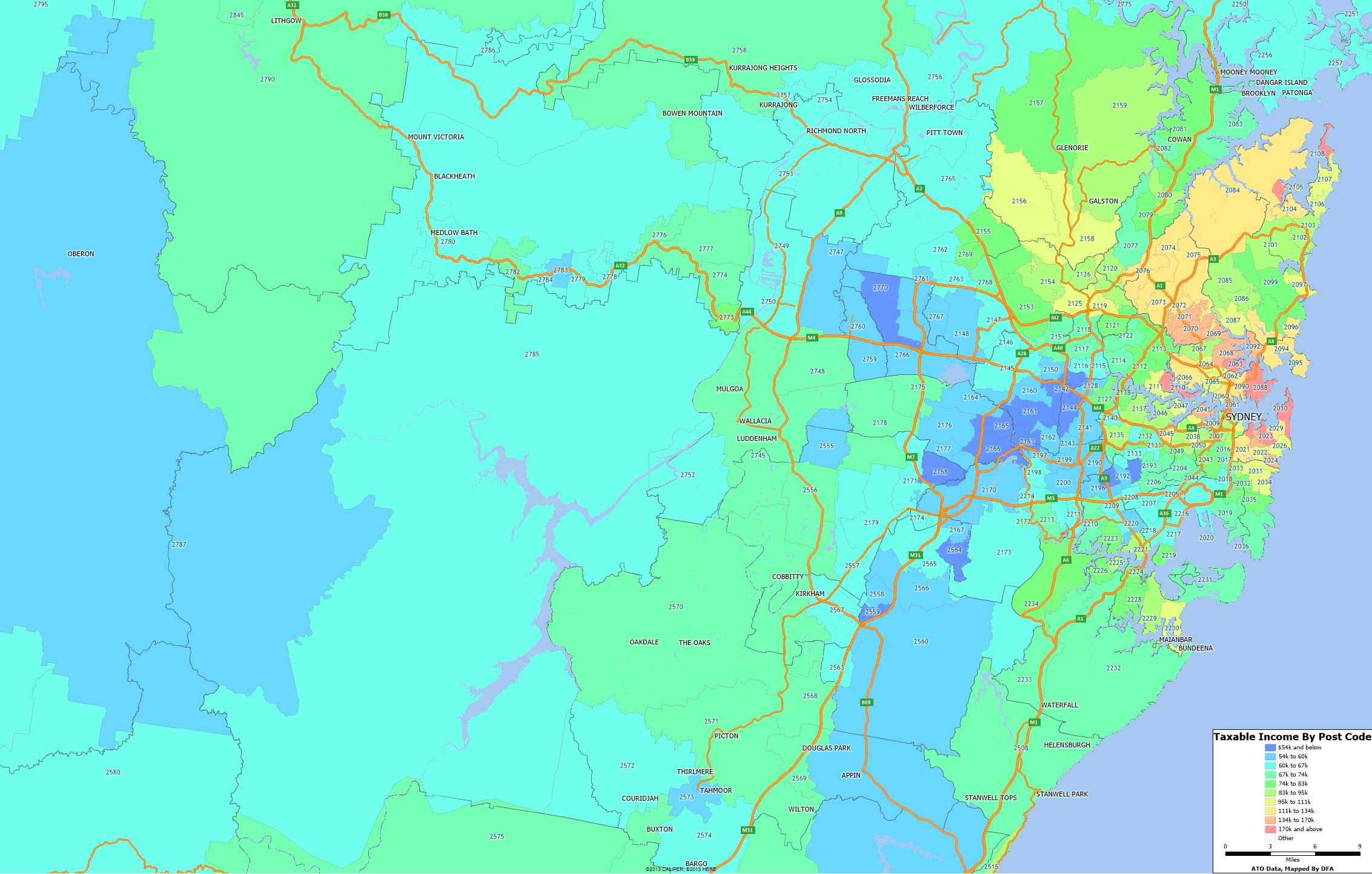 There are significant variations, of course (and this does not take account of those who have used various tax treatments to reduce their true income). The pink/red areas are the highest zones, the blue the lowest.
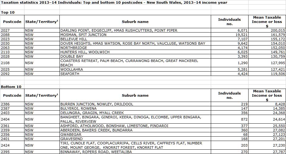
Another table gives the top and bottom post codes in NSW.
 Over the next few days we will cover the other states.