We explore our home price projections with real examples from our Core Market Model, and discuss broader financial market issues.
The Great Debate On China Coming On Tuesday…
Digital Finance Analytics (DFA) Blog
"Intelligent Insight"

We explore our home price projections with real examples from our Core Market Model, and discuss broader financial market issues.
The Great Debate On China Coming On Tuesday…
We have re-run our finance and property scenarios and added an additional “scenario 5”. I discuss the results with economist John Adams.
Here is a summary of the results.
 Here is a video in which we discuss the findings.
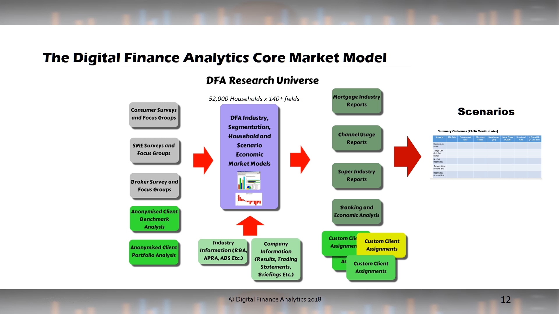
The scenarios are an output from our Core Market Model.
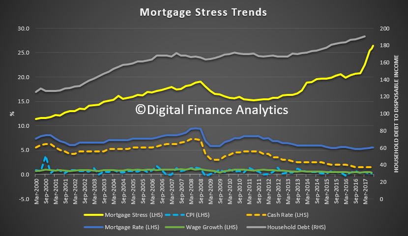
Digital Finance Analytics has released mortgage stress and default modelling for Australian mortgage borrowers, to end August 2017. Across the nation, more than 860,000 households are estimated to be now in mortgage stress (last month 820,000) with more than 20,000 of these in severe stress. This equates to 26.4% of households, up from 25.8% last month.
 We also estimate that nearly 46,000 households risk default in the next 12 months, 7,000 down from last month, as we have revised down our expectations of future mortgage rate rises.
In this video we discuss the results and countdown the top ten suburbs across Australia.
The main drivers of stress are rising mortgage rates and living costs whilst real incomes continue to fall and underemployment is on the rise. This is a deadly combination and is touching households across the country, not just in the mortgage belts. In August higher power prices, council rates and childcare costs hit home.
This analysis uses our core market model which combines information from our 52,000 household surveys, public data from the RBA, ABS and APRA; and private data from lenders and aggregators. The data is current to end August 2017.
We analyse household cash flow based on real incomes, outgoings and mortgage repayments. Households are “stressed” when income does not cover ongoing costs, rather than identifying a set proportion of income, (such as 30%) going on the mortgage.
Those households in mild stress have little leeway in their cash flows, whereas those in severe stress are unable to meet repayments from current income. In both cases, households manage this deficit by cutting back on spending, putting more on credit cards and seeking to refinance, restructure or sell their home. Those in severe stress are more likely to be seeking hardship assistance and are often forced to sell.

Martin North, Principal of Digital Finance Analytics said “flat incomes and underemployment mean rising costs are not being managed by many, and household budgets are really under pressure. Those with larger mortgages are more impacted by rate rises if and when they occur”.
“The latest housing debt to income ratio is at a record 190.4[1] so households will remain under pressure. Stressed households are less likely to spend at the shops, which acts as a drag anchor on future growth. The number of households impacted are economically significant, especially as household debt continues to climb to new record levels.”
“We continue to see the spread of mortgage stress in areas away from the traditional mortgage belts. A rising number of more affluent households are also being impacted.”
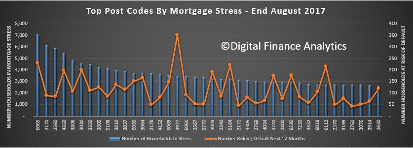
Regional analysis shows that NSW has 238,755 households in stress (225,090 last month), VIC 236,544 (229,988 last month), QLD 146,497 (144,825 last month) and WA 118,860 (107,936 last month).
The probability of default fell a little, with around 9,000 in WA, around 8,500 in QLD, 11,500 in VIC and 12,400 in NSW. We are projecting mortgage interest rates will remain lower for longer now, and this has had a beneficial impact on our results. Probability of default extends our mortgage stress analysis by overlaying economic indicators such as employment, future wage growth and cpi changes.
Here are the top counts of households in stress by post code.
 [1] *RBA E2 Household Finances – Selected Ratios March 2016
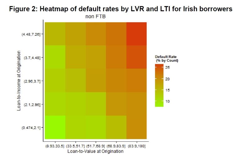
Traditional thinking is that higher loan to value loans are more risky than lower loan to value loans. We see this in the way banks price in risk, through their underwriting standards, and Lenders Mortgage Insurer premiums rise as LVR rises.
However, portfolio analysis from our core market model shows this is a myopic view of risk. When we run our weekly updates of the model we market to market property values, and also update incomes and mortgage payments to take account of changes.
In a rising market, LVR’s tend to improve, because the value of the property rises, creating capital which can insulate the lender in a case of default.
Loan to income metrics give a much more accurate calibration of risk, as we see mortgage stress rising significantly in line with higher LTI measures. In the current environment debt servicing ratios are also important, as mortgage rates are on the rise as incomes are only growing for some, whilst costs of living are rising.

So, here is a (pretty) chart which shows our take on risk of default across LVR and LTI metrics. LTI gives a better read on risk, and in fact the matrix of the two dimensions offers the most accurate calibration.
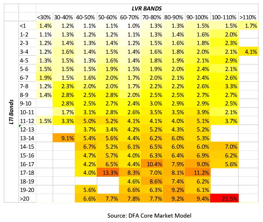 Interestingly, similar conclusions were cited by the Bank of England recently, using data from Irish borrowers after the GFC.
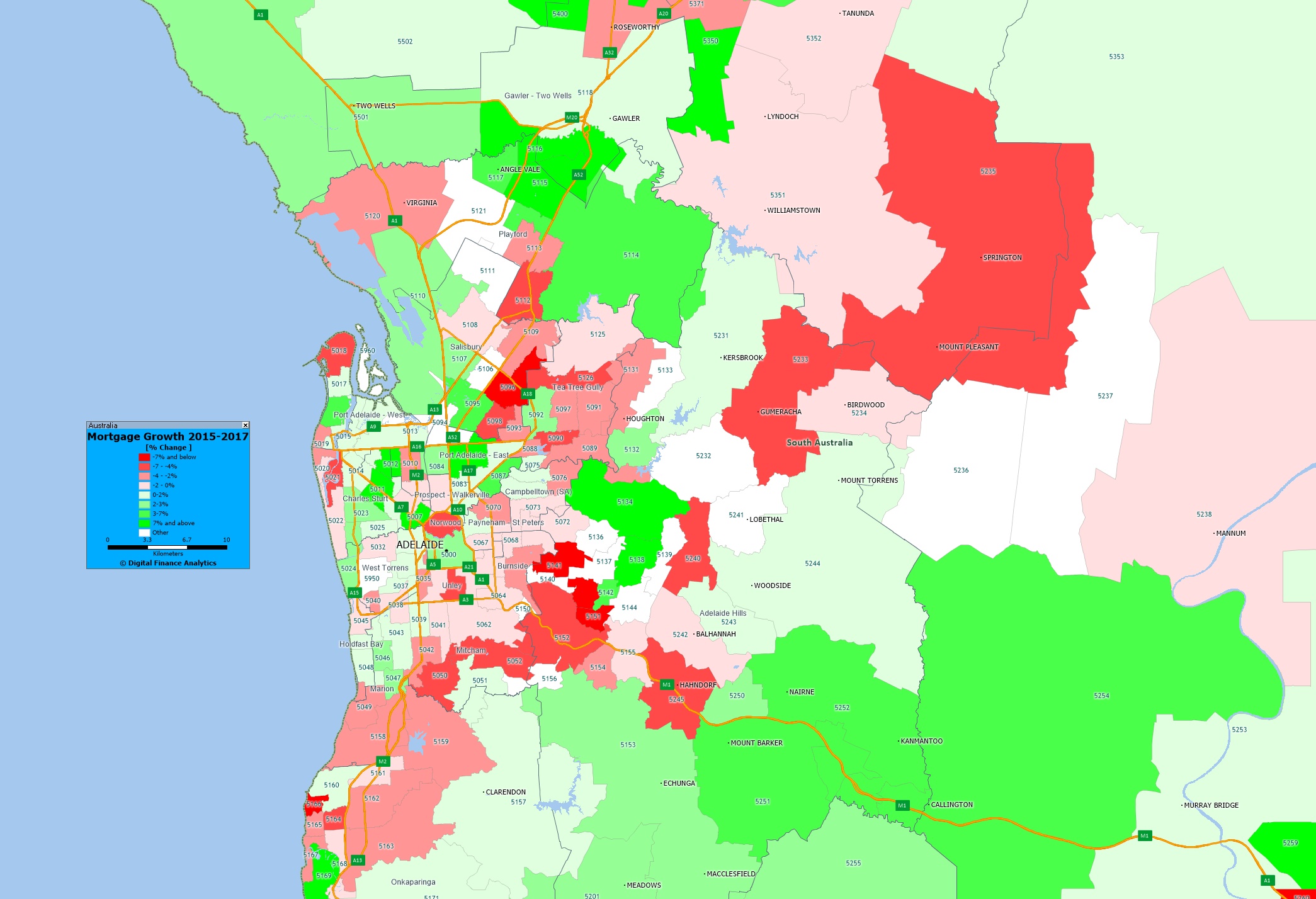
We finish our series on mortgage growth by looking at data from Adelaide and Hobart and plotting the relative change in volumes of loans between 2015 and 2017, by post code, drawing data from our core market models, and geo-mapping the results.
Here is Adelaide.
 Here is Hobart.
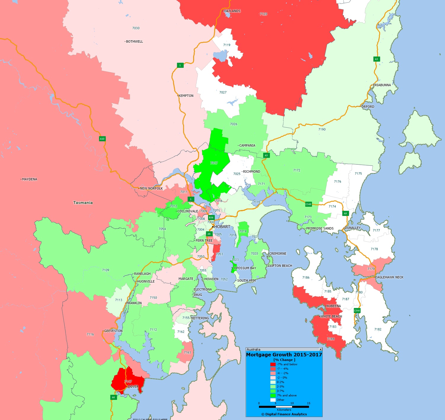 The yellow shades show the areas with the largest growth in the number of mortgages, the red shades show a relative fall in volumes. You can click on the map to view full screen. This is a picture of mortgage counts, not value, we may look at this later.
Compare these pictures with those for Sydney, Melbourne, Brisbane and Perth and we see just how different these markets are!
Of course this is just one of the many potential views available from the 140+ fields which are contained in our Core Market Model.
Last night DFA was involved in a flurry of tweets about the relationship between our rolling mortgage stress data and mortgage non-performance over time. The core questions revolved around our method of assessing mortgage stress, and the strength, or otherwise of the correlation.
We were also asked about our expectations as to when non-performing mortgage loans will more above 1% of portfolio, given the uptick in stress we are seeing at the moment.
Our May 2017 data showed that across the nation, more than 794,000 households are now in mortgage stress (last month 767,000) with 30,000 of these in severe stress. This equates to 24.8% of households, up from 23.4% last month. We also estimate that nearly 55,000 households risk default in the next 12 months.
However, it got too late last night to try and explain our analysis in 140 characters. So here is more detail on our approach to mortgage stress, and importantly a chart which slows the relationship between stress data and mortgage non-performance.
Our analysis uses our core market model which combines information from our 52,000 household surveys, public data from the RBA, ABS and APRA; and private data from lenders and aggregators. The data is current to end May 2017.
We analyse household cash flow based on real incomes, outgoings and mortgage repayments. Households are “stressed” when income does not cover ongoing costs, rather than identifying a set proportion of income, (such as 30%) going on the mortgage.
Those households in mild stress have little leeway in their cash flows, whereas those in severe stress are unable to meet repayments from current income. In both cases, households manage this deficit by cutting back on spending, putting more on credit cards and seeking to refinance, restructure or sell their home. Those in severe stress are more likely to be seeking hardship assistance and are often forced to sell.
We also make an estimate of predicated 30 day defaults in the year ahead (PD30) based on our stress data, and an economic overlay including expected mortgage rates, inflation, income growth and underemployment, at a post code level.
Here is the mapping between stress and non-performance of loans.
![]() The red line is the data from the regulators on non-performing mortgage loans. In 2016 it sat around 0.7%. There was a peak following the 2007/8 financial crisis, after which interest rates and mortgage rates came down.
The red line is the data from the regulators on non-performing mortgage loans. In 2016 it sat around 0.7%. There was a peak following the 2007/8 financial crisis, after which interest rates and mortgage rates came down.
We show three additional lines on the chart. The first is our severe stress measure, the blue line, which is higher than the default rate, but follows the non-performance line quite well. The second line is the PD30 estimate, our prediction at the time of the expected level of default, in the year ahead. This is shown by the dotted yellow line, and tends to lead the actual level of defaults. Again there is a reasonable correlation.
The final line shows the mild stress household data. This is plotted on the right hand scale, and has a lower level of correlation, but nevertheless a reasonable level of shaping. After the GFC, rates cuts, plus the cash splash, helped households get out of trouble by in large, but since then the size of mortgages have grown, income in real terms is falling, living cost are rising as is underemployment. Plus mortgage rates have been rising, and the net impact in the past six months, with the RBA cash rate cut on one hand, and out of cycle rises by the banks on the other, is that mortgage repayments are higher today, than they were, for both owner occupied borrowers and investors. Interest only investors are the hardest hit.
Households are responding by cutting back on their spending, seeking to refinance and restructure their loans, and generally hunkering down. All not good for broader economic growth!
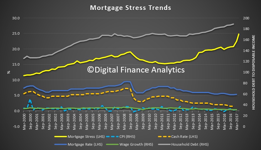 So, given the severe stress, mild stress and our PD30 estimates are all currently rising, we expect non-performing loans to rise above 1% of portfolio during 2018. Unless the RBA cuts, and the mortgage rates follow.
We continue our series on mortgage growth plotting the relative change in volumes of loans between 2015 and 2017, by post code, drawing data from our core market models, and geo-mapping the results.
Here is the Greater Perth picture.
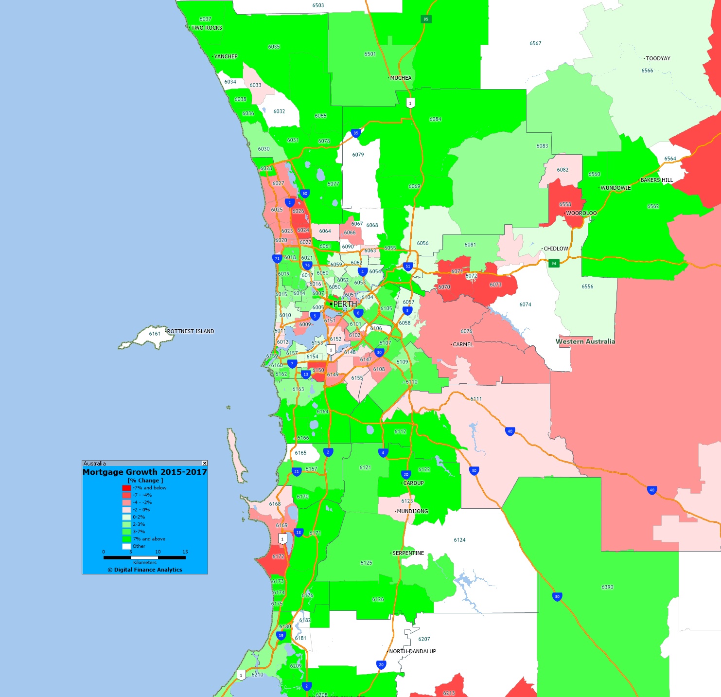 The yellow shades show the areas with the largest growth in the number of mortgages, the red shades show a relative fall in volumes. You can click on the map to view full screen. This is a picture of mortgage counts, not value, we may look at this later.
Of course this is just one of the many potential views available from the 140+ fields which are contained in our Core Market Model.
Next time we will look at Adelaide and Hobart.
We continue our series on mortgage growth plotting the relative change in volumes of loans between 2015 and 2017, by post code, drawing data from our core market models, and geo-mapping the results.
Here is the Greater Brisbane picture.
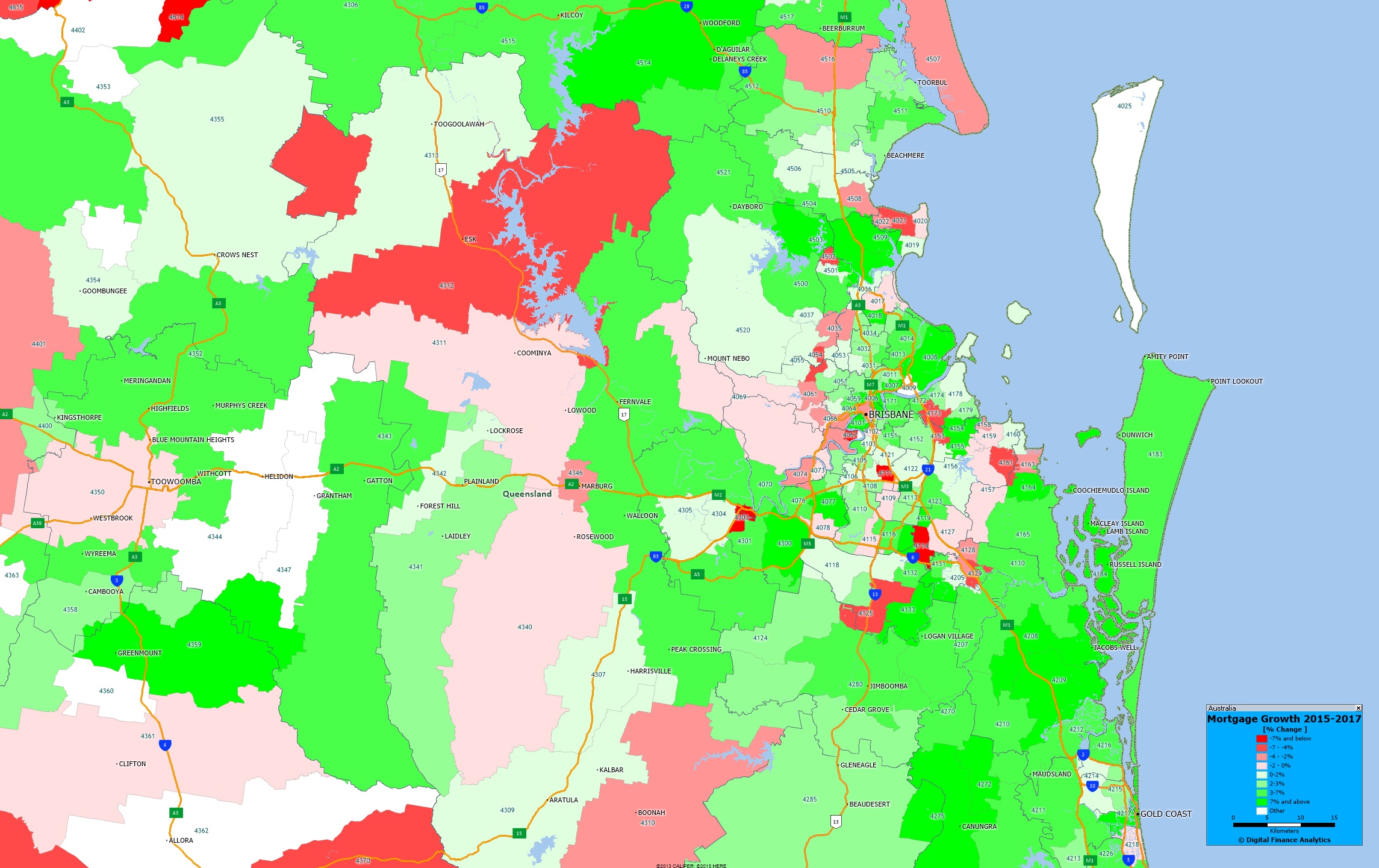 The yellow shades show the areas with the largest growth in the number of mortgages, the red shades show a relative fall in volumes. You can click on the map to view full screen. This is a picture of mortgage counts, not value, we may look at this later.
Of course this is just one of the many potential views available from the 140+ fields which are contained in our Core Market Model.
Next time we will look at Perth.
We continue our series on mortgage growth, plotting the relative change in volumes of loans between 2015 and 2017, by post code, drawing data from our core market models, and geo-mapping the results.
Here is the Greater Melbourne picture.
 The yellow shades show the areas with the largest growth in the number of mortgages, the red shades show a relative fall in volumes. You can click on the map to view full screen. This is a picture of mortgage counts, not value, we may look at this later. Relative to other states, there was significant expansion over this period.
Of course this is just one of the many potential views available from the 140+ fields which are contained in our Core Market Model.
Next time we will look at Brisbane.
One of the measures contained in the Digital Finance Analytics household surveys is the number of households with a mortgage in each post code across the country. By comparing our data from 2015, with 2017 we can spot some interesting growth trends, especially when we geo-map the data. Today we begin with Greater Sydney.
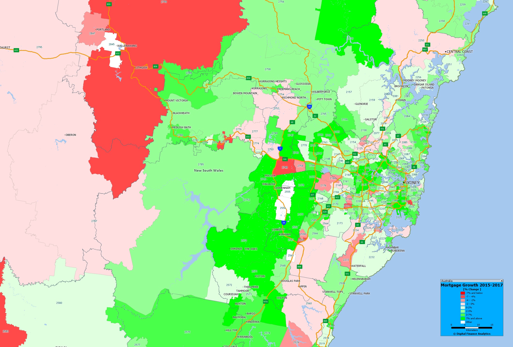 The yellow shades show the areas with the largest growth in the number of mortgages, the red shades show a relative fall in volumes. We see significant growth in western Sydney, where there has been significant residential development over this period. You can click on the map to view full screen. This is a picture of mortgage counts, not value, we may look at this later.
Of course this is just one of the many potential views available from the 140+ fields which are contained in our Core Market Model.
Next time we will look at Melbourne.