Real Disposable Income Stalled Since 2009 – HILDA

During the election campaign then-opposition leader Bill Shorten repeatedly claimed that everything was going up. Via The Conversation.

“Childcare is up 28%, out of pockets to see the doctor up 20%, specialists … up nearly 40%,” he said. And then the punchline: “everything is going up, except your wages.”

Statistically, it wasn’t true. The official rate of inflation was just 1.3%. The official rate of wage growth was 2.3%.

I haven’t asked him, but I wouldn’t be surprised if he kept saying it because his focus groups told him that’s what people felt.

Today’s release of the 17th wave of Australia’s Household, Income and Labour Dynamics Survey (HILDA) tells us that despite the official statistics, people were right to feel they were going backwards.

Funded by the Australian government and managed by the Melbourne Institute of Applied Economic and Social Research, HILDA is one of the most valuable tools Australian social researchers have.

It examined the lives of 14,000 Australians in 2001 and then kept coming back to them each year to discover what had changed. By surveying their children as well, and in future surveying their children, it will be able to build up a long-term picture of how circumstances change over the course of lives and generations.

It can be thought of as Australia’s Seven Up!, the British TV series that keeps going back for updates on the lives of 14 children it first examined when they were seven. Except that HILDA’s results have statistical significance, and the questions are detailed, asking among other things about depression and anxiety, work-life stress, stress in relationships, and illicit drug use.

We are right to feel no better off…

The Australian Bureau of Statistics does indeed find that wages are climbing faster than prices, as they almost always have, but because it doesn’t examine what happens to a particular household over time it can tell us little about whether an individual’s experience of things is getting better or getting worse.

HILDA gets a handle on each household’s disposable income by asking each member of the household about their gross income from wages, benefits, investments and other sources and then deducting its estimate of taxes. It gets a handle on the real (inflation-adjusted) changes by adjusting its totals for changes in the consumer price index.

It finds that for the thousands of households it interviewed, real disposable income grew strongly during the first nine years of the survey, between 2001 and 2009. Then, after the global financial crisis, for the eight years between 2009 and the 2017 results released today, that growth stalled.

Expressed in today’s dollars, the average annual real disposable income of those households climbed by A$19,773 between 2001 and 2009, about $2,472 per year.

But most of the growth was during the mining boom that stretched from 2003 to 2009 when the average annual real disposable household income climbed about $3,000 per year, as did the income of the more representative median (or middle) household.

Since 2009 and the global financial crisis, the average and the median have moved in different directions.

The average houshold’s annual real disposable income has climbed a further $3,156. The median (or typical) household’s income has fallen $542, although not steadily. The graph shows it falling between 2009 and 2011, climbing in 2012, and changing little thereafter.

…and as if it’s harder to get ahead…

It has also become harder to “get ahead”, in the phrase used often by the prime minister.

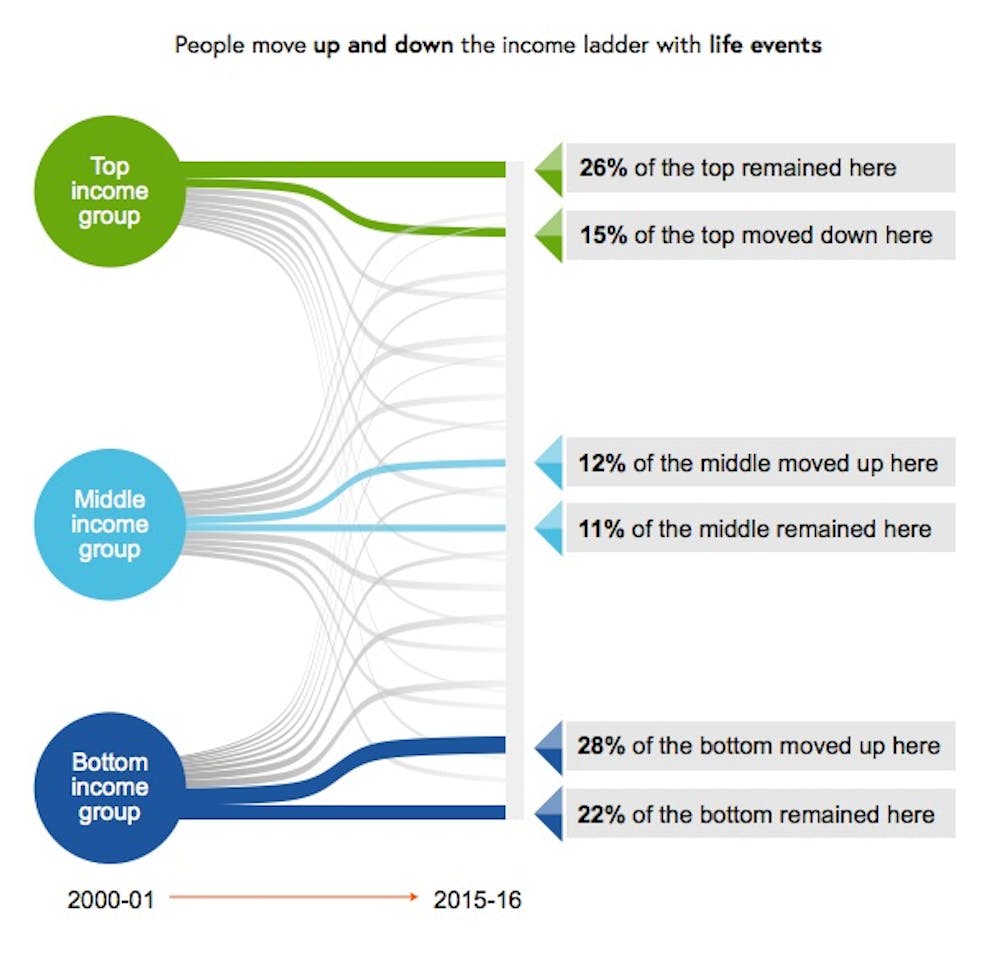
Between 2001 and 2005, 40% of the households in the bottom fifth of earners (the bottom qunitile) moved out of it into a higher one. In more recent years, between 2012 and 2016, a lower 38.5% moved up.

Between 2001 and 2005, 44% of the households in the top qunitile had to move down to let other households take their place. In more recent years, between 2012 and 2016, only 41.5% have moved down.

Getting a long way out of the income circumstances you were born in is a long-shot, according on HILDA’s early attempt at measuring intergenerational mobility.

People who were 32-34 years old in 2015-17 are highly likely to be in the same household income quintiles as those people found themselves in when they were 15-17 back in 2001-03.

There’s only a one in ten chance of moving from the bottom quintile as a teenager to the top quintile in your early thirties. There’s a 37% chance you’ll stay put.

Even among teenagers who grew up in the middle quintile, there’s only a 17% chance of making it to the top, along with a 19% chance of moving one rung up.

Interestingly, women turn out to be more tied to the income their families had when they were children than men, and both men and women tend to stay more closely tied to their mother’s income than their father’s.

Interestingly, women turn out to be more tied to the income their families had when they were children than men, and both men and women tend to stay more closely tied to their mother’s income than their father’s.

…yet we are less reliant on welfare, even pensions…

When HILDA began in 2001, 39% of Australians aged 18 to 64 were living in a household that received government welfare of some kind. By 2017, that proportion had fallen to 31%, but almost all of the drop happened before the global financial crisis in 2009.

Most of us are still in households that have received something from the government over a 10-year period: 58% of working age Australians in 2017, down from 64% in 2010.

Among older Australians aged 65 and over, reliance on the age pension and other benefits for more than half of income needs has dropped from 60% to 51%.

Among new retirees aged 65 and over, the proportion receiving the age pension has fallen from 76% of men and 74% of women to just 60% of men and 55% of women.

But while the growth of compulsory superannuation is likely to be part of the story, almost all of the decline happened before the financial crisis in 2009, suggesting that the destruction of wealth in the crisis kept people on the pension who otherwise might not have needed it.

…and gender roles are changing

Before the financial crisis, almost three quarters (73%) of men of traditional working age were employed full-time. After the crisis, the rate slipped to a much lower 67% and stayed there.

Female full-time employment was also hit by the crisis but has since almost totally recovered to be just a fraction below its pre-crisis peak of 39.6%.

Women’s hourly earnings are also climbing faster than men’s, up 24% between 2001 and 2017, compared to 21% for men’s.

While women have always been more likely than men to be employed casually, since the crisis male casual employment has climbed while female casual employment has declined. The two are now as close as they have ever been, with women now only six percentage points more likely than men to be employed causally.

In dual-earner male-female couples, the proportion in which the woman earns more than the man has climbed from 22% to 25%.

The woman being the main breadwinner is more common in couples that aren’t legally married and don’t have children. It is also far more common in the regions than in cities and among couples in which the man doesn’t have a university degree.

Men in predominantly female breadwinner households are somewhat less happy with their lives and with their relationships, as (perhaps surprisingly) are women.

Fathers tend to agonise more about work-family conflict than mothers, notwithstanding the much greater amount of housework and childcare work performed by mothers. The men who worry the most work long hours, have irregular shits and very young children. A mother working the same hours as a father will typically be more conflicted.

Most parents suffering high work-family conflict get out of it within a year or two, often by managing things better and sometimes by changing jobs. Those suffering high work-family conflict are 50% more likely than others to separate the next year.

HILDA’s great strength is that it will be able to follow those parents and their children and all the other families it surveys and tell us what happens next. Rather than being an Australian version of Seven Up!, it might be better described as Australia’s never ending story. Its co-director Roger Wilkins says its design allows it to be “infinitely lived”.

Don’t believe what they say about inequality

From The Conversation.

If you were going to reduce a 150-page Productivity Commission examination of trends in Australian inequality to a few words, it would be nice if they weren’t “ALP inequality claims sunk”, or “Progressive article of faith blown up” or “Labor inequality myths busted by commission”.

The editorial in the Australian Financial Review of August 30 says questions about whether inequality is increasing are “abstract”, taught in universities as “an article of faith”, and a “political truncheon”.

Here I should disclose that I teach courses covering inequality as well as undertaking research on the topic. Also, I was one of the external referees for this week’s Productivity Commission report.

It adds to a growing pile of high quality research on trends in income distribution in Australia, including a recent Australian Council of Social Service (ACOSS) and University of New South Wales study using data from the Australian Bureau of Statistics (ABS) that provides an in-depth analysis of income and wealth inequality in 2015-16 and an analysis of trends since 2000.

Also released at the end of July was the latest HILDA Statistical Report that analyses how things have changed over time for individuals between 2001 and 2016.

The Productivity Commission survey takes the deliberately ambitious approach of assessing a wider range of outcomes than income, including indicators of household consumption and wealth, their components, and changes over time and in response to events such as transitions to work, divorce and retirement.

Rising inequality? A stocktake of the evidence, Productivity Commission 2018, CC BY

Much of the reporting seems to have misread the messages the survey and the Chairman’s speech to the National Press Club were trying to emphasise. For example, the editorial in the Financial Review argues the Commission’s report shows “economic growth has made everyone in Australia in every income group better off”.

Well, no, it doesn’t.

The finding that every income group has benefited from income growth should not be interpreted as meaning every person in Australia is better off. The discussion of mobility in the report makes the point that the incomes of households and individuals fall as well as rise.

Put simply, not everyone – in fact very few (about 1%) – stay in exactly the same place. Table 5.1 (page 96) shows more than 40% of the Australian population were in a lower income group in 2016 than they had been in 2001, for reasons ranging from retirement to disability to unemployment to family breakdown.

Productivity Commission, CC BY

Single adults on Newstart, although not the same people, have fallen down the income distribution over the past 25 years, from around the bottom 10% to the bottom 5%. As another example, someone who worked on a manufacturing production line until it was closed and then got a job as a sales assistant would be better paid than a sales assistant used to be but most certainly not better paid than they used to be. They would have little reason to believe the Financial Review.

And as the Commission was at pains to point out, the stabilisation and slight decline in overall inequality over the past decade is to a large extent the result of specific government decisions.

One of the most important was the one-off increase in age pensions by the Rudd government in 2009. The 2016 ACOSS report on poverty found the relative poverty rate (before housing costs) for people aged 65 and over fell from around 30% in 2007-08 to 11% in 2013-14, due to the “historic increase” in pension rates.

ABS income surveys show the average incomes of households headed by people aged 65 and over climbed by 16% in real terms between 2007-08 and 2015-16, while for the population as a whole the increase was about 3%. As a result, the average incomes of older households jumped from 69% to 78% of those of households generally.

While economic prosperity was needed to fund that increase, it didn’t automatically fund it. That needed deliberate government intervention.

In his speech releasing the report, Commission chairman Peter Harris specifically noted “growth alone is no guarantee against widening disparity between rich and poor”.

Some forms of poverty for children “have actually risen”.

The slide in inequality resulting from the increase in the age pension is likely to have disguised increases in inequality elsewhere.

According to the Bureau since the global financial crisis the number of workers who are underemployed – working part time and wanting more hours – has climbed from about 680,000 to 1.1 million; from 6.3% to 8.9% of the workforce.

And the ABS finds wage disparities have increased. The ratio of the earnings of a worker at the 90th percentile (earning more than 90% of workers) to the earnings of a worker at the tenth percentile grew from 7.75 times in 2008 to 8.24 times in 2016. This was due to widening wage differentials for both full-time and part-time workers and an increase in the proportion of part-time workers

We often hear about Australia as a “miracle economy” enjoying 27 years of economic growth. In fact, the Commission report (Figure 1.2 page 13) shows real net national disposable income per person – a better measure of individual economic well-being than GDP – actually fell in six out of the last 27 years.

Productivity Commission

The income survey data show an even more mixed record. The Our World in Data database shows that by 2003 the real income of the median Australian household was only about 5% higher in real terms than in 1989, while the second and third decile households – mainly headed by those on low wages and some on social security – were actually no better-off than in 1989, largely due to the effects of the early 1990s recession.

Virtually all of the increase in real disposable household incomes enjoyed since 1989 (or 1981 for that matter) came in one five-year period, between 2003 and 2008 during the first mining boom.

What is striking about Australia compared to other countries is that since the global financial crisis we have largely maintained the income lift from the boom.

Will we be blessed by another boom to pump up the figures? Or might we be less lucky?

Despite the way it’s been spun, the Commission’s main message is that in the decades ahead we will need both policies that generate economic growth and policies that ensure it’s well spread. One without the other could leave many of us worse off.

Author: Peter Whiteford, Professor, Crawford School of Public Policy, Australian National University

RBA Charts Tell A Tale Of Household Woe

The latest RBA chart pack, a distillation of data to the end of the year, contains a few gems, which underscore some of the tensions in the consumer sector.

First, relative the the ultra-low cash rate, actual mortgage rates are rising – no surprise given the rise in mortgage stress we are registering.

Next, home loan approvals are on the slide – expect more of this as tighter underwriting standards bite, and many interest only borrowers are forced to switch to higher cost interest and principal loans.

Home price indices are trending lower (but still net positive growth overall at the moment). Expect more falls in the months ahead.

Household debt continues higher. Now double disposable income, and we have some of the most highly in debt households in the world. Lending growth is still three times income, so this is likely to continue higher.

All this is bearing down on household consumption as real income growth stalls. The savings ratio is falling, as households tap these to prop up their finances, OK in the short term, but unsustainable longer term.

US Real Income Remains Frozen

According to the US Bureau of Labor Statistics, real (adjusted for inflation) average hourly earnings were unchanged from January 2016 to January 2017. Before adjusting for inflation, average hourly earnings increased 2.5 percent over the 12 months ending in January 2017. Over the same period, the Consumer Price Index for all Urban Consumers (CPI-U), which is used to adjust average hourly earnings for inflation, also increased 2.5 percent.

Since 2009, the 12-month change in average hourly earnings ranged from 1.5 percent (in October 2012) to 3.6 percent (in December 2008 and January 2009). Over the same period, the 12-month change in the CPI-U ranged from −2.0 percent (in July 2009) to 5.5 percent (in July 2008). The 12-month change in real hourly earnings ranged from −2.4 (in July 2008) percent to 4.8 percent (in July 2009).

The 12-month changes in average hourly earnings and the CPI-U were equal in April, May, and June 2014. From that time until December 2016, the change in hourly earnings was greater than the change in the CPI-U, resulting in positive changes in real average hourly earnings.

These data are from the Current Employment Statistics program and are seasonally adjusted. Data for the most recent 2 months are preliminary.

No Overall Real Income Growth Since 2008 – RBA

There were two important charts contained in the speech by RBA Deputy Governor Philip Lowe today covering the resilience of our own economy, the productivity challenge, the balance in the housing market and the inflation outlook. Real disposable income per capita has been static since 2008, and rent inflation continues to fall. Both indicators of ongoing stress in the economy, especially since household debt is higher than ever, and we have a large share of housing in the investment sector, where we already know some households are in real-terms losing money each month.

This data partly explains the relatively low state of household finance confidence.

While we have done a pretty good job of adjusting to our changed circumstances, the not-so-good news is that growth in real income per capita in Australia has stalled (Graph 5). Indeed, average real income is no higher today than it was in 2008. This follows a 17-year period in which growth averaged a remarkable 3.1 per cent per year. During this earlier period, we benefited from: (i) strong productivity growth in the 1990s; (ii) a very large rise in our terms of trade; and (iii) favourable demographics, which helped increase the share of the population in paid employment.

Static Income RBAThe increase in supply now looks to be contributing to some moderation in the rate of increase in housing prices in these cities. It is also putting downward pressure on rents, with the CPI measure of rent inflation running at just 1.2 per cent in 2015, the lowest for 20 years (Graph 8). Whether or not these trends are maintained remains to be seen, and so we continue to watch developments in the housing market very closely.

Rental Income RBAThe latest data from the RBA chart pack shows again growing debt, and the reduced debt interest burden thanks to ultra low rates. If rates were to rise by even a small amount, in the current low income and low rental environment, this will be a problem.

household-finances

Private Sector Wage Growth The Lowest On Record

According to the ABS, the seasonally adjusted Wage Price Index (WPI) rose 0.6 per cent in the September quarter 2015 and 2.3 per cent over the last year, according to figures released today. It is an all time record low for the Private sector, though Government servants are doing rather better. This data underscores the continued pressure on rentals from investment properties, because rentals are more linked to income than house prices.

In the September quarter 2015, Private sector wages grew 0.5 per cent and Public sector wages grew 0.7 per cent (seasonally adjusted).

Wage-TrendsPrivate sector seasonally adjusted wage growth of 2.1 per cent over the last year is the lowest rate of wages growth since the start of the WPI series. The through-the-year series was first published in September quarter 1998.

In the Public sector, wages grew 2.7 per cent over the last year.

In the September quarter, the largest rise (original series) of all industries is 1.6 per cent in Accommodation and food services. Finance and insurance services had the smallest rise of 0.2 per cent.

Middle Income Households Income Is Getting Squeezed

Data from the ABS looking at income and wealth, shows that the average income of high income households rose by 7 per cent between 2011-12 and 2013-14, to $2,037 per week, whist low income households have experienced an increase of around 3 per cent in average weekly household income compared with middle income households which have changed little since 2011-12.

The average income of all Australian households has risen to $998 per week in 2013–14, while average wealth remained relatively stable at $809,900. Similarly, change in average wealth was uneven across different types of households. For example, the average wealth of renting households was approximately $183,000 in 2013-14. Rising house prices contributed to an increase in the average wealth for home owners with a mortgage ($857,900) and without a mortgage (almost $1.4 million).

Most Australian households continue to have debts in 2013-14, with over 70 per cent of households servicing some form of debt, such as mortgages, car loans, student loans or credit cards. For example, the average credit card debt for all households was $2,700.

One quarter of households with debt had a total debt of three or more times their annualised disposable income. Mortgage debt was much higher

These households are considered to be at higher risk of experiencing economic hardship if they were to experience a financial shock, such as a sudden reduction in their income or if interest rates were to rise, increasing their mortgage or loan repayments.

The survey findings also allow comparisons of income and wealth across different types of households.

In 2013–14, couple families with dependent children had an average household income of $1,011 per week, which was similar to the average for all households at $998 per week.

By comparison, after adjusting for household characteristics, one parent families with dependent children had an average household income of $687 per week.

Pay Rises Slacken Further

The latest ABS data shows that to March 2015 pay increase momentum slackened further. The trend index and the seasonally adjusted index for Australia rose 0.5% in the March quarter 2015. The Private sector rose 0.4% seasonally adjusted, and the Public sector rose 0.5%.

PayMarch2015TrendsThe trend was similar across the states, other than in TAS.

PayOrignbalStatesMarch2015 The rises in indexes at the industry level (in original terms) ranged from 0.1% for Administrative and support services to 1.0% for Education and training.

The trend and seasonally adjusted indexes for Australia both rose 2.3% through the year to the March quarter 2015. Rises in the original indexes through the year to the March quarter 2015 at the industry level ranged from 1.6% for Professional, scientific and technical services to 2.8% for Education and training.  Given that core inflation is running at 2.4%, in real terms many households are going backwards.

CPICoreApril2015

It is worth comparing the trends now and in the early 2000’s. We see that incomes were rising faster then, and though house prices rose quite strongly, the growth profile was different. We know that many households got out of jail thanks to lower interest rates AND rising real incomes. This time, house prices and rising strongly (especially in some centers) but incomes are going backwards. If and when interest rates start to rise, this will lead to a world of pain.

INcomeandHousePricesMarch2015


Household Income Trends Show Strongest Growth At The Top

The ABS today released their Distribution of Household Income, Consumption and Wealth data for the years from 2003 to 2012.   According to the ABS, the average gross disposable income of Australian households grew 58 per cent in the period 2003-04 to 2011-12. However, the highest income quintile grew at a rate above average, at 62 per cent. All other income quintiles grew above 50 per cent , but below the average rate of 58 per cent. We see that older Australian’s income has been growing faster than younger ones.

GrossIncomesBy-AgeBandsThe relative share of gross income is gravitating towards older households. This is a function of the growing number of older households, thanks to the demographic shifts, and the fact they hold the lions share of investments yielding income.

RelativeShareGrossIncomesBy-AgeBandsWe can also look across the income quintiles (20% bands). We see stronger income growth in the higher income groups. This is stated in perecentage terms, but in doller terms the relative amounts are significant.

GrossIncomesPCQuintilesWe can see that growth in incomes for the richest quintile is stronger than the lower ones.

GrossIncomesQuintilesThe ABS says growth in wages and salaries was by far the largest contributor to this increase, except for the lowest income quintile, where social assistance benefits were the largest contributor to their income growth.

This is an important data-set and is the first time data for household groups has been released under the framework of the national accounts. We can look at which household groups are driving the growth in income, consumption, savings and wealth in the national accounts.

For example, households with two adults and dependent children were responsible for about one-third of the growth in household gross disposable income.

Households where the reference person was aged 35 to 44 years had an increase in income tax of $9,000 – with their payments going from $17, 000 in 2003-04 to $26,000 in 2011-12 – which was above the average increase of $4,500.

Of course this data stops in 2012, so we cannot yet see the impact of falling incomes in real terms, which we have discussed previously.

Household Incomes And Property Segmentation

In the current discussions about macroprudential, stimulated by the RBA comments last week and likely to be stoked further as the RBA appears before the Senate Banking Committee on Thursday, many are claiming that household balance sheets and incomes are supporting the growth in house prices, and so no intervention is needed. The chair of the Banking Committee Sam Dastyari is “concerned about the unanticipated consequences of the Reserve Banks’s view-change on the sustainability of the housing boom and whether it needed to interfere with bank lending”.

The debate has shifted to first time buyers, and not wishing to put further barriers in the way of the small number able to enter the market at prices which are already too high. They may be missing the point. First, the increase in household wealth is directly linked to the rise in house prices (a weird piece of feedback here, as prices rise, households are more wealthy, so can accommodate higher prices – spot the chicken and egg problem?). In addition, wealth is growing thanks to stock market movements (though down recently) driven partly by the US and European low rates and printing money strategies. This will reverse as rates are moved to more normal levels later. Superannuation, the third element is of course savings for retirement, so cannot be touched normally (there are exceptions, and no, first time buyers should not be allowed to use their super to get into the property market). More first time buyer incentives won’t help.

But, we have been looking at household incomes, after inflation, at a segment level. We segment based on property ownership, and you can read about the DFA segments here. On average, across all households, income growth is falling behind inflation. This is the ABS data from June 2014. In the past few months, real income is going backwards, before we consider rising costs of living.

AdjustedIncomeGrowthAllHowever, at a segment level, the situation is even more interesting, and diverse. Those wanting to buy, but unable to enter the market are seeing their incomes falling sharply, inflation adjusted, making the prospect of buying a house more unlikely. We are seeing the number of households in this group rising steadily, see our Property Imperative Report.

AdjustedIncomeGrowthWantToBuysFirst time buyers, those who have, or are purchasing for the first time, are also seeing income falling in real terms, more sharply than the average. This is why we are predicting a higher proportion of first time buyers will get into mortgage stress, especially if interest rates are increased. This is one reason why loan to income ratios for this group are high.

AdjustedIncomeGrowthFirstTimeBuyersThen looking at holders, their incomes are moving closer to the average. Holders have no plans to change their property, many have mortgages.

AdjustedIncomeGrowthHoldersRefinancers, are hoping to lock in lower rates, though we note the forward rates are now higher than they were, which may suggest the lowest deals are evaporating. One of the prime motivations for switching in this segment is to reduce outgoings, not surprising when we see incomes falling faster than the average in real terms.

AdjustedIncomeGrowthRefinanceNow, looking at Up Traders, we find their incomes are rising more quickly than the average. Up Traders have been active recently. They have the capacity to service larger loans. They will be purchasing primarily for owner occupation.

AdjustedIncomeGrowthTradingUpDown Traders have incomes rising more quickly, thanks to investment income, and there still about one million households looking to sell and move into a smaller property, releasing capital in the process. They are also active property investors, directing some of their released capital in this direction, either direct, or via super funds.

AdjustedIncomeGrowthDownTradersInvestors also have incomes which are rising faster than the average, so no surprise they are active in the market, seeking yields higher than deposits, and taking advantage of negative gearing. We continue to see a small but growing number of investors using super funds for the transaction.

AdjustedIncomeGrowthInvestorsSo, the segmental analysis highlights how complex the market is, and that there are no easy fixes. Any rise in interest rates would hit first time buyers very hard. Demand from investors (the foreign investment discussions is only a sideshow in my view) will be sustained, with the current policy settings. Raising interest rates will not help much on this front, because interest will be set against income. So macroprudential controls on investment loans makes more sense.

One option would be to differentially increase the capital buffers the banks hold for investment loans, making their pricing less aggressive, and the banks more willing to lend to suitable owner occupiers and businesses, which is what we need. Trimming demand for investment properties may help to control prices.

The bottom line though is that many years of poor policy are coming home to roost, on both the supply and demand side. A number of settings need to be changed, as discussed before.