Taxable Income Mapping ACT 2015

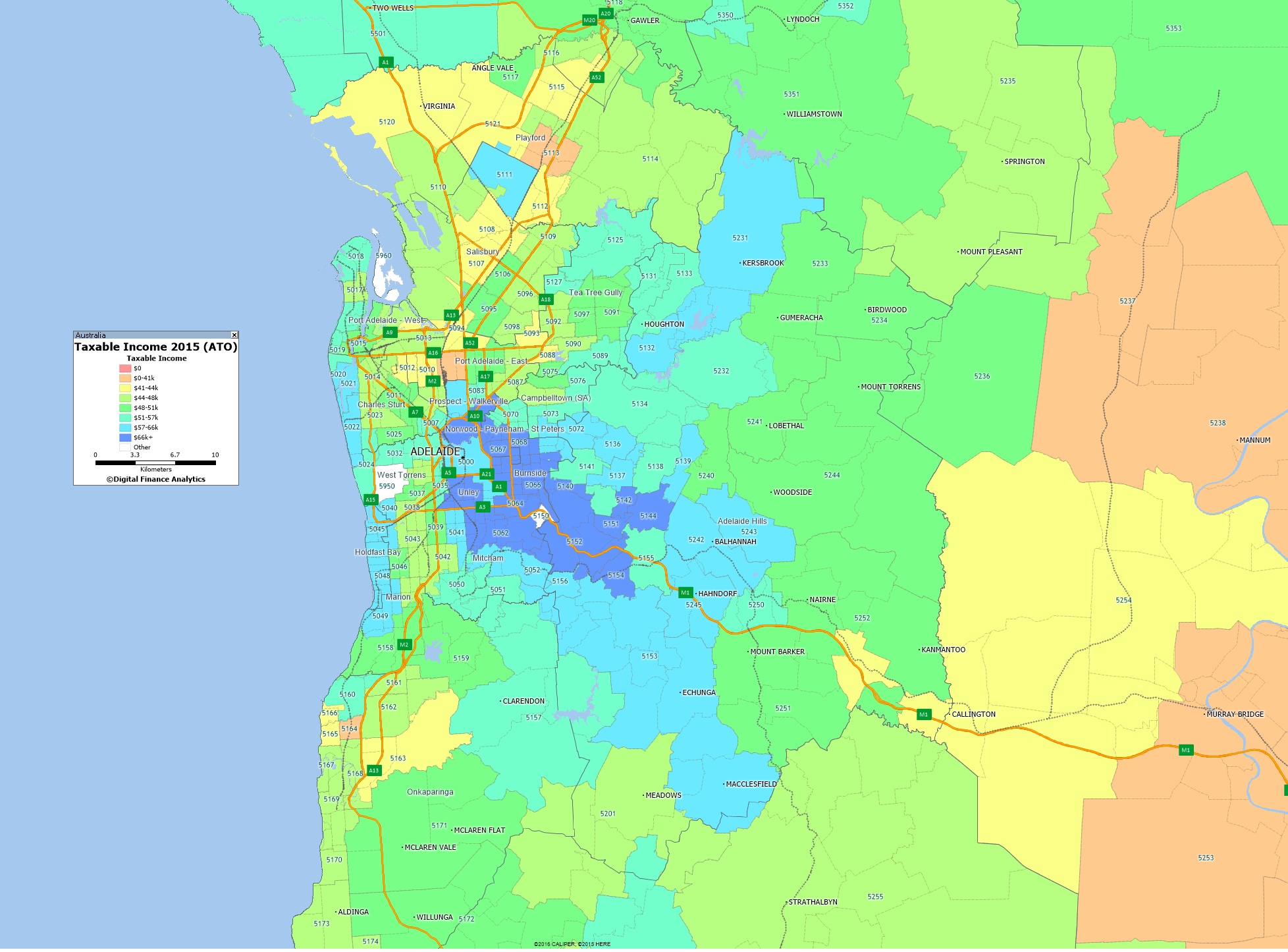
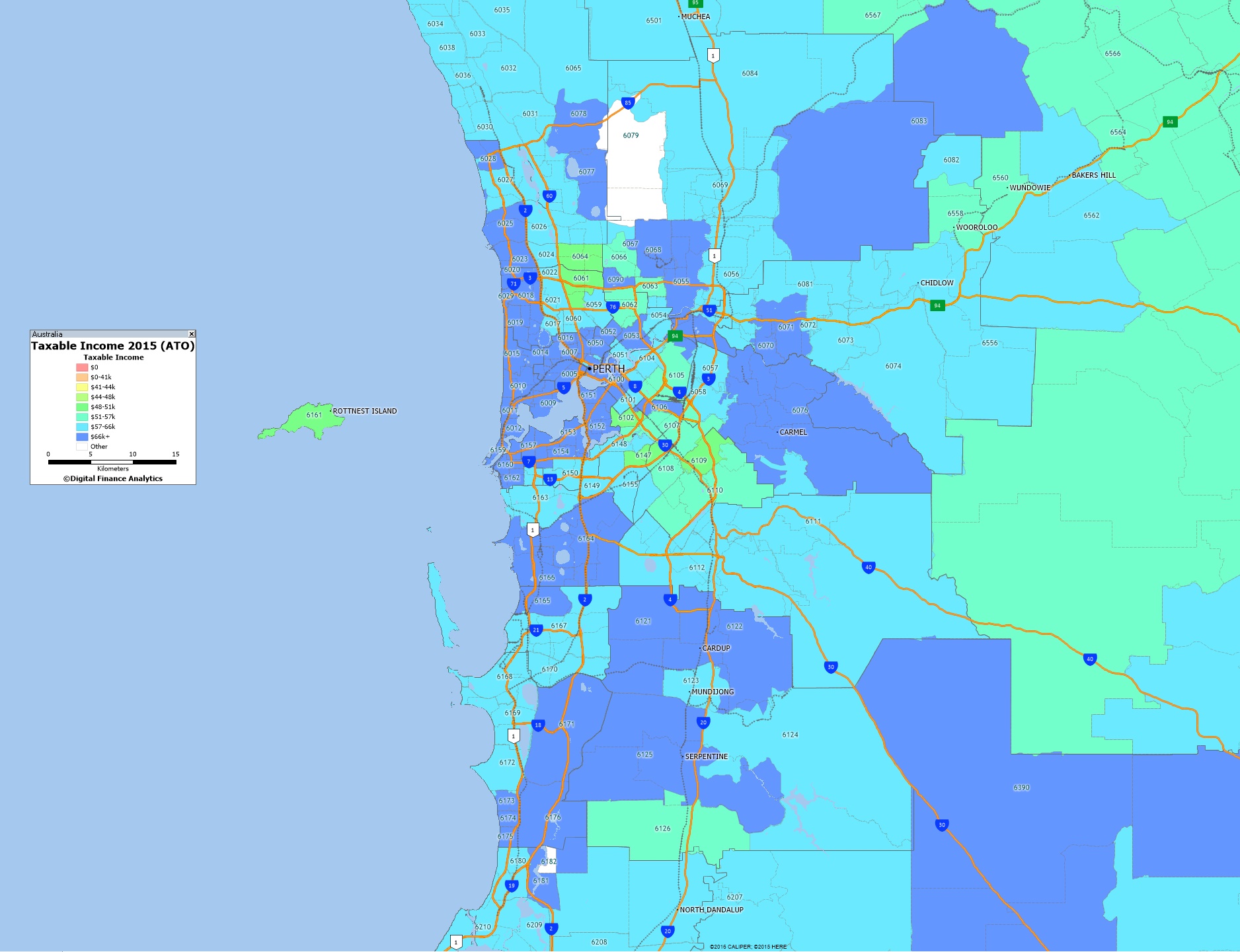
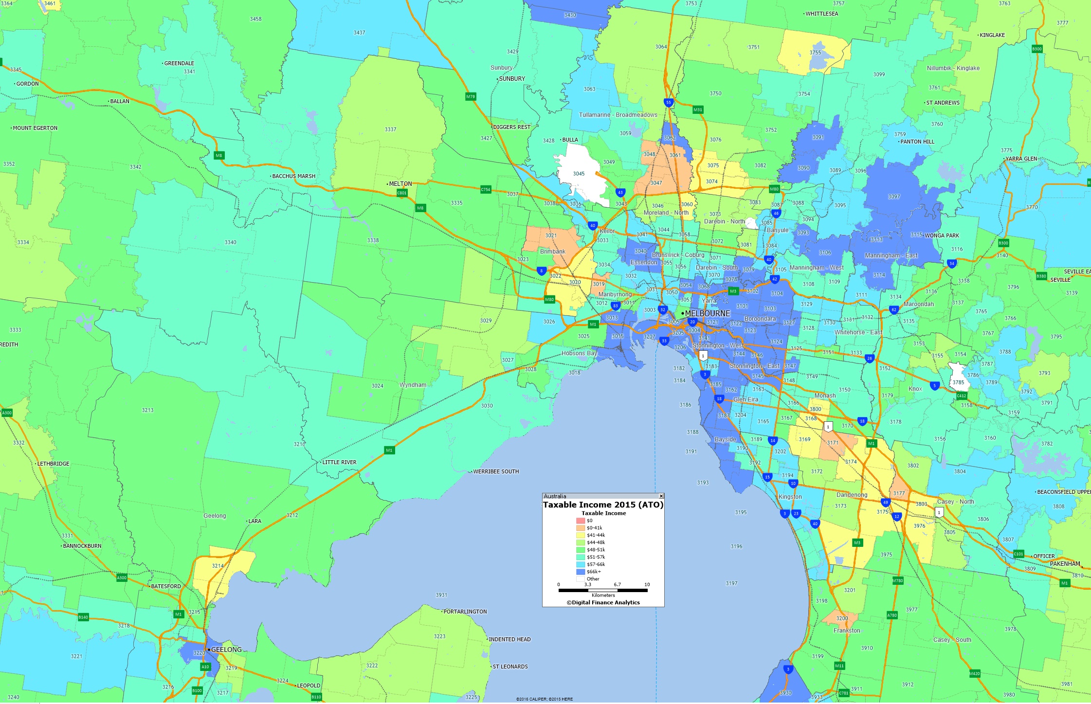
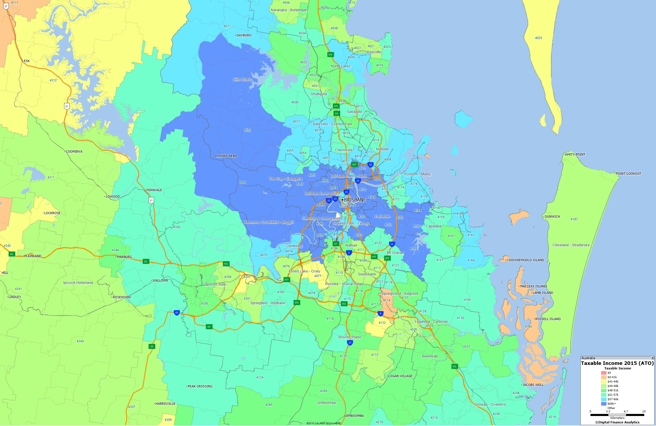
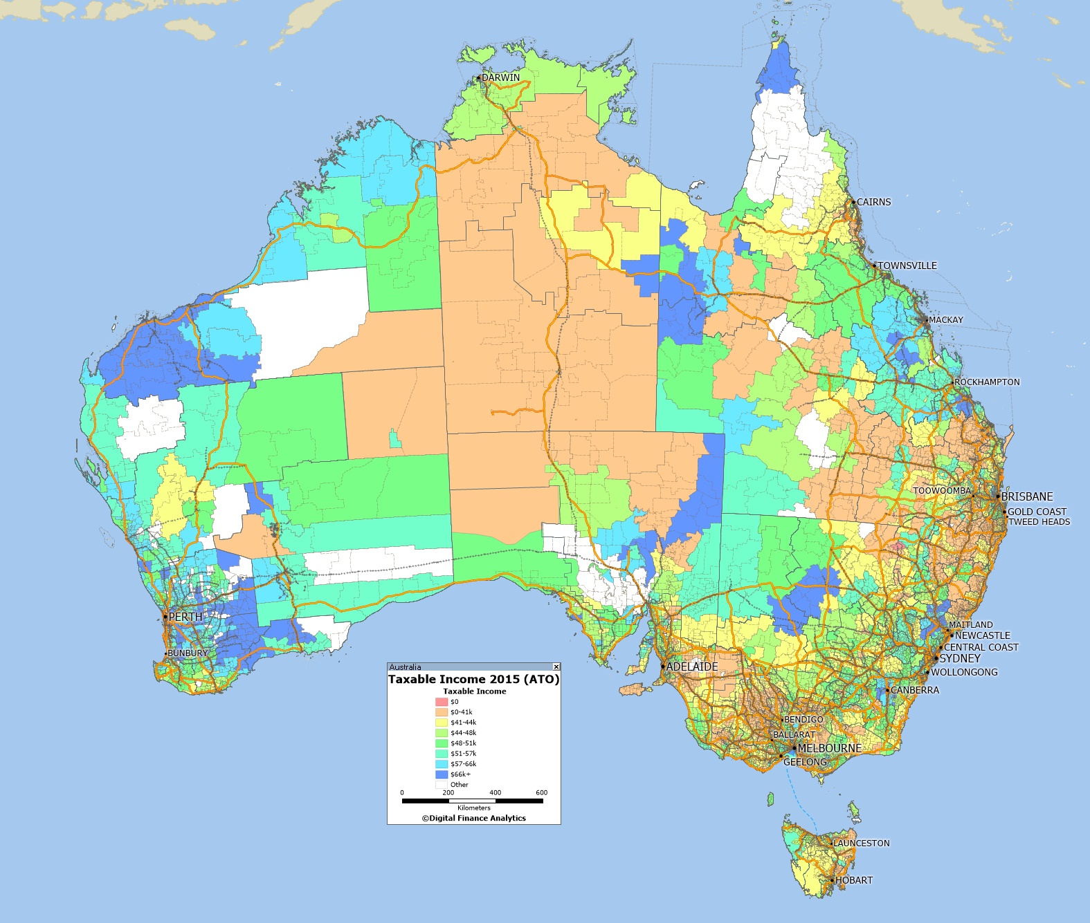
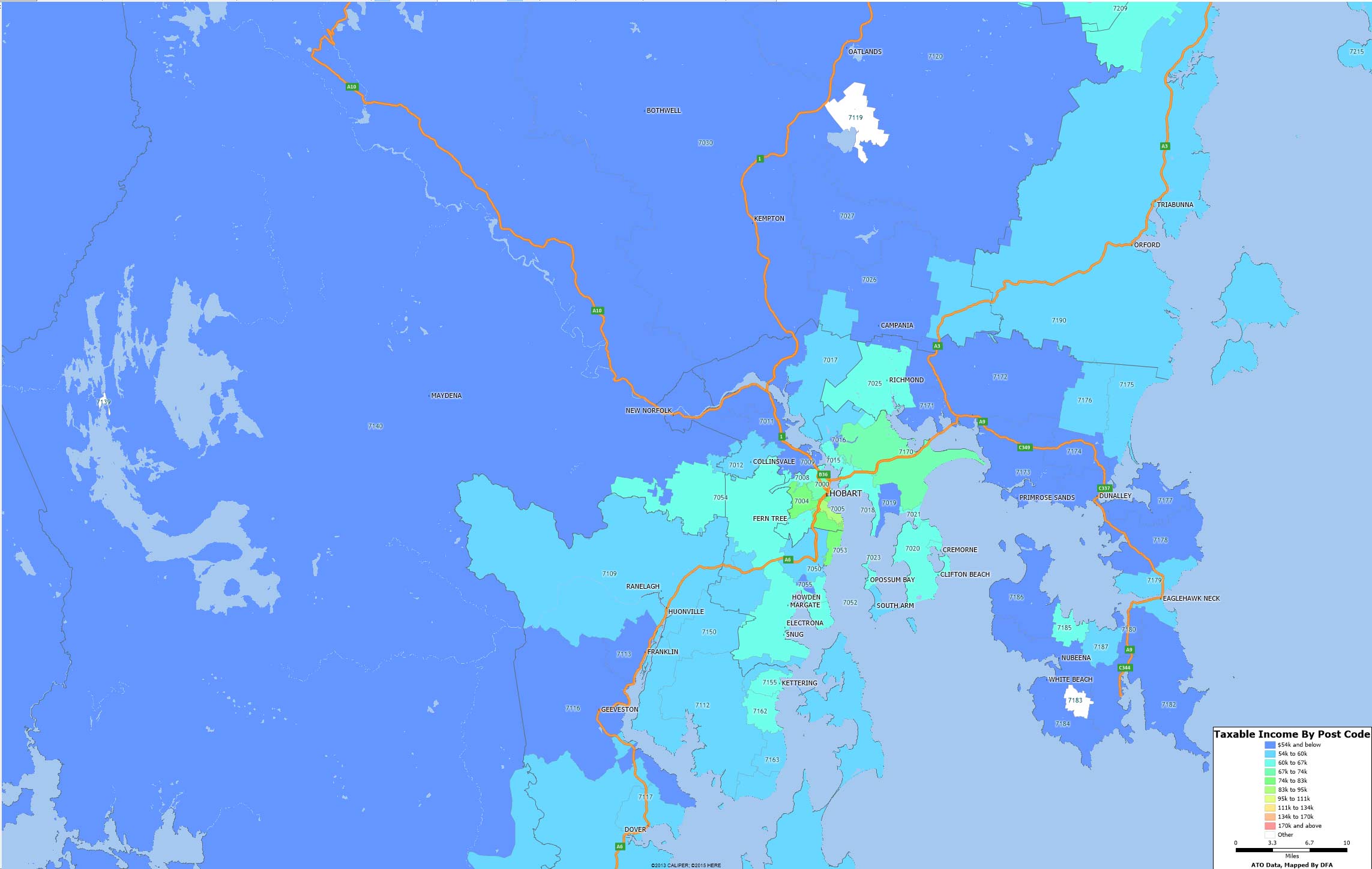
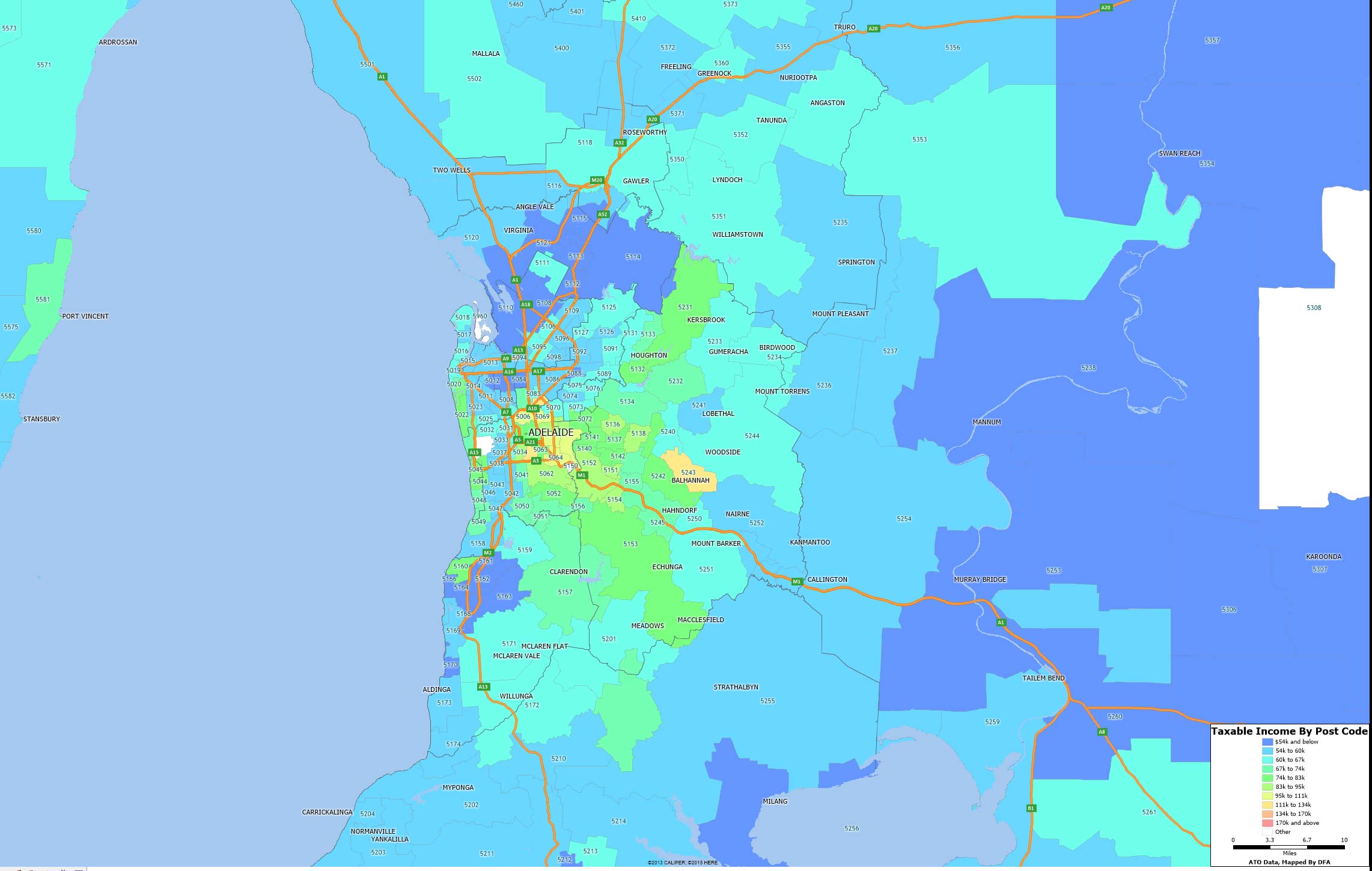
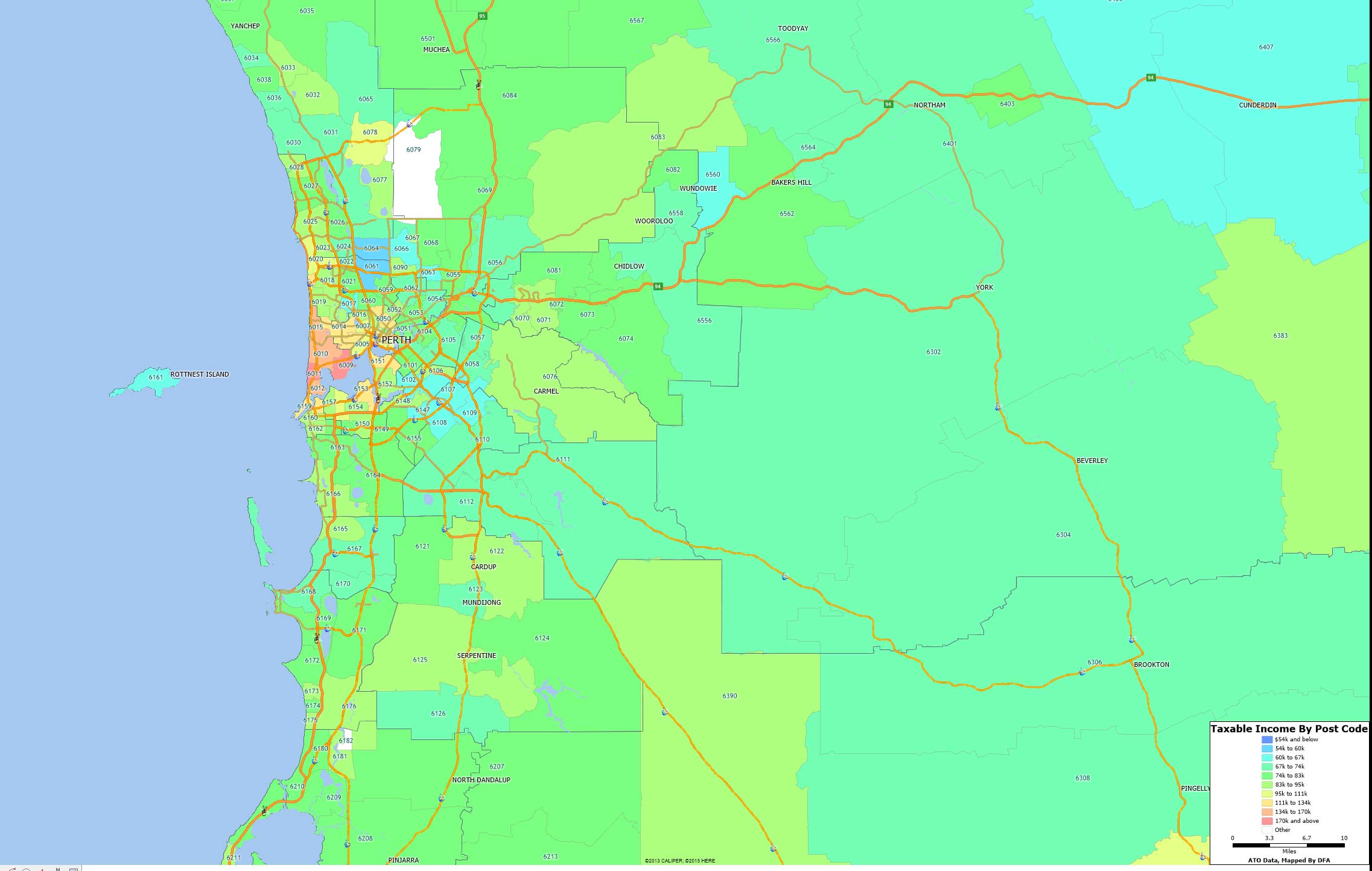
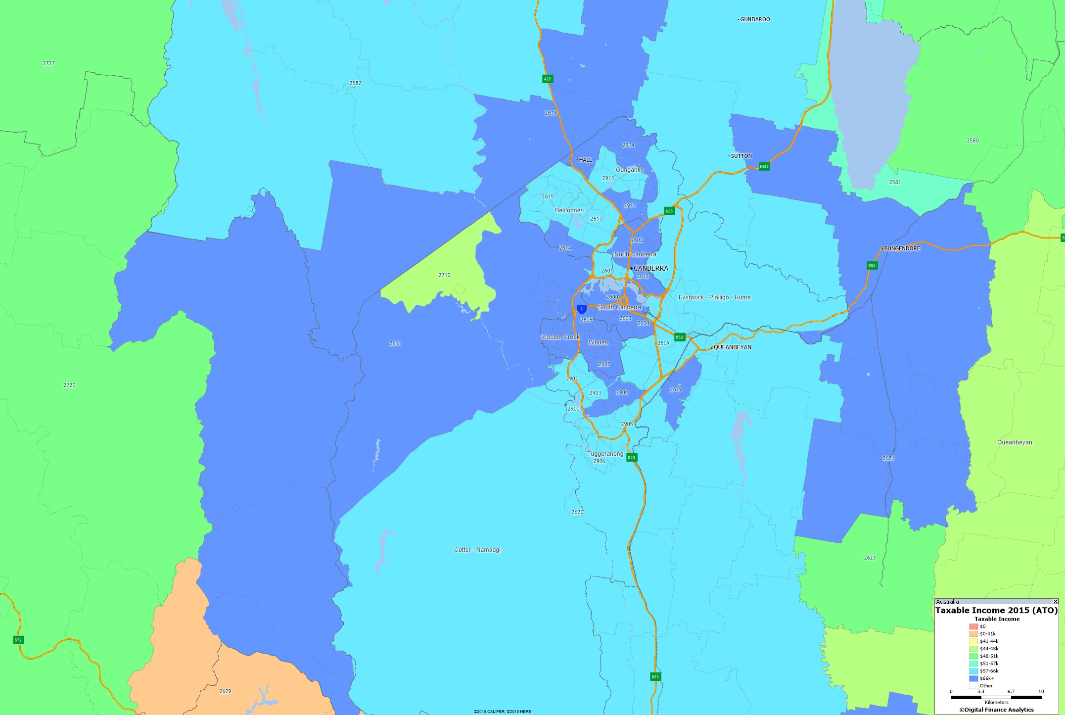
We continue our series on the latest ATO data with a look at the ACT, using the recently released 2015 taxable income data from the ATO, as a drill down on the all Australia data we previously posted. Blue shows the higher taxable income areas. [Yes, there does appear to be lots of blue!]

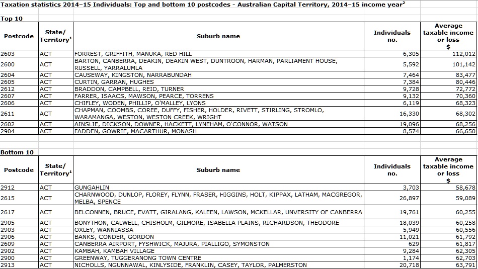
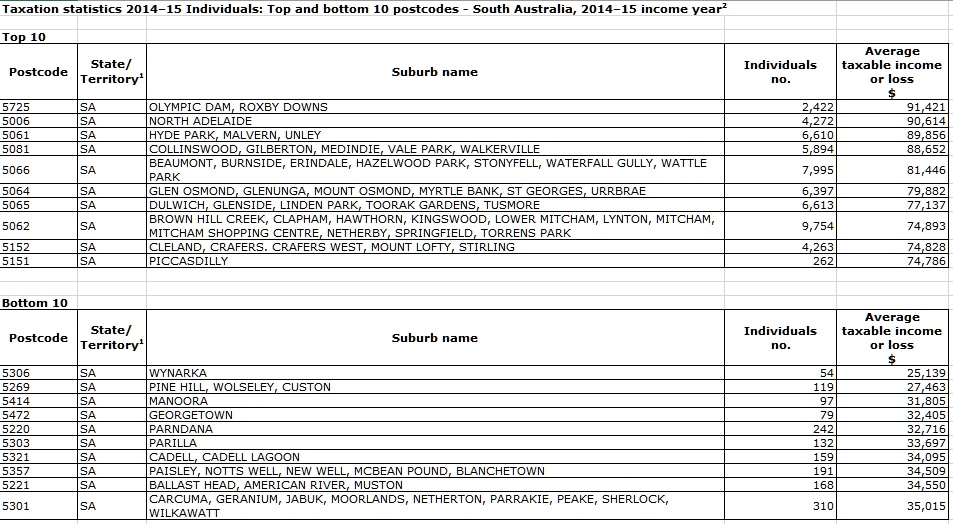
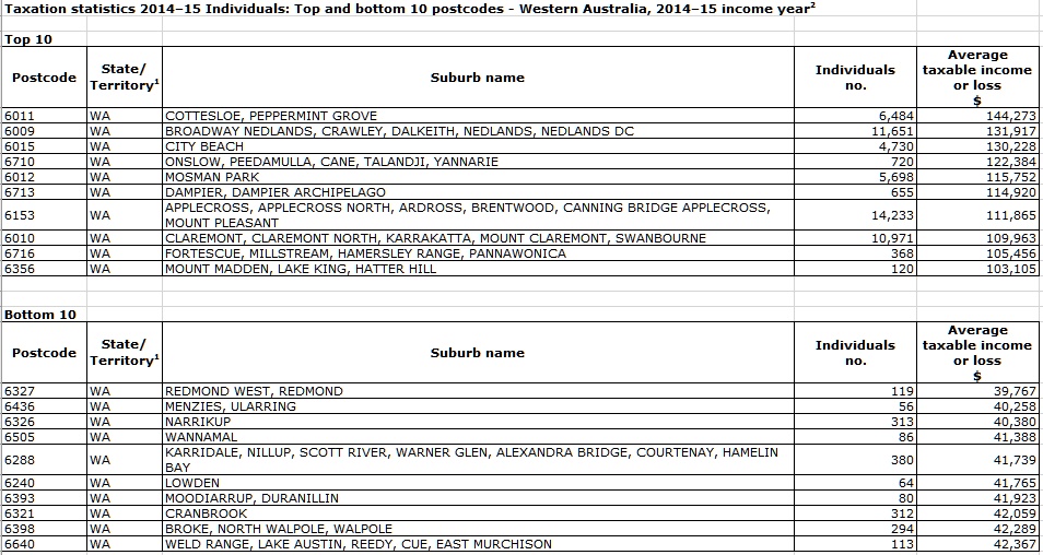
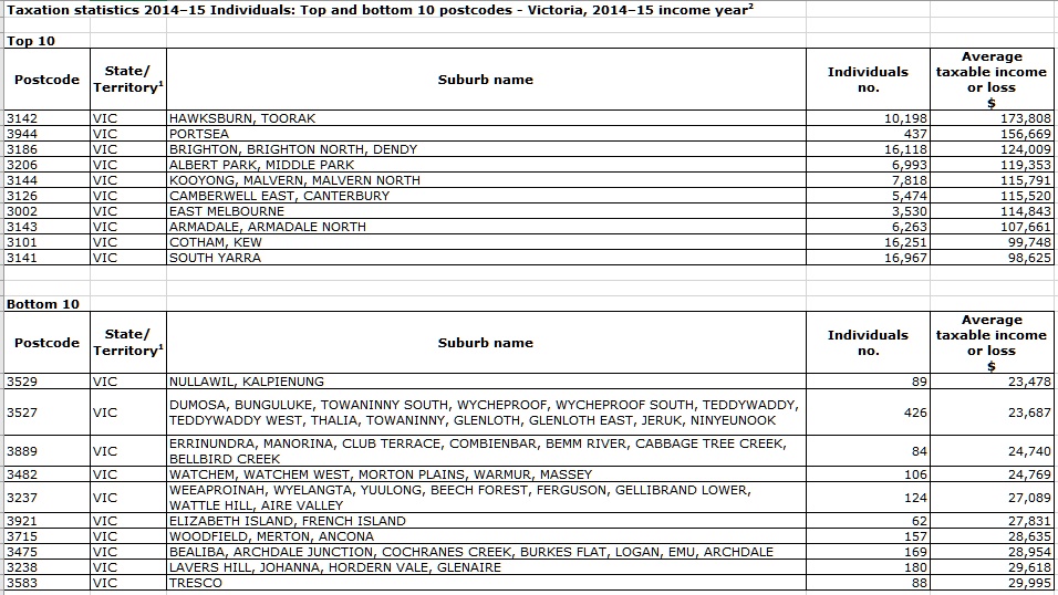
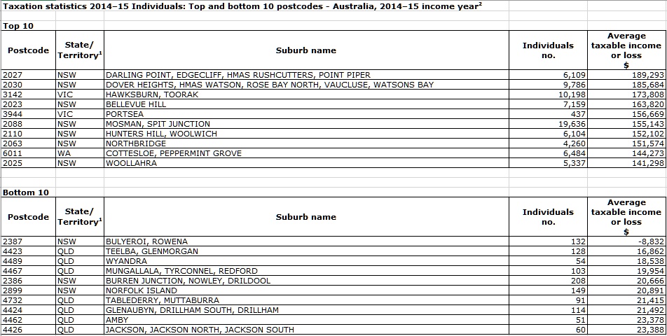
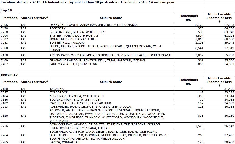
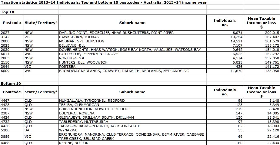
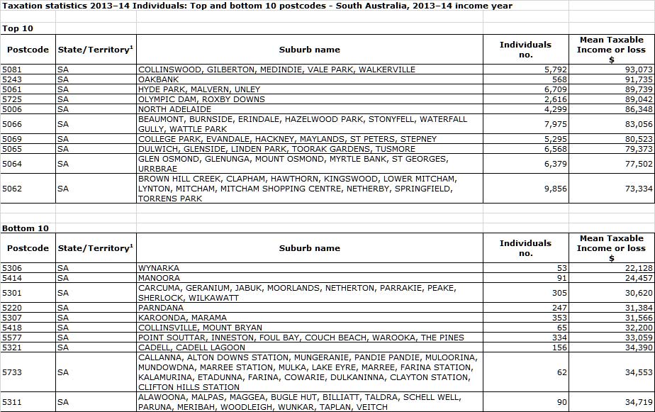
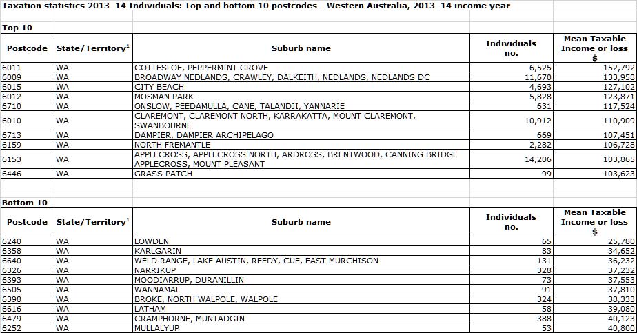
Here are the top and bottom 10 across the ACT.

Taxable Income Mapping Greater Adelaide 2015

We continue our series on the latest ATO data with a look at Greater Adelaide, using the recently released 2015 taxable income data from the ATO, as a drill down on the all Australia data we previously posted. Blue shows the higher taxable income areas.

Here are the top and bottom 10 across SA.

Taxable Income Mapping Greater Perth 2015

We continue our series on the latest ATO data with a look at Greater Perth, using the recently released 2015 taxable income data from the ATO, as a drill down on the all Australia data we previously posted. Blue shows the higher taxable income areas.

Here are the top and bottom 10 across WA.

Taxable Income Mapping Greater Melbourne 2015

We continue our series on the latest ATO data with a look at Greater Melbourne, using the recently released 2015 taxable income data from the ATO, as a drill down on the all Australia data we previously posted. Blue shows the higher taxable income areas.

Here are the top and bottom 10 across VIC.

Taxable Income Mapping Greater Brisbane 2015

We continue our series on the latest ATO data with a look at Greater Brisbane, using the recently released 2015 taxable income data from the ATO, as a drill down on the all Australia data we previously posted. Blue shows the higher taxable income areas.

Here are the top and bottom 10 across QLD.

Next time we will look at Greater Melbourne.

Taxable Income Mapping Greater Sydney 2015

Here is the geomap for Greater Sydney, using the recently released 2015 taxable income data from the ATO, as a drill down on the all Australia data we previously posted. Blue shows the higher taxable income areas.

Here is the top 10 and bottom 10 from the listings.

Next time we will look at Greater Brisbane.

Taxable Income Mapping Australia 2015

Using data from the latest ATO release from 2015, we can map average taxable incomes to post codes. Of course taxable incomes are the residual amounts the tax authorities get their hands on after tax management strategies (such as allowances, expenses, trusts, negative gearing, income sharing and the like) so they do not tell the full story. Nevertheless the results are interesting.

The blue areas show the zones of highest taxable income. Here are the top and bottom postcodes from the list, Australian wide.

In coming days we will drill into the various states, again with interesting results.

Hobart Region Taxable Income Heat Map 2014 and National Summary

Today we finish our series of taxable income heat maps, using data from the ATO, from 2013-2014, looking at Hobart. Then finally, we include a nationwide top ten summary.

Hobart-Tax-2014Here are the top and bottom 10 postcodes in the state.

TAS-Top-10-2014Finally, here are the top and bottom 10 postcodes across the country.

Top-10-OZ-2014