In the second part of our series on March 2024 results from our surveys, we deploy our mapping tools to display the hot spots across the country for mortgage, rental and investor stress, as well as defaults and net rental yields.
For a description of our approach, watch our earlier show here: So Who Is Really Feeling The Pinch? https://youtu.be/xvE-jPsGQUk
On Tuesday at 8pm Sydney we will deep dive on the post code level analysis. DFA Live Q&A: A Deep Dive On Post Codes Feeling The Pinch https://youtube.com/live/GmSKvYYQI1k
http://www.martinnorth.com/
https://digitalfinanceanalytics.com/blog/dfa-one-to-one/ for our One to One Service.
Go to the Walk The World Universe at https://walktheworld.com.au/
Today’s post is brought to you by Ribbon Property Consultants.
This is material drawn from several recent shows on this and other channels, explaining mortgage and household stress and what is happening in the current environment – with data to December 2021 and beyond.
Go to the Walk The World Universe at https://walktheworld.com.au/
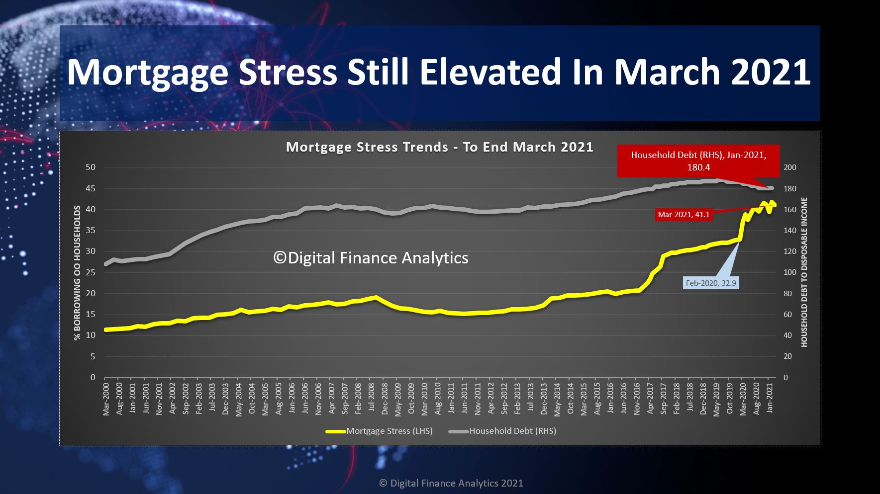
The latest results from our household surveys confirms that there are more households in financial stress than before the pandemic hit. As the various Government support mechanisms are ratcheted back, we will see the true impact on the community. Household debt is also turning higher again.
We have 41.1% of mortgaged households (1.5 million) in financial flow stress, despite the lower interest rate environment. While many have paid down debt, other have borrowed more. For example, the average new first time buyer loan is 15-18% larger than a year back- so much for the maintenance of lending standards!
We discussed this in detail in our live show, last night.
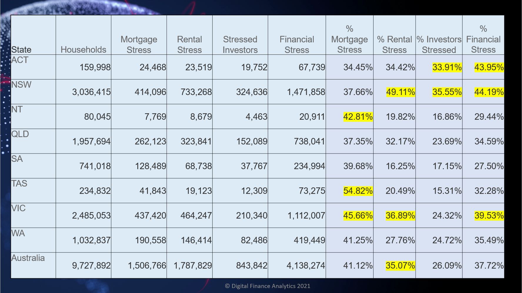
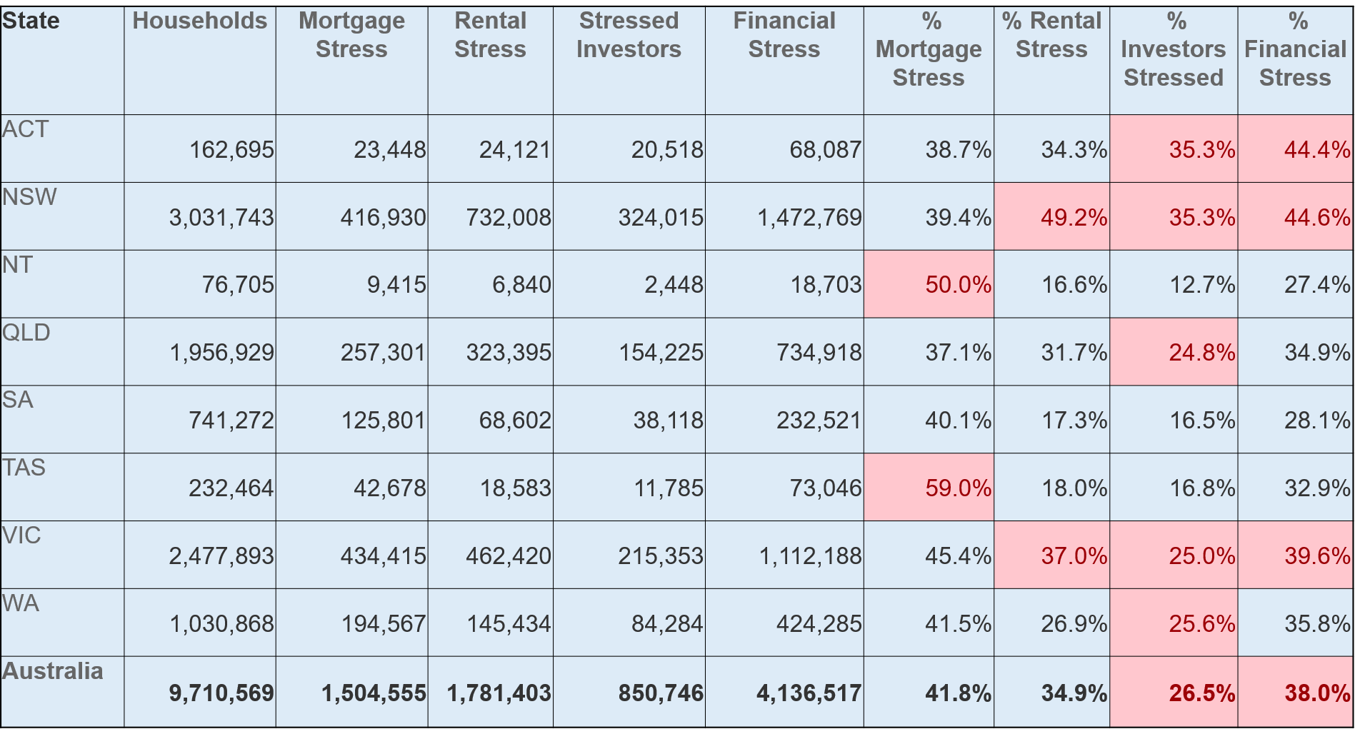
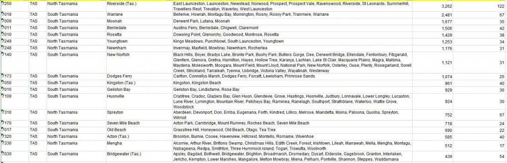
Across the states, the patterns are familiar, with Tasmania still reporting the highest proportion of households in mortgage stress thanks to low wages, and rising home prices. Victoria continues to be impacted by the longer lock-downs. Rental stress is being exacerbated by the end of tenant protections, so expect to see more evictions, and rent rises in the weeks ahead. Property investors in NSW are still having rental flow issues (due to high vacancies and lower rents). Overall financial stress – the aggregated measure across all households is highest in NSW, ACT and VIC.
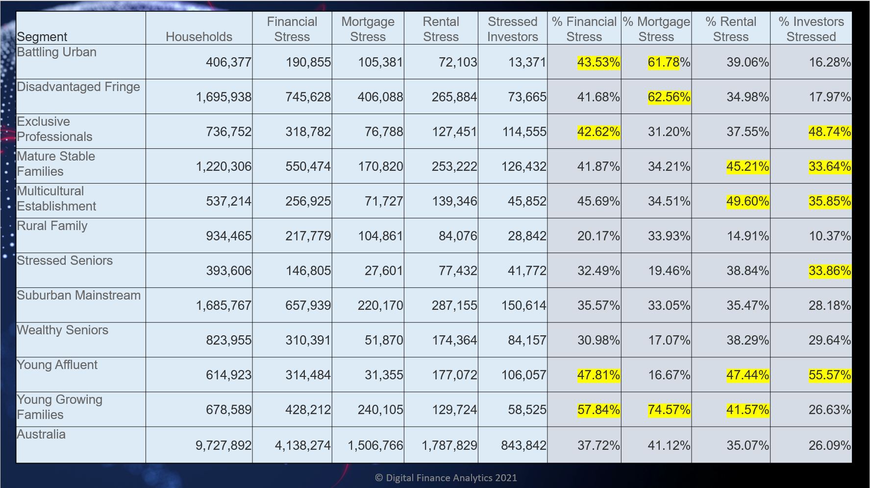
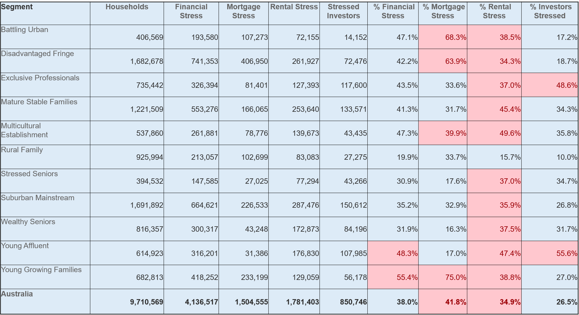
Across our household segments young growing families, and those on the urban fringe in high growth corridors are being impacted, although across our segments and stress categories, it remains a real patchwork.
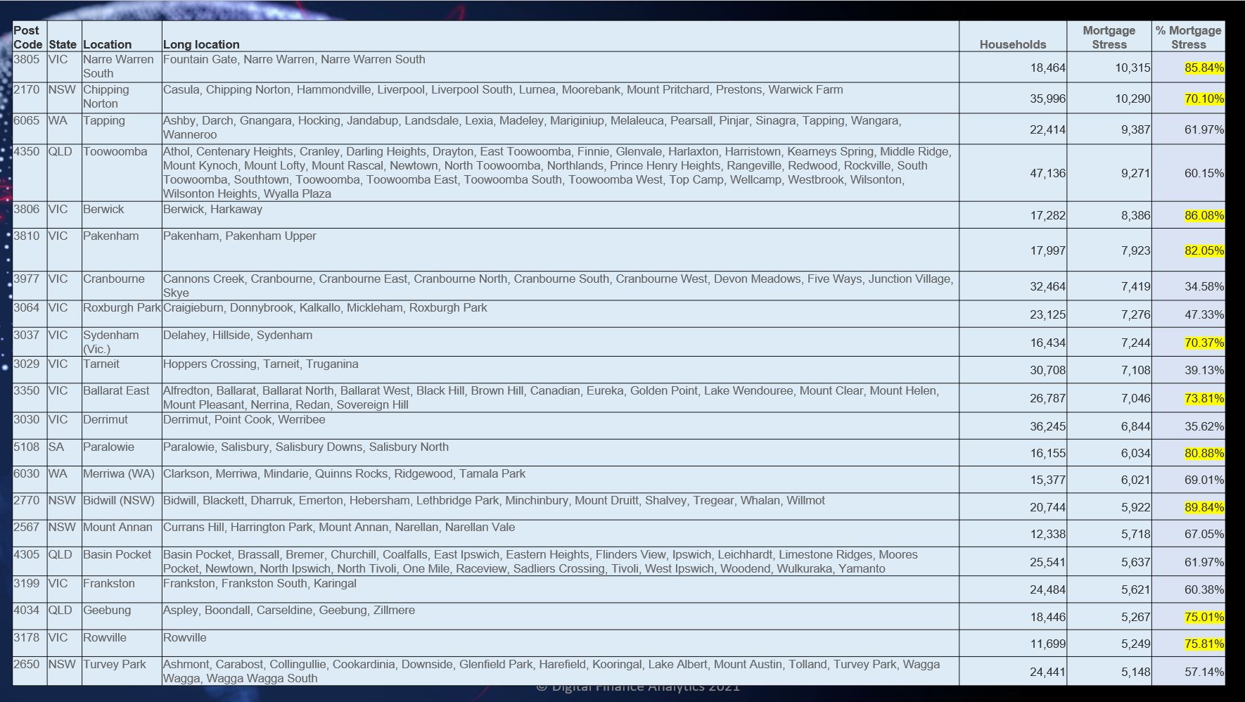
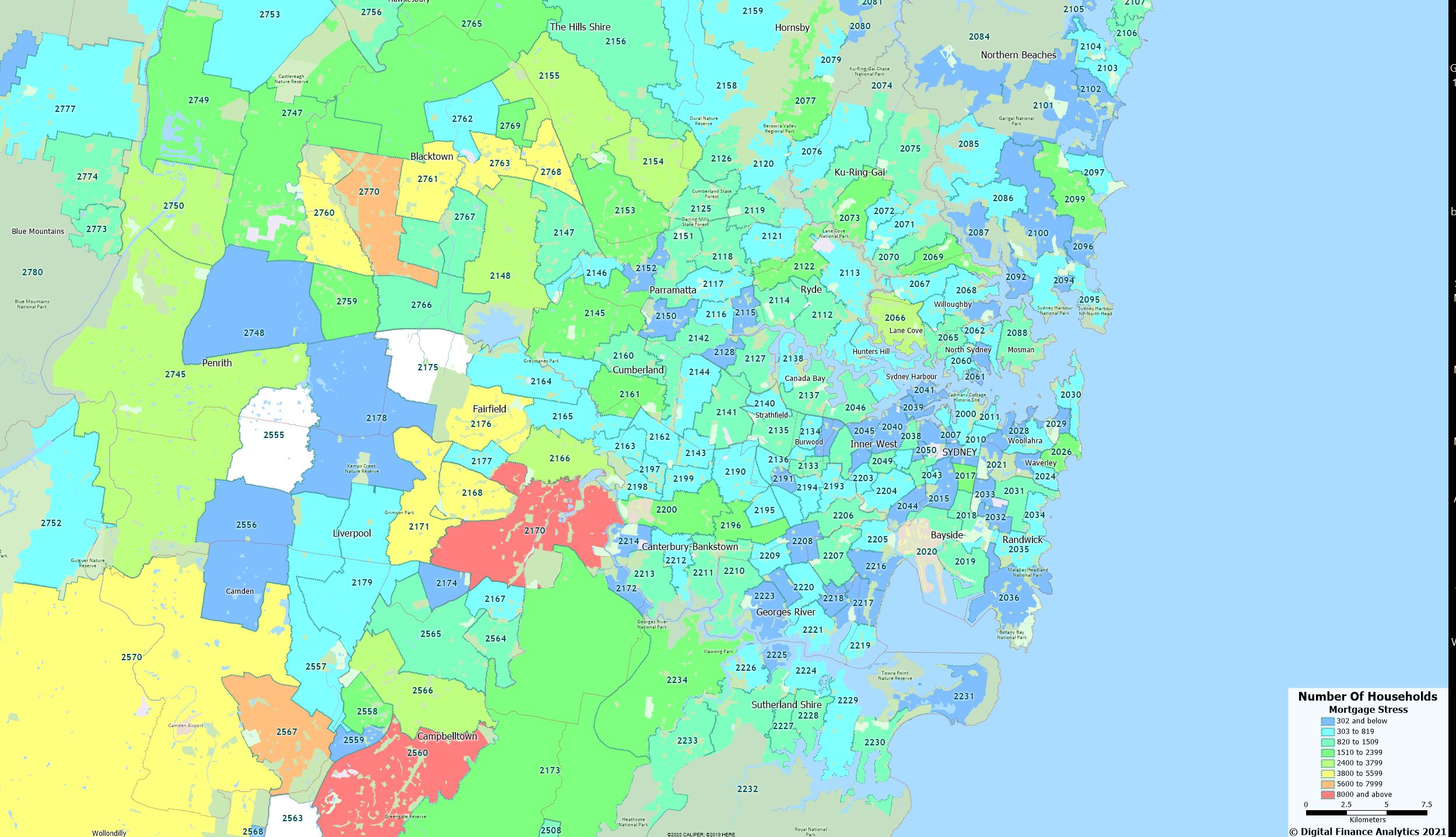
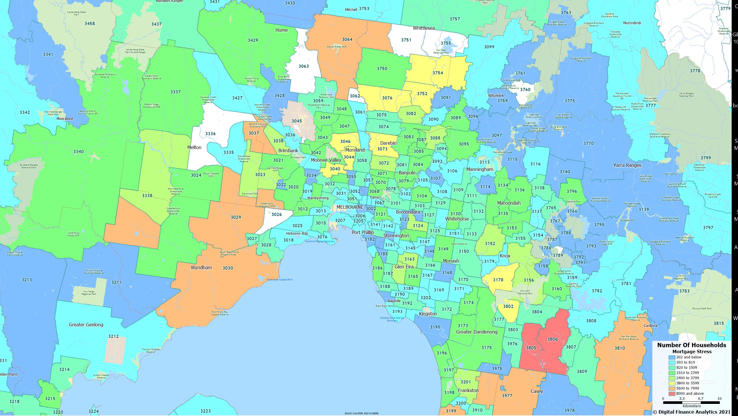
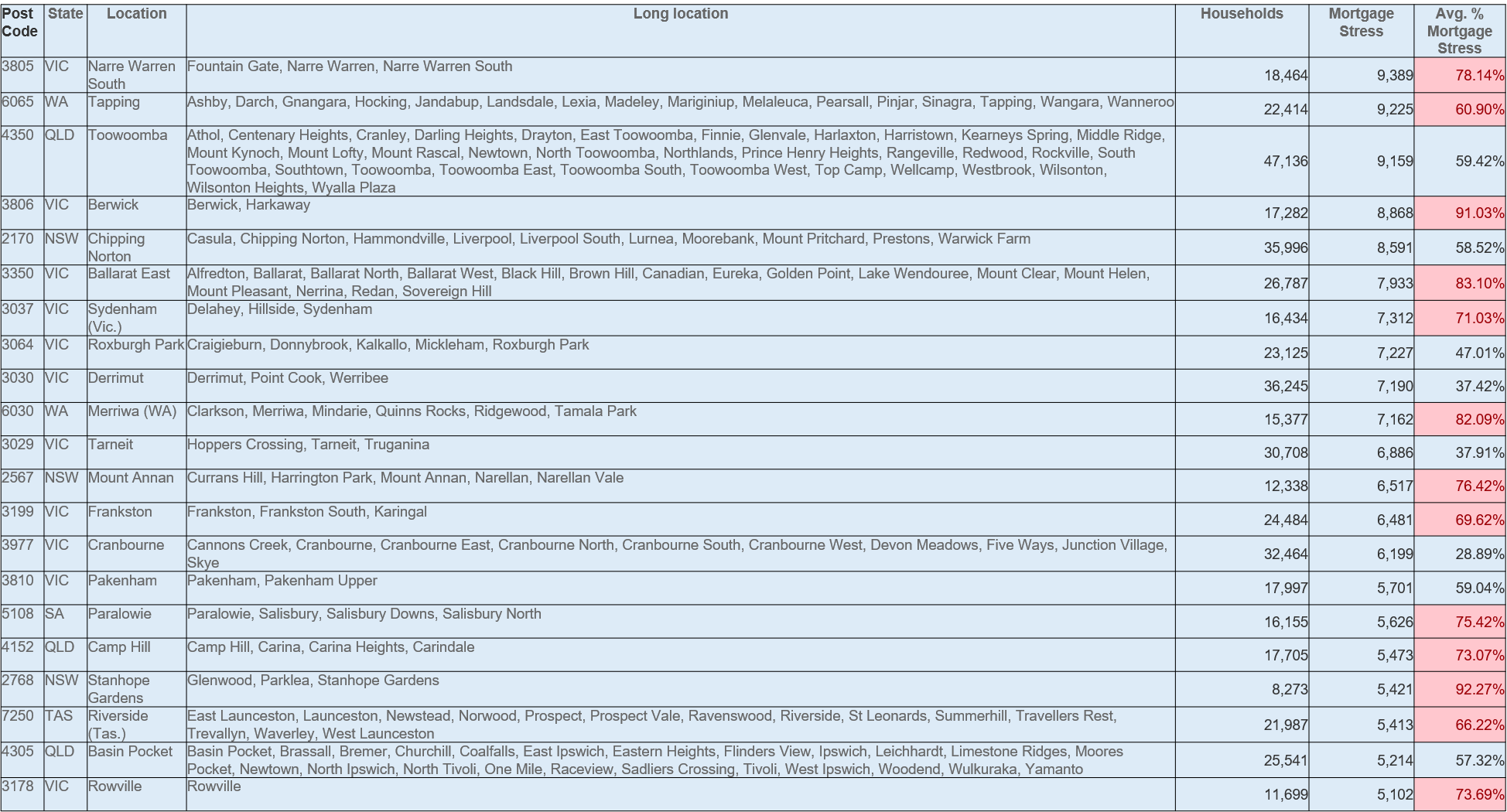
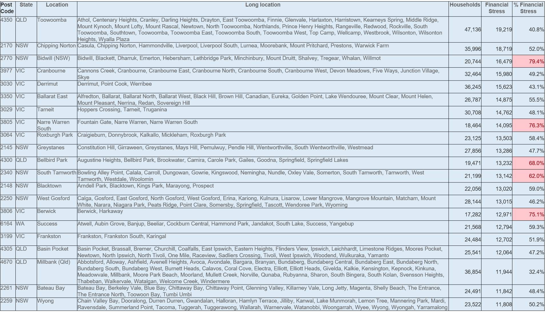
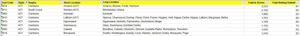
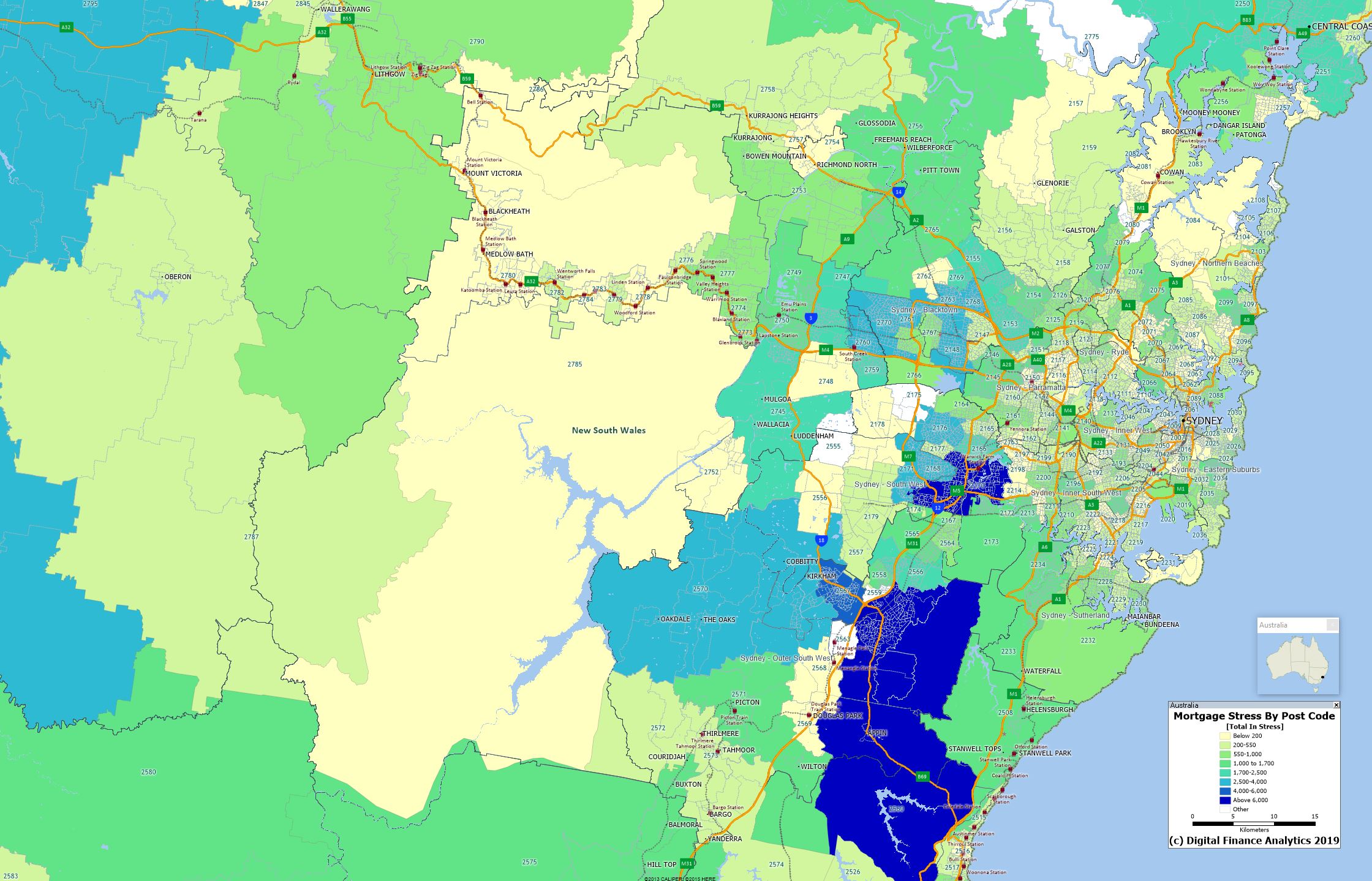
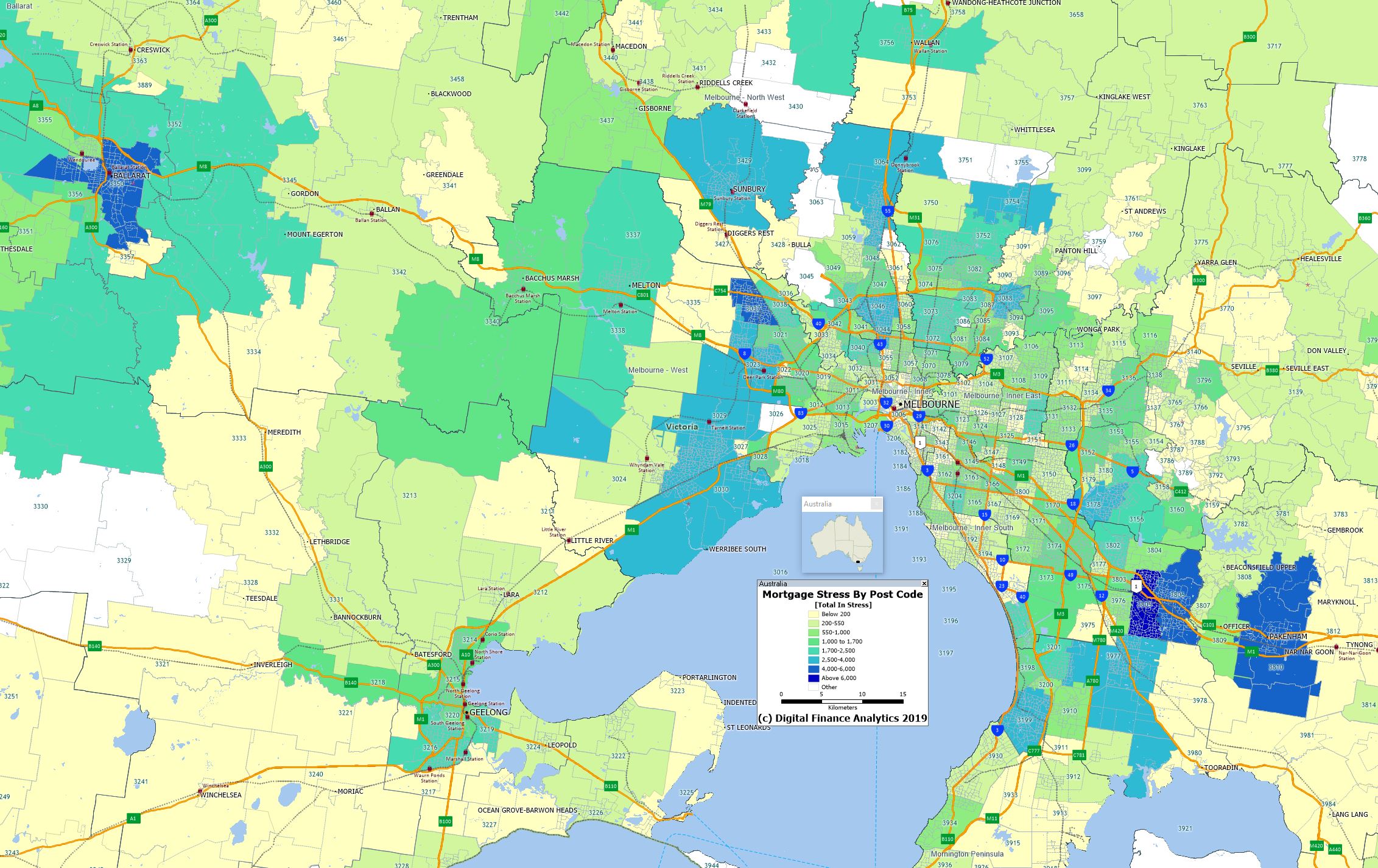
The top post codes for mortgage stress include Narre Warren and Fountain Gate, 3805 in Victoria, and Liverpool 2170 in NSW.
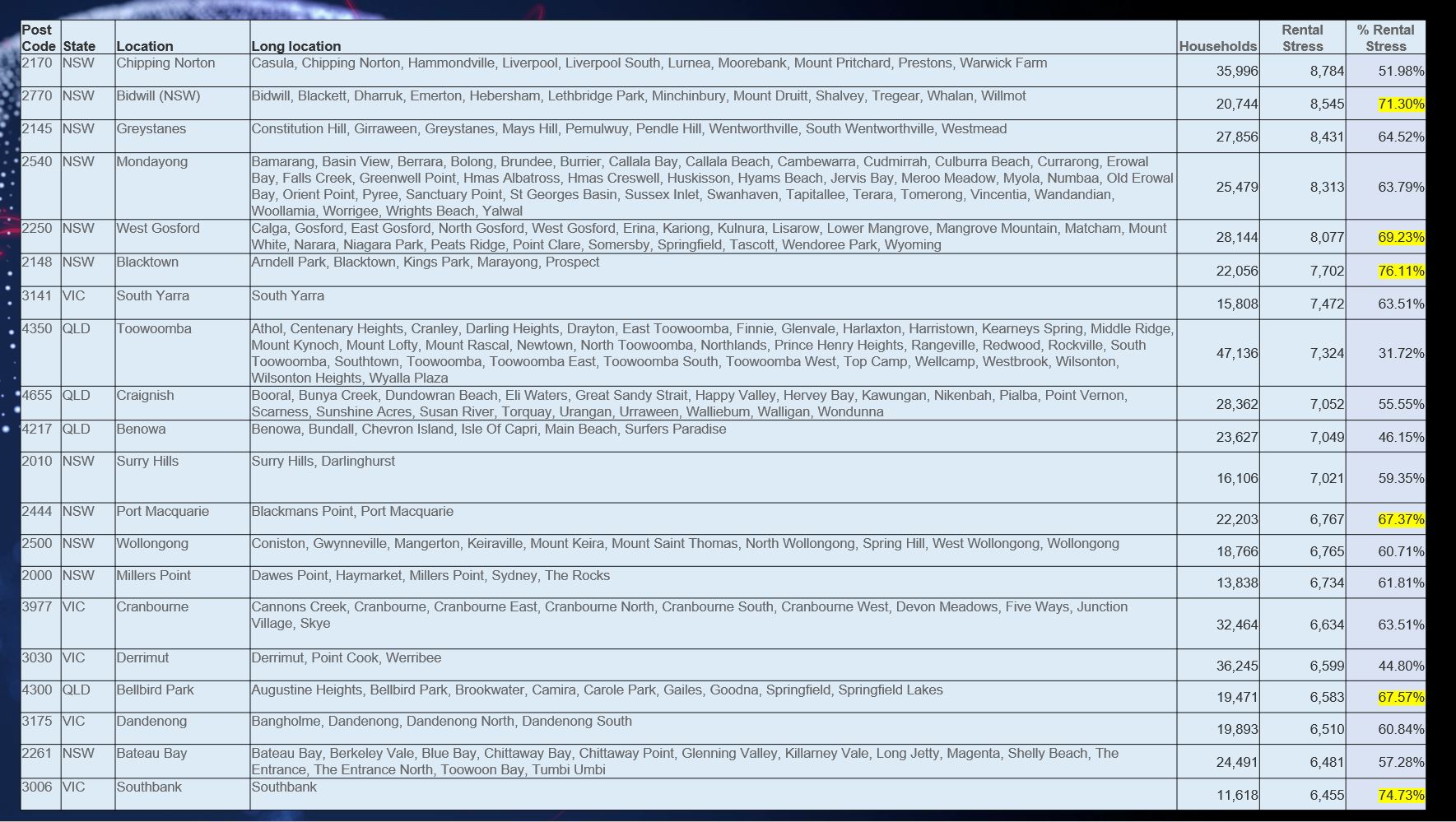
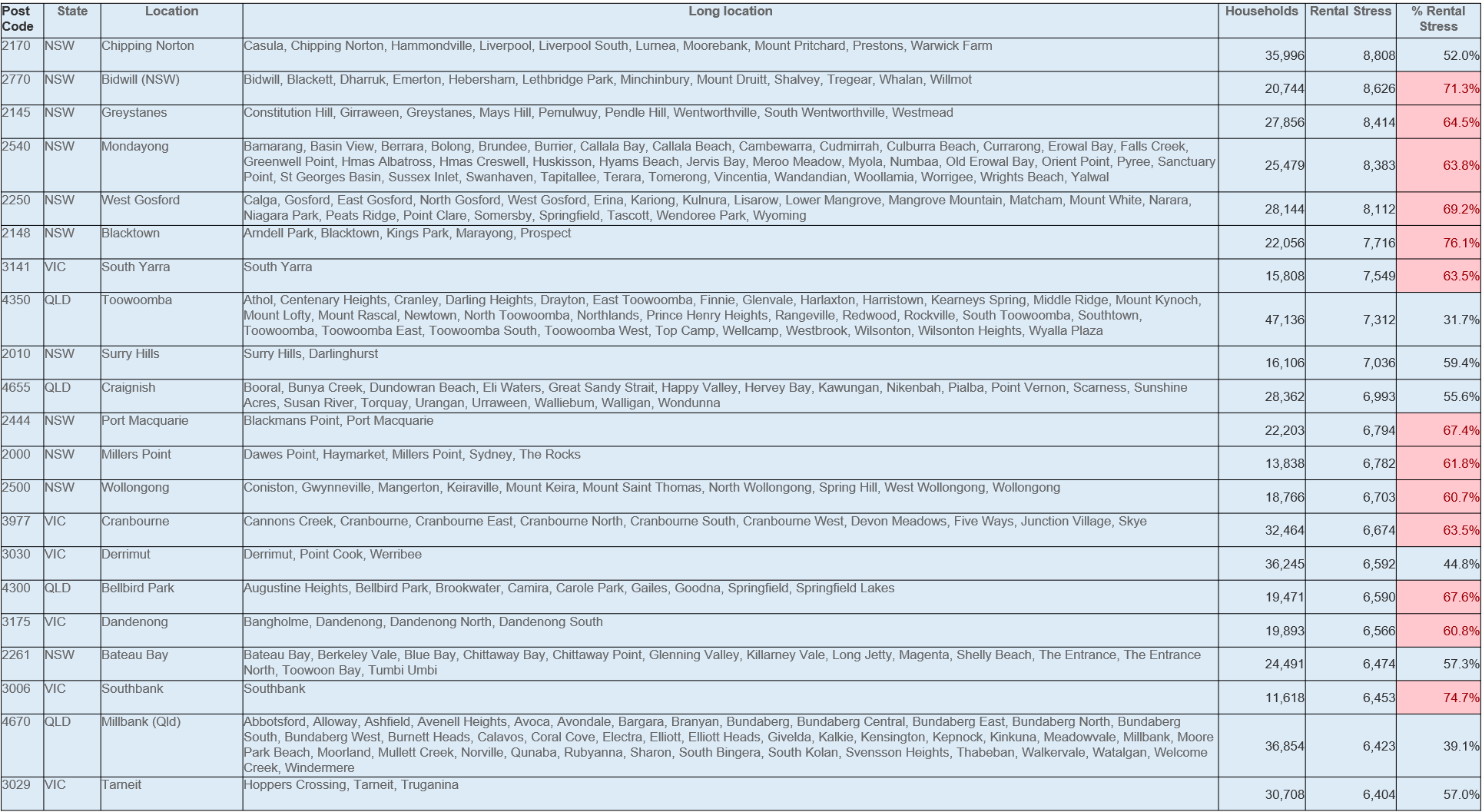
The top rental stress post codes include Liverpool 2170, NSW, Mount Druitt and Lethbridge Park 2770, NSW and Westmead 2145 NSW.
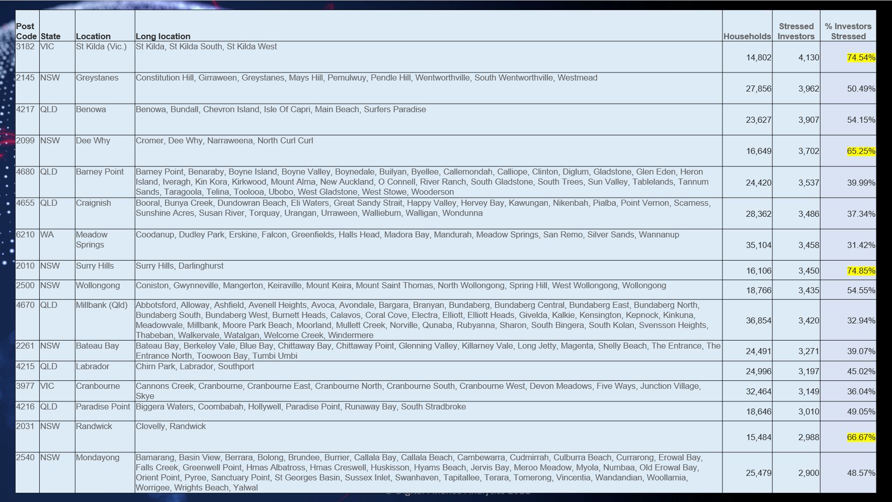
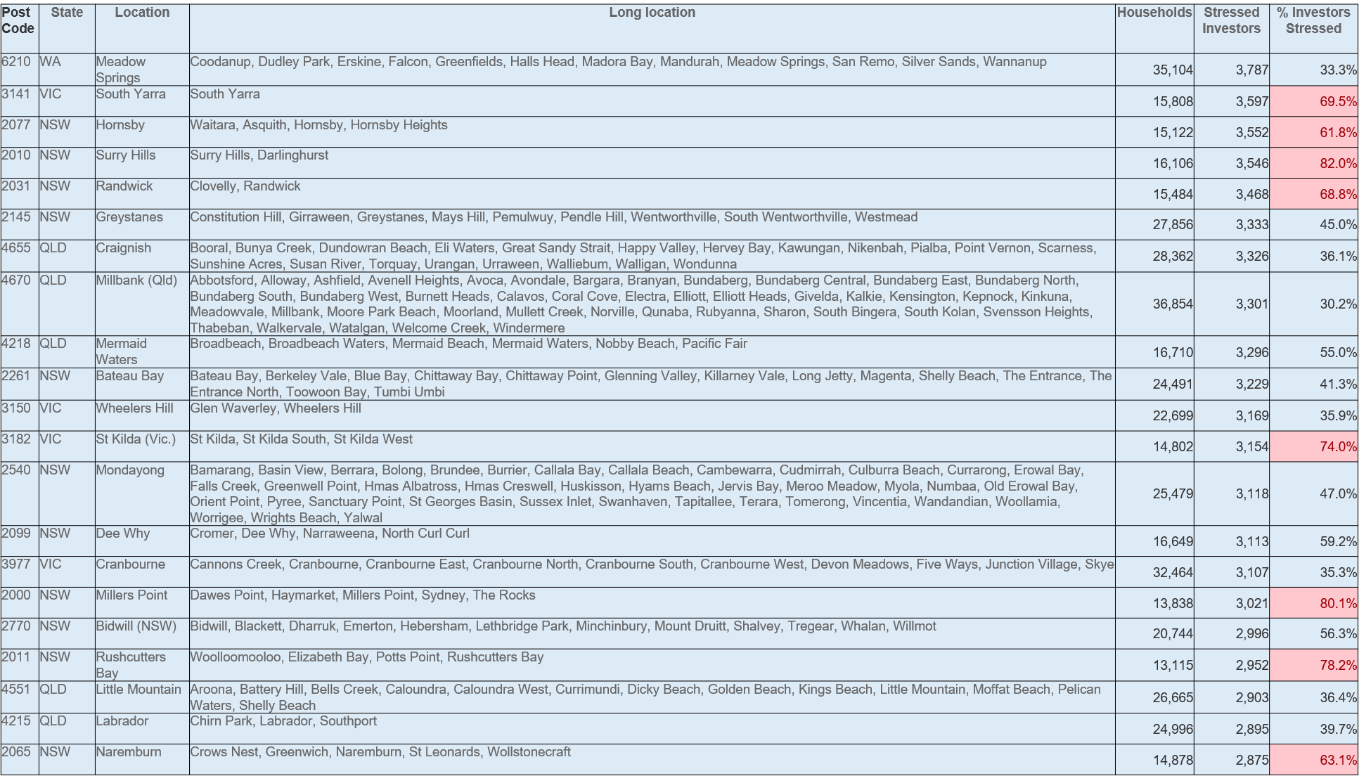
Investor stress is highest is St Kilda 3182, Westmead 2145 and Surfers Paradise 4217 in QLD.
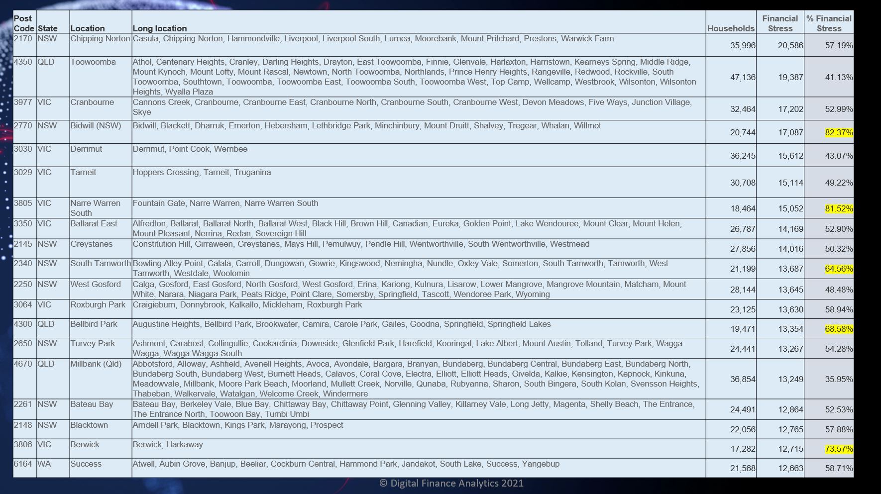
Cumulative financial stress is highest in Liverpool 2170, Mount Druitt 2145, and Westmead 2145.
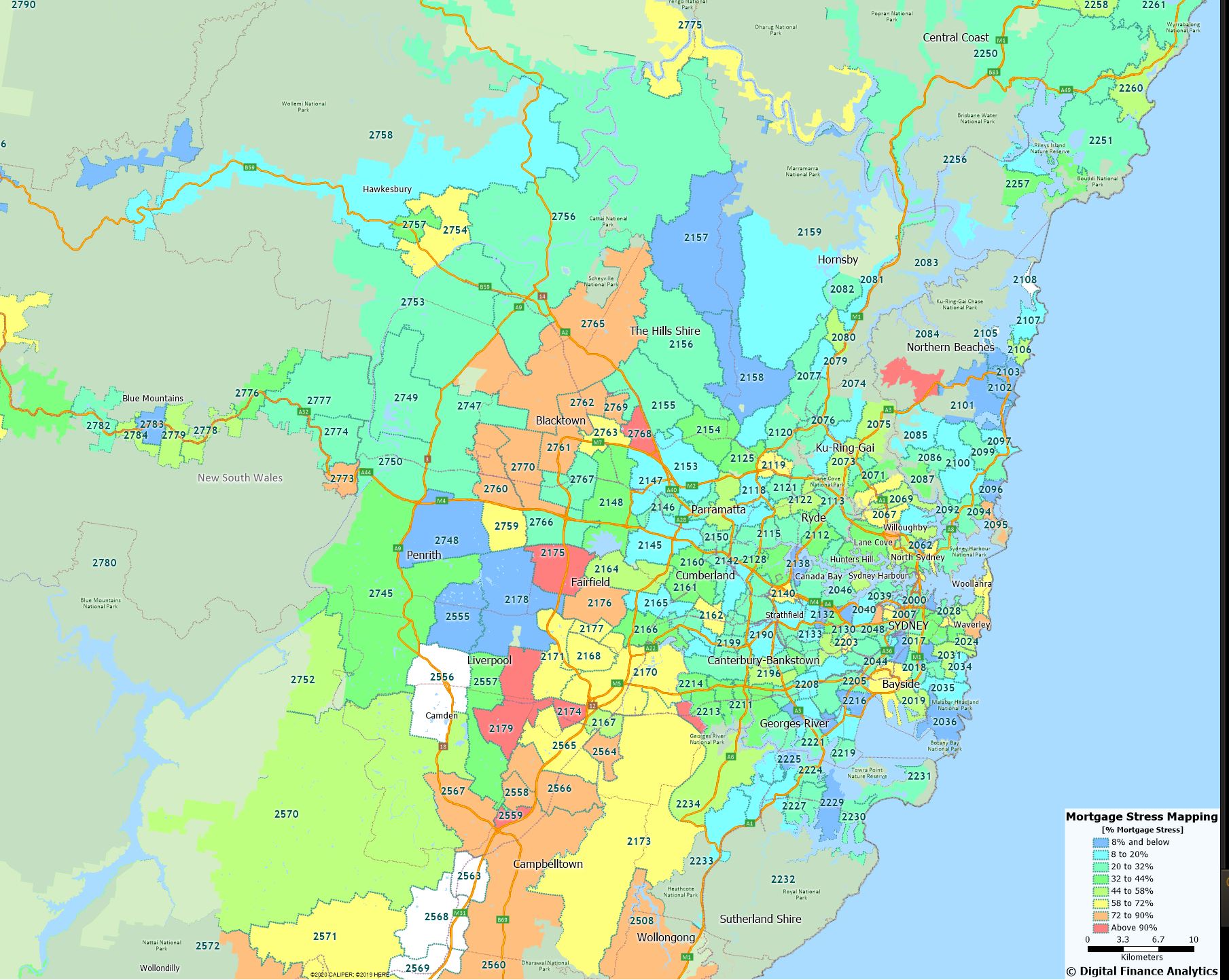
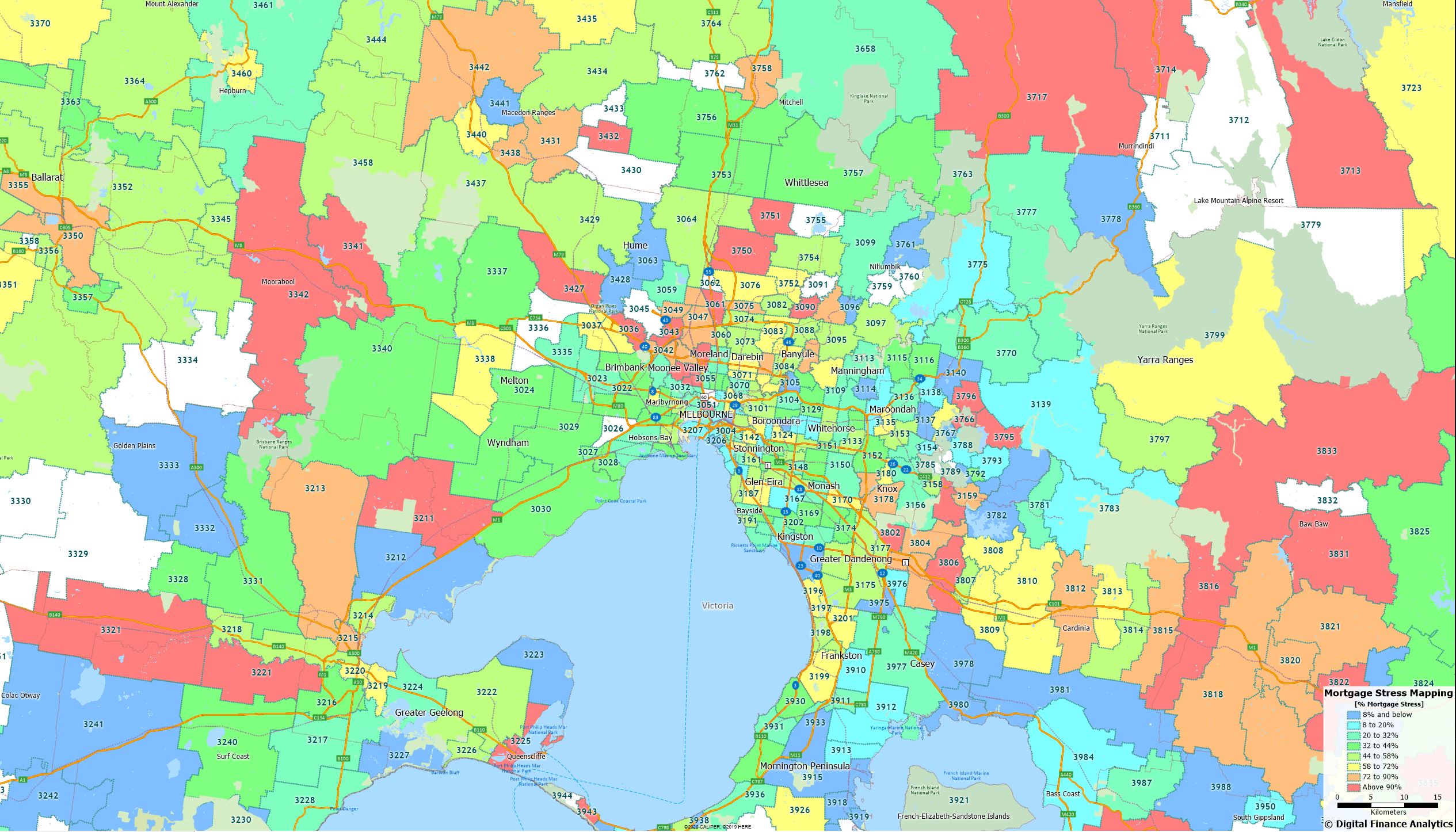
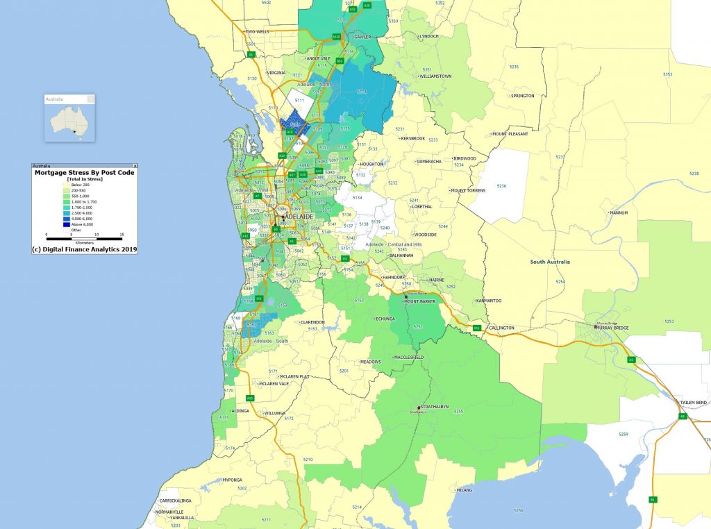
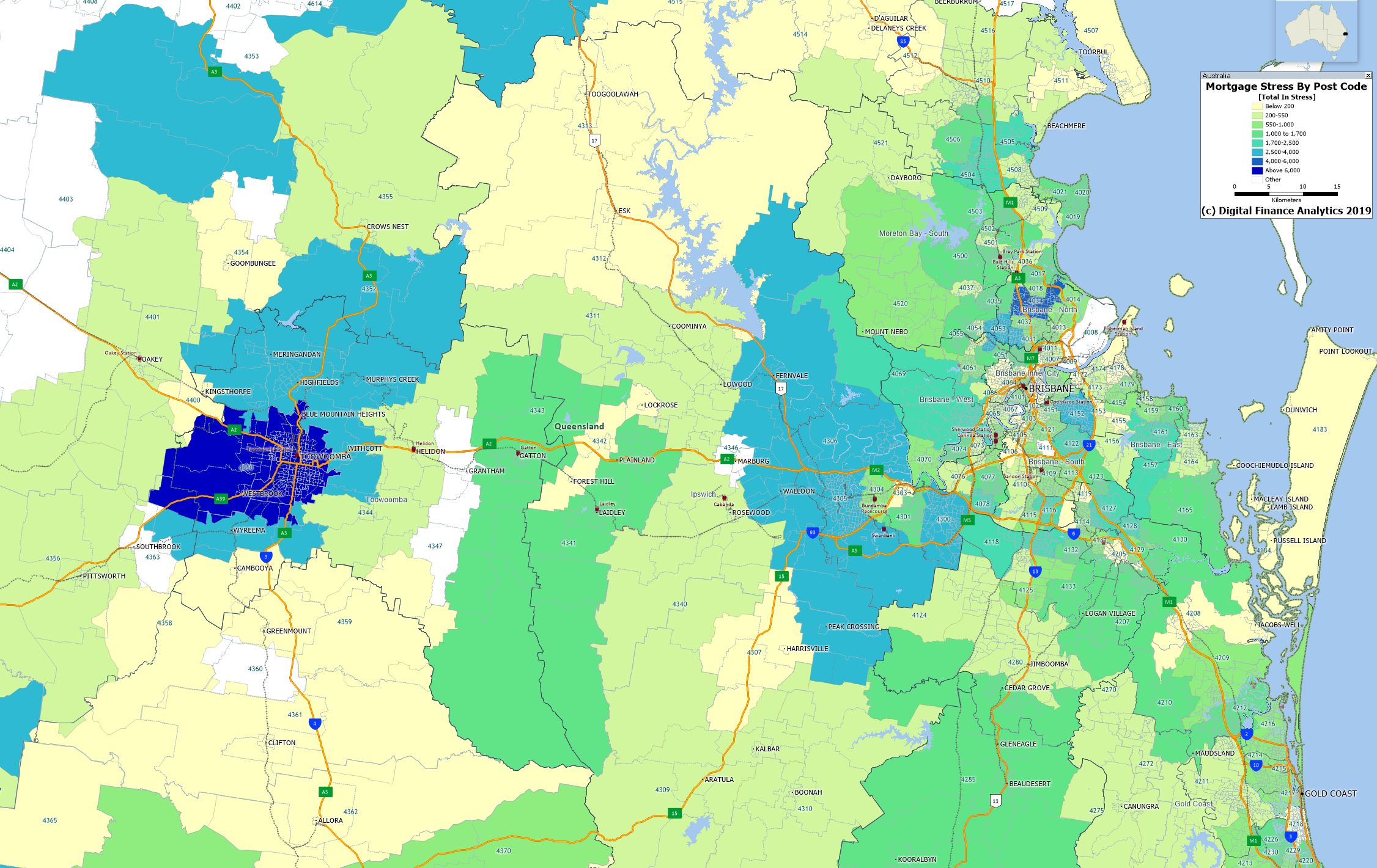
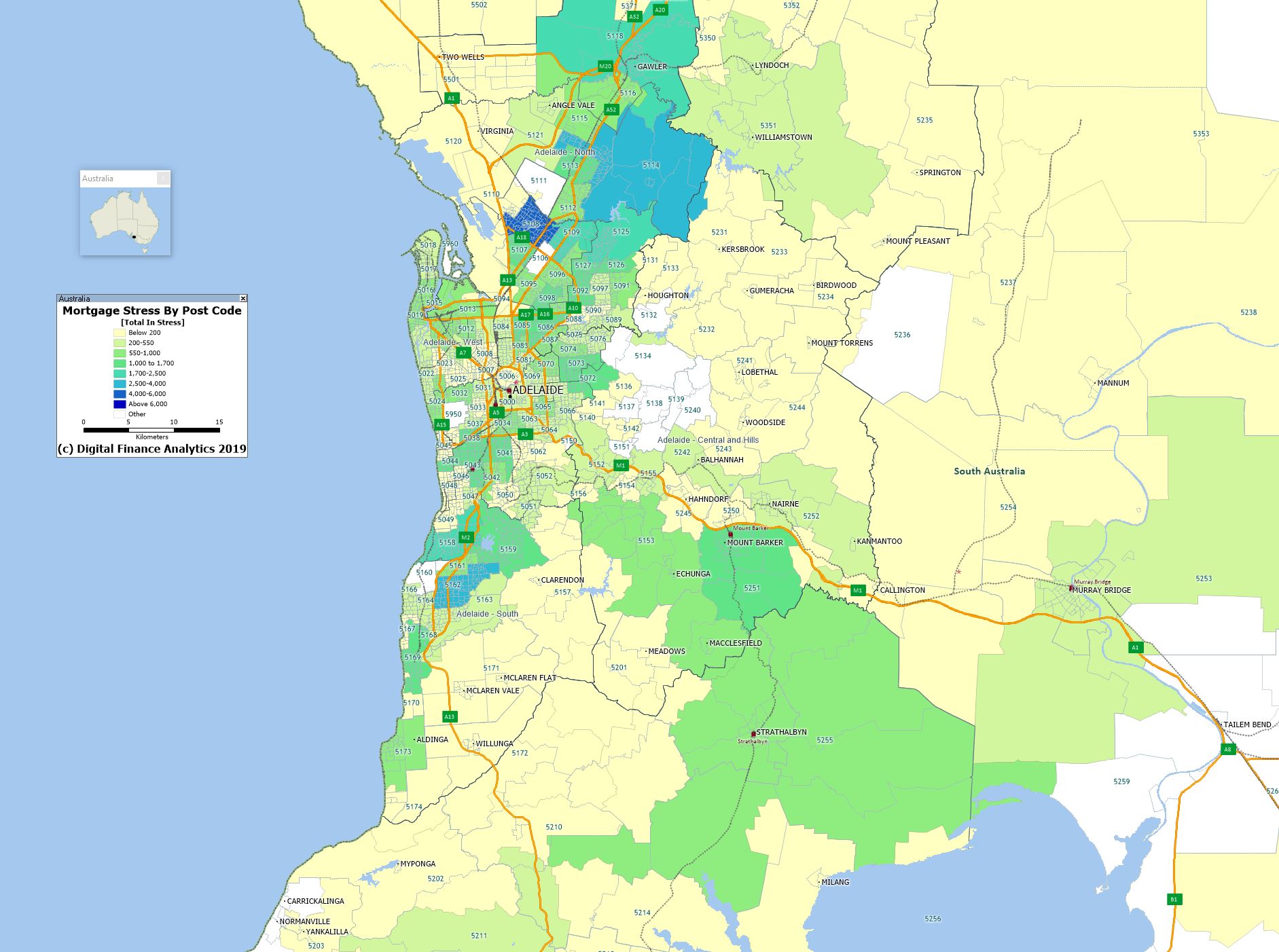
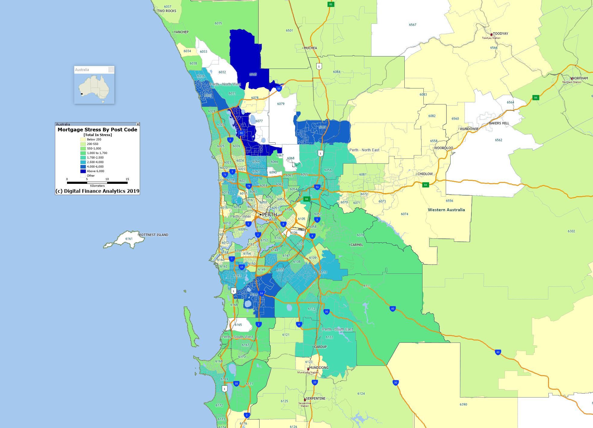
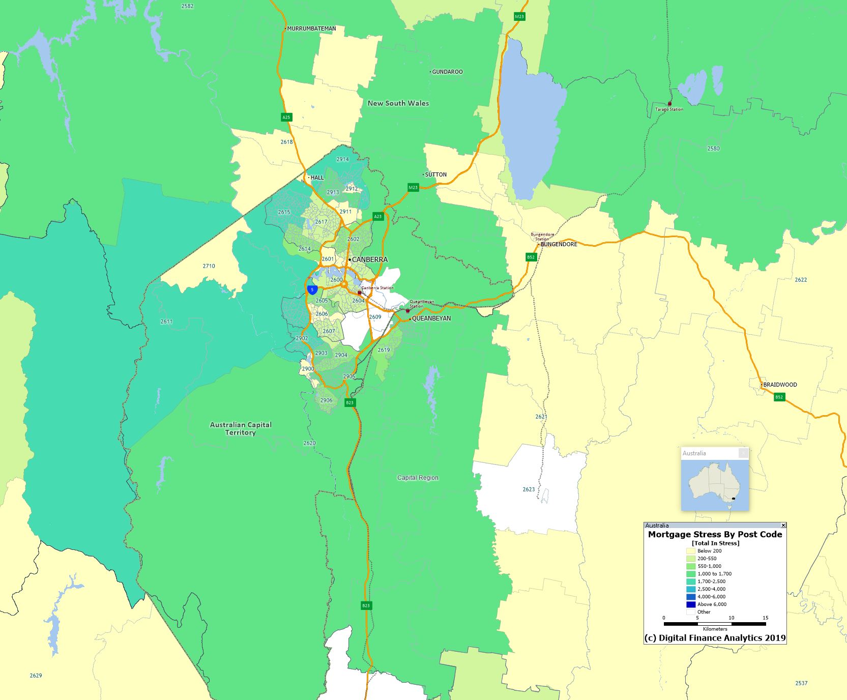
The mapping of mortgage stress to post codes reveals the potential hot spots, which include many of the high growth corridors, where vast estates continue to be built and sold to people who extend themselves to buy them. Many are first time buyers. Given flat wages, and higher unemployment post JobKeeper, this is one to watch.
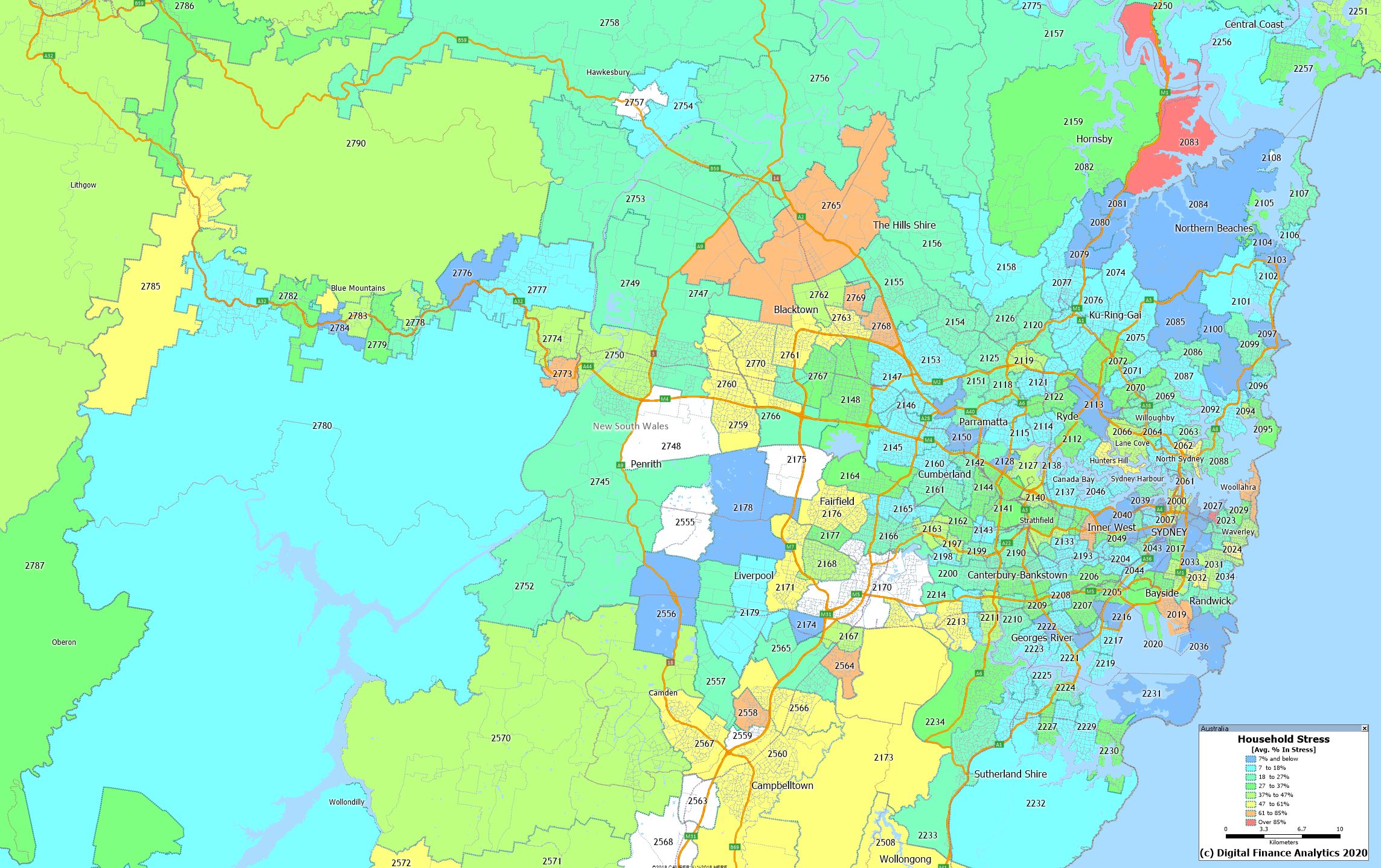
Sydney
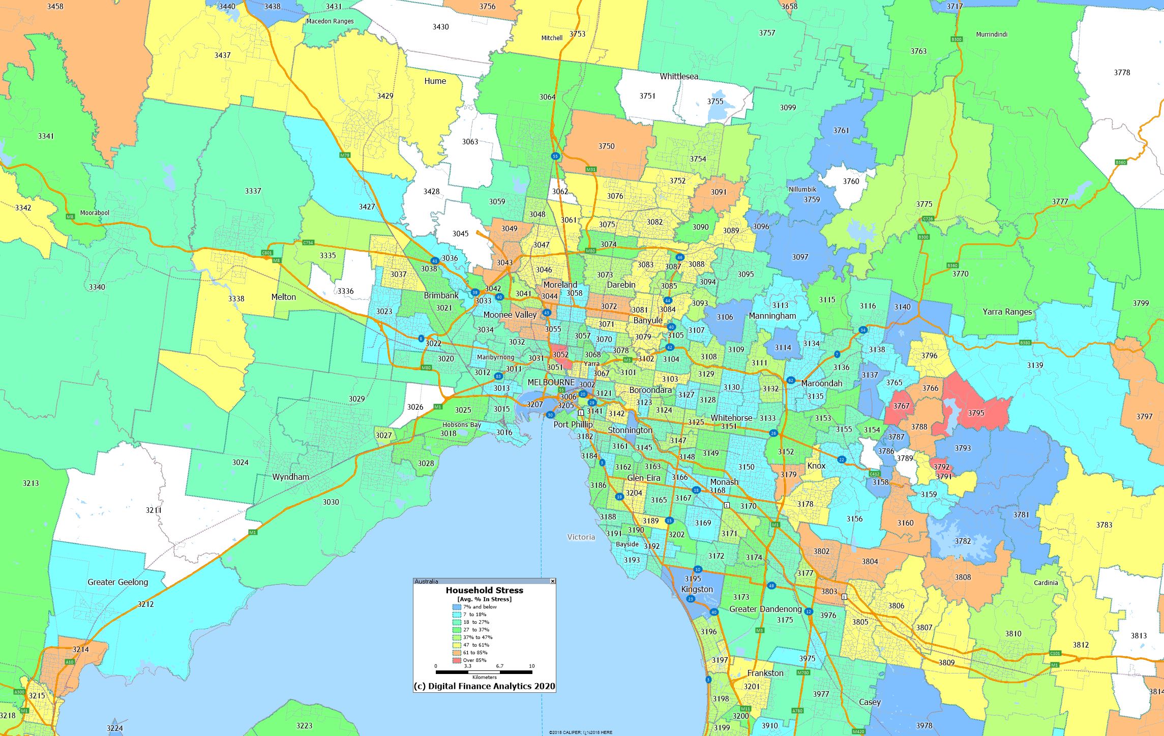
Melbourne
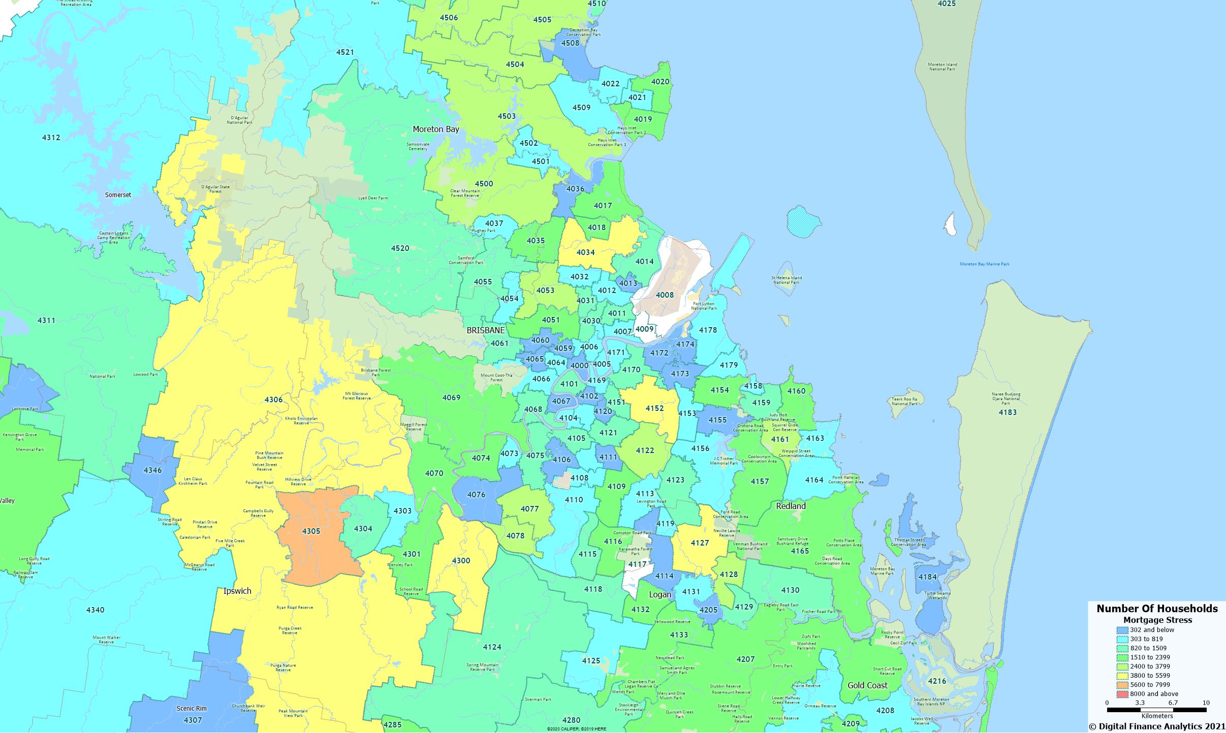
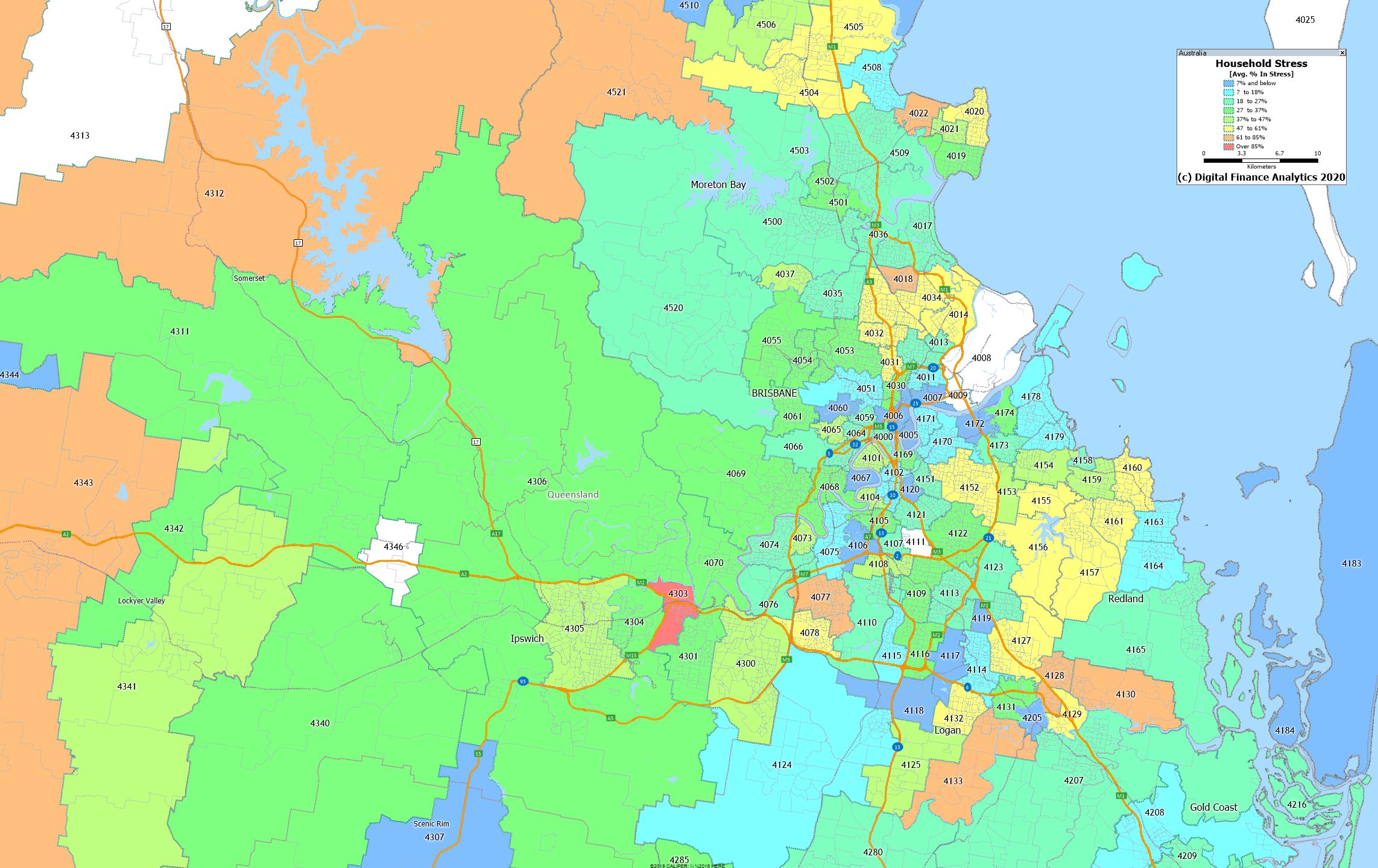
Brisbane
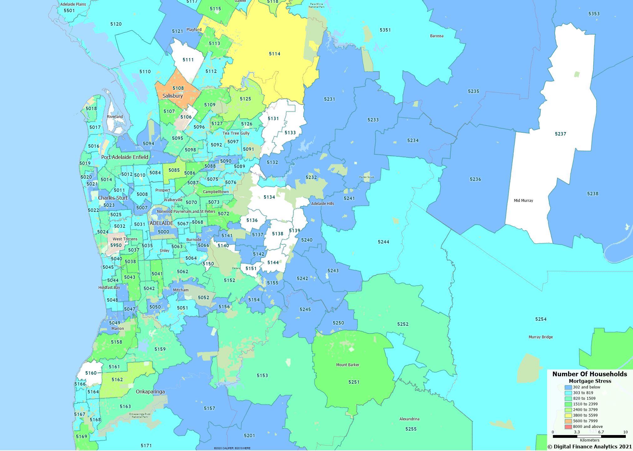
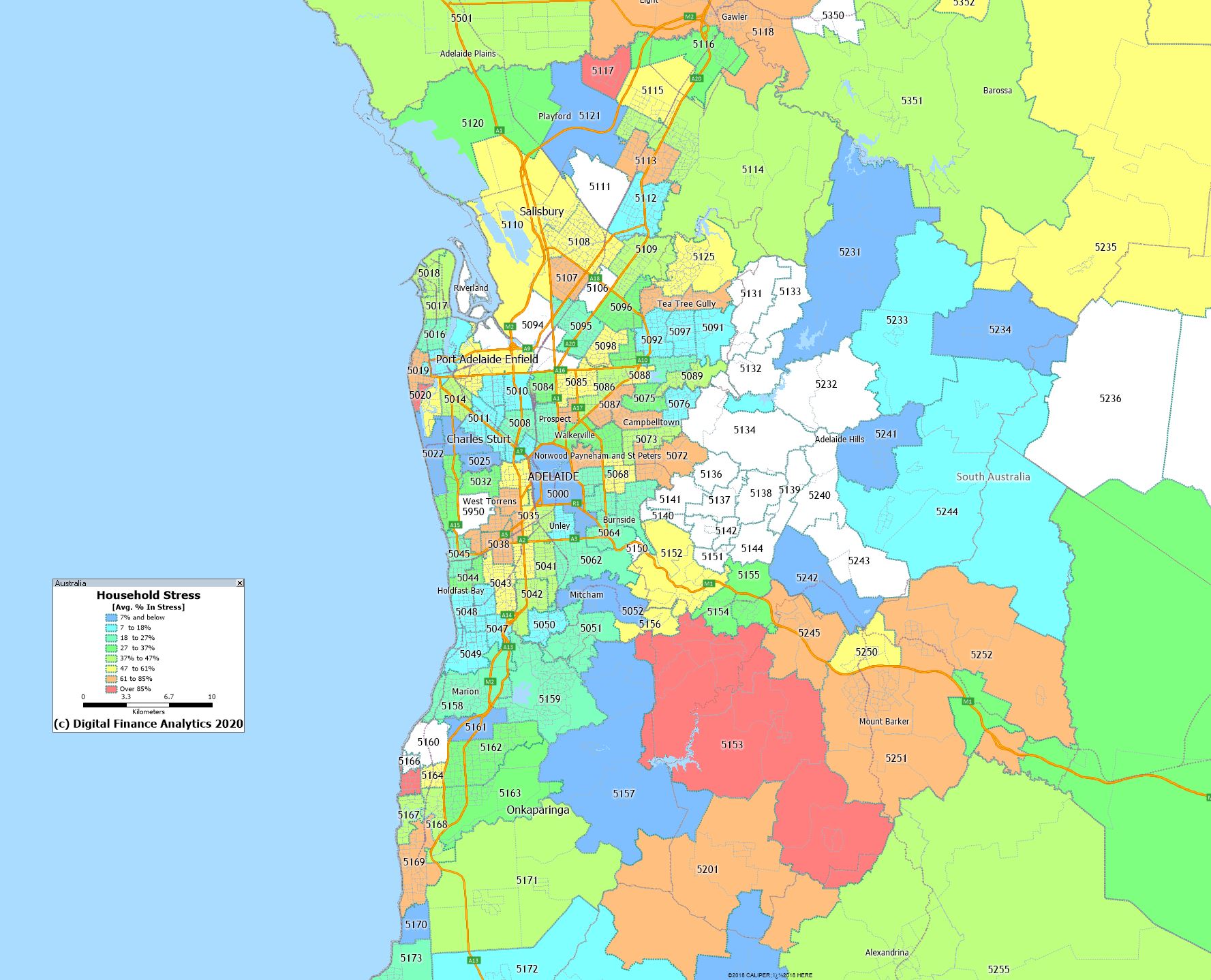
Adelaide
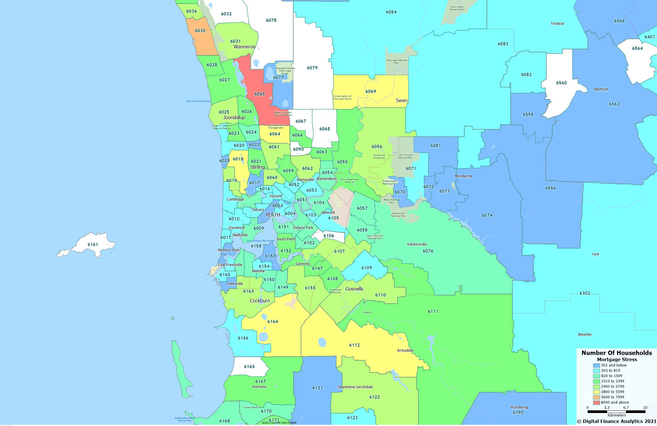
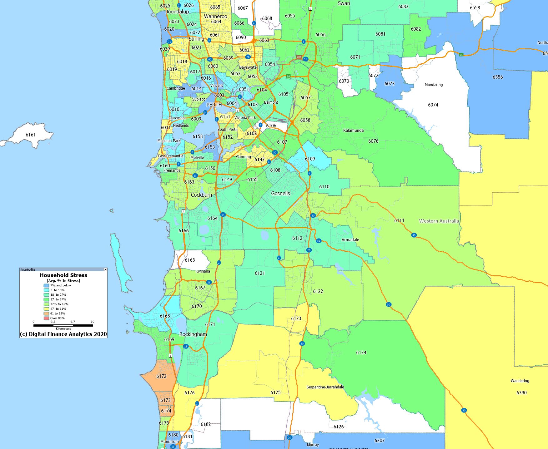
Perth
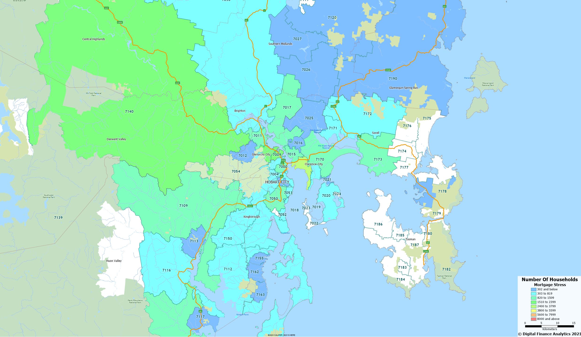
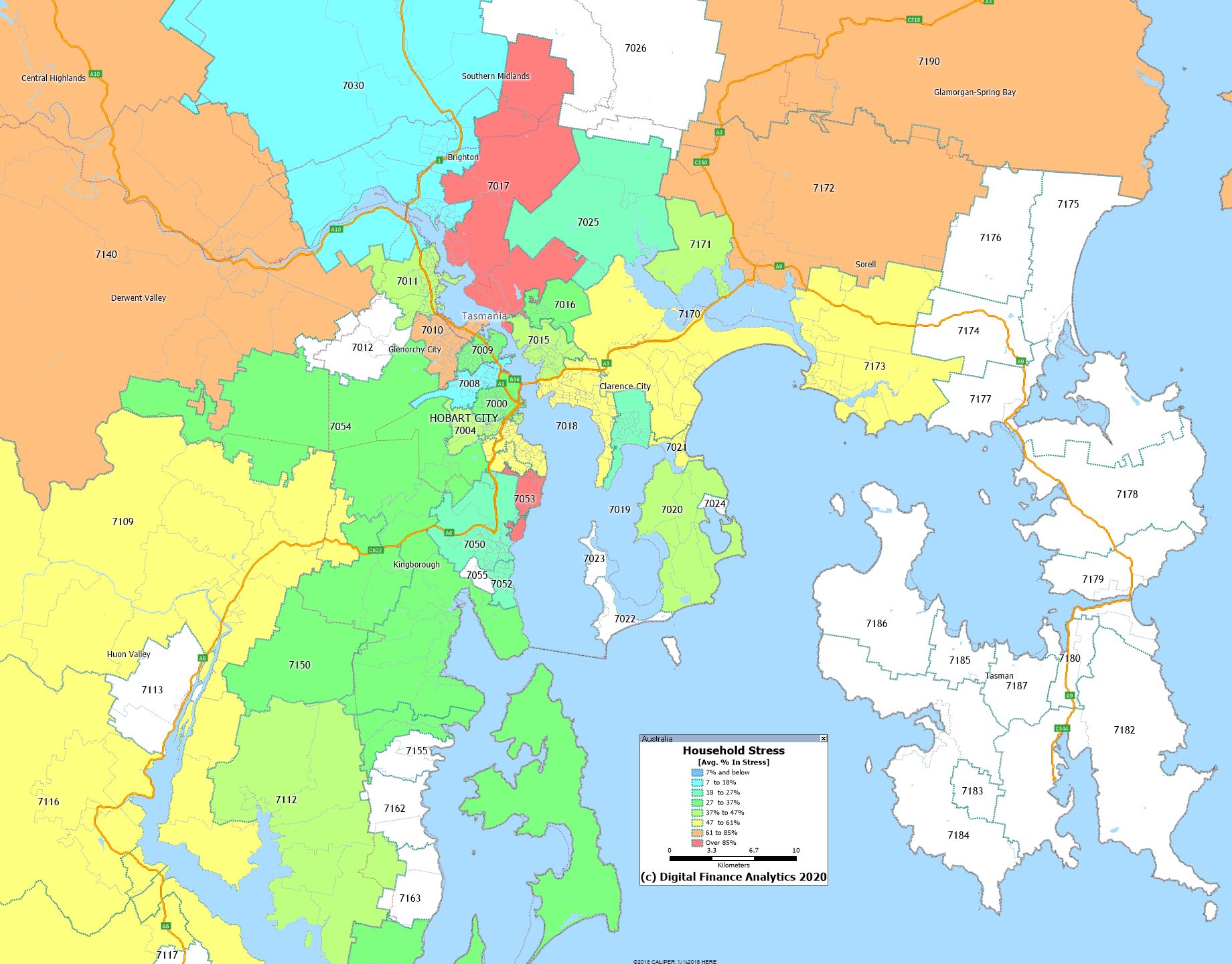
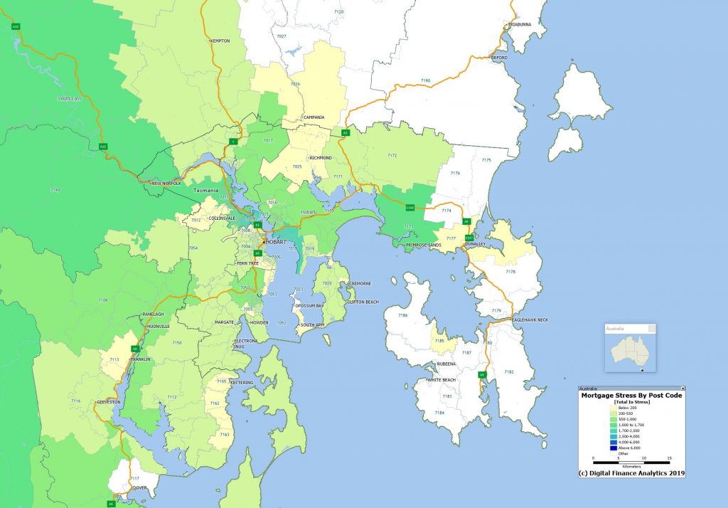
Hobart
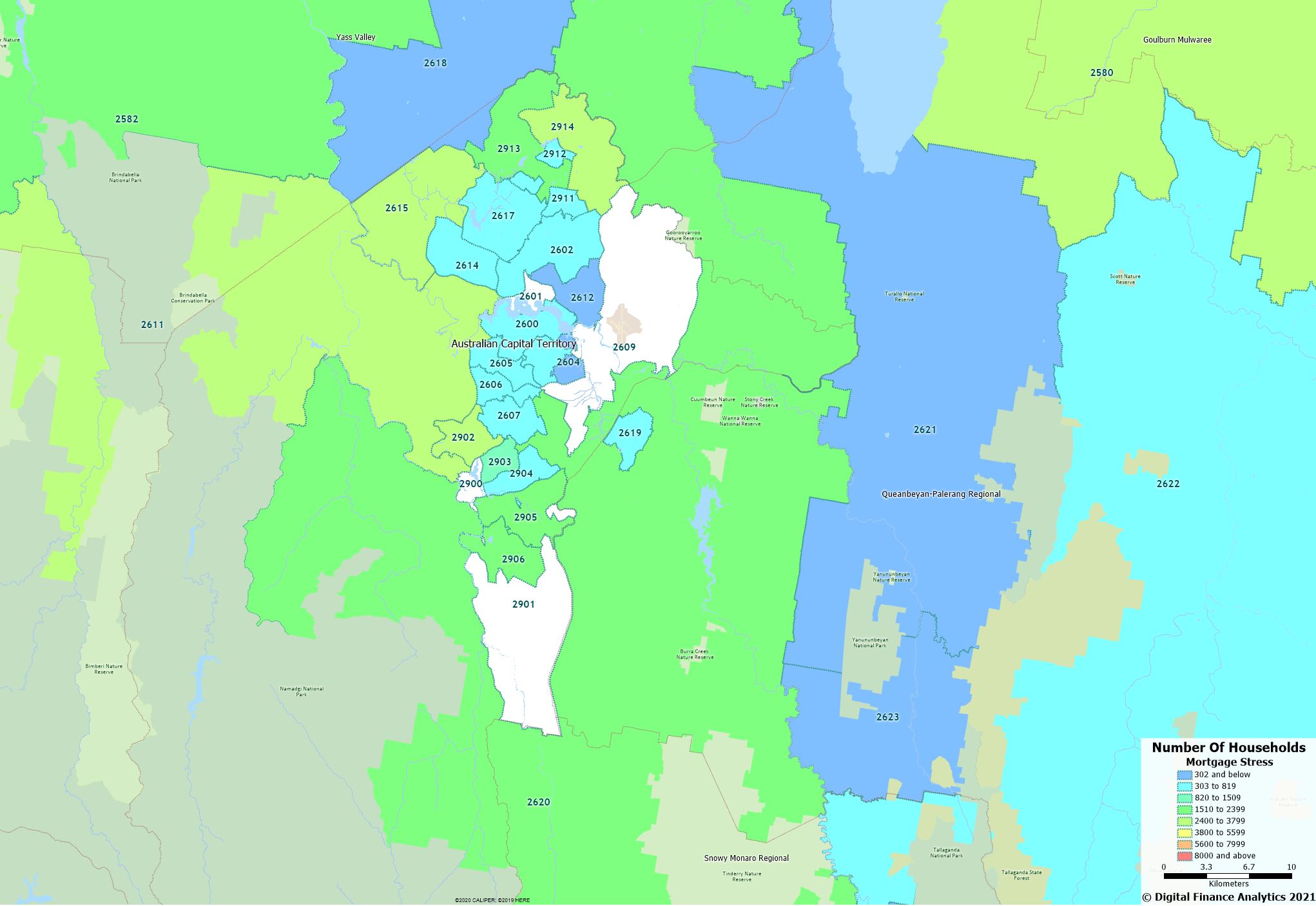
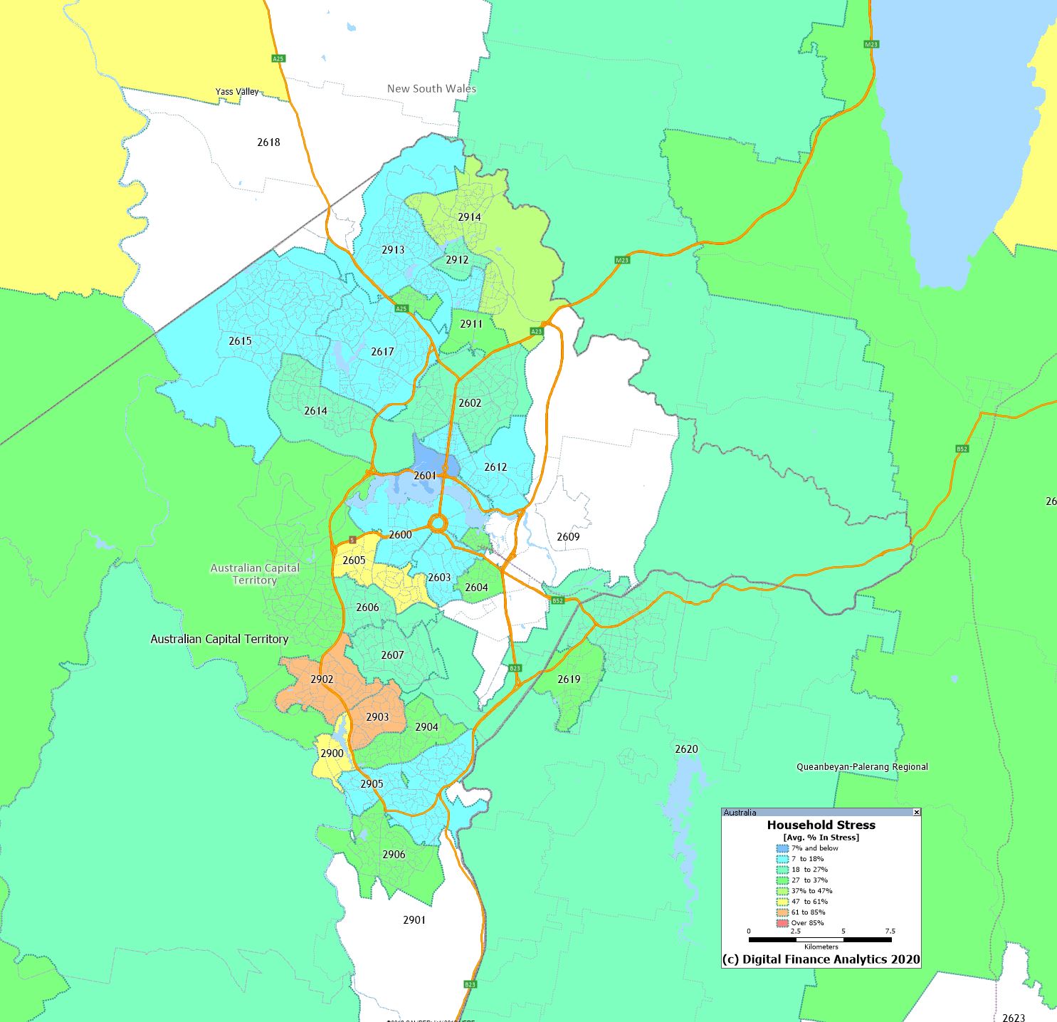
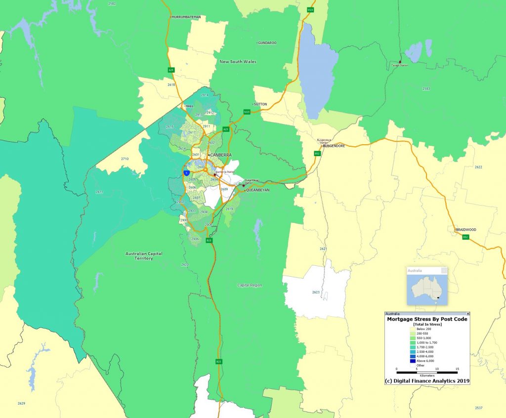
ACT
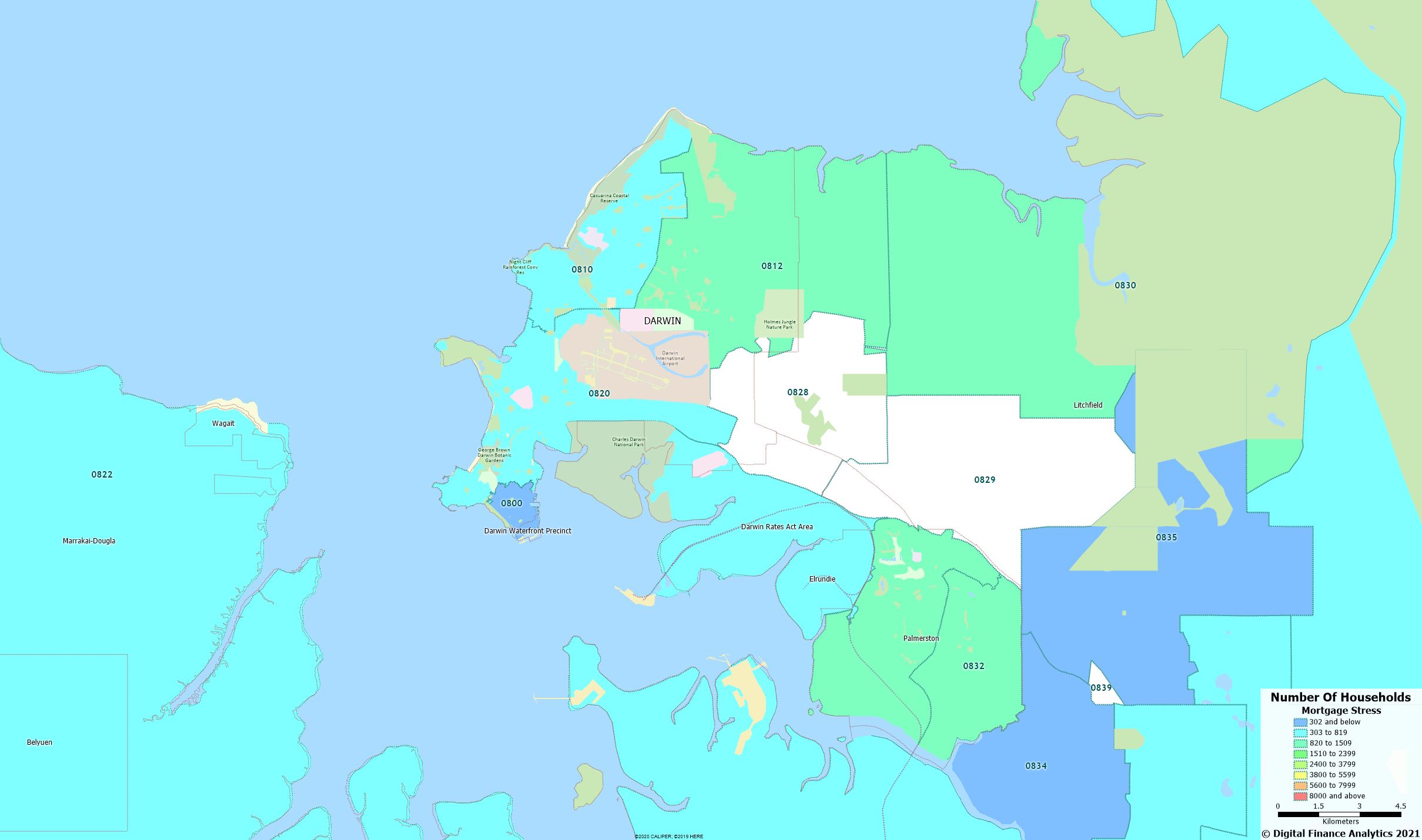
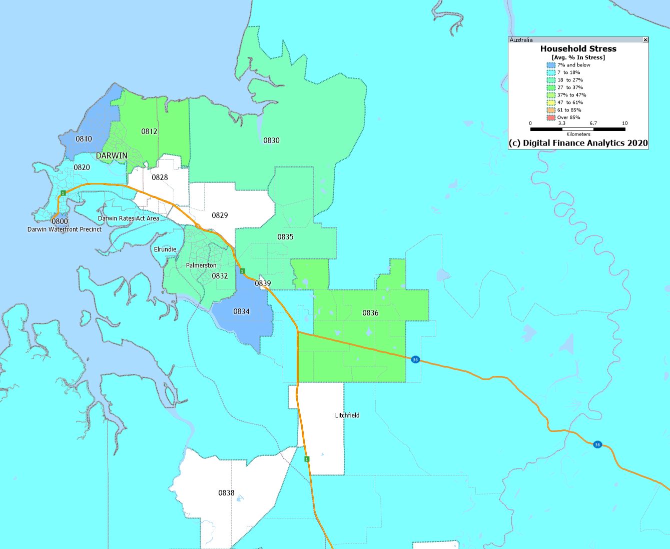
Darwin
Whilst property prices are rising in many areas, the financial pressures on households are building, and we expect to see more casualties ahead. Financial stress can ultimately lead to significant social and behaviourial issues. Mortgage default rates (which are also rising) do not tell the full story.
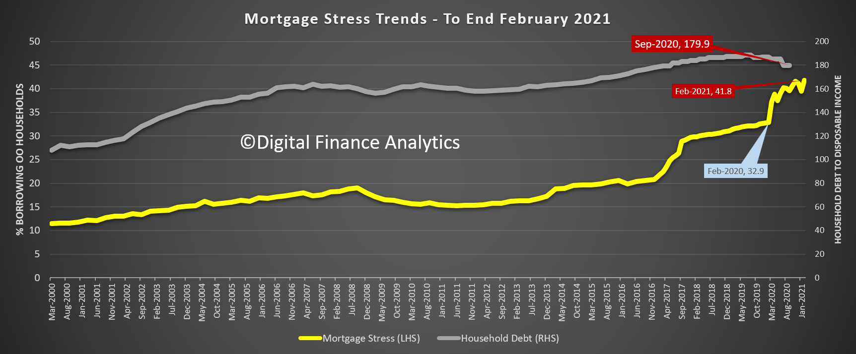
Well, against expectations – based on the main thrust of economic news (and spin), some may find it surprising to learn that our latest household surveys detected a RISE in Mortgage stress in February, based on our 52,000 or 0.5% rolling sample.
Remember that we are measuring free cash flow, and a range of factors have driven the rate higher. First, people are spending harder now, and draining their savings (some built large buffers last year). Second the number of people on principal and interest rate holidays from the banks has fallen as they restart some (any) sort of repayments, (which of course resets the default “timer”, conveniently). Third, more are weaning off JobKeeper, and payment rates on JobSeeker are dropping as the extra support is withdrawn. Finally, some have negotiated new loans, at lower rates, but others are not successful in this, due to credit history, or taking a larger loan. Support ends at the end of March, so expect to see more of this ahead.
And the snap lock-downs had a big impact on some incomes, which are growing only slowly, if at all.
It is worth remembering that some new loans are being made at up to eight times income – this is a very high multiple even in the current low rate environment. And rates may not be as low for as long as many currently expect!
Thus overall mortgage stress rose from around 39% last month to more than 41% this month.
Across the country, more than 1.5 million mortgage holders have cash flow issues, this is 41.8% of borrowers. Tasmania and NT had the highest proportion of households exposed, and Victoria rose to 45.4% in response to the recent lock-down.
We also measure rental stress, which is 34.9% of renters, investment property stress at 26.5%, and overall aggregate financial stress at 38%. In total around 4 million households are being crunched in some way.
Across the segments, young growing families, and those on the urban fringe are most exposed (this includes many recent first time buyers), while more affluent households are also caught, thanks often to multiple investment properties.
We can identify the top post codes for our four stress types, sorted by the number of households exposed. We see the same post codes appearing in multiple lists. There was a significant rise in the high growth areas around Melbourne, as well as Toowoomba in Queensland, and areas of New South Wales.
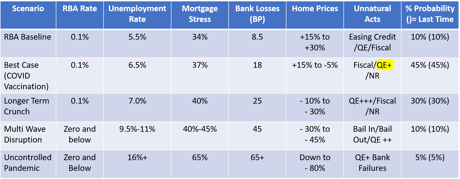
Underlying our modelling are our scenarios, which we have updated with the latest economic data inputs. There is a greater probability of home price rises, especially in some smaller states, and in the house, not high-rise unit segment.
And we discussed this analysis, together with the stress maps which accompany it in our recent live show.
Whilst some are falling over themselves to get into the market, we remain cautious, given the potential rise in stress, mortgage rates, and the tapering of Government support.
We have had many requests for updated mortgage stress maps, so today we include the latest post code level analysis – with data to end January 2020. We as showing the proportion of households in each state in stress, centered on the main urban centres. You can click on the maps to load and view the original capture.
We released a series of updated mortgage stress maps this week. However we received a number of requests for higher resolution versions, which although uploaded were not displayed on some platforms.
So here are the direct links to the source JPG files. You should be able to view them direct in your browser, or even download them. They show the heat maps in each region.
