The latest wages price data to end March 2022 was below expectations (despite the RBA liaison programme). As a result, households continue to go backwards unless you happen to be employed in a few high-demand industries. Public Sector works are also doing worse.
Go to the Walk The World Universe at https://walktheworld.com.au/
Today’s post is brought to you by Ribbon Property Consultants.
If you are buying your home in Sydney’s contentious market, you do not need to stand alone. This is the time you need to have Edwin from Ribbon Property Consultants standing along side you.
Buying property, is both challenging and adversarial. The vendor has a professional on their side.
Emotions run high – price discovery and price transparency are hard to find – then there is the wasted time and financial investment you make.
Edwin understands your needs. So why not engage a licensed professional to stand alongside you. With RPC you know you have: experience, knowledge, and master negotiators, looking after your best interest.
Shoot Ribbon an email on info@ribbonproperty.com.au & use promo code: DFA-WTW/MARTIN to receive your 10% DISCOUNT OFFER.
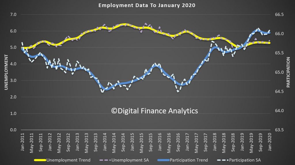
Interesting test today, as according to the latest ABS figures on unemployment trend stayed at 5.2%, but seasonally adjusted rose 0.2% to 5.3%. Who will report what (many were keen to highlight the recent falls in SA terms, will the reverse be true too?). We continue to prefer the more reliable trend series. Note too the incoming rotation group had a higher unemployment rate than the group it replaced. So, how much is real and how much noise? Still whatever, on these numbers you can forget wages growth. And this is before the China freeze really hit!
Employment and hours
In January 2020, trend monthly employment increased by around 20,000
people. Full-time employment increased by around 15,000 and part-time
employment increased by around 5,000 people.
Over the past year, trend employment increased by around 257,000 people
(2.0 per cent), in line with the average annual growth over the past 20
years (2.0 per cent).
Year on Year Employment Change Over 20 Years (%)
Full-time employment growth (1.7 per cent) was above the average annual growth over the past 20 years (1.6 per cent) and part-time employment growth (2.8 per cent) was below the average annual growth over the past 20 years (3.0 per cent).
The trend monthly hours worked increased by less than 0.1 per cent in January 2020 and by 1.3 per cent over the past year. This was lower than the 20 year average annual growth of 1.6 per cent.
Underemployment and underutilisation
The trend monthly underemployment rate remained steady at 8.5 per cent in January 2020, and increased by 0.2 percentage points over the past year.
“The underemployment rate continues to remain high, but is still below the levels from 2016-17,” said Mr Hockman.
The trend monthly underutilisation rate also remained steady at 13.7 per cent in January 2020, an increase of 0.4 percentage points over the past year.
States and territories trend unemployment rate
The monthly trend unemployment rate increased in Victoria and decreased in South Australia and Tasmania in January 2020. The unemployment rate remained steady in all other states and territories.
Over the year, unemployment rates fell in Western Australia, Tasmania and the Australian Capital Territory. Unemployment rates increased in New South Wales, Victoria, Queensland, and the Northern Territory. Seasonally adjusted data
The seasonally adjusted unemployment rate increased by 0.2 percentage points to 5.3 per cent in January 2020, while the underemployment rate increased 0.3 percentage points to 8.6 per cent. The seasonally adjusted participation rate increased by 0.1 percentage points to 66.1 per cent, and the number of people employed increased by around 14,000.
The net movement of employed in both trend and seasonally adjusted terms is generally underpinned by over 300,000 people leaving employment and around 300,000 people entering employment in the month.
In original terms, the incoming rotation group in January 2020 had a lower employment to population ratio than the group it replaced (62.0% in January 2020, compared to 64.2% in December 2019), and was higher than the sample as a whole (61.8%). The incoming rotation group had a lower full-time employment to population ratio than the group it replaced (43.2% in January 2020, compared to 44.5% in December 2019), and was higher than the sample as a whole (42.7%).
The incoming rotation group had a higher unemployment rate than the group it replaced (5.8% in January 2020, compared to 4.0% in December 2019), and was higher than the sample as a whole (5.7%). The incoming rotation group had a lower participation rate than the group it replaced (65.8% in January 2020, compared to 66.9% in December 2019), and was higher than the sample as a whole (65.6%).
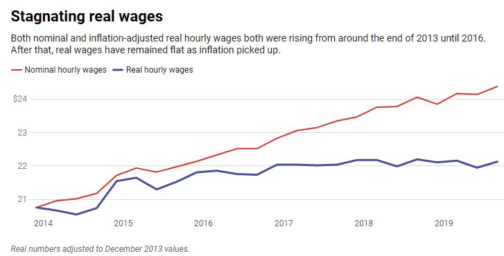
At first glance, the latest data – which came out on Feb. 7 – look pretty good. They show nominal hourly earnings rose 3.1% in January from a year earlier.
But the operative word here is nominal,
which means not adjusted for changes in the cost of living. Once you
factor in inflation, the picture changes drastically. And far from
representing a “blue collar boom” – as the president put it in his State of the Union address – the real, inflation-adjusted data show most U.S. workers have not benefited from the growing economy.
As an economist who studies wage data, I think it’s paramount that we take a step back and look at what the data really show.
Business journalists and financial markets
tend to focus on the monthly data. These figures are only reported in
nominal or current terms because the inflation data doesn’t come out
until later.
A more complete set of wage and pay data
is reported quarterly. The latest release came out in December for the
third quarter. These figures are not only adjusted for inflation but
also include fringe benefits, which account for just under a third of
total compensation.
At first blush, it makes sense to focus
primarily on the first set. Newer data is, well, newer, and market
participants and companies prefer the latest information when making
decisions about investments, hiring and so on.
But the effect of inflation means that the same US$1 bill buys less stuff over time as prices increase.
From December 2016 to September 2019, nominal wages rose 6.79% from $22.83 to $24.38. But after factoring in inflation, average wages barely budged, climbing just 0.42% in the period.
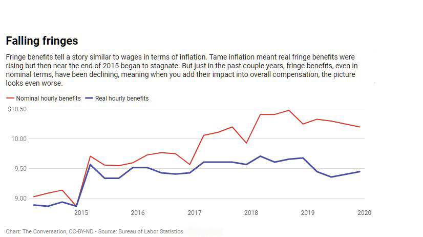
Incorporating fringe benefits into the picture adds another wrinkle.
The inflation-adjusted or real value of
fringe benefits, which include compensation that comes in the form of
health insurance, retirement and bonuses, declined 1.7% in the
three-year period.
Altogether, that means total real compensation slipped 0.22% from the end of 2016 to September 2019.
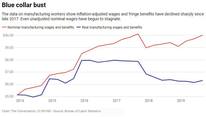
Of course, workers in different sectors
have fared differently. The Trump administration has singled out
manufacturing workers – who it says are the main beneficiaries of its
trade war and other policies intended to support the sector – as having
benefited from a “blue collar boom” in wages.
The nominal data for manufacturing workers
hardly support a boom but they do show an increase of 2.22% since
Donald Trump took office.
The adjusted data, however, make it look
more like a bust, with wages plunging 3.88% in the period. And, again,
the situation is worse when we add in fringe benefits, which brings the
decline to 4.33%.
So next time you read a story about a rise in pay, try to see if it reports the wage data in nominal or real terms, and if it includes fringe benefits too. If it’s only nominal wages, the numbers may mean a lot less than they seem.
Author: David Salkever, Professor Emeritus of Public Policy, University of Maryland, Baltimore County
The median weekly earnings of employees rose by 2.3 per cent from August 2018 to August 2019, according to figures released today by the Australian Bureau of Statistics (ABS).
This increase, based on data collected with the Labour Force Survey, is consistent with increases observed in the Wage Price Index and Average Weekly Earnings.
Over the year to August 2019, the median weekly earnings of female
employees rose by 4.3 per cent, while male employee earnings rose 1.3
per cent.
Head of Labour Statistics at the ABS, Bjorn Jarvis, said: “Median weekly
earnings for male employees rose by less than that of female employees,
partly because of the growing number of males working part-time hours,
and the industries and occupations that men and women are working in.”
The figures also show gradual changes in working arrangements over time.
There was an increase in the proportion of employed people with access
to flexible working hours (34 per cent in August 2019, up from 32 per
cent in August 2015) and who regularly worked at home (32 per cent, up
from 30 per cent).
There was a decrease in the proportion of employed people who usually
worked overtime (34 per cent in August 2019, down from 36 per cent in
August 2015), or were on call or standby (22 per cent, down from 24 per
cent).
The Characteristics of Employment Survey is run each August, in
conjunction with the monthly Labour Force Survey. It collects
information on earnings, working arrangements and forms of employment
(including independent contracting), as well as trade union membership
and labour hire every second year.
In the RBA’s Governor’s speech last night there was a reference to lower wages growth for longer, referring back to an earlier outing by Guy Debelle, Deputy Governor.
Debelle’s speech at Australian Council of Social Service (ACOSS) National Conference revealed at least to me that the RBA has no real idea as to why wages growth is so slow. They appear to have all but accepted it will be so. ” This increase in labour supply has meant that the strong employment outcomes in recent years has not generated the pick-up in wages growth that might otherwise have occurred. At the same time, I have highlighted the increased prevalence of wages growth in the 2s across the economy”.
We think the structural changes to the labour market (gig jobs, part-time work, multiple-jobs, etc) plus technological changes and globalisation all have a role to play. And the migration factors and temporary working visas are also playing into the mix. Finally, the balance between employee and employer seems to have shifted. Public sector wages are a little stronger.
He said: Over much of the past three years, employment has grown at a healthy annual pace of 2½ per cent. This has been faster than we had expected, particularly so, given economic growth was slower than we had expected. Employment growth has also been faster than the working-age population has been growing. As a result, the share of the Australian population employed is around its all-time high, which is a good outcome. Normally, we would have expected this strong employment growth to lead to a decline in the unemployment rate. But the unemployment rate has turned out to be very close to what we had expected and has moved sideways around 5¼ per cent for some time now.
So what is going on here? Strong employment growth but little change in the unemployment rate means
that the strength in labour demand has been met by strong growth in labour supply. This increase in
labour supply has come from more people joining the labour force and from some of those with jobs
putting off leaving the labour force. These trends have been particularly pronounced for females aged
between 25 and 54 and older workers of both sexes.
The surprising strength in labour supply has been one of the factors that has contributed to wages
growth being slower than we had expected. But at the same time, the lower growth in wages has probably
contributed to the strength in employment growth. My undergraduate honours thesis at Adelaide Uni
examined the aggregate labour demand curve in Australia which was a much debated topic at the time.[1] So more
than 30 years on, I will discuss similar issues today.
I will look at the rise in participation rates of females and older workers and discuss some of the
factors that have been contributing to it. I will also look briefly at what jobs have been created. In
doing so, I will make use of the micro data in the monthly labour force survey (LFS) as well as micro
data from the HILDA survey.[2] That is, we are examining the micro data to understand the macro trends in the
labour market.
By and large, the new jobs created over the past few years have been representative of the existing
stock of jobs. There have been low wage and high wage, lower skilled and higher skilled jobs created,
but about average on both counts. The jobs growth has been in household services jobs such as health
care, social assistance and, education, as well as in business services. Two-thirds of the employment
growth over the past two years has been in full-time jobs.
Then I will look at wages growth and show that the lower average wage outcomes of the past few years
have reflected the increased prevalence of wages growth in the 2s across the economy.
Finally, I will look forward and talk about the RBA’s forecasts for the labour market. Two of the
critical influences on that forecast are how much further labour supply will increase and how entrenched
are wage outcomes.
Participation
An increase in the number of people in employment can be met either by an increase in people entering
from outside the labour market or a decline in unemployment. The increase in people coming from outside
the labour force, causing an increase in the participation rate, is known as an ‘encouraged
worker’ effect – when economic conditions improve, there is a tendency for people to enter
or defer leaving the workforce.[3] Historically more of the increase in employment has translated into a reduction
in the unemployment rate than by a rise in the participation rate.
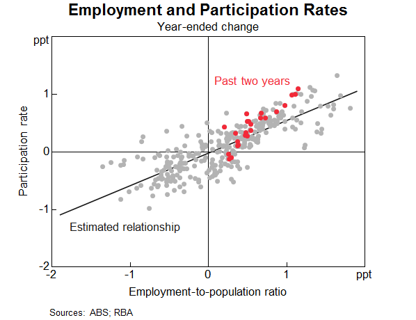
However, the past couple of years have been unusual. The increase in employment has been met
disproportionately by an increase in the number of people participating in the labour force
(Graph 1). The share of the population participating in the labour force is at a record high. The
two main groups contributing to this rise in participation are females and older workers. I will discuss
each of these in turn and some of the forces driving the outcomes over both the recent past and from a
longer perspective. An understanding of these forces can help us assess how much further these trends
are likely to continue.
Graph 1
Female participation
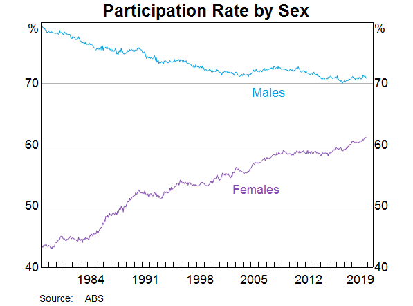
Female employment growth has accounted for two-thirds of employment growth over the past year. The
female participation rate is now at its highest rate, and the gap between female and male participation
is now the narrowest it has ever been (Graph 2).
Graph 2
The female participation rate has steadily increased over recent decades (from 40 per cent in
1970 to 61 per cent in 2019), and a similar upward trend is evident across other advanced
economies. Changing societal norms and rising educational attainment have contributed to more women
moving into paid employment or employment outside the home. Female participation has also been
influenced by the increasing flexibility of working-time arrangements, the availability and cost of
child care and policies such as parental leave.
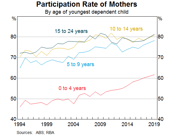
Nearly half of employed females work part time, often to care for children. Over recent decades, the
participation rate of mothers with dependent children has trended higher, rising by 10 percentage
points since the early 2000s to 73 per cent. Over the past decade, the rise in participation
has been most pronounced for mothers with children aged between 0 and 4 (Graph 3). Of those
returning to work within two years after the birth of a child, an increasing majority are citing
‘financial reasons’ as their main reason for doing so. Other mothers returning to work
cite ‘social interaction’ or to ‘maintain career and skills’ as their main
reason. Financial reasons could be capturing a number of different considerations including low income
growth, the rise in household debt or child care costs.
Graph 3
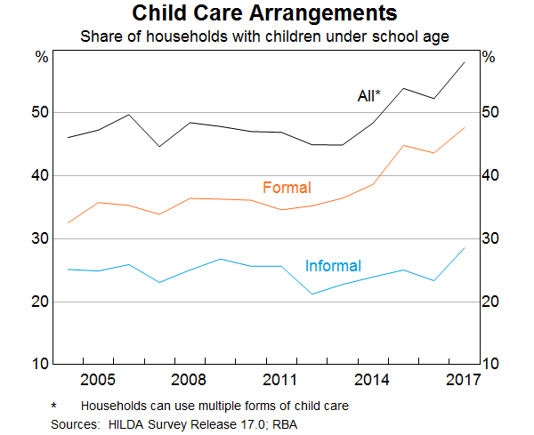
Research suggests the cost and quality of child care does have a significant effect on the labour
supply of women.[4] Data from the HILDA survey show that the share of households using formal child care
for young children has increased notably over the past decade (Graph 4). However, access to child
care places and financial assistance with child care costs remain ‘very important’
incentives for females currently outside the labour force.
Graph 4
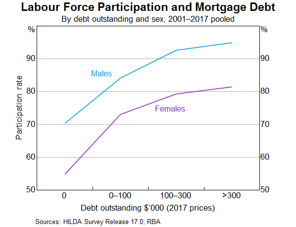
Another factor that is linked to higher rates of female participation over recent decades is the
increase in the level of mortgage debt of home owners (Graph 5). The rise in debt levels has
broadly coincided with the increase in the participation rate of females. However, it is difficult to
establish which way causality is going. Are debt levels higher because more households have two incomes
and can afford to borrow more? Or does the need to borrow more to afford housing drive the decision to
participate more? Or is it the case that the low level of income growth in recent years has meant that
households have more debt than they anticipated and need to work longer to pay it down? Research to
establish causality has usually found some evidence of a causal relationship running from higher debt
levels to higher participation.[5] However, the analysis indicates that the effects are not that large at an
aggregate level.
Graph 5
The rollout of the National Disability Insurance Scheme (NDIS) may also have encouraged increased
participation of female carers. We know from a detailed survey of NDIS participants and their families
that parents of those with disabilities work fewer hours on average and are more likely to be in casual
employment.[6] It is probably too early in the rollout of the scheme to see a material increase in the
number of parents re-entering the labour market. The survey suggests there has been a slight increase in
the average number of hours worked since the start of the scheme, but the percentage of families/carers
of NDIS participants who wanted to work more hours has not changed.
Thus two significant drivers of the increase in participation rates of females aged between 25 and
54 over a long period of time are child care costs and other financial factors. The open question
is how much more the participation rate of this group will rise.
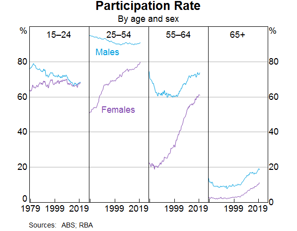
Older workers
The share of the Australian population aged between 15 and 64 years has continued to decline,
and is expected to continue to decline. This is due to the ongoing transition of baby boomers into
retirement ages. All else being equal, an ageing population will result in a fall in the supply of
labour, since the generation retiring is larger than the generation entering the workforce. But there
has been a long-term trend for each cohort to participate more than previous cohorts did at the same
age. That trend has accelerated recently, and more than offset the effect of ageing on its own. The
share of 55 year olds and older that are employed is 35 per cent, compared to
22 per cent 20 years ago.
This cohort effect is particularly clear in the third panel of Graph 6. The much larger rise in
female participation than males over the past two decades is a stark illustration of the effect, as the
other drivers of participation in this age group should have similar influences on both male and female
participation.
Graph 6
Why are older people working longer?[7] One contributing factor is improved health. People are
working longer because they can, both because of their own health and also because the nature of work
has changed over the years towards services and away from manual work, which means most people are in
less physically demanding jobs.
It used to be the case that many older workers would have to choose between working full time and
retiring. From a labour economics point of view, the labour/leisure trade-off has much more choice than
it used to.[8] In the past, it was often an all or nothing decision. As the labour market has become
more flexible over recent decades, older workers may be able to reduce their hours but still participate
in the labour market. Indeed, around one-third of workers aged 55 years and older are working part
time, with over half doing so because they prefer to do so. The ABS Retirement and Retirement Intentions
survey suggests that of people aged 45 years and older, around one-third of workers intend to cut
down from full-time work to part-time work as they get older.
As people live longer, they may want to work longer voluntarily, depending on the value they get from
working. But they also may need to work longer to achieve the necessary income to support the standard
of living they would like in retirement.
Access to a retirement pension or superannuation is a very significant element in the decision to
retire. More than half of all retirees over 60 cite that reaching retirement age or becoming
eligible for the pension/superannuation as the main reason they retired from work. The male
participation rate begins to decline around age 50 and there is a noticeable change in the rate of
decline around 65; the historical pension age for men. For women there is a similar pattern, although in
the past there was also a change in the rate of decline around age 60.
Accordingly, announced and actual increases in pension ages are also likely to have contributed to
increased participation. This has been documented in the past for females after the government increased
the female pension age from 60 to 65 between 1996 and 2013 (in 6 month increments every
2 years).[9]
Currently the pension age is being raised to 67 years for both sexes; a process that began in
2017. The average age of job leavers over the age of 55 has increased slightly in recent years. Our
analysis of LFS micro data provides tentative evidence that the 2017 changes to the pension age had an
impact on workers’ retirement decisions. The participation rate of those born in 1952 and 1953 (who
were affected by the changes in 2017) does not decline as quickly when they turned 65, compared to the
earlier cohort groups that were not affected by the pension age increase.[10] In
aggregate, this analysis suggests that the pension changes boosted the participation rate by around
0.1 percentage point.
As I said above, some older workers are working for financial reasons. As we all know, one of the major
considerations for those contemplating retirement is their wealth and ability to fund their retirement.
Increasing house prices and share prices over much of the last decade are likely to have reduced
participation of older individuals.[11] The recent decline in house prices may have resulted in
some individuals delaying their retirement and not withdrawing their labour supply. However, the price
declines were modest compared to the earlier increase, so that those considering retirement would have
experienced a net gain in house prices and a decline in their debt.
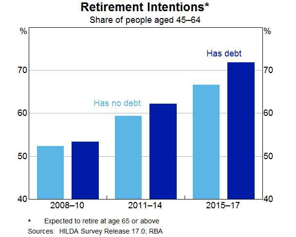
Similar to females, the rise in the participation rate of persons aged 55 years or older is also
likely to have been related to developments in household debt. Over recent decades there has been a
trend towards greater indebtedness for these persons. The proportion of older households with
owner-occupied home loans has risen from around 20 per cent in the early 2000s to around
37 per cent today. The increase in debt has also been associated with a change in the
retirement intentions of older workers. Over time, the gradual shift towards later retirement has been
more noticeable for those with debt (Graph 7). As with the female participation story, there is a
question of causality. Are people working later in life because they have an unexpectedly high level of
debt? Or had they always intended to work longer and hence were more willing to borrow more and carry
more debt later in life?
Graph 7
To draw this together, participation rates have risen as employment has grown over the past three
years. This increase in supply has been unexpected, so it is important to try to understand what is
driving it to have some sense on how much further these trends are likely to run. The two major shifts
in participation have been amongst females aged 25–54 and older workers. These trends have
been there for a while and have been even stronger recently. I have presented some of the insights from
our analysis of various micro data sources but there is still more to understand. We will continue to
focus on this given its importance to the outlook, which I will come to later.
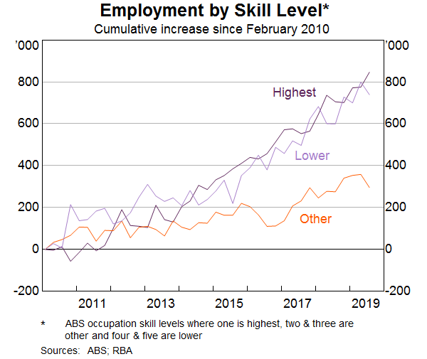
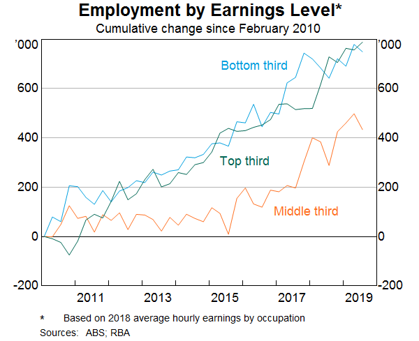
Employment
What sort of jobs have been created in recent years?
Some have assumed that the jobs that have been created in recent years are lower-skilled or lower-paid
jobs. However, when we break down the occupation-level data by skill type or pay level, this is not the
case. The strongest growth in employment over the past decade has been in highest-skilled (as defined by
the ABS) jobs. There has also been solid growth over the same period in lower-skilled jobs
(Graph 8). Similarly, the growth in employment has been broadly distributed across the pay spectrum
(Graph 9).
Graph 8
Graph 9
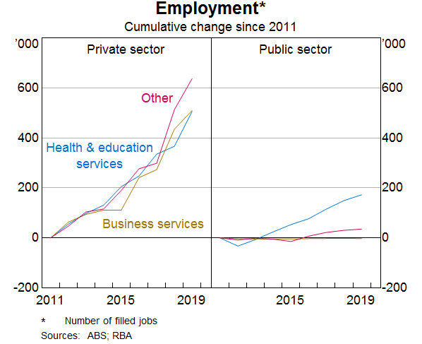
Another often stated view is that much of the job creation in recent years has been in the public
sector, rather than the private sector. According to the Labour Account data, the number of jobs created
in the private sector has far outnumbered the number of jobs created in the public sector
(Graph 10).[12] Private sector job creation has been particularly strong in health care and education
(which is partly, but a long way from entirely, due to government spending in these areas),
but also in business services and industries like construction and hospitality.
Graph 10
We have also used the micro data to look at the people that have moved into some of these growth areas.
For example, the share of employment in the health care & social assistance industry has increased
from 9 to 13 per cent over the past decade. Those entering or leaving health care and
social assistance tend to do so from a small number of other industries such as public administration,
support services, education and training and other services into health care and social assistance.
Around 10 per cent of people entering employment from outside the labour market are moving
into health care, while a slightly smaller share move into this sector from unemployment. A large share
of workers between the age of 55 and 69 years of age work in health care and social
assistance, so this is likely to be related to individuals delaying retirement.
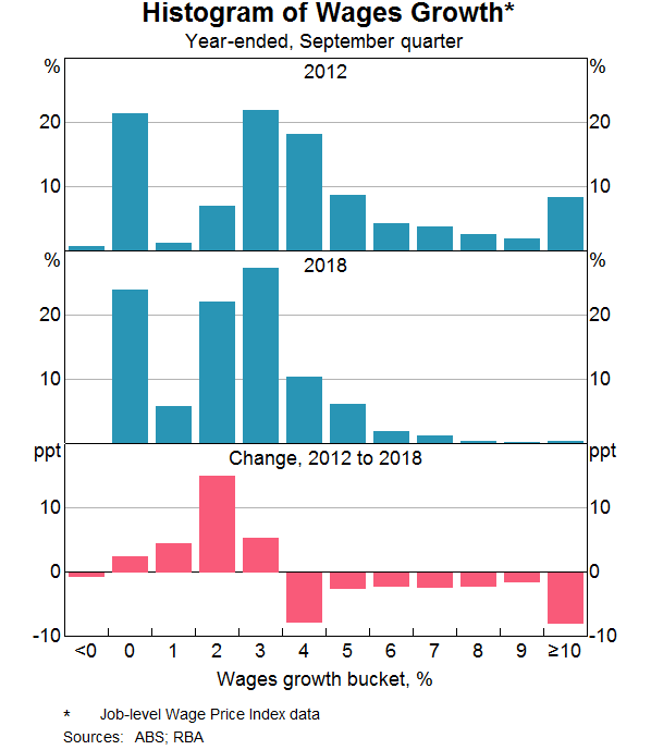
Wages
Wages growth has declined noticeably since around 2012. As wages growth has fallen, the distribution of
wages growth has also become increasingly compressed. This fall in the dispersion in wages growth across
jobs mainly reflects a sharp fall in the share of jobs receiving ‘large’ wage rises. The
Bank has highlighted this previously, but I will update that analysis and illustrate the increased
pervasiveness of wage outcomes between 2 and 3 per cent across the labour market.[13]
The share of jobs that experience a wage change of more than 4 per cent has fallen from over
one-third in the late 2000s to less than 10 per cent of jobs in 2018 (Graph 11). Given
that firms are also unwilling or unable to reduce wages, this has meant that the vast majority of wage
growth observations in the labour market are now tightly clustered in the range of
0–4 per cent.
Graph 11
There is growing evidence to suggest that wage adjustments of 2 point something per cent have
now become the norm in Australia, rather than the 3–4 per cent wage increases that were
the norm prior to 2012. The rising prevalence of wage outcomes in the 2s can be seen in the official
data and in the Bank’s liaison with firms.
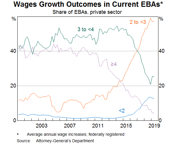
One notable example is the large increase in the share of enterprise bargaining agreements that provide
annual wage rises in the 2–3 per cent range. The share of such agreements has risen
from around 10 per cent over the 2000s to almost 60 per cent in 2019
(Graph 12). Over the same period, the proportion of agreements providing wage increases of
3 per cent or more has fallen sharply.
Graph 12
A similar picture emerges when we look at the job-level data that underlie the ABS’s wage price
index (WPI). These data, which also provide insights on wage outcomes for jobs where pay is set
according to individual arrangements, also show that the share of jobs getting wage rises in the
2–3 per cent mark has risen noticeably. The Bank’s liaison with firms also
confirms that the share of firms reporting wages growth of between 2 and 3 per cent has
increased to around 45 per cent in recent years. Prior to 2012, fewer than one in
10 firms were reporting wages growth in this range.
Another way to see this shift in wage setting over time is to look at the median rates of
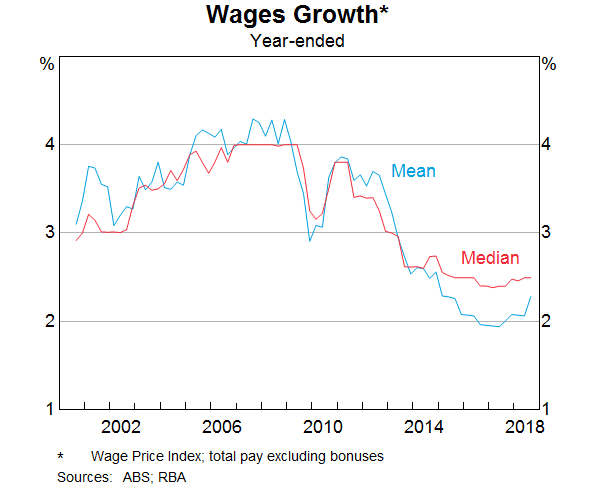
wages growth across all jobs in the labour market (Graph 13). Unlike the mean, the median is less
affected by the large decline in ‘large’ wage rises in recent years and the changing
prevalence of wage freezes. Prior to 2012, median wages growth was firmly anchored at
4 per cent. In recent years, median wages growth has fallen to 2½ per cent, and
has remained at that level.
Graph 13
Different measures of wages growth capture slightly different concepts of labour costs. The WPI, which
is one of the main measures that the Bank monitors, tracks wage outcomes of individual jobs over time,
rather than tracking particular employees.[14] This feature of the WPI makes it useful for gauging
developments in wages growth after abstracting from any changes in the nature of work or the composition
of employment. However, this feature also means that the WPI does not capture wage rises that come from
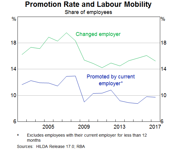
getting promoted or changing firms.
But other surveys suggest that promotions can be a key source of earnings growth for individuals. On
average, a promotion leads to a 5 per cent boost in hourly wages, which is comparable to the
wage rise a worker gets when switching firms. Since 2012, there has been a broad-based decline in the
proportion of employees that are getting promoted at work or switching jobs (Graph 14). This means
that a smaller fraction of the workforce are receiving these wage rises.
Graph 14
Why have wage outcomes in the 2s become so prevalent?[15] One phenomenon that could explain it is the
well-known tendency for workers to resist reductions to their wages in real terms.[16] This
phenomenon, also known as ‘downward real wage rigidity’, leads to a clumping of
employees’ nominal wage changes in the vicinity of their expected rate of inflation, particularly
when nominal wages growth is tracking at a low level. In that sense, the RBA’s inflation target of
2–3 per cent on average over time provides a strong nominal anchor in wage
negotiations. When my colleagues looked at the job-level WPI data they did find evidence of a clumping
of wage outcomes either at, or just above, expected inflation.
While wage increases in the 2s have become very common for many employees, those whose wages are set
according to an award have generally been receiving wage increases in excess of 2 per cent in
recent years. This reflects the Fair Work Commission adjustments, which have provided support to wages
growth at the lower end of the skill distribution, given the prevalence of award-reliant jobs in this
part of the labour market. Wages growth for the least-skilled jobs has outpaced all other skill groups
since around 2013. This contrasts with the commodity price boom period, when wages growth was strongest
for higher-skilled jobs. Consistent with this, the ratio of average hourly earnings of award-reliant
employees to those of other employees has risen since 2012, largely reversing the falls seen in the
earlier period.
Outlook
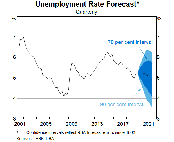
The recent Statement on Monetary Policy provided the Bank’s latest forecasts for the
labour market and wages growth. GDP growth is forecast to gradually increase over the next couple of
years, which should result in a small decline in the unemployment rate from its current rate of
5¼ per cent. As Graph 15 shows, there is always uncertainty around that central
forecast. One of the key sources of uncertainty currently around the outlook for the unemployment rate
as well as wages growth, is whether labour supply will be as responsive to labour demand as it has been
in recent years. That is, will the expected increase in labour demand encourage as much participation as
it has most recently? How much further do some of these drivers of increased participation for older and
female workers have to run? That is a difficult question to answer.
Graph 15
The dynamics of participation and unemployment flows will have an important bearing on wages growth as
well as household income growth. We expect wages growth to remain largely unchanged at its current level
over the next couple of years.
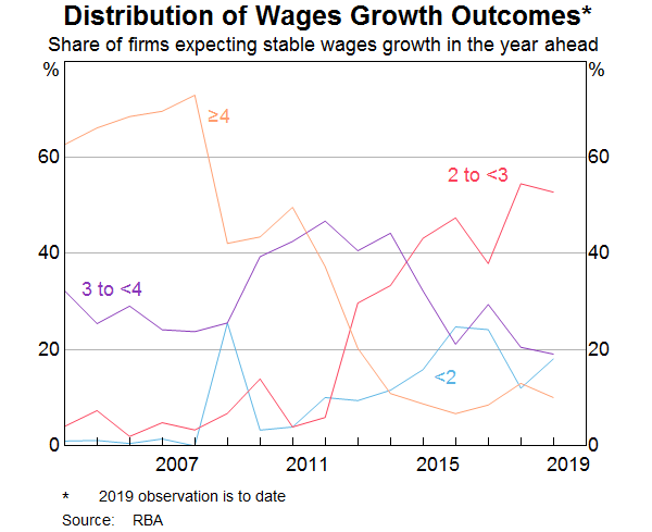
Why don’t we think wages growth will pick up over the next couple of years? What we know from our
liaison program is that the proportion of firms expecting stable wages growth in the year ahead is
around 80 per cent and only around 10 per cent anticipate stronger wages growth. Of
those firms expecting stable wages growth, the share reporting wage growth outcomes of
2–3 per cent has steadily risen over time. This supports the case that lower wage rises
have become the new normal (Graph 16).
Graph 16
Recently there has been a rise in the proportion of new EBAs with a term of three years or more. The
lower wages growth incorporated in those agreements suggests that wages growth of around
2½ per cent for EBA-covered employees will persist for longer than in the past.
The more wages growth is entrenched in the 2s, the more likely it is that a sustained period of labour
market tightness will be necessary to move away from that. At the same time, I don’t think there is
much risk in the period ahead that aggregate wages growth will move any lower.
Conclusion
Today I have provided an overview of the current state of play in the labour market and the Bank’s
expectation about how it might evolve in the period ahead. I have highlighted some of the key forces
that have shaped these developments, in particular, the rise in the participation rates of female
workers and older workers. The Bank is trying to understand what has been driving these macro
developments using some newly available micro data sources. This greater understanding should help
inform our outlook for the labour market.
This increase in labour supply has meant that the strong employment outcomes in recent years has not
generated the pick-up in wages growth that might otherwise have occurred. At the same time, I have
highlighted the increased prevalence of wages growth in the 2s across the economy. A gradual lift in
wages growth would be a welcome development for the workforce and the economy. It is also needed for
inflation to be sustainably within the 2–3 per cent target range.
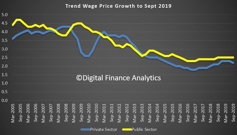
The trend and seasonally adjusted indexes for Australia both rose 2.2% through the year to the September quarter 2019. The public sector did better than the private sector.
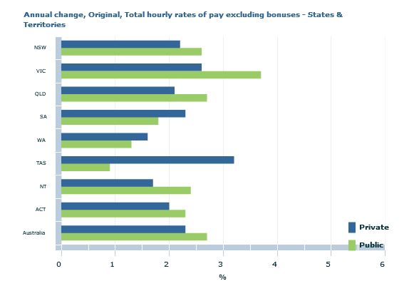
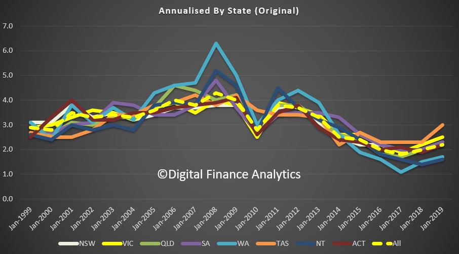
The original data by state shows TAS and VIC doing better than average, while WA and NT are below average.
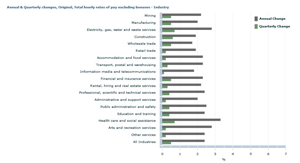
In original terms, rises through the year to September quarter 2019 at the industry level ranged from 1.7% for Information, media and telecommunications services to 3.2% for Health care and social assistance.
The trend Wage Price Index (WPI) rose 0.5 per cent in the June quarter 2019 and 2.3 per cent through the year, according to figures released today by the Australian Bureau of Statistics (ABS). These are lower than projected in the budget, and highlights the stresses in the economy. Without one-off factors the numbers would be even lower.
Seasonally adjusted private sector wage growth was 0.5 per cent, while public sector wage growth was 0.8 per cent in the June quarter 2019.
ABS Chief Economist, Bruce Hockman said: “Wage growth continues at a
steady rate in the Australian economy on the back of strong public
sector growth over the quarter. The most significant contribution to
wage growth this quarter came from the public sector component of the
health care and social assistance industry, where a number of large
increases were recorded in Victoria under a plan to ensure wage parity
with other states.”
In original terms, annual wages growth to the June quarter 2019 by industry ranged from 1.7 per cent for wholesale trade to 3.3 per cent for health care and social assistance.
Western Australia recorded the lowest through the year wage
growth of 1.6 per cent while Victoria recorded the highest of 2.9 per
cent.
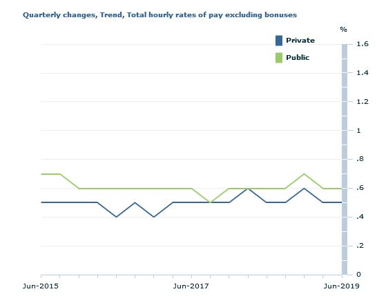
The trend Wage Price Index (WPI) rose 0.6 per cent in the March quarter 2019 and 2.3 per cent through the year, according to figures released today by the Australian Bureau of Statistics (ABS).
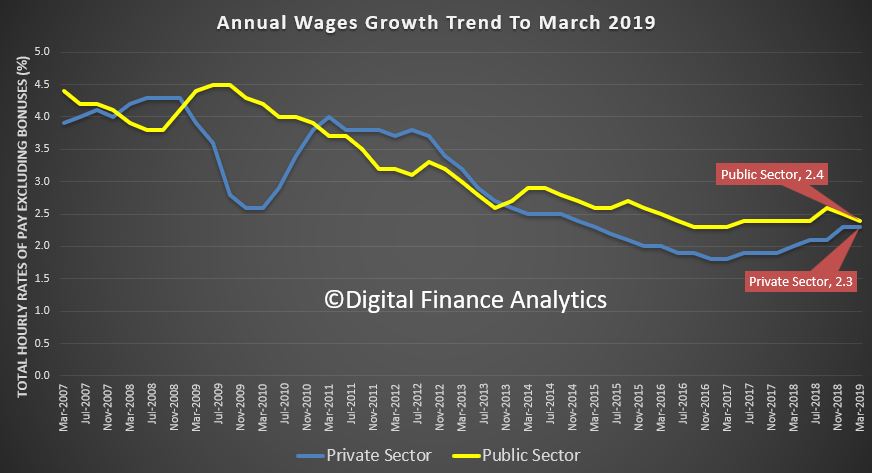
Trend growth in the public sector was 2.4% over the past year, compared with 2.3% in the private sector.
ABS Chief Economist Bruce Hockman said: ” The main contributors to growth over the quarter were regularly scheduled wage rises in the Health care and social assistance and Education and training industries, as was the case in the previous March quarter.”
In original terms, annual wages growth to the March quarter 2019 by industry ranged from 1.8 per cent for Construction and the Information, media and telecommunication services industries to 3.0 per cent for Health care and social assistance.
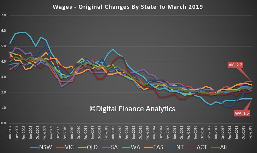
Western Australia recorded the lowest through the year wage growth of 1.6 per cent while Victoria recorded the highest of 2.7 per cent.
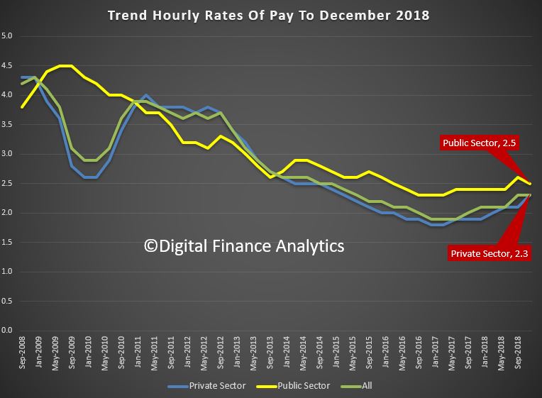
The trend Wage Price Index (WPI) rose 0.5 per cent in December quarter 2018 and 2.3 per cent through the year, according to figures released today by the Australian Bureau of Statistics (ABS). Growth remains anemic.
The trend quarterly rise of 0.5 per cent continues an extended period of moderate hourly wage growth. Annually, private sector wages rose 2.3 per cent and public sector wages grew 2.5 per cent.
ABS Chief Economist Bruce Hockman said that the annual rates of growth in the private sector have been lower than those recorded for the public sector over the last four years.
Remember that from last July the Fair Work Commission lifted the minimum wage by 3.5%. This factor impacted more than 2 million workers and has been responsible for lifting the overall results. But many households have seen no uplift at all.
In original terms, annual growth to the December quarter 2018 ranged from 1.6 per cent for the Information Media and telecommunication services industry to 2.8 per cent for the Electricity, gas, water and waste services and Health care and social assistance industries.
Western Australia once again recorded the lowest through the year wage growth of 1.6 per cent while Victoria recorded the highest of 2.7 per cent.
So if wages growth is stirring, its at the margin, and hardly noticeable.
“This report finds that trends in wages growth across the various measures considered have been fairly similar over the last 20 years. However, growth across these measures has been below the long-term average over the last five or so years,” it said, noting a relatively steady fall in growth rates since the global financial crisis (GFC).
Among the various reasons investigated by the report as potential contributors to low wage growth were the rates of unemployment and inflation, productivity, as well as “structural factors” such as changes across different industries, technology — particularly automation and the gig economy — and changes in employee bargaining power”.


 Blog")