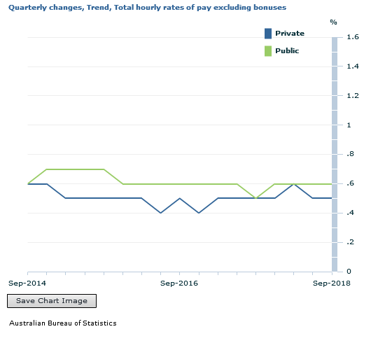
The seasonally adjusted Wage Price Index (WPI) rose 0.6 per cent in September quarter 2018 and 2.3 per cent through the year, according to figures released today by the Australian Bureau of Statistics (ABS).
The more reliable trend was 0.5% in the September quarter. Private sector wages grew by 0.55% over the quarter, whereas public sector wages grew by 0.61%.
So Public Sector wages are growing more strongly, whilst the private sector continues to struggle. The weak wages growth will dent the budget projections and household budgets.
ABS Chief Economist Bruce Hockman said seasonally adjusted, private sector wages rose 2.1 per cent and public sector wages grew 2.5 per cent, through the year to September quarter 2018.
“There was a higher rate of wage growth recorded across the majority of industries in comparison to this time last year, reflecting the influence of improved labour market conditions,” Mr Hockman said. “Annual wage growth at the Australia level was 2.3%, the highest growth rate since September quarter 2015.”
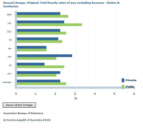
In original terms, annualgrowth to the September quarter 2018 ranged from 1.8 per cent for the Mining and Retail trade industries to 2.8 per cent for the Health care and social assistance industry.
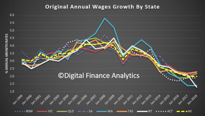
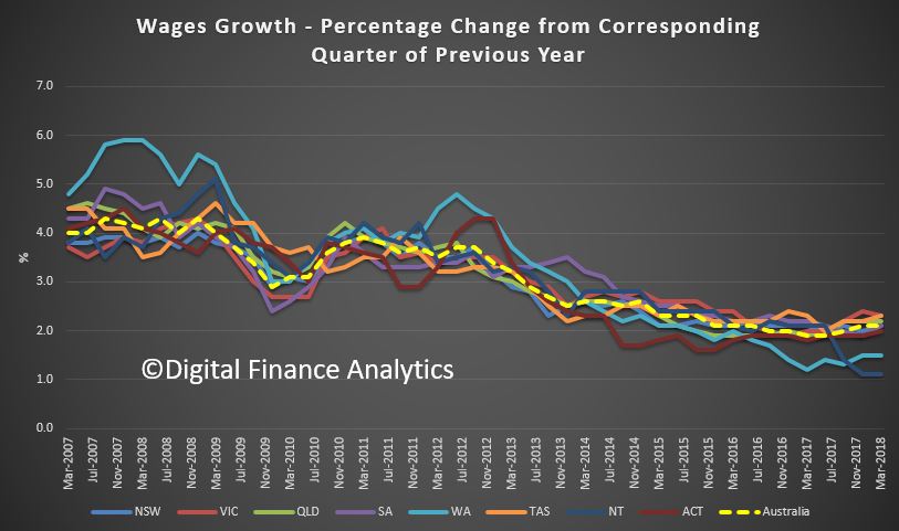
Western Australia recorded the lowest through the year wage growth of 1.8 per cent while Tasmania recorded the highest of 2.6 per cent.
The ABS also released today a feature article that extends previous research looking at the factors underpinning wage growth. The article,Update on the Size and Frequency of Wage Changes, usesjob-level micro data and shows that over the last two years the average frequency of wage changes has increased while the average size of wage rises has remained broadly stable.
Increased inequality and low wage growth are constraining economic growth. But why is wage growth so low? And how should policymakers respond?
Income inequality has increased significantly in most advanced economies since the early 1980s. In particular, very low rates of wage increase are widely blamed for the weak growth in aggregate demand this century and secular stagnation since the Global Financial Crisis. The GFC was itself brought on by the rise in consumer debt that was used at first to support demand in an attempt to offset the impact of weak wage growth.
Fairfax columnist Ross Gittins recently noted that “many economists were disappointed by this week’s news … that consumer prices rose only 2.1%”. That was because low inflation is “usually a symptom of weak growth in economic activity and, in particular, of weak growth in wages”.
Thus, today it is widely agreed that wages need to increase faster. The OECD, the IMF, leading US scholars, former US Treasury Secretary Larry Summers, Nobel prize winner Joseph Stiglitz and most recently Stephen Bell and I in our book, Fair Share, have all argued that increasing inequality is bad for economic growth.
To solve this problem, the critical issue for policymakers is what is causing this rising inequality and weak wage growth? Unless we better understand the causes, we are unlikely to achieve an effective policy solution.
First, we can quickly dismiss the explanation offered by federal Treasurer Scott Morrison, whose so-called “economic plan” assumes present low wage growth will respond positively to higher company profits. According to Morrison, a company tax cut will lead to more investment and thus more jobs, so eventually the benefits will trickle down and increase wages.
Unfortunately, this logic is the reverse of reality. It ignores the evidence that slow wage growth across all the developed economies has been a problem over a couple of decades now.
Slow wage growth is a continuing long-term problem in the developed economies.CC BY-ND
In fact, the evidence strongly suggests higher profits will not drive higher wages. The benefits of a company tax cut will largely be returned to shareholders, while the only wages that increase will be those of senior management.
Instead, higher investment will require increased consumer demand. And that in turn depends on stronger wage growth. In short, aggregate demand in a flat economy, like ours, is wages-led. Wages drive investment, not the other way around.
Broadly speaking, there are two serious schools of thought about what is causing weak wage growth and rising inequality.
One explanation puts most of the blame on a weakening of trade-union power.
The other explanation emphasises the impacts of technological change and, to a lesser extent, globalisation on the labour market. Together technology and globalisation are said to have changed job structures and demands for skills. They have reduced the share of middle-level jobs, which has directly increased income inequality, and they can depress the demand for labour more generally and thus wages in developed countries, but especially for less skilled labour.
These two explanations are not mutually exclusive – both may have played a role. However, I want to consider their relative significance as the basis for arguing which policy responses should be given priority.
Trade union power in Australia and its impact
A very distinguished professor of labour economics and former Industrial Relations Commission deputy president, Joe Isaac, recently argued persuasively that an important explanation of slow wage growth is “to be found in the change in the balance of power in favour of employers and against workers and unions”.
Isaac starts by noting that union membership in Australia has fallen from about 50% of all employees in the 1970s to the present 15%. This is one of the lowest rates in the OECD.
Isaac also finds some correlation between income inequality (measured by the Gini coefficient) and trade union density for 11 OECD countries. More relevant, though, would be the change in inequality relative to the change in union membership, especially as Australia has always had a relatively high Gini coefficient.
Isaac argues that this loss of membership and the reduced authority of the Fair Work Commission has weakened the bargaining power of organised labour in Australia. Employers are now able “to determine no wage increase or an increase less than their profits would warrant, with less resistance from workers and unions”. Although Isaac admits that “this conclusion is based on the association over time of union power decline and slow wages growth”, he concludes that “it seems reasonable to claim, at least prima facie, a causal connection between them”.
I am more sceptical. While I wouldn’t rule out any impact on wages and employee conditions from a decline in trade union membership and the possibly associated changes in the power of the Fair Work Commission, I question Isaac’s analysis for the following reasons.
First, it is uncertain how much trade union power has declined as a result of loss of membership. Another test of trade union power is the proportion of wages determined by awards and collective agreements – as Isaac shows, this proportion has largely remained the same in Australia. Indeed, in some countries, such as France, trade union membership has always been very low, but they have a highly centralised system of wage determination, which allows the unions a lot of influence.
Second, other countries have also experienced increases in inequality – much greater than in Australia in most cases – but don’t seem to have experienced any notable loss of union power. For example, some of the biggest increases in inequality over the last 30 years, as measured by the Gini coefficient for final disposable income, have occurred in countries like Sweden, Finland and Germany, which are not associated with any loss of trade union power.
Third, Isaac’s analysis of wage inequality focuses entirely on a decline in the wage share of total factor income. This ignores changes within the distribution of earnings. These latter changes are more important in many countries, and certainly for Australia.
While the wage share in Australia has declined since the 1970s and early 1980s, this was at least partly a result of deliberate policy under the Hawke/Keating governments’ Accord with the trade unions, when it was accepted that the wage share had been too high. Even today the wage share is still higher than in 1960, when the economy was generally considered to be performing exceptionally well.
Fourth, the changes in the distribution of earnings largely reflect changes in the structure of occupations rather than changes in relative wage rates. But trade unions seek to influence wage rates, and it is difficult to see how they can exert much direct influence over the structure of jobs.
For these various reasons, I don’t think the loss, if any, of trade union power can explain much of the increase in inequality in most countries over the last 30 years. It is necessary to look elsewhere for the explanation, and the main driver seems to have been the impact of technological change.
Impacts of technology and globalisation
In Fair Share, Stephen Bell and I examine the causes of increased inequality over the last 30 years in most of the advanced economies. A critical starting point is to distinguish between changes in the job structure and changes in relative wage rates. As we note:
Even if there were no change in relative wage rates, but employment increased faster for both high-paid and low-paid jobs, the earnings distribution would show up as more unequal. What would have happened is that the composition of the top and lowest deciles of earnings would have altered, which would increase the median income of the top decile and reduce the median income of the lowest decile, which would in turn be reported as an increase in the inequality of earnings.
The consensus in the studies we reviewed is that increased inequality of earnings largely reflects the impact of technological change. Globalisation and increased participation in global value chains may also have played a role, but less so in Australia, which we attribute to Australia having a more flexible labour market than, say, America.
We also surmise that increased financialisation and the capture of rents generated by technological change may help explain the very large increase in remuneration for the top 1%.
Interestingly, the OECD specifically rejected the hypothesis that regulatory changes have helped drive any significant increase in inequality. It found that “the net effect of regulatory reforms on trends in ‘overall earnings inequality’ remains indeterminant in most cases”.
Technological change has also driven the fall in the relative price of capital goods. This has led to some substitution of capital for labour. Again, this is “particularly pronounced in industries with a high predominance of routine tasks”, as the OECD notes.
These changes in job structure and the relative decline in the middle-level jobs have been the most important cause of increasing inequality in many countries, including Australia. Technological progress has also led to an increase in the demand for skills. In some countries that has increased the premium paid for skilled labour, but the extent of this depends upon the policy response affecting the supply of skills.
In Australia’s case, Bell and I find that the premium for skills, and consequently relative wage rates, did not change much because of the increase in education and training effort. Accordingly, much of the increase in earnings inequality in Australia reflects changes in the job structure rather than changes in relative wage rates (see also Keating and Coelli & Borland).
So what does this mean for policy?
Consistent with his view that a weakening of trade union power has driven the increase in inequality, Isaac recommends changing the Fair Work Act to rectify “the unbalanced industrial power in the labour market”. I can support most of Isaac’s recommended changes, and especially greater rights of union entry, which should help better police adherence to awards and wage agreements.
I also agree that Isaac’s recommended legislative changes are unlikely to result in unions abusing their increased power. This is because, as he puts it, “there are now prevailing forces, such as global competition and structural changes, which will continue to keep union power in check”.
However, these “prevailing forces” are what really caused most of the increase in inequality, as discussed above. I therefore doubt that these legislative changes will do much to reverse the increase in earnings inequality.
Instead, the best way to respond to the impact of technological change on the job structure and possible associated changes in wage premiums is to improve education and training. Enhanced education, training and labour market policies will help workers adjust to the challenges posed by new technologies and will also spur the adoption of those technologies.
In addition, if the supply of skills thereby increases in line with the increase in their demand, there should not need to be any change in relative wage rates. Although these types of reforms take time, in the end they can boost both aggregate demand and potential output, with benefits all round.
The seasonally adjusted Wage Price Index (WPI) rose 0.6 per cent in June quarter 2018 and 2.1 per cent through the year, according to figures released today by the Australian Bureau of Statistics (ABS).
Seasonally adjusted, private sector wages rose 2.0 per cent and public sector wages grew 2.4 per cent through the year to June quarter 2018.
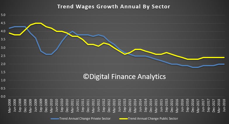
The trend data tracks a similar path, with public sector wages growth consistently stronger than the private sector.
ABS Chief Economist Bruce Hockman said “Wage growth in Australia has grown at an annual rate of 2.1 per cent, continuing to stabilise between 2.0 and 2.1 per cent over the past four quarters. Annual growth across industries is varied with diverse wage pressure across the labour market.”
In original terms, through the year wage growth to the June quarter 2018 ranged from 1.3 per cent for the Mining industry to 2.7 per cent for the Health care and social assistance industry.
Western Australia and the Northern Territory both recorded the lowest through the year wage growth of 1.3 and 1.4 per cent respectively while Victoria and Tasmania recorded the highest of 2.3 per cent. New South Wales was 2.1 per cent.
Debate continues over the Turnbull government’s proposal to cut the corporate tax rate from 30% to 25% for businesses with turnover of more than A$50 million.
One major point of contention is the possible effect of the tax cuts on Australian wages.
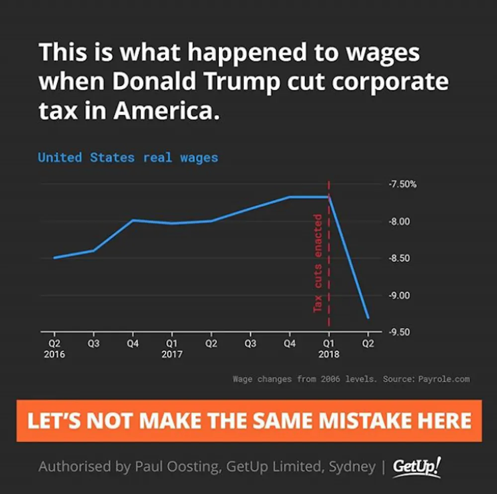
A social media post shared by lobby group GetUp! Australia argued against the tax cuts, suggesting that US real wages fell after the Trump administration cut corporate tax rates from 35% to 21%.
Let’s take a closer look.
Checking the source
The Conversation requested sources and comment from GetUp! to support the data used in the graph, and the suggestion that there had been a causal relationship between the enactment of corporate tax cuts in the US and a reduction in real wages.
We first found the graph in Bloomberg in this article by economics blogger and former Assistant Professor of Finance at Stony Brook University, Noah Smith.
The underlying data comes from the Payscale Real Wage Index – adjusted for inflation. We noted that percentage change since 2006 is an unorthodox Y axis for a wages graph, but that’s what the Payscale Index tracks.
We added the marker of the corporate tax rate being cut in the United States, which while passed in Q4 [the fourth quarter] of 2017, came into effect in Q1 [the first quarter] of 2018.
Note that in the Instagram image, we attributed Payrole.com as the source, instead of Payscale.com. This was a drafting error on our part.
Proponents of corporate tax cuts both in the US and Australia have asserted that there is a causal relationship between a lower corporate tax rate and higher wages (see US example and Australian example). The graph we posted in Instagram demonstrates that, in the US experience, that has not been the case.
This suggests that there is no causal relationship between a lower corporate tax rate and higher wages, and that cutting the corporate tax rate based on an expected flow on effect to wages would be a mistake.
Verdict
The social media post shared by GetUp! Australia, which could be read by many as suggesting that US corporate tax cuts caused wages to fall, is problematic and potentially misleading for two reasons.
Firstly: charts constructed with data from the US Bureau of Labor Statistics suggest that the chart used by GetUp! overestimates the drop in wage growth in the US between the first and second quarters of 2018.
According to the Bureau of Labor Statistics data, wage growth over that period declined slightly (rather than significantly), or was moderately positive, depending on the measure used.
Secondly, and most importantly: the chart used by GetUp! can’t conclusively establish any causal relationship between the enactment of US corporate tax cuts in January 2018 and any drop in wage growth.
While the chart does not support the argument that corporate tax cuts cause higher wages, it also cannot conclusively reject it.
What does the GetUp! chart show and suggest?
The social media post shared by GetUp! has the title: “This is what happened to wages when Donald Trump cut corporate tax in America.”
It shows a line chart with the heading: “United States real wages.” The reference to “real wages” means the index has been adjusted for inflation. A note below the chart says the wage changes are relative to 2006 levels.
The line chart depicts US real wages rising from minus 8.50% of 2006 levels in Q2 2016, to minus 7.70% in Q1 2018. A vertical line marks the point in Q1 2018 when the tax cuts were enacted. The line then shows a drop to minus 9.30% of 2006 levels in Q2 2018.
A reader could quite easily interpret the chart as meaning the enactment of corporate tax cuts in the US had an immediate and negative effect on real wage growth.
The subtitle reads: “Let’s not make the same mistake here.”
Are the data used in the chart appropriate?
As noted by GetUp! in their response to The Conversation, the source for the data used in the chart is Payscale, not payrole.com, as stated in the post.
Payscale is a US commercial company that provides information about salaries. The company publishes a quarterly wage index based on its own data, which it says is based on more than 300,000 employee profiles in each quarter, capturing the total cash compensation of full time employees in private industry and education professionals in the US.
Given the commercial nature of Payscale data, I don’t have access to their primary dataset, and can only rely on the description of the methodology reported on their website. I have no reason to doubt the validity of the data and/or the methodology.
I do, however, suggest that presenting the data in the form of percentage changes from 2006 is not ideal for an assessment of wage dynamics around the time of the enactment of corporate tax cuts.
In their response to The Conversation, GetUp! did acknowledge that “percentage change since 2006 is an unorthodox Y axis for a wages graph”.
It would be more informative to present the data as percentage changes between one quarter and the same quarter of the previous year, or between two consecutive quarters. I have done this in the two charts below, using the data publicly available from Payscale.
The story is qualitatively similar to that shown in the chart presented by GetUp!. Therefore, we can say that – based on the Payscale data – real wages seem to have dropped between the first and second quarters of 2018.
Is Payscale the best source for this kind of analysis?
While there is no reason to believe that the Payscale data are incorrect, it is worth considering a more standard statistical source.
Earnings data for the US are available from a variety of institutions. The difficulty, in this case, is that there are many different statistical definitions of earnings and wages depending on which sectors, geographical areas, and types of employees are observed.
One of the most commonly used definitions is the “average hourly earnings of production and non-supervisory employees on private payrolls”, with monthly data supplied by the US Bureau of Labor Statistics.
Using these data, I have recomputed changes in real wages (adjusted for inflation) between one quarter to the same quarter of the previous year and between two consecutive quarters.
These two charts based on US Bureau of Labor Statistics data tell a different story from the charts based on the Payscale data.
In particular, the change in wages between the first and second quarters of 2018 is moderately positive (+0.4%) rather than significantly negative (minus 1.7% based on the Payscale data).
The drop in wages between the second quarter of 2017 and the second quarter of 2018 is also less sharp (minus 0.11%, compared to minus 1.4% from the Payscale data).
These differences may be determined by the different coverage and/or statistical definitions used by Payscale and the US Bureau of Labor Statistics to measure wages and compensation.
The story the GetUp! chart suggests: is it correct?
The combination of the words and the image could suggest to some that there was a causal relationship between the enactment of corporate tax cuts and a drop in real wages in the US.
But the chart used in the post isn’t suited to provide any evidence on causality.
That’s because changes in real wages can be determined by a variety of economic factors, such as changes in the makeup of the labour force and business cycle fluctuations. A chart like the one published by GetUp! can’t possibly isolate the impact of just one factor.
The observation that wage growth dropped around the time of the enactment of the corporate tax cuts doesn’t automatically imply that this drop was caused by the tax cuts. At best, a correlation between the two events can be established, not a causal effect.
We also need to keep in mind that the relationship between tax cuts and wages is likely to involve time lags. The effect of corporate tax cuts on wages, or any other economic variable, takes time to feed through the economic system and to show up in the data. This reinforces the argument that the chart demonstrates correlation, rather than causality.
Having said that, while the data used cannot provide evidence for the argument that corporate tax cuts lead to lower wages, it cannot conclusively reject the argument, either. – Fabrizio Carmignani
Blind review
The GetUp! chart is captioned: “This is what happened when Donald Trump cut corporate tax in America.” Strictly speaking, GetUp! don’t actually claim that the corporate tax cut caused the wage to fall, but it is certainly what the reader is led to believe.
The author has identified the key problem with the GetUp! chart, which is that there is no evidence that the fall in real wages was caused by the enactment of corporate tax cuts. In fact, the chart provides no evidence to either support or reject the premise that a corporate tax cut would have any effect on wages.
The alternative data sourced by the author from the US Bureau of Labor Statistics cast some doubt on the accuracy of the data used by GetUp!, yet this is a distraction from the main argument that neither chart proves causality between corporate tax cuts and wage growth.
As the author says, there are many factors that influence real wage growth. Some examples include changes in the skills and experience of the working population, changes in government expenditure, and of course, changes to tax policy. It would be a mistake to attribute the recent decline in US wages to any single factor, such as the cut to the corporate tax rate.
This is why economic modelling is so powerful. In a “laboratory”, economic modellers can build two versions of the world: one with a tax cut and one without. With all other things held equal, the only differences between these two worlds must be a consequence of the tax cut.
Economic modelling produced by Victoria University’s Centre of Policy Studies (and of which I was an author) finds that despite stimulating growth in pre-tax real wages, a company tax cut would cause a fall in the average incomes of the Australian population.
So while this FactCheck shows that the wage chart from GetUp! is inconclusive, my view (based on the Victoria University modelling) is that company tax cuts could be a “mistake” where wages are concerned. – Janine Dixon
Author: Fabrizio Carmignani Professor, Griffith Business School, Griffith University; Reviewer: Janine Dixon Economist at Centre of Policy Studies, Victoria University
RBA Governor Philip Lowe discussed the state of the economy today, in a speech “Productivity, Wages and Prosperity“. His remarks included a section on wage growth. He concluded that any pick-up is expected to be only gradual given both the spare capacity that still exists in our labour market and the structural factors at work.
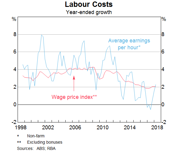
Over recent times, wages growth around the 2 per cent mark has become the norm in Australia. Some time back, the norm was more like 3 to 4 per cent. This downward shift in the rate of wages growth is clearly evident in the wage price index as well as in the more volatile measure of average hourly earnings in the national accounts.
There are both cyclical and structural explanations for why this change has taken place.
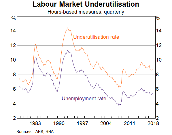
From the cyclical perspective, there is still spare capacity in the labour market. The unemployment rate has been around 5½ per cent for a year now. While we can’t be definitive about what constitutes full employment, most conventional estimates for Australia are that it means an unemployment rate of around 5 per cent. It is possible, though, that we could do better than this, especially if we approach the 5 per cent mark at a steady pace, rather than too quickly. Indeed, in a number of other countries, estimates of the unemployment rate associated with full employment are being revised lower as wage increases remain subdued at low rates of unemployment. We have an open mind as to whether this might turn out to be the case here in Australia too. Time will tell.
Broader measures of underutilisation suggest another source of spare capacity in the labour market. Currently, around one-third of workers work part time, with most of these people wanting to work part time for personal reasons. However, of those working part time, around one-quarter would like to work more hours than they do; on average, they are seeking an extra two days a week. If we account for this, these extra hours are equivalent to around 3 per cent of the labour force. This suggests an overall labour underutilisation rate of 8¾ per cent, compared with the 5½ per cent traditional unemployment rate measure based on the number of unemployed people.
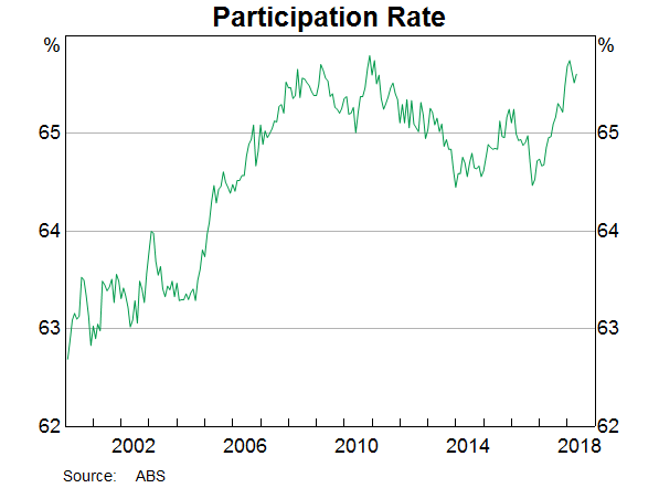
Recent experience also reminds us of another important source of labour supply; that is, higher labour force participation. As we have seen over recent times, when the jobs are there, people stay in the workforce longer and others, who had not been looking for jobs, start looking. So the supply side of the labour market is quite flexible, even more so than we expected.
Another cyclical element that has affected average hourly earnings over recent years is the decline in very highly paid jobs in the resources sector as the boom in mining investment wound down. It looks, though, that this compositional shift has now largely run its course.
These various factors go some way to explaining the low wages growth over recent times. When there is spare capacity in the labour market, it is understandable that wages growth is slow.
Yet, alone, these cyclical factors don’t fully explain what is going on. Some structural factors also appear to be at work, with perhaps the most important of these related to competition and technology. I will come back to this in a moment.
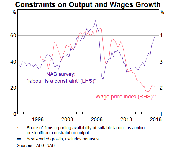
The idea that structural factors are at work is supported by this next graph, which shows the wage price index and the responses to the NAB business survey where firms are asked whether the availability of labour is a constraint on output. While there is still spare capacity in the labour market, firms are finding it more difficult to find suitable workers. Yet despite this difficulty, wages growth has not responded in the way that it once did.
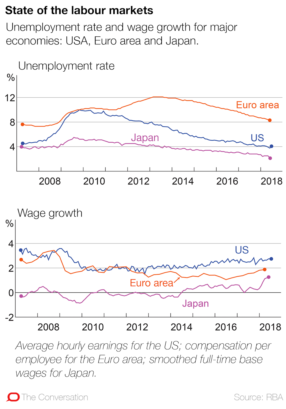
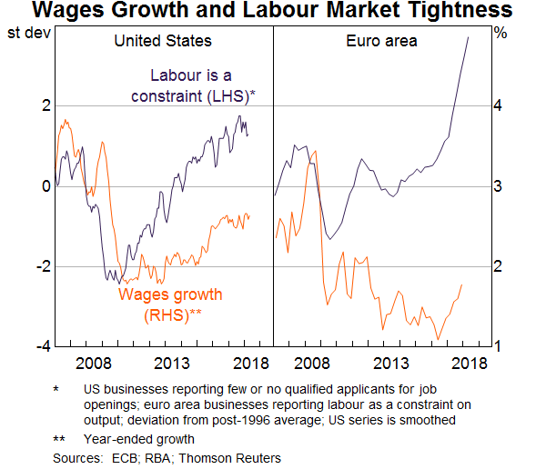
A similar pattern is evident overseas. This next graph shows wages growth in the United States and the euro area as well as survey-based measures of labour market tightness (similar to those in the NAB survey). In both economies, wages growth has picked up in response to tighter labour markets, but the response is not as large as it has been in the past.
We are still trying to understand fully why things look different in so many countries and how persistent this will be. Part of the story is likely to be changes in the bargaining power of workers and an increase in the supply of workers as the global economy becomes increasingly integrated. But another important part of the story lies in the nature of recent technological progress.
There are a couple of aspects of this progress that are worth pointing out. One is that it has been heavily focused on software and information technology, rather than installing new and better machines – or on intangible capital rather than physical capital. The second is that the dispersion of technology and productivity between leading and lagging firms has increased, perhaps because of the uneven ability of firms to innovate and use the new technologies. The OECD has done some very interesting work documenting this increasing productivity gap.
Both of these aspects of technological progress are affecting wage dynamics. The returns to those who can develop and best use information technology have increased strongly. These returns, though, are often highly concentrated in a few firms and in only certain segments of the labour market. At the same time, the firms that are not able to innovate and take advantage of new technologies as quickly are slipping behind and they feel under pressure. As a way of remaining competitive, many of these firms are responding by having a very strong focus on cost control. In many cases this translates into a focus on controlling labour costs. This cost-control mentality does not make for an environment where firms are willing to pay larger wage increases.
Over time, we can expect the diffusion of new technology to take place. This is what the historical record suggests. I am optimistic that this diffusion will boost aggregate productivity and lift our real wages and incomes. Advances in information technology, in artificial intelligence and in machine learning have the potential to reshape our economies profoundly and lift average living standards in ways that are difficult to envisage today. But the adoption and the diffusion of these new technologies is a gradual process; it takes time. While it is taking place, the benefits of new technologies are accruing unevenly across the community. In my view, this is one of the key structural factors at work.
Whatever weight one places on these various factors constraining wages growth, it is clear that the slow growth in wages is affecting our economy.
On the positive side of the ledger, it is one of the factors that has helped boost employment growth over recent times. Of course, there are other effects as well.
One is that the low growth in wages is contributing to low rates of inflation in Australia. Indeed, if wages growth were to continue at around its current rate for an extended period, it is unlikely that the rate of inflation would average around the midpoint of the inflation target in the period ahead. Wages growth of 2 per cent and reasonable labour productivity growth are unlikely to make for 2½ per cent inflation on a sustained basis.
Another consequence is that real debt burdens stay higher for longer. Many people who borrowed expected their incomes to grow at something like the old rate rather than the current rate. With their expectations not being realised, the real value of the debt stays higher than they expected and this is likely to affect their spending decisions.
And beyond these purely economic effects, the slow wages growth is diminishing our sense of shared prosperity. If this remains the case, it can make needed economic reforms more difficult.
Given these various effects, some pick-up in wages growth would be a welcome development. It would help deliver a rate of inflation consistent with the target, it would help with the debt situation and it would add to our sense of shared prosperity.
In my judgement, a return, over time, to a world where wage increases started with a 3 rather than a 2 is both possible and desirable. To be clear, this is not a call for a sudden jump in wages growth from current rates to 3 point something. Rather, we will be better off if this increase takes place steadily over time as the economy improves.
There are some signs that we are starting to move in this direction, but it is likely to be a gradual process.
Labour markets in most parts of the country have tightened over the past year. One piece of evidence in support of this is the responses to the NAB survey I showed earlier. There has been a sharp increase in the share of firms reporting the availability of labour as a constraint (Graph 6). The only other time in the past 25 years where this share has been as high as it is now was in the early stages of the resources boom. These survey results are consistent with what the RBA is hearing through our own business liaison program.
One explanation for why firms are reporting that it is hard to find workers with the necessary skills is that the very high focus on cost control over recent times has led to reduced work-related training. With the labour market now tightening, we are perhaps starting to pay the price for this. On a more positive note, a number of businesses and industry associations are now starting to address the skills shortage. Some businesses also tell us that another factor that has made it more difficult to find workers with the necessary skills is the tightening of visa requirements.
It’s reasonable to expect that as the labour market tightens, wages growth will pick up. The laws of supply and demand still work. Consistent with this, we hear reports through our liaison program of wages increasing more quickly in areas where there are capacity constraints, although these reports are still not very common.
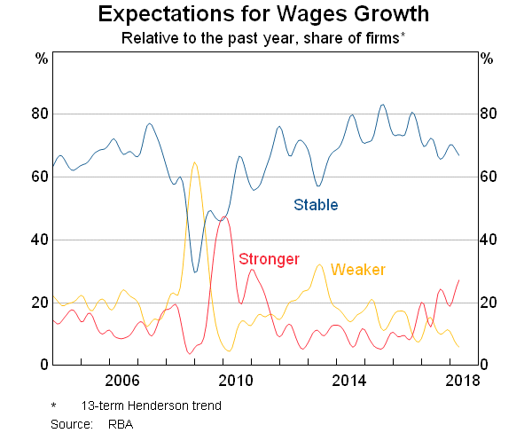
As part of our liaison program we also ask firms about their expectations for wages growth over the next year: whether it will be lower, higher or about the same as the recent past. The results are shown in this next graph. There are now more firms expecting a pick-up in wages growth and fewer firms expecting a decline compared with recent years.
So it is reasonable to expect growth in wages to pick up from here. To repeat the point, though, this pick-up is expected to be only gradual given both the spare capacity that still exists in our labour market and the structural factors at work.
The Reserve Bank of Australia (RBA) is making an explicit trade-off between inflation and financial stability concerns. And this could be weighing on Australians’ wages.
In the past, the RBA focused more on keeping inflation in check, the usual role of the central bank. But now the bank is playing more into concerns about financial stability risks in explaining why it is persistently undershooting the middle of its inflation target.
In the wake of the global financial crisis, the federal Treasurer and Reserve Bank governor signed an updated agreement on what the bank should focus on in setting interest rates. This included a new section on financial stability.
That statement made clear that financial stability was to be pursued without compromising the RBA’s traditional focus on inflation.
The latest agreement, adopted when Philip Lowe became governor of the bank in 2016, means the bank can pursue the financial stability objective even at the expense of the inflation target, at least in the short-term.
While the RBA board has explained its recent steady interest rate decisions partly on the basis of risks to financial stability, this sits uneasily with what the RBA otherwise has to say about underlying fundamentals of our economy.
It correctly blames trends in house prices and household debt on a lack of supply of housing, and not on excessive borrowing. These supply restrictions amplify the response of house prices to changes in demand for housing. RBA research estimates that zoning alone adds 73% to the marginal cost of houses in Sydney.
Restrictions on lending growth by the Australian Prudential Regulation Authority since the end of 2014 have been designed to give housing supply a chance to catch-up with demand and to maintain the resilience of households against future shocks.
The RBA argues that it needs to balance financial stability risks against the need to stimulate the economy through lower interest rates. But this has left inflation running below the middle of its target range and helps explain why wages growth has been weak.
The official cash rate has been left unchanged since August 2016, the longest period of steady policy rates on record. The fact that inflation has undershot its target of 2-3% is the most straightforward evidence that monetary policy has been too restrictive.
While long-term interest rates in the US continue to rise, reflecting expectations for stronger economic growth and higher inflation, Australia’s long-term interest rates have languished.
Australian long-term interest rates are below those in the US by the largest margin since the early 1980s. This implies the Australian economy is expected to underperform that of the US in the years ahead.
Inflation expectations (implied by Australia’s long-term interest rates) have been stuck around 2% in recent years, below the Reserve Bank’s desired average for inflation of 2.5%.
Financial markets can be forgiven for thinking the RBA will not hit the middle of its 2-3% target range any time soon. The RBA doesn’t believe it will either, with its deputy governor Guy Debelle repeating the word “gradual” no less than 12 times in a speech when describing the outlook for inflation and wages.
Inflation has been below the midpoint of the target range since the December quarter in 2014. On the RBA’s own forecasts inflation isn’t expected to return to the middle of the target range over the next two years.
The Reserve Bank blames low inflation on slow wages growth, claiming in its most recent statement on monetary policythat “labour costs are a key driver of inflationary pressure”. But this is putting the cart before the horse.
In fact, recently published research shows that it is low inflation expectations that are largely to blame for low wages growth.
Workers and employers look at likely inflation outcomes when negotiating over wages. These expectations are in turn driven by perceptions of monetary policy.
Below target inflation makes Australia less resilient to economic shocks, not least because it works against the objective of stabilising the household debt to income ratio. Subdued economic growth and inflation also gives the economy a weaker starting point if and when an actual shock does occur, potentially exacerbating a future downturn.
When the RBA governor and the federal treasurer renegotiate their agreement on monetary policy after the next election, the treasurer should insist on reinstating the wording of the 2010 statement that explicitly prioritised the inflation target over financial stability risks.
If the RBA continues to sacrifice its inflation target on the altar of financial stability risks, inflation expectations and wages growth will continue to languish and the economy underperform its potential.
Author: Stephen Kirchner, Program Director, Trade and Investment, United States Studies Centre, University of Sydney
In fact you can mount an argument the federal budget is already shot as a result.
The seasonally adjusted Wage Price Index (WPI) rose 0.5 per cent in March quarter 2018 and 2.1 per cent through the year.
Seasonally adjusted, private sector wages rose 1.9 per cent and public sector wages grew 2.3 per cent through the year to March quarter 2018.
In original terms, through the year wage growth to the March quarter 2018 ranged from 1.4 per cent for the Mining industry to 2.7 per cent for the Health care and social assistance industry.
Victoria and Tasmania both recorded the highest through the year wage growth of 2.3 per cent and the Northern Territory recorded the lowest of 1.1 per cent.
And bear in mind this weak result comes despite the Fair Work Commission’s June 2017 decision which lifted the minimum wage 3.3% and to $18.29 from July and flowed to ~2.3 million workers. This means the annual wages growth number contains this artificial artifact which means the underlying would be even lower.
And by the way you can argue this metric overstates the true picture as we see a lift in low paid jobs away from higher paid areas, like mining, and the ABS data does not adjust for this.
For comparison, the Average Compensation of Employees from the national accounts which is to December 2017 is tracking even lower circa 1.3%.
We got some more data on the state of the Australian Economy today from RBA Deputy Governor, Guy Debelle, which built on the recently released Statement on Monetary Policy (SMP).
There were four items which caught my attention.
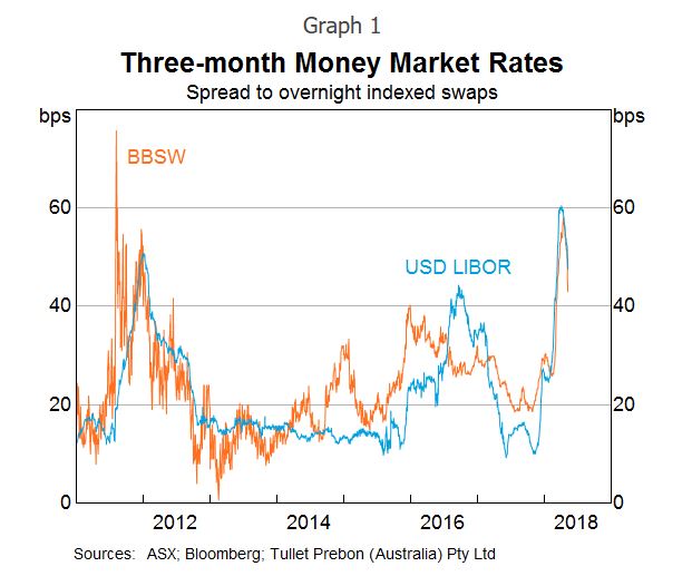
First, the recent rise in money market interest rates in the US, particularly LIBOR. He said there are a number of explanations for the rise, including a large increase in bill issuance by the US Treasury and the effect of various tax changes on investment decisions by CFOs at some US companies with large cash pools. This rise in LIBOR in the US has been reflected in rises in money market rates in a number of other countries, including here in Australia. This is because the Australian banks raise some of their short-term funding in the US market to fund their $A lending, so the rise in price there has led to a similar rise in the cost of short-term funding for the banks here; that is, a rise in BBSW. This increases the wholesale funding costs for the Australian banks, as well as increasing the costs for borrowers whose lending rates are priced off BBSW, which includes many corporates.
However, he says the effect to date has not been that large in terms of the overall impact on bank funding costs. It is not clear how much of the rise in LIBOR (and hence BBSW) is due to structural changes in money markets and how much is temporary. In the last couple of weeks, these money market rates have declined noticeably from their peaks. But to my mind it shows one of the potential risks ahead.
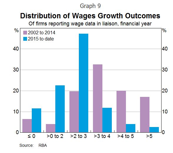
Second the gradual decline in spare capacity is expected to lead to a gradual pick-up in wages growth. But when? The experience of other countries with labour markets closer to full capacity than Australia’s is that wages growth may remain lower than historical experience would suggest. In Australia, 2 per cent seems to have become the focal point for wage outcomes, compared with 3–4 per cent in the past. Work done at the Bank shows the shift of the distribution of wages growth to the left and a bunching of wage outcomes around 2 per cent over the past five years or so.
The RBA says that recent data on wages provides some assurance that wages growth has troughed. The majority of firms surveyed in the Bank’s liaison program expect wages growth to remain broadly stable over the period ahead. Over the past year, there has been a pick-up in firms expecting higher wage growth outcomes. Some part of that is the effect of the Fair Work Commission’s decision to raise award and minimum wages by 3.3 per cent. They suggest there are pockets where wage pressures are more acute. But, while those pockets are increasing gradually, they remain fairly contained at this point
But he concluded that there is a risk that it may take a lower unemployment rate than we currently expect to generate a sustained move higher than the 2 per cent focal point evident in many wage outcomes today.
Third, he takes some comfort from the fact that arrears rates on mortgages remain low. This despite Wayne Byres comment a couple of months back, that at these low interest rates, defaults should be even lower! Debelle said that even in Western Australia, where there has been a marked rise in unemployment and where house prices have fallen by around 10 per cent, arrears rates have risen to around 1½ per cent, which is not all that high compared with what we have seen in other countries in similar circumstances and earlier episodes in Australia’s history. To which I would add, yes but interest rates are ultra-low. What happens if rates rise as we discussed above or unemployment rises further?
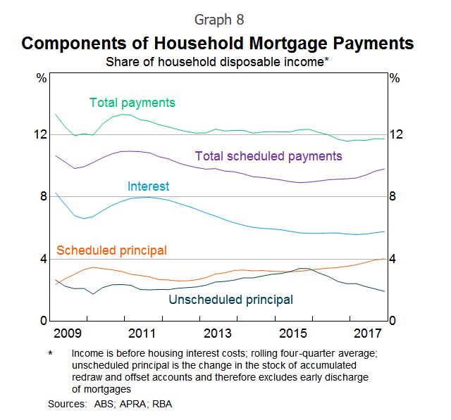
Finally, the interest rate resets on interest-only loans will potentially require mortgage payments to rise by nearly 30–40 per cent for some borrowers. There are a number of these loans whose interest-only periods expire this year. It is worth noting that there were about the same number of loans resetting last year too. The RBA says there are quite a few mitigants which will allow these borrowers to cope with this increase in required payments, including the prevalence of offset accounts and the ability to refinance to a principal and interest loan with a lower interest rate. While some borrowers will clearly struggle with this, our expectation is that most will be able to handle the adjustment so that the overall effect on the economy should be small.
This switch away from interest-only loans should see a shift towards a higher share of scheduled principal repayments relative to unscheduled repayments for a time. We are seeing that in the data. It also implies faster debt amortisation, which may have implications for credit growth.
And there is a risk of a further tightening in lending standards in the period ahead. This may have its largest effect on the amount of funds an individual household can borrow, more than the effect on the number of households that are eligible for a loan. This, in turn, means that credit growth may be slower than otherwise for a time. That he says has more of an implication for house prices, than it does for the outlook for consumption. To which I would add, yes, but consumption is being funded by raiding deposits and higher debt. Hardly sustainable.
So in summary, there are still significant risks in the system and the net effect could well drive prices lower, as credit tightens. And I see the RBA slowly turning towards the views we have held for some time. I guess if there is more of a down turn ahead, they can claim they warned us (despite their settings setting up the problem in the first place).
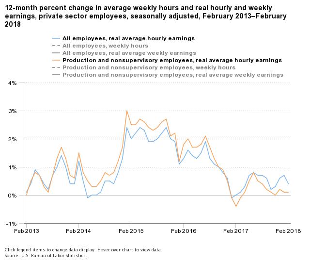
Data from the US Bureau of Labor Statistics shows from February 2017 to February 2018, real average hourly earnings increased 0.4 percent, seasonally adjusted. The increase in real average hourly earnings combined with a 0.3-percent increase in the average workweek resulted in a 0.6-percent increase in real average weekly earnings over the 12-month period.
Real average hourly earnings for production and nonsupervisory employees increased 0.2 percent from January to February, seasonally adjusted. This result stems from a 0.3-percent increase in average hourly earnings combined with a 0.1-percent increase in the Consumer Price Index for Urban Wage Earners and Clerical Workers.
Real average weekly earnings increased 0.8 percent over the month due to the increase in real average hourly earnings combined with a 0.6-percent increase in average weekly hours.
From February 2017 to February 2018, real average hourly earnings increased 0.1 percent, seasonally adjusted. The increase in real average hourly earnings combined with a 0.6-percent increase in the average workweek resulted in a 0.7-percent increase in real average weekly earnings over this period.
NOTE: Seasonally adjusted data are used for estimates of percent change from the same month a year ago for current and constant average hourly and weekly earnings. Special techniques are applied to the CES hours and earnings data in the seasonal adjustment process to mitigate the effect of certain calendar-related fluctuations. Thus, over-the-year changes of these hours and earnings are best measured using seasonally adjusted series. A discussion of the calendar-related fluctuations in the hours and earnings data and the special techniques to remove them is available in the February 2004 issue of Employment and Earnings or at www.bls.gov/ces/cesfltxt.htm.


