
So, we have new data from both CoreLogic and Domain on home price growth. The problem is we are getting somewhat different results, driven presumably by their different methodologies. But is does make it hard to decode the true story in some locations. Trends are still pointing down though.
Here is a plot of changes in values over the past year, based on CoreLogic’s December 2017 and January 2018 data, and the December 2017 data from Domain.
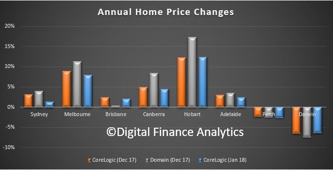 Domain looks more bullish in the eastern states, Brisbane apart. Corelogic is showing a fall between December and January in most east coast states.
Hobart is the winner, but is it 17% or 12%, a large variation. And is Canberra 8% or 4%?
Perth and Darwin and stuck in negative territory.
My take out is that these numbers are dynamic, and should not be taken too seriously, though the trend is probably the best indicator.
Perhaps their respective analysts can explain the variations. I for one would love to understand the differences.
Its a pity we have to wait so long for the ABS price data. But then again, that just adds another data point, which does not directly match.
Another case of being careful with the data!