
We are releasing the results of our rolling household surveys, which were completed before the latest round of bushfires started raging. Nevertheless, the results are a concern because the total number of households registering as financially stressed rose again, to 32.7% of borrowing households. This represent 1.1 million households across the country and a predicted default count of 83,220, despite lower cash rates, and some deeply discounted mortgages.
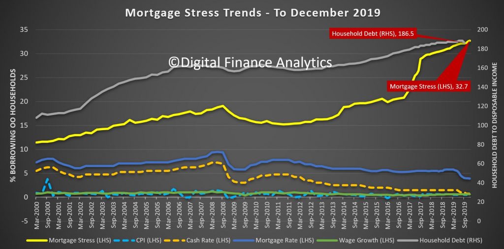
Stress is assessed in cash-flow terms, and when money in is not sufficient to cover the costs of the mortgage and other regular outgoings, the household is flagged as stressed. Granted they may have the capability to tap into deposits, pull down on credit cards, or even sell property, but on a regular basis they are in strife. We find a significant gap between those we assess as at risk, and those who believe they do have financial difficulty. Many adopt the head in the sand approach and hope things will improve, but given the current economic outlook, we think that is a courageous stance to take.
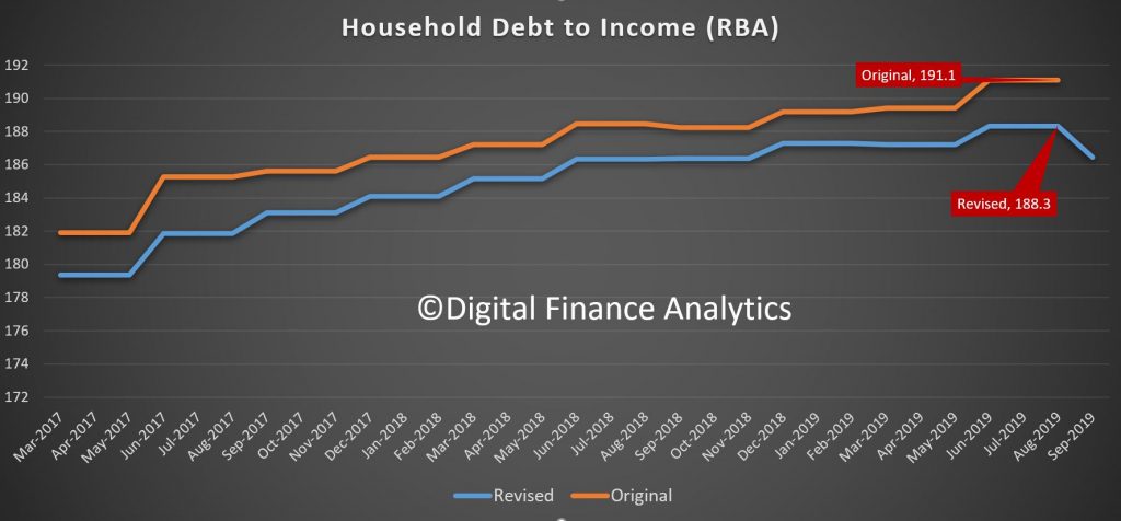
The RBA reported their E2 Selected Household ratios to September just before Christmas and weirdly, the entire debt to income ratio series was restated lower, not just the current quarter, but back through the series. As a result the average debt to income ratio dropped from 191 to a still high 186.5. We always have a issue with this series because it includes small business and households without borrowings, but the downshift in the series is quite significant, and unexplained. I have written to the RBA asking for an explanation. Note this is not the first time the series has been revised down, yet they do not include any explanation in the dataset.
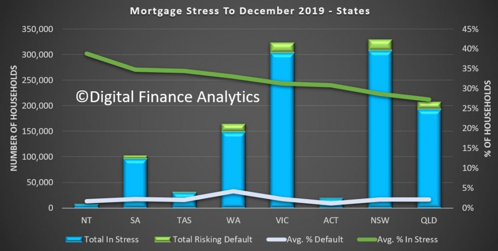
Across the states, NT, SA and TAS recorded the highest proportion of households in difficulty, though WA has the highest default probability risk over the next 12 months at 4.2%, whereas the three most populous states, VIC, NSW and QLD sat at 2.2%. Victoria proportionally to New South Wales has a higher mortgage stress reading.
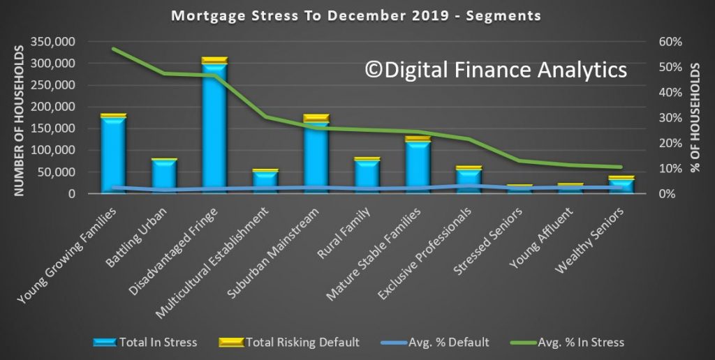
Among the DFA household segments, 57% of young growing households are in mortgage stress, and within this group there is a large cohort of first time buyers. 2.5% of these households risk default in the next 12 months.
47.5% of battling urban households are also in mortgage stress, and 1.7% risk default ahead. Many of these households occupy properties in the urban fringe, often on newish high density estates. The largest cohort is the disadvantaged fringe group, with 300,000 households in stress and 13,00 risking default. Stress continues to build in our more affluent segments too, with young affluent households at 11.3%, or 4,400 households and exclusive professionals at 21.5% in stress and 3.4% risking default. Losses from this exclusive group are expected to be as high as $1 billion dollars, and is the most value exposed group from a lender perspective.
Across the regions, the Central West of Queensland has 75% of households in stress, but only 300 households, followed by Alice Springs at 65% with around 2,000 households exposed.
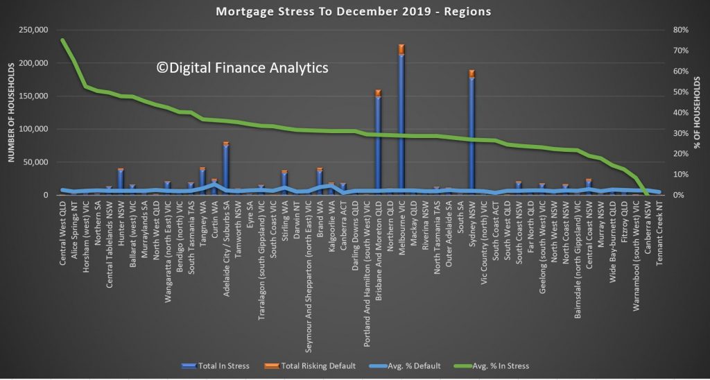
In the larger urban centres Adelaide has 35.9% of households exposed, which equates to 75,000 households, followed by Brisbane and Moreton Bay at 29.2% or 148,000 household, Melbourne at 28.9% or 213,000 households and Sydney at 26.9% with 178,000 households under stress.
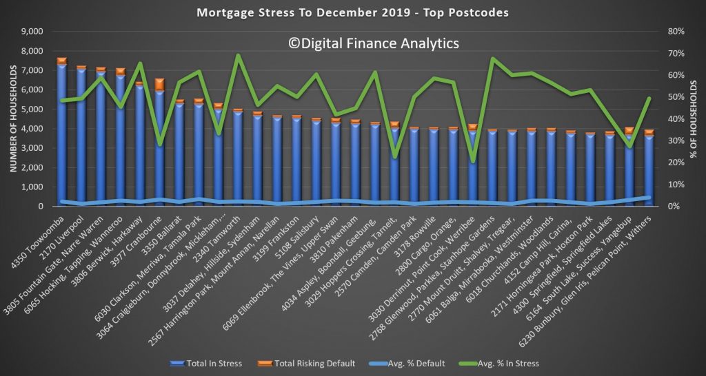
And across the top post codes, Toowoomba 4350, is the highest count at 7,300 households, or 48%, followed by Liverpool 2170 at 49% or 7,080 households, Fountain Gate and Narre Warren 3805 with 6,918 households or 59% and in WA Hocking, Tapping and Wanneroo with 45% of households equating to 6,732.
Given the current economic settings we expect stress to continue to rise. And shortly we will be looking at the latest household financial confidence index from DFA, which continues to highlight challenging times for more and more households.
But in closing, as I often say, households would do well to draw up a cash flow, to identify money in and money out, determine which spending is essential and prioritise accordingly. And remember, if you are in financial difficulty banks have an obligation to assist, so go talk to them, early. Avoid the head in the sand posture, as it leaves other parts horribly exposed!!

– Interesting set of charts !!! Especially that some charts are sorted on a % basis. I was surprised to see that on % basis stress in the NT, TAS & SA is (comperatively) higher than in other states.
– Given the amount of bad / depressing news coming from WA I am surprised to see that the financial stress is still fairly “muted”.
– One thing stands out like a sore thumb. Financial stress is (on a % basis) the highest in – what you call – “Young Growing Families”. That’s not surprising because I assume these families have (young) children and as those children grow older these children costs more and more. This a point – the relationship between family spending and the age of children- one Harry S. Dent also emphasizes. No wonder these families are in such a stress.
– When I read the words “Young Growing Families” then one word pops up in my mind: MILLENNIALS !!!!!!! If those MILLENNIALS are going “belly up” (financially) in droves then the Baby Boomers should be VERY, VERY afraid !!! – E.g. who is going to save those Boomers’ (financial) bacon when the millennials aren’t able to do so ? The same applies to when Baby Boomers are going “belly up” in droves. Then the Millennials are going to feel that in their wallet as well (to put it friendly).
– But other categories are less clear, less well defined. E.g. People from the “Battling urban” could have any age. People in their twenties ? thirties ? fourties ?
– Suggestion / Question: Perhaps you’re able to take the financial / mortgage stress and sort that info on age group and % basis, as well ? And are you willing to publish that info, such a chart here on your blog ? Or is this propietary information of DFA ? Perhaps you could publish such a chart once to give the people a taste of what the work of DFA entails ?
(I only now had time to watch the video)
– I love the way the data is presented in these charts. Because it shows both the % and the amount of households in financial stress in one chart. It shows e.g. that VIC & NSW are (on a % basis) are doing (relatively) well.
– But when one looks at the amount of households in financial stress then VIC & NSW are worse off.
– Question: Perhaps it’s time for an update for the charts for “Negative Equity”, this time also on a % basis ?
I have that data, so when I have time, I might update…