As we highlighted recently, the Bank of England is supporting the imposition of loan to income (LTI) ratios on banks in the UK, as a way to manage risks in the housing sector. So today, we start to explore loan to income data in Australia, captured though our rolling programme of household surveys. We start with some average national data, then look at the NSW picture in more detail. The UK recommendation, was to ensure that mortgage lenders do not extend more than 15% of their total number of new residential mortgages at Loan to Income ratios at or greater than 4.5. This recommendation applies to all lenders which extend residential mortgage lending in excess of £100 million per annum.
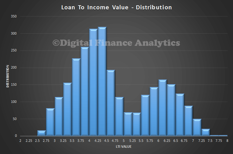
So whats the Australian data? We start by looking at the average LTI by postcode. The histogram shows the average LTI by household, calculated at a postcode level, and including all households with a mortgage. Income means the gross annual income, before tax or other deductions. We see that the LTI varies between 2.25 and 8. This is the ratio of household income to the size of the mortgage. We see a peak around 4.25-4.5 times, and a second peak at 6.25. Newer loans are more represented in this second peak.
Loan to income is a good indicator, because it isolates movements in house prices altogether from the data. The rule of thumb when I was working in the bank as a lender was to take 3 times the first income, and add one times the second income as a measure of the loan which was available to a household. Although rough, it was not too bad. Since then, lending rules have changed and criteria stretched. This ability to lend more has in turn led to higher house price inflation, thanks to supply/demand dynamics.
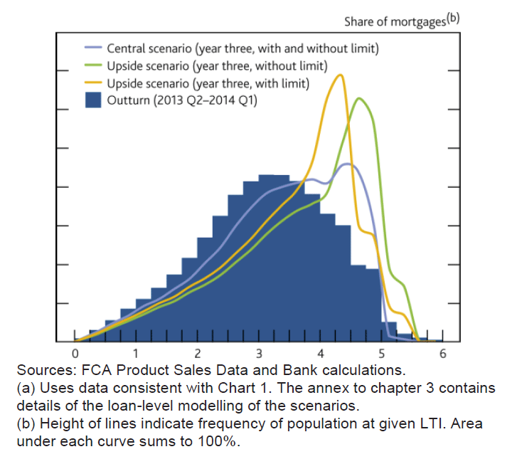
 The current data from the UK shows that LTI’s there are spread between 0 and 6. Interestingly, we see that in their forward scenarios they suggest an emerging second peak around an LTI of 5 times. So LTI’s in Australia are more stretched than in the UK. The regulators here do not report LTI data regularly. This is a significant gap.
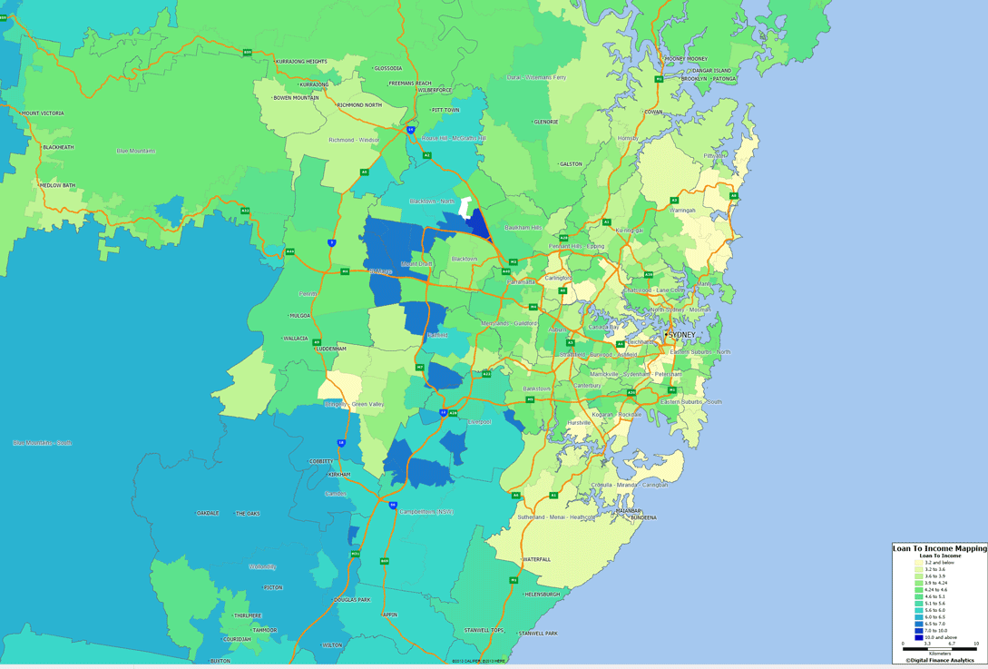
  We can map relative LTI average to post code. Here is the Sydney example, which highlights that there is a significant geographic concentration of high LTI loans in the western suburbs of Sydney.
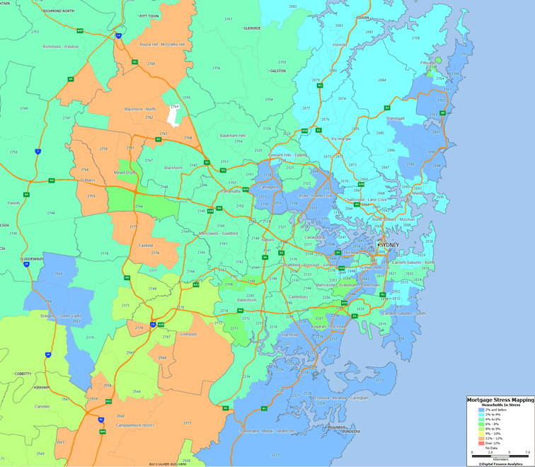
 There is, further, a correlation between higher LTI loans and Mortgage Stress. Here is the stress data for Sydney.
 These are concerning indicators. In addition as we dig into the data we find that the second peak in the LTI data relates to younger buyers, often first time purchasers. They are highly leveraged into the property market, and are surviving thanks to the very low interest rates available today. If rates rise, this could be a problem. This suggests that the loan to income situation in Australia is more adverse than the UK scene. Whilst we note the UK regulator is acting, there is no macro-prudential intervention in Australia. There should be.
Later we will present additional data across the other major centres, and examine in more detail those who are recent purchasers.

6 thoughts on “Australian Household Loan To Income Ratios Are Worse Than In The UK”