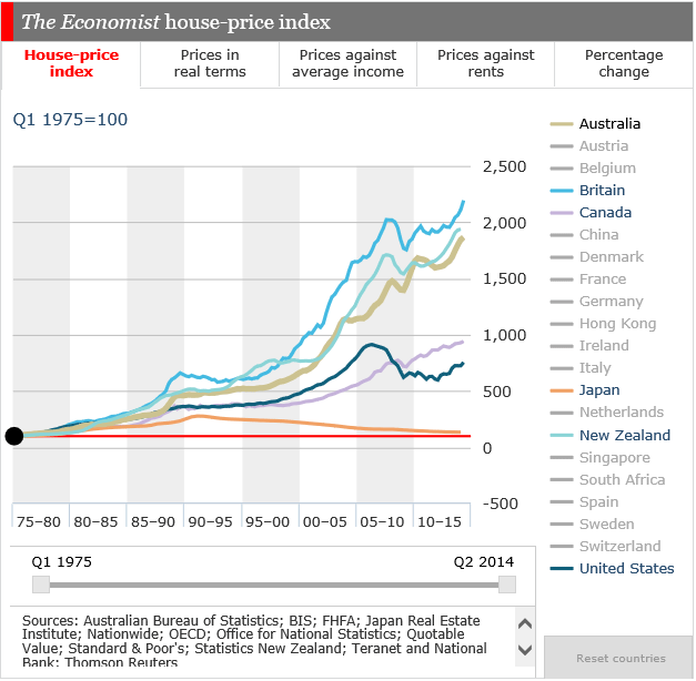
The Economist has just published its latest interactive house price comparison tool. It enables comparisons to be made across multiple countries, comparing absolute prices, real prices, rental ratios and prices against income. It is a powerful tool and highlights some interesting facts. One nice thing is you can select the range of dates also. Here are a few examples. First the trend in prices for selected countries. It shows Australia near the top of the list.
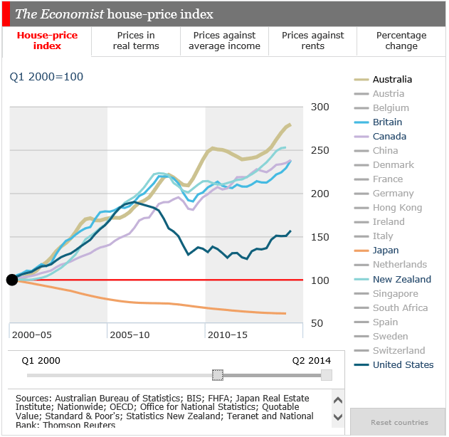
The trend since 2000 shows Australia clearly out in front amongst the countries I selected.
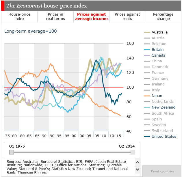
 Turning to price relative to income, we see Australia again featuring near the top
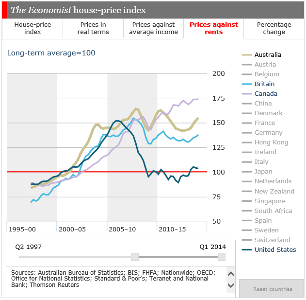
 Looking at the trends since 2000, we see how rentals are tracking. High, but not as high a house price movements suggesting perhaps linkages to interest rates and income growth?
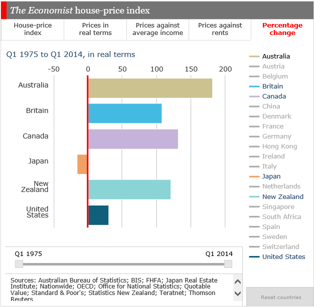
 But the most stunning chart in my view shows the change in values since 1975. We lead the way in Australia, leaving New Zealand, Canada and the UK in our wake. Also its worth noting the Japan story, no upward growth since 1975, that’s a different world.
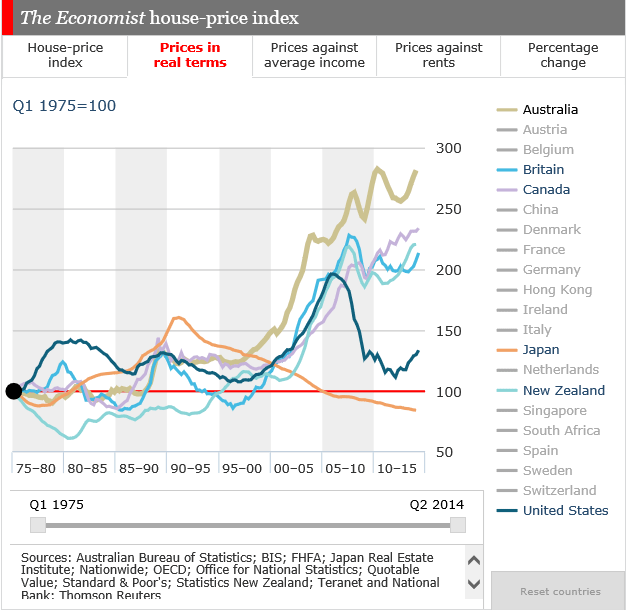
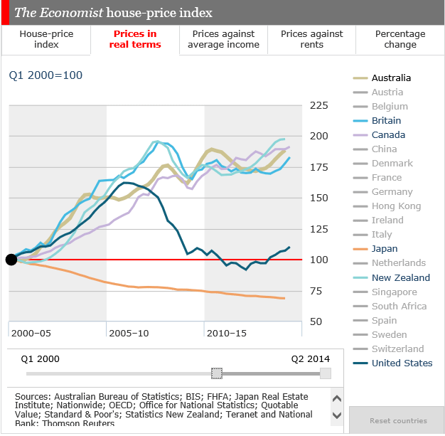
 Finally, in real terms, after correcting for inflation, Australia is way, way out in front looking at the long run from 1975. The trend since 2000 is not quite so stark.
 We like the tool, and recommend it if you want further proof that Australian property on an international basis looks expensive, on nearly any measure you care to select. But there is a broader question to reflect on. What is driving sky high property prices in a number of countries, including New Zealand, Canada and UK? Could the ultra low interest rates and quantitative easing in Europe and US simply be the root cause, inflating stock prices and property prices? The mega-economic experiment we are in the midst of is a path never before trod. So the outcome is not certain.

2 thoughts on “More Evidence That House Prices Are Too High”