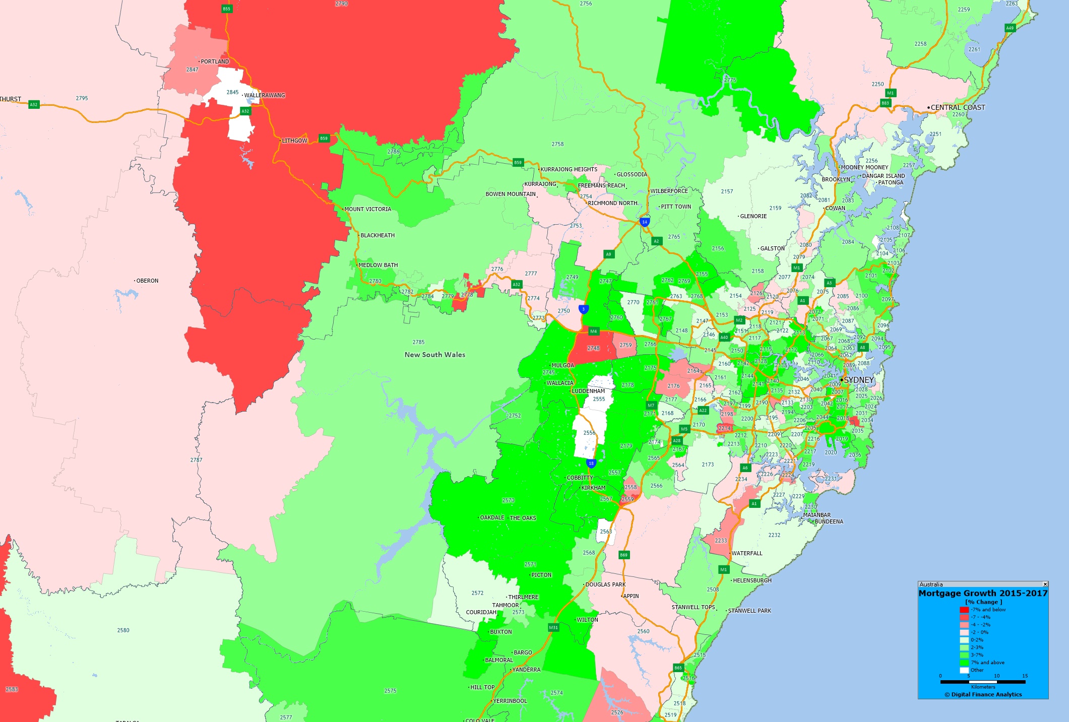
One of the measures contained in the Digital Finance Analytics household surveys is the number of households with a mortgage in each post code across the country. By comparing our data from 2015, with 2017 we can spot some interesting growth trends, especially when we geo-map the data. Today we begin with Greater Sydney.
 The yellow shades show the areas with the largest growth in the number of mortgages, the red shades show a relative fall in volumes. We see significant growth in western Sydney, where there has been significant residential development over this period. You can click on the map to view full screen. This is a picture of mortgage counts, not value, we may look at this later.
Of course this is just one of the many potential views available from the 140+ fields which are contained in our Core Market Model.
Next time we will look at Melbourne.

