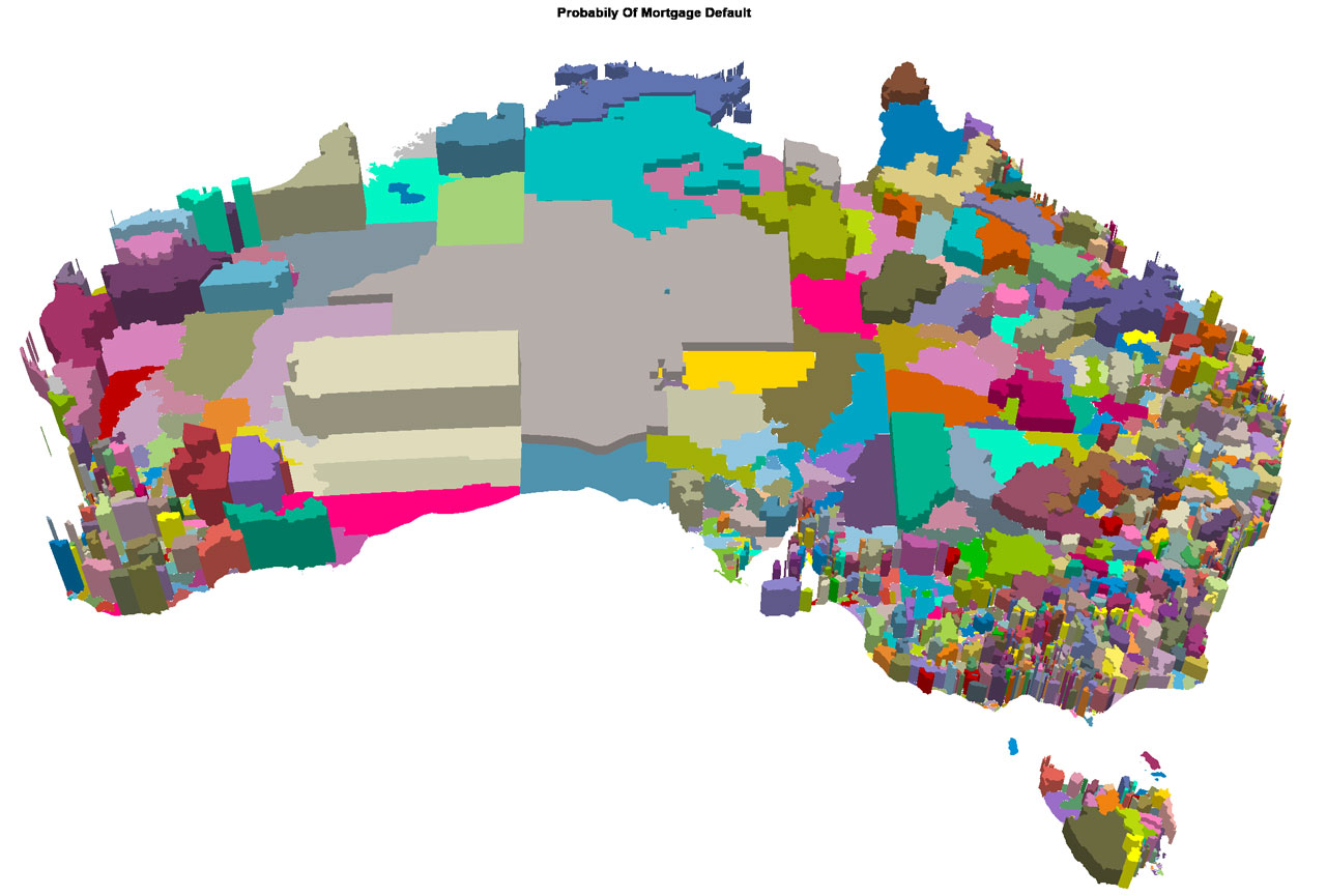
Here is a map of Australia, showing the relative probability of default by post code, looking ahead over the next 12-18 months. This is a 3d visualisation of the relative default risk, the higher the relief, the higher the risk. It nicely shows the potential issues across WA, as the mining boom subsides, some the risks in the mining heavy areas of QLD, and some pockets of concern in other regions.
This view is based on an average across all our household segments – if you started to drill down on the segment lens, you would see some interesting variations.
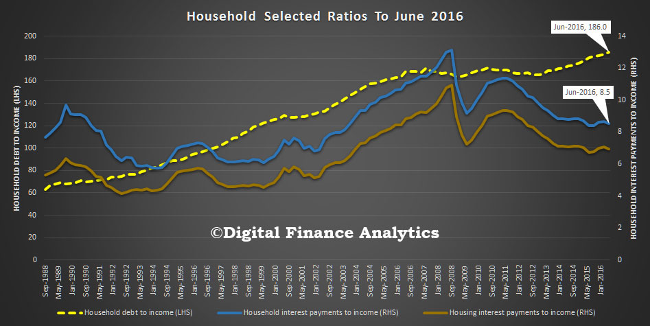
 However, as we highlighted on Monday, higher risks are not necessarily correlated to those households who are expected to be in difficulty – for example, battlers on the urban fridge – there are other more affluent, more leveraged households who are finding their lower income growth is really cramping their style. They remain optimistic because of the paper profits from their property holdings. Remember this is a picture based on ultra-low interest rates, but it shows again the problem with high household debt in a low growth environment.

