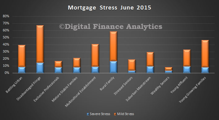
The 85th Annual Report from the Bank for International Settlements has just been released. This is an important document because in its economic chapters the authors attempt to get to grips with some of the critical issues creating uncertainty in the global economy and the financial system. Here is a summary of the main arguments.
Chapter I: Is the unthinkable becoming routine?
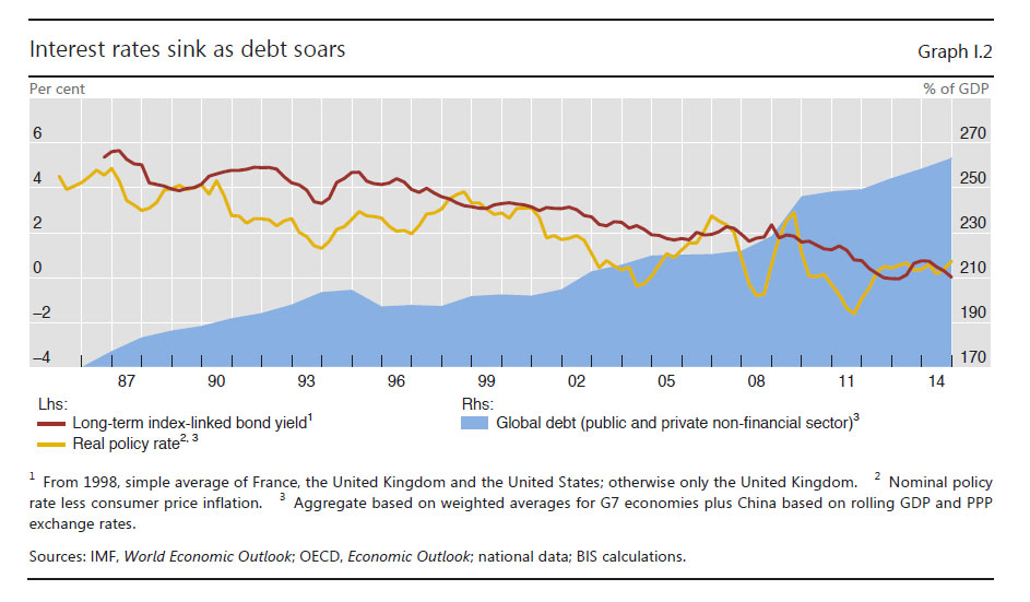
Globally, interest rates have been extraordinarily low for an exceptionally long time, in nominal and inflation-adjusted terms, against any benchmark. Such low rates are the most remarkable symptom of a broader malaise in the global economy: the economic expansion is unbalanced, debt burdens and financial risks are still too high, productivity growth too low, and the room for manoeuvre in macroeconomic policy too limited. The unthinkable risks becoming routine and being perceived as the new normal. This malaise has proved exceedingly difficult to understand. The chapter argues that it reflects to a considerable extent the failure to come to grips with financial booms and busts that leave deep and enduring economic scars. In the long term, this runs the risk of entrenching instability and chronic weakness. There is both a domestic and an international dimension to all this. Domestic policy regimes have been too narrowly concerned with stabilising short-term output and inflation and have lost sight of slower-moving but more costly financial booms and busts. And the international monetary and financial system has spread easy monetary and financial conditions in the core economies to other economies through exchange rate and capital flow pressures, furthering the build-up of financial vulnerabilities. Short-term gain risks being bought at the cost of long-term pain. Addressing these deficiencies requires a triple rebalancing in national and international policy frameworks: away from illusory short-term macroeconomic finetuning towards medium-term strategies; away from overwhelming attention to near-term output and inflation towards a more systematic response to slowermoving financial cycles; and away from a narrow own-house-in-order doctrine to one that recognises the costly interplay of domestic-focused policies. One essential element of this rebalancing will be to rely less on demand management policies and more on structural ones, so as to abandon the debt-fuelled growth model that has acted as a political and social substitute for productivity-enhancing reforms. The dividend from lower oil prices provides an opportunity that should not be missed. Monetary policy has been overburdened for far too long. It must be part of the answer but cannot be the whole answer. The unthinkable should not be allowed to become routine.
 Chapter II: Global financial markets remain dependent on central banks
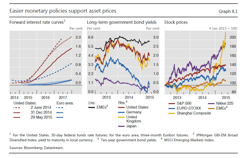
Accommodative monetary policies continued to lift prices in global asset markets in the past year, while diverging expectations about Federal Reserve and ECB policies sent the dollar and the euro in opposite directions. As the dollar soared, oil prices fell sharply, reflecting a mix of expected production and consumption, attitudes to risk and financing conditions. Bond yields in advanced economies continued to fall throughout much of the period under review and bond markets entered uncharted territory as nominal bond yields fell below zero in many markets. This reflected falling term premia and lower expected policy rates. The fragility of otherwise buoyant markets was underscored by increasingly frequent bouts of volatility and signs of reduced market liquidity. Such signs were perhaps clearest in fixed income markets, where market-makers have scaled back their activities and market-making has increasingly concentrated in the most liquid bonds. As other types of players, such as asset managers, have taken their place, the risk of “liquidity illusion” has increased: market liquidity appears ample in normal times, but vanishes quickly during market stress.
 Chapter III: When the financial becomes real
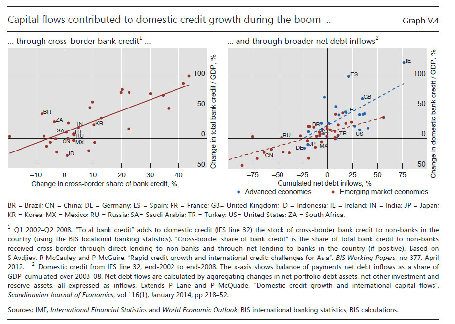
Plummeting oil prices and a surging US dollar shaped global activity in the year under review. These large changes in key markets caught economies at different stages of their business and financial cycles. The business cycle upswing in the advanced economies continued and growth returned to several of the crisis-hit economies in the euro area. At the same time, financial downswings are bottoming out in some of the economies hardest-hit by the Great Financial Crisis. But the resource misallocations stemming from the pre-crisis financial boom continue to hold back productivity growth. Other countries, less affected by the crisis, notably many EMEs, are experiencing different challenges. The shift in global conditions has coincided with slowing output growth and peaks in domestic financial cycles. There is the danger that slowing growth in EMEs could expose financial vulnerabilities. Better macroeconomic management and more robust financial structures, including longer debt maturities and reduced exposure to currency risk, have increased resilience. But the overall amount of debt has increased and the shift from banks to capital market funding could raise new risks.
 Chapter IV: Another year of monetary policy accommodation
Monetary policy continued to be exceptionally accommodative, with many authorities easing or delaying tightening. For some central banks, the ultra-low policy rate environment was reinforced with large-scale asset purchase programmes. In the major advanced economies, central banks pursued significantly divergent policy trajectories, but all remained concerned about the dangers of inflation running well below inflation objectives. In most other economies, inflation rates deviated from targets, being surprisingly low for some and high for others. The deviation of inflation from expected levels and questions surrounding the sources of price changes underscore an incomplete understanding of the inflation process, especially regarding its medium- and long-term drivers. At the same time, signs of growing financial imbalances around the globe highlight the risks of accommodative monetary policies. The persistence of those policies since the crisis casts doubt on the suitability of current monetary policy frameworks and suggests that resolving the tension between price stability and financial stability is the key challenge. This puts a premium on accounting for financial stability concerns much more systematically in monetary policy frameworks.
 Chapter V: The international monetary and financial system
The suitable design of international monetary and financial arrangements for the global economy is a long-standing issue. A key shortcoming of the existing system is that it tends to heighten the risk of financial imbalances, leading to booms and busts in credit and asset prices with serious macroeconomic consequences. These imbalances often occur simultaneously across countries, deriving strength from international spillovers of various types. The global use of the dollar and the euro allows monetary conditions to affect borrowers well beyond the respective issuing economies. Many countries also import monetary conditions when setting policy rates to limit interest rate differentials and exchange rate movements against the major currencies. The global integration of financial markets tends to reinforce these dynamics, by allowing common factors to drive capital flows and a common price of risk to move bond and equity prices. Policies to keep one’s own house in order by managing financial cycles would help to reduce such spillovers. In addition,
central banks need to better internalise spillovers, not least to avoid the effects of their actions spilling back into their own economies. Moving beyond enlightened self-interest would require international cooperation on rules constraining domestic policies.
 Chapter VI: Old and new risks in the financial landscape
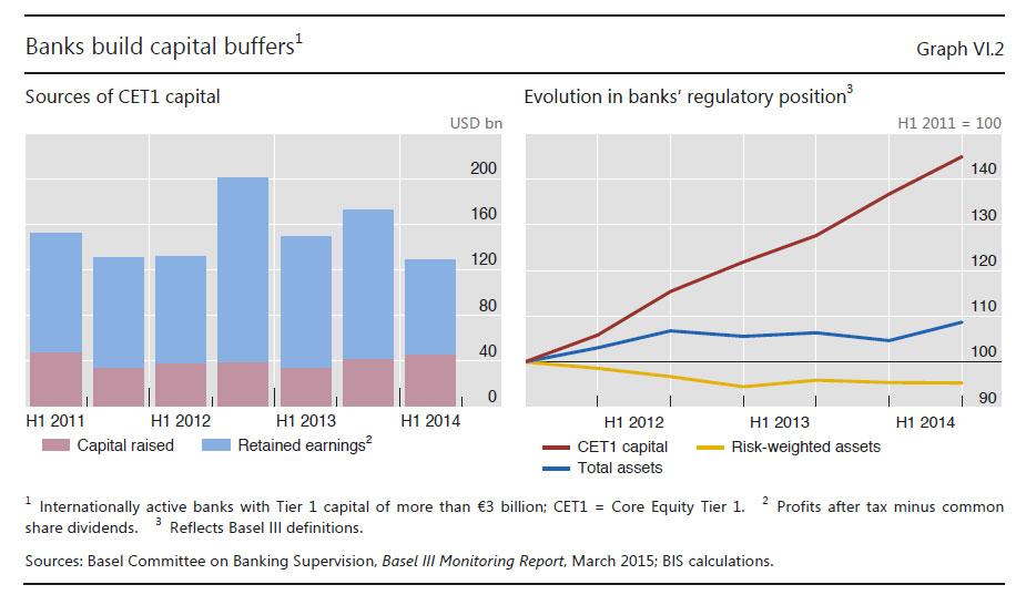
Risks in the financial system have evolved against the backdrop of persistently low interest rates in advanced economies. Despite substantial efforts to strengthen their capital and liquidity positions, advanced economy banks still face market scepticism. As a result, they have lost some of their traditional funding advantage relative to potential customers. This adds to the challenges stemming from the gradual erosion of interest income and banks’ growing exposure to interest rate risk, which could weaken their resilience in the future. By contrast, EME banks have so far benefited from market optimism amid buoyant conditions that may be masking the build-up of financial imbalances. For their part, insurance companies and pension funds have faced ballooning liabilities and muted asset returns. Asset-liability mismatches are weakening institutional investors and threaten to spill over into the real economy. As these investors offload risks onto their customers and banks retreat from traditional intermediation, asset managers are taking on an increasingly
important role. Regulatory authorities are carefully monitoring the financial stability implications of the growing asset management sector.