In a speech at the University of Edinburgh, External MPC member Professor David Miles set out the strengths and limitations of monetary policy. He argues that although central banks cannot keep inflation at a specific target at all times, monetary policy is more powerful than assumed by many economic models. But it is more reliant on being consistent with fiscal policy than is often recognised.
Central banks cannot keep inflation at target at all times. Nor would it be desirable for them to do so. The UK’s current experience is evidence of this; the significant fall in oil prices over recent months has, among others things, brought the level of inflation down to 0.5% with a chance that it will temporarily dip below zero in coming months. But clearly ‘one should not expect a central bank to be fully able to offset the impacts of such huge swings in commodity prices on current inflation.’ This is why ‘having a flexible inflation target which… allows policy to be set so as to return it to target over several quarters’, such as that in the Bank of England’s remit, ‘makes sense’.
But while monetary policy cannot prevent actual inflation being blown off-target, there are other respects in which, David argues, monetary policy can achieve ‘a lot more than is implied by many economic models’. These models often focus on how expectations shape the forward-looking behaviour of consumers, primarily through substitution effects. ‘In practice, in a mid-sized open economy with a huge stock of mortgages that are largely variable rate the mechanisms by which changes in interest rates affect spending go far beyond substitution effects’. By influencing short term spending decisions through cash flow effects, the influence of monetary policy extends beyond its impact on expectations.
‘Once you take seriously the idea that significant parts of the transmission mechanism of monetary policy don’t work through substitution effects, and may not solely reflect the expectations of forward looking agents, that can affect how you see unconventional monetary policy’. The idea that monetary policy loses most of its traction at the zero lower bound ‘underestimates what a central bank that is able to use its balance sheet can do’. David makes clear that he does not think the current low rate of inflation in the UK warrants additional stimulus. But the MPC’s previous experience of unconventional monetary policy, suggests its effectiveness extends beyond just its impact on expectations about future interest rates.
However, even accepting that monetary policy may be more effective than is sometimes realised, ‘monetary policy cannot be expected to achieve price stability in isolation from things fiscal’. This is because ‘monetary policy has fiscal consequences and unless fiscal policy is set in a way which is consistent with the aim of monetary policy those aims will not be met.’
‘This is not the same thing as saying that monetary policy has to be subordinate to fiscal policy.’ But it does highlight the importance of the primacy of the inflation target in anchoring inflation expectations and raises important questions about the future of the Bank’s balance sheet.
In concluding, David considers the case for broadening the aims of monetary policy and finds that any such move would be ‘unwise’. ‘Flexible inflation targeting is not inconsistent with attaching significant weight to short term fluctuations in output and employment.’ Longer to medium term targets for economic activity are a different matter. ‘Either those other targets are consistent with an inflation target – in which case achieving the inflation target is likely to require that output and employment over the medium term do not drift away from them – or they are not. If they are consistent then there is nothing much to be gained by adding them to the inflation target’.
In sum, ‘monetary policy does not hold all the cards’. It cannot, and should not aim to, keep inflation to target at all times, and that target itself needs to be consistent with fiscal policy. However, monetary policy can also influence the economy in more ways than standard economic models imply.

 Looking at the data by age, we see that those households under 20 were most likely to spend more than planned (31.5%) whereas amongst households over 60, only 11% overspent.
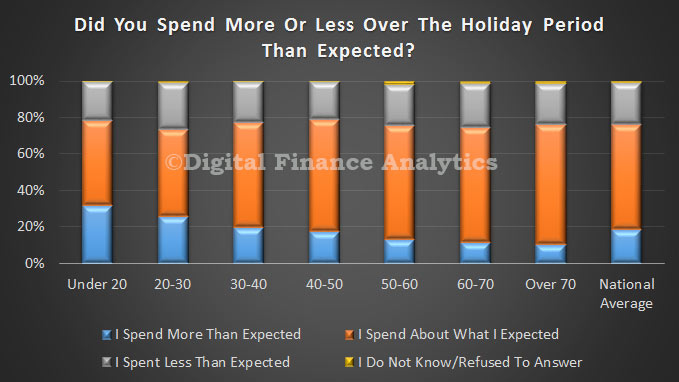 Finally, looking at income ranges, we see that those on the lowest incomes were most likely to spend more than they planned to, whilst those in the middle income ranges were more likely to spend less than expected.
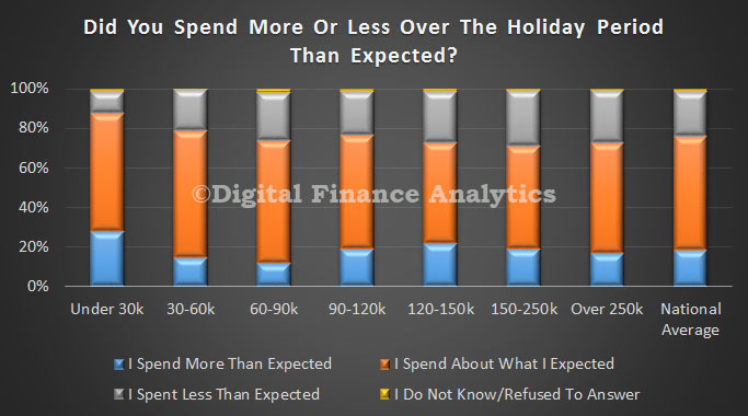 The survey also showed that those who overspent were most likely to use credit cards to cover the extra payments, and 17% of these did not know how they would cover the additional costs. On the other hand, those who spent as planned, or spent less than expected, were significantly less likely to use credit cards.
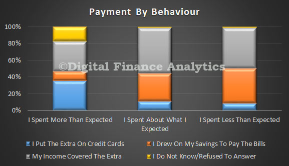

 With a projected 10.3 million tablet users this year, Australia is the only country in Asia-Pacific to have tablets reach a majority of the internet population already, and also the only country in the region where we expect a majority of the total population to use tablets at any point during our forecast period. Even other mature markets in the region, like