Top 20 Postcodes For Mortgage Stress Across Australia

Now we get to the pointy end of our mortgage stress and default analysis. Today we list the top 20 post codes across Australia where the highest number of households currently in mortgage stress reside. We also reveal our estimate for the number of defaults which we expect to occur in the coming months.

It is worth saying that the percentage of households stressed or at risk of default, in a particular post code, varies considerably, but we have chosen to look at the actual number of households this represents. This is because there are a number of post codes where the percentage is very high, but off a very low number of householders. Statistically speaking such low numbers would make us less certain of the accuracy of the estimates. But by choosing to focus on the absolute number of households involved, the estimates are more firmly grounded. In any case the numbers involved, if larger, makes a material difference to the economy, and the banking system.

So, then, here is the list. The post code with the highest number of households in mortgage stress in December 2016 is Harristown – 4350 – in Queensland. It is about 109 kms from Brisbane. This area covers Toowoomba, Harristown, Glenvale and Rockville etc and a population of close to 60,000. Many of the households here are younger. Incomes are lower than the QLD average. More than 4,500 households there are in difficulty and more than 170 households in the district risk mortgage default.

Within the top 20 nationally, the post code with the highest level of default risk is Lamington, WA, a suburb of South East & Central. It is about 549 kms from Perth.  The region includes Kalgoorlie, Lamington and Williamstown, etc. Many of these households are in the younger aged segments.  Incomes are higher than the WA average. Here more than 2,600 households are in mortgage stress, and more than 200 are likely to default.

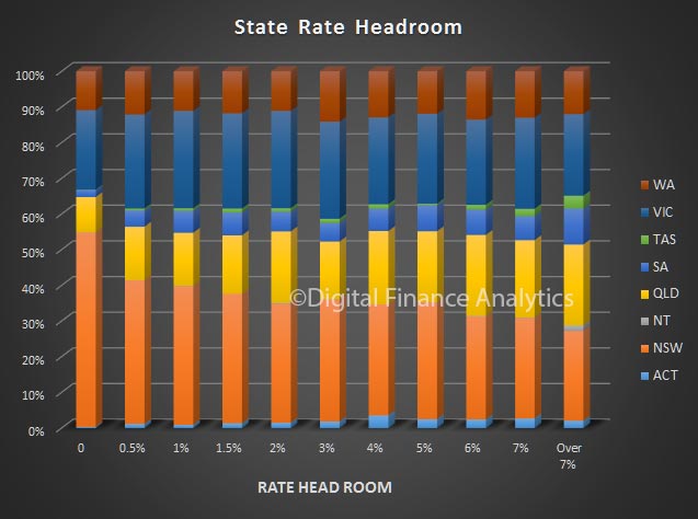
The distribution of stressed households in also interesting. Within the top 20, Western Australia has the largest number of households (26.4%), just ahead of Victoria (26.38%), but off a smaller population base. Shows the pressure on households in the west.

Next time we will look in more detail at some the state levels data.

A Segmented View Of Mortgage Stress and Default

As we continue our series on mortgage stress, using the latest data from our surveys, we look at how stress aligns with our core household and property owning segments.

To set the context for this, here are a couple of charts showing the mortgage distribution by income and age bands. The majority of mortgages are held by households with an income of between $50,000 and $150,000.

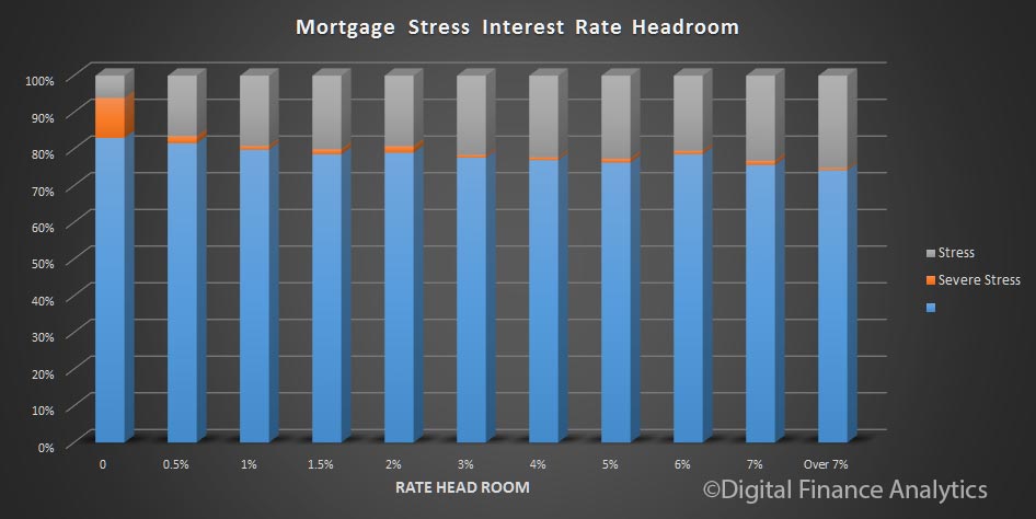
Mortgage stress and default are slightly higher across the lower income bands, but note that households with substantially higher incomes can also be in severe stress. But of course the absolute number are very small.

The highest proportion of mortgages are held by those aged 30-39, more than 30%.

Default probability is higher among younger and older households. Whilst the number of these households with a mortgage is relatively low, more are in severe mortgage stress because their incomes are much lower. More generally, some mortgage stress is evident across all age bands. In volume terms, the highest stress volumes are found in those 30-39 years.

Next we turn to our property segmentation.  Those holding property account for the largest segment of the market. You can read about our segmentation approach here.

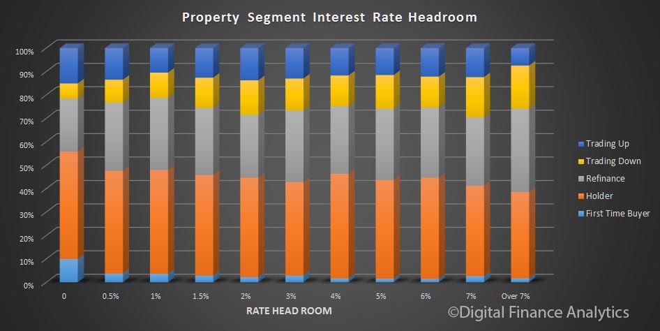
Probability of default is highest among first time buyers, who also have the highest proportion of severe mortgage stress. The segment with the lower risk and levels of stress are those seeking to trade up.

On interesting finding, bearing in mind we highlighted the rise of first time buyers seeking help from “The Bank of Mum and Dad“, is that those who do get help are more likely to default. So, assistance from parents may be a two-edged sword.

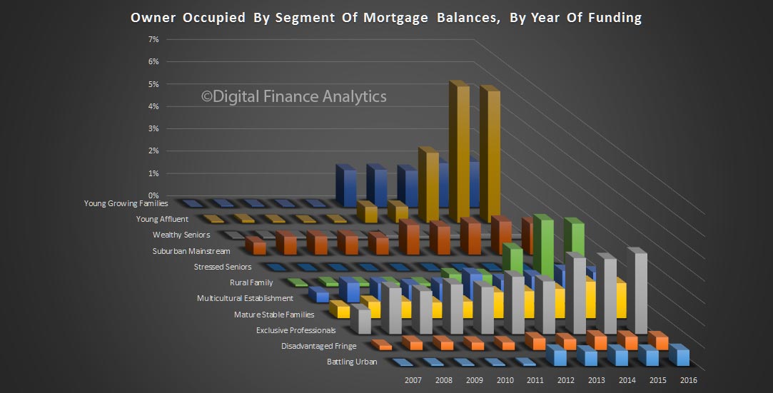
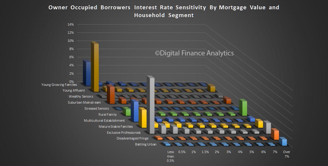
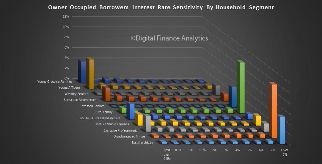
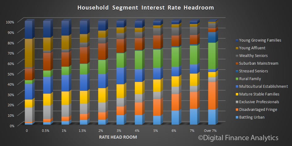
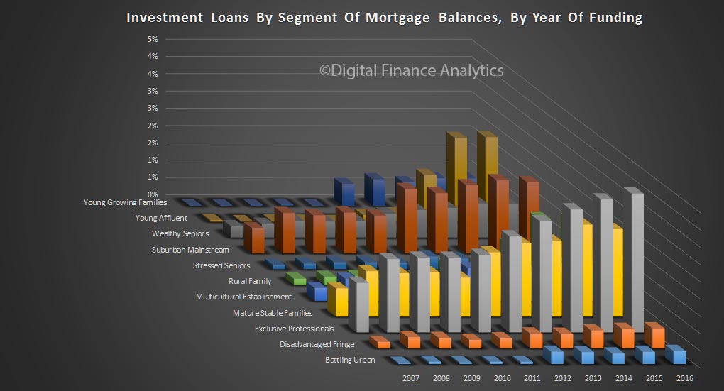
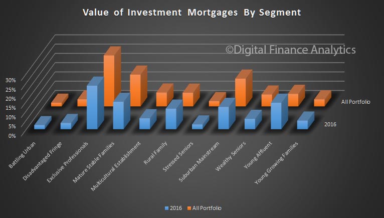
Finally, we turn to our master segmentation. The number of households with a mortgage varies across these segments. The value distribution footprint is quite different, with the exclusive professional and young affluent segments holding the larger average mortgage.

Mortgage stress is highest among the disadvantaged fringe, though their mortgages are relatively lower and default rates are relatively low. Wealthy seniors registered high levels of severe mortgage stress, thanks to pressure on incomes (the impact of low returns from bank deposits and rentals are important here).

However, the highest risk of defaults sits with the younger segments. Young affluent households, with large mortgages are most exposed because their incomes are flat whilst they are highly leveraged, so as interest rates rise, they are exposed. Many have bought new high-rise apartments in the inner city areas.

Young growing families may have, on average smaller mortgages, but their finances are tight, with little room to maneuver, and any rise in interest rates will be a problem for them. Costs are living are moving higher for this group, especially child care costs.

So, we think effective segmentation is critical to understand the various portfolio risks which reside in the bank’s mortgage book. We need to move beyond LVR and LTI.

Next time we will look at some of the post code level data.

Mortgage Stress Covers 18.5% Of Book Value

Containing our latest series on mortgage stress and probability of default, we look further at the distribution of mortgage stress and potential defaults, using data from our household surveys, which includes results up to the middle of December 2016.

Building on the data we discussed yesterday, it is worth remembering that the bulk of mortgages reside in just a few zones across the country. This chart shows the number of loans in each of the major cities and regional areas, as a proportion of the total – we are looking here at owner occupied loans. The urban centres of Sydney, Melbourne and Brisbane hold the bulk of the loans, add in the rest of NSW and Perth, and you have more than 80% of all loans covered. So what happens in these areas is significant from a portfolio point of view. We include both loans from the banks (ADIs) and non-banks in this analysis.

We can then look at the same analysis, but by loan value. Given the larger loans in Sydney, thanks to higher prices, the distribution based on value is more skewed, with more than 35% of loans in the greater Sydney region.

If we then overlay those households who are in mortgage stress, we see that in value terms, 6% of the portfolio in stress is in greater Sydney, 3.5% in greater Melbourne, and just over 2% in greater Perth.

Total this up, and we conclude that in value terms, 18.5% of the current owner occupied loans are held by households in some degree of mortgage stress.  This proportion has been rising over the past couple of years, as income growth slows, whilst household debt rises.

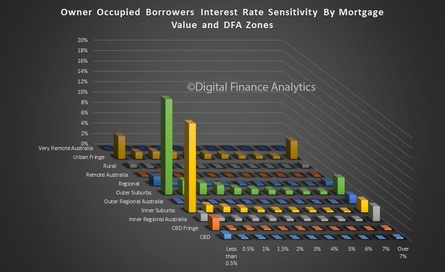
Another way to look at the data is by a more granular regional break down. Here is the probability of default by region, plus the latest reading on mortgage stress. The highest probability of default can be found in the Kalgoorlie, Curtin and Brand regions of WA. Regional WA probability of default sits at around 4%.

Ballarat, Horsham and Alice Springs has the highest rate of mortgage stress. But, when you look at the relative distribution of mortgages on the same basis, we see that the bulk of the mortgages reside in just a few regions. In other words, there may be high stress levels, but on low absolute volumes of loans. Once again, to see what is really going on, you need to get granular.

Next time we look at stress and default by our segmentation models.

Mortgage Stress And Probability Of Default Is Rising

We have just finished the December update of our mortgage stress and probability of default modelling for the Australian mortgage market.

Our model has been updated to take account of the latest employment, wage, interest rate and growth data, and we look are the current distribution of mortgage stress (can households settle their mortgage repayments, on time without financial pressure?) and make an estimate of the probability of households defaulting on their repayments by more than 30 days. The former uses our survey data on mortgages held, interest rates applied, and income available in the light of other financial commitments. Probability of default overlays the broader economic drivers. The base analysis is completed at a customer segment level by post code then rolled up to form various data views. In the next few days, we will discuss the findings in some detail. You can read more about our approach here. We also also reveal the current top 100 post codes for mortgage stress and mortgage defaults across the nation.

To begin, here is a summary by states, split down by CBD and rest of state.

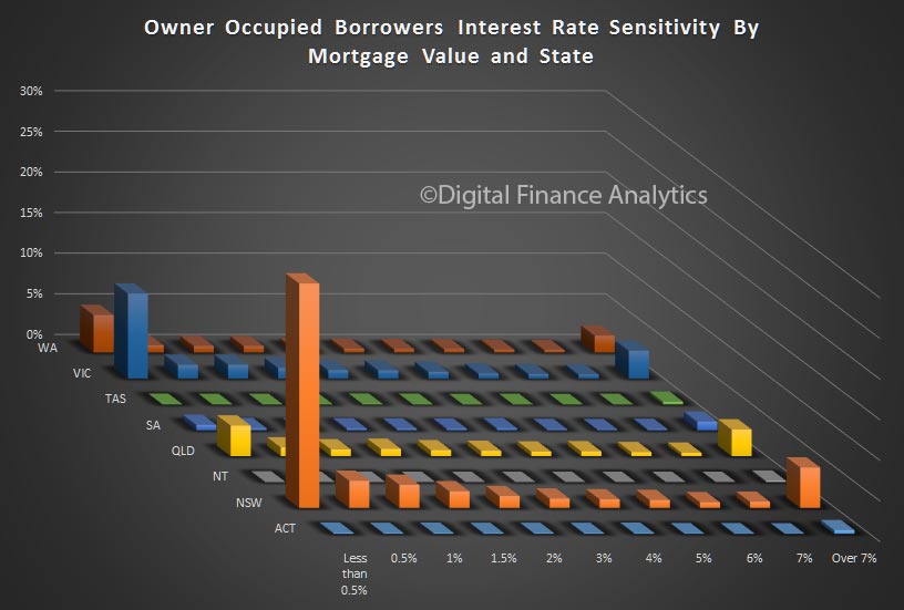
The highest probability of default can be found in regional WA, thanks to pressure in the mining belt. 30 days defaults will be close to 4%. Here, around 25% of households are in mortgage stress, including some in severe stress – see our descriptions here.

Default expectations are also high in and around Perth, where employment prospects are faltering, and incomes under pressure. In QLD, away from Brisbane, we see similar issues. The ACT has the lowest level of default probability.

The highest levels of mortgage stress are found in Tasmania, and across Regional NT, where more than 30% of households are under pressure. We also see hot spots in regional areas.

Of note is the high proportion of households in greater Sydney in severe mortgage stress – at 6.2% of borrowing households. This is a function of large mortgages (driven by high prices), rising interest rates AND flat incomes. By way of comparison, Melbourne households in severe stress sit at 3.3%, as mortgages are a little smaller. They are both higher than the national average of 2.8% of households.

Combined, across the country, more than 22% of all households are now in some degree of mortgage stress.

Next time we will dig into the more specific geographic footprints, because you really have to get granular to make sense of what is going on. Averages across the national simply mask what is going on.  Later will will look at loan-to-income and debt servicing ratios which are also deteriorating for many.  Then finally we will look at the loss implications for the banking sector.


The 2016 Property Market In Review

Today we start a short series which will review the property market in 2016, and then look forward to 2017. We will start by looking at demand for property, then look at property and funding supply, before examining the risk elements in the market for both property owners, lenders and the broader economy.

Remember that there is more than six trillion dollars invested in residential property in Australia, three times as much as in the whole superannuation system, and close to a third of households rely on income from property, either directly or indirectly, (from rents, or jobs in the sector across construction, maintenance and management), to say nothing of the capital two thirds of Australians are sitting on thanks to strong recent price rises. So what happens to property really matters.

Property Demand

We start with demand for property. The latest data from our household surveys shows that demand for property is very strong. Two thirds of households have interests in property, and about half of these have a mortgage. Owner occupied home owners are a little more sanguine now, but property investors, after a wobble earlier in the year, are still strongly in the market. In addition, there is still demand from overseas investors, and migrants. Overall demand is now stronger than at the start of the year. This is reflected in continued high auction clearance rates, especially down the east coast.

First time buyers are finding it difficult to compete with cashed up investors, and with incomes static and tighter underwriting standards, it is harder than ever for them to enter the market.  Down traders – people looking to sell and release capital – are active, and are in the market for smaller homes, and investment property. Households seeking to trade up are also active, driven by the expectation of ongoing capital gains. Investors are attracted by the generous tax breaks, including negative gearing and capital gains.  This despite rental incomes falling again, and the fact that about half of investors are underwater on a cash-flow basis, though bolstered by continued capital gains.

So overall demand is strong, and it has not yet been impacted by the rising mortgage interest rate bias that we have seen in the past couple of months.

Property Supply

Turning to property supply, there have been a significant surge in new building, mainly in and close to the central business districts in Melbourne, Brisbane and to some extend in Sydney, though here new building is more widely spread. Well over two hundred thousand new properties are coming on stream and more than half of these will be high-rise apartments. That said forward approvals are slipping now, so we may have passed “peak build” in the current cycle.

We are also seeing significant subdivision of existing residential land, and a rise in new house construction as well. The average plot size continues to fall, but we still place larger buildings on these smaller plots.

In Sydney and Melbourne, the amount of housing on the market is not meeting demand, though this is not true in some other markets – for example in areas of Western Australia and Queensland, especially in the mining belts. The Reserve Bank is concerned about the impact of potential oversupply in apartments in the main centres.

Finance Supply

Turning to finance supply, Households can still get mortgage finance, but in recent times there has been a significant tightening of underwriting standards. Interest rate buffers are now higher than they were, income flows are being examined more critically, and lenders who are making interest only loans, which account for about one third of transactions, are looking for greater precision as to how the capital will be repaid later. Foreign investors are finding it harder to get a loan from the major lenders, although a number of smaller banks, and other non-traditional lenders are more than willing to do a deal. In addition, foreign income is now under greater scrutiny, following a number of recent frauds.

Overall credit growth is a little slower than a year ago, but at above 6% is still well above inflation and income growth. Within the mix, recently, investment mortgages have been growing faster than owner occupied loans. Household debt has reached an all-time high, thanks mortgage growth, with the ratio at 186 percent of debts to disposable incomes, one of the highest ratios in the world. Low interest rates mean that currently the servicing burden is not currently too bad, but this would change quickly if rates were to rise, thanks to excessive leverage.  Household savings ratios are falling.

Whilst unemployment rates remain controlled, at 5.6%, the main issue for many households is that real incomes are just not rising, and as a result, some are finding it harder to make their mortgage repayments on time. At the moment mortgage delinquency is rising, just a little, but faster in areas of WA and QLD.

Recently the Trump Effect has led to a rise in US bond yields, and this has had a knock-on effect in the capital markets, lifting the rates banks must pay for capital. As a result, we have seen the yield curve move up, and banks have been lifting their mortgage rates – somewhat selectively so far – with investors taking the brunt, but the trend is widening. The recent RBA cash rate cuts are being offset by these rises, and we think it unlikely the RBA will lower rates again, so mortgage rates will continue to rise. We will discuss the possible impact in 2017 later.

Summary

So we can say that 2016 has been a positive year for those in the market, with sizable capital gains for many, significant transaction momentum and construction, and in line with the RBA’s intention part of the re-balancing of the economy away from mining construction. The cost has been, first higher home prices, as well as larger pools of debt and more households excluded from the market.  Banks have 62% of their assets in residential property, a high, and are more exposed to the sector than ever, despite holding more capital than they did. We believe regulators should be doing more, but only reluctantly, and lately, are they coming to the party.

Next time we will look at prospects for 2017.

First Time Buyers Caught In The Property “Jaws”

Compared with 12 months ago, First Time Buyers are caught in the jaws created by a combination of tighter mortgage underwriting standards and higher property market prices. Together these forces make  the prospect of a purchase significantly less likely.  This conclusion is drawn from our updated our household surveys. Looking in detail at the survey results:

Compared with 12 months ago, 56% of first time buyers still have the same appetite to enter the market, just 5% has a stronger appetite now, whilst 39% have a lower appetite than a year ago.

The fall is driven partly by prices continuing to accelerate out of reach, with 51% saying their target was now more out of reach than a year ago, whilst 43% said there was no real change and 6% said prices has fallen. There were considerable state and regional variations.  Prices in WA and areas of QLD are lower, whilst prices in NSW, VIC and ACT are significantly higher.

Finally, the combination of flat incomes, and tighter mortgage underwriting standards means that more than half – 58% – said they borrowing capacity had effectively been reduced. Around 40% said there was no change, and just 2% said their borrowing capacity had risen. Once again first time buyers in NSW and VIC were the most under pressure, thanks to high prices, and static incomes.

No surprise therefore that the latest ABS statistics shows the number of first time buyers continuing to languish.

Household Finance Confidence Higher Again

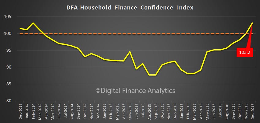
The latest data from the Digital Finance Analytics Household Finance Confidence Index shows a further improvement, with the November score now just above the 100 neutral position at 100.02. This is up from 98.2 in October, and the first time since 2014 we have been above the neutral setting.

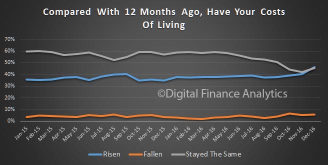
fci-nov-2016-summaryThe full effect of recent rate changes and the availability of low-rate fixed mortgages, together with climbing home values in most states, combined,  have driven both home owners, and property investors confidence higher. In fact, for the first time in more than a year, property investors are more confident than owner occupiers. On the other hand, the one-third of households excluded from the property market drifted lower, thanks to higher costs of living and static or falling incomes.

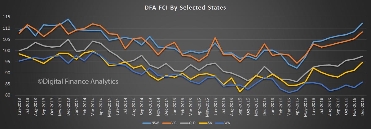
fci-nov-2016-propertyLooking across the states, households in NSW are much more confident, with VIC slightly behind. Households in WA reported a fall in confidence, thanks to poorer employment prospects and falling home prices.

fci-nov-2016-statesjpgOn average households were a little less comfortable with the amount of debt they hold, thanks to expectations that interest rates have passed their low point, and will rise. 27.6% of households were less comfortable, up 3.9% from last month.

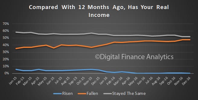
fci-nov-2016-debtWe also see a continued fall in real incomes, thanks to rising costs and flat or falling pay. 47.5% said their incomes had fallen, in real terms, in the past year, up 2.3% last month.

fci-nov-2016-income Households reported improved investment incomes from stocks and term deposits. However, appetite for investment property, especially down the east coast remains strong.

On average, younger households were less confident compared with those aged above 50 years.

By way of background, these results are derived from our household surveys, averaged across Australia. We have 26,000 households in our sample at any one time. We include detailed questions covering various aspects of a household’s financial footprint. The index measures how households are feeling about their financial health. To calculate the index we ask questions which cover a number of different dimensions. We start by asking households how confident they are feeling about their job security, whether their real income has risen or fallen in the past year, their view on their costs of living over the same period, whether they have increased their loans and other outstanding debts including credit cards and whether they are saving more than last year. Finally we ask about their overall change in net worth over the past 12 months – by net worth we mean net assets less outstanding debts.

Household Financial Confidence Higher as Rates Fall

We release the October edition of the Digital Finance Analytics Household Finance Confidence Index (FCI) today. Overall average confidence is up again, as a direct response to the RBA rate cut, and property owning households are the more confident. The index reached 98.2, up from 97.1 last month, and is trending towards the long term neutral setting. Property Investors and Households with Owner Occupied property continue to move above the neutral setting, thanks to continued capital appreciation (in most centres) and lower mortgage rates and some rises in term deposit rates.  Those without property interests drag the average down, highlighting again how important property is to household finances.

fci-oct-16On a state basis, NSW and VIC are most positive. WA the least positive, reflecting falls in home prices, rising rental vacancies and less appetite for property.

fci-oct-16-states Household income, in real terms remain in the doldrums, putting more pressure on those with larger mortgages.

fci-oct-16-incomeBy way of background, these results are derived from our household surveys, averaged across Australia. We have 26,000 households in our sample at any one time. We include detailed questions covering various aspects of a household’s financial footprint. The index measures how households are feeling about their financial health. To calculate the index we ask questions which cover a number of different dimensions. We start by asking households how confident they are feeling about their job security, whether their real income has risen or fallen in the past year, their view on their costs of living over the same period, whether they have increased their loans and other outstanding debts including credit cards and whether they are saving more than last year. Finally we ask about their overall change in net worth over the past 12 months – by net worth we mean net assets less outstanding debts.
Small Amount Credit Contract Reforms in Australia: Household Survey Evidence and Analysis

Last year we published a report on financially stressed households, including coverage of small amount credit contracts, using data from our household surveys.

Payment-PicNow Professor Gill North has published an important academic paper – see this link – “Small Amount Credit Contract Reforms in Australia: Household Survey Evidence and Analysis” which takes the analysis of the survey data much further. Here is the abstract.

A review of small amount credit contract regulation in Australia began in 2015 as mandated under section 335A of the National Consumer Credit Protection Act 2009 (Cth). The review panel sought comprehensive data on industry and consumer characteristics and trends. To provide such evidence, consumer groups commissioned original empirical research using data collected from a longitudinal survey that monitors the financial position and attitudes of Australian households. This data on household use of small amount credit contract loans was extracted for the last decade, allowing detailed analysis of the historical patterns and developing trends. The data indicates that overall demand for small amount short duration credit is growing in Australia, the consumer base is broadening, and the predominant form of lending today is online. Deeper analysis highlights the varying motivations of borrower households and their different stages and levels of financial difficulty. It also confirms the socio-economic, employment, educational and financial disadvantages of most households using these loans and their vulnerability to adverse changes in personal circumstances and negative external shocks.


Where You Buy Matters

We did some specific research for a slot on ABC Radio in South Eastern Regional NSW, covering the regions around Cooma, Bega, Jindabyne, and Batemans Bay. Using data from our surveys we were able to pull out some insights into the property markets in these locations. Given the fixation elsewhere on capital city prices, it is worth remembering that the property market actually consists of a series of micro-markets, with very different characteristics and outcomes. Our research shows this nicely.

So, looking at the four markets, lets start with average home price trends.

south-pricesAt Cooma, the Capital of the Snowy Mountains, prices are on average around $240,000, though they have slipped a bit in the past year, with a fall of around 10%.

Bega, in the rural heartland of the Sapphire Coast, has an average price of around $300,000 with a small fall in the last year of around 3%.

Jindabyne which overlooks Lake Jindabyne near the Snowy Mountains has an average price of $430,000, and has seen a strong rise this year after a small fall last.

Finally, Batemans Bay, in an area surrounded by understated natural beauty, attracting everyone from watercolour artists and rock fishermen, keen surfers and fishing enthusiasts to families on holiday, has an average price of $330,000 up about 3% this year.   Units here rose around 1.3% to around $230,000.

The types of families vary across the region. For example, Jindabyne has many younger families, including those with growing kids, whereas Batemans Bay has an older population including many edging towards, or in retirement. Households in Bega and Cooma tend to be in the middle, with an average age of 51.

So now we look at the mortgage metrics for these areas. The loan to value ratio is highest in Cooma at 84%, reflecting some price falls, and larger mortgages. But the loan to income and debt servicing ratios are quite healthy, so there is little mortgage stress at current interest rates. It rates were to rise, that could change. Many of the properties here have been held for several years, so some capital value has been locked in, but capital growth remains limited.

Compare this with Batemans Bay. Here the LVR is significantly lower, at around 51%, but the DSR and LTI are higher. This reflects the more limited incomes many older households now have, despite the fact they still have an outstanding mortgage. There is more sensitivity to rising rates.  There have been more recent property transfers, and loan refinances.  We also see growth in the number of apartments in the region.

southHouseholds in Jindabyne have a higher debt service ratio, reflecting the larger mortgages required to purchase here compared with incomes. Again there is sensitivity to rising rates. The loan to income ratio is 4.7 on average.

We also found that demand along the coast is being supported by those from the cities buying a second property for holiday, or investment purposes, including the scenario where they grab equity from an existing Sydney property to fund the purchase. This illustrates the spillover effects of high Sydney prices.

So overall, property momentum in these regions does not mirror the growth rates in Greater Sydney, though there are some spillover effects. Property on the coast is in greater demand, including from investors, and many prospective local buyers are being priced out of the market. Some mortgage holders have quite a high debt burden, in terms of meeting repayments, and would be sensitive to rising rates.