Lenders Are Inconsistent In Their Interest-Only Conversations

Building on yesterday’s post which discussed the interest-only loan debt trap, today we show that lenders are having quite varied conversations with their borrowers.

We took a cross section of households who have interest-only loans, and mapped their experience to a selection of specific lenders, looking at whether there was, as part of the purchase or refinance discussion, any explicit exploration of how the capital amount was to be repaid. Remember this is looking at the transaction from the perspective of the household, not the lender.

interest-only-by-providerThe average is that 43% of households with interest-only loans had an explicit discussion, but whilst some lenders achieved a score above 90%, others were much lower.  A wide variation. The policy as set out by APRA is not being universally applied.

We also found that newer loans are more likely to be funded in the context of an explicit capital repayment discussion, whereas older loans were less likely to include such a discussion. This, we think, reflects lenders reacting the regulator guidance in the past couple of years.  But there is clearly more to do.

interest-only-by-agre-providerIt also reinforces the point there is a cadre of loans shortly to come to reset and review, where householders suddenly find they are asked some hard questions about capital repayment – perhaps for the first time. If they do not pass muster, an interest-only loan may not be available, forcing them to move to another lender (if available), or different loan structure, where repayments to principle are included.  This could get quite nasty.

Should, we ask, lenders be contacting borrowers, outside the review cycle, to preempt the problem?  Unless they have a watertight record of an explicit capital repayment discussion, we think they should.

Which Loans Are Most At Risk?

Following yesterdays post on our latest Probability of Default Modelling, we received a number of requests for more detailed information, and especially where the risks of default are highest within the portfolio.

So today we provide some further analysis, cutting the probability of default metrics by some additional dimensions. We make the point that granular analysis is required to really understand what is going on, portfolio level analysis masks too many differences to be useful!

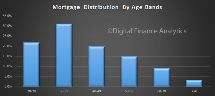
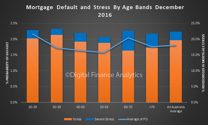
We start with age bands. This chart shows the relative distribution of owner occupied loans by age bands, (the red line) and the relative default probability as estimated by our models. More mature households are relatively better placed, but younger households, and those who are entering retirement still holding a mortgage have a higher risk score.

pd-october-2016-ageTurning to household income, we see elevated risks of default among lower income bands, but it does not go away as we go up the income scale. This is because those households with larger incomes generally are more leveraged and are more likely to be holding interest only loans.

pd-october-2016-incomeWe find that generally households with interest only loans are more likely to default, but the difference is relatively small, on average.

pd-october-2016-loan-typeChannel of origination does influence the probability of default, with those using a mortgage broker slightly more likely to default. We think there are a number of factors below the waterline here which explains the differences. For example brokers know where to look for the larger loan, can help position the application for approval, and households choosing to use brokers are often after a bigger loan on the same income, compared with those via a branch.

pd-october-2016-channelTwo other perspectives. Loan to income has a significant impact, with those putting more than 60% of their income to repay the mortgage most at risk. As the LTI reduces, so does the risk. We think the LTI and DSR ratios should become the cornerstone of mortgage underwriting. APRA please note!

pd-october-2016-ltiFinally, Loan To Value ratios are linked to risk, but it is not a straight forward relationship. In fact some of the lower LVR loans are more likely to default than those in the 50-70% LVR range. This is simply a function of constrained incomes. At the upper end risk rises again, thanks to larger loans relative to income, and lower net assets held.

pd-october-2016-lvr

Probability Of Mortgage Default Rises

We have re-run our Probability of Mortgage Default modelling, based on our most recent household surveys. This modelling takes the basic household finance data in our survey, and models the impact of economic changes, inflation, income growth, and other factors, to estimate the probability of 30+ day mortgage default at a post code level.

As part of our household surveys, we capture data on mortgage stress, and when we overlay industry employment data and loan portfolio default data, we can derive a relative risk of default score for each household segment, in each post code. This data covers mortgages only (not business credit or credit cards, which have their own modelling). We use this to develop a percentage risk of default measure.

There are some significant variations across the data, though overall, we expect mortgage default rates to continue to rise over the next 12-18 month, thanks to low wage growth, employment changes, and other factors. This despite record low interest rates.

Western Australia and Queensland mining areas will bear the brunt, whereas New South Wales, Victoria and ACT are best placed. Households with units in the CBD and surrounds will also be under pressure. This will likely put some downward pressure on home prices in these areas.

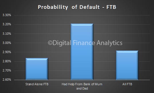
Here is a summary of default probability by state, and owner occupied household segments. First Time Buyers in WA are at highest risk.

pd-oct-2016-stateLooking at the same data, by Lender Mortgage Insurance (LMI) status, we see that those needing LMI (generally with an LVR above 80%) are at a higher level of risk, compared with those who do not have LMI.

pd-oct-2016-lmiLoans with a higher debt servicing ratio (DSR) are more at risk. We think DSR is the better risk measure, as our modelling highlights.

pd-oct-2016Probability of default does vary by mortgage provider. Here is a sample from lenders from our database. Clearly lenders have different underwriting rules and standards, as well as different channels to market.

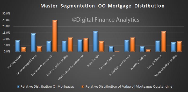
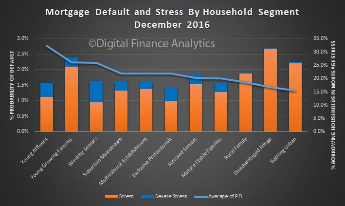
pd-oct-2016-providerLooking at our master segmentation, we see that more affluent younger and wealth seniors are at risk. This is because they are more highly geared, and therefore most sensitive to changes in income.

Interestingly, those disadvantaged households on the edge of cities, and battling urban households are at lower risks of default. This is because they have not been able to gear up as much as other household groups as lending standards have tightened.

However, as expect many young growing families are finding it difficult to make their mortgage repayments, and with incomes static, this will only get worse.

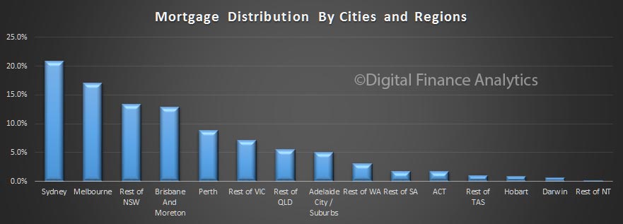
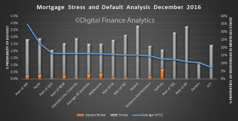
pd-oct-2016-segmentFinally, here is a view by region across Australia. Locations in WA have the highest potential risk, whilst Canberra has the lowest.

pd-oct-2016-regionsWe should say this is an estimate, as of course economic predictions do change. That said, it has proven to be quite an accurate tool for risk assessment purposes.

One in four Australian workers financially stressed

Financial stress is now a fact of life for more than one in four Australian workers who say they have low confidence in their financial position and find it difficult to make ends meet.

New research, undertaken by AMP for its 2016 Financial Wellness report, revealed Australians’ confidence in their finances continued to decrease in the past two years from 54 per cent of people confident in 2014 compared to 48 per cent in 2016. Lower confidence is despite an increase in disposable cash held by Australians, rising 6.3 per cent over the past two years.

Payment-Pic

Vicki Doyle, Director Corporate Superannuation, AMP commented on the impact of financial stress on individuals in the workplace and business productivity.

“Financial stress is a common occurrence in the Australian workforce, with more than 2.8 million employees, representing one in four workers, under financial stress in 2016.

“People who experience financial stress are more likely to be unable to work due to stressrelated sickness, which can affect their health and morale in addition to lowering workplace productivity – at an estimated cost of $47 billion in lost annual revenue for employers.

“It’s important we find ways to address levels of financial stress in the workplace. We know the real difference financial goals can make in preventing and overcoming financial stress. Australians who have clearly defined goals are much more likely to be financially secure,” she said.

Impact on productivity

The research shows financially stressed employees lose on average 6.9 hours of productive work per week and, on average, are absent 1.3 hours per week due to stress-related sickness.

Financial stress is highest among workers in accommodation and food services, with 35 per cent of people financially stressed. Employees are also at high risk of financial stress in healthcare and social assistance (32%), and administrative services (31%).

“In addition to the personal impact of financial stress, we’re also seeing a significant impact on business owners and operators through lost productivity and employee absenteeism, which is particularly high in the hospitality and healthcare industries,” Ms Doyle said.

Importance of goal setting

While the majority of people, at around 80 per cent of the workforce, already have financial goals in-mind, only 18 per cent of these people have a defined plan to achieve their goals.

“Employers can help their employees to bring clarity and shape to their financial goals by supporting financial wellness in the workplace. If employees have well-defined goals and a plan to achieve them, they are less likely to experience financial stress, helping them to be more productive,” Ms Doyle said.

Additional findings

  • Australians say common triggers for their financial stress are bad debt (50% of stressed workers), the need to save for retirement (35%) and providing for their family (34%). Missing bills and making mortgage repayments also contribute to higher levels of financial stress for 32 and 22 per cent of stressed employees, respectively.
  • Brisbane is the most financially stressed city, with 30 per cent of workers in this region experiencing financial stress. This is followed by Adelaide (25%), Perth (23%), Sydney (20%) and Melbourne (19%). Darwin and Hobart are the least financially stressed at 18 and 16 per cent, respectively.
  • Financial stress is highest in the accommodation and food services industry, with 35 per cent of employees stressed. This is followed by healthcare and social services (32%) and administration and support services (31%). Twenty-six per cent of employees in retail jobs say they are financially stressed.
  • The number of employees experiencing financial stress in the mining industry has significantly increased over the past two years, almost tripling from 9 per cent in 2014 to 26 per cent in 2016.
  • Females are more likely to experience financial stress with 30 per cent stating this is the case, compared to 19 per cent of males.
  • Single-parent families are at higher risk of experiencing financial stress (36%) compared to dual-parent households (21%).
  • Casual workers are more than twice as likely to experience financial stress compared to full-time or part time workers. Fifty-four per cent of casual workers are financially stressed compared to 22 and 27 per cent of full time and part time workers, respectively.
  • Low income is strongly correlated with financial stress with 34 per cent of people earning less than $50,000 p.a. under stress. However, the incidence of financial stress for highincome earners, earning $150,000 and above, is increasing with 16 per cent stating they are under financial stress compared with only 8 per cent in 2014.
  • Retirement is a trigger of financial stress, especially among employees aged 50 years and above. Concerns about retirement is the main cause of financial stress for one in five financially-stressed employees aged 50-59 and almost a third of employees aged 60 or above.

Mortgage Report Vol 23 Launched With JP Morgan

The latest edition (volume 23) of the mortgage industry report was released Oct 19. In this edition we look at mortgage discounting and refinance behaviour. This report takes input from the DFA household surveys, but is not directly available due to compliance requirements. However, the underlying DFA data is available via The Property Imperative, on request.

We looked further at refinancing behaviour. About a quarter of loans are churning each year. We asked specifically about the price drivers, and we found that more households are now aware of mortgage discounts, although first time buyer switchers were more concerned with the monthly mortgage repayment costs, whilst investors were more concerned with the overall costs of switching.

refinance-price-driversWe found that most borrowers churned between the big four, though there were some variations.

refinance-lender-mappingAcross our household segments, we see some variations in refinance preferences, but the regionals, credit unions are other lenders are not picking up share. Indeed with more rational pricing behaviour now in edivence in the majors, and selective discounting, it looks like they will maintain their grasp on the market.

refinance-segment-lender-mappingWe also found that around 20% of those seeking to refinance are looking to extract equity from their existing property – to take advantage of rising home prices, compared with 8% to repaid capital.

refinance-equity-changeAgain there are significant variations across the household segments.

refinance-segment-equityIn summary the JP Morgan report says:

2016 has been characterized by unprecedented levels of discounting until recent weeks. Over the last 12 months, rather than preserving ROE (i.e. re-price to offset higher capital requirements), banks looked to preserve margin (but see the ROE dilute as a consequence of the higher capital allocation). Effectively, it is as though the industry saw the November 2015 re-pricing as a war-chest to go and buy market share through bigger front-book discounts, rather than remaining disciplined on price in order to preserve ROEs.

This volume of the Australian Mortgage Industry Report focuses on the recent evidence of more rational pricing, and the need for the major players in the mortgage industry to exhibit more pricing discipline. At the heart of the issue is the fact that incremental ROEs since the financial crisis (that is change in profit over change in capital) are around 12% – not much better than the cost of equity, and bordering on being insufficient to grow dividends.

Within this construct, we see mortgage ROEs having fallen from ~35%-40% down to ~25%, which leaves the remaining non-mortgage businesses delivering cost-of-equity style returns.

The implications for mortgage pricing are simple. Either margins need to be maintained, or dividends will come under pressure. With profitability across the non-mortgage portfolio not improving, mortgage ROEs can’t really ‘afford’ to go lower than they are today without having an impact on dividend sustainability. Effectively, we may have reached a ‘line in the sand’ on mortgage profitability.

jpm-oct-2016

Household Financial Confidence Improves, If You Hold Property

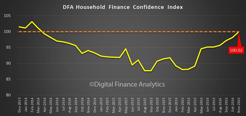
The latest edition of the Digital Finance Analytics Household Finance Confidence Index (FCI) to end September 2016 is released today. Using data from our household surveys we examine how households regard their overall financial position. The composite index rose from 95.8 in August to 97.2 in September, the highest reading for a couple of years, though still just below its 100 neutral setting. It is dragged down by households excluded from the property market.

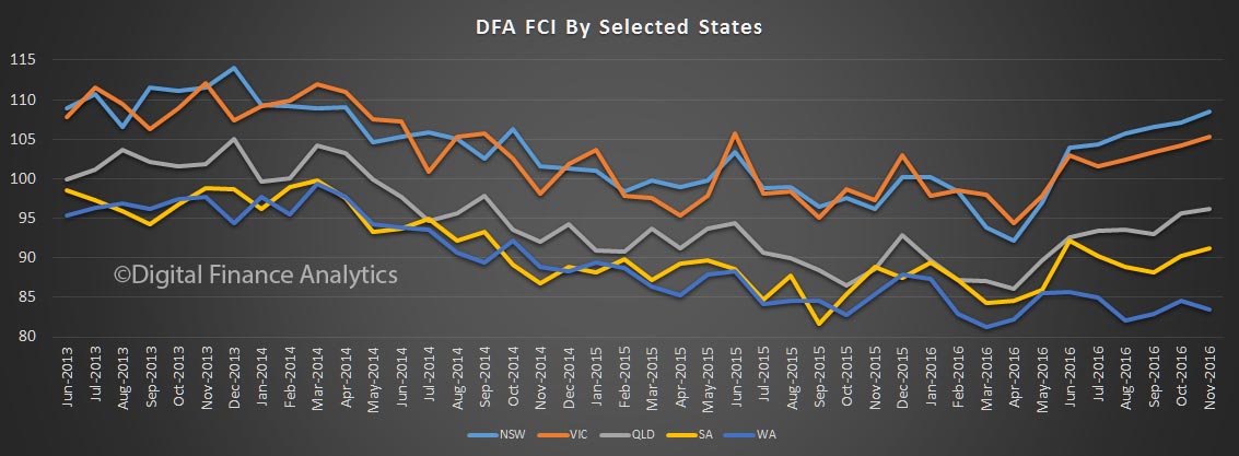
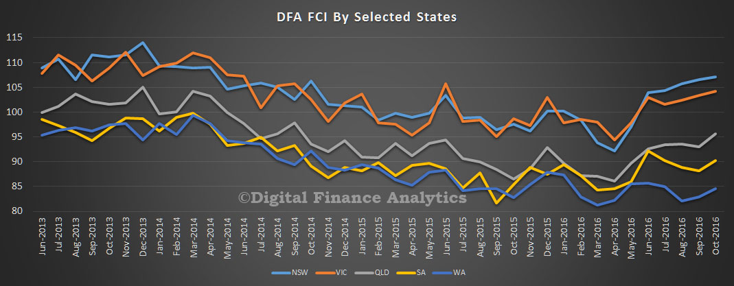
fci-sept-2016This average national score masks some important differences. First, the score varies by state. Households in NSW and VIC are now above the neutral setting, thanks to improving job prospects, rising home prices, and lower interest rates on mortgages. With stock markets on the rise, the only negative indicator in these states is low returns on bank savings (which is encouraging more to look at investment property) and high debt. Costs of living, though rising, seem largely manageable.

There is a different story in WA and SA, where unemployment is a higher risk, property prices are muted, and debt remains high. QLD sits between the two extremes, with households in and around Brisbane mirroring the results in NSW, whilst regional QLD is mirroring WA; a state divided. In these states, costs of living are more of a concern.

fci-sept-2016-statesLooking at the results by property owning segmentation, owner occupied home owners are the most positive about their financial position, thanks to the increasing wealth effect of rising home prices, in an ultra-low interest rate environment. Property investors are increasingly confident, thanks to better than expected capital values, lower interest rates and no disruption to capital gains or negative gearing policy. The only shadow on their horizon is flat rental incomes and poor tenant behaviour.

However, one quarter of households are property inactive – mainly in rental accommodation, or living with friends or family. They are excluded from the wealth effect of property. With incomes static, the costs of rent, alongside other costs of living, kept their scores much lower (and indeed take the national average below its neutral setting). Take property inactive households out of the equation, and the remaining groups would be well above the neutral setting. Your property owning status determines your wealth footprint – no wonder people aspire to get on the property ladder, at almost any cost!

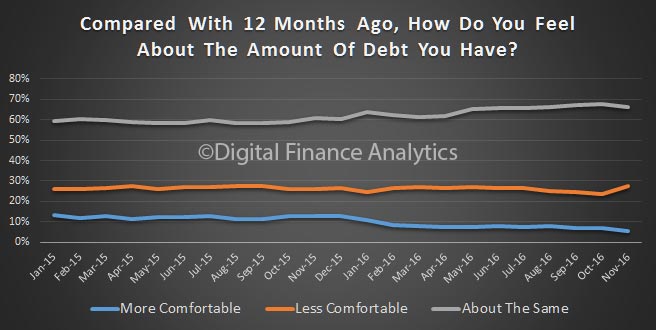
fci-sept-2016-pty Finally, we look at one of the specific dimensions in the survey. This month we look at debt exposure. Two thirds of borrowing households are as comfortable with the debts they hold as a year ago (bigger debts, but lower interest rates). Around 7% are more comfortable than a year ago, and 24% less comfortable, driven by finding it more difficult to service their debts in a low income growth, high cost growth environment. Remember, interest rates are very low at the moment, so this level of debt pressure remains a concern. If rates were to rise, pressure on these households would rise, fast.

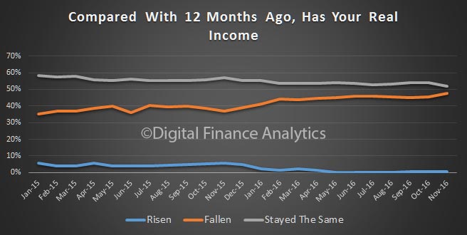
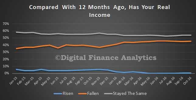
fci-sept-2016-debtBy way of background, these results are derived from our household surveys, averaged across Australia. We have 26,000 households in our sample at any one time. We include detailed questions covering various aspects of a household’s financial footprint. The index measures how households are feeling about their financial health. To calculate the index we ask questions which cover a number of different dimensions. We start by asking households how confident they are feeling about their job security, whether their real income has risen or fallen in the past year, their view on their costs of living over the same period, whether they have increased their loans and other outstanding debts including credit cards and whether they are saving more than last year. Finally we ask about their overall change in net worth over the past 12 months – by net worth we mean net assets less outstanding debts.

Retirement will be harder for future Australians

New research by the Swinburne Institute for Social Research, shows the wealth effect of holding property, and the risks in retirement of those unable to get on the ladder. In fact, a comfortable retirement is unlikely for those renting, because they are excluded from capital growth, which makes up such a large element of household wealth.

They also show that households who invested in property in 2013 were far more highly leveraged than those from 2003, reflecting changes in tax concessions, and growing household debt.

Essentially, households have little choice but to join the property owning sector, once again highlighting why people are so desperate to join the band wagon; and the risks embedded should home prices revert to more normal level. As we said in a recent blog – all most everyone wins from ever high home prices, until the music stops.

The report examined the wealth of people aged 40 to 64 years and recent retirees.

It evaluated the degree to which households can accumulate wealth for retirement, focusing on housing, and the impact of relationships and divorce or separation.

owners-wealth

Lead researcher Dr Andrea Sharam says lone person and couple-only renters over 45 years of age tend to have little wealth.

“There are currently 425,000 people in lone person or couple households over 50 renting in Australia with this number expected to rise to 600,000 by 2030 and again to 830,000 by 2050.

“This number of impoverished older people equates to a huge increase in demand for housing assistance.”

Men and women are revealed to have different pathways into rental poverty in old age. For women the cost of care and the gender wage gap negatively affects them, while for men low educational achievement, consequential limited employment prospects and disability are factors.

“Relationship breakdown typically adversely impacts wealth with one if not both former partners often falling out of home ownership and not later recovering home ownership.

“Single mothers with young children are particularly vulnerable,” Dr Sharam says.

Policy recommendations

The report recommends a number of policy changes, including substantial community investment in social housing, and new affordable housing tenures aimed at midlife households who may not be eligible for social housing but also cannot afford full market house pricing.

“Social housing eligibility should be widened to order to cater for a broader range of incomes,” Dr Sharam says.

This would help prevent the loss of wealth associated with being a private renter and minimise the danger of retirees exhausting their resources before end of life.

The report also recommends better rights for renters, including:

  • security of tenure in residential tenancies legislation,
  • institutional investment in rental housing,
  • age-specific rental supplements, and
  • a National Rental Affordability Scheme (NRAS) type program targeted to age pensioners.

To read the full report see, Security in Retirement: The impact of housing and key critical life events.

SACC Lending Market Evolving Fast

We have updated our Small Amount Credit Contract (SACC) models to include data to end September 2016. SACC is of course the new name for what were pay day loans, before the last round of regulatory changes. In fact we are still waiting on Government for their response to the review which was completed earlier in the year.

We published detailed analysis of the market last year. The report “The Stressed Finance Landscape” is available here. Our model is based on responses from our household surveys, and we also overlay economic growth factors and other data, to estimate potential future growth.

So looking at the new data, our first observation is that growth in SACC loans (under $2,000 and 1 year) is significantly faster than personal credit as reported by the RBA personal credit data. The overall value of these SACC loans is still small, under $1 billion compared with the $145 billion for personal credit (cards and personal loans).

sacc-sept-2016However, the growth in SACC loans appears to be directly linked with the rise on online usage, as more lenders, and borrowers go digital. We think about 70% of new SACC loans were originated via the online channels. We are also expecting the momentum to slow, as market participants tweak their business models and players leave, or enter the market.

sacc-size-and-online-sept-2016One clue is the mix of households. We identify households who have no choice but to use SACC loans (financially distressed) and those who choose to use these loans for convenience (financially stressed). The mix is changing, with more financially stressed using SACC, whilst distressed households are static, and we think will reduce over time, as lenders change the focus of their business models. In a nutshell, the new focus of the industry is convenient loans to more affluent households, rather than those struggling to make ends meet, and probably on Centrelink payments.

segment-sacc-sept-2016 The final clue is that the larger proportion of households with digital capabilities are those stressed, not distressed, so there is strong alignment with online origination. We conclude that it is online which is changing the game. This has profound implications for those seeking to work with households under pressure financially and how digital offerings should be regulated.

Latest Gross and Net Rental Yields Vary; Wildly

We can spot the best and worst investment property returns across the nation, using updated data from our household surveys. The average GROSS rental return in Australia is 3.9%, the NET rental return (after interest costs, management and repair costs etc, but before tax) is 0.4%. The average net equity held in a investment property is $161,798. This is the marked to market value of the property, minus the loans outstanding.

The data takes account of lower interest rates, and changes in rents as well as the latest property values. Things get interesting when we start to look at the segmented data. Not all investment properties are equal. Here is the average by each state.

rental-yield-oct-2016-statesThe left hand scale shows both gross rental yield (blue) and net rental yield (orange), while the line shows the average net equity in the property. We have sorted from lowest net rental return.

In VIC whilst the average gross return is still at 3.3%, the average net return is a 0.2% LOSS, while the average equity is $152,412. Compare this with QLD, with a gross return of 4.5% and a net return of 1.1%, with equity of $154,665. The best net return is to be found in TAS, where gross yield is 5.3%, net yield 1.7% and average equity $141,595.

Another way to look at the data is by our household segments. Here we find more affluent households are getting significantly better net returns (before tax) compared with those with lower incomes, including battlers, those living on the city fringes, and multicultural families.

rental-yield-oct-2016-household-segmentsCutting the data by our property segmentation, we find that portfolio investors are doing the best, with net returns well above 1%.

rental-yield-oct-2016-property-segmentLooking at our geographic bands, we find those on the urban fringe, or suburbs doing the least well. The best returns at a net yield level can be found in the CBD or CBD fringe.

rental-yield-oct-2016-geogFinally, we can drill down to individual postcodes and suburbs. To illustrate this, here is a chart of the 20 worst performers in VIC.  Households in Glenlyon (3461), a suburb of Bendigo about 86 kms from Melbourne are at the bottom.

rental-yield-oct-2016-vic-b20 The average net yield is a LOSS of 3.5%, and a net equity of just $24,000.

Remember that we are looking at the data before tax. Many investors will be willing to wear low net returns on property, to offset other income because of anticipated future capital gains. Negative investment gearing has a big impact on household investment behaviour.

Trading Up and Trading Down

We finish our household survey update by looking at holders, up-traders and down-traders. Importantly, there are more households seeking to trade down compared with those trading up. You can read the full analysis in the Property Imperative 7, released today.

Holders – More than 780,000 households are holding property, with 81% owner occupied and 21% investment. 418,000 of these properties are owned outright and are mortgage free. Of these households 54% expect house prices to rise in the next year, but under 1% would consider using a mortgage broker because they are by definition not intending to transact in the next year (99%).

Up Traders – Our survey identified about 1,045,000 households who are considering buying a larger property. Most (92%) are owner occupied. Of these households 12% are expecting to transact within the next 12 months, whilst 56% of households expect house prices to rise in this period.

survey-sep-2016-uptradeThe main reasons for these households to transact are as a property investment (42% – up from 40% last year), to obtain more space (29% – down from 33% last year), because of a job move (12%) and for a life-style change (13%). Many of these households will require further finance (74% – up from 70% last year) and a quarter will consider using a mortgage broker (22%), whilst 35% of these households are actively saving to facilitate a transaction. We note that prospective future capital gains rated most strongly, the view of property as an investment continues to drive behaviour. The trend is getting stronger.

Down Traders – More than 1.2 million households are considering selling and buying a smaller property, up by 100,000 from last year. Of these 71% are considering an owner occupied property, and 29% an investment property. Of these 680,000 currently have no mortgage and own the property outright. Around 20% of these households expect house prices to rise over the next year, a consistently low figure compared with other segments, whilst 38% expect to transact within 12 months, 10% will consider using a mortgage broker and 8% will need to borrow more. Households will transact to facilitate increased convenience (31%), to release capital for retirement (33%), because of unemployment (2%) or because of illness or death of a spouse (10%).

survey-sep-2016-down-traderWe see a continued sense among down traders that an investment property is likely to be a factor in their ongoing wealth management strategy, especially given the saving crunch underway at the moment, with deposit rates falling, and the inherent quest for yield.