The ABS released their preliminary data today. Tasmania apart, construction chain measures continue to fall. Trend estimate for residential building work done fell 3.0% this quarter and has fallen for four quarters.
The trend estimate for total construction work done fell 1.6% in the September quarter 2019.
The seasonally adjusted estimate for total construction work done fell 0.4% to $50,849.7m in the September quarter.
The trend estimate for total building work done fell 1.8% in the September quarter 2019.
The trend estimate for non-residential building work done rose 0.2% and residential building work fell 3.0%.
The seasonally adjusted estimate of total building work done fell 0.5% to $29,703.6m in the September quarter.
The trend estimate for engineering work done fell 1.1% in the September quarter.
The seasonally adjusted estimate for engineering work done fell 0.2% to $21,146.2m in the September quarter.
Trend percentage change: Total construction
The trend estimate for total construction work done fell 1.6% this quarter and has fallen for five quarters.
Trend percentage change: Engineering
The trend estimate for engineering construction work done fell 1.1% this quarter and has fallen for six quarters.
Trend percentage change: Building
The trend estimate for total building work done fell 1.8% this quarter and has fallen for four quarters.
Trend percentage change: Residential
The trend estimate for residential building work done fell 3.0% this quarter and has fallen for four quarters.
Trend percentage change: Non-residential
The trend estimate for non-residential building work done rose 0.2% this quarter and has risen for five quarters.
Chain volume measures – Trend estimates
New South Wales Victoria
Construction work done in New South Wales has fallen for four quarters.
Construction work done in Victoria has fallen for four quarters.
Queensland
Western Australia
Construction work done in Queensland has fallen for six quarters.
Construction work done in Western Australia has fallen for eight quarters.
South Australia
Northern Territory
Construction work done in South Australia has fallen for five quarters.
Construction work done in the Northern Territory has fallen for eight quarters.
Tasmania
Australia Capital Territory
Construction work done in Tasmania has risen for seven quarters.
Construction work done in the Australian Capital Territory has fallen for four quarters.
In the RBA’s Governor’s speech last night there was a reference to lower wages growth for longer, referring back to an earlier outing by Guy Debelle, Deputy Governor.
Debelle’s speech at Australian Council of Social Service (ACOSS) National Conference revealed at least to me that the RBA has no real idea as to why wages growth is so slow. They appear to have all but accepted it will be so. ” This increase in labour supply has meant that the strong employment outcomes in recent years has not generated the pick-up in wages growth that might otherwise have occurred. At the same time, I have highlighted the increased prevalence of wages growth in the 2s across the economy”.
We think the structural changes to the labour market (gig jobs, part-time work, multiple-jobs, etc) plus technological changes and globalisation all have a role to play. And the migration factors and temporary working visas are also playing into the mix. Finally, the balance between employee and employer seems to have shifted. Public sector wages are a little stronger.
He said: Over much of the past three years, employment has grown at a healthy annual pace of 2½ per cent. This has been faster than we had expected, particularly so, given economic growth was slower than we had expected. Employment growth has also been faster than the working-age population has been growing. As a result, the share of the Australian population employed is around its all-time high, which is a good outcome. Normally, we would have expected this strong employment growth to lead to a decline in the unemployment rate. But the unemployment rate has turned out to be very close to what we had expected and has moved sideways around 5¼ per cent for some time now.
So what is going on here? Strong employment growth but little change in the unemployment rate means
that the strength in labour demand has been met by strong growth in labour supply. This increase in
labour supply has come from more people joining the labour force and from some of those with jobs
putting off leaving the labour force. These trends have been particularly pronounced for females aged
between 25 and 54 and older workers of both sexes.
The surprising strength in labour supply has been one of the factors that has contributed to wages
growth being slower than we had expected. But at the same time, the lower growth in wages has probably
contributed to the strength in employment growth. My undergraduate honours thesis at Adelaide Uni
examined the aggregate labour demand curve in Australia which was a much debated topic at the time.[1] So more
than 30 years on, I will discuss similar issues today.
I will look at the rise in participation rates of females and older workers and discuss some of the
factors that have been contributing to it. I will also look briefly at what jobs have been created. In
doing so, I will make use of the micro data in the monthly labour force survey (LFS) as well as micro
data from the HILDA survey.[2] That is, we are examining the micro data to understand the macro trends in the
labour market.
By and large, the new jobs created over the past few years have been representative of the existing
stock of jobs. There have been low wage and high wage, lower skilled and higher skilled jobs created,
but about average on both counts. The jobs growth has been in household services jobs such as health
care, social assistance and, education, as well as in business services. Two-thirds of the employment
growth over the past two years has been in full-time jobs.
Then I will look at wages growth and show that the lower average wage outcomes of the past few years
have reflected the increased prevalence of wages growth in the 2s across the economy.
Finally, I will look forward and talk about the RBA’s forecasts for the labour market. Two of the
critical influences on that forecast are how much further labour supply will increase and how entrenched
are wage outcomes.
Participation
An increase in the number of people in employment can be met either by an increase in people entering
from outside the labour market or a decline in unemployment. The increase in people coming from outside
the labour force, causing an increase in the participation rate, is known as an ‘encouraged
worker’ effect – when economic conditions improve, there is a tendency for people to enter
or defer leaving the workforce.[3] Historically more of the increase in employment has translated into a reduction
in the unemployment rate than by a rise in the participation rate.
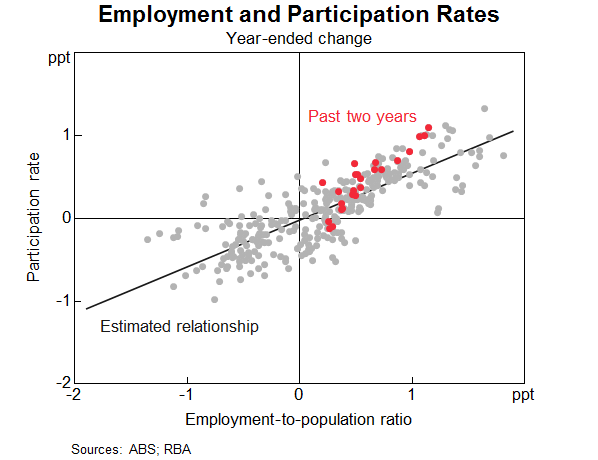
However, the past couple of years have been unusual. The increase in employment has been met
disproportionately by an increase in the number of people participating in the labour force
(Graph 1). The share of the population participating in the labour force is at a record high. The
two main groups contributing to this rise in participation are females and older workers. I will discuss
each of these in turn and some of the forces driving the outcomes over both the recent past and from a
longer perspective. An understanding of these forces can help us assess how much further these trends
are likely to continue.
Graph 1
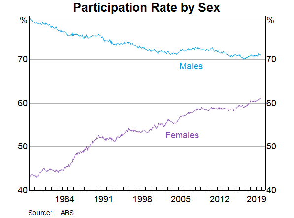
Female participation
Female employment growth has accounted for two-thirds of employment growth over the past year. The
female participation rate is now at its highest rate, and the gap between female and male participation
is now the narrowest it has ever been (Graph 2).
Graph 2
The female participation rate has steadily increased over recent decades (from 40 per cent in
1970 to 61 per cent in 2019), and a similar upward trend is evident across other advanced
economies. Changing societal norms and rising educational attainment have contributed to more women
moving into paid employment or employment outside the home. Female participation has also been
influenced by the increasing flexibility of working-time arrangements, the availability and cost of
child care and policies such as parental leave.
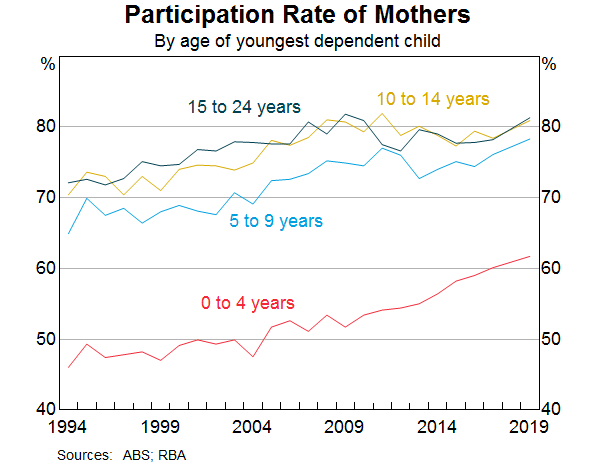
Nearly half of employed females work part time, often to care for children. Over recent decades, the
participation rate of mothers with dependent children has trended higher, rising by 10 percentage
points since the early 2000s to 73 per cent. Over the past decade, the rise in participation
has been most pronounced for mothers with children aged between 0 and 4 (Graph 3). Of those
returning to work within two years after the birth of a child, an increasing majority are citing
‘financial reasons’ as their main reason for doing so. Other mothers returning to work
cite ‘social interaction’ or to ‘maintain career and skills’ as their main
reason. Financial reasons could be capturing a number of different considerations including low income
growth, the rise in household debt or child care costs.
Graph 3
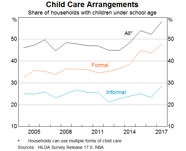
Research suggests the cost and quality of child care does have a significant effect on the labour
supply of women.[4] Data from the HILDA survey show that the share of households using formal child care
for young children has increased notably over the past decade (Graph 4). However, access to child
care places and financial assistance with child care costs remain ‘very important’
incentives for females currently outside the labour force.
Graph 4
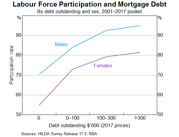
Another factor that is linked to higher rates of female participation over recent decades is the
increase in the level of mortgage debt of home owners (Graph 5). The rise in debt levels has
broadly coincided with the increase in the participation rate of females. However, it is difficult to
establish which way causality is going. Are debt levels higher because more households have two incomes
and can afford to borrow more? Or does the need to borrow more to afford housing drive the decision to
participate more? Or is it the case that the low level of income growth in recent years has meant that
households have more debt than they anticipated and need to work longer to pay it down? Research to
establish causality has usually found some evidence of a causal relationship running from higher debt
levels to higher participation.[5] However, the analysis indicates that the effects are not that large at an
aggregate level.
Graph 5
The rollout of the National Disability Insurance Scheme (NDIS) may also have encouraged increased
participation of female carers. We know from a detailed survey of NDIS participants and their families
that parents of those with disabilities work fewer hours on average and are more likely to be in casual
employment.[6] It is probably too early in the rollout of the scheme to see a material increase in the
number of parents re-entering the labour market. The survey suggests there has been a slight increase in
the average number of hours worked since the start of the scheme, but the percentage of families/carers
of NDIS participants who wanted to work more hours has not changed.
Thus two significant drivers of the increase in participation rates of females aged between 25 and
54 over a long period of time are child care costs and other financial factors. The open question
is how much more the participation rate of this group will rise.
Older workers
The share of the Australian population aged between 15 and 64 years has continued to decline,
and is expected to continue to decline. This is due to the ongoing transition of baby boomers into
retirement ages. All else being equal, an ageing population will result in a fall in the supply of
labour, since the generation retiring is larger than the generation entering the workforce. But there
has been a long-term trend for each cohort to participate more than previous cohorts did at the same
age. That trend has accelerated recently, and more than offset the effect of ageing on its own. The
share of 55 year olds and older that are employed is 35 per cent, compared to
22 per cent 20 years ago.
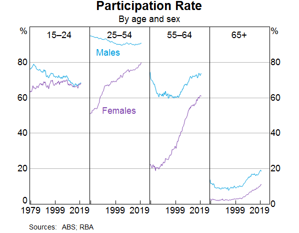
This cohort effect is particularly clear in the third panel of Graph 6. The much larger rise in
female participation than males over the past two decades is a stark illustration of the effect, as the
other drivers of participation in this age group should have similar influences on both male and female
participation.
Graph 6
Why are older people working longer?[7] One contributing factor is improved health. People are
working longer because they can, both because of their own health and also because the nature of work
has changed over the years towards services and away from manual work, which means most people are in
less physically demanding jobs.
It used to be the case that many older workers would have to choose between working full time and
retiring. From a labour economics point of view, the labour/leisure trade-off has much more choice than
it used to.[8] In the past, it was often an all or nothing decision. As the labour market has become
more flexible over recent decades, older workers may be able to reduce their hours but still participate
in the labour market. Indeed, around one-third of workers aged 55 years and older are working part
time, with over half doing so because they prefer to do so. The ABS Retirement and Retirement Intentions
survey suggests that of people aged 45 years and older, around one-third of workers intend to cut
down from full-time work to part-time work as they get older.
As people live longer, they may want to work longer voluntarily, depending on the value they get from
working. But they also may need to work longer to achieve the necessary income to support the standard
of living they would like in retirement.
Access to a retirement pension or superannuation is a very significant element in the decision to
retire. More than half of all retirees over 60 cite that reaching retirement age or becoming
eligible for the pension/superannuation as the main reason they retired from work. The male
participation rate begins to decline around age 50 and there is a noticeable change in the rate of
decline around 65; the historical pension age for men. For women there is a similar pattern, although in
the past there was also a change in the rate of decline around age 60.
Accordingly, announced and actual increases in pension ages are also likely to have contributed to
increased participation. This has been documented in the past for females after the government increased
the female pension age from 60 to 65 between 1996 and 2013 (in 6 month increments every
2 years).[9]
Currently the pension age is being raised to 67 years for both sexes; a process that began in
2017. The average age of job leavers over the age of 55 has increased slightly in recent years. Our
analysis of LFS micro data provides tentative evidence that the 2017 changes to the pension age had an
impact on workers’ retirement decisions. The participation rate of those born in 1952 and 1953 (who
were affected by the changes in 2017) does not decline as quickly when they turned 65, compared to the
earlier cohort groups that were not affected by the pension age increase.[10] In
aggregate, this analysis suggests that the pension changes boosted the participation rate by around
0.1 percentage point.
As I said above, some older workers are working for financial reasons. As we all know, one of the major
considerations for those contemplating retirement is their wealth and ability to fund their retirement.
Increasing house prices and share prices over much of the last decade are likely to have reduced
participation of older individuals.[11] The recent decline in house prices may have resulted in
some individuals delaying their retirement and not withdrawing their labour supply. However, the price
declines were modest compared to the earlier increase, so that those considering retirement would have
experienced a net gain in house prices and a decline in their debt.
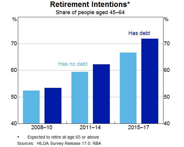
Similar to females, the rise in the participation rate of persons aged 55 years or older is also
likely to have been related to developments in household debt. Over recent decades there has been a
trend towards greater indebtedness for these persons. The proportion of older households with
owner-occupied home loans has risen from around 20 per cent in the early 2000s to around
37 per cent today. The increase in debt has also been associated with a change in the
retirement intentions of older workers. Over time, the gradual shift towards later retirement has been
more noticeable for those with debt (Graph 7). As with the female participation story, there is a
question of causality. Are people working later in life because they have an unexpectedly high level of
debt? Or had they always intended to work longer and hence were more willing to borrow more and carry
more debt later in life?
Graph 7
To draw this together, participation rates have risen as employment has grown over the past three
years. This increase in supply has been unexpected, so it is important to try to understand what is
driving it to have some sense on how much further these trends are likely to run. The two major shifts
in participation have been amongst females aged 25–54 and older workers. These trends have
been there for a while and have been even stronger recently. I have presented some of the insights from
our analysis of various micro data sources but there is still more to understand. We will continue to
focus on this given its importance to the outlook, which I will come to later.
Employment
What sort of jobs have been created in recent years?
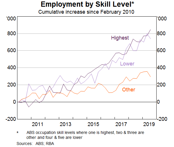
Some have assumed that the jobs that have been created in recent years are lower-skilled or lower-paid
jobs. However, when we break down the occupation-level data by skill type or pay level, this is not the
case. The strongest growth in employment over the past decade has been in highest-skilled (as defined by
the ABS) jobs. There has also been solid growth over the same period in lower-skilled jobs
(Graph 8). Similarly, the growth in employment has been broadly distributed across the pay spectrum
(Graph 9).
Graph 8
Graph 9
Another often stated view is that much of the job creation in recent years has been in the public
sector, rather than the private sector. According to the Labour Account data, the number of jobs created
in the private sector has far outnumbered the number of jobs created in the public sector
(Graph 10).[12] Private sector job creation has been particularly strong in health care and education
(which is partly, but a long way from entirely, due to government spending in these areas),
but also in business services and industries like construction and hospitality.
Graph 10
We have also used the micro data to look at the people that have moved into some of these growth areas.
For example, the share of employment in the health care & social assistance industry has increased
from 9 to 13 per cent over the past decade. Those entering or leaving health care and
social assistance tend to do so from a small number of other industries such as public administration,
support services, education and training and other services into health care and social assistance.
Around 10 per cent of people entering employment from outside the labour market are moving
into health care, while a slightly smaller share move into this sector from unemployment. A large share
of workers between the age of 55 and 69 years of age work in health care and social
assistance, so this is likely to be related to individuals delaying retirement.
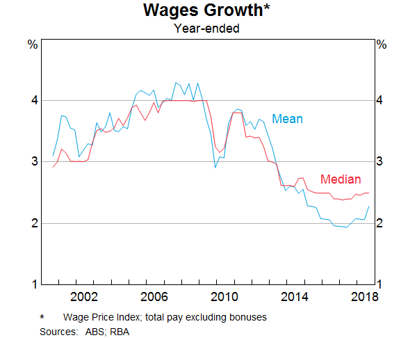
Wages
Wages growth has declined noticeably since around 2012. As wages growth has fallen, the distribution of
wages growth has also become increasingly compressed. This fall in the dispersion in wages growth across
jobs mainly reflects a sharp fall in the share of jobs receiving ‘large’ wage rises. The
Bank has highlighted this previously, but I will update that analysis and illustrate the increased
pervasiveness of wage outcomes between 2 and 3 per cent across the labour market.[13]
The share of jobs that experience a wage change of more than 4 per cent has fallen from over
one-third in the late 2000s to less than 10 per cent of jobs in 2018 (Graph 11). Given
that firms are also unwilling or unable to reduce wages, this has meant that the vast majority of wage
growth observations in the labour market are now tightly clustered in the range of
0–4 per cent.
Graph 11
There is growing evidence to suggest that wage adjustments of 2 point something per cent have
now become the norm in Australia, rather than the 3–4 per cent wage increases that were
the norm prior to 2012. The rising prevalence of wage outcomes in the 2s can be seen in the official
data and in the Bank’s liaison with firms.
One notable example is the large increase in the share of enterprise bargaining agreements that provide
annual wage rises in the 2–3 per cent range. The share of such agreements has risen
from around 10 per cent over the 2000s to almost 60 per cent in 2019
(Graph 12). Over the same period, the proportion of agreements providing wage increases of
3 per cent or more has fallen sharply.
Graph 12
A similar picture emerges when we look at the job-level data that underlie the ABS’s wage price
index (WPI). These data, which also provide insights on wage outcomes for jobs where pay is set
according to individual arrangements, also show that the share of jobs getting wage rises in the
2–3 per cent mark has risen noticeably. The Bank’s liaison with firms also
confirms that the share of firms reporting wages growth of between 2 and 3 per cent has
increased to around 45 per cent in recent years. Prior to 2012, fewer than one in
10 firms were reporting wages growth in this range.
Another way to see this shift in wage setting over time is to look at the median rates of
wages growth across all jobs in the labour market (Graph 13). Unlike the mean, the median is less
affected by the large decline in ‘large’ wage rises in recent years and the changing
prevalence of wage freezes. Prior to 2012, median wages growth was firmly anchored at
4 per cent. In recent years, median wages growth has fallen to 2½ per cent, and
has remained at that level.
Graph 13
Different measures of wages growth capture slightly different concepts of labour costs. The WPI, which
is one of the main measures that the Bank monitors, tracks wage outcomes of individual jobs over time,
rather than tracking particular employees.[14] This feature of the WPI makes it useful for gauging
developments in wages growth after abstracting from any changes in the nature of work or the composition
of employment. However, this feature also means that the WPI does not capture wage rises that come from
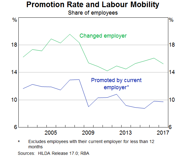
getting promoted or changing firms.
But other surveys suggest that promotions can be a key source of earnings growth for individuals. On
average, a promotion leads to a 5 per cent boost in hourly wages, which is comparable to the
wage rise a worker gets when switching firms. Since 2012, there has been a broad-based decline in the
proportion of employees that are getting promoted at work or switching jobs (Graph 14). This means
that a smaller fraction of the workforce are receiving these wage rises.
Graph 14
Why have wage outcomes in the 2s become so prevalent?[15] One phenomenon that could explain it is the
well-known tendency for workers to resist reductions to their wages in real terms.[16] This
phenomenon, also known as ‘downward real wage rigidity’, leads to a clumping of
employees’ nominal wage changes in the vicinity of their expected rate of inflation, particularly
when nominal wages growth is tracking at a low level. In that sense, the RBA’s inflation target of
2–3 per cent on average over time provides a strong nominal anchor in wage
negotiations. When my colleagues looked at the job-level WPI data they did find evidence of a clumping
of wage outcomes either at, or just above, expected inflation.
While wage increases in the 2s have become very common for many employees, those whose wages are set
according to an award have generally been receiving wage increases in excess of 2 per cent in
recent years. This reflects the Fair Work Commission adjustments, which have provided support to wages
growth at the lower end of the skill distribution, given the prevalence of award-reliant jobs in this
part of the labour market. Wages growth for the least-skilled jobs has outpaced all other skill groups
since around 2013. This contrasts with the commodity price boom period, when wages growth was strongest
for higher-skilled jobs. Consistent with this, the ratio of average hourly earnings of award-reliant
employees to those of other employees has risen since 2012, largely reversing the falls seen in the
earlier period.
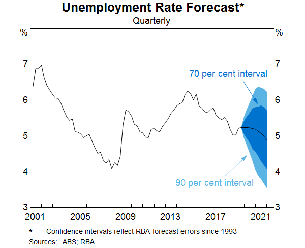
Outlook
The recent Statement on Monetary Policy provided the Bank’s latest forecasts for the
labour market and wages growth. GDP growth is forecast to gradually increase over the next couple of
years, which should result in a small decline in the unemployment rate from its current rate of
5¼ per cent. As Graph 15 shows, there is always uncertainty around that central
forecast. One of the key sources of uncertainty currently around the outlook for the unemployment rate
as well as wages growth, is whether labour supply will be as responsive to labour demand as it has been
in recent years. That is, will the expected increase in labour demand encourage as much participation as
it has most recently? How much further do some of these drivers of increased participation for older and
female workers have to run? That is a difficult question to answer.
Graph 15
The dynamics of participation and unemployment flows will have an important bearing on wages growth as
well as household income growth. We expect wages growth to remain largely unchanged at its current level
over the next couple of years.
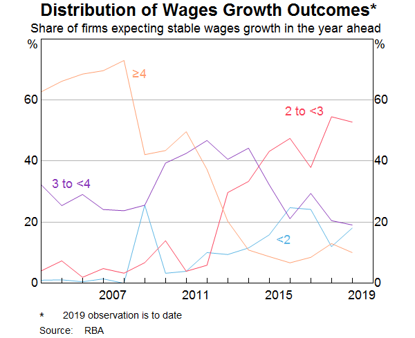
Why don’t we think wages growth will pick up over the next couple of years? What we know from our
liaison program is that the proportion of firms expecting stable wages growth in the year ahead is
around 80 per cent and only around 10 per cent anticipate stronger wages growth. Of
those firms expecting stable wages growth, the share reporting wage growth outcomes of
2–3 per cent has steadily risen over time. This supports the case that lower wage rises
have become the new normal (Graph 16).
Graph 16
Recently there has been a rise in the proportion of new EBAs with a term of three years or more. The
lower wages growth incorporated in those agreements suggests that wages growth of around
2½ per cent for EBA-covered employees will persist for longer than in the past.
The more wages growth is entrenched in the 2s, the more likely it is that a sustained period of labour
market tightness will be necessary to move away from that. At the same time, I don’t think there is
much risk in the period ahead that aggregate wages growth will move any lower.
Conclusion
Today I have provided an overview of the current state of play in the labour market and the Bank’s
expectation about how it might evolve in the period ahead. I have highlighted some of the key forces
that have shaped these developments, in particular, the rise in the participation rates of female
workers and older workers. The Bank is trying to understand what has been driving these macro
developments using some newly available micro data sources. This greater understanding should help
inform our outlook for the labour market.
This increase in labour supply has meant that the strong employment outcomes in recent years has not
generated the pick-up in wages growth that might otherwise have occurred. At the same time, I have
highlighted the increased prevalence of wages growth in the 2s across the economy. A gradual lift in
wages growth would be a welcome development for the workforce and the economy. It is also needed for
inflation to be sustainably within the 2–3 per cent target range.
Kevin Rudd has warned Australia is too “China dependent” in economic terms, and must diversify its international economic engagement. Via The Conversation.
Setting out principles he believes should govern the way forward in
dealing with China, the former prime minister said for too long
Australia had been “complacent in anticipating and responding to the
profound geo-political changes now washing over us with China’s rise,
America’s ambivalence about its future regional and global role, and an
Australia which may one day find itself on its own”.
Launching journalist Peter Hartcher’s Quarterly Essay, Red Flag:
Waking up to China’s challenge, Rudd said Australia needed a
regularly-updated “classified cabinet-level national China strategy”.
This should be based on three understandings. The first was that
“China respects strength and consistency and is contemptuous of weakness
and prevarication”.
The others went to awareness of China’s strengths and weaknesses, and
of Australia’s own strengths, weaknesses and vulnerabilities.
Rudd, who was highly critical of the government, declared “Australia
needs a more mature approach to managing the complexity of the
relationship than having politicians out-competing one another on who
can sound the most hairy-chested on China”. This might be great domestic
politics but did not advance the country’s security and economic
interests.
Australia should “maintain domestic vigilance against any substantive
rather than imagined internal threats” to its political institutions
and critical infrastructure.
He fully supported the foreign influence transparency act, but he
warned about concern over foreign interference translating “into a form
of racial profiling”.
“These new arrangements on foreign influence transparency should be
given effect as a legal and administrative process, not as a populist
witch-hunt” – a return to the “yellow peril” days.
Rudd said Australia must once again become the international champion
of the South Pacific nations, arguing the government’s posture on
climate change had undermined Australia’s standing with these countries
and given China a further opening. “The so-called ‘Pacific step-up’ is
hollow.”
Australia should join ASEAN, Rudd said; this would both help that
body and assist Australia to manage its long term relationship with
Indonesia.
On the need to diversify Australia’s international economic
engagement, Rudd said: “We have become too China-dependent. We need to
diversify further to Japan, India, Indonesia, Europe and Africa – the
next continent with a rising middle class with more than a billion
consumers. We must equally diversify our economy itself.”
Rudd argued strongly for Australia to continue to consolidate its alliance with the United States.
But “Australia must also look to mid-century when we may increasingly
have to stand to our own two feet, with or without the support of a
major external ally.
“Trumpist isolationism may only be short term. But how these
sentiments in the American body politic translate into broader American
politics with future Republican and Democrat administrations remains
unclear.”
Rudd once again strongly urged a “big Australia” – “a big and
sustainable Australia of the type I advocated while I was in office.
“That means comprehensive action on climate change and broader environmental sustainability,” he said.
“Only a country with a population of 50 million later this century would begin to have the capacity to fund the military, security and intelligence assets necessary to defend our territorial integrity and political sovereignty long term. This is not politically correct. But it’s yet another uncomfortable truth.”
Author: Michelle Grattan, Professorial Fellow, University of Canberra
The latest edition of our weekly finance and property news digest with a distinctively Australian flavour.
Contents:
00:22 Introduction
01:20 US Trade War
02:30 US Data and Markets
03:40 US Debt Growing Too Fast Says Fed
05:30 Repo and QE
07:40 Europe
08:20 Germany Financial Stability
10:50 China Another Bank Bailed Out
11:50 OECD Growth Lower
14:55 Australian Segment 14:55 OECD On Australia 19:10 Westpac MI Index 20:30 Inflation Expectations 21:10 NAB Household Debt 21:30 Housing Affordability 25:10 Home Prices and Auctions 26:32 Markets 26:50 Westpac and AUSTRAC 28:00 RBA. Unconventional Monetary Policy, and Negative Rates
We recently posted Out and About in Wollongong featuring the Jolly Swagman, in which we examined the state of the local economy. The show was supported by some excellent research from Mitchell Grande, a recent Graduate of Politics, Philosophy, Economics (Honours) at the University of Wollongong – concerned with Australian public policy, and especially energy policy. Today we provide additional context from his research.
His research involved three interviews across different professions, renamed for anonymity: Interviewee A, a former Development Assessment Officer in Wollongong for many years; Interviewee B, a non-governmental organisation Project Officer operating within Crown St Mall; and Interviewee C, an Economic Development Officer with the Council.
Behind these interviews is the background story
of Wollongong after the turn of the century. Pioneered by rezoning of
Wollongong’s inner-city industrial land, in favour of mixed-use residential
developments or shop-top housing, there has been a profound shift in the local economic
and labour market landscapes. Noticeably from our video, there is a lot of
development reinforced by lots of Council strategies. In times like these, it’s
worth getting on to the street to see behind the data and progress – and what
we found was interesting: things are bad, but things are better.
Interviewee A spoke of the 2009 changes in the
Local Environmental Plans (LEPs), which swung heavily toward shop-top
development, including the removal of height restrictions to quite unreal
limits. In their time, they approved four 10 to 30+ storey buildings in Wollongong
Central Business District (CBD), and particularly around Wollongong Station – but
few if any have come to fruition, due to the global financial crisis and also
the poor planning-related features of ‘the Dead Zone.’ As we saw, this area had
confusing commercial mixes like pawn shops and money stores, services and real
estate agencies, as well as a mix of poor parking and daggy takeaways. Being
the main in/out ramp of the station, foot traffic isn’t an issue – it’s just
all heading somewhere else.
The 2009 LEP changes led to a major imbalance
for local development, focusing on maximising residential construction and
returns. Most of all, the LEP held a “very confusing and convoluted floor space
ratio (FSR)” which favours commercial space but “which ‘Gong developers shy
away from.” Interviewee A, here, spoke to the uniformity of FSR as a state-wide
number given by the Department of Planning. This, not rates, is one major
reason for vacancies. These kind of planning controls have steered local cities
into densification, gentrification, and an expanding zone of unaffordability
through urban sprawl, visualised by ghost shops.
After
walking a few blocks toward the mall, noticeable changes in both vibrancy and
vacancy were apparent. More services, notably health and wellbeing, as well as
massage parlours and more cheap loans shops (for every one of those there was a
couple more vacancies). A diverse street, for sure. But whether these are real
drivers of economic growth, value creation, or just inelastic goods and
services is implicit. Among all else, this type of job mix reinforces
underemployment and poor wage conditions for the city.
The area between the Mall and the Dead Zone is hindered by the de-integration between these areas and the Hospital, having little draw in value and liveliness. As well, high running costs, high rents, low retail spending, and rising mortgage stress… these businesses would be betting heavily on new demand from the towers being built behind it. The story of de-integration between these areas is synonymous with the entire Wollongong local government area – albeit a much larger story – disjointed between education, health, metro, and recreation precincts.
For Interviewee B, the new retail segment of
Crown St Mall has been chancy. It serves its purpose as a hub for, say, going
to Chemist Warehouse or JB Hi-Fi, as well as having a food court and strip of
restaurants – where most, if not all, are either chains, franchises, or
commonplace brand names. This section has dramatically shifted the CBD’s centre
of gravity, with rare if any vacancies appealing to consumers. Foot traffic is
strictly to the centre (or the Mall), with people passing by proximate eateries,
bus stops, and many vacancies – whether these feet notice and buy from these
surrounds is another question. Interviewee B spoke to the ability of chains and
big box retailers to withstand higher rents and ‘cyclical’ lower sales than,
say, the local butcher who stuck it tough across from Coles.
Following
a pitstop at Wollongong’s big box centre, we finally ventured down Crown St
Mall. A perfect Spring day in the ‘Gong, with a foragers market spanning a
third of the way. For a midday Friday, it was plenty bustling. But the ground
floor and upstairs vacancies were pervasive, with one for sale or for lease
every few stores. In particular, the diversity of the store fronts was fairly
constrained to health services, global brands, banks and financial services, as
well as the tried and true café/bar.
Interviewee B works in the space between
government and landlords, seeking to fill Crown St Mall vacancies with ‘makers
and creators’ until the landlord finds a apposite tenant. These makers and
creators run on a continually renewing 30-day license, while the shopfront is
still advertised as for lease. Although not very well showcased in the video,
these spaces are filled with new ideas and tenants who are battling through the
local economic shift from traditional retail models. For these tenants, rents
remain high as much as turnover remains low: a recent fix of already poor
consumption hampered by online shopping and buy-now-pay-later services. In
short, it is important to keep the Mall vibrant with non-traditional stores but
“no way can [makers and creators] step into Crown St Mall on a full rental
lease…” averaging $1,500 per week.
This form of short-term leasing is, in my
opinion, successful insofar as it allows business who would otherwise shift
into the ‘burbs a chance at establishing customers and proficiency in a pedestrian
mall setting. It has successfully brought vibrancy to otherwise dingy spots of
the Mall, like Globe Lane; an impressive growth story. The main question, in
the long run, is the scheme’s sustainability and whether it can positively
impact wages or the local economy through a surge in value added or productive
activities. A very tall order.
Toward
the end of the pedestrian Mall, where the market had ceased, we stopped again.
The pattern of financial services and vacancies continued. Beyond the Mall
toward the beach, although not featured in the video, is an interesting few
blocks of many independent takeaway joints (bars, cafes, burgers), public
administration buildings, and spats of development. Of note, lots of recently
built shop-top housing is sparingly filled with ground floor tenants and is
adjacent to more under construction mixed-use buildings.
As spoken to in the outset, the LEP rezoning of the inner-city toward the mixed-use development model has severely jolted the labour market, favouring both services and residential construction over value-added or manufacturing businesses. The inner-city land which surrounds the mall once retained over 12,000 manufacturing jobs back in 2007-2008. Since, the sector has fallen to 6,000 employees (2017-2018). Importantly, this is a treble effect of rezoning pressuring SMEs out of the inner-city, as much as it is higher rents and growing specialisation of overseas low-wage competitors grounding out businesses.
Interviewee B has seen this all too often,
especially along Crown St Mall. SMEs are highly leveraged in personal debt and burdened
by cost of living pressures, reluctant to fully close and instead stay fraught
with affordability. Because of this, in their experience, tried ideas leave but
rarely relocate. And if they were to, it would be out of the inner-city over to
Fairy Meadow or Corrimal.
Interviewee C was well aware of the loss of
manufacturing jobs, reiterating the Council’s commitment to public and private
investment into office space, framing the opportunity to tap into the services
labour market. Equally, investment is being directed to ‘[meet] the demand of
inner-city living’ with shop-top housing increasing by 1,500 dwellings over
2016-2021. But glaringly, “the profitability and investment return of
residential development has far outweighed the commercial management of
development, leaving very little room for management.” It is intended that current
and future investment will positively serve the anchor tenants, which, on the
one hand, should be true as long as local population grows, and sustainable
businesses land a lease. Easily done, right? But as we know, the
ever-present question of demand and the ability to match is very uncertain.
Interviewee A believes the transition from
manufacturing (etc.) will continue ever onward toward a service-based economy.
Through such, they foresee more sociocultural flight, more commercial
shortfalls in transition, and more finance being tied into housing, rents and
accommodation. To stave off the current ‘feel’ of the ‘Gong, they suggest, “either
someone at UOW needs to create the next Google” or locals must have all their
needs localised and accommodated, meaning minimal commute times for work or
health related specialists.
Which brings us to Lang’s Corner, set to be a
10-or-so storey commercial office tower at the so-called end of the Mall.
Interviewee C strongly affirmed the need for high-quality office space as a
main driver of jobs growth. This goes with councils target of 1,050 jobs per
annum until 2030, by retaining local skills and accommodating those shifting
from Uni or primary industry, to become a ‘nationally significant city.’ Lang’s
Corner is a part of “30,000 sqm of new commercial space, including 16,500 sqm
of A-grade office space…” in the pipeline. Interviewee C then shared a number
of reports which reaffirmed their position about the economic health and needs of
Wollongong:
Knight Frank’s 2017 report said that Wollongong’s “A-Grade office vacancy rate
currently measures 8.5% (from 74,626 sqm total A-Grade stock) …” citing that
“vacancy will reduce significantly in early 2017 following the recent
announcement that the SES will move to the former ATO building.”
And then in their 2018 report that “[at] 10.6%, Wollongong’s office vacancy rate
is currently at its lowest level in five years, having declined from 11.2% in
January 2017…” and that “Limited leasing options are causing rents to rise…”
“…prompting the need for more office space in Wollongong to facilitate economic
development.”
The 2019 Office Market Report, published by the Property Council of
Australia, found that there is currently a shortage of office space in the city
centre – a much smaller zone than Knight Frank’s. Here, “the vacancy rate for
A-grade is low at just 1.4%.”
It was in that report that “Total vacancy
decreased from 10.6 percent to 10.0 percent in the year to January 2019; The
vacancy decrease was due to 2,518sqm of withdrawals; and Demand was negative
with -1,387sqm of net absorption recorded”
A Herron Todd White report found commercial vacancies “flat”, however,
held optimism going into 2020 due to a ‘recovering housing market’ and interest
rate cuts which ‘should stimulate retail spending’.
This report also profiled Wollongong as having
“Leasing conditions [which] have continued a long term trend of being static
given above average vacancy
rates and generally soft demand, while supply continues to be introduced to the
market given the large number of mixed-use projects completed in the Wollongong
CBD over recent times and with additional projects also being developed at
present…”
But importantly “There is no upward pressure
being placed on rental rates with conditions generally favouring tenants.” They
claimed that buyer demand does exist, however, had not shone through in 2019.
Interviewee A rejects the need for more office
space, rather “there is a good mix… it [demand] is just not really there.” As
well, “the vibrancy and feel of the place [in comparison to, say, the Shire
CBDs along the trainline] also isn’t there…” “it has its own feel.” Interviewee
A then went on to warn that current population and consumer issues, as well as
demand and ability issues, will maintain the commercial sprawl and only increase
vacancies and intimidate overindebted SMEs.
It appears that the real surge behind this demand/shortage of office space/scarce supply-induced rents is largely due to the residential development imbalance, in that Council has been ‘all in’ on housing speculation for some time, now requiring mammoth investments into commercial/office space. The frankly obtuse ratio of residential to commercial floor space has reduced local labour market diversity (i.e. losing manufacturing and primary industry, gaining services and food) in opting for shop-top developments. It is now vital, for the sustainability of the region, to catch up.
At the
close of the video, we stood beneath two new mixed-use towers of 22 storeys and
19 storeys, with another under construction down the road set to be 21 storeys.
The main questions which stuck with Joe and Martin were how the ‘Gong would
absorb this supply, especially given population growth of 0.8% and the current
macroeconomic conditions. Given the trend in local rents and consumer spending,
will the ground floors be leased? Because, as we have seen play out across
Australia’s junior CBDs, vacancies in newly constructed mixed-use buildings
have been ubiquitous, with high turnover of retailers going bust or relocating
out of mixed-use buildings, just to be replaced by ‘essential’ services. It is locally
apparent that landlords refuse to lower rents for non-service tenants, in order
to protect their loan-to-value ratios and avoid bank repayments.
It’s especially uncertain whether such an
increase in residential supply will depress local prices, maintain the 2018
highs to maximise developers’ return, or be taken by domestic market,
supposedly, upward. Council is fairly certain on developing more sooner,
stylised by a great deal of high-rise development. At present, Wollongong has
over 18 cranes: 8 were mixed-use residential (Parq on Flinders, Crownview
Wollongong, Signature in Regent St, Avante in Rawson St, Skye Wollongong,
Atchison St, and the Verge in Underwood St, Corrimal); 5 were residential
(Loftus, Beatson and Church streets, The Village in Corrimal); 3 were
commercial (Getaway, IMB Banks, Lang’s Corner); 2 at the University of
Wollongong, and 1 day surgery at Urunga Parade. Local construction is at a high
– only being beaten by Gold Coast with 29 cranes and Adelaide with 19 cranes
on the infamous Crane Index.
Given the palpable feel of vacancies on the
ground around these development cites, it seems that the area might soon be
flooded with mixed-use and commercial space at a highly inopportune time in the
market. It’s hard to tell whether the ground-level retail/commercial spaces of
these under construction towers can actually be filled – let alone sustained – by
their anchor tenants, or whether diverse business ideas (other than services or
cafes) can be sustained. Again, this is a treble effect of local consumers
preferring the brand name hard-top retailers, as well as online shopping and
buy-now pay-later services, which eat away at the turnover needed to sustain
the sticky high rents.
It seems we can only wait and see what will
amount of the ‘Gong’s residential and commercial mix. Of course, the current
lived reality in the local economy – slow income growth, high debt and mortgage
stress, wobbly house prices, as well as a retail recession, high rents, and collapsed
construction approvals – seems to imply one story, experience across Australia.
While optimistic advocates of the ‘build it and they will come’ mantra seem to
be telling us another.
Suddenly, at the level of central banks, Australia is regarded as an investment risk. Via The Conversation.
On Wednesday Martin Flodén, the deputy governor of Sweden’s central bank, announced that because Australia and Canada were “not known for good climate work”.
As a result the bank had sold its holdings of bonds issued by the
Canadian province of Alberta and by the Australian states of Queensland
and Western Australia.
Central banks normally make the news when they change their “cash rate” and households pay less (or more) on their mortgages.
But central banks such as Australia’s Reserve Bank and the European
Central Bank, the People’s Bank of China and the US Federal Reserve have
broader responsibilities.
As an example, the new managing director of the International
Monetary Fund Kristalina Georgieva warned last month that the necessary
transition away from fossil fuels would lead to significant amounts of “stranded assets”.
Those assets will be coal mines and oil fields that become worthless,
endangering the banks that have lent to develop them. More frequent
floods, storms and fires will pose risks for insurance companies.
Climate change will make these and other shocks more frequent and more
severe.
In a speech in March the deputy governor of Australia’s Reserve Bank Guy Debelle said we needed to stop thinking of extreme events as cyclical.
We need to think in terms of trend rather than cycles in the weather.
Droughts have generally been regarded (at least economically) as
cyclical events that recur every so often. In contrast, climate change
is a trend change. The impact of a trend is ongoing, whereas a cycle is
temporary.
And he said the changes that will be imposed on us and the changes we will need might be abrupt.
The transition path to a less carbon-intensive world is clearly quite
different depending on whether it is managed as a gradual process or is
abrupt. The trend changes aren’t likely to be smooth. There is likely
to be volatility around the trend, with the potential for damaging
outcomes from spikes above the trend.
Australia’s central bank and others are going further then just
responding to the impacts of climate change. They are doing their part
to moderate it.
Its purpose is to enhance the role of the financial system in
mobilising finance to support the transitions that will be needed. The
US Federal Reserve has not joined yet but is considering how to participate.
One of its credos is that central banks should lead by example in their own investments.
They hold and manage over A$17 trillion. That makes them enormously large investors and a huge influence on global markets.
As part of their traditional focus on the liquidity, safety and
returns from assets, they are taking into account climate change in
deciding how to invest.
The are increasingly putting their money into “green bonds”,
which are securities whose proceeds are used to finance projects that
combat climate change or the depletion of biodiversity and natural
resources.
Over A$300 billion worth of green bonds were issued in 2018, with the total stock now over A$1 trillion.
Central banks are investing, and setting standards
While large, that is still less than 1% of the stock of conventional
securities. It means green bonds are less liquid and have higher buying
and selling costs.
It also means smaller central banks lack the skills to deal with them.
In September it launched a green bond fund that will pool investments from 140 (mostly central bank) clients.
Its products will initially be denominated in US dollars but will
later also be available in euros. It will be supported by an advisory
committee of the world’s top central bankers.
Launching the fund in Basel, Switzerland, the bank’s head of banking Peter Zöllner said he was
confident that, by aggregating the investment power of central banks,
we can influence the behaviour of market participants and have some
impact on how green investment standards develop
It’s an important role. Traditionally focused on keeping the financial system safe, our central banks are increasingly turning to using their stewardship of the financial system to keep us, and our environment, safe.
Author: John Hawkins, Assistant professor, University of Canberra
Australia’s trend unemployment rate remained steady at 5.3 per cent in October 2019, according to the latest information released by the Australian Bureau of Statistics (ABS) today. The unemployment rate increased in the Northern Territory and New South Wales, and decreased in Tasmania.
Trend unemployment in October 2019 remained steady at 5.3 per cent, 0.2 percentage points higher than the same time last year.
The increase in the unemployment rate over the past year has coincided with a 0.5 percentage point increase in the participation rate, from 65.6 per cent to 66.1 per cent.
The trend monthly underutilisation rate also remained steady at 13.8 per cent in October 2019, an increase of 0.4 percentage points over the past year.
Employment and hours
In October 2019, trend monthly employment increased by around 12,300 people. Full-time employment increased by around 5,800 people and part-time employment increased by around 6,500 people.
Over the past year, trend employment increased by around 268,500 people (2.1 per cent), which continued to be above the average annual growth over the past 20 years (2.0 per cent). Full-time employment increased by 1.8 per cent and part-time employment increased by 2.8 per cent over the past year.
The trend monthly hours worked increased by 0.2 per cent in October 2019 and by 1.7 per cent over the past year. This was slightly above the 20 year average year-on-year growth of 1.6 per cent.
Underemployment and underutilisation
The trend monthly underemployment rate remained steady at 8.5 per cent in October 2019, an increase of 0.2 percentage points over the past year. The trend monthly underutilisation rate also remained steady at 13.8 per cent in October 2019, an increase of 0.4 percentage points over the past year.
States and territories trend unemployment rate
The monthly trend unemployment rate remained steady in Victoria, Queensland, South Australia, Western Australia and the Australian Capital Territory in October 2019. The unemployment rate increased in the Northern Territory and New South Wales, and decreased in Tasmania.
Over the year, unemployment rates fell in Western Australia and the Australian Capital Territory, and increased in all other states and territory. Seasonally adjusted data
The seasonally adjusted unemployment rate increased by 0.1 percentage points to 5.3 per cent in October 2019, while the underemployment rate increased by 0.2 percentage points to 8.5 per cent. The seasonally adjusted participation rate decreased by 0.1 percentage points to 66.0 per cent, and the number of people employed decreased by around 19,000.
The net movement of employed in both trend and seasonally adjusted terms is underpinned by around 300,000 people entering and leaving employment each month.
Note that in original terms, the incoming rotation group in October 2019 had a higher employment to population ratio than the group it replaced (63.0% in October 2019, compared to 61.7% in September 2019), and was higher than the sample as a whole (62.4%). The incoming rotation group had a higher full-time employment to population ratio than the group it replaced (42.8% in October 2019, compared to 41.9% in September 2019), and was higher than the sample as a whole (42.5%).
The unemployment rate of the incoming rotation group was lower than the group it replaced (5.3% in October 2019, compared to 5.4% in September 2019) and was higher than the sample as a whole (5.1%). The participation rate of the incoming rotation group was higher than the group it replaced (66.4% in October 2019, compared to 65.2% in September 2019) and higher than the sample as a whole (65.7%).
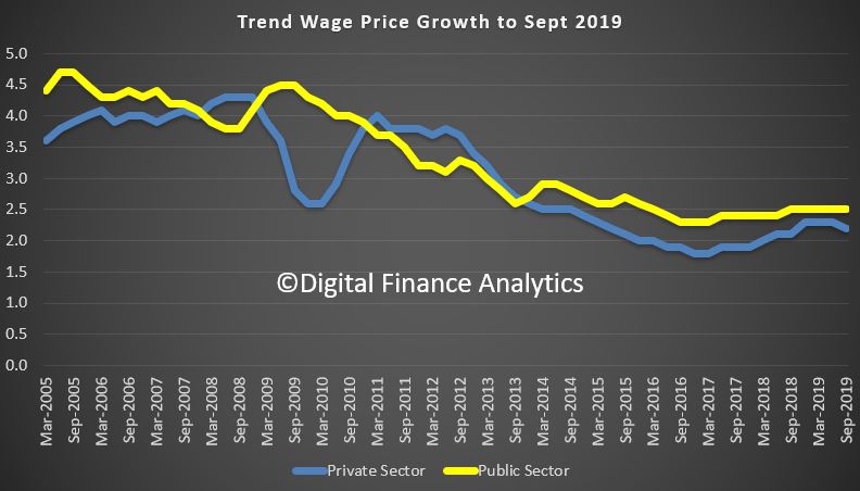
The trend and seasonally adjusted indexes for Australia both rose 2.2% through the year to the September quarter 2019. The public sector did better than the private sector.
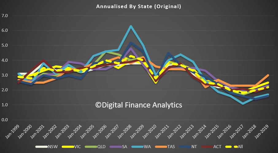
The original data by state shows TAS and VIC doing better than average, while WA and NT are below average.
In original terms, rises through the year to September quarter 2019 at the industry level ranged from 1.7% for Information, media and telecommunications services to 3.2% for Health care and social assistance.