Auction Clearance Rates Still Holding Up – CoreLogic RP Data

The latest from Corelogic RP Data indicates that auction clearance rates are still holding up pretty well. So far this week, 2,127 capital city auction results have been reported to CoreLogic RP Data, resulting in a preliminary auction clearance rate of 72.1 per cent across the combined capital cities. There were a total of 2,615 capital city auctions held this week. This week’s result indicates that clearance rates are no longer tracking higher than they were one year ago, when the final auction clearance rate over the
week was 72.3 per cent across 2,080 auctions. Over the previous week there were 2,297 auctions with a clearance rate of 73.2 per cent. Whilst Sydney and Melbourne were well above 70%, Adelaide, Perth and Canberra were lower.

RP-Auctions-Sep15-2015
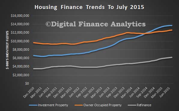
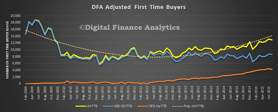
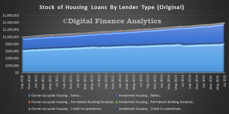
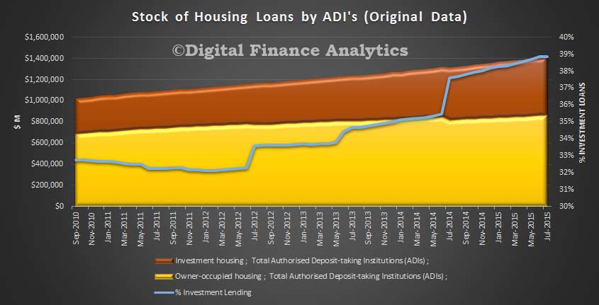
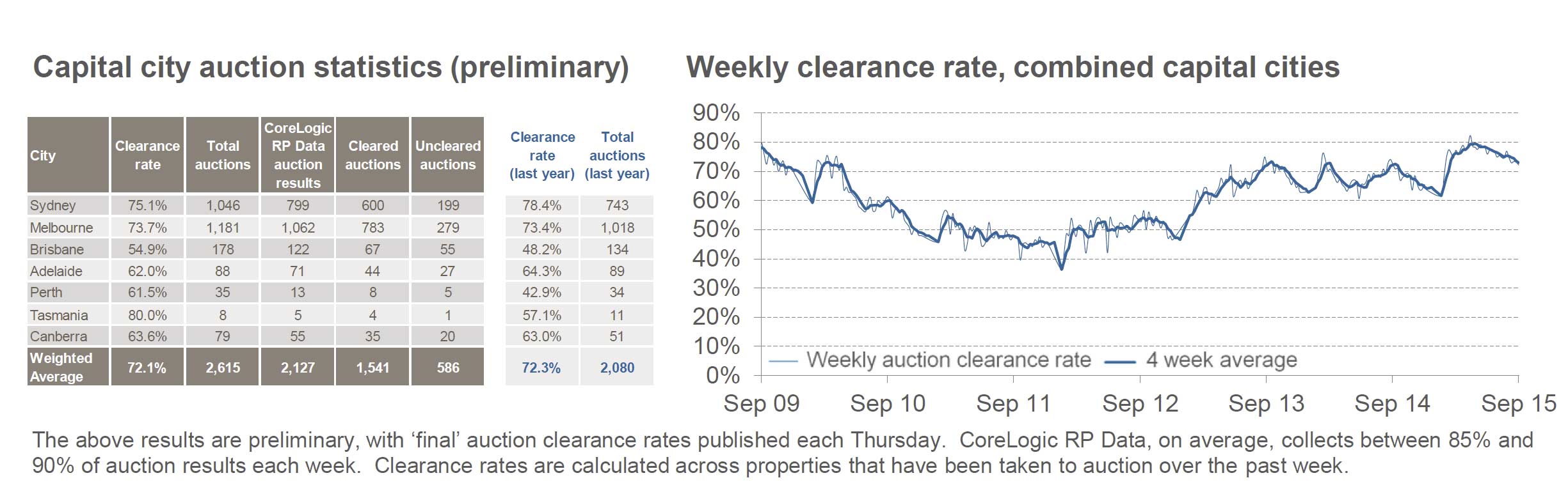
Whilst the combined average house price was up 10.9% in the past 12 months, mortgage application activity appears to be a little lower now.

Data indicates the recession is effectively here; it’s what policy makers do next that counts

From The Conversation.

The latest economic figures released by the Australian Bureau of Statistics (ABS) have fuelled the debate on the future of the Australian economy and prompted many to ask: “Will Australia go into a recession?”

This question is legitimate, but off the mark. In fact, the data tells us that we should not be worried about going into recession.

What we should worry about instead is how to get out of the recession. Because, like it or not, the recession is already here and the sooner we acknowledge the problem, the sooner we can start the recovery.

So, what does the data say?

According to ABS, trend Gross Domestic Product (GDP) growth in Australia in the second quarter of 2015 was 0.5%. This was only marginally below the rate observed in the first quarter of the year (0.6%). The implied annual growth rate of GDP is therefore around 2%.

While considerably below the long-term average of 3.25% a year, trend growth is still positive, which means that Australia is not technically in a recession.

Economists technically define a recession as a period of at least two consecutive quarters of negative GDP growth. This occurs rarely in an advanced economy like Australia.

The last time Australia was technically in recession was 24 years ago, when trend growth turned negative in the third quarter of 1990 and did not go back to positive until quarter four of 1991.

Before then, trend growth was negative for five quarters between 1982 and 1983, for two quarters in the middle of 1974, and for four quarters between 1960 and 1961.

However, while not being technically in a recession, Australia today shows most of the symptoms of recession.

Reload: what does the data say?

First of all, trend GDP is by construction smoothed. However, recessions (and expansions) are cyclical phenomena that are better represented by seasonally adjusted GDP.

In the second quarter of 2015, seasonally adjusted GDP in Australia grew by a mere 0.2%, sharply down from the first quarter when it grew by 0.9%. That is, seasonally adjusted data suggests that the country is much closer to the beginning of a technical recession.

Second, seasonally adjusted Gross Domestic Income (GDI) showed negative growth of -0.4%. This is particularly worrying because GDI is statistically more reliable than GDP as a predictor of the cyclical fluctuations of the economy.

Third, and probably even more importantly, indicators of an individual’s welfare are taking a turn for the worse. The second quarter of the year saw a negative growth in GDP per capita (-0.2%) and net national disposable income per capita (-1.2%).

These negative income dynamics add to persistently weak labour market performance.

The ABS labour force survey shows that in July 2015, seasonally adjusted unemployment reached 795,500 units. This is the highest level since November 1994 and approximately 125,000 units higher than at the peak of the global financial crisis (June 2009). The corresponding unemployment rate was 6.3%.

In the same month of July 2015, youth unemployment increased to 13.8%. This was the first monthly increase since the beginning of the year.

Perhaps this is not technically a recession, but certainly it looks, smells, and feels a lot like one.

Intervention needed

The government, however, seems to be in denial.

Finance Minister Mathias Cormann is reportedly “very optimistic about the outlook moving forward”. Treasurer Joe Hockey recently said that “the Australian economy is showing a deep resilience that people in Canada and elsewhere would die for.”

Unfortunately, the fact that Canada is in a technical recession and other resource intensive countries are suffering from falls in commodity prices does not make the situation of Australia any better.

Conversely, the business sector seems to have understood the reality of the situation. This is evident, for instance, in the declining levels of business confidence and conditions reported by the NAB Monthly Business Survey of July 2015.

The good thing about recessions is that, generally, they end. The bad thing, instead, is that their effects are felt proportionally more by households at the bottom end of income distribution.

Another bad thing is that the consequences of a recession (in terms of unemployment, reduced welfare for instance) tend to outlive the recession itself.

For all these reasons, some form of intervention would be desirable; but how?

In Australia’s case, the empirical evidence clearly indicates that fiscal stimulus works: for each dollar spent by the government, GDP increases by more than one dollar.

In fact, already now, what has prevented the country from recording negative GDP growth is good old Keynesian spending.

Government final consumption grew by 2.2% in the second quarter of the year and 4% since the beginning of the year. Public gross fixed capital formation increased by 4% in the second quarter.

Without this extra public spending Australia would have probably experienced its first quarter of negative growth.

Certainly, Australia also has structural problems that condition its longer-term performance and that a fiscal stimulus will not solve.

But the stimulus will improve the short-term outlook, restore confidence, and create favourable socioeconomic conditions to undertake structural reforms.

To get there, however, an initial step is required: the government must get past its denial of the problem. Let’s hope that this happens sooner rather than later.

Author: Fabrizio Carmignani, Professor, Griffith Business School at Griffith University

Lending To End July 2015 – Investment Housing Still Strong

The ABS released their finance statistics to end July today. Investment housing flows made up 38.2% of all new fixed commercial lending in the month, and 29% of all new commercial lending. Overall lending for housing was more than 44% of all new bank lending in the month. Investment lending remains strong, and after recent bank’s loan reclassification, was higher than previously reported. The tightening of lending criteria for investment loans was yet to work through into meaningful outcomes.

Secured lending for owner occupation, including refinance was $18.86 bn (up from $18.71 bn last month) . Owner occupied was $12.6bn (up from $12.5 bn in June) and refinancing was $6.20bn, (up from 6.15 last month).

Housing-Trends-to-July-2015Investment housing was $13.72 bn, (up from $13.69 bn last month), and other commercial lending was $22.22 bn, (down from $22.26 bn last month). Personal finance was $7.48 bn (down from $7.51 bn in June).

All-Finance-July-2015 The total value of owner occupied housing commitments excluding alterations and additions rose 0.8% in trend terms, and the seasonally adjusted series rose 2.2%.

The trend series for the value of total personal finance commitments fell 0.4%. Revolving credit commitments fell 1.0% and fixed lending commitments fell 0.1%. The seasonally adjusted series for the value of total personal finance commitments fell 2.6%. Fixed lending commitments fell 5.8%, while revolving credit commitments rose 2.6%.

The trend series for the value of total commercial finance commitments fell 1.2%. Revolving credit commitments fell 1.7% and fixed lending commitments fell 1.1%. The seasonally adjusted series for the value of total commercial finance commitments fell 2.7%. Revolving credit commitments fell 13.0%, while fixed lending commitments rose 0.9%.

The trend series for the value of total lease finance commitments fell 0.1% in July 2015 and the seasonally adjusted series rose 60.2%, following a rise of 2.8% in June 2015.

Cost of Consumer Leases Can Be as High as 884% – ASIC

ASIC today released a report that found that consumer leases can be a very expensive option for consumers seeking to access common household goods, and that the market for consumer leases is failing many low income consumers.

Consumer leases are a contract for the hire of goods under which the consumer will pay more than the cash price of the goods and where the consumer does not have a contractual right or obligation to purchase the item. Fixed term consumer leases with a term greater than four months are regulated under the National Consumer Credit Protection Act 2009 (Cth) (National Credit Act). Unlike credit contracts such as payday loans, consumer leases are not subject to price caps.

A 2014 report by IBISWorld estimated the value of the leasing industry in Australia as around $570 million for rentals of electronic goods (including televisions, stereos, DVD players and computers) and household appliances (including fridges, ovens, microwaves, toasters and blenders).

ASIC compared the cost of leases from two sources: the advertised prices on leasing 544 products through nine lessors, collected by the Royal Melbourne Institute of Technology (RMIT) in April 2015 on behalf of ASIC; and a review by ASIC of 69 leases provided by two lessors since 2014 to consumers in receipt of Centrelink payments.

ASIC found the market for consumer leases is delivering poor outcomes for many consumers. For similar household goods, ASIC found large price variations both across different lessors and within individual lessors for different consumer segments. In both cases the consumers that are more likely to be charged higher amounts are Centrelink recipients, despite being on lower incomes.

More specifically, ASIC found:

  • the highest price charged by a lessor, expressed as an interest rate, was 884% (for a clothes dryer).
  • that consumer leases can cost as much as five times the maximum amount permitted under a payday loan, where a cap on costs applies.
  • that consumers receiving Centrelink payments are being charged much higher prices than the prices advertised by lessors.

‘As there is no cap on the amount lessors can charge, we found that some consumers can end up paying very high costs.’ ASIC Deputy Chair Peter Kell said.

‘Of particular concern is that the most financially vulnerable consumers in Australia are paying the highest lease prices for basic household goods. For two year leases, half the Centrelink recipients in our study paid more than five times the retail price of the goods.’

The amounts charged by different lessors for the same goods vary significantly

Product and lessor Retail price Total fortnightly rental payments Amount charged above retail price Interest rate
5 kg dryer (lessor 1) $429.00 $488.80 $59.80 25.88%
5 kg dryer (lessor 2) $449.00 $1,582.88 $1,133.88 85.33%
5 kg dryer (Centrelink recipient) $345.00 $3,042.00 $2,697 884.34%

Note: The maximum fortnightly rental payment in the RMIT market survey is the payment at the 75th percentile.

ASIC is also reviewing the conduct of some lessors for compliance with their responsible lending obligations under the Credit Act.

‘ASIC is reviewing a number of larger lessors, to see if they are making reasonable inquiries to ensure the consumer can afford the lease and that it meets their needs, particularly considering how high the total cost of a lease can be. Relying on consumers being able to make payments as long as they are in receipt of Government benefits is not a substitute to making these inquiries,’ Mr Kell said.

ASIC has taken a series of enforcement actions against lessors for failure to comply with responsible lending requirements over the last few years, including banning directors, cancelling licences and obtaining refunds for customers.

‘We will consider further enforcement action if necessary,’ said Mr Kell.

‘We also recommend consumers shop around, as there are often cheaper options available for obtaining goods. Consumers can compare the total cost of a consumer lease using ASIC’s ‘Rent vs buy’ calculator, available on ASIC’s MoneySmart website. The website also provides helpful tips on alternatives to consumer leases, such as layby, no interest loans or Centrelink advances’.

ASIC will provide a copy of this report to the panel looking into the effectiveness of the law relating to small amount credit contracts (SACCs), in accordance with section 335A of the National Credit Act. The terms of reference include consideration of whether any of the provisions which apply to SACCs should be extended to regulated consumer leases. The panel is due to report at the end of this year.

Australia’s Unemployment Rate Decreased to 6.2 per cent in August 2015

Australia’s estimated seasonally adjusted unemployment rate for August 2015 was 6.2 per cent, a decrease of 0.1 percentage points. In trend terms, the unemployment rate was unchanged at 6.2 per cent in August 2015, as announced by the Australian Bureau of Statistics (ABS) today.

The seasonally adjusted labour force participation rate decreased 0.1 percentage points to 65.0 per cent in the August 2015 estimate.

The ABS reported the number of people employed increased by 17,400 to 11,775,800 in August 2015 (seasonally adjusted). The increase in employment was driven by increases in male full-time employment, and female full-time and part-time employment, with the largest increase seen in full-time employment for males (up 10,100).

The ABS seasonally adjusted monthly hours worked in all jobs series decreased in August 2015, down 0.6 million hours to 1,623.8 million hours.

The seasonally adjusted number of people unemployed decreased by 14,400 to 781,100 in August 2015, the ABS reported.

The seasonally adjusted underemployment rate remained steady at 8.4 per cent in August 2015, from a revised May 2015 estimate. Combined with the unemployment rate, the latest seasonally adjusted estimate of total labour force underutilisation was unchanged at 14.3 per cent in August 2015, from a revised May 2015 estimate.

So, Is Housing Lending On The Turn?

The ABS data on housing finance today suggests that the momentum in housing is shifting, as the tighter restrictions on investment lending bites; this despite strong market demand and the fact that investor property finance has never been higher at 38.9%.  Looking at the monthly flow trend data, lending overall rose 0.52% in the month, by $169 m. Within that, monthly approvals data shows that owner occupied lending rose 0.84% (up $105 m from last months approvals), refinancing up 0.72% ($44 m) and Investment lending up 0.14% ($19 m). In seasonally adjusted terms, the total value of dwelling finance commitments excluding alterations and additions rose 1.5%.

Housing-Flows-July-2015Within these numbers, we see that owner occupied construction fell 1% compared with last month, owner occupied new property purchases rose 2.24%, owner occupied refinance rose 0.72% and owner occupied “other” purchases rose 1%. On the investment side of the equation, investment purchases by individuals fell 0.47%, whilst investment construction rose 4.3% and investment by other entities (including SMSFs) rose 2%. Still momentum, but the investment sectors is shifting. We expect to see ongoing strong demand from the SMSF sector.

Housing-Flow-Movements-July-2015Looking at first time buyers, both the original data from the ABS, shows a small fall in the month to 15.4% in July 2015 from 15.8% in June 2015, and the DFA data for investor FTB also fell. The number of first time buyers are still sitting at around 12,000 a month in total, still well below the peaks in 2009. Our surveys indicate strong FTB investor appetite. The changed underwriting requirements however are having an impact.

FTB-Adjusted-July-2015Looking at the loan stock data, the major banks still have the lion’s share, but we see that on the investment side, credit unions grew their books the largest in percentage terms, with a 1.1% rise in investment loans (compared with a rise of 0.52% by the banks and 0.68% for the building societies).  We suspect some investors are switching to smaller banks, credit unions and the non-bank sector when they find the larger players less willing to lend. Overall growth on the owner occupied side was 0.43%.

Housing-Loan-Stocvk-By-Lender-Type-July-2015Finally, looking at the overall stock of loans, we see that investment loans now make up a record 38.9% of the total portfolio, thanks partly to the recent restatement of loan types by some the banks. We think this is too-higher share of housing lending (it is more risky in a down-turn) and the banks 60% total loan portfolio in housing is also too high, sucking finance from business sectors which might contribute to real economic growth.

Stock-Housing-Loans-July-2015

What Drives US Household Debt?

Analysis from the Federal Reserve Bank of St Louis shows that in the US, whilst overall household credit is lower now, this is being driven by reduced credit creation, and not increased credit destruction.  We see a very different profile of debt compared with Australia, where household debt has never been higher. However, our analysis shows that core debt is also being held for longer, so the same effect is in play here, although new debt is also accelerating, driven by housing.

6tl-hhfinHousehold debt in the United States has been on a roller coaster since early 2004. As the first figure shows, between the first quarter of 2004 and the fourth quarter of 2008, total household debt increased by about 46 percent—an annual rate of about 8.3 percent. A process of household deleveraging started in 2009 and stabilized at a level 13 percent below the previous peak in the first quarter of 2013. During those four years, the household debt level decreased at a yearly rate of 3 percent. Since then, it has moved only modestly back toward its previous levels.

This essay provides a simple decomposition of the changes in debt levels to shed light on the sources of those changes. The analysis is similar to the decomposition of labor market flows performed by Haltiwanger (2012) and the decomposition of changes in business credit performed by Herrera, Kolar, and Minetti (2011). We use the term “credit change” to refer to the change in household debt: the difference between household debt (D) in the current period, t, and debt in the previous period, t –1, divided by debt in the previous period, t –1:

The total household debt is the sum of debt for each household i, so this can also be written as

Equivalently, one can add the changes in debt for each household i:

The key advantage of using household-level data is that one can separate positive changes (credit creation) from negative changes (credit destruction) and compute the change in debt as

Credit change = Credit creationCredit destruction,

where

and

These concepts are interesting because they can be linked to different household financial decisions. Credit creation can be linked to additional credit card debt or a new mortgage and credit destruction can be linked to repaying debt or simply defaulting.

As this decomposition makes clear, a stable level of debt (a net change of 0) could be the result of a large credit creation offset by an equally large credit destruction. Or it could indicate no creation and no destruction at all. To differentiate between these cases, it is useful to consider “credit activity” (also called reallocation), which is defined as

Credit activity = Credit creation + Credit destruction.

This is a useful measure because it captures credit activity ignored by the change in total debt.

The second figure shows credit creation, destruction, change, and overall activity. Recall that credit change is the difference between credit creation and destruction, while credit activity is the sum of credit creation and destruction. The credit change shown in the second figure traces the increase in debt before the 2008 crisis, the deleveraging that followed, and the relative stability of debt over the past 3 years. Analy­sis of debt creation and destruction shows that the expansion of debt was due to above-average creation of debt before the crisis—not insufficient credit destruction; credit destruction was actually slightly above average. Thus, credit activity was extensive during that period, with large amounts of both destruction and creation.

The deleveraging involved a decrease in creation (or origination) of debt: Creation started at nearly 10 percent in the expansion period but dropped below 5 percent after the financial crisis. Credit destruction was not the main contributor to the deleveraging: Destruction did not grow during the deleveraging period; it was actually slightly lower than during the expansion period. Thus, the deleveraging period of 2009-11 saw a very low level of credit activity, mainly due to the small amount of new credit issuance.

Finally, the stability of debt from 2011 to 2013 masked the increasing credit activity since both destruction and creation increased but offset each other. In sharp contrast, during the past year, the stability of debt has been due to very low levels of creation and destruction. In fact, credit activity is currently as low as it was in the middle of the financial crisis: about 9 percent of total household debt.

Overall, this analysis of household debt suggests that reduced credit creation, and not increased credit destruction, has been the key driver of the recent evolution of U.S. household debt. A topic for future investigation is that U.S. households are currently engaging in record low levels of financial intermediation, which is not obvious by simply observing the level of household debt.

Middle Income Households Income Is Getting Squeezed

Data from the ABS looking at income and wealth, shows that the average income of high income households rose by 7 per cent between 2011-12 and 2013-14, to $2,037 per week, whist low income households have experienced an increase of around 3 per cent in average weekly household income compared with middle income households which have changed little since 2011-12.

The average income of all Australian households has risen to $998 per week in 2013–14, while average wealth remained relatively stable at $809,900. Similarly, change in average wealth was uneven across different types of households. For example, the average wealth of renting households was approximately $183,000 in 2013-14. Rising house prices contributed to an increase in the average wealth for home owners with a mortgage ($857,900) and without a mortgage (almost $1.4 million).

Most Australian households continue to have debts in 2013-14, with over 70 per cent of households servicing some form of debt, such as mortgages, car loans, student loans or credit cards. For example, the average credit card debt for all households was $2,700.

One quarter of households with debt had a total debt of three or more times their annualised disposable income. Mortgage debt was much higher

These households are considered to be at higher risk of experiencing economic hardship if they were to experience a financial shock, such as a sudden reduction in their income or if interest rates were to rise, increasing their mortgage or loan repayments.

The survey findings also allow comparisons of income and wealth across different types of households.

In 2013–14, couple families with dependent children had an average household income of $1,011 per week, which was similar to the average for all households at $998 per week.

By comparison, after adjusting for household characteristics, one parent families with dependent children had an average household income of $687 per week.

Australia’s economy is slowing: what you need to know

From The Conversation.

Australia’s economy grew by just 0.2% in the June quarter, below expectations of 0.4%, largely as a result of reduced mining and construction activity and a decline in exports of 3% during the quarter.

Nominal Gross Domestic Product grew by 1.8% during the year, which the Australian Bureau of Statistics said was “the weakest growth in nominal GDP since 1961-62”. Despite this, Australia has now recorded 24 straight years of growth.

The news has some analysts and economists spooked, and politicians blaming each other for the slowdown.

Treasurer Joe Hockey said:

At a time when other commodity based economies like Canada and Brazil are in recession, the Australian economy is continuing to grow at a rate that meets and sometimes beats our most recent budget forecasts.

He also said it was “factually wrong” to say it was the weakest growth since 1961.

The fact is that the economic growth we had in the last quarter was in line with expectations. Of course it bounces around from quarter to quarter, but it was in line with our overarching expectation to have two and a half per cent growth in the last financial year.

Shadow Treasurer Chris Bowen said:

Growth has flat-lined since the Abbott government’s first damaging budget last year and cost of living pressures are continuing to increase. This is the biggest quarterly decline in living standards since the global financial crisis.

This is a very weak set of figures and for the government to cast around for international comparisons to try and make it sound better is a pretty pathetic excuse.

The Treasurer says Australia is still doing better than Canada, Brazil, the US and New Zealand. How should people view these numbers in a global context? To what extent is the slowing rate of growth due to global economic headwinds, and to what extent is it due to domestic factors?

Griffith Business School Professor Fabrizio Carmignani answers:

In the past, the Australian economy has proved to be quite resilient to global economic shocks. Today we are facing what could be potentially a perfect storm.

For one thing, international commodities prices are very volatile and have resulted in a sharp contraction of Australian’s terms of trade. For another, China is going through a complicated economic phase and it is not, at this moment, the same solid anchor for the Australian economy as it might have been previously. So, it is not surprising to see that on a seasonally adjusted basis, quarterly growth in Australia has been oscillating between 0.2% and 0.3% for the last five quarters.

We owe it to some good old Keynesian stimulus on the demand side (read: government consumption and to a lesser extent public gross fixed capital formation) if we are not entering a technical recession.

The comparison with Canada, on surface, is favourable to Australia. Canada has officially entered a recession after recording two consecutive quarters of negative GDP growth in the first half of 2015. This is essentially due to low oil prices. However, according to media reports, Canada is still committed to achieving a target of annual growth of 2.5% this year, which is exactly what the Treasurer has stated for Australia. So, it seems to me that the difference between Australia and Canada here is thinner that what might appear at first sight. A fraction of a percentage point below or above the zero growth line is not really indicative of substantially different structural positions.

Both Australia and Canada are facing similar challenges in terms of diversification. The current “crisis” to me shows that these challenges are still far from being fully addressed in both countries.

Australia has had 24 years of consistent growth. How much of this can we attribute to the mining boom? And given the cyclical nature of the economy, can we expect a downturn?

Griffith University Professor Tony Makin answers:

Australia has performed relatively well compared to other OECD economies over recent decades, though did actually experience a recession during the GFC according to income and production measures of GDP.

Taking population growth into account, Australia’s economic performance since the global financial crisis has been worse than the raw GDP numbers show. On a per capita basis, national income has grown on average below one per cent per annum, less than half the almost two and a half per cent per head per annum average rate in the decade before the GFC.

The extraordinary boost to the terms of trade from the world commodity price hike, especially between 2005 and 2011, substantially raised Australia’s international purchasing power. However, GDP growth during the mining boom was actually less than during the economic reform era from the mid-1980s through to the end of the 1990s when commodity prices were fairly flat.

The main culprit for Australia’s sub-normal economic growth in recent years has not been falling commodity prices, which have undoubtedly played a role, but Australia’s underlying competitiveness problem, combined with a productivity slowdown that began from the turn of the century.

While the recent depreciation of the dollar will go some way to restoring Australia’s competitiveness and help stave off recession, genuine productivity-enhancing reform focusing on the economy’s supply side remains as important as ever for returning GDP and income per head growth to long-term average rates.

One journalist at Wednesday’s press conference said the new data showed “the weakest growth since 1961”, but the Treasurer said that was factually wrong. Who is right?

UNSW Australia Professor Richard Holden answers:

The statement that it is the slowest growth since 1961 seems, to me, to be false. We have had recessions in the 1990s and 1980s, which is two successive quarters of negative growth. And yesterday we had positive growth, so it was a slowdown but not the worst we have seen since 1961. I think the journalist’s statement doesn’t seem correct to me, on the face of it. I think the Treasurer is right.

It is possible the journalist was referring to the Australian Bureau of Statistics comment yesterday that:

GDP growth for 2014-15 was 2.4%. Nominal GDP growth was 1.8% for the 2014-15 financial year. This is the weakest growth in nominal GDP since 1961-62.

Nominal growth and growth are not quite the same thing. Nominal growth means GDP growth that is not adjusted for inflation.

But yes, yesterday’s numbers are still below projected growth. It is below market expectations. I think the Treasurer saying we have projected 2.5% annual growth this year and this is basically on target is a bit disingenuous. This is slow growth, it’s actually very troubling.

I understand the Treasurer can’t talk down the economy so his comments are understandable and he is in a difficult position. But the low rate of growth is genuine cause for concern.

I have written before about the concept of secular stagnation, which is the idea that growth of advanced economies looks like it has slowed down dramatically. The figures yesterday are further evidence of that theory.

Victoria University Senior Research Fellow Janine Dixon answers:

While it is factually correct that real GDP – the volume of production in the economy – has grown, the low growth in nominal GDP points to an underlying weakness in the economy. This is our exposure to the very large fall in commodity prices. When we translate real GDP into real income, we take into account that fact that the prices of the things we produce for export have fallen relative to the prices of the things we consume, some of which are imported. This has been a very important determinant of real incomes in the last few years.

Real net national disposable income is a better measure of our living standards than GDP. As well as adjusting for prices, we take into account the fact that some of the income generated domestically actually accrues to the rest of the world if the factors of production are foreign owned. We also deduct the value of capital that is “used up” or depreciated during the year.

Real net national disposable income per person has now fallen for 14 quarters in a row. This represents the most sustained fall in standards of living in the last 50 years.

What’s especially interesting about this period is that falling incomes have not been associated with falling output or particularly high unemployment. In the 1990-91 recession (the one we had to have) or the early 1980’s, incomes fell, but the solution to the problem was fairly clear. More than 10% of the workforce was unemployed. Fixing unemployment would boost production, incomes and living standards.

This time around, incomes are falling because commodity prices are falling. Commodity prices, set on world markets, are largely out of our hands. The labour market is much more flexible these days, and unemployment is 6%, not 10%. We are left with just one way to turn things around. In the words of Nobel laureate Paul Krugman, “Productivity isn’t everything, but in the long run it is almost everything”.

Is GDP really in line with expectations, both of the government and the market?

Griffith University Professor Ross Guest answers:

These GDP expectations are continuously being revised down as new information comes to hand.

The projected growth is lower than nearly everybody expected and everybody is having to revise downward their expectation.

What will the slowing annual growth mean for the federal budget, which had forecast growth for 2015-16 of 2.75%?

Ross Guest answers:

If growth were to remain at its current level of 2%, the budget deficit would be A$15 billion larger, in ball park terms, than the government projected. To put that in perspective, the total amount we spend on unemployment benefits is A$10 billion.

Australia living standards and the Australian government budget are being hit by a perfect storm of lower commodity prices and lower productivity growth.

Victoria University Senior Research Fellow Janine Dixon answers:

The GDP growth forecast for 2015-16 is fairly subdued at 2.75% and the budget not overly ambitious – a deficit of 2% of GDP. The trouble lies in 2016/17 and beyond, when annual GDP growth is forecast to be above 3%.

Over the next five years a couple of downside risks exist that will make it unlikely that GDP will grow this strongly, and consequently the budget’s return to surplus will be more difficult to achieve.

If the terms of trade fall further than allowed for in the budget forecasts, and if productivity growth remains weak, as it has been in recent years, real national income could be 3% lower than forecast by 2020. Roughly, this means the tax base for the government will be 3% smaller than expected. Rather than having a balanced budget by 2020, we would still be running a deficit, of around 0.75% of GDP or $12 billion in today’s terms.

Retail Trade Down 0.1% SA in July, Though Trend Higher

The latest Australian Bureau of Statistics (ABS) Retail Trade figures show that Australian retail turnover fell 0.1 per cent in July 2015 following a rise of 0.6 per cent in June 2015, seasonally adjusted.

The less volatile trend estimate for Australian retail turnover rose 0.2 per cent in July 2015 following a 0.3 per cent rise in June 2015. The trend estimate rose 4.4 per cent compared to July 2014.

In seasonally adjusted terms there were rises in clothing, footwear and personal accessory retailing (2.9 per cent), department stores (1.3 per cent) and cafes, restaurants and takeaway food services (0.3 per cent). Food retailing (0.0 per cent) was relatively unchanged. There were falls in household goods retailing (-1.9 per cent) and other retailing (-0.6 per cent) following rises in both industries in June.

In seasonally adjusted terms there were rises in Queensland (0.3 per cent), Western Australia (0.3 per cent) and the Northern Territory (0.1 per cent). Tasmania was relatively unchanged (0.0 per cent). There were falls in New South Wales (-0.2 per cent), South Australia (-0.8 per cent), Victoria (-0.2 per cent) and the Australian Capital Territory (-0.2 per cent).

Online retail turnover contributed 3.1 per cent to total retail turnover in original terms.