In an interesting speech yesterday Dr David Gruen Executive Director Macroeconomic Group presented some startling data to the assembled company at the CEDA State of the Nation 2014 event. Citing the Gratton Institute report he said “in 2013, Australian superannuation fees ranged from approximately 0.7 per cent to 2.4 per cent of mean fund size, with fees averaging around $726 per year for a member with a balance of $50,000”. But more significantly, he also cited some international comparative data from the OECD “Although international comparisons are difficult, in 2011, Australia’s average superannuation fees were around three times those in the UK. In aggregate, Australians spend around $20 billion annually, or over 1 per cent of GDP, on superannuation fees”.
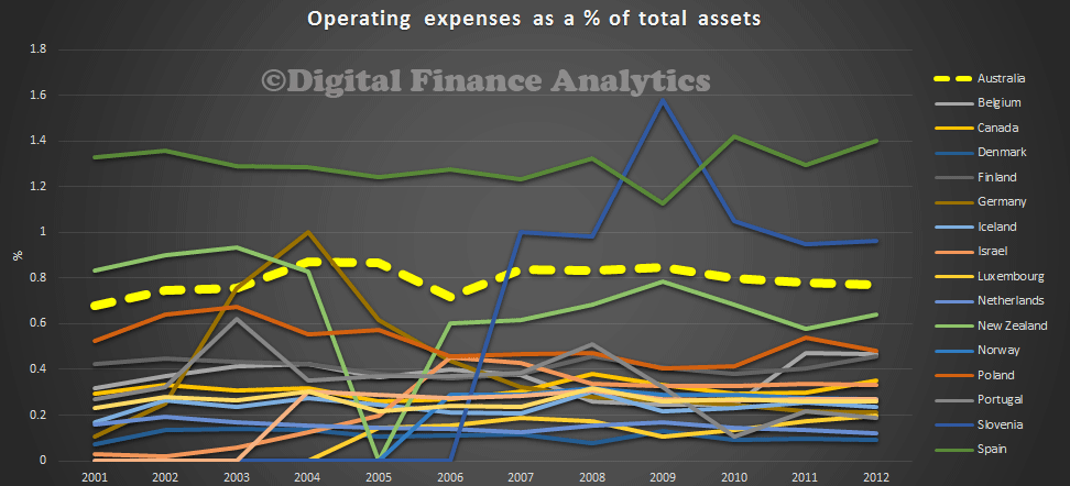
Now, looking at the international comparative data, available from the OECD Pension Funds Database, we find Australia is not only more expensive than the UK, but most other countries where super, or a pension equivalent exists, and good data is available. The OECD data is a ratio of expenses to assets, rather than fees. We see that Australia is consistently more expensive than other countries, other than Spain and Slovenia. New Zealand is lower, than Australia, slightly. Does the difference reflect the size of our superannuation industry, because whilst we have per capita, the largest super pools, we do not seem to be reaping scale benefits. Why is this? Could it have something to do with the industry concentration in the sector?
 Dr Gruen goes on to say:
A microeconomic reform that permanently reduced costs across the economy by a few tenths of 1 per cent of GDP would be considered a significant and worthwhile reform. Significant reductions in superannuation fees would have widespread benefits for society as a whole.
This problem is a global one. In 2009, the Squam Lake Working Group – probably the most prestigious group of finance academics ever assembled, with representatives from a variety of different viewpoints, including Frederic Mishkin from Colombia University, Nobel Prize winner Robert Shiller, John Cochrane from the Chicago School and Raghuram Rajan, now the Governor of the Reserve Bank of India – had this to say:
‘High-fee funds argue that their fees are justified by superior performance. A large body of academic research challenges that argument. On average, high fees are simply a net drain to investors. While some investors might gain by selecting successful high-fee funds, the negative-sum nature of the process implies that other investors must lose even more. Most employees saving for retirement are poorly placed to compete in this game. They should not be forbidden from doing so, but disclosure of high fees and a “surgeon general’s warning” are appropriate.’6
The impact on fees of recent initiatives is unclear at this stage. In particular, the introduction of MySuper and Superstream should make the sector more efficient and push down costs — and there is some evidence that this is occurring. Nevertheless, there needs to be policy consideration of further options to increase competition and drive down costs. Given the stakes, this is an important area for the Financial System Inquiry to examine.
Finally, he makes an important point about the need to provide for income in retirement, rather than simply wealth accumulation, and a call for product innovation in this area.
The key focus of superannuation should be on the provision of retirement income, rather than primarily on wealth accumulation. As more Australians move into retirement, it will become increasingly important for the industry to provide the range of products that people need to manage the financial aspects of their retirement.
It will be increasingly important for the private sector to help manage longevity risk through income stream products such as insurance or pooled products. Most life insurance products do not address longevity risk and the individual immediate annuity market in Australia is small. At issue is the availability of a range of products that balance risk transfer and affordability and the identification of any industry, taxation or regulatory impediments to developing cost effective products that enable individuals to manage longevity risk.
Longevity risk therefore is an important issue, presenting an opportunity for innovation by the superannuation industry. It is also an important issue to get right given the rapidly rising numbers of retirees. In particular, we do not want longevity risk ‘solutions’ that lock retirees into inappropriately high fees and fail to provide sufficient incentives for the superannuation industry to become more efficient.
Our research into the Australian Annuities industry, which we summarised in an earlier post, highlighted that many households were not aware of how much they would need in retirement, were unaware of the average life expectancy, and that annuities were seen as a potentially risky, high cost and inflexible solution:
We asked about their attitudes to annuities. Most said they did not understand them, thought they would get ripped off, and were a poor choice because they wanted to keep control. They also made the point that governments might change the rules on them, and in any case nearly 80% said they would rely on government pensions to see them through.
The bottom line is that not many households are interested at the moment. Younger households might be, but of course later in life. So the demand side of the equation suggests that annuities will not be the product of choice for many anytime soon.
The broader issue of a mismatch between savings and income expectations, and future life expectancy is a bigger and more serious issue, as the government will not be able to afford to extend support to the every growing ranks of baby boomers who have exhausted their superannuation savings. This looks like a significant issue which requires significant changes in education and perhaps policy.
It will be interesting to see what transpires from the Financial System Inquiry, and whether we see further product innovation develop, alongside pressure to reduce fees. Given the big banks have a significant footprint in superannuation, we can expect opposition to fee reduction, and if fees do fall significantly, then pressure on profitability of the majors. Finally, it is worth noting that this speech was posted on the Treasury website!

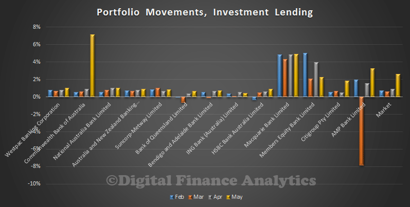
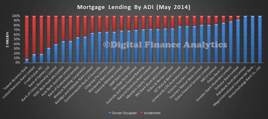
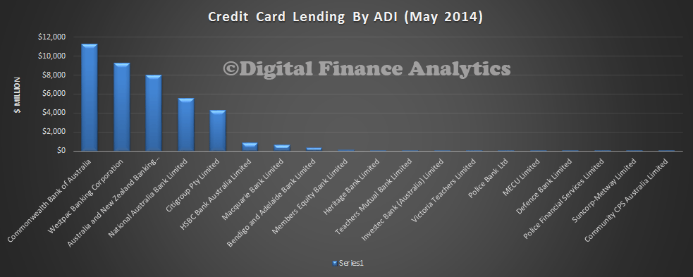
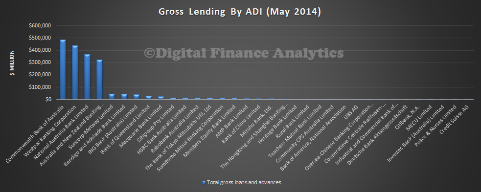
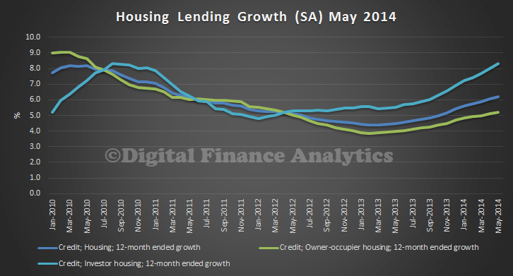
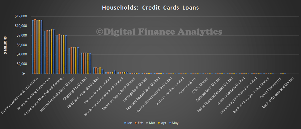 We can show the relative share trends as a percentage of total book. CBA has 28% of the market, and Westpac 23% – together holding more than half the market. Macquarie is a small, but growing player, as we will see in a moment. Citigroup’s share dropped just a little.
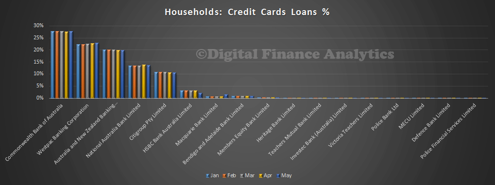 So. lets look at the changes in more detail. Here are the movements by percentage change of individual portfolios. Thanks to Macquarie’s acquisition of HSBC’s Woolworths white label credit card portfolio for $362 million in May, we see a significant swing away from HSBC, to Macquarie, who more than doubled their portfolio in the transaction. HSBC released a statement saying it was still committed to the Australian market, but the Woolworth agreement would terminate, although they would continue to provide card services through to 2015.
 Looking at the data another way, in portfolio dollar terms, we see CBA growing a little, whilst nab, ANZ and Citigroup fell in May. The Macquarie transaction also shows up clearly. Overall in May the total across all banks fell just over $200 million.
 So, we see household card debit is quite constrained at the moment. We also see Macquarie extending its reach across retail banking, including mortgage lending, and credit cards.