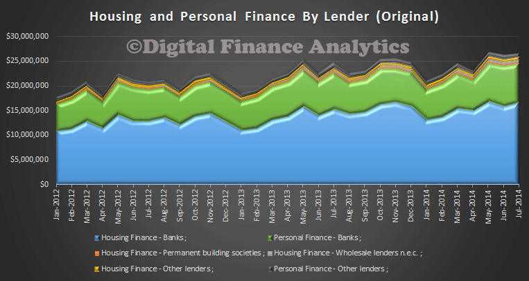
The RBA just released their Financial Stability Review for September 2014. They made a number of comments on Housing Lending, which I have collated in a more digestible form here.
INVESTMENT LENDING
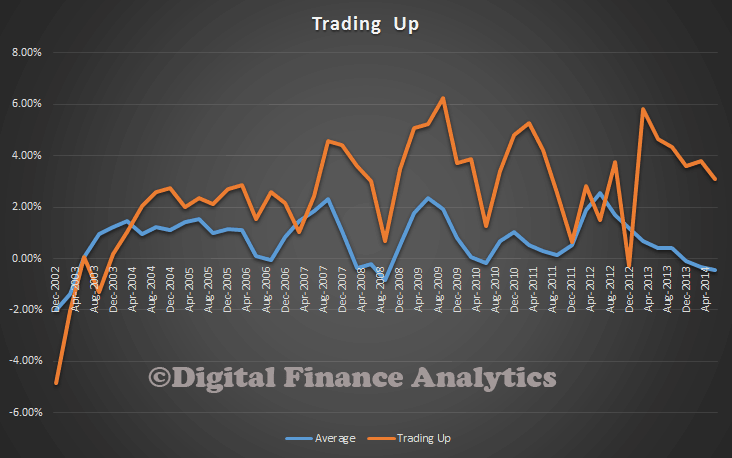
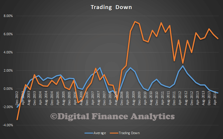
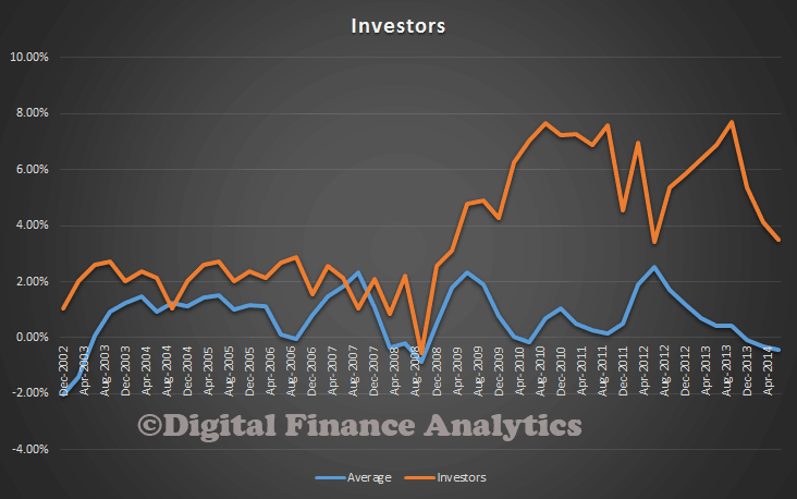
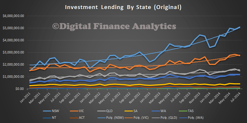
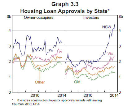
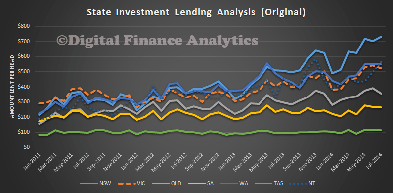
Household credit growth has picked up, almost entirely driven by investor housing credit, which is growing at its fastest pace since late 2007. The willingness of some households to take on more debt, combined with slower growth in incomes, means that the debt-to-income ratio has picked up a little in the past six months. The increase in household risk appetite is most evident in the continued strength of investor activity in the housing market. The momentum in investor housing activity has been concentrated in Sydney and (to a lesser extent) Melbourne. Investor housing loan approvals are almost 90 per cent higher in New South Wales than they were two years ago and are 50 per cent higher over the same period in Victoria. As a share of approvals, both are back around previous peaks. By contrast, the momentum in the owner-occupier market appears to have slowed over the past six months or so, with loan approvals to owner-occupiers little changed. Some potential first home buyers are likely to have been priced out of parts of the market by investors, who typically have higher incomes and are therefore able to bid up prices. The broad-based reduction in grants to first home buyers for established housing since late 2012 has also contributed to reduced demand from these buyers.
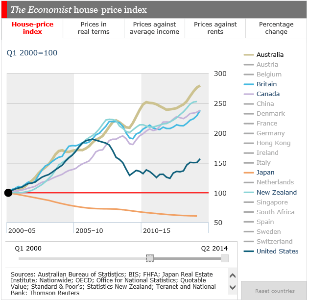
 Strong investor demand can be a sign of speculative excess, with the risk that additional speculative demand can amplify the cycle in housing prices and increase the potential for prices to fall later. This is particularly the case if that demand is largely based on unrealistic expectations of future price growth, perhaps extrapolated from recent experience. A speculative upswing in demand can also be damaging if it brings forth an increase in construction on a scale that leads to a future overhang of supply. This risk is more likely to arise in particular local markets than at the national level. Nationally, Australia is a long way from an oversupply of housing and some increase in supply is to be expected in response to higher prices, which should also help to temper those rising prices.
CREDIT GROWTH
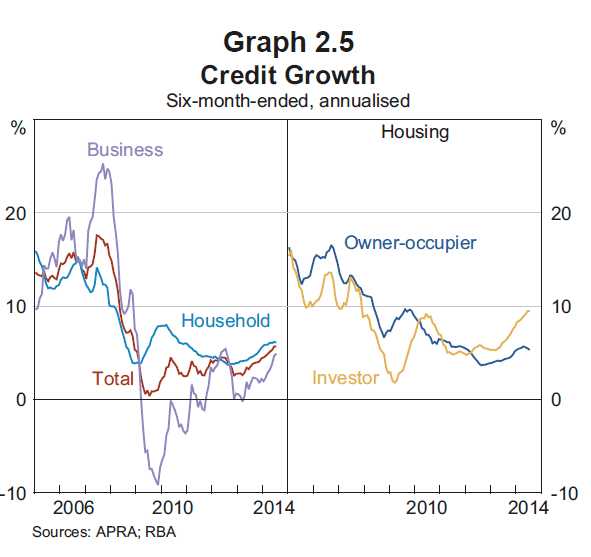
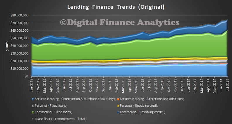
Growth in banks’ domestic lending has lifted over the past six months, after a few years of modest growth (Graph 2.5). Housing credit expanded at an annualised rate of around 7 per cent over the six months to July 2014; growth in investor credit continued to strengthen and at nearly 10 per cent reached its fastest pace since 2007, well above the rate for owner-occupiers. Business credit growth also picked up, although it continues to be weighed upon by subdued non-mining business investment. The pick-up in credit growth has been accompanied by stronger price competition in some loan markets. The ongoing improvement in bank funding conditions, including for smaller banks, has aided price competition. It will be important for banks’ own risk management and, in turn, financial stability that they do not respond to revenue pressures by loosening lending standards, or making ill-considered moves into new markets or products. Banks need to ensure that loans originated in the current environment can still be serviced by borrowers in less favourable circumstances – for instance, at higher interest rates or during a period of weaker economic conditions. Furthermore, banks should be cautious in their property valuations, and conscious that extending loans at constant loan-to valuation ratios (LVRs) can be riskier when property prices are rising strongly, as is currently the case in some commercial property and housing markets.

MORTGAGE COMPETITION
In the residential mortgage market, price competition for new borrowers has intensified. Fixed rates have been lowered in recent months. According to industry liaison, a number of lenders have also extended larger discounts on their advertised variable rates and broadened the range of borrowers that receive these discounts. Banks are offering other incentives to attract new borrowers, including fee waivers, upfront cash bonuses or vouchers. In addition, some banks recently raised their commission rates paid to mortgage brokers. However, reports from banks and other mortgage market participants suggest that, in aggregate, banks’ non-price lending standards, such as loan serviceability and deposit criteria, have remained broadly steady over recent quarters. This seems to be supported by APRA data on the composition of banks’ housing loan approvals, which suggest that the overall risk profile of new housing lending has not increased. It is noteworthy that the industry-wide share of ‘low-doc’ lending continues to represent less than 1 per cent of loan approvals, while the share of loans approved with an LVR greater than 90 per cent has fallen over the past year (see ‘Household and Business Finances’ chapter). That said, strong investor activity in the housing market has meant that the share of investor loans approved with LVRs between 80 per cent and 90 per cent has risen.
INTEREST ONLY LOANS
The shares of interest-only loans for both investors and owner-occupiers have also drifted higher, and average loan sizes (relative to average income) have increased. The increase in interest-only share of banks’ new lending, which has continued to increase for both investors and owner-occupiers in 2014, might be indicative of speculative demand motivating a rising share of housing purchases. Consistent with mortgage interest payments being tax-deductible for investors, the interest-only share of approvals to investors remains substantially higher than to owner-occupiers. According to liaison with banks, the trend in interest-only owner-occupier borrowing has been largely because these loans provide increased flexibility to the borrower. It does not necessarily mean that borrowers are taking on debt that they may not be able to service if both interest and principal repayments are made. Rather, some of these borrowers are likely to be building up buffers in offset accounts. In any case, APRA’s draft Prudential Practice Guide emphasises that a prudent authorised deposit taking institution would assess customers’ ability to service principal and interest payments following the expiry of the interest-only period. More broadly, consumer protection regulations require that lenders do not provide credit products and services that are unsuitable because, for example, the consumer does not have the capacity to meet the repayments.
Future housing loan performance is likely to at least partly depend on labour market performance. Although forward-looking indicators of labour demand have generally improved since last year, they remain consistent with only moderate employment growth in the near term.
LENDING STANDARDS
Although, in aggregate, bank housing lending standards do not appear to have eased lately, a crucial question for both macroeconomic and financial stability is whether lending practices across the banking industry are conservative enough for the current combination of low interest rates, strong housing price growth and higher household indebtedness than in past decades. Moreover, lending to investors is expanding at a fast pace, which could be funding additional speculative activity in the housing market and encourage other (more marginal) borrowers to increase debt. Lending growth is varied across geographical markets and individual lenders, which may suggest a build-up in loan concentrations and therefore correlated risks within the banking industry. The Reserve Bank’s assessment is that the risk from the current strength in housing markets is more likely to be to future household spending than to lenders’ balance sheets. However, the direct risks to banks will rise if current rates of growth in investor lending and housing prices persist, or increase further. In light of the current risks, APRA has increased the focus of its supervision on banks’ housing lending. Specifically, it has:
• begun a regular supervisory survey of a broader range of risk indicators for banks with material housing lending
• released a draft Prudential Practice Guide (PPG) for housing lending that outlined expectations for banks’ risk management frameworks, serviceability assessments, deposit criteria and residential property valuations.1 By way of example, prudent serviceability assessments are seen to involve: an interest rate add-on to the mortgage rate, in conjunction with an interest rate ‘floor’, to ensure the borrower can continue to service the loan if interest rates increase; a buffer above standard measures of household living expenses; and the exclusion, or reduction in value, of uncertain income streams. While much of the guidance in the PPG is already common practice within the industry, it is nonetheless important that practices are not deficient at even a minority of lenders
• written to individual bank boards and chief risk officers asking them to specify how they are monitoring housing loan standards and ensuing risks to the economy
• assessed the resilience of banks’ housing loan (and other) portfolios to large negative macroeconomic shocks, including a severe downturn in the housing market, as part of its regular stress testing of banks’ balance sheets.
In addition, the Reserve Bank is discussing with APRA, and other members of the Council of Financial Regulators (CFR), further steps that might be taken to reinforce sound lending practices, particularly for lending to investors.
PREPAYMENT OF MORTGAGES
The proportion of disposable income required to meet interest payments on household debt has stabilised accordingly, at around 9 per cent. Households continue to take advantage of lower interest rates to pay down their mortgages more quickly than required. The aggregate mortgage buffer – balances in mortgage offset and redraw facilities – has risen to be around 15 per cent of outstanding balances, which is equivalent to more than two years of scheduled repayments at current interest rates. Prepayment rates and the proportion of borrowers ahead of schedule on their mortgage repayments are also high according to liaison with banks. Part of this prepayment behaviour has been due to some banks’ systems not automatically changing customer repayment amounts as interest rates have declined, while in many cases households have not actively sought to reduce their repayments. This might be a sign that household stress is currently limited. The household saving ratio, although trending down a little lately, remains high at just under 10 per cent. Households’ aggregate balance sheet position has continued to improve in recent quarters: real net worth per household is estimated to have increased by 4 per cent over the year to September 2014.
SECURITISATION
One area of shadow banking activity in Australia that warrants particular attention is non-bank securitisation activity, given strengthening investor risk appetite as well as the connections between this activity, the housing market and the banking system (through the various support facilities provided by banks). As discussed, RMBS issuance has picked up since 2013 and spreads have narrowed, including for non-bank issuers (i.e. mortgage originators). Mortgage originators tend to have riskier loan pools than banks; this is partly because they are the only suppliers of non-conforming residential mortgages, which are typically made to borrowers who do not meet the standard underwriting criteria of banks. These originators currently account for about 2 per cent of the Australian mortgage market (not all of which is non-conforming), and so have limited influence on competition in the mortgage market and the housing price cycle. Even so, it is useful to monitor any signs of greater non-bank activity, as this could signal a broader pick-up in risk appetite for housing.
LENDERS MORTGAGE INSURANCE
Lenders mortgage insurers (LMIs) are specialist general insurers that offer protection to banks and other lenders against losses on defaulted mortgages, in return for an insurance premium. LMIs’ profitability improved in the first half of 2014, with the industry posting a return on equity of about 14 per cent, up from an average of around 10 per cent over the preceding few years. The number and average value of claims on LMIs has declined recently in response to the buoyant housing market, as well as previous improvements in underwriting standards. In addition, some LMIs have recently increased their premium rates. In May, the largest LMI, Genworth Australia, successfully listed on the ASX, with around one-third of the company now independently owned. Also, in August QBE announced plans to partially float its subsidiary, which is the other major LMI in Australia. Share market listing will subject the relatively concentrated Australian LMI industry to greater market scrutiny and increase its access to domestic capital markets; such developments could be beneficial to financial stability given the LMI industry’s involvement in the credit creation process and linkages to the banking system.
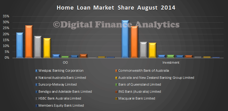
 In terms of relative market share, WBC has 32% of all Investment loans, and CBA 26.9%. On the Owner Occupied loans, CBA has 27.2% of the market and WBC 21.4%.
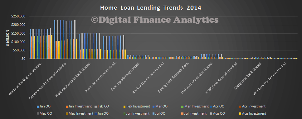
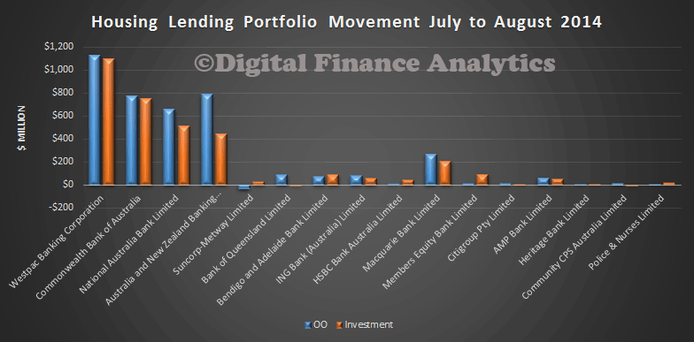
 Looking at portfolio movements, in the past month, WBC has been lending the most, note also Macquarie is active as it continues its strategy to grow its retail business.
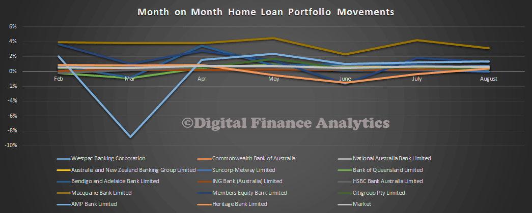
 Another way to look at this growth pattern is by month on month percentage movements. Relatively, Macquarie is the most aggressive, followed by AMP bank.
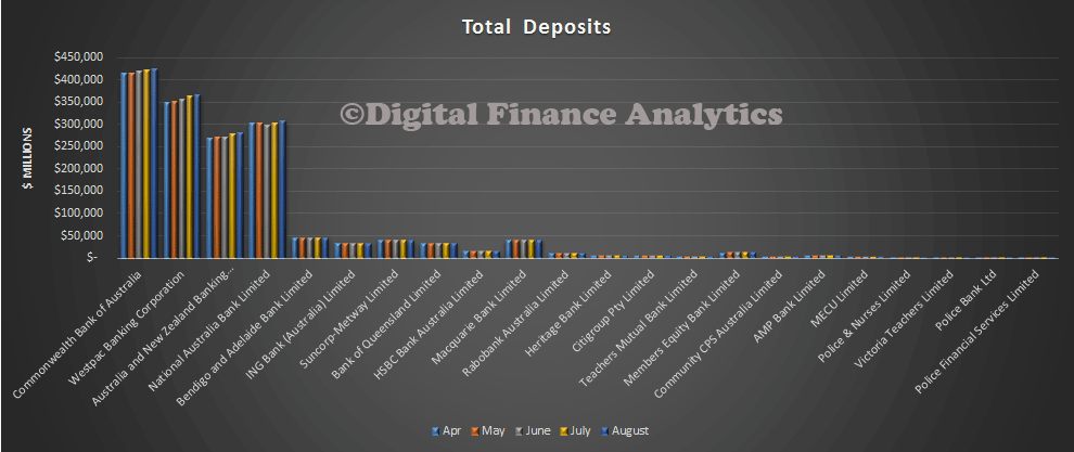
 Turning to the other data in the statistics, on the deposit side, balances grew by 0.75%, to $1.749 trillion. This is a slowing from the previous 1.02%, perhaps reflecting falls in average deposit rates relative to other investments.
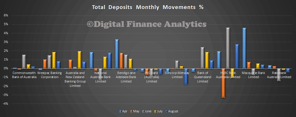
 In terms of monthly movements, nab has been the most aggressive amongst the larger banks, together with HSBC from the smaller players. Relatively speaking, Suncorp, Rabobank and Bendigo went backwards.
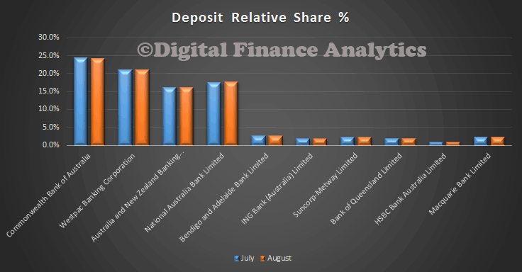
 Looking at relative shares, CBA has 24.2%, WBC 21.0% and nab 17.6%. This chart highlights the concentration in the big four, with a combined 78.4% of all deposits. With deposits backed by the government guarantee, these might be viewed as government back funds, and this helps to prop up the credit ratings of the major players. The Australian Government has guaranteed deposits up to $250,000 in Authorised Deposit-taking Institutions at the moment. There is a case to review this, and we wonder if the FSI report, due soon will mention it.
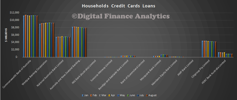
 Finally, Cards. The balances on cards are at $40 billion, just $130m up from last month.
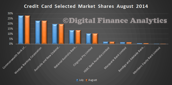
 CBA has 27.9% of the market, Westpac 22.9% and ANZ, 19.6%. The big four have combined 84%, and with Citigroup’s 10%, the five have close to 95%.
 So, in summary, deja vu. Hot investment lending, industry concentration, and large deposit balances guaranteed.
