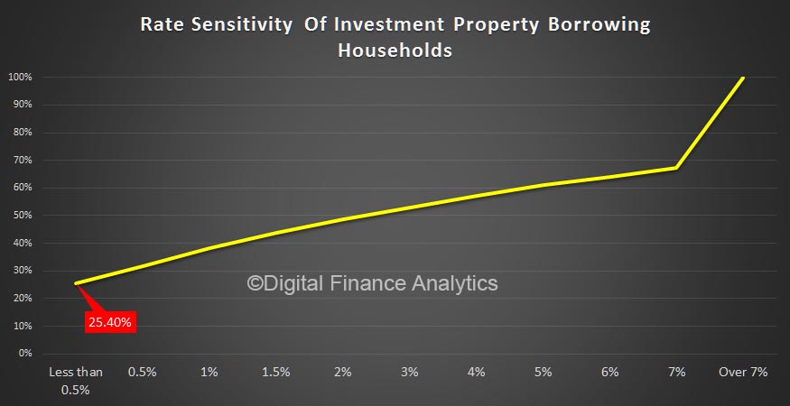
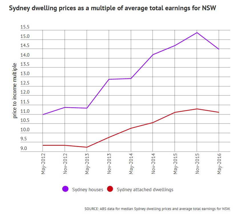
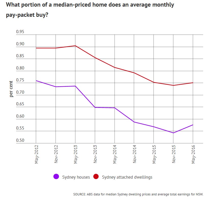
The OECD has once again warned that rising borrowing costs could wreak havoc on global property markets this year.
Chief economist of the Organisation for Economic Co-operation and Development, Catherine Mann, told the UK’s The Telegraph that property prices had soared in Canada, New Zealand and Sweden in a way “not consistent with a stable real estate market”.
What she didn’t mention is that the OECD’s own research puts Australia in the middle of that pack based on house-price-to-income ratios – making it at least as likely to be affected by the US Federal Reserve-led rise in global interest rates.
In its last economic outlook, the Paris-based think tank rated Sweden at 22 per cent above its long-term price-to-income ratio, Australia 29.4 per cent above, Canada at 30.5 per cent and New Zealand at 31.9 per cent.
In the UK market, where that ratio is only 21.3 per cent, the London market is already cooling rapidly thanks in part to Brexit uncertainty.
Ms Mann said it would be “interesting” to see “who bears the burden – who bears the adjustment cost”.
The Australian story
The same question needs to be asked in Australia, in light of our eye-watering levels of household debt.
There are mixed opinions as to whether the Reserve Bank will cut official rates again this year, but even if it does it will be fighting a tide of rising rates in wholesale funding markets.
Those rates affect a third of our banks’ borrowing costs and are likely to force more out-of-cycle mortgage rate hikes.
Who will bear that pain?
To understand what Catherine Mann, the OECD’s chief economist, means by “adjustment costs”, both asset prices and lending rates have to be taken into account.
That’s because banks lend money based on two main criteria: the income the borrower has to service debt at a given interest rate, and the likelihood of the asset increasing or decreasing in value.
Just before the global financial crisis hit, some Australian lenders were offering mortgages at loan-to-valuation ratios of up to 107 per cent.
Re-mortgaging to cover extravagant spending is coming to an end. Photo: GettyThey were so confident the market would continue rising, that they were happy for the safety buffer of equity to build up in the months or years after the loan was made.
Likewise, serviceability ratios were stretched to the limit at lenders such as Bankwest, because the mining boom was inflating wage packets relatively quickly.
The GFC changed all that. The lenders that were pushing those ratios too far, such as Bankwest, St George and Rams Home Loans, came close to collapse in 2009 and were snapped up at bargain prices by the bigger banks.
While the worst excesses of the GFC have not been repeated, banks and borrowers have once again become too comfortable with the idea that rising property prices and wages will get overstretched borrowers out of trouble.
Ms Mann is essentially warning us not to get too comfortable, as the era of ultra-low interest rates comes to an end.
Debt as ‘income’
To illustrate the point, I’ll go back to the example of the “completely disorganised” borrower described to me by a lending manager last year.
“[What’s] interesting in terms of the implications … is who bears the burden,” said Catherine Mann. Photo: GettySuch borrowers, he said, would bumble along with maxed-out credit cards, a personal loan for their last holiday, a leased car, and a fairly opulent lifestyle overall.
In a rising market, they could, and did, remortgage every few years and use equity in their home to pay for their extravagance.
What’s changed? Well firstly, many Australian households are seeing a big slowdown in the capital growth of their homes.
The latest all-cities average dwelling price from CoreLogic, released on Tuesday, shows a national increase of 10.8 per cent over 12 months.
However, that is overwhelmingly concentrated in Sydney (up 15.5 per cent) and Melbourne (13.7 per cent).
For “disorganised” borrowers living in Perth, where values have actually fallen 4.3 per cent, there’ll be no more remortgaging to pay off their other debts – the era of equity withdrawal is over, for some years at least.
Higher mortgage costs will make the end of debt-funded spending an even bigger shock. Photo: GettyThe situation is similar in Darwin, where prices rose less than inflation in the past 12 months (0.9 per cent), or Brisbane where prices were just a bit ahead of inflation (3.6 per cent).
If out-of-cycle rate increases start to bite into their budgets, households in many areas are facing a double-whammy – no more debt-financed consumption, plus higher monthly outgoings just to keep a roof over their heads.
As economist Steve Keen has argued for years, household consumption is financed by two things: wages, plus the net change in debt.
We are now going into an era when a growing number of households will have only their wages to spend.
With wage growth at record lows and mortgage rate increases on the medium-term horizon, for the over-indebted that’s going to come as quite a shock.
Category: Home Prices
Channel Nine News Does House Prices and Mortgage Defaults
A segment today from Channel Nine featured the latest data on Sydney residential property, and featured data from the Digital Finance Analytics mortgage default heat mapping, as well as the latest from CoreLogic on Home Prices.
Home Prices Gallop Away
The latest data from CoreLogic to December 2016 shows Perth apart, home prices rose significantly.
December 2016 saw capital city dwelling values rise by 1.4%, taking the annual capital gain for 2016 to 10.9% – the highest growth rate for a calendar year since 2009. Factoring in gross rental yields and capital gains, housing as an asset class, earned a total annual return of 14.7% based on the combined capital cities index results.
Across Australia’s capital cities, the annual change in dwelling values for 2016 ranged from -4.3% in Perth to 15.5% in Sydney, with Melbourne and Hobart also showing annual capital gains higher than 10%.
Whilst there may be issues with the basis of the index, this rise is so strong that it underscores the need to tighten macro prudential controls. The regulators have simply been too lax.
A Tale of Two Housing Markets: Hot and Not So Hot
A hot housing market is hot for reasons beyond low mortgages interest rates. It is explained by islands of concentrated capital, GDP growth and talent which combined act as magnets that attract global capital and talent, even as prices notch higher. Though this is a US example, similar arguments are relevant closer to home!
If we had to guess which areas will likely experience the smallest declines in prices and recover the soonest, which markets would you bet on?
Though housing statistics such as average sales price are typically lumped into one national number, this is extremely misleading: there are two completely different housing markets in the U.S. One is hot, one is not so hot.>Just as importantly, one may stay relatively hot while the other may stagnate or decline.
All real estate is local, of course; there are thousands of housing markets if we consider neighborhoods, hundreds if we look at counties, cities and towns and dozens if we look at multi-city metro regions.
But consider what happens to average sales prices when million-dollar home sales are lumped in with $100,000 home sales. The average price comes in around $500,000– a gross distortion of both markets.
Here’s a real-world example of what has happened in hot markets over the past 20 years. The house in question is located in a bedroom community suburb in the San Francisco Bay Area metro area. The home was built in 1916 and has 914 square feet, no garage and a small lot. It sold in 1996 for $135,000. This was a bit under neighborhood prices due to the lack of garage and small size, but nearby larger homes sold in the $145,000 to $160,000 range. The house was sold in 2004 for $542,000, and again in 2008 for $575,000. It is currently valued at $720,000. The neighborhood average is $900,000. According to the Bureau of Labor Statistics inflation calculator, inflation since 1997 has added 50% to the cost of living: $1 in 1997 equals $1.50 in 2016.
Adjusted for inflation of 2.5% annually, calculated cumulatively, the home would be worth a shade over $220,000 today. Long-term studies have found that housing tends to rise about 1% above inflation annually, so if we add 1% annual appreciation (3.5% calculated cumulatively over the 20 years), the home would have appreciated about $47,000 above and beyond inflation, bringing its value to $268,000–almost double the purchase price.
But being in a hot market, this little house appreciated a gargantuan $450,000 above and beyond inflation and long-term appreciation of 1% annually. Those who bought in hot markets are $500,000 richer than those who bought in not-so-hot markets.
Another house I know in a hot metro market sold for $438,000 in 1997 and is currently valued at $1.4 million. The owners picked up substantially more than $500,000 in bonus appreciation.
Or how about a home that sold for $607,000 in 2010 and is now valued at $960,000? (Note that I have picked neighborhoods and metro areas I have known for decades, so I can verify the current valuations are indeed in the real-world ballpark.)
Inflation alone added about $60,000 to the value since 2010; the $300,000 appreciation above and beyond inflation is pure gravy for the owners.
It’s easy to dismiss these soaring valuations as credit-driven bubbles that will eventually pop, but that narrative misses the enormous differences in regional incomes and GDP expansion. The little 900 square foot house that’s barely worth $100,000 in most of the country may well fetch $700,000 in hot markets for far longer than we might expect if it is in a metro area with strong GDP and wage growth.
To understand why, look at these three maps of the U.S. The first reflects the GDP generated within each county; the second shows real growth in GDP by region, and the third displays the wages of the so-called “creative class”–those with high-demand skillsets, education and experience.
The spikes reflect enormous concentrations of GDP. This concentrated creation of goods and services generates jobs and wealth, and that attracts capital and talent. These are self-reinforcing, as capital and talent drive wealth/value creation and thus GDP.
Unsurprisingly, there is significant overlap between regions with high GDP and strong GDP expansion. The engines of growth attract capital and talent.
Creative class wages are highest in the regions with strong GDP expansion and concentrations of GDP, capital and talent. Attracting the most productive workers requires hefty premiums in pay and benefits, as well as interesting work and opportunities for advancement.
That people will make sacrifices to live in these areas should not surprise us–including paying high housing costs. This willingness to pay high housing costs attracts institutional and overseas investors, a flood of capital seeking high returns that further pushes up the cost of housing.
The rising cost of money will impact all housing. So will recession. But if we had to guess which areas will likely experience the smallest declines in prices and recover the soonest, which markets would you bet on?
Markets that are “cheap” because wages are low and opportunities scarce, or high-cost areas with high wages and concentrations of the factors that drive growth and innovation?
The point is that hot housing markets are hot for reasons beyond low interest rates for mortgages. These islands of concentrated capital, GDP growth and talent are magnets that attract global capital and talent, even as prices notch higher.
Britons Hoard Cash as Economic Uncertainties Prompt Caution
Britons are holding onto their cash in a sign that they may be hunkering down in the face of economic uncertainties, according to the British Bankers Association.
Personal deposits grew an annual 4.8 percent in November, data compiled by the BBA show. They increased by 32.4 billion pounds ($39.7 billion) in the first 11 months of the year, outstripping the 19.8 billion-pound growth in the same period of 2015.
British investors and savers were shaken by the June decision to leave the European Union, which prompted the Bank of England to cut interest rates to a record-low 0.25 percent. While the economy has held up well so far, most economists foresee a slowdown in 2017 as businesses seek more clarity on the nation’s future relationship with the world’s largest trading bloc.
“We’ve seen personal deposits, in particular, grow more strongly in recent months as consumers hoard cash in the absence of higher-yielding, liquid investment opportunities,” BBA Chief Economist Rebecca Harding said. “This growth in personal deposits may also suggest that consumers are looking to grow their cash reserves against potential economic uncertainties, such as an expectation of lower wage growth.”
The BBA figures also showed that approvals for home loans fell 9 percent in November from a year earlier. In the first 11 months of the year, approvals declined 4 percent.
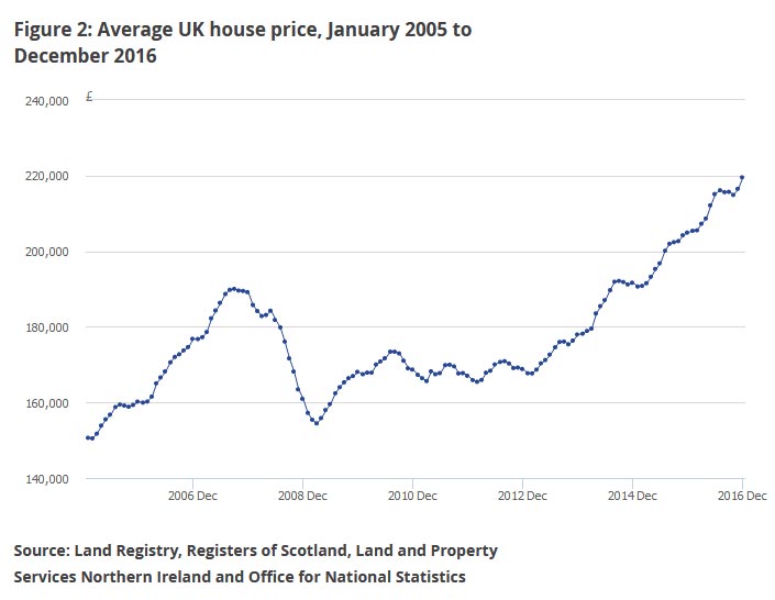
U.K. house prices may only eke out a modest gain next year as economic growth weakens and a pickup in inflation squeezes consumers, according to a separate report by Halifax. The mortgage lender sees housing demand easing in 2017, partly as tax changes and stricter underwriting standards restrict buy-to-let investment.
It highlighted the market in London, where poor affordability means the capital will see a sharper slowdown than elsewhere.
London’s underperformance has also been a theme of 2016, with Brexit and an increase in stamp duty weighing on the market. Luxury home prices in some of the most expensive districts are down more than 10 percent this year, and land values are also dropping. Property website operator Rightmove said this month that the bubble in prime London “continues to deflate,” and it sees prices there declining 5 percent in 2017.
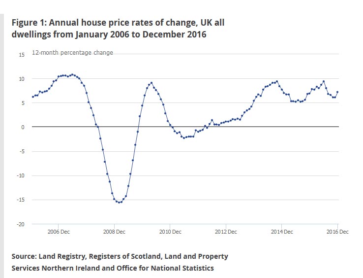
Halifax said prices should find some support from the shortage of property for sale, low levels of building and low interest rates. It forecasts that values will be rising about 1 percent to 4 percent in the U.K. by the end of next year. The most recent official data showed an increase of about 7 percent in October.
The wide range for the forecast “reflects the higher than normal degree of uncertainty” for the economy, it said.
“Slower economic growth in 2017 is likely to result in pressure on employment with a risk of a rise in unemployment,” said Martin Ellis, housing economist at Halifax. “This deterioration in the labor market, together with an expected squeeze on households’ spending power, is likely to curb housing demand.”
The Royal Institution of Chartered Surveyors also sees a slowdown in price growth in 2017, adding to the multiple reports that underscore the recent loss of momentum in Britain’s housing market. It says the supply shortage means the average number of properties on realtors’ books is close to a record low, supporting the outlook for values.
Mix Bag Of Property Price Growth
The ABS released their property price data to September 2016. It shows averaging across the states is meaningless. Prices fell hard in Darwin and Perth, but rose strongly in Sydney and Tasmania in the last quarter. The total value of residential dwellings in Australia was $6.15 trillion.
The price index for residential properties for the weighted average of the eight capital cities rose 1.5% in the September quarter 2016. The index rose 3.5% through the year to the September quarter 2016.
The capital city residential property price indexes rose in Sydney (+2.6%), Melbourne (+1.7%), Adelaide (+0.9%), Brisbane (+0.2%), Canberra (+0.8%) and Hobart (+2.3%) and fell in Perth (-1.6%) and Darwin (-1.2%).
Annually, residential property prices rose in Melbourne (+6.9%), Hobart (+6.8%), Canberra (+5.5%), Sydney (+3.2%), Adelaide (+3.2%) and Brisbane (+3.1%), and fell in Darwin (-7.2%) and Perth (-4.0%).
The total value of residential dwellings in Australia was $6,155,225.1m at the end of the September quarter 2016, rising $112,142.3m over the quarter.
The mean price of residential dwellings rose $9,000 to $631,000 and the number of residential dwellings rose by 39,300 to 9,755,400 in the September quarter 2016.
Is Australia’s Property Market One of the Worst Speculative Manias in Human History?
Former bank boss David Murray has warned of disastrous property crash.
Australia’s property market now mirrors one of the worst speculative manias in human history, according to a former Commonwealth Bank CEO.
In a televised interview that drew little media attention, David Murray warned that the entire economy is “vulnerable” because of overvalued house prices in Sydney and Melbourne.
“All the signs of a bubble are there. Many of the signs are the same as the Dutch tulips,” Mr Murray told Sky News on December 1.
Starting in 1634, the Dutch bid up the price of tulip bulbs to extraordinarily high levels. Then, in 1637, the price collapsed, turning the craze into a byword for speculative insanity.
Since 2009, Sydney dwelling prices have risen by 95 per cent and Melbourne by 85 per cent, according to CoreLogic, a prominent property analysis firm.
Mr Murray, who chaired a recent inquiry into the health of Australia’s financial sector, said we may yet avoid a Dutch-style price plunge. It is a risk, not a certainty.
“If the economy tracks along okay, it might turn out that this thing sorts itself out. But when those risks are there, something needs to be done about it in a regulatory sense, and the Reserve Bank and APRA need to stay on it.”
Australia’s central bank (the Reserve Bank) and its prudential regulator (APRA) share the task of protecting the financial sector.
In recent years, APRA has imposed tougher lending policies on the big banks, including forcing them to hold more capital as a buffer against mortgage defaults. This was a recommendation made by Mr Murray during his financial sector review.
The former bank boss has been warning of a property bubble since at least last year. The fact that prices in Melbourne and Sydney have not corrected already is a further cause for concern, he said in his latest interview.
“When we get a momentum in a market like this, when you get these self-amplifying price spirals, the fact they keep going on and on longer than expected is another sign that it’s not very healthy.”
The crash, if it eventuates, would be triggered by a large number of landlords being forced to sell their investment properties all at once, thereby driving down prices, Mr Murray said.
“We have more investors in the market than we’ve had historically and those investors typically, even people on lower incomes, own multiple properties and those properties are often collateralised in the system. So they’re the people who become forced sellers, and that’s the risk to the system.”
Unlike those who predict a property crash with glee, Mr Murray gloomily delivered his warning. A crash might make it easier for first home buyers to enter the market, but it would have terrible consequences overall, he said.
“If home prices fall significantly, there’s a wealth effect on the economy and a constraint on consumption and that doesn’t help everybody, it doesn’t help jobs, so we don’t want that.”
Mr Murray was CBA chief executive between 1992 and 2005. Two years after leaving the bank, he was awarded an Order of Australia for his service to the finance sector.
In 2014, at the request of the Abbott government, he chaired the financial system inquiry, which recommended a slew of reforms to increase the sector’s resilience to crisis, including an increase in bank capital levels.
Also in the Sky News interview, Mr Murray said he had faith in the ability of Australian banks to protect themselves from the risks of mortgage defaults.
“They are basically well-managed institutions,” he said.
He also said Australia’s federal government should invest more in productive public infrastructure in order to boost jobs and growth.
“Infrastructure – great public goods in transport, energy, whichever area – are very valuable to the economy and can lift productivity, subject to proper cost-benefit analysis and correct choice of project.
“So if there are ways that some government funds can be used and public-private partnerships can be used wisely, that is a good way of getting productivity and growth in the economy.”
Global House Prices: Time to Worry Again?
During 2007-08, house prices in several countries collapsed, marking the onset of a global financial crisis. The IMF’s Global House Price Index, a simple average of real house prices for 57 countries, is now almost back to its level before the crisis (Chart 1). Is it time to worry again about a global fall in house prices?
The classic study of financial crises by Carmen Reinhart and Ken Rogoff has taught us the folly of claiming “this time is different.” Still, there are several reasons to think that the present conjuncture is a time for vigilance but not panic.
- First, unlike the boom of the 2000s, the current boom in house prices is not synchronized across countries. And within countries, the boom is often restricted to one or a few cities. In many cases, the booms are not being driven by strong credit growth: some house price increases, particularly at the city level, are due to supply constraints.
- Second, countries are now more active in the use of macroprudential policies to tame housing booms. As our former Deputy Managing Director Min Zhu declared: “The era of benign neglect of house price booms is over.”
Lack of synchronicity
A closer look at the global index reveals three clusters of countries (Chart 2, left panel).
- The first cluster—gloom—consists of 18 economies in which house prices fell substantially during the global financial crisis and have remained on a downward path.
- The second—bust and boom—consists of 18 economies in which housing markets have rebounded since 2013 after falling sharply during 2007-12.
- The third—boom—comprises 21 economies in which the drop in house prices in 2007–12 was quite modest and was followed by a quick rebound.
Not only are there differences across countries, but the situation differs within countries. China offers a good example. While land prices overall have kept up a steady upward march, this masks tremendous variation at the city level. Beijing has “experienced one of the greatest booms ever seen in housing markets,” according to Joe Gyourko, an expert at the University of Pennsylvania. With his co-authors, Gyourko has constructed a residential land price index for 35 large cities in China based on government sales of land to private developers. These data show that prices have increased in inflation-adjusted terms by about 80 percent a year in Beijing over the past decade but by only 10 percent a year in Xian. Whether this pattern of price increases will continue depends on the balance between supply and demand, which varies across cities as well. Some other examples are those of Amsterdam, Oslo, and Vienna, where house prices are rising far more than the national averages.
Supply constraints
Many of the past housing booms were driven by excessive credit growth. But this time supply constraints appear to be playing a big role in driving some of the price booms. Residential permits have grown only modestly in the “boom” and “bust and boom” country clusters (Chart 2, right panel). The impact of supply constraints is evident in the case of many of cities. In Copenhagen and Stockholm, the increase in the housing stock has not kept up with population growth, feeding some of the price increase observed there. In recent years, the IMF has also flagged the role of supply constraints in some cities in Australia and Canada, as well as in many European countries—France, Germany, the Netherlands, Norway, and the United Kingdom.
Increased vigilance
Another difference from the pre-crisis period is that national and international regulators are being more vigilant about monitoring house price booms and using macroprudential policies to tame them. The use of such policies has been quite extensive in the period since the crisis, particularly in the “gloom” and “boom” clusters (Chart 3).
The IMF has been urging macroprudential measures, alongside measures to boost supply, in many countries including Australia, Canada, and several European countries. This is because, even if house price increases are due to supply constraints, their impact of household indebtedness could have adverse implications for financial stability.
Just last week, the European Systemic Risk Board published a set of country-specific warnings on medium-term vulnerabilities in the residential sector for eight member states: Austria, Belgium, Denmark, Finland, Luxembourg, the Netherlands, Sweden, and the United Kingdom. This provides a good example of the kind of vigilance that will be needed to keep the past from again becoming prologue.
Treasury Modelling Suggests Foreign Property Investors Have Only Small Impact
The Treasure released a working paper today – “Foreign Investment and Residential Property Price Growth“. This paper explores the relationship between foreign investment in Australian residential real estate and property prices.
They take the number of foreign approvals (with exceptions), and look, at a postcode level for differences in purchase price, between those with high foreign transactions, and those will little or none. They conclude that the increase in prices attributable to foreign investors is small when compared to the average quarterly increase in property prices of around $12,800 in Sydney and Melbourne during the study period. Across Sydney and Melbourne, for a typical postcode, foreign demand increases prices by between $80 and $122 on average in each quarter. Almost nothing. We were not convinced.
The number of foreign investment approvals has trended up in recent years, which has coincided with strong property price growth in many parts of Australia. While domestic buyers make up the vast majority of demand for property, it may be the case that, at the margin, foreign buyers are affecting property prices. This is because the stock of dwellings is relatively fixed in the short run so any increase in demand, whether from domestic or foreign sources, would be expected to result in higher prices, at least until increased prices have provided an incentive for the construction of additional supply. In the longer term, the high level of house prices in Australian capital cities, relative to those in other countries, likely reflects supply constraints. These constraints include state government land release and zoning policies, infrastructure provision and local government development approval processes.
Australia’s policy for foreign investment in residential real estate aims to increase Australia’s housing stock. As such, applications from non-residents to purchase new properties are usually approved without conditions, but non-residents are prohibited from purchasing established dwellings. Temporary residents can apply to purchase one established property to use as a residence while they live in Australia. The majority of approvals have been granted for investment into new, as opposed to existing dwellings. This suggests that foreign demand is being channelled into increasing the property supply as intended. While some commentators have argued that foreign demand is pricing out first home buyers, it is not clear that this is the case. The number of foreign investment approvals granted for new properties is especially noteworthy given new properties make up a very small proportion of the total number of properties in Australia and because first home buyers tend to buy established properties.
In recent years the level of foreign demand for Australian property has increased strongly. This has been driven largely by increasing applications from Chinese nationals, which rose from around 50 per cent of total foreign investment approvals in mid-2010 to around 70 per cent in early 2015. The increased importance of Chinese demand to Australian real estate increases Australia’s exposure to factors affecting the Chinese economy. Further, any change to the relative attractiveness of holding assets outside of China or ability to do so will likely affect foreign demand for Australian property, which may have domestic economic and financial implications.
Over the period of this study, foreign investment in residential real estate has been concentrated in Melbourne and Sydney (Chart 1).
But despite Melbourne receiving more foreign investment approvals than Sydney, price growth in Sydney has been much stronger than in Melbourne over the period. As such, it is difficult to directly attribute price growth in Sydney to foreign investors alone. Other factors, such as the relatively low number of building approvals, commencements and completions in the late 2000s are potential longer term drivers of the recent price growth in Sydney.
To estimate the sensitivity of property prices to changes in foreign demand we develop a fixed effects model of postcode level price growth using foreign investment approvals data from the Foreign Investment Division of the Treasury as the main explanatory variable.
Despite these shortcomings the data from the Foreign Investment Division at the Treasury is preferable to alternative measures of foreign investment in residential property. These alternative measures, such as from the National Australia Bank, are problematic because they are based on survey data from
industry participants and it is not clear how these industry participants determine whether property buyers are foreign.Under almost all model specifications there is a statistically significant and economically meaningful relationship between foreign investment approvals and property price growth, but the majority of price growth experienced in recent times does not appear to be attributable to increased foreign demand. Instead, the fact that property price growth has been strong over an extended period is likely to have been primarily driven by other factors such as impediments to supply, especially in some regions where natural and human-imposed constraints on supply are especially limiting.
The increase in prices attributable to foreign investors is small when compared to the average quarterly increase in property prices of around $12,800 in Sydney and Melbourne during the study period. Across Sydney and Melbourne, the models which we consider to be the best specified indicate that, for a typical postcode, foreign demand increases prices by between $80 and $122 on average in each quarter. This is based on the average postcode in these two cities receiving around 0.6 more foreign investment approvals each quarter over time. Further, for each additional foreign investment approval beyond this typical increase of 0.6, median property prices are estimated to rise by between $145 and $222.
Given that the typical increase in the number of foreign investment approvals from one quarter to the next in Sydney and Melbourne is only around 0.6, one additional foreign investment approval beyond this trend increase would be a relatively large spike in the number of approvals. As such, it can be seen that foreign demand has accounted for only a small proportion of the increase in property prices in recent years.
While the results of this study show a consistent, but small positive relationship between foreign investment approvals and property price growth, there are some limitations. This includes the data limitations set out in Section 3, particularly around compliance and that the data reflects intentions to purchase and not actual purchases. The foreign investment data also may not pick up purchases by a citizen or permanent resident on behalf of family members overseas. Quantifying the effect of these limitations is difficult. It is also important to note that while the results suggest the impact across Australia and the capital cities is small, the impacts in certain areas or at particular times may be more intense.
Whilst we applaud the Treasury for trying to bring science to this complex issue, we think there are fundamental flaws in the analysis, which devalues the conclusions significantly.
First, we think the modelling needs to look at total demand, at a post code level by purchaser type. We know from our own surveys, demand varies significantly driven by mix of prospective purchasers. In some locations, – for example Wolli Creek, we see high demand for foreign purchasers, first time buyers, other property investors and down traders – demand is outstripping supply, and here investors are outbidding first time buyers. This is the point, supply is not uniform, and therefore the pricing equilibrium will be quite different in individual locales. Reading their method, we think this is a significant issue.
Second their measure of foreign demand is the number of foreign investment approvals. This data are sourced from the Foreign Investment Division at the Treasury and it not available to the public, so the data cannot be validated, or independently reviewed. Recent inquiries however have called into question the accuracy of the approvals data. It likely understates the volume. Why not release the data, so we can judge?
They did not include data on advanced off-the-plan foreign investment approvals, nor price data from off-the-plan sales from such developments. We believe that this is likely to miss bulk approvals from developers who, at a single application, and approval gets multiple property transactions approved.
They make the point that foreign investment approvals are concentrated in a relatively small number of postcodes — more than three quarters of postcodes receive less than one approval every three months. Approvals do not represent actual purchases. For example, a foreign person may receive a foreign investment approval but later decide not to purchase a dwelling. No data are available regarding properties sold by foreigners. As such, the foreign investment data are an indication of gross foreign demand not net foreign demand. For instance, if a property is sold by one foreign person to another, there is no net change in foreign demand for
dwellings but an additional foreign investment approval will be recorded. It is unclear when an approval for foreign investment will be acted upon because the approval is valid for 12 months. However, anecdotal evidence suggests that in most cases approvals are acted upon soon after being granted. In some cases an approval may be sought shortly after a
contract is entered into but before the conveyancing and settlement period is finalised. As such, they consider leading and lagging relationships in the Results section. This yields some insights into the behaviour of foreign investors.
Foreign investment approvals data do not distinguish between houses and units, so in postcodes with price data for both houses and units, they aggregate prices for these two property types. Specifically, this aggregation is weighted by the proportion of houses and units in each postcode. In postcodes where no price data are available for a particular property type at any time — for example, units in a regional postcode — but price data are available for the other property type — for example, houses — they use the available price data as a measure of postcode
level price.
They do not control for changes in the quality of properties in each postcode through time. We do not consider this to be a major limitation because of the relatively short time period of our study. However, the lack of hedonic adjustment could be problematic where price data are derived from a small number of sales. That is, where postcode level property markets are relatively illiquid and the quality of transacted properties changes through time even though the quality of properties in the postcode more broadly does not change.
So, we conclude this exercise may generate some heat, but we are not sure it casts light on the real issues surrounding foreign buyers. The data limitations and surrounding processes need to be improved if we are to get a handle on the true story.
US Housing Bubble 2.0
US Houses have NEVER BEEN MORE EXPENSIVE to end-user, mortgage-needing shelter buyers. The recent rate surge crushed what little affordability remained in US housing. It now it requires 45% more income to buy the average-priced house than just four years ago, as incomes have not kept pace it goes without saying.
1) The average $361k builder house requires nearly $65k in income assuming a 4.5% rate, 20% down, and A-grade credit. Problem is, 20% + A-credit are hard to come by. For buyers with less down or worse credit, far more than $65k is needed. For the past 30-YEARS income required to buy the average priced house has remained relatively consistent, as mortgage rate credit manipulation made houses cheaper.
Bottom line: Reversion to the mean will occur through house price declines, credit easing, a mortgage rate plunge to the high 2%’s, or a combination of all three. However, because rates are still historically low and mortgage guidelines historically easy, the path of least resistance is lower house prices.
2) The average $274k builder house requires nearly $53k in income assuming a 4.5% rate, 20% down, and A-grade credit. Problem is, 20% + A-credit are hard to come by. For buyers with less down or worse credit, far more than $53k is needed.
For the past 30-YEARS income required to buy the average priced house has remained relatively consistent, as mortgage rate credit manipulation made houses cheaper.
Bottom line: Reversion to the mean will occur through house price declines, credit easing, a mortgage rate plunge to the high 2%s, or a combination of all three. However, because rates are still historically low and mortgage guidelines historically easy, the path of least resistance is lower house prices.
3) Bonus Chart … Case-Shiller Coast-to-Coast Bubbles
Bottom line: IT’S NEVER DIFFERENT THIS TIME. Easy/cheap/deep credit & liquidity has found its way to real estate yet again. Bubbles are bubbles are bubbles. And as these core housing markets hit a wall they will take the rest of the nation with them; bubbles and busts don’t happen in “isolation.”
Case-Shiller’s most Bubblicious Regions
- Ask Yourself: If 2005-07 was the peak of the largest housing bubble in history with “affordability” never better vis a’ vis exotic loans; easy availability of credit; unemployment in the 4%’s; the total workforce at record highs; and growing wages, then what do you call “now” with house prices at or above 2006 levels; high unaffordability; tighter credit; higher unemployment; a weak total workforce; and shrinking (at best) wages?
- Logical Answer: Whatever you call it, it’s a greater thing than the Bubble 1.0 peak.
The mind-numbing Case-Shiller regional charts below are presented without too much comment. The visual says it all.