This is why apartment living is different for the poor

From The Conversation.

There’s been a lot of talk about apartment living of late. Whether it’s millennials who can’t afford to buy a house, downsizers making a lifestyle change, owner-occupiers struggling to get defective buildings fixed, or foreign investors buying into new development, there’s no shortage of opinions and interest.

Except for one group: lower-income and vulnerable residents.

In Greater Sydney, the latest census data show that almost one in five households (17%) living in apartments and townhouses have weekly household incomes of less than A$649.

Among this group the largest sub-group (36%) live in private rental housing. That’s more than 72,000 households living on $649 or less per week in a housing market where average weekly rents for apartments are $550.

Our research for Shelter NSW identifies multiple challenges such households face.

Why does this matter?

It matters because some things about apartment and townhouse living are fundamentally different to living in a house. These differences have particular impacts on lower-income and vulnerable people living in higher-density housing.

The significant differences include:

  • You live closer to your neighbours, so it’s more likely you’ll see, hear or meet them.
  • You share services and spaces with neighbours, from gardens to laundries to lifts.
  • You have to co-operate with other residents and owners to manage and pay for building operation and upkeep.

If you live in a private apartment building then the fact that a large proportion of apartments are sold to investors and rented out will likely have three key impacts on you:

  1. Developers often cater for investors when designing new apartment buildings, so you will likely find a limited variation in apartment designs and sizes available.
  2. Resident turnover in your building may be high, as private renters move more frequently.
  3. Tensions between owner-occupiers and investor-owners may result in disagreements and disputes over budgeting and maintenance.

While these unique aspects of higher-density living can be tricky for anyone, they present particular challenges for lower-income and vulnerable residents. They tend to have less choice about their living arrangements, so they can’t up and move to better-designed, constructed and managed properties if things aren’t working out.

Building flaws affects some residents in particular

Poor building quality is one of the major issues in high-density development in Australia. The problems relate to design, defects and maintenance.

The design issues include noise disturbances as a result of poor design, inadequate solar access and cross ventilation, the availability and flexibility of shared spaces, and safety and security considerations.

Another issue is design that fails to help meet the needs of particular groups (such as people with a disability, and families with children).

Beyond design, the construction quality of higher-density developments is a major issue in Australia. Key concerns include the quantity and severity of building defects, as well as the difficulties owners face having defects fixed.

Among the problems are quality of workmanship, management of construction, private certification, limited warranties and the often-prohibitive cost of legal action.

As with poor design, lower-income households are particularly susceptible to construction issues. This is because there are more incentives to cut corners when constructing more affordable housing. Examples include rushing jobs, hiring cheaper but less experienced tradespeople, or using substandard materials.

Once residents move in, negotiating to fix defects is particularly difficult for private renters, as they typically must go through the real estate agent or landlord. This means renters may be stuck with unsatisfactory living conditions.

Lower-income renters are also likely to be over-represented in poorly maintained buildings, as these are usually cheaper to rent. Compared to a detached house, maintenance in higher-density properties is complicated by the complexity of the buildings themselves and the governance structures.

As a result, required maintenance work is often not carried out, or is reactive rather than proactive. This is especially true in buildings occupied by lower-income renters with no direct recourse to the strata committee. They often cannot afford to move and may fear retaliatory rent increases if they report maintenance issues.

Social relations can be challenging

Neighbour disputes happen everywhere, but evidence suggests disputes are more common in areas with more lower-income and vulnerable residents and with more apartments.

Common causes of neighbour conflict in higher-density housing reflect different expectations about noise levels, parking practices, or spending on maintenance and improvements.

Neighbour disputes can have significant impacts on health. This potentially counteracts the health benefits associated with the walkable nature of many higher-density neighbourhoods.
When disputes arise, the number of stakeholders involved complicates efforts to find a resolution. They might include renters, resident owners, investor owners, building managers, strata managers and strata committee members.

Research with strata residents in New South Wales shows residents find formal dispute resolution mechanisms complex and slow. Most disputes are resolved informally.

Lower-income residents, and renters in particular, are likely to have less influence over the outcomes of such processes.

Fostering positive neighbour relations can be more difficult where resident turnover is high, such as in buildings dominated by private renters. It is also more difficult in poorly designed buildings without quality shared spaces.

New norm promotes inequity

Apartment living is the new norm in Australia. As the nursery rhyme says, when it’s good it’s very, very good, but when it’s bad it’s horrid. If these homes are poorly designed, poorly built, poorly maintained or poorly managed, they are poor places to live.

The market-led housing model that underpins Australia’s compact city policies has meant that people with less money get a poorer product. Few planners or politicians have adequately acknowledged these inequities.

Authors: Hazel Easthope, Senior Research Fellow, City Futures Research Centre, UNSW; Laura Crommelin, Research Associate, City Futures Research Centre, UNSW; Laurence Troy, Research Fellow, City Futures Research Centre, UNSW

Another Perspective On Debt

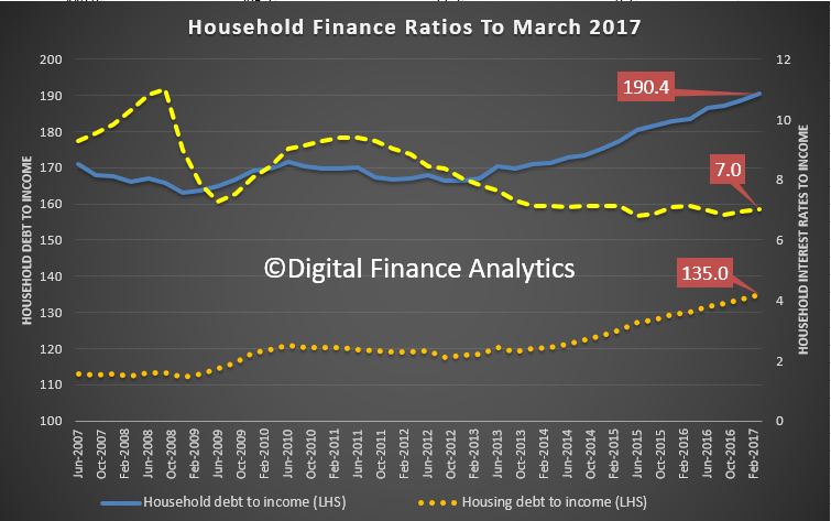
We had significant reaction to yesterday’s post on the “normal” status of high household debt. So today we take the argument further using data from the RBA Household Balance Sheet series (E1) and the recent ABS data on income growth.

The traditional argument trotted out is that household wealth is greater than ever, this despite low income growth and rising debt. But of course wealth is significantly linked to home prices, which in turn is linked to debt, so this is a circular argument. You get a different perspective by looking at some additional trends.

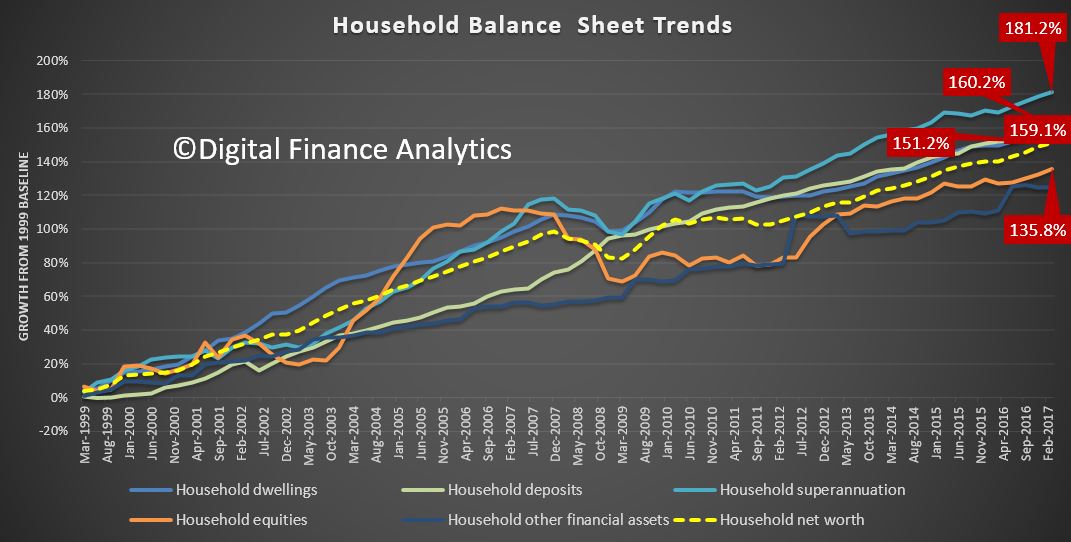
But lets start with the asset side of the ledger. We have base-lined the data series from 1999. Since then, superannuation has grown by 181.2%, and at the fastest rate. But it is arguably the least accessible asset class.

Residential property values rose 160.2% over the same period, and grew significantly faster than equities which achieved 135.8% growth, no wonder people want to invest in property – the capital returns have been significantly more robust. Deposit savings grew 159.1% (but the savings ratio has been declining recently). Overall household net worth rose 151.2%. So the story about households being more affluent can be supported on this view of the data. But it is myopic.

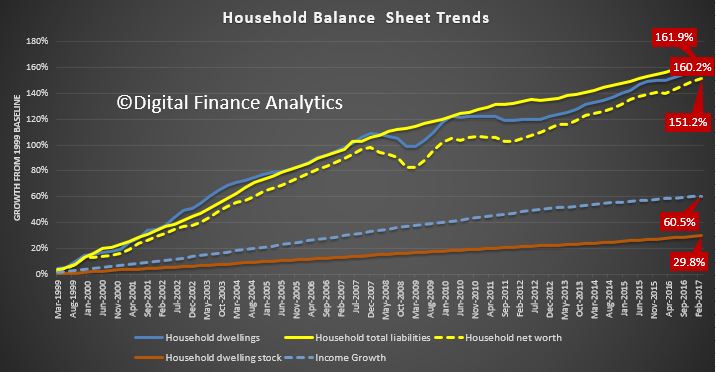
The chart below tracks overall household debt, house prices, household net worth, income growth and the growth in the number of residential properties.

Overall household debt rose 161.9%, a growth rate which is higher than residential property values, at 160.2% and above overall household net worth at 151.2%.

But look at the growth in income, which is 60.5%, under half the asset growth. OK, interest rates are lower now, but this increase in leverage is phenomenal – and explains the “debt is normal” findings from our focus groups. I accept debt is not equally spread across the population, but there are significant pockets of high borrowing, as can be seen from our mortgage stress analysis – and its not just among battling urban fringe mortgage holders.

Finally, it is worth noting the growth in the number of residential properties rose by just 29.8% over the same period. So the average value of individual properties have increased significantly. On paper.

To me this highlights we have learned nothing from the GFC, our appetite for debt, supported by the low interest rate monetary policy, significant tax breaks, and salted by population growth has created a debt monster, which has the capacity to consume many if interest rates were to rise towards more normal levels. Unlike Governments, household debt has to be repaid, eventually.

This data series shows clearly the relationship between more debt and home prices, they feed of each other, and this explains why the banks have enjoyed such strong balance sheet growth. But the impact on households is profound, and long term.

Our current attitude to debt will be destructive eventually.

Is This Amount of Debt “Normal”?

As part of our household survey we had the chance to discuss household debt in our focus group. We had selected participants with large debt burdens, because we wanted to understand better what was driving this behaviour. It was mixed group, with households represented between 20 and 60 years, from multiple locations.  The RBA data showing high household debt prompted the research.

In the session, a number of themes emerged. Yes we got the story about incomes not rising, costs going up and big mortgages; as expected. But there was another theme that struck home to the facilitators.

It is this. Around two thirds of the households in the session had a basic assumption that high debt levels were normal. They had often accumulated debts through their education, when they bought a house, and running credit cards. Even more interestingly, their concern from a cash flow perspective was about servicing the debts, not repaying them.

One quote which struck home was “once I am dead, my debts are cancelled”, I just keep borrowing til then.

Wow! Debt, it seems has become part of the furniture, and will remain a spectre at the feast throughout their lifetime.  The banks will be happy!

But this got me thinking about the implications of this observation. If households are making debt decisions based on just debt servicing, what does that say about their future cash flow in a low income growth, potentially rising interest rate environment? Is this normal behaviour now?  Has financial literacy failed, or is there a new logic in town?

If there is, then I have to ask – am I out of kilter in believing that debt can be useful, but it should be paid down as soon as possible, and that borrowing is the exception, not the rule.  Or is the new normal to be saddled with high debt, and live with it? For ever?

The remaining one third, by the way, were more conscious of the need to repay, and were surprised by the majority view in the room.

No wonder households are more highly in debt than ever as the recent RBA data shows. But what I am getting at are the cultural norms which now exist. As a result, lenders will continue to have a field day, but what are the true economic and social costs of this phenomenon?

We hope to do more research on this. Watch this space.

Aging Japan Puts a Strain on the Financial System

From The IMFBlog.

Japan’s population is shrinking and getting older, posing challenges to the nation’s financial system. How Japan copes could guide other advanced economies in Asia and Europe that are grappling with the same trends but are at an earlier phase of similar demographic developments.

A declining and aging population weighs on growth and interest rates. This puts pressure on profits of banks and insurance companies. Judging how these shifts affect financial firms was part of the IMF’s Financial Sector Assessment Program for Japan, the world’s third-largest economy. The program is a comprehensive and in-depth assessment of a country’s financial sector. It analyzes the resilience of the financial sector, the quality of the regulatory and supervisory framework, and the capacity to manage and resolve financial crises.

An aging population is also likely to reduce the role of banks in the financial system. With increasing longevity, the demand for longer-term securities rises (since people save more for longer retirements). This results in a flatter yield curve–and banks typically make money by borrowing at low short-term rates and lending at higher longer-term ones. In line with this intuition, analyses of data from 34 countries around the world confirm that the size of the banking sector relative to nonbank financial intermediaries is negatively associated with aging. About 40 percent of the increase in the size of market finance in Japan since 1990 can be explained by aging.

Smaller banks that rely on lending to local markets are particularly vulnerable, since they face less demand from households and firms. Older households still need banking services for transaction purposes, which means that lending will likely fall much faster than deposits. As a result, over the next two decades some regional banks could see their loan-to-deposit ratios fall by 40 percentage points.

In response to profitability problems, banks are also engaging in riskier forms of lending and investment as they search for yield. They have been making more real estate loans, helping to drive up housing prices in some areas despite overall population shrinkage. Condominium prices appear to be moderately overvalued in Tokyo, Osaka, and several outer regions. Banks have also been investing more in securities in countries where economic growth is faster than Japan’s.

Life insurance companies are also facing increasing pressure. They have been putting more money into riskier overseas markets to get the yield needed to meet interest guarantees.

The problem is that many banks and insurers still need to develop the capacity to manage the risks associated with these new types of investments.

Consequently, stress tests suggest that market risks are increasing and that there are some vulnerabilities among regional and shinkin (cooperative) banks and life insurers. Although bank liquidity is generally ample, some of the regional banks are exposed to risks in foreign-currency funding.

The Bank of Japan has had to adapt its monetary policy to low “natural” rates in the economy and sought to stimulate demand by monetary easing. In this context, it had to resort to large-scale asset purchases. These purchases in turn, have put a strain on markets. The level of liquidity—how easily and quickly investors can buy and sell securities—in Japanese government bond markets seems to have been adversely affected by the central bank’s purchases. Moreover, the resilience of government bond market liquidity also seems to have declined as the share of Bank of Japan holdings has increased.

Japan’s financial system has so far remained stable. But there are steps policymakers can take to ensure that it remains sound as society ages and slow growth continues:

  • Supervisors need to modernize supervision to keep pace with the more sophisticated activities emerging across banks, insurers, and securities firms. Tailoring capital requirements to individual bank risk profiles and implementing a framework that appropriately recognizes the financial conditions of insurers would be key.
  • Corporate governance needs to be strengthened across the banking and insurance sectors to manage new risk taking.
  • The macroprudential framework could be further strengthened to better identify and address any buildup of systemic risks.
  • Some (in particular regional) banks will feel increased pressure, so they should be encouraged to take timely action in response to viability concerns.
  • Regional banks should be encouraged to consider augmenting fee-based income, reducing costs, and consolidating.
  • Sustaining productivity growth is a particular challenge as the population ages, and new, innovative firms can play an important role. Constraints to financial access for small and medium enterprises and start-ups should be eased by further promoting risk-based lending. Alternative forms of financing for these young businesses should be further encouraged.

These long-term challenges for business models of many banks, combined with the existence of large systemic institutions, highlight the need for a strong crisis management and resolution framework.

Rising mortgage debt is the biggest threat to super balances

From The New Daily.

New data suggests rising property prices are a threat to the retirement system, as many Australians use their superannuation balances to pay off their mortgages before they retire.

The latest investment update from NAB highlights that many Australians are concerned about ending their working lives in debt. It reported an increase in the number of respondents who feared a lack of retirement savings. It also found that paying down debt was the highest priority for the next 12 months.

Likewise, the 2017 Household, Income and Labour Dynamics in Australia (HILDA) report – widely reported in recent days for its concerning home ownership numbers – also showed that both men and women were spending considerable chunks of their super to pay debts.

It found that men paying down debts spent on average $240,000 to do so in 2015, or 58 per cent of their super, while men helping family members spent $108,500, around 84 per cent of super. Women paying down debt spent $120,500, or 70 per cent of super and those helping family spent $67,000, or 48 per cent of super.

Some men and women also spent up big on things for themselves, as the following table shows. However, men spent far more than women here, indicating the gender imbalance in superannuation accounts.

Ian Yates, chief executive of the Council on the Ageing (COTA), said rising property prices could force more people to pay down more mortgage debt on retirement in the future.

“People are paying off debts of not inconsequential amounts on retirement. The numbers doing it and the amounts used surprised me,” he told The New Daily.

“It’s a concerning trend and if people plan to use their super to pay off a mortgage then they are not using it to provide retirement income.”

He said this could result in the government being faced with a dilemma.

“Given the family home is untaxed, the increased use of concessionally-taxed superannuation to pay off homes in retirement would not be what the government intended,” he said.

That could mean governments would be forced to review both superannuation and housing policy as “both superannuation and the age pension are predicated on high levels of home ownership”.

The HILDA report also showed that both men and women are retiring later with the average age of women retirees reaching 63.8 years in 2015 and men 66.1 years.

Mr Yates said the rise in retirement ages, while partly due to desire to work longer, also had a negative financial driver.

“A lot of people got frightened by the market crash accompanying the financial crisis and decided they need a bigger financial buffer before they retire.”

For 16 years the HILDA survey, run by the University of Melbourne, has polled the same 17,000 Australians.

The report’s author, Professor Roger Wilkins, pointed to the falling home ownership levels among younger people. In 2014, approximately 25 per cent of men and women aged 18 to 39 were home owners, down from nearly 36 per cent in 2002.

Younger people with housing debt saw average mortgages up from $169,000 to $336,500 between 2002 and 2014.

That reality plus rising prices meaning people have to save longer before buying “could result in the superannuation system being thwarted in its aim to provide retirement income by rises in outstanding mortgage debt”, Professor Wilkins told The New Daily.

Egalitarian or Edwardian? The rising wealth inequality in Australia

From The Conversation.

Recent commentary on levels of inequality exposes the myth that Australia is an egalitarian society in which the privileges of birth have little currency.

Focusing on inequality in the distribution of incomes ignores an equally important dimension of inequality: wealth. Wealth is much more unequally distributed than income. Therefore, ignoring wealth inequality skews perceptions of social inequality.

Perceptions of the levels of income and wealth inequality are derived from our day-to-day experiences. This means that not mixing with people from the other end of the wealth distribution can colour our perceptions of inequality.

The lack of official data on the wealth holdings of Australians hampers research into trends in wealth inequality. Between 1915 and 2003-04, there is almost no official wealth data to examine.

In 2003-04, the wealthiest 20% of Australian households held 58.6% of total household wealth, and the poorest 20% of households held just 1.4% of total household wealth. In 2013-14, the wealthiest 20% of households held 61% of total household wealth, and the poorest 20% of households held just 1% of total household wealth.

These figures indicate that wealth inequality increased over the decade to 2013-14.

The table below details trends over time in various measures of wealth inequality. The P90 to P10 ratio compares the wealth of households at the 90th percentile with that of households at the tenth percentile. A larger ratio indicates greater levels of inequality.

In 2003-04, households at the 90th percentile held 45 times as much wealth as households at the tenth percentile. In 2013-14, households at the 90th percentile of the distribution held 52 times as much wealth as households at the tenth percentile. This indicates that wealth inequality increased in that decade.

Using the mean and median household wealth figures, it is possible to calculate the ratio of median to mean wealth.

The closer this ratio is to one, the lower the level of inequality. In 2003-04, the ratio was 0.63. In 2013-14, it was 0.57. This also indicates that wealth inequality increased.


The distribution of household wealth also varies between Australia’s state and territories, and by location within states and territories.

Households in the ACT recorded the highest mean household wealth (A$890,100). Households in Tasmania recorded the lowest mean household wealth ($595,600).

When these figures are disaggregated by location into capital city households and households located in the rest of the state, the largest wealth gap occurs in New South Wales. The mean wealth of households in Sydney was $971,700, whereas the mean wealth of households in the rest of NSW was $534,700.

The median-to-mean-wealth ratios show wealth was most unequally distributed in Brisbane and Perth.


Given a relatively large proportion of household wealth is held in the form of property assets, the recently released Household, Income and Labour Dynamics in Australia Survey report identifies property as the key driver of increasing wealth inequality.

The percentage of 18-to-39-year-olds with property declined by 10.5 percentage points between 2002 and 2014. And the level of debt of those with a mortgage doubled in real terms.

So, fewer young adults have mortgages now compared to a decade ago, and those who do have mortgages have higher levels of debt.

Two other sources of publicly available data on wealth are the lists of the super-wealthy published annually by the Business Review Weekly in Australia and Forbes in the US.

Figures published in the Business Review Weekly show that, after adjusting for inflation, in 1984 the wealthiest 20 Australians held $8.25 billion in assets. In 2017, the wealthiest 20 Australians held $104 billion.

Forbes’ lists of billionaires (in $US) show that the number of billionaires living in Australia increased from two to 26 between 1987 and 2014.

Having an increasing number of billionaires would not be an issue if all Australians’ wealth was increasing at a similar rate. However, if the gap between the wealth of the billionaires and that of the average residents increases dramatically, there is likely to be discontent.

Drawing on figures published in the Credit Suisse Wealth Report, it is possible to compare the wealth of the billionaires with that of average Australians.

In 2014, the wealth of the 26 Australian billionaires was equivalent to 214,914 adults with average wealth.

Recent turmoil in the UK and the US may be an indicator that the “peasants are revolting” and are not willing to return to the 19th century, when the very rich lorded over the masses.

Australia has yet to experience mass demonstrations and voter backlashes. But events overseas should be ringing alarm bells among our politicians in Canberra.

Author: Jennifer Chesters , Research Fellow, Youth Research Centre, University of Melbourne

Affordable housing shortfall leaves 1.3m households in need and rising

From The Conversation.

A new report by the Australian Housing and Urban Research Institute (AHURI) reveals, for the first time, the extent of housing need in Australia. An estimated 1.3 million households are in a state of housing need, whether unable to access market housing or in a position of rental stress. This figure is predicted to rise to 1.7 million by 2025.

To put it in perspective, 1.3 million is around 14% of Australian households. This national total includes 373,000 households in New South Wales, where the number is expected to increase by 80% to more than 670,000 by 2025 under the baseline economic assumptions of the modelling.

The first graph below shows the average annual level of housing need to 2025. The second, showing the percentages of households, permits a direct comparison by state. NSW and Queensland are in the worst position. The ACT is calculated to have the lowest proportional level of need.

What does this mean for households in need?

Housing need is defined as:

… the aggregate of households unable to access market-provided housing or requiring some form of housing assistance in the private rental market to avoid a position of rental stress.

This includes potential households that are unable to form because their income is too low to afford to rent in the private rental market. These households would traditionally rely on public housing and community housing to meet their needs. However, more and more are being forced into the private rental market, paying housing costs they are unable to afford without making significant sacrifices.

To 2025, on average 190,000 potential households in NSW will be unable to access market housing in a given year. The graph below is the most revealing as it illustrates the gap between affordable housing demand and supply.

The lack of social housing and subsidised rental housing prevents such households forming under affordable conditions. Many will manage to form but will have to spend well over 30% of their income on housing costs to do so, putting them in a position of financial stress.

The results also reveal the increasing pressure the affordable housing shortfall places on the housing assistance budget, notably Commonwealth Rent Assistance.

The absence of a significant new supply of affordable housing – there has been no large-scale program since the National Rental Affordability Scheme (NRAS) began in 2008 – has left state governments trying to find ways to plug the affordability gap.

Responses have been largely on the demand side, such as first home buyer concessions recently announced in NSW. But such incentives are no use for low-income households. To help them, intervention needs to be on the supply side.

How does Australia compare?

The AHURI research built on ideas emerging from research into housing need in the UK. It revealed interesting differences between the two countries.

UK government policy prior to 2010 emphasised the role of the planning system in helping to substantially increase affordable housing supply. This reflected evidence from England and Scotland that found a link between low levels of new housing supply and higher and rising house prices.

In this project, we found plenty of evidence of deteriorating housing affordability in Australia. But we did not find a particularly strong relationship between housing supply and price growth. This might reflect how other drivers of deteriorating housing affordability are more important in Australia – such as tax incentives for investors.

These findings suggest we need to look more closely at how new supply and investment demand interact, and in what circumstances boosting new supply is likely to improve affordability.

From our analysis of individuals’ labour market circumstances and incomes, it was also clear that the Australian workforce has not escaped the erosion of secure, full-time employment opportunities seen in other countries.

The combination of widespread insecure, part-time employment opportunities, high housing costs and low supply of rented social housing means the housing of many working Australians is extremely precarious.

How was the research done?

The research modelled housing need at the state and territory level to 2025 using an underlying set of economic assumptions and interrelated models on household formation, housing markets, labour markets and tenure choice.

The models were underpinned by data from the Housing, Income and Labour Dynamics in Australia (HILDA) Survey, the Australian Bureau of Statistics (ABS) and house price and rent data.

This research delivers, for the first time in Australia, a consistent and replicable methodology for assessing housing need. It can be used to inform resource allocation and simulate the impact of policy decisions on housing outcomes.

The intention is to further develop the model to assess housing need at the level of local government areas.

So, what are the policy implications?

The scale of the affordable housing shortfall requires major action from federal and state governments.

NRAS had its problems but at least delivered a supply of below-market housing. Australia cannot rely on the private sector to deliver housing for low-income households without some form of government subsidy as it is simply not profitable to do so.

The question is what government is going to be prepared, or even able, to spend big to close the affordable housing supply gap?


Authors: Steven Rowley, Director, Australian Housing and Urban Research Institute, Curtin Research Centre, Curtin University; Chris Leishman, Professor of Housing Economics, University of Adelaide


Here’s why it’s so hard to say whether inequality is going up or down

From The Conversation.

Is inequality rising or falling? The answer, if recent public debate is anything to go by, may appear at first to depend on who you ask.

Part of the reason why we get such conflicting narratives about whether it’s rising or falling is that economic inequality can be measured in different ways, using different data sets.

And you might get a different answer depending on whether you’re talking about income inequality or wealth inequality. Income is the flow of economic resources over a certain time period, while wealth is the stock of resources built up over time.

We can draw some insights from the newly released Household Incomes and Labour Dynamics in Australia (HILDA) 2017 report, which reveals the latest results of a longitudinal study that has been running since 2001.

But it doesn’t show the whole story. Combining HILDA’s results with data from the Australian Bureau of Statistics’ income surveys gives a more comprehensive picture of trends in economic inequality in Australia.

HILDA data show lower income inequality than the ABS

Firstly, you need to know that when we are talking about income, most people are referring to the disposable income of the household, not individuals.

That’s all the income that members of a household receive from various sources, minus tax. You can then then adjust for the number of people in the household, accounting for the differing needs of adults and children to get what economists call “equivalised household disposable income”.

The HILDA survey, funded by the Department of Social Services and conducted by the Melbourne Institute, has followed some 17,000 individuals every year since 2001. (The most recent ABS income survey final sample consists of 14,162 households, comprising 27,339 persons aged 15 years old and over.)

One commonly used way to measure inequality is called the Gini coefficient, which varies between zero (where all households have exactly the same income) and one (where all the income is held by only one household). The Gini coefficient for equivalised household disposable income varies between about 0.244 in Iceland to 0.397 in the United States (with most other high income OECD countries falling between these two levels), but is as high as 0.46 in Mexico and 0.57 in South Africa.

The latest HILDA report puts Australia’s Gini coefficient at 0.296 and notes that it has “remained at approximately 0.3 over the entire 15 years of the HILDA Survey.”

The HILDA surveys show a lower level of income inequality than the ABS figures do. Some of the differences between these estimates will reflect the broader definition of income used by the ABS, and the significant changes in this definition over time.

In a sense, the HILDA longitudinal survey is like a video where the same people are interviewed every year, whereas the ABS surveys are like a snapshot of the Australian population taken every two years.

But there are also problems with longitudinal surveys because participants often drop out of the survey over time. Also the survey is based on people who were living in Australia in 2001, thus leaving out immigrants who have arrived since that time. While the survey has refreshed the sample in 2011 to address this problem, this attrition may reduce the representativeness of the sample. In addition, the sample size of the ABS surveys is about 50% greater than HILDA, which will reduce sampling errors.

ABS data show inequality has risen

The Australian Bureau of Statistics (ABS) has conducted income surveys since the late 1960s, although it is only surveys since 1982 that are comprehensive and available for public analysis. These ABS surveys are also used in most of the international data sources that compare income inequality across countries – the OECD Income Distribution database and the Luxembourg Income Survey.

The ABS data show a clear increase in both wealth and income inequality over the mid- to long run.

The chart below shows two long series of estimates from the ABS surveys – those published in 2006 by researchers David Johnson and Roger Wilkins (who now oversees the HILDA survey) from 1981-82 to 1996-97, and official figures prepared by the ABS, from 1994-95 to 2013-14.

Despite the differences in income measures and equivalence scales, the long run trend from the ABS figures is clear.

There are periods in which inequality fell, but overall inequality rose over the whole period – including in the most recent period to 2013-14. The Gini coefficient in 2013-14 is a little lower than its peak just before the Global Financial Crisis, but the difference is not large.

True, there have been changes in the ABS’ survey methodology over the years but these changes should not have an effect after 2007-08, as income definitions haven’t changed in a major way since then.

Wealth is much more unequally distributed than income

The ABS also publish information on the distribution of net worth – that’s household assets minus liabilities. Wealth is much more unequally distributed than income.

According to the ABS, the Gini coefficient for net worth in 2013-14 was 0.605 (compared to a Gini coefficient for income of 0.333). This is a clear increase from a Gini of 0.573 in 2003-04.

Put another way, ABS data show a high income household in the richest 20% of the income distribution has an income around 5.4 times as high as the average household in the bottom 20% of the income distribution, as this chart demonstrates:

In contrast, ABS data show that on average households in the richest 20% of the distribution of net worth have wealth of around $2.5 million or more than 70 times higher than the net worth held on average by households in the bottom 20% of the wealth distribution, as this chart demonstrates:

Somewhat surprisingly, however, the Credit Suisse Global Wealth Report puts wealth inequality in Australia at below the world average (and the mean and median levels of net worth at among the highest in the world).

This largely reflects the still high level of home ownership in Australia and the high levels of wealth in home ownership, which accounts for nearly half of total net worth on average.

Reconciling conflicting trends

While these two major sources of data show conflicting trends on income inequality, the ABS sample size is much greater. Ultimately, however, the reasons for the differences between the findings of the ABS and the HILDA survey are not obvious.

One way forward would be for the ABS and the Melbourne Institute to jointly analyse the differences between their findings to identify why their estimates of inequality diverge.

Author: Peter Whiteford, Professor, Crawford School of Public Policy, Australian National University

Our second-class citizens – kids who can’t leave home

From The New Daily.

This year’s Household, Income and Labour Dynamics in Australia (HILDA) survey results confirm, with damning certainty, how Australia is spiralling back into inequality based around property ownership.

The Household, Income and Labour Dynamics in Australia survey, one of the most comprehensive studies of social and economic trends, shows the proportion of 18 to 39-year-olds owning their own home slumping from 36 per cent in 2002 to just 25 per cent today.

Within that figure, couples with dependent children went from an ownership rate of 55.5 per cent 15 years ago, to just 38.6 per cent.

That’s important, because it is parents passing wealth down to their children that are once again starting to define who gets into property and who doesn’t – we’re going back to a 1950s-style class division.

All in the numbers

To see how, consider the way assets grow in value over time, and the relationship between inflation-adjusted (‘real’) growth, and nominal growth.

Imagine a couple buying a home in Brisbane in 2002 at the age of 25. When they hit 40 this year, two things will have happened.

Firstly, for any given interest rate, the real value of their monthly mortgage payments will be lower thanks to the eroding effect of inflation.

Assuming their income had only just kept pace with inflation, their repayments after 15 years would be, for any given interest rate, only 70 per cent as large a chunk of their pay packets.

Secondly, the home would be worth about 1.9 times as much in inflation-adjusted terms, or 2.7 times as much in nominal dollars, based on ABS data.

Those left behind

By contrast, a 25-year-old couple who decided not to buy in 2002, but who at the age of 40 decided to do so today, faces two financial nasties – they’ll need a much larger deposit; and they’ll have to hand over a much larger chunk of their income each month if they want to pay off the home by retirement.

If this example were set in the 1980s and 1990s, you might say “it’s their own stupid fault”.

And you’d probably be right – the barriers to entering the housing market were much lower then.

Today, however, the HILDA numbers describe a housing market in which many young Australians have no choice about getting into the market.

Since the turn of the millennium, house prices across Australia have roughly doubled in inflation-adjusted terms, and a deposit for a home can’t just be ‘scraped together’ by maxing-out a few credit cards and smashing the piggy bank.

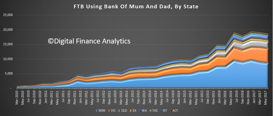
So young Australians have three options: stay at home for years more and save madly for a deposit; move out and rent, saving even more madly for a deposit; or receive a windfall gift or loan from the ‘bank of Mum and Dad’.

The HILDA data shows more young Aussies opting for the first option. In 2001, 43 per cent of men and 27 per cent of women aged 22 to 25 lived with their parents, but those numbers have now ballooned to 60 per cent for men and 48 per cent for women.

The old progression of moving out and renting, scraping together a deposit, and then moving into property ownership is almost impossible for many – unless the ‘bank of Mum and Dad’ is able to help.

A compounding problem

When Mum and Dad are unable to help with a deposit, the effects on wealth equality begin to compound.

Today’s 25-year-olds who do not have family money behind them will take much longer to get into the market, meaning they’ll have smaller capital gains behind them when their own children come asking for help.

Buying a home has never been a universal right, but as detailed last week, it’s something that at its peak was available to 71.4 per cent of Australian households.

As that number slides lower – or tumbles lower for younger groups – it’s time to face facts.

The new class divide in Australia is between those who have generous property-owning parents, and those who do not.