Taxable Income Mapping Greater Sydney 2015

Here is the geomap for Greater Sydney, using the recently released 2015 taxable income data from the ATO, as a drill down on the all Australia data we previously posted. Blue shows the higher taxable income areas.

Here is the top 10 and bottom 10 from the listings.

Next time we will look at Greater Brisbane.

Taxable Income Mapping Australia 2015

Using data from the latest ATO release from 2015, we can map average taxable incomes to post codes. Of course taxable incomes are the residual amounts the tax authorities get their hands on after tax management strategies (such as allowances, expenses, trusts, negative gearing, income sharing and the like) so they do not tell the full story. Nevertheless the results are interesting.

The blue areas show the zones of highest taxable income. Here are the top and bottom postcodes from the list, Australian wide.

In coming days we will drill into the various states, again with interesting results.

ATO reveals Australia’s richest and poorest postcodes

From The New Daily.

Sydney’s eastern suburbs have retained their title as the home of Australia’s richest residents.

That’s the word from the Australian Taxation Office, which names postcode 2027 as the single largest concentration of blue-chip earners in the nation, with an average individual income of $189,293, based on newly released tax return statistics from 2014-15.

That shouldn’t come as a surprise. The plush pocket of harbourside high-earners includes Point Piper, where Prime Minister Malcolm Turnbull makes his home in a waterfront mansion estimated by Domain.com.au to be worth as much as $50 million.

That makes him wealthy even by the solid-gold standards of neighbouring Darling Point, Edgecliff and Rushcutters Bay, all in the same 2027 postcode.

NSW accounted for seven of the top 10 rated postcodes, while Victoria occupies two rungs at the top of the wealth ladder, according to the data released on Wednesday for the 2014-15 year.

That’s the upside. The other side of the coin is that the state also has the poorest postcodes, with the 132 residents of Bulyeroi, in the north-central part of the state, scraping by on an average taxable loss – yes, loss – of $8832.

That makes Bulyeroi the most down-at-heel town in the entire country.

Overall pauper honours, however, go to Queensland, where seven of the poorest postcodes are to be found. The other three entries at the bottom of the income ladder are all in NSW.

The Melbourne suburb of Toorak is the third-richest, with the Victorian seaside town of Portsea, grandly positioned at the entrance to Port Phillip Bay, ranking fifth in the wealth stakes.

The only other state to figure in the top 10 was Western Australia, where Cottesloe/Peppermint Grove secured the ninth spot, just ahead of Sydney’s Woollahra on $144,273.

The most common professions reported among the top 10 postcodes included medical specialists and practitioners, financial dealers, psychiatrists, judicial and other legal professionals, mining engineers, chief managing directors, and engineering managers.

Surgeons were the highest earners, with an average taxable income of $377,044, followed by anaesthetists at $341,041.

Australia’s wealthiest postcodes, by suburb

  1. 2027 (NSW): Darling Point, Edgecliff, Hmas Rushcutters, Point Piper
  2. 2030 (NSW): Dover Heights, Hmas Watson, Rose Bay North, Vaucluse, Watsons Bay
  3. 3142 (VIC): Hawksburn, Toorak
  4. 2023 (NSW): Bellevue Hill
  5. 3944 (VIC): Portsea
  6. 2088 (NSW): Mosman, Spit Junction
  7. 2110 (NSW): Hunters Hill, Woolwich
  8. 2063 (NSW): Northbridge
  9. 6011 (WA): Cottesloe, Peppermint Grove
  10. 2025 (NSW): Woollahra

Australia’s poorest postcodes, by suburb

  1. 2387 (NSW): Bulyeroi, Rowena
  2. 4423 (QLD): Teelba, Glenmorgan
  3. 4489 (QLD): Wyandra
  4. 4467 (QLD): Mungallala, Tyrconnel, Redford
  5. 2386 (NSW): Burren Junction, Nowley, Drildool
  6. 2899 (NSW): Norfolk Island
  7. 4732 (QLD): Tablederry, Muttaburra
  8. 4424 (QLD): Glenaubyn, Drillham South, Drillham
  9. 4462 (QLD): Amby
  10. 4426 (QLD): Jackson, Jackson North, Jackson South

DFA notes this a TAXABLE INCOME, so after offsets and other tax saving measures. It tells you little about the status of gross household income.


Generation Rent

A report by AMP says a major demographic shift in the US has contributed to a steady decline in home ownership since the Global Financial Crisis (GFC), with Generation Y dubbed Generation Rent as millennials delay purchasing a home in the suburbs in favour  of renting in the urban core.

A new AMP Capital whitepaper, Generation Rent, explores this trend, the  implications for real estate investors and the opportunities within the US apartment REIT sector.

AMP Capital Client Portfolio Manager for Global Listed Real Estate and report author Chris  Deves said: “The greater propensity for millennials to rent isn’t necessarily a surprise.  After all, this is the same generation that pioneered the ‘sharing economy’, a collaborative approach to consumption, which draws heavily  on the notion of renting.

“Millennials are opting for proximity to nightlife, restaurants and the workplace along with  access to shared spaces and amenities, which is translating into greater demand for rented apartments in the urban core.  As a demographic cohort, the  strong willingness of millennials to relocate in the pursuit of new career  opportunities necessitates flexibility and mobility, which is also more  conducive to renting over owning.”

The paper shows this is an important tailwind for US apartment REITs, which  make up roughly 8 per cent of the global listed real estate benchmark or more  than US$100 billion of equity market capitalisation.

“On a  through-cycle basis, this shift is a positive for residential landlords and, in  turn, a positive for investors in the listed institutional apartment operators,  which have asset portfolios with meaningful exposure to key urban centres.

“Apartment  REITs are generally high quality and consolidation in the sector has left a set  of large, well-capitalised companies with seasoned management teams, making  them attractive for real estate investors with a long-term investment horizon,”  Mr Deves said.

Mr Deves notes that millennials won’t, however, rent forever.  He said: “The  American dream of home ownership is not dead and buried.  Gen Y are just  as likely to head for the suburbs as previous generations, and starting a  family is often an important catalyst.  The key difference is that we are  seeing this occur increasingly later in life.

“Cyclical affordability issues and demographic change has and will support demand for  apartment rentals in city centres.  During the property cycle, the US  apartment REITs should therefore be in a stronger position to push rents, and quality management teams with insight into the needs of millennials will be  best placed to deliver value for investors of all sizes.”

While the story is similar for Australian millennials, investing in the US is the best way to play this trend for local investors as it offers the largest, highest quality, and most liquid set of listed apartment landlords.

Mr Deves said: “Australian investors should consider a global strategy for listed real  estate in order to access these kinds of thematics, which may not be as readily  investible in their local market.  A global approach also offers geographic diversification for the real estate portfolio.”


Time to end the Treasurer’s ‘housing supply’ con

From The New Daily.

When Derryn Hinch told the ABC on Monday that “owning your own home is not an Australian right”, he was unwittingly throwing his weight behind a huge con.

That con, in essence, is to convince voters that a major structural undersupply of dwellings is responsible for the current housing affordability crisis.

The argument is utterly bogus, though Mr Hinch may not yet understand why.

When asked if young Australians had “unrealistic expectations of where they can afford to buy homes close to the city”, he replied:

“You’re right. You’re 100 per cent right … it’s the expectation that, you know, here I am, I’m married, I’m da da da da, and therefore I should have a house.

“Now, in many European countries, and you look at places like New York City, most people – I think I’m right in saying this, or it was some years ago – most people rent, they don’t buy, they can’t afford it.”

Sounds reasonable, until you look at the number of Australian residents per dwelling.

Houses have grown a bit bigger on average, but even in ‘bubble state’ NSW the average number of residents per dwelling has been virtually flat since the millennium (see chart below).

housing crisis sydney

And yet our political leaders, hand-in-glove with property developers and the banks, try to create the illogical impression that average house prices have risen because people want to live close to city centres.

Treasurer Scott Morrison told the Australian Housing and Urban Research Institute in Melbourne on Monday that “… just over half of renters say they rent because they can’t afford to buy their own property”.

“Because of this, they are staying in the rental market for longer – a dynamic that puts upward pressure on rental prices and availability and even more pressure on lower-income households, increasing the need for affordable housing,” Mr Morrison said.

“Increasing numbers of higher income earners privately renting has the obvious effect of lowering availability of affordable rental stock to those on low incomes.”

The Treasurer’s logic is completely flawed.

When a renter becomes a home owner, they vacate one property and occupy another. When a high-income earner sells their home and decides to rent, they vacate one property and occupy another.

The average number of Australian residents per dwelling is not affected by that process.

If immigration, or the birth and death rates, ever get substantially ahead of the national supply of housing stock, that really would be a supply issue – we’ll know more about that when the second round of 2016 census data is released in June.

But until that happens, rising prices in one area should be offset by fewer dollars chasing properties in another area.

So why does that not happen?

Well actually, it does. House prices are falling in Perth, for instance, as mining-related workers head east to look for new jobs. Rental vacancies in that city have risen from around 1 per cent to 5 per cent in the past four years.

But those relative shifts between one capital city and another, or between inner and outer suburbs, have been dwarfed in the post-millennium era by the credit bubble that began to grow when generous discounts to capital gains tax were legislated in 1999.

Twin distortions

The 50 per cent CGT discount, combined with existing negative gearing provisions, meant that property investors could afford to borrow more to bid up house prices. As they did so, owner-occupiers were forced to try to match them.

The entire market has been lifted, like a harbour full of different-sized boats, by the same tide – cheap credit and ridiculously generous tax incentives for investors.

The two most important causes of the housing affordability crisis are, therefore, the ones Mr Morrison has already vowed not to reform.

To make planned affordability measures in this year’s budget seem plausible, Mr Morrison’s housing supply con must be maintained.

Mr Hinch should not join that effort. Owning your own home may not be an Australian right, but shopping for a home in a market that is not systematically distorted to benefit investors, developers and banks certainly is.

First results from the 2016 Census

From The Conversation.

In a country as diverse as Australia, it is impossible to identify a set of characteristics that defines us. However, with today’s release of data from the 2016 Census, it is possible to identify some of the common characteristics, how they vary across states and territories, and how they are changing over time.

Australia undertakes a compulsory long-form census – where detailed information across several areas is required of every individual respondent – every five years.

So, what did we learn from the first set of results? According to the Australian Bureau of Statistics (ABS):

The 2016 Census has revealed the ‘typical’ Australian is a 38-year-old female who was born in Australia, and is of English ancestry. She is married and lives in a couple family with two children and has completed Year 12. She lives in a house with three bedrooms and two motor vehicles.

Australia is getting a bit older; the typical Australian in 2011 was aged 37.

How do today’s results vary across Australia?

First, age varies by state and territory.

With variables like age, we often find the “typical” value by taking the median. In essence, we (statistically) line everyone up from youngest to oldest, and find the person who is older than half the population but younger than the other half.

In Tasmania, the median age among 2016 Census respondents was 42. But in the Northern Territory, it was 34. Those in Australian Capital Territory were also quite young (median age 35), whereas those in South Australia were relatively old (40).

The NT population’s relatively young age is influenced by the very high proportion that identify as Aboriginal and Torres Strait Islander.

While we don’t have updated estimates for that proportion (either for the NT or nationally), the data released today show that the Aboriginal and Torres Strait Islander population is quite young. The median age nationally is 23. New South Wales and Queensland have the youngest Indigenous population, with a median age of 22.

This release also tells us something about the different migrant profiles across Australia. Nationally, the most common country of birth for migrants is England. And the median age of migrants is much older than for the Australian-born population (44 compared to 38).

The most common country of birth for migrants living in Queensland was New Zealand; in Victoria it was India; in NSW it was China. There may not be too many more censuses until the most common migrant nationally was not born in England.

Ahead of the forthcoming federal budget, there has been a lot of media and policy attention on housing affordability. Today’s release of census data points to some subtle differences across Australia that may influence policy responses.

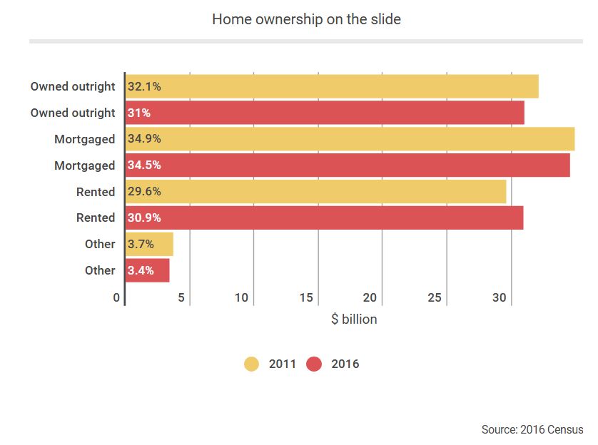
Nationally, the most common tenure type is owning a three-bedroom home with a mortgage. In Queensland, however, renters make up a roughly equal share of the population. But, in Tasmania and NSW, more people own their own home outright. And in the NT, renting is the most common tenure type.

In a finding that won’t surprise many, the typical female does a bit more unpaid work around the house than the typical male. The most common category for males is less than five hours a week. The most common for females is five to 14 hours.

We won’t know how this compares to paid work for a while yet – or whether these differences vary depending on age.

What future releases will tell us

The profiles released today offer us limited information. But the census remains one of Australia’s most important datasets.

When detailed data are released in June and then progressively throughout the rest of 2017, we will be able to dig deeper into small geographic areas or specific population groups.

We will be able to ask if there are pockets of Australia with significant socioeconomic disadvantage, and if it is worsening. We will be able to hold governments accountable for the progress we have made on the education, employment and health outcomes of the Indigenous population.

And we will be able to test whether the languages we speak, the houses we are living in, and the jobs that we are doing, are changing.

But those questions rely on a high-quality census.

The attention on the 2016 Census until now has been mostly negative. There was increased concern related to data privacy, the failure of the online data entry system on census night, and staff cuts at the ABS.

In October 2016, the ABS estimated the response rate to the 2016 Census was more than 96%, and that 58% of the household forms received were submitted online. But what matters more than how many people filled in the census and how they did it is whether the responses given were accurate. We therefore need to see a lot more interrogation of the data before taking the results at face value, but we can remain cautiously optimistic.

The ABS will be hoping that now some data is released, attention will shift to what the results tell us about Australian society. It is to be hoped the data will be robust, the insights will be newsworthy, and policy and practice will shift accordingly.

We won’t know this for sure until the first major data release of data June 27 – the data released today were just a sneak peak.

Author: Nicholas Biddle, Associate Professor, ANU College of Arts and Social Sciences, Australian National University

Housing affordability takes a $2000 hit in just three months

From The NewDaily.

First home buyers will be forced to save an extra $2000 towards a deposit just to keep up with the last three months of price growth, according to CoreLogic data exclusive to The New Daily.

The median house price in the eight capital cities is now $613,200, CoreLogic estimated, based on sales in the March quarter.

At the end of last year, this figure was $592,807, which means in just three months, as hopeful buyers saved madly, the goalposts shifted 3.4 per cent further away. And that’s only for a modest 10 per cent deposit.

All up, a young couple now needs about $61,300 for a 10 per cent deposit on a median-priced house in the city. In Sydney, it’s a staggering $88,000.

If they’re saving for a 20 per cent deposit, which many banks now prefer, they’ll need $176,000 for a median-priced Sydney home – up $8200 in three months.

house-price-growth-depositIf prices stood still from today, a couple saving for a 10 per cent deposit in a capital city would need to put away roughly $1200 a month for the next four years, presuming they earned 2.5 per cent interest, compounded monthly.

And this doesn’t include lenders mortgage insurance (LMI), which Australian banks have made compulsory for all borrowers with deposits below 20 per cent. Gone are the days of 0 per cent deposit loans unless you have a guarantor.

A median-priced house in a capital would require roughly an extra $13,500 in LMI, which the couple would presumably ask to be ‘capitalised’ into their loan – meaning they would pay an extra $67 per month on their repayments.

To avoid LMI entirely, first-time buyers would need to save a 20 per cent deposit of $122,640, based on CoreLogic’s median capital house price. That’s $4000 more than three months ago.

And then there’s stamp duty and the litany of other upfront costs that home buyers face. Stamp duty alone could add an extra $23,000 to a median-priced home.

As these figures show, a guarantor is probably the only way for many buyers to get into the market. Many institutions will lend 100 per cent or even 110 per cent of the home value if first-time buyers have a guarantor.

There is plenty of controversy over whether or not houses are more or less affordable than ever. For example, Jamie Alcock, an academic at The University of Sydney, wrote in The Conversation last week that mortgages are now more affordable, as record-low interest rates are nowhere near the 17 per cent highs of the 1990s.

Even if that’s true, the CoreLogic figures, coupled with the tighter lending requirements of the banks, prove that house price growth is making it harder for deposit savers to keep up.

And as Professor Alcock warned, when interest rates do inevitably rise, today’s ‘comfortable’ borrowers will become tomorrow’s highly stressed repayers.

Union of Labor and Growth

From The IMFBlog.

John Evans is Head of the Trade Union Advisory Committee to the Organisation for Economic Cooperation and Development, which represents some 65 million organized workers worldwide. In this podcast, he says that the labor market works much like any other market, driven by supply and demand, and the latter is very dependent on how well the economy is doing.

“On the demand side, the labor markets globally haven’t fully recovered from the Great Recession after the [U.S. investment bank] Lehman Brothers crash in 2008. We still have 200 million people unemployed. We still have very sluggish growth. On the income side, what we’ve seen globally, but particularly in certain countries, is a generalized rise to greater inequality of labor incomes in the last 30 to 35 years.”

Is this only a problem for developing countries?

“I think it affects everyone,” says Evans. “The Gini coefficient increased very significantly in some of the industrialized countries. The post-World War II years was a period of falling income inequality, whereas now we’ve seen a jump back to some of the levels that existed in the 1920s.”

Evans says the IMF’s analysis of advanced economies shows that half the increase in inequality between the top decile and bottom decile is due to weaker unions and declining unionization. As such, there’s a strong case for advocating more broadly-based inclusive growth, which is what most institutions now say is their key policy.

“Sixty percent of people globally work outside formal employment. So, how the labor market institutions re-attach them to the labor force is crucially important.”

While technology is transforming the labor force, Evans says technology will have less impact in the short term on increasing jobs, but more impact on the quality of work, and potentially on income distribution.

“If we look at past waves of technological change in different countries—trying to make sure workers have new skills, that there are policies to help them move to new jobs, and that they have a sense of security and protection in that change process—it’s sometimes been managed well, and sometimes badly. But it’s certainly a feature of history.”

Evans believes governments are looking at labor markets as crucial to delivering jobs and reducing inequality. Research by institutions like the IMF and World Bank has found new results about labor markets, and policymakers are listening. “The models we’ve seen in some countries of good social dialogue, social partnerships, and high levels of trust between both management and workers and their unions, and also a recognition of that by governments, is making the process better.”

Listen to the podcast

Why spatial inequality in Australia is no joke

From The Conversation.

As in many other countries, income inequality in Australia has grown over the past two decades. At the same time, Australia is one of the most urbanised countries in the world, with more than 60% of the population concentrated in just six major cities. Incomes in these cities are very spatially segregated, with high and low earners concentrated in different suburbs.

In new research, I used census data to examine these patterns. Focusing on the incomes of men aged 25-54 in our six largest cities, I found that income inequality among men has grown substantially since 1991 – particularly during the 1990s.

This has been associated with increases in the relative income gaps between different areas within the cities. The share of inequality associated with location has also increased over time – an indicator of increasing segregation.

To the extent to which people draw on the resources of the people who live in their local area, this spatial segregation has potential implications for social cohesion and intergenerational inequality. There are also substantial differences across cities. Sydney was substantially more unequal than other cities over the whole period.

The census tells us the gap has widened

These results are based on detailed tabulations from the five censuses from 1991 to 2011. The focus on men aged 25-54 is partly for data availability reasons, but also permits a simpler focus on those income trends associated with wage growth and workforce-age income support payments.

The research examines how incomes vary across the local areas in our six largest cities. These areas are defined using the Australian Bureau of Statistics “statistical local areas” (SLAs) designation.

In Sydney and Melbourne, SLAs correspond closely to local government areas, while they are generally smaller areas in the other states. The income measure is the single census question on the person’s total income (before deducting taxes) – answered in categories.

Statistical interpolation techniques are used to generate a smooth income distribution and to compensate for a change in the payments of income support between 1991 and 1996. More details can be found here.

The graph below shows trends in city-wide inequality since 1991.

Figure 1: City-wide inequality. Author’s calculations from ABS Census data

In each city, male income inequality grew substantially during the 1990s. It flattened out after 2001 (generally increasing slightly up to 2006, then falling back a little after the global financial crisis). In all years, incomes were substantially more unequal in Sydney than the other cities, with this gap widening over the period.

In part, this reflects the larger size of Sydney. However, Sydney is now only slightly larger than Melbourne. Most of the gap is likely due to the high wages in parts of the financial services industry centred in Sydney.

Within the sub-regions of each city, inequality also increased, following a similar pattern. However, the growth in income inequality within local areas was less than the overall growth in inequality. Corresponding to this, the gap between the average incomes in each region also increased.

This is indicated in the graph below, which shows a measure of between-region inequality – the extent to which the average incomes in each area differ. Using the “GE(1)” measure of inequality, this more than doubled between 1991 and 2001. It then increased slightly up to 2006 and fell back slightly after the GFC.

Figure 2: Between-SLA inequality. Author’s calculations from ABS Census data

The overall combination of these trends is that the share of city-level inequality associated with location has grown over the period. For the GE(1) measure, this share increased from about 15% to 18%. That is, spatial segregation between rich and poor has increased over time.

Are we segregating ourselves?

One simpler way of describing the spatial concentration of incomes is to consider the situation of the top 10% of Sydney men – those with annual pre-tax incomes of $141,000 or more in 2011.

What fraction of these rich men lived in the low-income areas of Sydney? If we define low-income areas as the SLAs with the lowest average incomes and containing 20% of the male working-age population, then we find that only 5% of rich men lived in these areas in 2011.

So while it is true that some rich men live in the areas that have low average incomes (and maybe they might meet poor men), they are four times less likely to do so than the average man (5% vs 20%). And this segregation has increased over time. Back in 1991, 6.2% (rather than 5%) of rich men lived in these poor regions.

The other cities are also segregated, though not quite as much as Sydney. Looking at the top 10% of earners in each city in 2011, the percentage of these who were in poor local areas was 5.6% in Melbourne and Brisbane, 5.9% in Adelaide, and around 9% in Canberra and Perth.

Dark shades of inequality

This data also allows us to consider which areas are more segregated or mixed. This is mapped below for Sydney and Melbourne.

Figure 3a: Within-SLA inequality in Sydney. Author’s calculations from ABS Census data
Figure 3b: Within-SLA inequality in Melbourne. Author’s calculations from ABS Census data

The darker shades indicate local areas with more within-area inequality – though for small regions such as this, it is more appropriate to use a word with more positive connotations such as “heterogenous” or just “mixed”. The more mixed areas are generally those with higher average incomes (plus some areas with high ethnic heterogeneity).

This is driven by the fact that most regions include at least some men with low incomes, but high-income men are unlikely to live in the more homogeneous outer suburbs.

The concentration of high-paying employment and the poor transport linkages of Australia’s major cities undoubtedly play a large part in driving this.

Author: Bruce Bradbury, Associate Professor, Social Policy Research Centre, UNSW


Sydney Population Now Over 5m

Sydney’s population has officially reached 5 million, according to figures released today by the Australian Bureau of Statistics (ABS).  This is one key reason why demand for property is so strong here.

ABS Director of Demography, Beidar Cho, said that at 30 June 2016, 5,005,400 people lived in the NSW capital – up 82,800 from the previous year.

“It took Sydney almost 30 years, from 1971 to 2000, to grow from 3 million to 4 million people, but only half that time to reach its next million,” she said.

Today’s figures show that Melbourne is Australia’s fastest growing capital city. Its population grew by 2.4 per cent in 2015-16, ahead of Brisbane (1.8 per cent) and Sydney (1.7 per cent). Australia’s slowest growing capital city was Adelaide, at below 1 per cent.

The fastest growing area in Australia in 2015-16 was ACT – South West, which grew by 38 per cent. This area includes the recently developed suburbs of Wright and Coombs. Other areas experiencing fast growth included Pimpama (35 per cent) on the Gold Coast, the coastal area of Yanchep (29 per cent) in Perth’s north and Cobbitty – Leppington (28 per cent) in Sydney’s outer south-west.

  • Australia’s estimated resident population (ERP) reached 24.1 million at 30 June 2016, increasing by 337,800 people or 1.4% since 30 June 2015. This growth rate was unchanged from 2014-15.
  • All states and territories experienced population growth between 2015 and 2016. Victoria had the greatest growth (123,100 people), followed by New South Wales (105,600) and Queensland (64,700).
  • Victoria also grew fastest, increasing by 2.1%, followed by New South Wales and Queensland (both 1.4%), the Australian Capital Territory (1.3%) and Western Australia (1.0%). The Northern Territory had the slowest growth (0.2%), followed by South Australia and Tasmania (both 0.5%).
  • The combined population of Greater Capital Cities increased by 276,500 people (1.7%) between 30 June 2015 and 30 June 2016, accounting for 82% of the country’s total population growth.
  • Melbourne had the largest growth of all Greater Capital Cities (107,800), followed by Sydney (82,800), Brisbane (41,100) and Perth (27,400).
  • Melbourne also had the fastest growth (2.4%), ahead of Brisbane (1.8%) and Sydney (1.7%).
  • Sydney’s population reached 5 million in 2015-16. While it took almost 30 years (1971 to 2000) for Sydney’s population to increase from 3 million to 4 million people, it took only another 16 years to reach its next million.