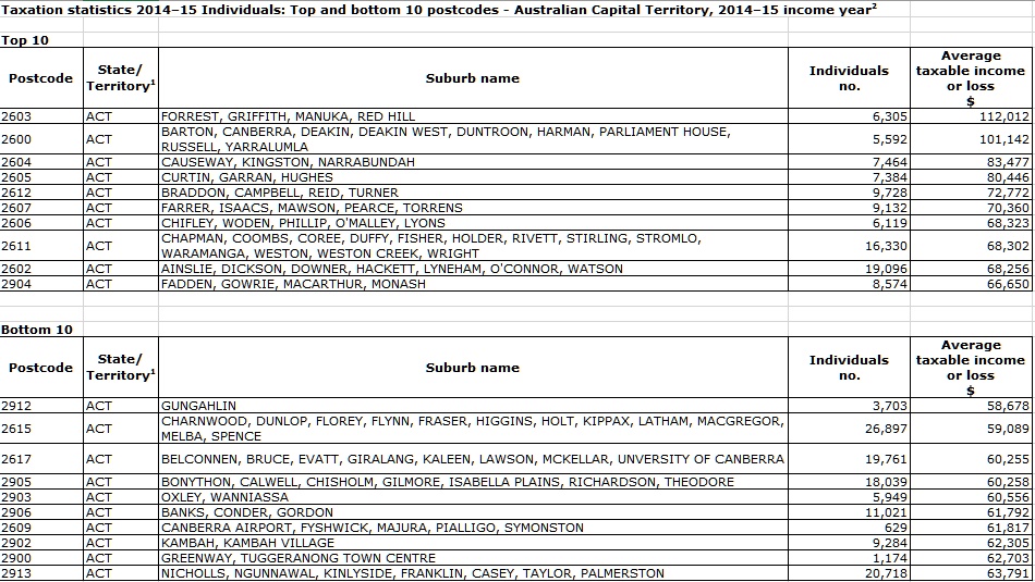
We continue our series on the latest ATO data with a look at the ACT, using the recently released 2015 taxable income data from the ATO, as a drill down on the all Australia data we previously posted. Blue shows the higher taxable income areas. [Yes, there does appear to be lots of blue!]
Category: Social Trends
Aussie politicians outed as big-time property investors
From The Real Estate Conversation.
Many of the federal politicians tasked with fixing Australia’s intractable housing affordability problems are significant property investors themselves, according to findings from an investigation by the ABC.
The study, which looked at data from Parliament’s registers of interests, shows that at least 95 per cent of our elected federal members own at least one property; this compares with a home ownership rate for the general population of around 50 per cent, according to the ABC.
Source: the ABC.
Many of the politicians deciding if property investment should be tax advantaged are significant property investors themselves. Of our 226 federal politicians, approximately half own at least one investment property – and a number owning significantly more. Only approximately 10 percent of the general population are property investors.
National Party senator Barry O’Sullivan has the largest portfolio, with 33 properties.
And which party owns the greatest number of properties? The Coalition, with 295 properties, compared with Labor’s 193 properties.
Source: the ABC.
The study didn’t include properties wholly owned by politician’s spouses.
For renters, making housing more affordable is just the start
Deloitte Access Economics’ Chris Richardson recently suggested that young Australians would be better off renting than trying to buy a house. He argued:
… rents today make a lot more sense than housing prices.
This may be true. However, the situation for renters is far from clear-cut. Rents continue to increase in Australian cities, and are out of reach for low- and very-low-income earners.
Renters also face substantial housing insecurity. In Australia, 50% of renters are on a fixed-term one-year lease; 20% are on a month-to-month “rolling” lease.
For renting to become a truly viable, long-term alternative to home ownership, greater rental affordability and security is needed.
Rental affordability
Longer-term structural changes to tackle housing affordability, including boosting the supply of social housing and increasing tenure diversity, will be essential. There are some promising moves, including the recently announced proposal for a bond aggregator model to fund social and affordable housing.
Failing a substantial increase in affordable housing, there will be a need to increase rent assistance payments, particularly in high-cost regions.
This acknowledges that housing costs differ across the country and that many low-income earners need to remain in high-cost regions. This includes older people whose social and family networks are in these regions, and people who work in these areas.
Many industries in high-cost cities are dependent on people who earn low and very-low incomes. These people have a right – and need – for affordable, secure housing – and a house that is a home.
Affordability is the thin end of the wedge
For renting to become a true alternative to home ownership, greater rental security is needed.
To move toward secure rentals we need to reward long-term investment. One example might include encouraging institutional investors, including superannuation companies and other businesses that invest in large amounts of rental housing, who are in it for the long haul.
However, there is no reason to assume that institutional investors will offer more affordable rental properties, or be any better landlords than so-called “mum and dad” investors. We therefore need to pursue changes to rental laws to ensure renters, including the growing generation of long-term renters, can experience a secure sense of home. Specific changes include:
Removing no-grounds eviction. The perceived risk of eviction leads to stress for renters. And the right to no-grounds eviction can lead to retaliatory eviction by landlords when tenants exercise their rights, including rights to maintenance and repairs.
The Tenants’ Union of NSW has called for a balancing of landlord and tenant interests through tenancy laws that specify reasonable grounds for termination.
Such laws could follow the German example. In Germany, rental laws ensure security of tenancy while retaining the right of landlords to terminate a lease in certain circumstances, such as if a tenant violates the lease agreement (for example, by not paying rent) or if the landlord requires the property for personal use.
Rent increases are sometimes a “backdoor” way of evicting tenants. In a recent survey, 11% of renters reported receiving a “rent hike after requesting a repair and 10% said that their landlord or agent became angry”. We need stronger regulation of rent increases and stronger penalties for unreasonable increases.
There are precedents for this in other jurisdictions. Germany again provides a great example. There, rent increases are allowed less frequently. And they:
… must be based in the rents of three similar dwellings or a database of local reference rents and rents may not increase more than 20% over three years.
Ensuring the right to make a home. Rental laws need to ensure the right of tenants to make their house into a home, including making cosmetic changes to a property, ability to keep pets, and allowing alterations that would allow an older person or person with a disability to live there.
Some older renters I have interviewed recently have had to move after these types of adjustments were rejected by landlords who thought age-related modifications were not attractive.
In New South Wales, the right to make changes that would ensure a property is liveable for people with different housing needs is being considered as part of the current residential tenancy law review. However, the right to make cosmetic changes is excluded.
Popular wisdom often suggests that tenants and landlords have different interests. In fact, they have very similar interests. Both benefit from secure tenancies and a property that is well maintained and cared for.
Failure to ensure rental affordability and security will require a raft of policy changes in other areas, including pension income calculations that assume home ownership. It will also condemn a generation of long-term renters to increasingly unaffordable and insecure housing.
Author: Emma Power, Senior Research Fellow, Geography and Urban Studies, Western Sydney University
A Profile of the Working Poor, 2015
In 2015, according to the U.S. Census Bureau, about 43.1 million people, or 13.5 percent of the nation’s population, lived below the official poverty level.
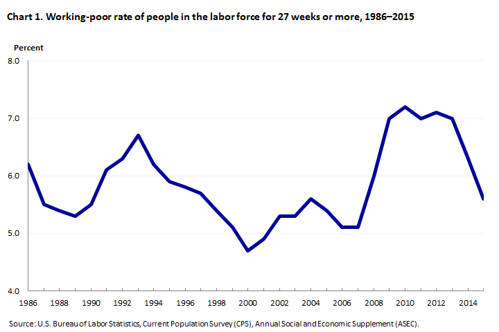
Although the poor were primarily children and adults who had not participated in the labor force during the year, 8.6 million individuals were among the “working poor” in 2015, according to data from the Bureau of Labor Statistics; the 8.6 million figure was down from 9.5 million in 2014. The working poor are people who spent at least 27 weeks in the labor force (that is, working or looking for work) but whose incomes still fell below the official poverty level. In 2015, the working-poor rate—the ratio of the working poor to all individuals in the labor force for at least 27 weeks—was 5.6 percent, 0.7 percentage point lower than the previous year’s figure.
Following are some highlights from the 2015 data:
- Full-time workers continued to be much less likely to be among the working poor than were part-time workers. Among persons in the labor force for 27 weeks or more, 3.4 percent of those usually employed full time were classified as working poor, compared with 14.1 percent of part-time workers.
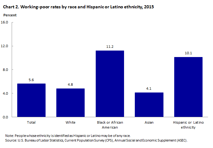
- Women were more likely than men to be among the working poor. In addition, Blacks and Hispanics continued to be more than twice as likely as Whites and Asians to be among the working poor.
- The likelihood of being classified as working poor diminishes as workers attain higher levels of education. Among those with less than a high school diploma, 16.2 percent of those who were in the labor force for at least 27 weeks were classified as working poor, compared with 1.7 percent of college graduates.
- Individuals who were employed in service occupations continued to be more likely to be among the working poor than those employed in other major occupational groups.
- Among families with at least one member in the labor force for 27 weeks or more, those with children under 18 years old were about 5 times as likely as those without children to live in poverty. Families maintained by women were almost twice as likely as families maintained by men to be living below the poverty level.
Demographic characteristics
Among those who were in the labor force for 27 weeks or more in 2015, the number of women classified as working poor (4.5 million) was higher than that of men (4.1 million). The working-poor rate also continued to be higher for women (6.3 percent) than for men (5.0 percent). The working-poor rates for both women and men were down from a year earlier.
Blacks and Hispanics were more than twice as likely as Whites and Asians to be among the working poor. In 2015, the working-poor rates of Blacks and Hispanics were 11.2 percent and 10.1 percent, respectively, compared with 4.8 percent for Whites and 4.1 percent for Asians.
What Is the Informal Labor Market?
From The St.Louis Fed On The Economy Blog.
Although often associated with developing countries, illicit activities or undocumented workers, the informal labor market is much broader than many would imagine. In fact, people from all walks of life participate in a wide array of legitimate business ventures that are part of the informal economy. So, how big is the U.S.’s informal labor market, and who participates in it?
What Is the Informal Labor Market?
There is no unique definition for informal employment. However, a generally accepted way to define it is by considering individuals (and their employers) who engage in productive activities that are not taxed or registered by the government.1
Though this type of work has always existed—picture the fruit vendor at the farmers’ market who only accepts cash for payment—the expansion of online platforms that facilitate these arrangements has increased their visibility and fueled their popularity.
Measuring the Informal Labor Market
Numerous surveys have surfaced lately in an effort to better understand the fringes of the U.S. labor market. Though methodologies differ (as do the specific questions these surveys attempt to answer), comparing the results helps shine a light on the sometimes elusive nature of the informal labor market.
Survey of Informal Work Participation
For example, the Survey of Informal Work Participation within the Survey of Consumer Expectations revealed that about 20 percent of non-retired adults at least 21 years old in the U.S. generated income informally in 2015.2 The share jumped to 37 percent when including those who were exclusively involved in informal renting and selling activities.
When breaking down the results by the Bureau of Labor Statistics (BLS) employment categories, about 16 percent of workers employed full time participated in informal work. Not surprisingly, the highest incidence of informal work was among those who are employed part time for economic reasons, with at least 30 percent participating in informal work. Also, at least 15 percent of those who are considered not in the labor force by the BLS also participated in informal work.
Enterprising and Informal Work Activities Survey
Another example is the Enterprising and Informal Work Activities (EIWA) survey, which revealed that 36 percent of adults in the U.S. (18 and older) worked informally in the second half of 2015.3 Of these informal workers, 56 percent self-identified as also being formally employed, and 20 percent said they worked multiple jobs (including full-time and part-time positions).
Survey Differences
The difference in methodologies between these two surveys is clear simply from looking at the basic results. Despite pointing in similar directions, the results on the extent of the informal labor market cannot be directly compared to each other. But when we look at the demographic breakdown of contingent and informal workers, the results are quite consistent.
The EIWA survey showed that informal workers were distributed across all income categories. For example:
- 30 percent of respondents reported having an annual income of $100,000 or greater.
- 18 percent reported earning less than $25,000.
There were slightly more women than men among informal workers, though the share of women was much larger in lower income categories.
The majority of informal workers were white, non-Hispanic (64 percent), while the share of Hispanic workers tended to be slightly higher than that of African-Americans (16 and 12 percent, respectively). The racial breakdowns were consistent across most income categories, with a higher incidence of informal work among minorities in the lowest income categories.
Finally, most informal workers had at least a college degree (31 percent) or some college (30 percent), but high school graduates were also a sizeable share (26 percent).4
Impact on the Labor Market as a Whole
Capturing the extent of the informal labor market in the U.S. may help improve the measures of employment and labor market slack, as well as better measure the effects that informal employment activities have on the U.S. economy.
Moreover, it would help improve policies to incentivize workers in the informal sector to participate fully in the formal sector and by consequence take advantage of benefits that are in place for formal-sector jobs.
Notes and References
1 Demetra Smith Nightingale and Stephen Wandner provide other definitions of informal employment and associate different types of workers with the formality of their employment arrangements. See Smith Nightingale, Demetra and Wandner, Stephen A. “Informal and Nonstandard Employment in the United States: Implications for Low-Income Working Families.” The Urban Institute, Brief 20, August 2011.
2 See Bracha, Anat and Burke, Mary A. “Who Counts as Employed? Informal Work, Employment Status, and Labor Market Slack.” Federal Reserve Bank of Boston Working Paper No. 16-29, December 2016.
3 See Robles, Barbara and McGee, Marysol. “Exploring Online and Offline Informal Work: Findings from the Enterprising and Informal Work Activities (EIWA) Survey.” Finance and Economics Discussion Series 2016-089. Washington: Board of Governors of the Federal Reserve System, October 2016.
4 Appendix D in Robles and McGee (2016) shows these demographic characteristics are consistent across different surveys.
Social impact investment can help retirees get the housing and care they need
A recent report raised concerns about the erosion of retirement income by ongoing rental or mortgage payments.
The report by the Australian Institute of Superannuation Trustees is timely, given the Australian aged pension system is predicated on an assumption of outright home-ownership. Yet increasing numbers of people are still paying mortgages after retirement, use superannuation to pay off mortgage debt, or do not own a home and must rent.
Any significant decline in home ownership or equity in a home also has impacts on higher care needs. This is because older people will not have an asset to sell to fund the bonds required to enter aged care accommodation.
Author providedThese developments – and the increasing housing insecurity for older people – potentially undermine the sustainability of Australia’s retirement system and, in turn, public finances.
Addressing the problem
Social impact investment strategies could fund more affordable housing and aged care for seniors.
Social impact investments are:
… investments made into organisations, projects or funds with the intention of generating measurable social and environmental outcomes, alongside a financial return.
Impact investment in Australia may take a variety of different forms. It can be organised through direct equity investment, acquisition of units in a mutual fund, debt, venture capital, social impact bonds or other fixed income mechanisms, which might combine blended social impact and financial return.
The sources of investment are equally diverse. These may include philanthropists, funds, businesses, government, private investors, or a combination of two or more.
In Australia, social impact investing is a relatively recent phenomenon although it is developing rapidly in a variety of areas. Impact investing in Australia will be worth $A33 billion by 2022 and extends to a diverse range of investments.
In relation to housing support, examples include the Aspire Social Impact Bond, which targets people experiencing long-term homelessness, and Homeground, a not-for-profit real estate service.
In relation to housing developments, projects such as the innovative CapitalAsset partnerships instigated by ShelterSA. The project aims to collaborate with developers, landowners and investors to build affordable housing developments through a property unit trust.
Housing is likely to be a focus area of social impact investment partnerships between Social Ventures Australia and organisations such as HESTA and Macquarie.
Financing is the key to increasing stocks of affordable housing. It seems the federal government is likely to institute a bond aggregator model involving institutional investors and affordable housing providers.
Retirement housing issues have not been a focus for social impact investing in Australia or elsewhere. However, it is suggested this form of investing could tackle the problems outlined in the Australian Institute of Superannuation Trustees report in three ways.
(Almost) home owners
For those who must maintain a mortgage into retirement, or who want to avoid using most of their superannuation funds to pay off the mortgage, thought could be given to offering lower-cost loans or products akin to reverse mortgages at lower than commercial rates.
Alternatively, under a shared equity arrangement – where reduced payments are made until the sale of the property or the death of the owner/s – the property could be sold and the sale price shared by the older person to put towards care or the estate and the lender.
Social impact investment lenders could finance this in the same way as banks do but at reduced rates. There would still be a healthy return, and older people could live better in retirement with reduced payments but secure in the knowledge they do not have to leave or lose their home.
Regarding the older people who rent, again social impact investing could focus on ensuring that any housing projects developed have a certain percentage of the accommodation available for older people.
Models proposed for social impact investing in affordable housing could be applied to ensure this accommodation is suitable for older people.
Wrap-around services
In both cases, the financing models could be supported by social impact investing provided for support services.
For example, wrap-around services, such as those provided in the Newquay project in Britain, aim to keep older people in their homes and out of hospitals and aged care.
If housing costs are a problem for people in retirement, that’s also going to hamper their ability to pay for care. shutterstock
Ripe for repair
Social impact investing could mobilise private capital to work with not-for-profits to attract investment funds. Grace Mutual has mooted such a project in Australia.
Furthermore, social impact investments could work in areas, such as rural and regional Australia, that are traditionally left to government because of low population and problems with profitability and economies of scale.
Sabina Lim recently suggested the services gap in health and aged care is ripe for social impact investing in Australia.
It’s time to bridge the gaps
Governments alone cannot bridge the gaps and support affordable housing for seniors.
Although government will certainly continue to play a significant role, impact investment should be encouraged as a way to resolve financing and development issues in meeting seniors’ needs for accommodation and care.
Such involvement can be fostered through partnerships between government, NGOs and private investors, together with taxation and other financial incentives. Legal, policy and planning impediments to financing and investment in seniors housing also need to be removed.
Importantly, we need other players in the market who are prepared to invest in affordable housing and aged care for Australians in retirement.
Authors: Eileen Webb, Associate Professor, Curtin Law School, Curtin University; Gill North, Professorial Research Fellow, Deakin University; Richard Heaney, Professor of Finance, University of Western Australia.
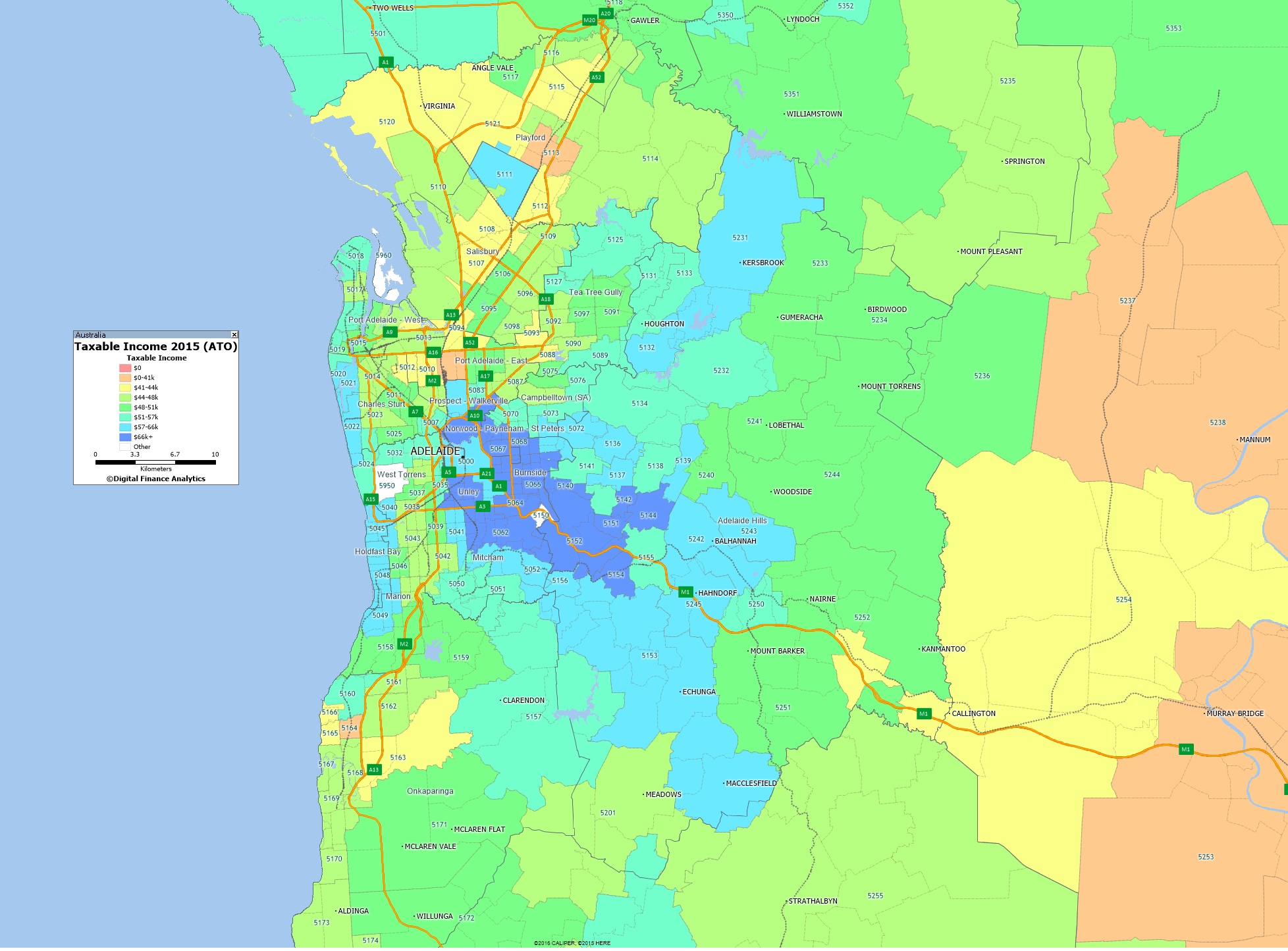
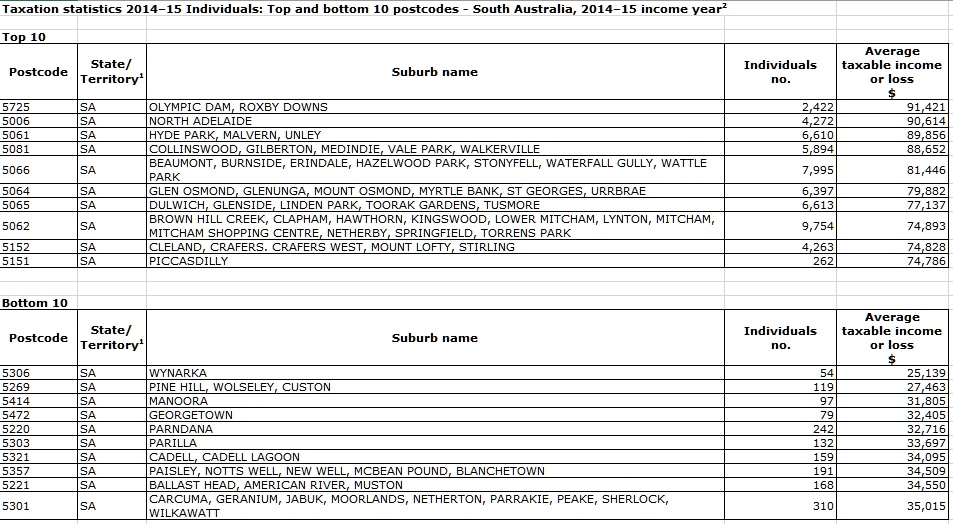
Taxable Income Mapping Greater Adelaide 2015
We continue our series on the latest ATO data with a look at Greater Adelaide, using the recently released 2015 taxable income data from the ATO, as a drill down on the all Australia data we previously posted. Blue shows the higher taxable income areas.
Australia’s housing market and the great intergenerational tax rort
Interesting perspective from The Guardian. However, it seems to miss the root cause of the housing affordable issue, namely the financialistion of property, now seen as a financial asset, rather than somewhere to live. This has created demand from investors, lifted the volume of loans which can be written, and created a leveraged edifice which may topple should prices fall. This phenomenon explains the behaviour of many western housing markets, which have been stoked by ultra low interest rates and QE. But the Guardian piece is still worth reading…
Owning your own home was once the great Australian dream but it has turned into a nightmare for young aspiring homeowners.
Based on the evidence, government housing policy appears to be as follows: keep prices high at all costs, enslaving new buyers with obscene levels of debt for the benefit of banks and existing landowners. In a nutshell, this is called intergenerational taxation.
This is a social form of taxation in which there is a significant transfer of wealth from one generation of society to another. In Australia’s economic model, as house prices continue to soar, young homebuyers are forced to take on huge debts to acquire a home that turns to capital for the older seller of the home.
Our banks and mortgage companies are writing the largest home loans in the world both relative to what a young homebuyer earns and in sum value. Putting all financial stability risks and issues aside, the more a bank lends to a new homebuyer the greater the profit a seller and lender will make. When irrational exuberance is rife, lenders increase the sum of debt they issue to young homebuyers and property investors alike. This essentially increases the rate of intergenerational taxation. And the greater the young are effectively taxed in this way, the richer older generations become.
However, when house prices fall hard, like they have already in some parts of Australia, the intergenerational taxation rate falls hard too – even to the point where the flow reverses and younger people can benefit.
Take the Western Australian mining town of Karratha where a median-priced house back in 2011 would have cost about $850,000, or roughly seven times the median income of a household. Today the same house costs less than $300,000, which is roughly two-and-a-half times the median household income.So, back in 2011, the ballpark intergenerational tax rate from the young to the old in Karratha was a one-off payment roughly the equivalent of 400%-450% of the younger person’s annual income. Today, however, Karratha homeowners are now likely paying a one-off intergenerational tax rate of 15%-25% to younger Australians.
Karratha saw a remarkable transfer of wealth from young to old but now the reverse means an older cohort of Australians are left with a liability they may never repay in full. It serves as a warning for people who have bought into the Sydney and Melbourne housing markets in recent years and who are vulnerable to a fall in prices.
To head off some of these problems, the government now wants to allow younger Australians to tap their super for deposits on homes, thereby increasing their tax transfer to the older generation.
Behind the scenes is our banking system and our financial regulators. The Reserve Bank has been the primary facilitator of the intergenerational transfer by bringing interest rates down to a record low and promising a safety net for banks.
So the question a young homebuyer must ask themselves is why have the government, mortgage lenders, landowners and the RBA built a wealth transfer system that leaves the aspiring young homebuyer as the most leveraged in the world?
The answer to this question is very simple. The reality is a very small number of powerful lobby groups in Canberra have a hundred times more influence on shaping housing policy than young people. In other words, the voice of our youth is unfortunately all but irrelevant and ignored.
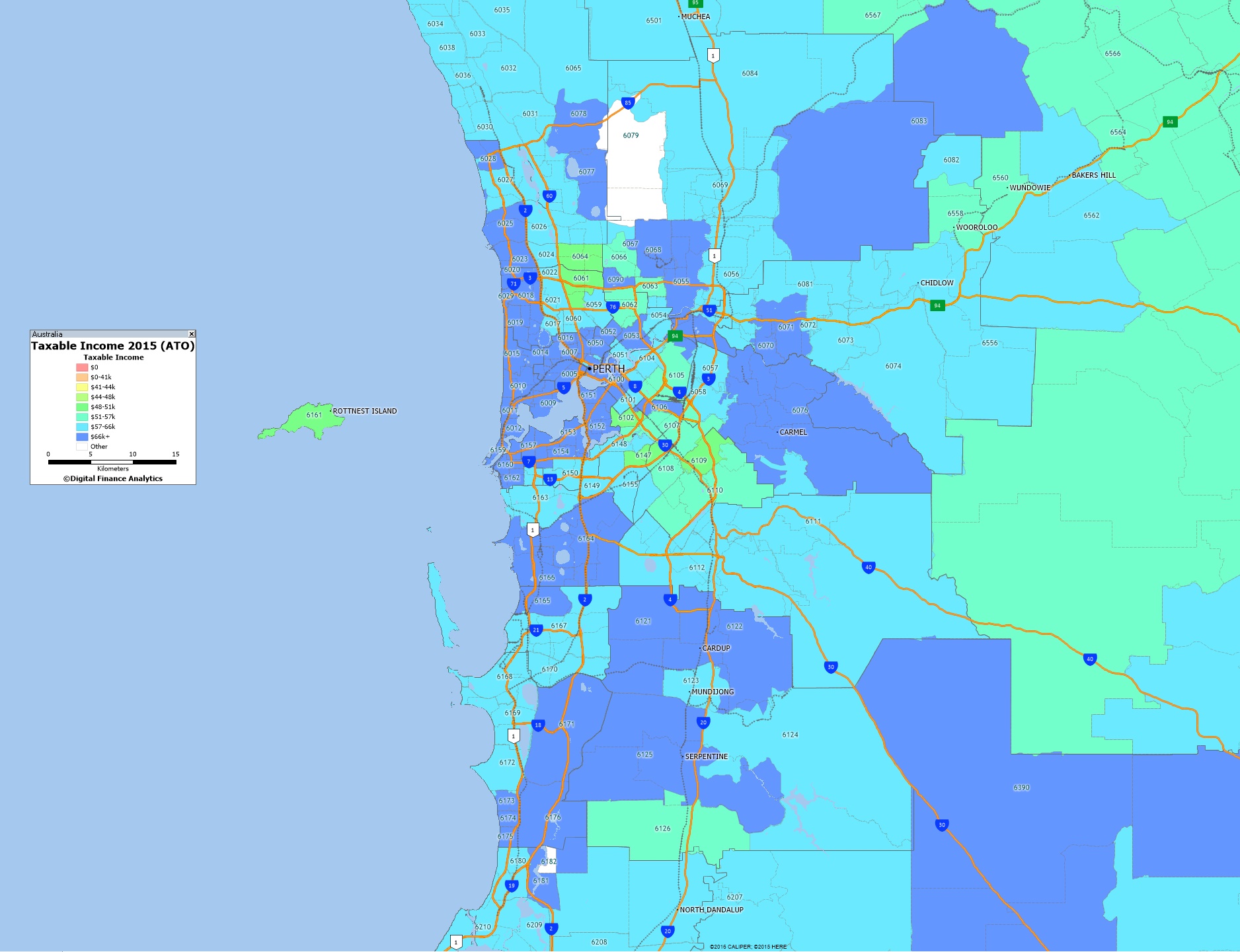
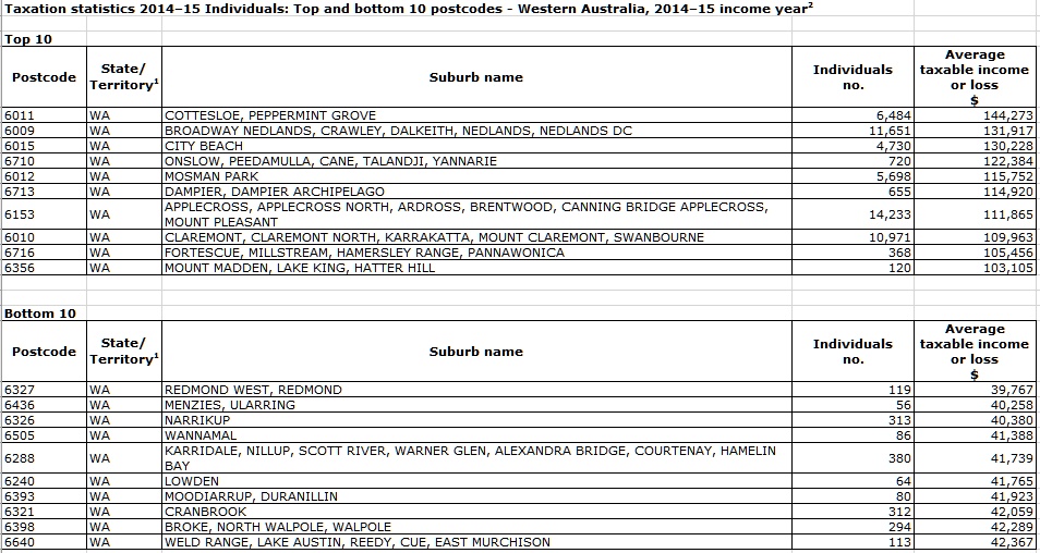
Taxable Income Mapping Greater Perth 2015
We continue our series on the latest ATO data with a look at Greater Perth, using the recently released 2015 taxable income data from the ATO, as a drill down on the all Australia data we previously posted. Blue shows the higher taxable income areas.
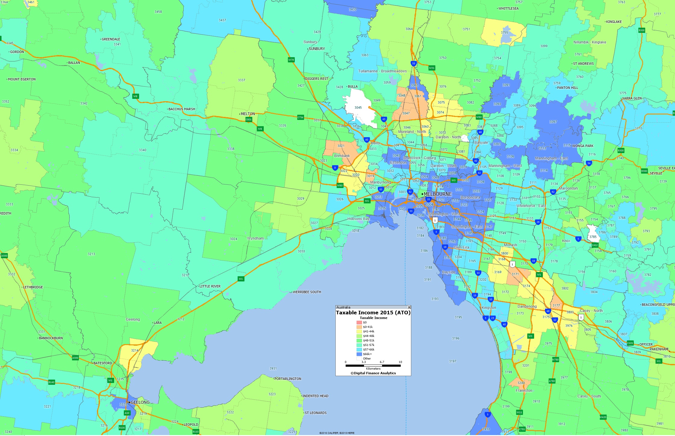
Taxable Income Mapping Greater Melbourne 2015
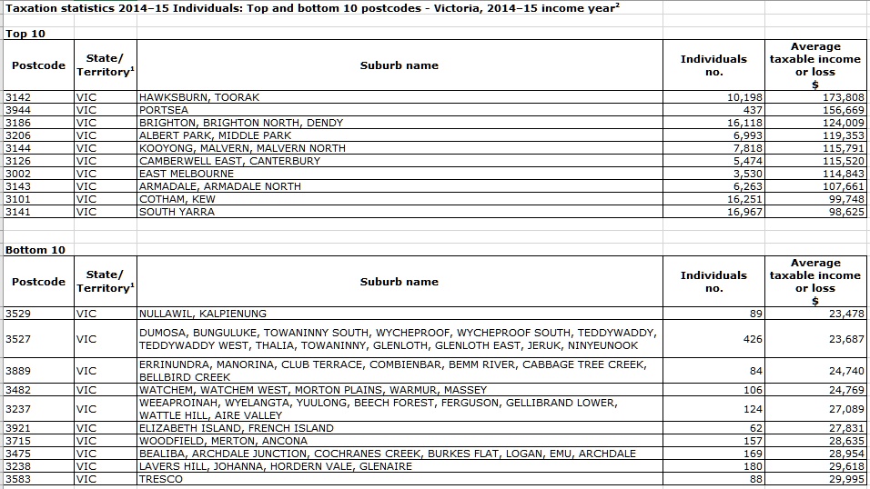
We continue our series on the latest ATO data with a look at Greater Melbourne, using the recently released 2015 taxable income data from the ATO, as a drill down on the all Australia data we previously posted. Blue shows the higher taxable income areas.


