We need to find new ways to measure the Australian labour force

From The Conversation.

Over the last few years, we’ve seen a massive shift in the way we work. Thousands of Australians have abandoned the traditional 40-hour work week to work fewer hours or take on ad-hoc work, such as driving for Uber or doing odd jobs on Airtasker.

But the way we measure the labour market has not kept up. We still rely on the Australian Bureau of Statistics’ labour force survey, a survey from the 1960s conducted according to international conventions that is no longer appropriate for today’s labour market.

Today’s economy – one of independent contractors, ad-hoc work, irregular and flexible hours – needs a new form of measurement.

How the government measures the workforce

Every month the Australian Bureau of Statistics (ABS) surveys about 0.32% of the civilian population aged over 15 years about their employment status.

In short, you’re counted as employed if you completed at least one hour of paid work in the week before the survey.

But this doesn’t sound quite right. Clearly, one hour of paid work per week doesn’t fit most people’s idea of employment.

In fact, over one million workers are counted as “underemployed”, meaning they would work more hours if they could. This raises the question of whether these people should really be considered “employed”. The answer depends on what policy question you are trying to address.

Is our unemployment rate right?

Let’s get right into how our unemployment rate is calculated.

If respondents haven’t done any paid work in the last week, they are asked two further questions – first, have they actively sought work in the last four weeks, and second, are they currently available to start work? They are only considered unemployed if they answer yes to both of these questions. Otherwise, they’re not counted as part of the labour force.

This means full-time homemakers, carers, the ill and non-working retirees aren’t considered unemployed.

The labour force is the sum of the employed and the unemployed. The unemployment rate is the percentage of the labour force who are unemployed.

Lastly, the participation rate is the percentage of the population aged 15 and older who are in the labour force. According to the latest ABS trend estimates, the participation rate stood at 64.5% in November, no change from October.

The participation rate has been consistently trending upwards over time for women and falling for men. This does not mean women are increasingly doing more work but that over time they have switched from unpaid to paid work. One of the main reasons for falling participation among men is that unskilled manual jobs for older men have been declining over several decades and many men have been reclassified as unemployed, disabled or retired.

More issues with the survey

The Labour Force Survey only provides a measure of employment and not the number of jobs. For example, a person might work 20 hours per week at a supermarket and 10 hours per week as an Uber driver. Employment is always classified according to the “main job”, so the ABS deems them as one person employed part-time (working fewer than 35 hours) in the retail industry.

If that person worked five more hours as an Uber driver the next week, they would be classified as full-time (35 hours) but the supermarket job would still determine the industry in which they are employed.

The crucial problem here is that there are two jobs being done, but the ABS employment estimate only counts one. So be wary of commentators and politicians making statements like “the economy gained/lost 10,000 jobs last month”! What jobs are they measuring?

The labour force survey also fails to make distinctions between different types of workers. About two million Australians work as independent contractors like construction workers or other business operators such as hairdressers working from home. However, in the figures they are not distinguished from regular employees.

Whereas it might be relatively easy for an employee to know if they did any paid work in the week before the survey, it might not be so obvious for a non-employee. For instance, an author might work 50 hours on their book one week and three hours the next. Most of their work is basic research rather than writing. They receive a royalty payment twice a year. How would they answer the question of whether they did any paid work in the last week?

For non-employees the question of whether they are prepared to start work and have been actively looking for work can also be complex. Someone doing consultancy work might not actively look for work because clients seek them out instead.

We need something new

The ABS has tried tackling some of these issues by conducting some different surveys, including the Characteristics of Employment Survey which presents information on all employed persons according to their status of employment. However, the framework classifies jobholders by their main job. That is, only the job in which they usually worked the most hours. This doesn’t capture many of the issues of concern in, say, the “sharing” or “gig” economy

The ABS has also attempted to compare the number of filled jobs to the amount of employed people, using estimates in the labour force survey. This can reveal interesting information about the labour market. For instance, in February 2013 there were 11,628,300 employed people in Australia, but an estimated 12,287,200 filled jobs. That is, there were 658,900 more filled jobs than there were employed people.

But even then, the estimates still use the conventional definition of a job.

The ABS is still working on an Australian Labour Market Account, based on International Labor Organisation (ILO) methodology, which may address some of the issues discussed here. But this will still be based on traditional definitions of jobs, employment, and unemployment.

Our conventional employment measures are no longer equipped to inform us about important aspects of our labour force and a reliance on them could lead to inappropriate policy. We need labour force numbers than can capture the nuances of a modern economy.

Are the rich really getting poorer and the poor getting richer?

From The UK Conversation.

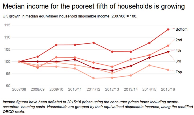
The median UK household is better off. The poorest households are doing even better than the median, and the richest households have been the greatest losers. At least that’s one way to read the headline statistics put out by the Office for National Statistics (ONS) on January 10 in a new report on household disposable income and inequality.

Yet exactly the same statistics could have been reported in a very different way. In fact, while the poorer 90% of UK households have seen their equality of income improve, all these households are now receiving less in real terms because of the fall in the value of the pound, and this report says nothing about the best-off 10% of households.

Let’s take the three groups, the average, the poorest, and the richest, one by one.

The average household

Does the median UK household now really have more disposal income than a year earlier? Here, the dates being compared are the financial year up to April 2016 compared with the financial year ending in April 2015. According to the ONS, that median disposal income is now £26,300, compared to £25,700 a year earlier. The government statisticians say this is the case after they have accounted for inflation and changes to household composition.

The disposable income being described by the ONS is income after taxes have been paid and benefits have been received – but it is before housing costs have been deducted. So where rent and the cost of buying a home has risen those rises are not been taken into account.

Average UK house prices rose by 8.2% in the year to April 2016. Rents have been rising by similar amounts and fewer young couples are setting up home. If this housing crisis means that fewer grown-up children are able to leave home, household composition would alter and the average household would look a little better off overall because that grown-up child might well have an income.

The poorest households

The incomes of the country’s poorest households – in the bottom fifth of the income distribution – have increased. This is because unemployment has fallen and even very low-paid work pays more than most benefits (if you can get enough hours). However, the reason unemployment has fallen in recent years is because of the most draconian application of benefit sanctions ever applied in the history of the UK.

In 2013, over one million people were sanctioned, losing benefits that amounted to more than all the fines handed out by sheriff’s courts in Scotland and magistrates courts in England and Wales for all the actual crimes committed that year.

What the imposition of sanctions at unprecedented rates showed was that it is possible to reduce unemployment by taking away benefits. To survive, people are forced to take any work that they can possibly find, or move in with relatives or with anyone that will give up a sofa.

This employment growth has resulted in the apparent disposable income of the median household in the worse-off fifth of households appearing to rise by £700 a year, or just over £13 a week. However, for those households in which an extra adult is now working, the cost of actually getting to work every day, of the clothing needed for that work, and the loss in time to care for others (such as children) will be more than that £13 weekly rise.

The richest households

At the same time, the ONS reports that the median income for the best-off fifth of households fell by £1,000 last year. But crucially, this is their median income, and the incomes of the better-off half of all those households are ignored. There is actually greater income inequality in the best-off fifth than between all the other 80% of households put together. Within the best-off tenth, inequalities are huge, with the top 1% of households receiving roughly the same income as the next 9%.

Information on changes to national insurance contributions and child benefit payments, have shown us that most people in the best-off tenth will not have fared well either. But other statistics on the incomes of some of the very best-off (such as top paid bankers) also reveal that those in the very richest 1% have done well over this period.

The number of British bankers paid over a million Euros a year rose from 3,178 to 3,865 in 2014. There is no reason to believe that has reduced. In fact, preliminary figures for 2015 revealed that 971 people working in just four of the large US banks in London received more than a million Euros in pay in 2015, with 11 working for Goldman Sachs getting more than 5m Euros each.

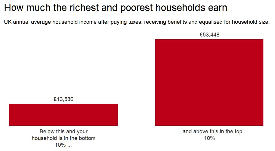
For the poorer 90% of households in the UK, with total household incomes below £53,448 a year, economic inequalities are falling. But they are falling because the people who are poorest are being forced into work that they would not do if they had any choice. They are falling because benefits such as child benefit are no longer universal (top rate tax payers no longer qualify). Or possibly because it is harder and harder for young adults to leave the family home and statistical adjustments for household composition are not sophisticated enough to account for such changes.

Most people are not really financially better-off, other than a tiny proportion of the population in the top 1% who are not even included in these statistics. Most people becoming a little more equal (while a few become very much better off) – as living costs are about to rise even further due to inflation – is not a good news story.

Author: Danny Dorling, Halford Mackinder Professor of Geography, University of Oxford

Soaring property prices put sophisticated investors in harm’s way

From the Sydney Morning Herald.

Investors whose wealth has increased through soaring property prices and rising assets face being pushed into riskier financial products as they gain sophisticated investor status, experts say.

While it may seem like an attractive option for investors to attain a “sophisticated investor” certificate allowing them to participate in complex share placements, exotic bonds and exclusive private equity deals, experts are calling for an urgent rethink of the criteria.

“There are alarming levels of financial illiteracy across all Australian demographics,” says Mark Brimble, chair of the Financial Planning Education Council and lecturer at Griffith University.

“We can’t just assume that because someone has a certain value of assets and income that they understand these products.”

As it stands, investors with net assets – including their residential property – of $2.5 million and/or a gross income of least $250,000 a year for the last two years qualify for an SI certificate signed by an accountant. This enables them to participate in pre-IPOs, IPOs and receive tax benefits for investing in Early Stage Innovation Companies (ESICs), among other things.

But as house prices have soared – the median in Sydney is up 65.9 per cent since 2012 and Melbourne is up 48 per cent – it is much easier for people to qualify for this status.

“These criterion were meant to be a significant hurdle for people,” says Peta Tilse, managing director of Sophisticated Access and founder of Cygura, a centralised online platform for sophisticated investor certification and validation.

“But it’s become very outdated and thanks to the booming property market, including the family home, opens that sophisticated investor door right up,” says Ms Tilse.

The Australian Securities and Investments Commission (ASIC) offers client consumer protection to retail investors where financial advisors deliberately miscategorise their clients or when companies fail to properly disclose their businesses. However these protections are not available to sophisticated investors.

Another law, established in 1991, automatically upgrades an investor from retail to wholesale or sophisticated if they invest $500,000 or more in one particular product.

“It’s a law not many people know about and it was made when the average full time earnings were $19,000 per year, rather than the $80,000 now,” says Ms Tilse.

How Households Will Respond To Interest Rate Rises

We have updated our analysis of how sensitive households with an owner occupied mortgage are to an interest rate rise, using data from our household surveys. This is important because we now expect mortgage rates to rise over the next few months, as higher funding costs and competitive dynamics come into pay, and as regulators bear down on lending standards.

To complete this analysis we examine how much headroom households have to rising rates, taking account of their income, size of mortgage, whether they have paid ahead, and other financial commitments. We then run scenarios across the data, until they trip the mortgage stress threshold.

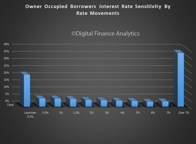
At this level, they will be in difficulty.  The chart shows the relative distribution of borrowing households, by number. So, around 20% would have difficulty with even a rise of less than 0.5%, whilst an additional 4% would be troubled by a rise between 0.5% and 1%, and so on. Around 35% could cope with even a full 7% rise.

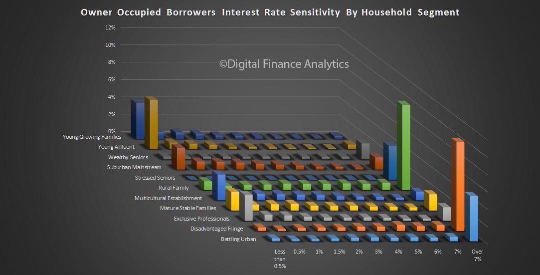
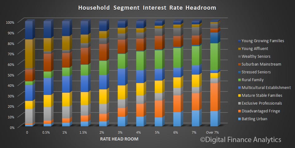
If we overlay our household segments, we find that young growing families and young affluent households are most exposed to a small rate rise. However, some in other segments are also at risk.

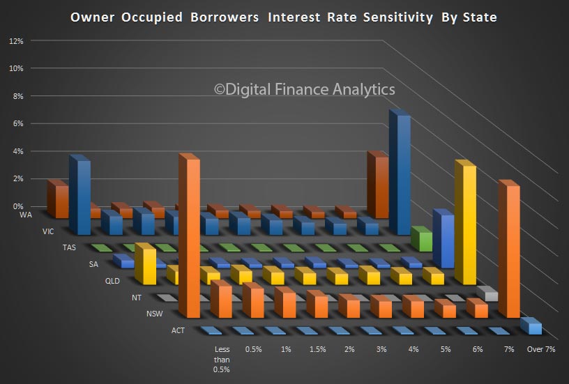
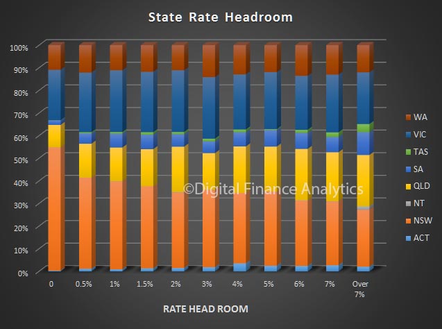
State analysis highlights that households in NSW are most sensitive, a combination of larger volumes of loans as well a larger loans, relative to incomes resulting is less headroom.

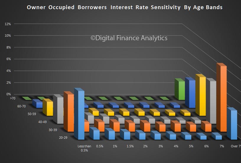
Younger households are relatively more exposed, because their incomes tend to be more limited and are not growing in real terms relative to mortgage repayments.

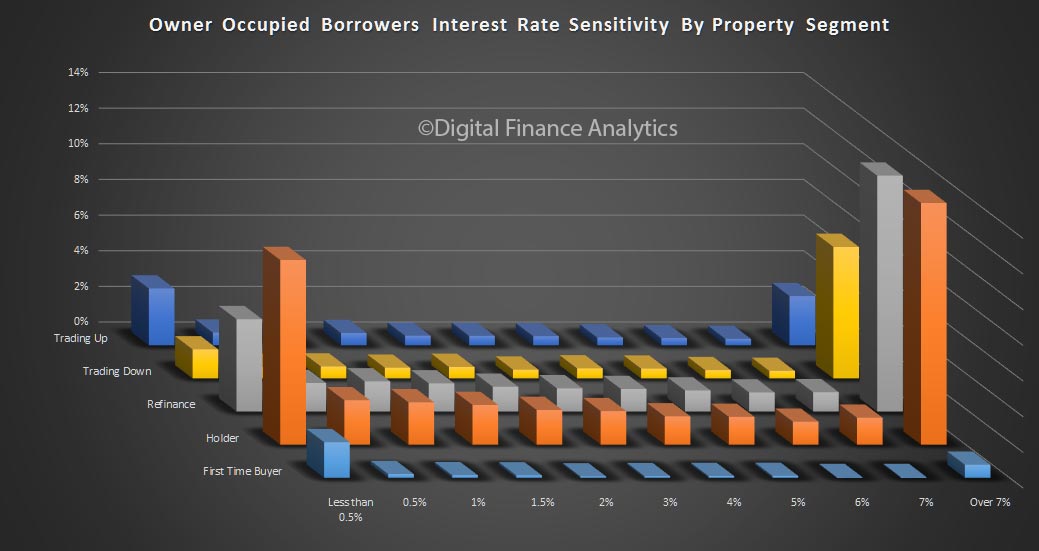
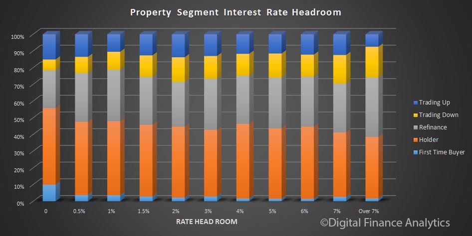
Analysis by DFA property segment shows that whilst some first time buyers are exposed at low rate movements, those holding a mortgage with no plans to change their properties (holders) are also exposed. In addition, some seeking to refinance are doing so in the hope of reducing payments, because they have limited headroom.

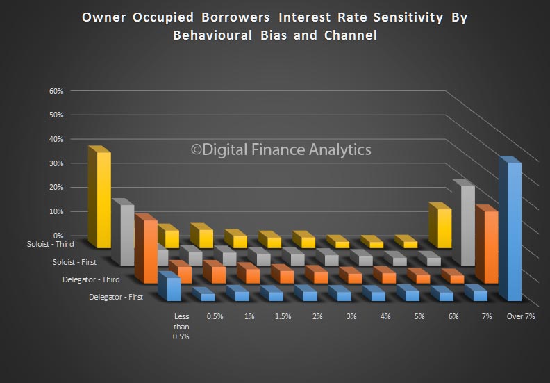
Finally we turn to other insights from our data. First, those households who sourced their mortgage via a mortgage broker are more likely to be in difficulty with a small rate rise, compared with those who went direct to a bank. This, once again, shows third party loans are more risky. This perhaps is connected to the types of people using brokers, as well as the broker’s ability to suggest lenders with more generous underwriting standards and coaching on how to apply successfully.

We also see that rate seekers (we call these soloists) who are driven primarily by best rates, are more sensitive to small rate rises, compared with those who are more inclined to seek advice, and appreciate service more than price (we call these delegators).

Soloists who went via a broker are the most exposed should rates rise even a little, whereas delegators going to a bank, are more able to handle future rises.

Segmentation, effectively applied can results in quite different portfolio outcomes!

The End Is in Sight for the U.S. Foreclosure Crisis

From The St. Louis Fed.

The extended period of historically elevated rates of extreme mortgage distress and defaults in the U.S. housing market, better known as “the foreclosure crisis,” has faded from view as the economy continues its slow recovery. A deeper look at mortgage performance data from the Mortgage Bankers Association suggests the crisis has ended in some states, while it is not quite over yet for the nation as a whole. However, the end is near. The condition of current mortgage borrowers considered as a group—nationwide or state by state—is once again comparable to the period just before the Great Recession and the onset of the foreclosure crisis.

As explained below, we identify the fourth quarter of 2007 as the beginning of the nationwide foreclosure crisis; we judge that it had not yet ended as of the third quarter of 2016. Based on current trends, we expect it should end in early 2017. This nearly 10-year nationwide foreclosure crisis will have been longer and deeper than anything we’ve seen since the Great Depression. As many as 10 million mortgage borrowers may have lost their homes.

Some states and regions have experienced severe recessions and housing crises worse than the nation as a whole, while others have suffered less. The result is a wide range of foreclosure-crisis experiences. Among the seven states that make up the Eighth Federal Reserve District, we conclude that only Missouri and Tennessee have exited their foreclosure crises as of the third quarter of 2016 when judged by a national standard; Arkansas likely will follow soon. Meanwhile, Illinois, Indiana, Kentucky and Mississippi may be a year or more away from exiting. If we take into account long-standing differences in mortgage conditions across states, our conclusions are more favorable. Only Illinois has failed to return to its own pre-crisis level and, even there, the end of the foreclosure crisis appears imminent.

Using Data to Define the Start and End of the Foreclosure Crisis

We define the recent foreclosure crisis as the period during which the share of mortgages that are seriously delinquent (90 days or more past due) or in foreclosure in a particular state or nationwide was above the worst level experienced in recent memory (i.e., not including the Great Depression).2 To recognize secular changes in mortgage practices and performance—in particular, steadily rising levels of outstanding mortgage debt and a proliferation of new types of mortgages—we calculate a crisis threshold for the nation and for individual states as the combined rate of serious delinquency plus foreclosure inventory that first exceeds its own five-year moving average by an amount greater than any previously experienced in the data.

We define the end of a foreclosure crisis as the first quarter in which the combined rate drops below its initial crisis reading.

The Foreclosure Crisis at a National Level

Mortgage Bankers Association data show that the U.S. foreclosure crisis started in the fourth quarter of 2007, when the combined rate reached 2.81 percent, a level that exceeded its five-year moving average by 0.67 percentage points, more than any other previous level. Given that the combined rate stood at 3.2 percent in the third quarter of 2016, this suggests that the nationwide foreclosure crisis has not yet quite ended. However, based on the rate of decline in recent quarters, the data-defined end of the crisis on a national scale is likely to occur as soon as the first quarter of 2017. Indeed, comparable data from Lender Processing Services, as shown in the recently released Housing Market Conditions report from the St. Louis Fed, also suggest the foreclosure crisis is nearing its end.

It Has Been a Long, Hard Slog

However it is defined, the mortgage foreclosure crisis will go down as one of the worst periods in our nation’s financial history. For the nation as a whole, the crisis will have lasted almost a decade—about as long as the Great Depression. For most states in the Eighth District, the slightly shorter duration of their foreclosure crises, when measured against their own data trends, has been offset by higher average rates of serious mortgage distress seen even in non-crisis periods.

The conclusion that the foreclosure crisis has been a long, miserable experience for many is unavoidable. And many Americans continue to suffer lasting financial, emotional and even physical pain as a result of their experiences during this time. However, a look at the data today shows that, at least, the end is in sight.

The Changing Work Roles of Wives and Husbands

Interesting US research featured by The Federal Reserve of St. Louis, on changing work patterns, highlighting the falling participation rates and decline in hours, especially among men, as women increase their representation in the US work force. Married women in particular are having a big impact on the market. They suggest the changes in the labor supply of men and women may be related,

It is well-known that the labor force participation rate for men and the hours worked by men have declined over the past four decades. More men are reporting that they either are not employed and not actively searching for a job or are working part time; these two trends are contributing to the decline in the average hours worked by men in the past four or five decades.

During this same time, women have increased their representation in the labor market: The fraction of women participating in the labor force has increased, as has the number of hours women work outside the home, with the majority of the increases driven by growth in the labor supply of married women.

The changes in the labor supply of men and women may be related, especially if we consider married men and women. Time allocation—that is, how much a spouse works, how much time each spends on housework and child care, and how much leisure each enjoys—is decided within households. This context is needed to analyze married individuals’ decisions to withdraw from the labor market or to work part time. Although many papers have documented the decline in the labor supply of males,2 this article focuses on the changing role of wives in providing economic support for their families and changes in the labor supply of prime-age (25-54) married males.

We focus on prime-age married males because of this group’s traditional role of being the breadwinners; these men are typically attached to the labor market and work full time.

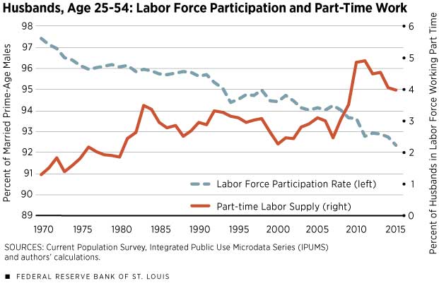
This shows changes in the labor force participation rate of this group. The trend is similar to that for men in general. In 1970, more than 97 percent of these husbands participated in the labor market, dropping below 93 percent in 2011 and staying there. Meanwhile, the rate of part-time workers among prime-age husbands increased substantially since the 1970s: Less than 1.5 percent of the men worked part time in 1970; this fraction has been about 4 percent or more since 2009. As for wives, close to 26 percent of married women in the labor force worked part time in 1970, but only about 22 percent worked part time after 2000.

Household Labor Supply

Several factors could contribute to the decline in labor force participation and hours worked by married prime-age men and to the increase in labor supply of their wives. The explanations include both demand- and supply-side motives. One explanation for the declines related to men is that there is a drop in demand, especially in the manufacturing sector; this decline in demand is related to skill bias, technological changes and offshoring. The increase in married female labor supply can be partly explained by the increase in educational attainment of women and the increase in relative wages in high-skill occupations.

In the context of household labor supply, however, a decline in the gender pay gap can cause an increase in the female labor supply and a decrease in the male labor supply as a response to the household’s joint decision on labor and to the household’s overall income. In other words, the higher income generated by wives may reduce the incentive of husbands to work many hours or to work at all.

Furthermore, increases in labor force participation of married women and their hours worked can also be due to an increase in risk pooling in households, especially in households in which women are married to low-skilled men or to men working in declining industries. With women’s strides in education, they can provide insurance within the household by working more when men lose their jobs or when the wages offered to men are low. This insurance motive may kick in even before the husband loses his job. Wives may decide to work outside the home when there is just a threat of unemployment or a decline in their husbands’ earnings.

Another possible explanation for the increase in married males’ working part time has to do with the fact that finding jobs can take time and effort. Working part time allows the individual to spend more time searching for a better-paying job or investing in the acquisition and enhancement of skills, which often means going back to school or even acquiring skills that allow individuals to change occupation or sector.7 Thus, in households in which wives work full time, husbands might be able to be choosier in accepting jobs—they can afford to be less willing to take full-time jobs for low pay or jobs that may not offer good promotion prospects or other nonpecuniary qualities. These men may take part-time jobs while searching for better jobs.

Next, we explore changes in characteristics of households in which prime-age men were not participating in the labor force or worked part time between 1970 and 2015.

Labor Supply and Education Composition

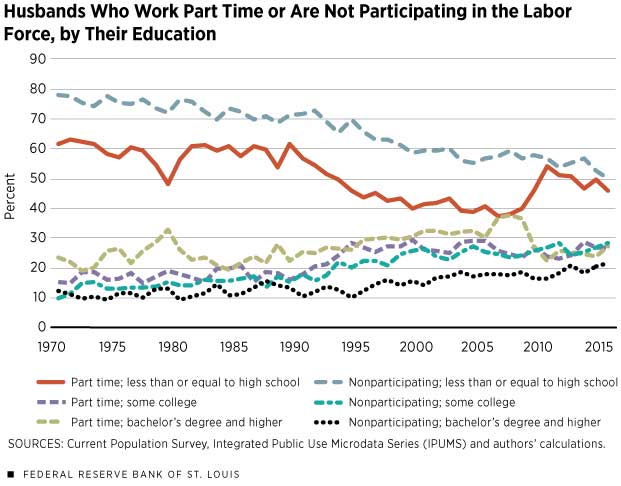
The education composition of husbands who either work part time or are nonparticipating has changed significantly over time.

As shown above, in both groups, the respective fraction of husbands with high school education or less decreased, and the fraction of husbands with at least some college education increased since 1970. (During and after the Great Recession of 2007-09, however, the fraction of males who worked part time and had no more than a high school diploma went up but has since reverted to its decreasing trend. As for better-educated husbands, there was a relative decline in the fraction working part time during the recession. The differences between the experiences of the two groups during the recession can be due to the differences in the demand for the skills of educated and less-educated men; another factor is that more-educated husbands are more likely to have more-educated wives with different labor market prospects.)

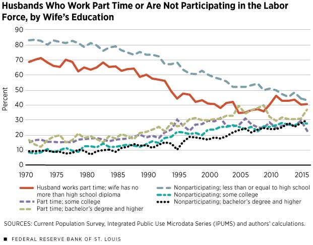
To further explore the changes in the composition of households in which husbands do not participate in the labor force or work part time, we turn to the education compositions of the wives.

This demonstrates, the fraction of these husbands who are married to women with high school education or less declined significantly. The fact that women in households in which males work part time or do not participate are more educated than in the past (and given the decline in the gender earnings gap) may imply that these women are more likely to work, earn relatively more and provide more economic support for their families.

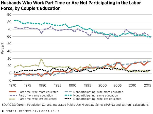
In addition to the education composition of the men and women, the relative earning potential of the spouses in the household can be important to understanding how the spouses allocate their time among jobs, housework, child care and leisure.

This presents the change in composition of part-time and nonparticipating husbands by their education status relative to that of their wives. Interestingly, among these two groups of men, there is a clear decline in those who are married to women with the same education level or less and an increase in the fraction of those who are married to women who are more educated than they are. The percentage of those married to wives who are relatively more educated than them increased from about 9 percent in 1970 to about 27 percent in 2015.

The patterns in both increasing education of women in households in which men work part-time jobs and the fact that in an increasing fraction of these households women are more educated than the men suggest that the earning potential of women in these households is higher than it used to be. These patterns also suggest that these women might have better labor market prospects than men and have an important role in providing economic support for their families.

Relative Share of Wives’ Earnings

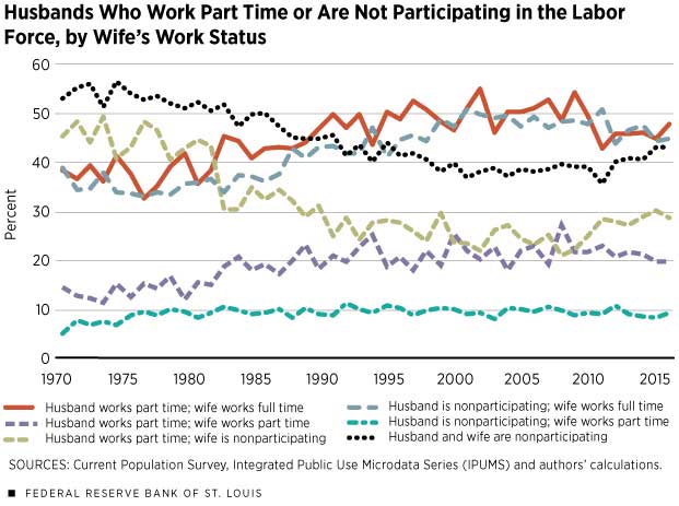
This describes the employment status of women in households in which the husbands work part time or are nonparticipating. Despite the short dip after the Great Recession, the overall increasing trend of the fraction of men who work part time and are married to women who work full time is clear. The patterns for wives of nonparticipating husbands are similar.

Next, we describe the role of the wife’s income relative to the husband’s income and how that relationship changed over time.

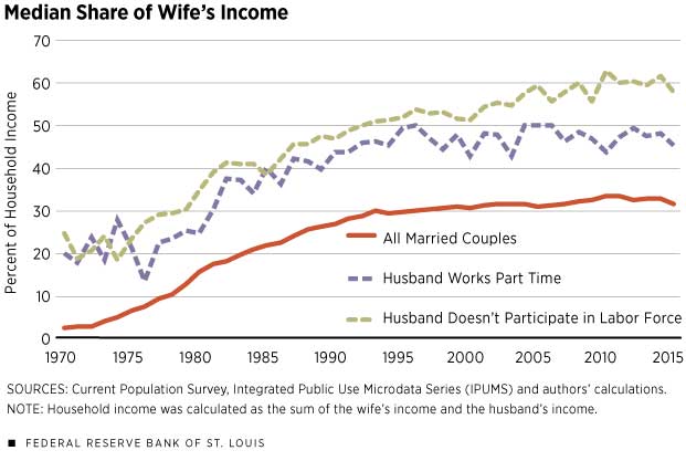
This shows the median share of the wife’s income in the total household income for married households. In the overall sample, the share was close to 2 percent in 1970, which is consistent with traditional families in which the men are the breadwinners. This share rose to about 30 percent by the late 1990s and has fluctuated around 30 percent since then. The share of the wife’s income in families with husbands who work part time or are nonparticipating is always higher than the share of the wife’s income in all married families. However, in families in which men work part time or do not participate, the wife’s income in recent years has been equal to or has exceeded that of the husband.

Conclusion

Despite the findings that most of the increase in nonparticipation of prime-age males stems from relatively less-educated males,9 the fraction of educated, prime-age husbands who do not participate or who work part time has increased over the past few decades. At the same time, in these households, the fraction of educated women and the fraction of women who are more educated than their husbands increased.

Increase in nonparticipation of prime-age males stems from relatively less-educated males, the fraction of educated, prime-age husbands who do not participate or who work part time has increased over the past few decades. At the same time, in these households, the fraction of educated women and the fraction of women who are more educated than their husbands increased.

These data partly reflect decades of demographic changes: rising college graduation rates in the overall population, with women’s educational achievements surpassing men’s; a decline in the marriage rate, especially for those with less education; and changes in the marriage markets. Thus, the composition of the households in which males do not work or who work part time has also changed. We found that in these households the role of women in providing income to the family is higher than it was in the past. These changes are likely to affect households’ labor supply and job-search behavior (the intensity of search and what kinds of jobs and pay people are willing to accept).

In addition, the data show that changes in labor supply during and right after the Great Recession vary by the education of the spouses: The fraction of males working part time who had no more than a high school education or who were married to women with no more than a high school education increased during the recession; meanwhile, the fraction of better-educated males working part time and of males working part time who were married to better-educated females declined during the recession, suggesting differences in both labor market opportunities and labor-search behavior for more-educated families.

Although many papers suggest that the role of the changes in labor demand is important, the descriptive analysis cannot be used to infer causal effect and to separate demand and supply factors. However, it is important to assess the role of the marriage market and the role of both spouses in generating income and providing housework in order to fully understand trends in labor participation and hours worked and how they interact with business cycles and labor market conditions.

In particular, assessment is needed of job-search behavior and the choice of sector in which people want to work. Whether to remain in a sector with high probability of unemployment or to acquire new skills, whether to work outside the home and, if so, how many hours to work—all of these decisions for husbands may depend on their wives’ employment opportunities, as well as their own employment opportunities.

Aussies feel pressure on household budget

From AAP. Only one-fifth of Australians think the national economy is in good shape, a new survey has found, in a grim assessment of consumer cheer heading into Christmas.

A quarterly survey by consumer advocacy firm CHOICE has found only about one in five people believe the Australian economy is in good shape – the lowest positive rating since its Consumer Pulse survey began in 2014.

The December results show that consumers are under increasing financial pressure and feel less positive about their household budget and the economy.

“Many Australians start to feel sharper financial pressures leading into the holiday period, as gifts and parties eat into our savings or credit balance,” acting CHOICE chief executive Matt Levey said.

Australians are also reporting a drop in spending on non-essentials, with more than half of respondents tightening the belt and putting off purchase of big ticket items.

CHOICE’s Consumer Pulse report found fears over the economy are the worst they have been since the survey began two years ago, with just one in four households saying they’re living comfortably.

“In particular, our survey shows that Australians between 30 and 49 are more likely to live off credit cards if they run out of money before pay day,” Mr Levey said.

A third of people under 30 said they dipped into their savings in the last year to make it to pay day, while a quarter had borrowed money from family or friends. About 20 per cent of people aged 30 to 49 reported they deliberately missed the due date on a bill.

CHOICE’s report follows the release this week of the federal government’s mid-year budget review, which forecast that despite lower savings, consumers will likely boost spending on the back of low interest rates and employment growth.

However, the Consumer Pulse figures show that consumers are not necessarily feeling confident enough about their financial future to take on more debt or spending.

“MYEFO’s predictions about household savings match what Australians have told our survey,” Mr Levey said.

“But this won’t necessarily translate into higher consumer spending. In the next 12 months, a majority of people say they are planning to cut back on discretionary and non-essential purchases.”

CHOICE’s Consumer Pulse report, which tracks Australians’ views about the economy and household spending, was based on online responses from 1025 people aged between 18 to 75 years.

FHBs increasingly locked out of property

From Australian Broker.

The average first home buyer has to wait for 4.9 years to save for a 20% deposit, an increase from the 4.5 year wait of in 2011.

These figures come from the 2016 Bankwest First Time Buyers Deposit Report which compares local incomes to house prices. It examines how long FHBs in different capital cities have to wait to save the 20% deposit needed to avoid costly lenders mortgage insurance.

First home buyers in Sydney suffered the longest wait, spending 8.4 years to save the necessary amount. This was an increase from the 7.9 year period required last year and was far ahead of the 5.8 years required back in 2011.

For Melbourne, the time required again increased from 5.4 years in 2011 to 5.8 years last year and onto 6.2 years this year.

In fact, figures in all capital cities except for Perth and Darwin have been rising since 2011, creating difficulty for most first home buyers when securing their first property.

“Low interest rates, sluggish wage growth, and rising house prices are making it increasingly difficult for first time buyers to get a foot on the property ladder in most capital cities in Australia,” said Andrew Whitechurch, Bankwest’s executive general manager of retail.

“We’ve seen extremely strong growth in property values in Sydney and Melbourne, while wages have grown by just 2.2 per cent nationally.”

These financial challenges have seen the number of first home buyers in the market decrease dramatically. In 2016, FHBs made up of 13.4% total buyers which was half that found in 2009.

A Deep Dive On Household Rate Sensitivity

Today we look at a Interest Rate Sensitivity – a specific slice of data from our household surveys which we use to drive the mortgage stress data series, as we discussed recently.

Using data from our surveys we are able to estimate the amount of headroom households would have if mortgage interest rates were to rise. We are expecting rises through 2017.

We look at a range of scenarios, and as rates rise estimate the “pain point” for specific households, taking into account their other commitments, income, type of loan and mortgage repayments. Today we look at owner occupied loans.

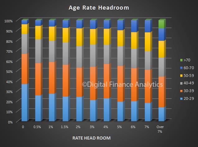
Looking at sensitivity by age of household, more than 65% of those under 40 years with a mortgage would have difficulty if rates rose just 0.5% (50 basis points).  Households who are older, on average have more headroom. In the “more than 7%” category, 60% of households are over 40 years.

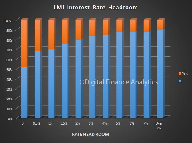
Another interesting cut is the penetration of Lenders Mortgage Insurance (LMI). Around half of households with an LMI protected loan (remember the LMI Insurance protects the BANK, not the Household) would have difficulty if rates rose bu 50 basis points. Households with no need for LMI (normally because they have a lower loan-to-value ratio) have more headroom.

We see from our property segmentation that a greater proportion of first time buyers would be caught if rates rose 50 basis points, but property holders are the largest segment at the high end of the risk profile.

A look at our master segments shows that young growing families and young affluent households are relatively the most exposed if rates rise. Interestingly our battling urban, and disadvantaged fringe groups (who would generally be regarded as the worst credit risk) have more headroom. This is because they have smaller mortgages, so are less leveraged.

By state, NSW have the highest proportion of households which would be exposed by a 50 basis point rise – again because of large mortgages and high home prices.  By comparison, households in QLD AND VIC have more headroom.  Some households in WA are also exposed at 50 basis points.

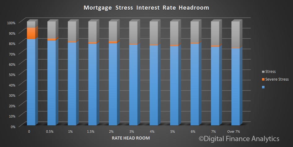
Finally, we also see that the majority of households we identified as in severe mortgage stress appear in the band who would be under pressure if rates rose just 50 basis points. This is a validation of our modelling, and shows the alignment between mortgage stress and rate movements.

A further illustration of the power of effective segmentation!


Mortgage Stress And Probability Of Default Is Rising

We have just finished the December update of our mortgage stress and probability of default modelling for the Australian mortgage market.

Our model has been updated to take account of the latest employment, wage, interest rate and growth data, and we look are the current distribution of mortgage stress (can households settle their mortgage repayments, on time without financial pressure?) and make an estimate of the probability of households defaulting on their repayments by more than 30 days. The former uses our survey data on mortgages held, interest rates applied, and income available in the light of other financial commitments. Probability of default overlays the broader economic drivers. The base analysis is completed at a customer segment level by post code then rolled up to form various data views. In the next few days, we will discuss the findings in some detail. You can read more about our approach here. We also also reveal the current top 100 post codes for mortgage stress and mortgage defaults across the nation.

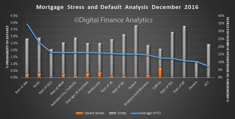
To begin, here is a summary by states, split down by CBD and rest of state.

The highest probability of default can be found in regional WA, thanks to pressure in the mining belt. 30 days defaults will be close to 4%. Here, around 25% of households are in mortgage stress, including some in severe stress – see our descriptions here.

Default expectations are also high in and around Perth, where employment prospects are faltering, and incomes under pressure. In QLD, away from Brisbane, we see similar issues. The ACT has the lowest level of default probability.

The highest levels of mortgage stress are found in Tasmania, and across Regional NT, where more than 30% of households are under pressure. We also see hot spots in regional areas.

Of note is the high proportion of households in greater Sydney in severe mortgage stress – at 6.2% of borrowing households. This is a function of large mortgages (driven by high prices), rising interest rates AND flat incomes. By way of comparison, Melbourne households in severe stress sit at 3.3%, as mortgages are a little smaller. They are both higher than the national average of 2.8% of households.

Combined, across the country, more than 22% of all households are now in some degree of mortgage stress.

Next time we will dig into the more specific geographic footprints, because you really have to get granular to make sense of what is going on. Averages across the national simply mask what is going on.  Later will will look at loan-to-income and debt servicing ratios which are also deteriorating for many.  Then finally we will look at the loss implications for the banking sector.