Successive governments in Europe have impressive visions for the future of our cities. These reject the divisive urban model of earlier decades, where richer people moved to low-density, car-dependent suburbs, leaving inner cities predominantly to the poor.
In the sustainable cities of the future, the vision is to attract richer people back to city centres. This will reduce their need to travel and increase public transport use. Importantly, these movements are supposed to bring about more mixed communities of people from different walks of life, living alongside one another harmoniously.
To achieve this urban renaissance, the UK has, for example, been directing housing development towards brownfield sites in the core of cities, limiting greenfield development at the edge. It has also been among those pushing substantial investment through urban regeneration schemes in land preparation or infrastructure.
Sure enough, this has halted and in some cases reversed the population losses which core cities have experienced for decades as richer people have been attracted back to the centres. Yet poorer people are being pushed out; poverty is “suburbanising”. We have seen this pattern in the US and more recently in England, particularly London.
Scotland’s four largest cities are also experiencing this trend, as new data confirms. In Glasgow, Edinburgh, Aberdeen and Dundee, the share of each city’s population living near the centre either stayed the same or rose between 2004 and 2016. At the same time, the proportion of poorer people has been falling (see graphs below).
Income-deprived population living in central city (%)
Non-deprived population living in central city (%)
The central area of Edinburgh has seen a loss of approximately 4,000 people in low income households over the period. In Glasgow, Scotland’s biggest city, where this trend has been identified before, the figure is approximately 6,000. For the smaller cities of Aberdeen and Dundee, the losses were around 400 and 700 respectively.
Segregation
What is driving this change? As city living has become more popular, poorer households are finding it harder to compete for housing. Social housing stock has fallen for decades, meaning those in poverty are having to rely more on renting privately. When cities attract wealthier people, landlords can charge rents that poorer people struggle to afford.
Meanwhile, recent welfare reforms have successively cut the housing benefits that subsidise rent payments for those on low incomes – at the same time as inequality levels have been rising more generally. The net result is that these people are pushed towards cheaper areas, away from the more central neighbourhoods.
As in other countries, this suburbanisation of Scottish poverty looks to be a steady but largely hidden process. If it continues, the cities of the future will be far from the visions set out by policymakers and planners.
Instead, they will continue to be marked by segregation and deep division, only now with poorer households pushed to the edge. That has potentially serious implications for these people’s welfare, particularly their ability to access employment. It also threatens broader social cohesion. If politicians are serious about their visions for the future, it is time we recognised these trends and started talking about how to halt them.
Author: Nick Bailey, Professor of Urban Studies, University of Glasgow;
Jonathan Minton, Quantitative Research Associate, University of Glasgow
A new study shows two million Australians are experiencing high financial stress which prevents them from coping in difficult situations, for example, in paying unexpected expenses such as a big mobile phone bill or the fridge breaking down.
Adults face these sorts of scenarios frequently. When they arise, people usually turn to savings, a credit card, or a friend or family member to help out.
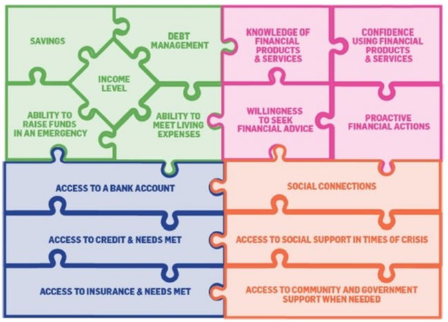
Our report, Financial Resilience in Australia, funded by the National Australia Bank, quantifies the amount of Australians: experiencing problems paying debts; meeting the costs of living; and accessing appropriate, affordable and acceptable financial products and services.
It also shows some Australians have trouble accessing social support in times of crisis and may have low levels of financial knowledge.
Our research measured financial resilience by the four key resources that support it: personal economic resources (such as savings), financial products and services (such as insurance), financial knowledge and behaviour (including financial literacy), and social capital (having social support in times of crisis, including friends and families).
Many Australians simply don’t have the resources to bounce back. For example, around:
One in two adults have limited to no savings
One in two only have a “basic understanding” of financial products and services
One in ten have unmet need for credit and/or insurance
One in five have limited or no social connections
One in 30 stated they needed but did not have access to any form of government or community support.
This has implications for the short and long-term impact on individuals and their families.
Who is most at risk?
Our research found secure housing, steady income, education, being employed and good mental health are strongly associated with financial resilience.
On average, financial resilience is significantly lower among people who are homeless, living in social housing, are short-term renters or live in student accommodation.
Financial resilience increases with the level of education and, unsurprisingly, people with very low personal incomes fare poorly.
Employment status is a key marker. People who are unemployed, underemployed, not in the labour force and those who only work odd jobs are more likely than their full-time employed counterparts to have lower levels of financial resilience.
People with a serious mental illness are significantly more likely to be in severe or high financial stress, are less likely to be financially secure and fare worse on each of the individual resource groups than people without mental illness.
The gender split in financial resilience is fairly even overall. However, the four components of financial resilience are influenced by gender. Women have lower general levels of economic resources than men, but men have lower levels of social capital than women.
People who were born overseas in a non-English speaking country have lower levels of resilience than those who were born in Australia. Finally, the influence of age on financial resilience varies and is often affected by other factors.
One in four study participants reported difficulties accessing financial services. The barriers are varied, but include cost, trust, poor and inadequate services, and (for a few) language, disability and discrimination.
This underscores the importance of making financial information, products and services more user-friendly and accessible. This will ensure these resources are available and accessible to everyone who needs and wants them in society.
The factors influencing financial security are not surprising. People who own their own homes, have a university-level education and have a personal yearly income of more than A$100,000, for example, have higher levels of financial resilience. However, only 35.7% of Australians are financially secure.
The prevailing attitude around financial problems is that individuals are solely responsible for their situation. Our research challenges this ideas as it shows multiple aspects to financial resilience, some out of the individual’s control.
The below shows how interlocked the different components of financial resilience are and when pieces of the puzzle are removed, the most vulnerable people are at risk.
At the moment social sector leaders are lobbying the government to scrap proposed budget cuts that will reduce the amount of certain welfare payments. Our research shows these same people have the least resilience to bounce back if they were to lose some financial support.
This is an example of how the government needs to play a more active role in understanding financial resilience and where support is needed. By understanding the often interrelated elements of financial resilience, tipping points and who is most at risk, prevention and intervention can be better tailored.
Authors: Rebecca Reeve, Senior Research Fellow, Centre for Social Impact, UNSW Australia; Kristy Muir, Professor of Social Policy / Research Director, Centre for Social Impact, UNSW Australia
Truth be told, most Australians live in good housing. This is good news for all of us because our housing is a major determinant of our health and wellbeing. But our very recent research findings, published this month in the Journal of Prevention and Intervention in the Community, and the lessons of history tell us this good news story is at risk.
Ideally, housing provides us with the secure, comfortable shelter that people and their families need to live healthy, productive lives. In general, we have a modern housing stock with good heating and cooling, few major structural problems and few problems with damp and mould. By contrast, bad housing makes it much more likely you will get sick and stay sick once ill.
In Australia’s early years, much of the housing stock was of poor quality, often overcrowded, and posed real risks to people’s health. Slums were common in the inner parts of the major cities and in many country towns.
As late as 1915 bubonic plague was a reality in the poorer parts of our cities and other contagious diseases remained an ever-present risk. Numerous letters to the editor documented a real social concern with the housing standards of the poor.
Government intervention, economic prosperity and tenancy laws all improved housing conditions across Australia. Within a century Australia was defined by good housing and high rates of home ownership. The nation saw off the last of its slums in the late 1940s.
Now the same conditions that gave rise to substandard housing in the 19th century are returning in the 21st, with a likely similar outcome. Recently, the Reserve Bank governor acknowledged young Australians need their parents’ help to buy a home in Sydney. But most Australians don’t have a wealthy and doting parent to fund them into the house of their dreams.
The alternative is to live in lower-quality housing and to make do with a home that is relatively inaccessible, fundamentally unaffordable or both.
A million Australians on the housing brink
The confronting reality is that poor housing conditions are more prevalent in Australia than we think.
We have a sizeable “hidden fraction” of Australians living in poor-quality housing. In particular, many of our most vulnerable have the double disadvantage of also having housing conditions that we might deem as falling below an unacceptable standard.
In one of the few contemporary analyses of this issue, we used the Household Income and Labour Dynamics (HILDA) Survey, a national longitudinal dataset, and find compelling evidence of a substantial stock of poor-quality housing in Australia.
The scale of our findings is somewhat surprising: we found almost a million Australians are living in poor or very-poor-quality housing. Within this total, more than 100,000 are residing in dwellings regarded as very poor or derelict.
These simple findings are important. They show the existence of a significant (and currently little known) population of individuals living in very poor conditions. At the very least, we need to monitor Australian housing conditions in a systematic way if we are to avoid this problem worsening.
Harms of poor housing multiply
Poor-quality housing makes the already disadvantaged even worse off. Younger people, people with disabilities and ill health, those with low incomes, those without full-time (or any) employment, Indigenous people and renters are much more likely to be found in the emerging slums of 21st-century Australia.
Importantly, many of these groups are already disadvantaged and (most probably) have a pressing need for housing that improves or supports their health and wellbeing. People with an existing illness or disability, for example, are almost twice as likely to live in dwellings in very poor condition as people without a disability or illness.
These findings about the size and uneven distribution of the problem should force us to ask what effects poor-quality housing has on people – on their mental, physical and general health? It is clear from our analysis that such housing has measurable impacts on mental, physical and general health. This impact is large enough to be statistically significant.
Given the time it takes to reform policy and plan for our cities and regions, Australia urgently needs to face up to the dismal reality that once again many Australians are living in housing not fit for habitation.
Governments must take steps to ensure the supply of affordable housing of reasonable quality. Otherwise, we are destined to become a nation scarred once again by slums, reduced life chances and shortened lives.
Authors: Emma Baker, Associate Professor, School of Architecture and Built Environment, University of Adelaide; Andrew Beer, Dean, Research and Innovation, University of South Australia; Rebecca Bentley, Associate Professor, Centre for Health Equity, Melbourne School of Population and Global Health, University of Melbourne
The latest Deloitte’s Media Consumer survey, based on 2,000 consumers, highlights Social media is playing a central role in how we search for, discover, consume, and interact. Indeed social media networks have become entertainment destinations in their own right. Facebook takes centre stage.
We are seeing new content formats, streamed video and advertising seamlessly integrated in a social context, providing an immersive and frictionless media experience. This manifests in many ways including the broadcast of live sports on Twitter, integrated news feeds through Facebook instant articles, music streaming embedded into Twitter or the use of bots to deliver a ‘conversational’ two-way news experience. Social media is increasingly powerful in shaping our media consumption experiences. This year, we are seeing the popularity of more immersive forms of content and media. Going to the movies saw an increase of 20% since last year, and although nascent, the arrival of virtual reality (VR) is upon us with the majority of respondents (58%) believing it will enhance their viewing experience. Video advertising or live streaming integrated into social platforms is the new norm.
At the same time, we seem to be becoming more engaged with the content that we consume – this year sees multi-tasking while watching TV remain at almost ubiquitous levels, but we are doing fewer additional activities at the same time. More of us are paying for the video content that we want – 22% of respondents pay for a subscription video on demand (SVOD) service and we pay more attention to content that we have paid for (70% of respondents agree they tend to pay closer attention to content that they have paid to watch). We would rather pay for TV shows than be distracted by ads (43% of respondents agree) and in news, where we are willing to pay for news online, it is because we value the in-depth analysis.
This year we have focused on the Millennial effect – the extent to which Millennials are shaping the future of media consumption.
There are many behaviours which are subsequently adopted by Xers, Boomers and even Matures. But there are key differences within the ‘Millennials’ demographic. Trailing Millennials (14-26 year-olds) are the true digital natives, observable in distinct behaviours such as higher adoption of streaming as a means for accessing TV content (used more than live programming), increased willingness to pay for all forms of digital content and more pronounced digital habits such as bingeing and multi-tasking.
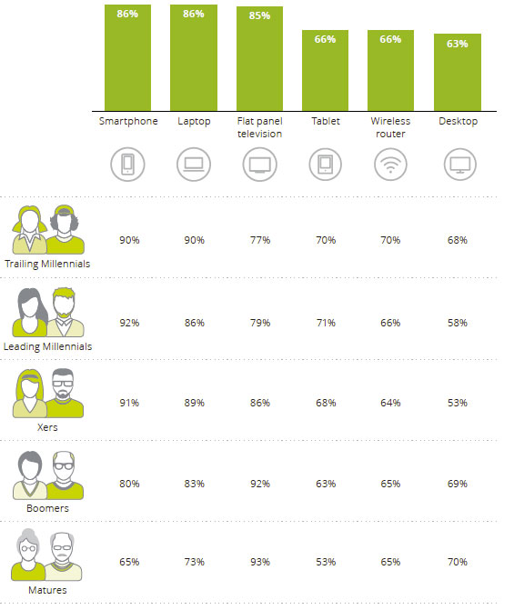
Highlights include, the number of connected devices we maintain continues to increase – 56% of survey respondents are digital omnivores (owning a smartphone, laptop and tablet), up from 50% last year. Device selection is all about convenience with 69% of respondents agreeing that being able to watch content when they want is more important than the device on which they watch it. Managing all these devices can be difficult, with 39% of respondents believing that managing all the connected technology in their house is so complex that they require help to operate it.
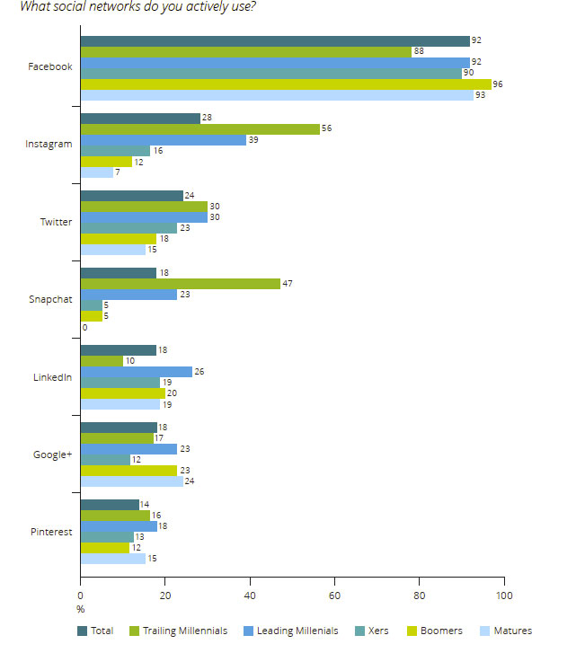
Sixty-one percent of Australian survey respondents engage with social media on a daily basis – up slightly since last year (59%) and representing 31% growth (CAGR) since 2013. This increase is observed across all age groups, although the fastest rates of growth over the past four years have been among Boomers (38% CAGR) and Matures (40% CAGR).
Uptake is greatest within Millennials with only 4% of Leading Millennials not actively using social media. Of those who do use social media, 77% of Trailing and 84% of Leading Millennials engage with these networks on a daily basis. Among Matures, there are two camps – as many Mature respondents are checking their social networks daily (36%) as there are not using social media at all (37%). For Boomers, nearly half are daily users (47%), whilst only a quarter (25%) aren’t on any form of social network.
Twenty-seven percent of social media users check or update their status four or more times a day (up from 23% in 2015). These heavy users are predominately Millennials, although this year they are also joined by some more socially active Boomers and Matures. And as the mix of generations actively engaging with social media changes, it helps to know who is using what and why. Friends, followers, or connections? Facebook is the big winner among social networks. It is by far the most commonly used – 92% of survey respondents who use social media are actively using Facebook and this is reflected across generations. Facebook has become the centre of our social (media) lives, used to ‘keep up’ (in all senses) with our near and dear, whether they are near or far.
Seventy-eight percent of users rank ‘keeping up with friends and family’ in their top three reasons for using Facebook. Being connected with others is more important to them than other reasons for use, such as entertainment (43%) or simply distraction (42%). But what this connection really means is more nuanced. Facebook has shifted our definition of what it means to be a ‘friend’ or to be ‘connected’. It is a platform focused on growing user interactions and now boasts a plethora of services to achieve this outcome (e.g. posts, photos, videos, live video, messenger, games and news sharing). Using Facebook can perhaps now best be seen as something of a habit, less about real connections and more about keeping up with the facade that people curate (intentionally or not) on their profile pages.
As a consequence, for some it might be starting to lose its appeal. Younger generations are not the most represented on Facebook, it’s their parents and grandparents. Ninety-six percent of Boomers who are using social media are actively using Facebook, surpassing the 92% of Leading Millennials who are. And of all generational groups, Trailing Millennial social networkers are using Facebook the least, with 88% identifying as active users.
The youngest generation – the most prolific users of social media – are looking further for their social media needs and newer (post-2010) social networks are catching on. The second and third most actively used social networks are Instagram (owned by Facebook) and Twitter – though they significantly lag the scale of Facebook (28% and 24% of survey respondents who use social media are on these two platforms). Instagram’s appeal is in the visual moment captured; 66% of survey respondents rank ‘sharing photos and videos’ in their top three reasons for use. In contrast, survey respondents value Twitter for both entertainment (56%) and keeping up to date on breaking news (52%).
In recent years, developed countries have experienced a change in the age composition of their population. In particular, these countries have seen an increase in the age-dependency ratio, computed as the ratio of the young population (under 15) and elderly population (65 and over) to the working-age population (15 to 64).
Because the young and the elderly are the most likely to be economically dependent, analyzing their recent evolution may help us understand how changes in the age-dependency ratio could affect other economic outcomes in the developed world. In particular, the evolution of the three variables making up the age-dependency ratio—the elderly population, the young population and the working-age population—is of interest.
The figure below plots the annual age-dependency ratio for the G-7 countries over the period 1990-2012. In recent years, all these countries have experienced an increase in age-dependency ratios.
Among the G-7, Japan has experienced the largest increase in its age-dependency ratio. It was also the country where these demographic trends started first.
From the early 90s, Japan has seen a large increase in its elderly population, with 25 percent of its total population being 65 and older in 2014. Its age-dependency ratio was 61 percent.
In all the G-7 countries, the increase in the age-dependency ratio has been driven by an increase in the elderly population together with a decrease in the working-age population. This increase has happened despite a decrease in the young population ratio in all of the G-7 countries. The young, working-age and elderly populations as percentages of the entire populations of countries are shown in the figures below.
The decrease in the young population may also pose problems for the economic future of countries, since it is likely going to contribute to a reduction in labor force participation in the long run. Indeed, fertility has been declining in all these countries.
A decrease in the labor force due to demographic trends may result in a slowing down of economic growth. This could eventually spill over to developing economies. Policies aimed at alleviating these problems could address increasing productivity to counteract a shrinking working population or stimulating the labor force participation of the elderly population.
Interesting post from the Federal Reserve Bank of ST. Louis, shows that Counties with severe declines in housing net worth during the 2007-09 recession experienced larger declines in employment.
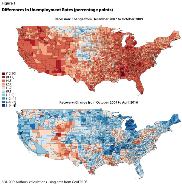
The U.S. national labor market has recovered from the effects of the 2007-09 recession. The national unemployment rate was 10 percent at the end of 2009 but now stands at only 4.7 percent, which the Federal Open Market Committee considers close to the rate’s long-run value.1 Despite the national labor market recovery, significant regional variation remains. Recent economic research highlights links between regional labor and housing markets. This essay examines the recent recession and recovery by plotting county-level unemployment rates and changes in houses prices and finds a negative correlation between the two.
National unemployment reached its pre-recession low in December 2007, with the unemployment rate in 1 in 3 counties below 4 percent. Regions with higher unemployment rates included the West Coast, Central South, and Upper Peninsula of Michigan. The Midwest and South, from Minnesota to Texas, had the lowest unemployment rates—below 3.5 percent in most counties. As the recession deepened, unemployment rates rose until only 1 in 15 counties remained below 4 percent. Figure 1 shows the percentage-point changes in county-level unemployment rates from the pre-recession low to the peak of the U.S. unemployment rate (December 2007 to October 2009) and from the peak to the most recent data (December 2007 to April 2016). Shades of red (blue) indicate increases (decreases) in county unemployment rates.2 As shown in the top panel, by October 2009, the unemployment rate in most counties increased between 4 and 20 percentage points. The areas with higher unemployment rates before the recession experienced larger increases in unemployment during the recession. For a strip of counties in the Midwest, the unemployment rate remained low, increased only slightly, or even declined.
As shown in the bottom panel of Figure 1, although some county-level unemployment rates remain slightly above their pre-recession levels, most have recovered to or below those levels. As prior to the recession, the unemployment rate in about 1 in 3 counties is below 4 percent. The unemployment rates in most counties in Arizona, New Mexico, Nevada, and Utah remain above their pre-recession levels, while counties in the Midwest remain mostly below their pre-recession levels.
Why did unemployment rise so severely in some areas but stay low in others? One explanation may be related to the elasticity of the housing supply. Gascon, Arias, and Rapach (2016) argue that areas with an inelastic housing supply (i.e., the supply does not respond much to changes in house prices) are more vulnerable to recessions and experience worse downturns than areas with a more elastic supply. An inelastic housing supply leads to larger house price drops and declines in net worth during downturns, leading to larger declines in local consumption spending that further depress the local economy. Mian and Sufi (2014) show that counties with severe declines in housing net worth during the 2007-09 recession experienced larger declines in employment.3
We illustrate this correlation using county-level house price data from the CoreLogic Home Price Index. The scatter plots in Figure 2 show for the two periods noted above, respectively, the percent change in county house prices relative to the percentage-point change in the county unemployment rate, weighted by the county population in 2007.4 The size of each dot represents the county population. The figure shows a strong negative correlation between changes in house prices and changes in the unemployment rate: During the recession, counties with larger decreases in house prices experienced larger increases in the unemployment rate (left panel), while during the expansion the opposite has been true (right panel).
2 We downloaded county-level unemployment data from GeoFRED® and then applied the Census Bureau’s X-13 ARIMA seasonal adjustment program to look at percentage-point changes in the unemployment rate from peak to trough and from peak to peak.
3 Mian and Sufi (2014) show that housing net worth mostly affects nontradable employment, or employment in industries that are not tradable outside the local labor areas. For example, restaurants and retail shops are nontradable, while agriculture production is tradable.
4 Because county-level house price data are not as available as unemployment rate data, fewer counties are included in Figure 2 than Figure 1. House price data were also seasonally adjusted using the Census Bureau’s X-13 ARIMA seasonal adjustment program. April 2016 is the most recent month for which county-level house price data are available.
Australians often pride themselves on living in the land of the “fair go”. However, the available evidence shows the distribution of wealth in this country is no more egalitarian than the average for the OECD countries.
In fact, depending on how wealth is measured, Australia may have above average inequality in wealth distribution.
Most think of inequality in terms of income differences between rich and poor people. But even more fundamental are the differences in the value of the assets that people own. It is the presence (or absence) of this accumulated wealth that determines people’s social position and their opportunities in life; who gets what depends substantially on who owns what.
Until recently, we have known very little about wealth inequalities. The last official national census of wealth in Australia was 101 years ago.
In recent years, however, international data compiled by the OECD and political economist Thomas Piketty’s research have provided a better basis for seeing how Australia compares with other nations.
Wealth distribution in Australia
A new report by the Evatt Foundation marshals the existing evidence on wealth in Australia.
As you would expect, Australia as a whole has become much wealthier since 1970: the total stock of capital has grown twice as fast as national income during the decades since then.
But what is more striking is the marked increase in wealth inequality over the same time. We have become collectively richer but much more unequal.
A reasonable estimate is that, currently, the poorest 40% of Australian households effectively have no wealth at all: about half of them actually have negative net wealth because of their personal debts. At the opposite pole, the wealthiest 10% have more than half the nation’s total household wealth. The top 1% alone have at least 15% of the total wealth.
This affluent elite is getting cumulatively richer – not only when compared with poor households but also, significantly, relative to the middle 50% of households.
Two faultlines are widening. One is between the bottom 40% and the rest, and the other is between the top 10% and the 50% in the middle. The latter division is ultimately explosive, since it indicates that the broad Australian middle class is getting a shrinking share of the fruits of economic progress.
Distribution of wealth in Australia, 2013-14.Evatt Foundation
How does Australia measure up internationally?
Compared with the 16 other OECD countries for which comparable data exists, Australia looks slightly more egalitarian than average if all forms of wealth are included.
However, this is largely because of ownership of household durables, such as clothing, furniture, appliances and cars. The household durables represent 12% of our wealth compared with the OECD average of 7.7%.
There are many reasons why durables should be excluded to improve comparability. The national accounts, for example, excludes durables from the aggregate household balance sheet. Piketty’s analysis also excludes durables. Australia’s HILDA survey excludes all durables except cars.
The Evatt Foundation report shows that if we also exclude durables from the OECD wealth data, Australia’s top 10% of households own about the same wealth share as their counterparts in France, Norway and Canada. The only rich countries that are clearly less egalitarian than Australia are Austria, the Netherlands, Germany and the US.
An emphasis on narrowing wealth inequality needs to be present in all public policies.Ann-Marie Calilhanna/AAP
What does this mean for politicians?
Ultimately, the case for Australian egalitarian exceptionalism is weak. Australia is not more equal than most other comparable rich countries, and its wealth inequality is growing.
Dealing with this situation is perhaps the biggest challenge facing our political leaders today, although you might not get this sentiment from the victors’ public statements in the recent election.
Other recurrent political economic stresses need attention – most obviously, climate change, financial instability and job insecurity. But these challenges are interlinked, and they all need managing in relation to economic inequality. If the policies are not equitable, they will not be sustainable.
An emphasis on narrowing wealth inequality needs to be present in all public policies. These range from pensions and superannuation to disability services, housing provision, transport, regional policies and taxation.
Unless this integrated approach is taken, the cherished belief in a “fair go” will be a dwindling feature of life in Australia. The evidence suggests it is already disappearing.
Authors: Christopher Sheil,Visiting Fellow in History, UNSW Australia; Frank Stilwell,Emeritus Professor, Department of Political Economy, University of Sydney
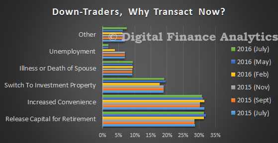
Having looked at first time buyers and investors, today we look at households already owning a property. One important group are down-traders. This segment, of more than 1.2 million households have an existing owner occupied property. Many will have paid down their mortgage, and will have enjoyed significant capital gains in recent years. Now they want to sell, and buy something smaller, and sometimes also an investment property.
There are two key drivers. First, one third are driver by a desire for more convenient living (perhaps a smaller or no garden, or a move into an apartment, or somewhere with better public transport and services). Next we find one third transacting in connection with planning for retirement. Around 20 per cent are looking to switch their investments into property, whilst others are dealing with the death of a spouse or other factors. In total this group is a very significant influence on the market, with an appetite for quality apartments.
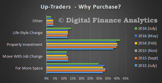
Next we look at up-traders. This is a significant, smaller, but important group, seeking to purchase a larger, and probably more expensive property. One third are driven by a desire for more space, but more – close to 45 per cent – are influenced by the prospect of capital appreciation, so a purchase is more an investment-related decision. Others are influenced by a life-style change, or a change in employment.
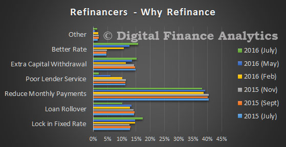
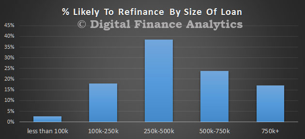
Then finally, we look at those seeking to refinance an existing loan. This is a large and significant group, which are being teased by ultra low rates and special offers. The most important reason to refinance is to reduce monthly payments, no surprise given flat income growth, and large loans. However, around 15 per cent are motivated by the opportunity to realise capital gains created by recent price growth. This flow of funds may go towards a holiday, building works, or other purchases, or to pay off other debts.
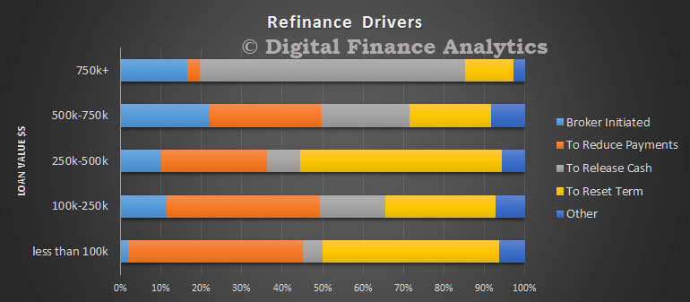
When we analyse the drive to refinance by loan size, we see that those with larger loans are more driven by cash release, whilst those with smaller loans are more concerned about reducing payments. We also note that brokers are more directly involved in the refinance of larger loans.
Typically, the refinanced loan will sit in the $250-500k range
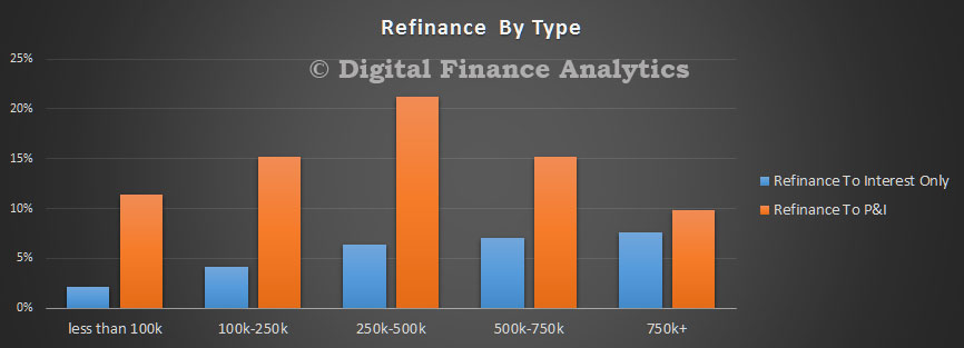
Finally, we found that larger loans, even now, were more likely to be refinanced to interest only, rather than a principal and interest loan.
This concludes the latest updates. We will continue to run the surveys, and we expect to publish the next edition of The Property Imperative, with the latest results, in September or October this year.
SMSF trustees have diversified away from international and domestic equities, instead favouring property investments and opting to hold more in cash reserves, according to the SuperConcepts SMSF Investment Patterns Survey.
An analysis of SMSF investment trends across the 2016 financial year shows investments in Australian shares reduced from 37.1 to 34.5 per cent of portfolios, while international shares decreased from 14.1 to 13.1 per cent.
SuperConcepts Executive Manager Technical & Strategic Solutions, Phil La Greca said the continued volatile markets could be driving the more cautious approach SMSF trustees are adopting.
“Over the financial year, we’ve seen a large number of SMSF trustees diversify away from international and domestic equities. At the same time, there’s been an increasing number of investors moving into property and cash, suggesting they are looking to reduce their exposure to the stock market, which experienced periods of higher volatility during the period.
“Despite the reduction in equity investments, there remains an opportunity for SMSF trustees to further improve diversification with a large number of portfolios still heavily weighted in Australian shares, particularly the ASX top 20 stocks. The major banks were the most commonly held investments at 30 June 2016,” he said.
The move to more conservative asset classes saw cash holdings increase from 17 to 18 per cent of portfolios over the financial year, despite cash interest rates continuing to decline.
“We’ve seen trustees increase the amount of cash they have invested in short-term term deposits, climbing from 4.7 to 5.5 per cent over the year. With current interest rates on term deposits providing little returns, the move to cash could mean investors are feeling less confident in the stock market,” Mr La Greca said.
Property, both direct and listed, has continued to prove a popular investment for SMSF trustees, increasing from 18.3 per cent of investments to 21.7 per cent at the end of the financial year.
Proposed changes to superannuation has appeared to impact confidence with a significant reduction in average contributions to an SMSF, dropping 38 per cent from the June quarter in 2015 to the June quarter in 2016.
“Average contributions to SMSFs declined over the financial year, particularly in the December, March and June quarters compared to previous corresponding periods, a likely result of the uncertainty around potential superannuation changes before the May budget. Contributions declined from $17,320 in June quarter 2015 to $10,748 in June quarter 2016,” Mr La Greca said.
The SuperConcepts SMSF Investment Patterns Survey covers approximately 3,300 funds, a sample of SMSFs administered by Multiport (part of the SuperConcepts group) and the investments they held at 30 June 2016. The assets of the funds surveyed represent approximately $3.1 billion.
Bjorn Jarvis, the Program Manager of the ABS’ Labour and Income Branch reported that almost 1.2 million people were receiving an income stream from their superannuation in 2013-14, at an average of $502 per week.
“Of that 1.2 million, about three quarters were aged 65 years or over and one quarter were between 55 and 64 (876,000 and 307,000, respectively),” said Mr Jarvis.
“This means just over one in four people aged 65 years and over (excluding those in nursing homes and retirement villages) were receiving a superannuation income stream in 2013-14, up from one in five in 2003-04.”
Mr Jarvis also said that in 2013-14, 420,000 people reported they had withdrawn a lump sum from their superannuation in the previous two years. Half were for amounts less than $25,000.
“Three quarters of people used the lump sum to invest in their home, make other investments, buy or pay off a vehicle, or to pay off outstanding debts. For the other one quarter, the most commonly cited reasons were for holidays, followed by general living and medical expenses,” said Mr Jarvis.
The number of people with some superannuation and the average value of their accounts have both grown in the 10 years to 2013-14.
In 2003-04, around two–thirds (64 per cent) of people aged 15 years and over, had superannuation. By 2013-14, this had risen to 71 per cent, with about 85 per cent of people aged 25 to 54 years having superannuation. For people with superannuation, the average value of their accounts increased in real terms from $68,000 to $110,000.

Edinburgh’s Royal Mile. Andy Ramdin, CC BY-SA