We have just finished updating our household surveys, and over the next few days we will be running through some of the key findings which in due course will flow into the next edition of the Property Imperative.
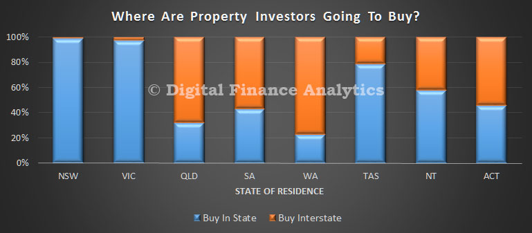
We start with an observation which, is at one level completely logical, yet at another level is surprising. We have been asking prospective property investors whether they are planning to purchase in the next twelve months, as usual. There is still strong appetite, thanks to strong returns, tax incentives and low interest rates. However, we have also asked about which state they were expecting to purchase in, and we have found some significant variations across the states. We conclude that NSW and VIC are investment property honeypots, attracting both local and interstate interest, especially from WA. Another reason why prices are on the rise here.
The first chart shows the relative proportion of property investors in each state, who expect to purchase in their home state. Almost all NSW based investors are expecting to buy in NSW, and those in VIC, mainly in VIC. But there are more residents in QLD, SA, ACT and WA who are expecting to buy interstate than in their home states.
We then asked those considering interstate transactions, to identify their likely target state. In NSW, the small number considering interstate investment picked VIC, whilst residents in VIC going interstate will pick NSW. Across the other states, the majority of those seeking investments interstate will pick NSW, or second VIC. A smaller number would also select ACT. These three states captured the bulk of the interstate attention.
Finally, we asked about the drivers of this decision. The prime driver related to increased capital returns, a larger property market, lending criteria and rental returns.
So, we can conclude that demand in NSW and VIC for investment property is heightened by interested interstate investors who are attracted by the higher returns in these two states. Further evidence of the two speed housing market.
Poverty in Australia has declined, welfare reliance has stabilised and long-term poverty is becoming rare – but overall economic wellbeing is no longer improving, and households wealth has remained static, despite rising property prices, according to Australia’s most respected longitudinal study of economic wellbeing.
And there is a rapidly growing wealth divide between generations, with median wealth increasing by 61% among people aged 65 and over, compared to just 3.2% among people aged 25 to 34, since 2001.
This is the picture from the latest statistical report of the Household, Income and Labour Dynamics in Australia (HILDA) Survey, collected by the Melbourne Institute of Applied Economic and Social Research. Collected every year, HILDA is Australia’s only nationally representative household longitudinal study, and has followed the same individuals and households since 2001.
Stagnating household incomes and wealth
Perhaps best summarising the experience of Australian households since 2001 is the path taken by median income, shown in the figure below. The HILDA data shows that in the early years of this century, the median household income (after taxes, and adjusted for both inflation and household size) grew strongly.
However, since 2009 growth has stalled, with the median income stagnating at approximately $45,000.
HILDA data on household wealth, collected every four years since 2002, shows a somewhat similar pattern. Median household wealth grew strongly between 2002 and 2006, but has since grown very little – despite continued increases in house prices.
Measures of average economic wellbeing of Australian householdsHILDA Survey, Release 14.0
In some respects, Australia has handled this slowdown quite well. There has been relatively little change in income inequality since 2009, and measures of poverty have actually declined slightly in recent years. For example, the percentage of the population with an income less than half the median income was 10.3% in 2014, down from its 2007 peak of 13%.
Decline in welfare reliance
Furthermore, while HILDA shows that the large decline in welfare reliance among working-age people between 2004 and 2008 was arrested by the 2008 global financial crisis, welfare reliance has increased only slightly since 2008.
Nonetheless, it is clear that overall economic wellbeing is no longer advancing as it was prior to the global financial crisis. Financial pressures have also increased for families using child care and for those with private health insurance. These markets have experienced substantial real price increases, effects of which have been exacerbated by government policies which in recent years have acted to reduce subsidies.
HILDA correspondingly shows that households’ expenditure on these items has been rising faster than their incomes.
Winners and losers
There are, moreover, some concerning trends evident in the HILDA wealth data. The proportion of adults who are home owners has declined from 57% in 2002 to less than 52% in 2014, and on current trend will be below 50% by next year. There is an important intergenerational dimension to this decline: home ownership has declined from 39% to 29% among people aged 25 to 34, from 63% to 52% among people aged 35 to 44, and from 76% to 67% among people aged 45 to 54. There has been almost no decline in home ownership among older age groups.
Associated with this, but also strongly connected to changes in superannuation holdings and to a lesser degree, investment property ownership, has been a growing divide in wealth between the young and old.
Between 2002 and 2014, median wealth grew by 39% among people aged 55 to 64 and by 61% among people aged 65 and over. By contrast, median wealth grew by only 3.2% among people aged 25 to 34, 7.4% among people aged 35 to 44 and 10.8% among people aged 45 to 54.
HILDA also shows that particular groups in the community have continued to experience high rates of disadvantage over the entire period since 2001. Most notably, people with disability, poor general health or poor mental health have not fared well economically, and poverty rates among children living in lone-parent households have consistently been above 20%.
Long-term disadvantage
The longitudinal nature of the HILDA data further provides important insights into the prevalence and determinants of persistent or long-term disadvantage. Long-term poverty is in fact relatively rare, with 85% of poverty spells lasting three or fewer years.
That said, poverty is considerably more likely to be long term for people with disability, Indigenous people, immigrants from non-English speaking countries, the elderly, single people, people living in rural areas, and people with low levels of education.
Perhaps most surprising are HILDA’s findings on welfare reliance over the longer term. While only around 18% of people aged 18 to 64 receive income support payments in any given year, nearly 45% of people in this age range received income support at some stage in the 14 years to 2014.
Indeed, nearly 70% of all working-age people were at some stage in a household that received income support payments. Contact with the welfare system is therefore very high, but is typically only for relatively short periods, suggesting the welfare system in many cases works as a temporary safety net rather than as a long-term income source.
In 2014, new questions on “material deprivation” were included in the HILDA Survey to provide more direct information on the groups in the community faring worst economically. Among the findings were that 12% of households did not have $500 in savings for an emergency, 8% did not have home contents insurance because they couldn’t afford it, and 5% could not afford dental treatment when needed.
Consistent with findings using more traditional income-poverty measures, rates of deprivation were found to be highest among lone-parent families, Indigenous people and people with severe disabilities.
The more direct material deprivation approach does reveal, however, that the elderly have very low rates of deprivation, despite having high rates of income poverty. This suggests that income needs are lower for the elderly, for reasons such as their high rates of (outright) home ownership.
Implications for future policy
The detailed picture of the economic lives of Australians that is provided by the HILDA Survey is necessarily somewhat complicated. It is nonetheless clear that the current trajectories of income and wealth are in general much lower than in the early years of this century.
The HILDA Survey data suggest that the effects of this slowdown have to date been relatively equitably distributed, notwithstanding some concerns about trends in the wealth distribution. Of course, there is no guarantee that this will continue to be the case in future, particularly in the context of the need to reduce the government deficit.
The form that deficit-reduction policies take will be profoundly important to the distribution of economic wellbeing over coming years.
Author: Roger Wilkins, Professorial Research Fellow and Deputy Director (Research), HILDA Survey, Melbourne Institute of Applied Economic and Social Research, University of Melbourne
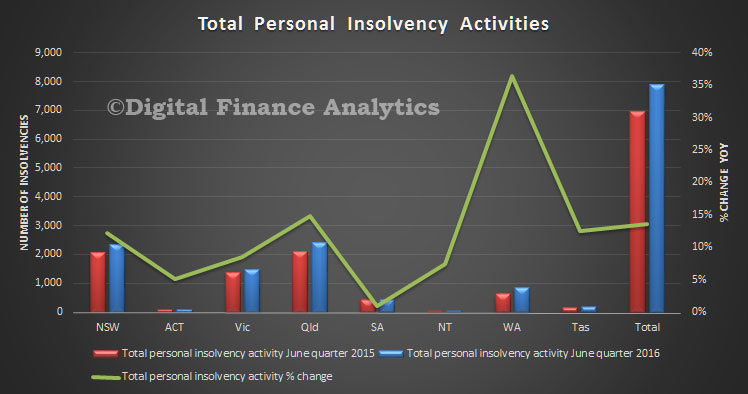
The Australian Financial Security Authority today released the personal insolvency activity statistics for the June quarter 2016. Total personal insolvencies increased 13.7% in the June quarter 2016 compared to the June quarter 2015. This is the largest rise since the March quarter 2009, when compared to the same quarter in the previous year. WA is worst hit with a 35% year on year rise.
In the June quarter 2016, economic conditions (465 debtors) was the most common business related cause whilst unemployment or loss of income (2,138 debtors) and excessive use of credit (2,132 debtors) were the most common non-business related causes.
By type of personal insolvency, bankruptcies increased by 7.0%, debt agreements increased by 24.3% and personal insolvency agreements were stable (0.0%).
Debt agreements in the June quarter 2016 are the highest on record, with 3,329 debt agreements. The previous record was in the September quarter 2015 (3,081 debt agreements).
Debt agreements reached record highs in New South Wales, Queensland and Western Australia in the June quarter 2016.
In the June quarter 2016, 17.5% of debtors entered a business related personal insolvency. This is a rise from 16.1% in the March quarter 2016 and from 16.3% in the June quarter 2015.
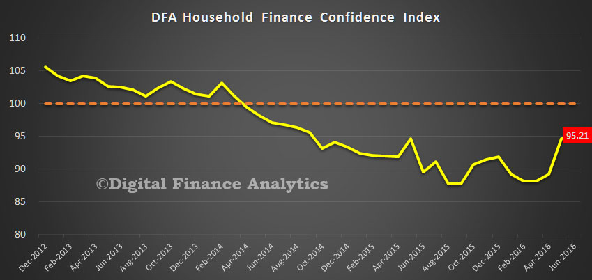
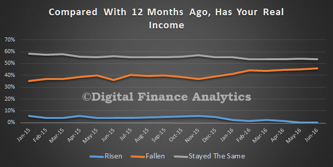
The latest edition of the Digital Finance Analytics Household Finance Confidence Index to end June is released today. Overall confidence improved again, to 95.21, although this is still below the long-term neutral score of 100 which we fell below in 2014.
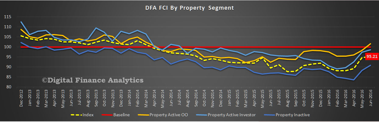
Despite Brexit, the indecisive election result, and stock market volatility, the average financial confidence all household split by property segments improved, with property active owner occupied households now above neutral, thanks to ever lower mortgage interest rates, and positive news on home prices in the major states of NSW and VIC. Property inactive households were a little more positive too, thanks to rental increases being contained and food costs down a little. Property investors are also positive, thanks to lower interest rates, and better access to mortgage funds at good prices. Intention to purchase property has improved, thanks to continued capital gains, lower mortgage funding costs and net perceived better returns than stocks or deposits. Future price growth expectations also rose.
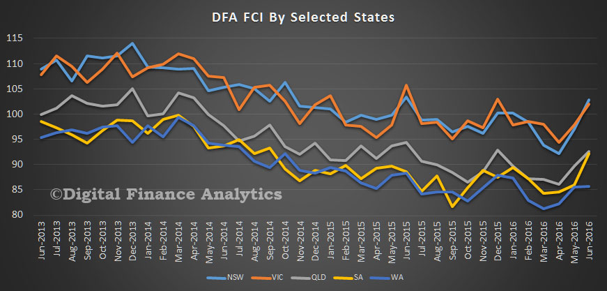
The state variations are quite stark however, with NSW and VIC improving strongly, whilst WA languishes, thanks to flatter home prices, and rising unemployment. Variations across the regions were even more extreme.
Income, in real terms, continues to fall for many. Those reliant on interest from bank deposits were hardest hit, with average rates for many falling. Further drops in returns on deposits will force many to consider alternatives, including property.
By way of background, these results are derived from our household surveys, averaged across Australia. We have 26,000 households in our sample at any one time. We include detailed questions covering various aspects of a household’s financial footprint. The index measures how households are feeling about their financial health. To calculate the index we ask questions which cover a number of different dimensions. We start by asking households how confident they are feeling about their job security, whether their real income has risen or fallen in the past year, their view on their costs of living over the same period, whether they have increased their loans and other outstanding debts including credit cards and whether they are saving more than last year. Finally we ask about their overall change in net worth over the past 12 months – by net worth we mean net assets less outstanding debts.
Young people, job creation and taxation have all been at the centre of the federal election campaign; yet almost nothing has been said about one of the sleeper issues these have in common – the cash-in-hand economy.
Youth unemployment is typically twice the national unemployment rate. Millennials are finding it harder to secure full-time work after leaving university. Shockingly, Australians aged 15-24 are at the highest risk of hospitalisation following a workplace accident.
However, there is another risk young people face that we know surprisingly little about.
A rose by any other name?
“Cash-in-hand” is a familiar phrase in our economy. Like most shady dealings, it goes by many names: unreported employment, the informal economy, or a grey labour market. Whatever we call it, it is used to circumvent Australian workplace and taxation legislation.
This should not be confused with being paid in cash. For example, let’s say an employer wanted to reduce their expenditure on transaction fees. They could add up an employee’s hours, calculate wages for the week minus tax, superannuation and other deductions. The adjusted wages could then be paid straight from the till, accompanied by a payslip.
The tell tale signs of a “cash-in-hand” job are a lack of formal employment paperwork, such as signed contracts, weekly payslips or a group certificate at tax time.
There are obvious downsides. These jobs are unlikely to pay the correct minimum wage, penalty rates, or super contributions. A greater concern is these jobs aren’t covered by workers compensation. Considering the previously mentioned risk of hospitalisation, cash-in-hand jobs become a serious concern.
Who, what and why?
The most concerning aspect is that so little data is being collected about these jobs.
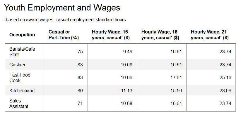
A 2012 survey found that one in four young workers had recently done cash-in-hand work. While no concrete data exists on where these jobs are being offered, we can make some educated guesses.
The figure above was created by selecting the top five jobs where the average age of employees was between 15-21. This gives us the most common industries for young Australians: fast food, hospitality, and retail.
Figure 2 ‘Participation in education and/or employment among young people aged 15 to 24, by age group, 2005 and 2014’Australian Institute of Health and Welfare analysis of ABS 2015
We know that approximately 899,000 young people are both working and studying. However, 229,900 are receiving study payments, at a maximum rate of $216.60 per week with the ability to earn an additional $216.50. This puts the maximum payment as $433.10 – just over $30 above the poverty line. Let’s use some hypothetical examples, and say that “Julie” and “Ravi” are two of these student workers.
Julie is 18 and works casually at a local cafe in Brunswick while studying at the University of Melbourne. To maximise her earnings, she works 13 hours during the week at $16.61 an hour. This gives her $215.80, combined with her Austudy payments for a total of $432.40 per week.
Ravi is a 21 year old international student. He is studying for his Masters at Deakin University and works at a supermarket in Burwood, near the house he and his brother share. His rent and expenses are comparable, but he cannot receive Austudy. His Visa states that he can only work 20 hrs a week, giving him a maximum income of $459.64 after tax. After accounting for expenditure, Ravi is a little better off with $92.13 to cover other expenses.
Neither example accounts for business cycle/seasonal demands, parental income affecting payments, unexpected expenses, legal fees, health costs, or textbooks. Basic living costs account for 80-87% of their entire wage.
If either student faces costs that can’t be met by their usual wages, they may consider “cash-in-hand” work the only viable alternative. Julie will still get her Centrelink payments, and Ravi won’t breach his visa requirements.
What we don’t know could hurt us
The risks of this informal economy extend well beyond young workers. Professor Christopher Bajada estimates that cash-in-hand jobs make up a informal economy equivalent to 15% of Australia’s GDP. Similarly, in 2004 the government estimated the informal economy between 3-15%.
Even if we take the lowest estimate of 3% of GDP, that’s approximately AUD$48.6 billion outside our economy. A 2012 comprehensive report produced by The Australia Institute estimates a staggering $3.3 billion of revenue is being lost to cash-in-hand working arrangements. Given that taxation, debt and public spending have become key election battlegrounds, this lost revenue is potentially game changing.
Author: Shirley Jackson, PhD Candidate in Political Economy, University of Melbourne
CoreLogic’s latest – population growth slows nationally but New South Wales and Victoria attract a record high proportion of the population increase.
Demographic data for the December 2015 quarter was released by the Australian Bureau of Statistics yesterday.
At the end of 2015, the national population was estimated to be 23,940,278 persons having increased by 1.4% or 326,073 persons over the year. Although the population continues to increase at a fairly rapid pace, the rate of population growth has been trending lower since it peaked at 2.2% over the year to December 2008.
Nationally, population growth is driven by two factors: migration and natural increase (births minus deaths). Over the 12 months to December 2015, the national population increased by 148,935 persons due to natural increase and by 177,138 persons due to net overseas migration. Net overseas migration has increased a little over the quarter but has fallen dramatically since it peaked at 315,687 persons over the 12 months to December 2008. Natural increase is -1.0% lower over the year while net overseas migration is -0.5% lower.
Looking at state population data, New South Wales and Victoria have recorded the greatest increases in population over the past year, up by 106,116 and 109,830 persons respectively. Across the other states and territories the annual population increases have been recorded at: 59,714 persons in Queensland, 11,180 persons in South Australia, 30,980 persons in Western Australia, 2,110 in Tasmania, 840 persons in Northern Territory and 5,271 persons in the Australian Capital Territory. The above chart shows the rate of population growth over the year and it shows that not only has Victoria seen the greatest increase in population over the year it also has the fastest rate of growth of all states and territories.
Over the past year, Victoria has accounted for 33.7% of the total increase in the national population (more than a third) which is a record-high for that state. Elsewhere, South Australia accounted for 3.4% of national population growth (lowest since March 2002) and Western Australia accounted for 9.5% of population growth (lowest since December 2002). The above chart highlights that historically either New South Wales or Queensland has typically accounted for the highest proportion of population increases. Since the financial crisis, New South Wales and Victoria have accounted for increasing proportions of national population growth due to their stronger economies and the subsequent lure of job opportunities in Sydney and Melbourne.
At the state level there are two components of migration; net overseas migration and net interstate migration. It is important to look at how the trends across each category of migration impact on population growth in each state.
Throughout 2015 almost three quarters of net overseas migration occurred in either New South Wales (38.6%) or Victoria (34.2%). The chart shows that annual net overseas migration to New South Wales and Victoria is continuing to rise (albeit at a moderate pace) but is falling elsewhere. The 34.2% of national new overseas migration for Victoria over the year was a record-high. Queensland accounted for just 11.0% of net overseas migration over the year, its lowest share since March 1991 and well below the 20.1% of national net overseas migration the state attracted in March 2009. Western Australian net overseas migration accounted for just 8.2% of national net overseas migration, a far cry from its recent peak of 23.9% in September 2012. As the mining boom has faded and the New South Wales and Victorian economies have strengthened over recent years, more migrants have been choosing to settle in these two states and fewer are settling in Queensland and Western Australia.
Victoria and Queensland are the only two states that have recorded positive net interstate migration over the 2015 calendar year with net interstate migration cancelling itself out at a national level. Over the year, net interstate migration was recorded at +13,049 persons in Victoria, which is an historic high. In Queensland, following a long decline in net interstate migration, the number of migrants crossing to border into Queensland has started to turn, recorded at +8,326 over the past year its highest level since March 2013. Across the other states and territories, the losses from net interstate migration have been recorded at: -8,749 in New South Wales, -4,967 in South Australia, -4,313 in Western Australia, -79 in Tasmania, -2,732 in Northern Territory and -535 in Australian Capital Territory. The net outflow in New South Wales is the largest since March 2014, South Australia’s outflow is the greatest since September 1996 and Western Australia’s outflow is the greatest on record. Tasmania’s net outflow is the lowest since June 2011, the Northern Territory’s is the lowest since December 2013 as is the Australian Capital Territory’s.
Although population growth is continuing to trend lower, it is becoming more evident that growth is much greater in the states with stronger economies (NSW and Vic). It is clear that the economic strength of a state is key to attracting more residents not just domestically but also internationally. It also looks that as housing becomes increasingly unaffordable in the two capital cities of NSW and Vic, interstate migration into Queensland (the third largest state) is beginning to pick-up again. I would suggest this is being driven by an improving employment market accompanied by a much more affordable housing market.
The more up-to-date overseas arrivals and departures data indicates that net overseas migration is likely to continue to slow over the coming quarters.
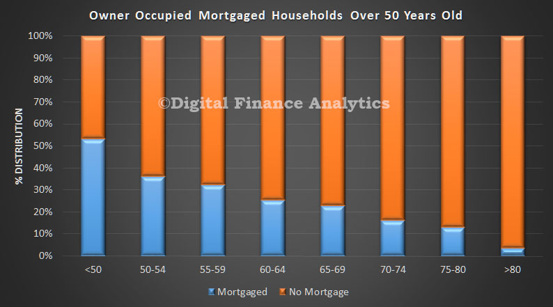
Data from ING DIRECT reveals that Australians are increasingly taking property debt into their retirement years, with the number of over 65 year olds still holding a mortgage rising by 28 per cent in the past three years. This finding aligns with data from our own surveys, as shown in this data extract from DFA analysis of owner occupied loans held by those over 50.
Of those in their retirement years that still have a mortgage, 26 per cent hold an investor loan while 74 per cent are owner occupiers. The average debt they are holding is $158,000.
Mark Woolnough, Head of Third Party Distribution at ING DIRECT commented: “As property prices climb and people wait longer to get onto the property ladder, it’s not a surprise that people are holding their home loan debt later in life. However, proper planning is critical to make sure that this debt doesn’t cause stress in later years and people can enjoy the retirement they have worked hard for.”
According to ING DIRECT’s Autumn Buyers Guide, since June 2012 the average capital city residential property has increased in value by 32 per cent, with growth of 7.6 per cent in the past 12 months alone. The average age of a home buyer has also risen in recent years to 38.
Mr Woolnough added: “We talk about superannuation and property as the barbells of a person’s financial lifecycle – in most cases they are the two biggest investments that a person will ever make.
“Research has shown us that people are very open to discussing broader financial needs when they are sourcing a mortgage, such as their superannuation, and brokers are in a great position to encourage and support their clients to consider and sort their super in light of this growing property debt trend.”
The analysis is based on ING DIRECT’s own customer base. ‘Retirement years’ considers those customers aged between 65 and 79.
Over the last 25 years, home ownership rates have fallen sharply for young Australians. Between 1982 and 2011, the home ownership rate for young adults aged 25 to 34 years dropped from 56% to 34%. Growing concerns about their home ownership prospects have prompted those in Generation Y (defined as 18-35 years for the purposes of this article) to become increasingly vocal about the difficulties of achieving home ownership.
The vast majority (86%) of Gen Y households living in the private rental sector or with their parents aspire to own a home, although not necessarily in the short term. Of these households, 30% believed they would be able to buy a home in the next two to five years. One-quarter believed home ownership was five to ten years away. Only 6% did not believe they would ever be able to buy a home.
Although many are choosing to delay home ownership as a lifestyle choice, others are forced to delay because of a lack of affordable housing options. Across all age groups, home owners were more likely to perceive their housing as affordable.
The survey reported that those living in unaffordable housing were making significant sacrifices to meet their housing costs. And 55% said sustaining high housing costs was leading to mental health issues, with those most affected in the private rental sector. This highlights the importance of affordable housing.
The ‘bank of mum and dad’
The deposit gap is the biggest barrier to home ownership. The survey calculated the average gap between the deposit currently available to an individual and the amount the individual expected to need for home purchase. This gap was around A$50,000.
Among Gen Ys already in home ownership, 38% reported they had received financial assistance from their parents or grandparents. For those yet to enter home ownership, only 17% expected to receive some assistance to buy. A further 24% indicated help might be offered.
Therefore, almost 60% of Gen Ys surveyed are unlikely to receive the benefit of intergenerational assistance. This may prevent them from ever entering home ownership.
Parental assistance to purchase
Housing opportunities for ‘Generation Rent’
Assistance for home purchase is becoming more and more important for Gen Ys. They are being dubbed “Generation Rent” as the Great Australian Dream of home ownership moves further out of their reach.
Among Gen Y survey respondents, three-quarters rated the First Home Owner Grant and stamp duty relief as being important in helping them into home ownership. Even the scrapped first home saver accounts scheme was viewed as important. The generation is becoming increasingly reliant on these volatile demand-side incentives.
Importance of government assistance
So what can be done to help those who wish to enter home ownership but lack financial support? Government-backed low-deposit loans such as Keystart in Western Australia and Homestart in South Australia, which are designed for those on low to moderate incomes, have made a real difference to thousands of households. Although not without risk to government, these type of loans could be introduced in other states.
Shared ownership products enable the purchaser and a third party to share ownership of the dwelling, which reduces deposit requirements and monthly payments. These are successful in the UK, accounting for 18% of total housing stock, and are growing in popularity in Australia under the schemes noted above. There may be scope for community housing providers to step into this sector in partnership with private developers.
Discounted home ownership is another option. This option could be tied to developer contributions as part of inclusionary zoning requirements. However, it must be structured in a way that ensures any discount on the market price is retained in perpetuity.
The National Rental Affordability Scheme had its critics but at least provided a supply of affordable housing that reduced the rental burden for many households. That, in turn, increased their chances of saving for a deposit.
The rental sector is in dire need of a replacement scheme, which could possibly be enhanced using a model whereby investors offering new rental dwellings below market rents for a defined period are eligible for stamp duty relief. The argument will be raised that this will encourage demand from investors, raising prices.
It is more critical than ever for government to implement meaningful structural reforms that improve home purchase affordability for Generation Y. Otherwise, growing numbers of Gen Ys all over Australia face a lifetime of renting without the financial and emotional security of home ownership.
Authors: Steven Rowle, Director, Australian Housing and Urban Research Institute, Curtin Research Centre, Curtin University;Amity Jame, Senior Research Officer, Curtin Business School, Curtin University;Rachel On,Deputy Director, Bankwest Curtin Economics Centre, Curtin University
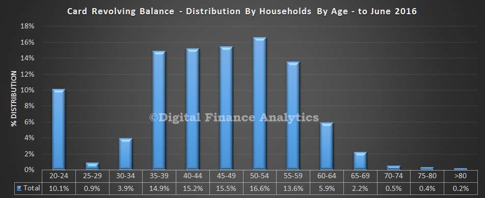
Following the US card data analysis we reported this morning, we have been looking at the situation among Australian households by using data from our household surveys. We extracted the average revolving balance data from our surveys, and mapped this first to household age bands. We find that the largest proportion of debt are found in households aged 50-54, and more generally, older households have more debt, similar to the US findings. The spike in the 20-24 age bands is explained by young households yet to own a property, and often living with parents, or in shared accommodation, with larger spending appetites.
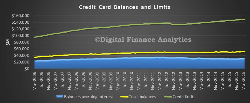
Data from the RBA also shows that nationally, whilst credit limits have steadily increased, the total balances accruing interest have not.
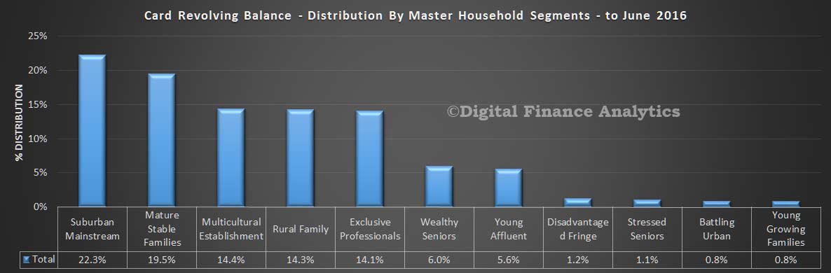
We also looked at households by our master segments, and found that most debt sits with our suburban households. These are relatively stable households, but not the most affluent. Stressed households, relatively, hold lower debt balances.
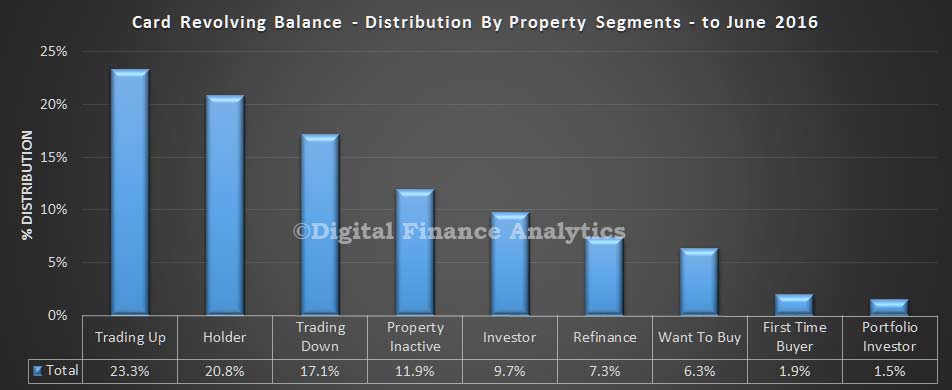
This is confirmed by looking at households by our property segmentation. The highest debt distribution is found in households looking to trade up, hold property, or trade down. These groups have significant assets behind them. Other groups, including first time buyers have lower debt balances.
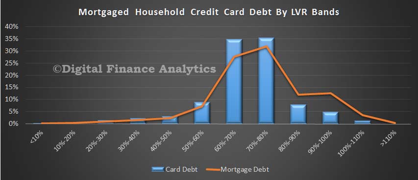
In our final piece of analysis, we looked are credit card debt distribution by the loan to value of those with mortgages. We found the largest debt levels reside in LVR bands between 60-80%, where the same is true of mortgage balances. So, we can see a correlation between LVR bands and credit card revolving debt.
So, overall we conclude that older households, especially with a mortgage hold the highest card balances, and that card lending is intrinsically connected with home lending.
Australia has always lauded its working class culture, and the subsequent rise of the middle class, but the very nature of society is changing dramatically. In fact, we’re currently experiencing the biggest gap in wealth the country has ever seen.
New research by social researchers McCrindle, based on the latest analysis of the Australian Bureau of Statistics wealth and income data, breaks down the annual household income by quintiles of two million of Australia’s 10 million households. While the average household earns just over $107,000 annually, the top 20% earns more than twice that amount while the bottom 20% take home around one-fifth of the average at just . In other words, the wealth of the highest quintile households on average is 71 times that of the lowest quintile households.
Using the Gini coefficient measure of income spread — with 0 being perfect equality and 1 being total inequality — Australia is facing the most unequal level ever seen, at 0.446 compared to 0.417 in the mid 1990s. In the 20 years since, average household gross incomes have increased 60% from $66,196 to $107,276 today, while over the same period, incomes of the highest quintile have increased by 74% from $149,552 to $260,104. The details are below.

 We then asked those considering interstate transactions, to identify their likely target state. In NSW, the small number considering interstate investment picked VIC, whilst residents in VIC going interstate will pick NSW. Across the other states, the majority of those seeking investments interstate will pick NSW, or second VIC. A smaller number would also select ACT. These three states captured the bulk of the interstate attention.
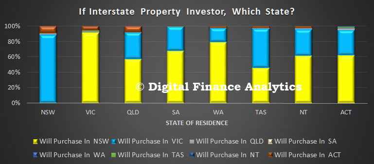 Finally, we asked about the drivers of this decision. The prime driver related to increased capital returns, a larger property market, lending criteria and rental returns.
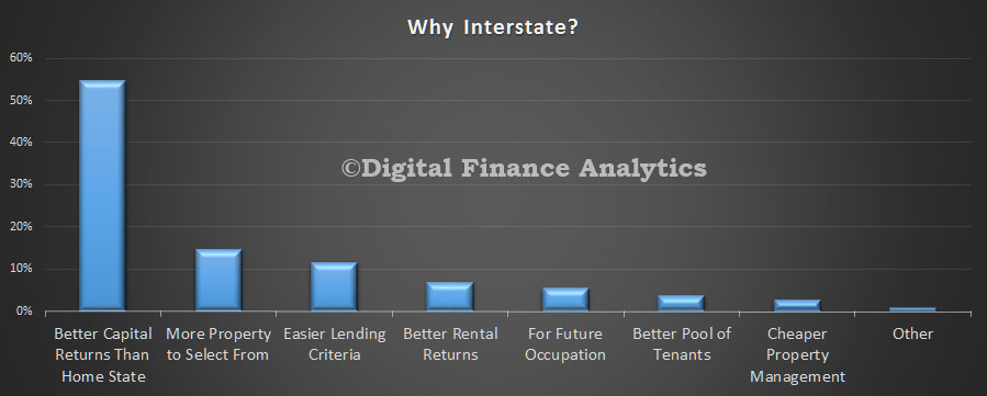 So, we can conclude that demand in NSW and VIC for investment property is heightened by interested interstate investors who are attracted by the higher returns in these two states. Further evidence of the two speed housing market.