We have been busy adding in new functionality to our Core Market Model, which is our proprietary tool, drawing data from our surveys and other public and private data sources to model and analyse household finances.
We measure mortgage stress on a cash flow basis – the October data will be out next week – and we also overlay economic data at a post code level to estimate the 30-day risk of default (PD30). But now we have added in 90-day default estimates (PD90) and the potential value which might be written off, measured in basis points against the mortgage portfolio. We also calibrated these measures against lender portfolios.
So today we walk though some of the findings, and once again demonstrate that granular analysis can provide a rich understanding of the real risks in the portfolio. Risks though are not where you may expect them!
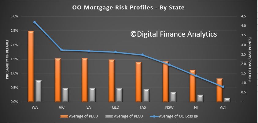
First we look risks by by state. This chart plots the PD30 and PD90 and the average loss in basis points. WA leads the way with the highest measurement, then followed by VIC, SA and QLD. The ACT is the least risky area.
So, looking at WA as an example, we estimate the 30-day probability of default in the next 12 months will be 2.5%, 90-day default will be 0.75% and the risk of loss is around 4 basis points. This is about twice the current national portfolio loss, which is sitting circa 2 basis points.
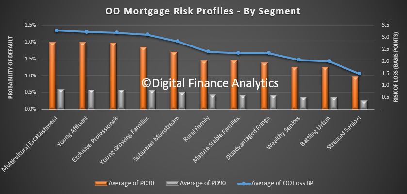
 Turning to our master household segmentation, we find that our Multicultural Establishment segment has the highest basis point risk of loss, at around 3 basis points, followed by Young Affluent, Exclusive Professionals and Young Growing Families. This immediately shows that risk and affluence are not totally connected. In fact our lower income groups, are some of the least risky. The PD30 and PD90 follows this trend too.
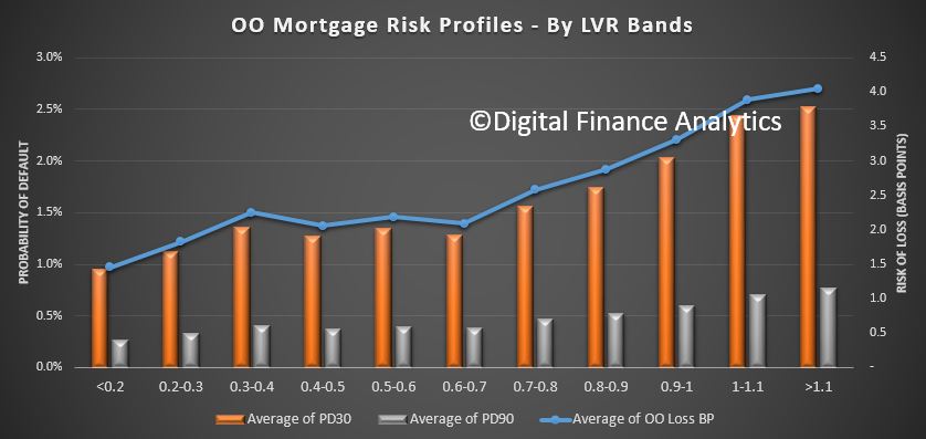
 The Loan to Value bands show some correlation to risk, although the slope of the curve is not that aggressive, indicating that LVR as a risk proxy is not that strong. This is because in a rising market, LVRs will rise automatically, irrespective of serviceability.
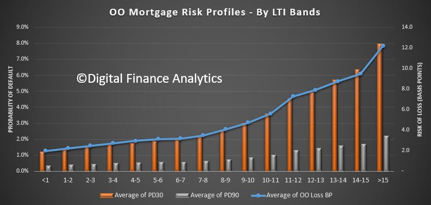
 A more sensitive measure of risk is Loan To Income (which APRA mentioned yesterday for the first time!). Here we see a significant rise in risk as LTI rises. Above 6 times income the risk starts to rise, moving from around 3 basis points, to 6 basis points at an LTI of 10, and 12 basis points at an LTI of 15+. So rightly LTI should be regarded as the leading risk indicator, yet many lenders are yet to incorporate this in their models. It is better because in the current flat income environment, income ratios are key.
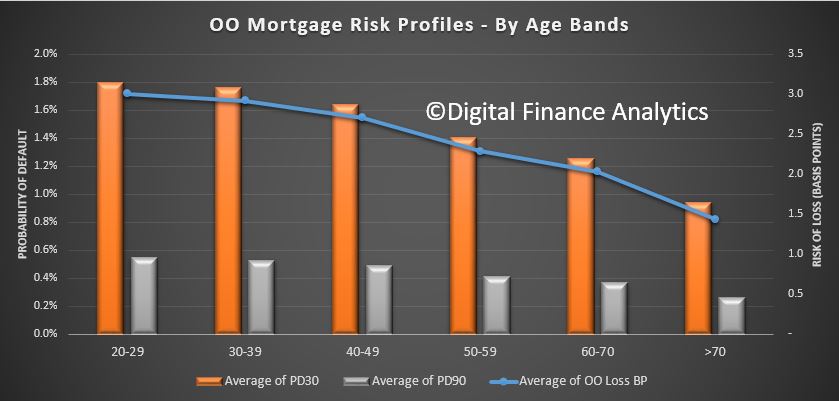
 Age is a risk indicator too, with households below 40 showing a higher risk of loss (3 basis points) compared with those over 50 (2.25). Even those into retirement will still represent some level of risk.
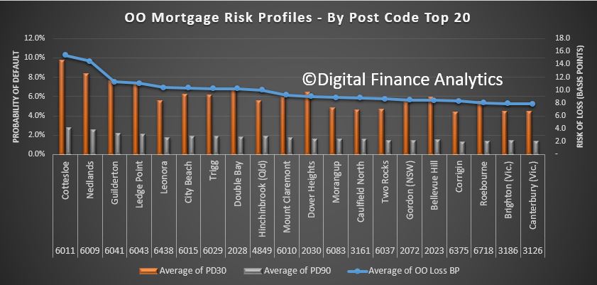
 Finally, and here it gets really interesting, we can drill down into post codes. We plotted the top 20 most risky post codes across the country from a basis points loss perspective. What we found is that in the top 20 there is a high representation of more affluent post codes, especially in WA, with Cottlesloe, Nedlands and City Beach all registering. We also find places like Double Bay and Dover Heights in Sydney, Hinchenbrook in QLD and Caulfield in VIC appearing. These are, on a more traditional risk view, not areas which would be considered higher risk, but when we take the size of the loans and cash flows into account, they currently carry a higher risk profile from an absolute loss perspective.
 So, we believe the time has come for more sophisticated, data driven analysis of mortgage risks. And risks are not where you might think they are!

One thought on “Getting Deep and Dirty On Mortgage Risk”