After nearly a half century of unlimited dollar creation, multiple bubbles and busts…the current asset reflation has been the most spectacular…but alas, perhaps too successful.
The Fed’s answer to control or restrain this present reflation is raising interest rates to stem the flow of business activity, lending, and excessive leverage in financial markets. But in the Fed’s post QE world, a massive $2 trillion in private bank excess reserves still waits like a coil under tension, ready to release if it leaves the Federal Reserve. Thus, the only means to control this centrally created asset bubble is to continuously pay banks higher interest rates (almost like paying the mafia for protection…from the mafia) not to return those dollars to their original owners or put them to work. With each successive hike, banks are paid another quarter point to take no risk, make no loan, and just get paid billions for literally doing nothing.
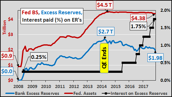
The chart below shows the nearly $4.4 trillion Federal Reserve balance sheet, (acquired via QE, red line), nearly $2 trillion in private bank excess reserves (blue line), and the interest rate paid on those excess reserves (black line). While the Fed’s balance sheet has begun the process of “normalization”, declining from peak by just over a hundred billion, bank excess reserves have fallen by over $700 billion since QE ended. So what?
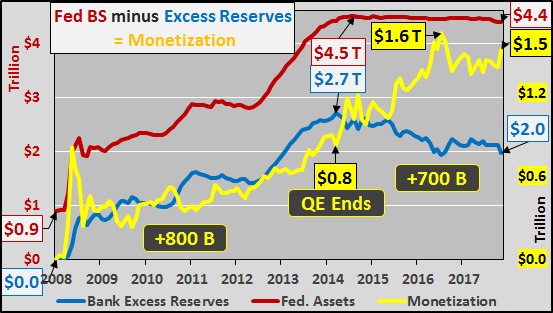
The difference between the Federal Reserve balance sheet and the excess reserves of private banks is simply pure monetization (the yellow line in the chart below). This is the quantity of dollars that were conjured from nothing to purchase Treasury’s and mortgage backed securities from the banks. But instead of heading to the Fed to be held as excess reserves, went in search of assets, likely leveraged 2x’s to 5x’s (resulting anywhere from $3 trillion to $7.5+ trillion in new buying power).
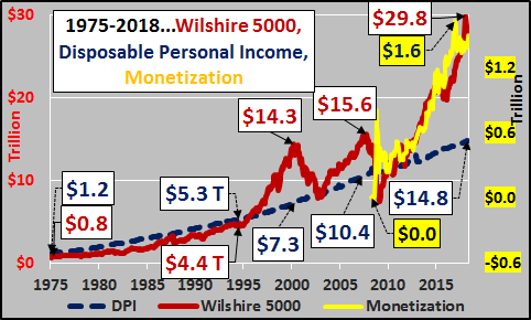
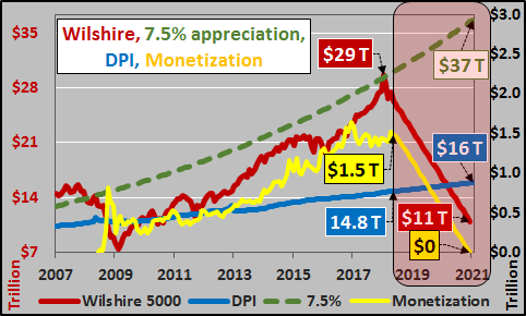
From world war II until 1995, equities were closely tied to the disposable personal income of the American citizens (DPI representing total annual national income remaining after all taxation is paid, blue line). However, since ’95 lower and longer interest rate cuts have induced extreme levels of leverage and debt. The Fed actions have created progressively larger asset bubbles more divergent from disposable personal income at peak…but falling below DPI during market troughs. But after the ’07 bubble, the pure monetization found its way into the market with spectacular effect. As the chart below shows, the Wilshire 5000 (representing the market value of all publicly traded US equities, red line) has deviated from the basis of US spending, US total disposable income (the total amount of money left nationally after all taxes are paid, blue line).
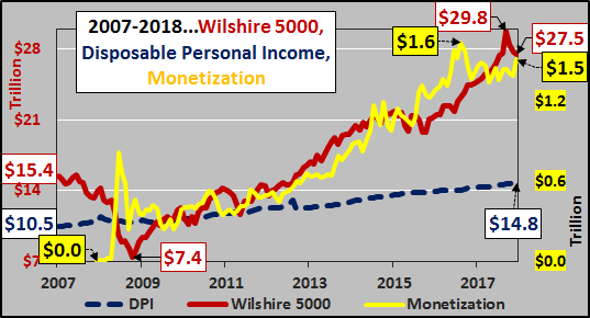
In the chart below, the growth in monetization has acted as a very nice leading indicator for equities. As each successive pump of new money left the Federal Reserve and entered found its way to the market in search of assets, assets subsequently reacted. Likewise, each drawdown in monetization saw a similar pullback in equities.
What happens next? The Federal Reserve plans to systematically reduce its balance sheet via raising interest rates on excess reserves. This is to incent and richly reward the largest of banks to maintain these trillions at the Federal Reserve. As the chart below shows, theoretically this means the monetized money is set to continue evaporating, and assuming it was highly levered, then the unwind and volatility of deleveraging should only continue to worsen.
And…if the Federal Reserve is true to its word and even halves its balance sheet while banks maintain the excess reserves at the Fed, then all the digitally conjured $1.5 trillion is set to be “un-conjured”. Again, assuming the monetized monies were at least somewhat levered, the unwind of that leverage will continue to produce a chaotic and volatile slide in markets. As the chart below suggests, if US equities (and broader assets) follow the unwind of the monetization, then equities are likely on their way back down to and through their natural support line, disposable personal income. Conversely, I’ve included the 7.5% long term anticipated market appreciation for reference (green dashed line). Quite a spread between those differing views on future asset valuations.
Of course, the “data dependent” Fed could change its mind, or perhaps banks will continue to pull those excess reserves and put them to work (with growing leverage) rather than take the risk-free money from the Fed…either way this is something worth watching.


