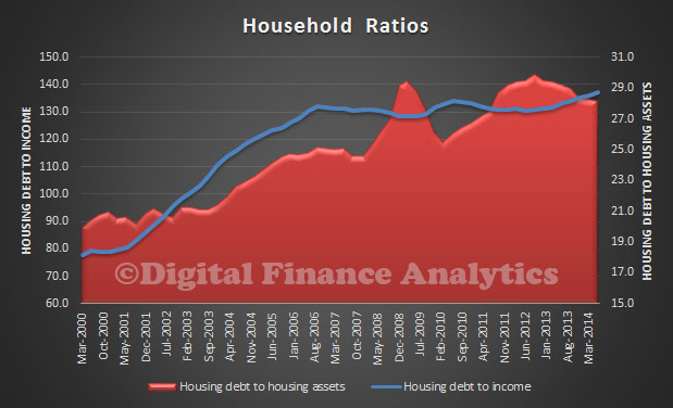
Using the RBA household ratios, we can look at the effect of debt on the average household. It blows up the myth of “household deleveraging”, much talked about after the GFC. Whilst the average data masks the differences between different household segments (see the segmented analysis in our survey and we know debt is becoming more concentrated in some households, whilst others pay down), it can tell a story. The first chart shows the ratio of housing debt to income, and we see it has been rising steadily since 2013, and is substantially higher than in 2000. The other point to note is that the ratio of housing debt to assets is down a bit, thanks to house prices rising faster than debt. However, households have never been so in debt.
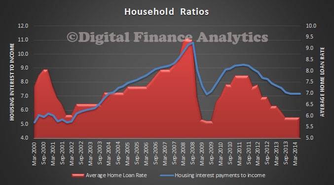
 Another way to look at the data is to compare the ratio of interest payments to (quarterly) average income. We see that with rates currently low, the ratio is down from its high in 2008. However, it is worth noting the average home loan rate has fallen further compared with the housing interest payment to income ratio. This is because relative to income the average mortgage is bigger today – reflecting elevated prices and higher loan to value ratios.
 This is consistent with the loan to income ratios we highlighted earlier and a fall in real incomes. More evidence the RBA should act!

One thought on “Household Debt Burden Increases Again”