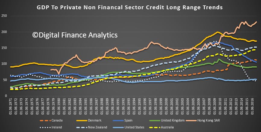
The BIS data-sets on financial trends across countries is a fertile place to go for interesting charts. They recently released several updated series. The one I found most interesting was the ratio of private sector debt from banks, compared with GDP, or formally “Credit to Private non-financial sector from Banks, total at Market value – Percentage of GDP – Adjusted for breaks”. All series on credit to the non-financial sector cover 44 economies, both advanced and emerging. They capture the outstanding amount of credit at the end of the reference quarter. Credit is provided by domestic banks, all other sectors of the economy and non-residents.
Here is a plot from 1971 to present day. I selected some of the more telling data from the 44 available (omitting those in the central range for example).
 We see that the strongest rise in the ratio has been in Hong Kong, followed by Denmark, then New Zealand and Australia. Also, look at the impact a recession had on the ratios for Ireland and Spain.
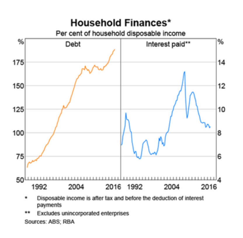
Households and Businesses here hold more debt relative to GDP, and we have moved from the bottom of the range in 1971, accelerating more strongly than many to our current heavily debt ridden state. This degree of leverage highlight the risks in the system, and of course will get worse if growth rates stay low while lending for housing continues at ~6% growth each year. And we know that much of the debt sits with households.
 The USA, by comparison is pretty steady over the range, and well below Canada and Denmark.
