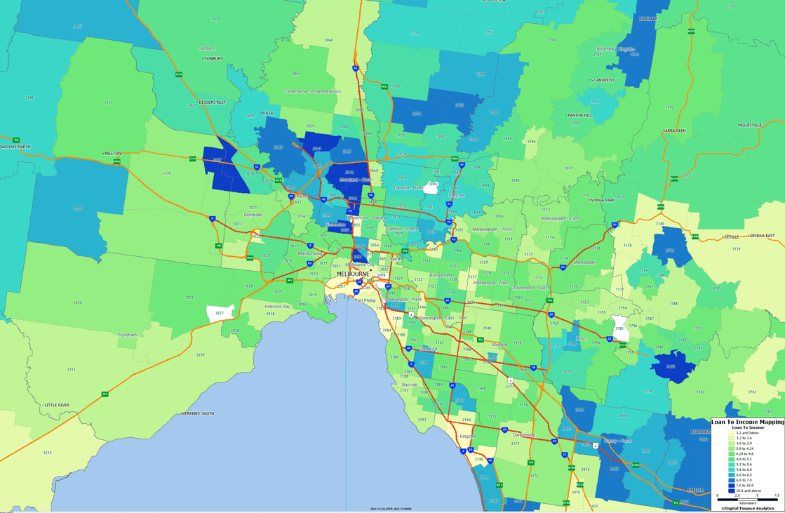
Continuing our series on Loan To Income (LTI) ratios, using our household survey data, today we focus our attention on Melbourne. As previously discussed Loan To Income is a relevant measure when considering how stretched households may be with regards to their mortgage loans. So first we present the results using our geomapping analysis. The shades of blue show the higher average ratios, which we see predominately to the north and east of Melbourne.
 You can compare this mapping with the mortgage stress analysis for Melbourne, as there are some significant correlations.
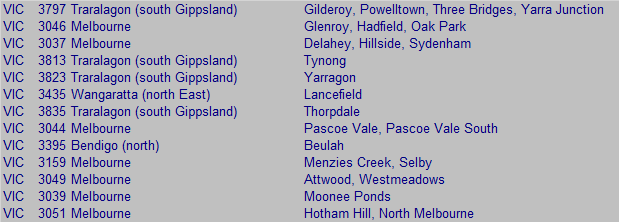
More specifically, the highest LTI ratios are found in the following post codes:
 In contrast the lowest LTI ratios are found in these post codes:
 We have already summarised the situation in Sydney, when we first discussed the data in the context of the recent UK initiatives to curb high LTI loans. We will present detailed data for other states later.
