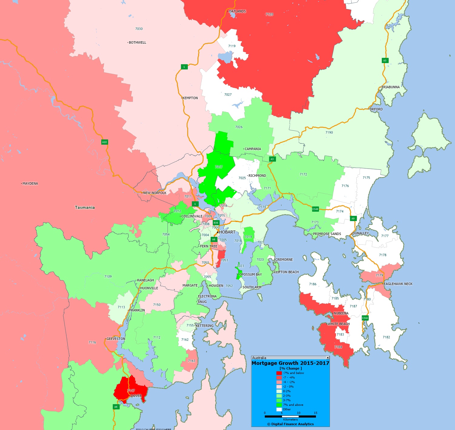
We finish our series on mortgage growth by looking at data from Adelaide and Hobart and plotting the relative change in volumes of loans between 2015 and 2017, by post code, drawing data from our core market models, and geo-mapping the results.
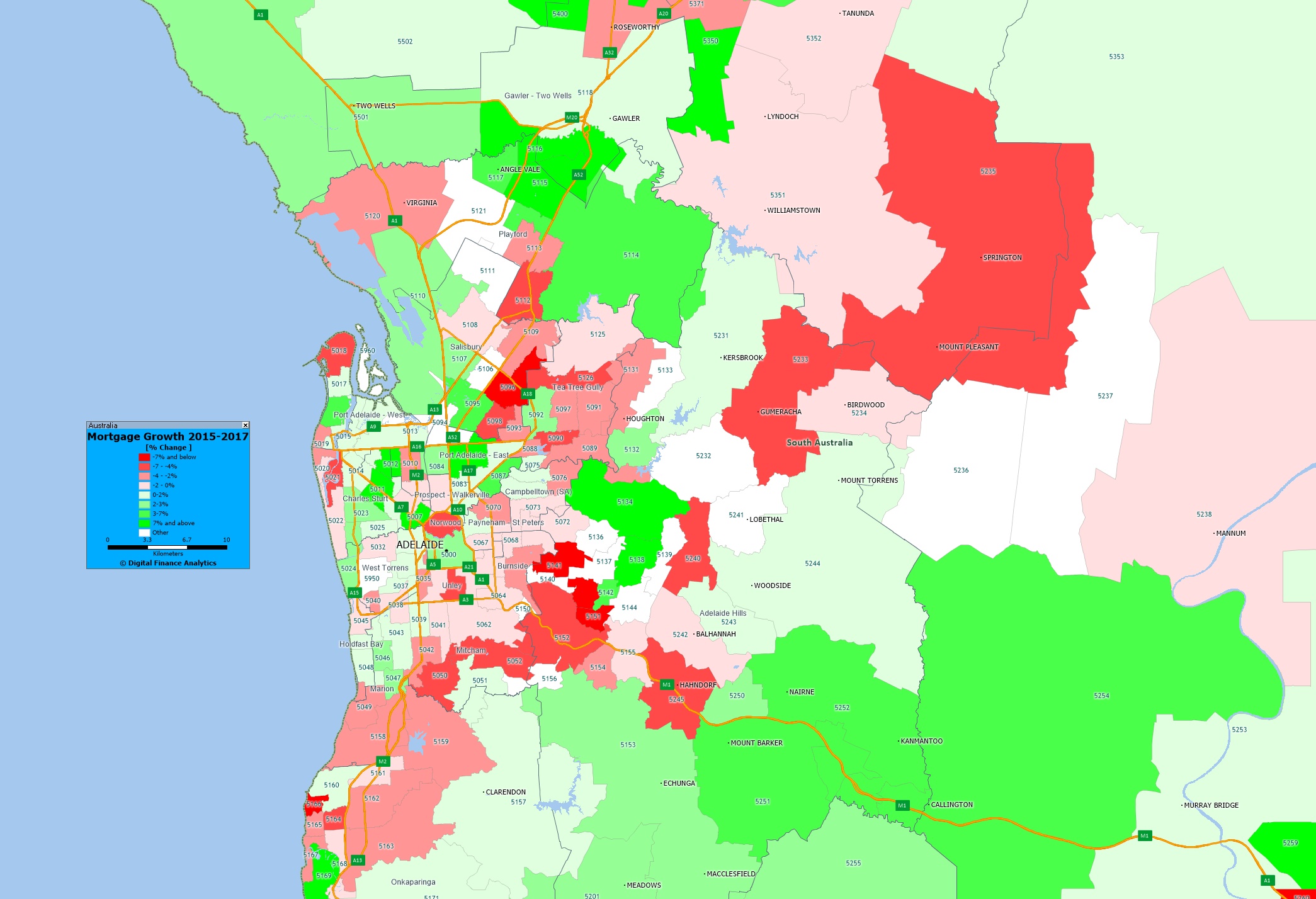
Here is Adelaide.
 The yellow shades show the areas with the largest growth in the number of mortgages, the red shades show a relative fall in volumes. You can click on the map to view full screen. This is a picture of mortgage counts, not value, we may look at this later.
Compare these pictures with those for Sydney, Melbourne, Brisbane and Perth and we see just how different these markets are!
Of course this is just one of the many potential views available from the 140+ fields which are contained in our Core Market Model.


