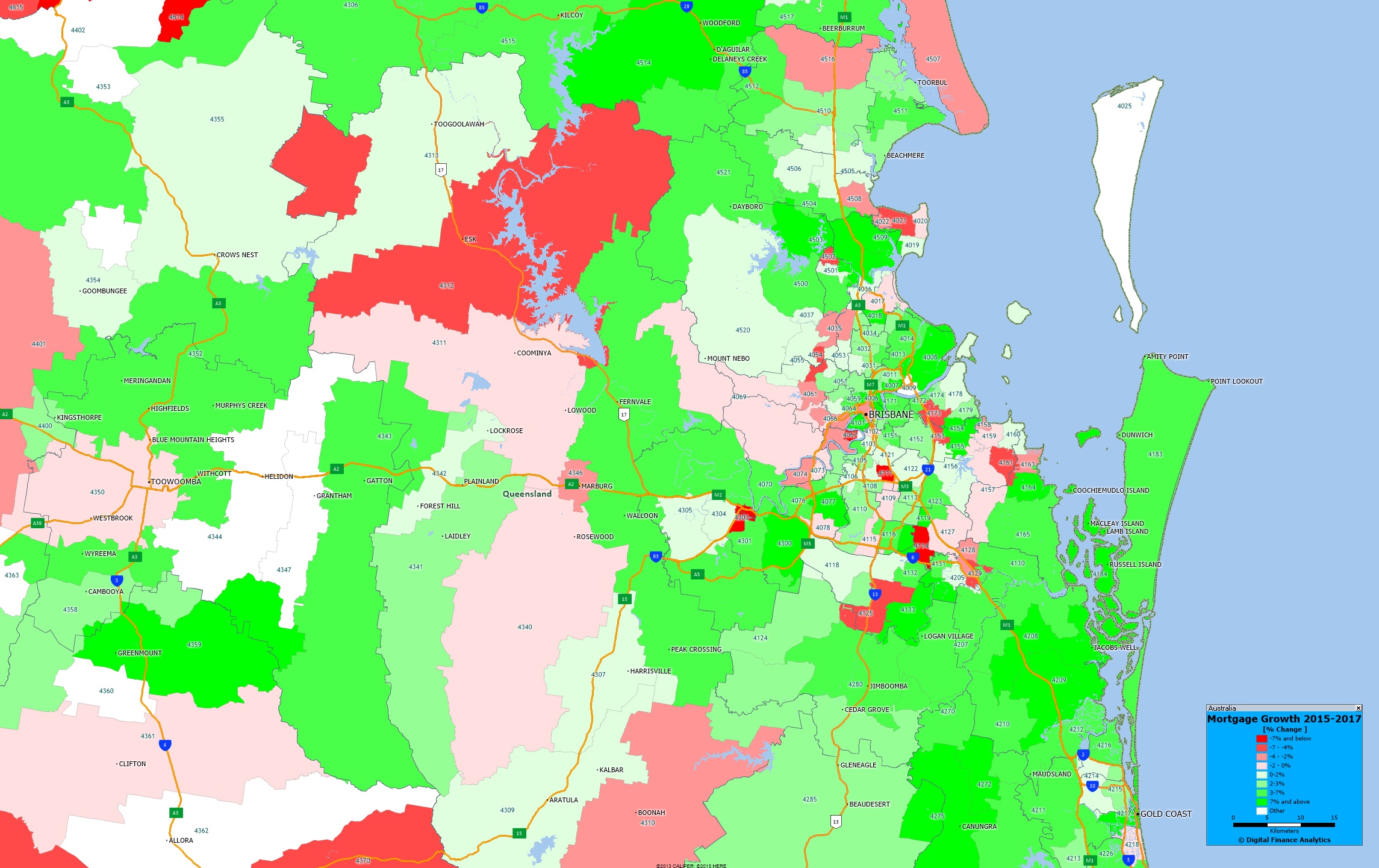
We continue our series on mortgage growth plotting the relative change in volumes of loans between 2015 and 2017, by post code, drawing data from our core market models, and geo-mapping the results.
Here is the Greater Brisbane picture.
 The yellow shades show the areas with the largest growth in the number of mortgages, the red shades show a relative fall in volumes. You can click on the map to view full screen. This is a picture of mortgage counts, not value, we may look at this later.
Of course this is just one of the many potential views available from the 140+ fields which are contained in our Core Market Model.
Next time we will look at Perth.


One thought on “Mortgage Growth In Greater Brisbane”