I’m here primarily to talk about the Fair and Effective Markets Review, a joint initiative by the Bank of England, the Financial Conduct Authority (FCA) and HM Treasury, launched by the Governor of the Bank of England and the Chancellor last June. The aim of the Review is to reinforce confidence in wholesale fixed income, currency and commodity markets – or ‘FICC’ for short – in the wake of LIBOR, FX and other appalling cases of misconduct that have come to light since the height of the financial crisis. The Review is interested in three key questions. First, what were the root causes of this behaviour? Second, how far have the steps taken by firms and regulators since the crisis gone to put things right? And, third, what remains to be done?
Before describing the work of the Review in more detail, I want to take a bit of a step back and ask why it is that we are here at all. And that’s not as strange a question as it might first seem, because for a long period the phrase ‘wholesale banking conduct’ was thought to be something of an oxymoron. Wholesale markets were seen as being (for the most part) deep and liquid – and therefore hard to manipulate – and involving professional, well-informed, forward-looking counterparties, who could both look after their own interests, and sustain overall market integrity, through the operation of robust market discipline. To put it bluntly, firms knew that an attempt by them to abuse the interests of others in the market today could be punished by the removal of large quantities of lucrative business tomorrow. And that knowledge was thought to be the most powerful way of sustaining broadly well-functioning and sound markets. ‘Caveat emptor’ never meant ‘anything goes’ – wholesale markets have always been subject to the law on competition, fraud and misrepresentation; and the regulatory perimeter has been progressively extended across many wholesale businesses in recent years. But the size of the regulatory rulebook, and the degree of supervisory intensity, has tended to be much more modest than in markets and activities involving less well-informed retail customers.
The potential power of market discipline in maintaining market integrity has a strong intellectual appeal. If it works in the way described, it allows wholesale markets – crucial to a well-functioning global economy – to operate without the cost of too many regulatory rules. And, crucially, it delivers strong alignment between what matters for the private business success of financial market firms, and what matters for good conduct. Even where market discipline is strong, regulators still play an important role – but more as referees, with yellow or red cards to use in extremis. In such a world, the strongest constraint on the conduct of wholesale market participants comes from the knowledge that if they act inappropriately they lose the business. If they lose the business, they lose their bonuses. And, if misconduct goes too deep, firms go bust. So the incentives to make money and to ensure good conduct are aligned, and operate primarily through the business line.
Those responsible for ensuring good conduct – probably the business heads – don’t have to struggle to make themselves heard in annual pay rounds or beg traders to read manuals or attend courses. We could debate for some time whether there was a historic ‘golden age’ when the real world actually worked like this. But it clearly has not done so in recent years, which have seen a sequence of appalling market abuses involving collusion, manipulation of benchmarks and other financial market prices, structuring assets in ways designed deliberately to undermine the interests of end-investors, deliberate mis-valuation of large scale positions, and the abuse of private information for personal or corporate gain. No amount of counterparty sophistication – that key plank of the ideal model I discussed earlier – can protect you against collusion. Measured in terms of regulatory fines and damaged reputations, the cost has been large enough. But more profound still has been the damage to public trust in FICC markets, which in turn has impaired their effective operation, created uncertainty among intermediaries, investors and other end-users, diverted huge amounts of management and financial resources, and materially increased the compensation required for taking risk. Everyone recognises that these markets matter too much to the global financial system to leave these problems untouched. And that is why we are all here today.
The behaviours that have come to light strike many as being deeply immoral, and have triggered an extensive public debate about the role of ethics in banking. But what I find even more striking is that few, if any, of those behaviours were even in the firms’ own economic interests, properly construed. Quite apart from issues of social responsibility or regulatory compliance, they were bad business, and bad for the markets in which they operated. In some cases, trading desks in one part of the firm benefited at the expense of others in the same firm; in others, practices that were profitable on one day likely led to losses on others; and, more generally, persistent market misconduct risked giving firms, or entire markets, the reputation of being akin to the ‘wild west’. How did this happen? Part of the answer is that firms lost control of their trading teams, or mis-incentivised them. Conflicts of interest were allowed to range unchecked. And traders were put in positions where they could cause mortal damage to their firms’ franchises for, at best, modest profit opportunities. Now, as a direct result, firms’ senior management are being assailed with advice, demands, and ‘shoulds and shouldn’ts’ from every direction. But, for those who still believe in the basic market discipline story, the real question is: how did firms so fundamentally misunderstand their own long-term interests – and those of the markets in which they operated and on which the global economy relies? And how can those interests be re-established? In one sense, the supervisory and regulatory interventions seen since the crisis, together with the huge enforcement fines, may be seen as substitutes for the incentives to good conduct that the market failed to deliver. But if those interventions are not to have to become ever more draconian over time, we must also find ways to re-energise the discipline of the market – to return to what Governor Mark Carney has termed ‘true’ markets – free from collusion, manipulation, abuse of private information, transparent, open and competitive.
Now all of this may seem a bit high-falutin’ compared to some of the more practical questions on the agenda of this conference. Shouldn’t we just get on with finding practical steps to ensure that bad guys don’t again imperil firms’ livelihoods and reputations? Certainly that is a crucial part of it. But a repeated theme stressed to us throughout the Fair and Effective Markets Review consultation, and heard again at this conference, has been the importance of ensuring that the new structures being put in place to manage conduct are aligned with the business, and not in some sense parallel to, or outside of, it. Structures that fail to meet this test may be considered crucial today, when memories of the crisis and the enormous fines that followed are still fresh. But the risk is they get progressively de-emphasised as memories fade, budget rounds come and go, and new priorities emerge. There is currently an enormous focus on conduct in most firms, as there was after previous historical bouts of market abuse. But all of you know the challenges that can arise in trying to drive through lasting change: getting particular business lines to think outside their silos; securing adequate Board time for conduct discussions; ensuring conduct gets an appropriate weight in annual bonus round discussions – even where it conflicts with revenue considerations; or getting trading staff to attend training courses. There is at least a risk that the current focus on conduct risk may turn out to be like that annual New Year’s Resolution to visit the gym every day, refreshed no doubt sincerely every January, but looking a little threadbare by mid-year… The only way to ensure that This Time Is Different is to ensure that (a) effective market disciplines are re-established, and (b) that conduct risk management is intimately aligned with (indeed, arguably identical to) the successful running of the business, rather than something (to overstate for effect) that is done primarily to look good to the world, the regulator, or others. In that regard I found Chris Severson’s discussion of the parallel between naval aviation and banking conduct on the first day of this conference very revealing. Navy pilots don’t obsess over safety for appearance’s sake, or out of fear of a fine or court-martial from the authorities. They do it because if you’re not safe, you (or others) die. We need to ensure that incentives are similarly aligned in banking. Traders will never face the same threat to life and limb as fighter pilots. But nothing focuses the mind as effectively as the knowledge that professional demise for themselves and their teams is a real possibility if they don’t conduct themselves properly. As a recent report by Oliver Wyman put it, to get proper engagement from the frontline, conduct risk management needs to be described as good business practice rather than compliance with rules. Achieving that will require a joint effort by market participants and the public authorities – and that is a key guiding principle of our Review.
To understand why public and private incentives seem to have diverged in recent years, it is helpful to start from the ideal model I described earlier and ask where it might have broken down. When we began our Review last summer, I – perhaps naively – thought it might prove difficult to identify potential root causes. In fact, the challenge has been to limit the possible explanations to a manageable number. To help structure our analysis, therefore, the Review’s consultation document is based around the framework shown in the table below.
The vertical axis on the Table lists six key potential sources of abuse or vulnerability. Three relate to the structure of markets, and three to the conduct within them. The horizontal axis of the Table is important too. Market participants have sometimes argued to us that the main failing in recent years was by regulators, who should have been more vigilant for the abuse perpetrated by a handful of ‘bad apples’, and tougher in prosecuting it. In fact, as Minouche Shafik, the Chair of the Review, has argued, the scale of the problem clearly extends beyond a few bad apples4. But even if that were not the case, I am not sure how often those making these points have thought through the consequences of espousing this view. Market participants are far closer to the day-to-day operation of markets than regulators can ever hope to be; market discipline, as I have argued, is a potent force if properly engaged; and, to put it politely, we do not tend to be overwhelmed with requests from the industry for tougher, more intrusive (and inevitably more expensive) regulation. Recommendations for further, targeted, regulatory interventions must remain part of the Review’s toolkit. But a key message we want to get across is that many of the solutions could more plausibly lie in the hands of the market, guided or catalysed by the authorities where required. In that regard we are fortunate to have the services of a dedicated Market Practitioners Panel, chaired by Elizabeth Corley of Allianz Global Investors, and consisting of senior business heads from the buy-side, sell-side and end user communities, together with infrastructure providers and independent experts. Let me briefly highlight a few of the areas in which the ideal model might have broken down, using Table A as a guide.
The first row, grandly titled ‘market microstructure’, posits that some wholesale markets may not be as deep, liquid or transparent as the ideal suggests. A key issue in the LIBOR abuses, for example, was that the benchmark was based on an exceedingly thin underlying market for unsecured interbank borrowing. Markets for some other FICC products, such as some types of corporate bonds for example, can also be highly illiquid – and, partly as a result, transparency levels can also be relatively low. Thin or ‘dark’ markets can be easier to manipulate.
The second row of the Table asks whether a lack of effective competition or market discipline may have played a role in recent abuses. Both the LIBOR and the FX misconduct cases involved striking examples of collusion between traders – indeed in the case of FX in particular, it is hard to see how any market manipulation would have been possible in such deep and liquid markets without it. Increased concentration and horizontal integration in wholesale markets in recent years may also have increased the scope of potential conflicts of interest and reduced the ability of market users to shop around – which as I mentioned earlier is such a crucial part of the historical market discipline paradigm. Many, if not most, of the recent major cases of misconduct in FICC markets, highlighted weaknesses in the design of benchmarks – which is the third and final structural category in the Table. The flaws were remarkably varied, and depended significantly on the design of individual benchmarks – LIBOR for example was insufficiently grounded in actual transactions, the WMR FX benchmark had too narrow a window, and precious metals benchmarks were insufficiently transparent. A common feature however was that the design, technology and governance arrangements around measures that had once probably been adequate for small-scale usage had failed to keep pace with the massive increase in scale and diversification of their usage, creating opportunities for abuse or misconduct that were unlikely to have been as evident when the measures were first created. There has been rapid evolution in FICC market structures under all three categories in recent years, driven by both regulatory and technological change. Under market microstructure, the G20 commitments on OTC derivatives, MiFID2 in Europe and Dodd-Frank in the US, the new post-crisis Basel capital and leverage requirements, and intense pressure on revenues and costs are all driving FICC markets towards a more transparent, standardised, agency-based trading model. Under competition, the highly integrated investment bank business model has become less economic than it once was, and multiple electronic platforms are competing for new business. And under benchmarks, there has been a massive push from regulators and administrators to strengthen the design and oversight of key measures – including the Wheatley reforms to LIBOR, the IOSCO standards for benchmarks, the Financial Stability Board (FSB) reviews of interest rate and FX benchmarks, and the Fair and Effective Markets Review’s own recommendations to bring a further seven major benchmarks into UK legislation, which have been accepted by Government. The challenge for and effective market conditions over time. Or whether further steps are needed to ensure that market discipline can again play a full role in maintaining good standards of market conduct.
The lower half of the Table covers conduct issues in FICC markets, and therefore has a more direct bearing on the issues being discussed at this conference. The fourth row asks whether the standards that market practices should adhere to have been sufficiently clear, or well understood, in FICC markets. As you will all be aware, any effective conduct programme has to start with a clear description of the behaviours that you as a firm expect to see from your staff. Enforcement cases – of which there have regrettably been many in recent years – provide one clear set of anchors for this work. But how clear are you about the appropriate standards in less egregious cases? How do you identify or promulgate appropriate ‘case law’ in FICC markets? Are the various market codes currently in existence helpful, or do they need strengthening? And is the regulatory perimeter in the right place, whether in spot FX markets or elsewhere? Once appropriate standards have been established, the fifth row of the Table asks how you establish clear accountabilities within your organisation, how you monitor and control those accountabilities, and how you ensure that incentives are appropriately aligned with good behaviour. Much of our discussion yesterday fell under this heading – and no surprise because it was arguably failings in this area more than any other that drove recent misconduct. As some of the enforcement notices vividly illustrate, either by design or by neglect, some traders were able to behave in ways that directly harmed the reputations of their own firms. How was this allowed to happen? Had responsibility for oversight been delegated too far from the so-called First Line of Defence (or trading heads)? Were incentives appropriately aligned? Were some firms Too Big to Fail, or Too Big to Manage? And how did Boards monitor conduct across their organisations?
The final row in the Table highlights the importance of having effective tools for identifying and punishing misbehaviour. Often this is seen as being primarily the responsibility of regulators – but as I think everyone now recognises that is far too much of a ‘hands off’ attitude for something that can threaten a firm’s very survival. Regulation provides a crucial backstop. But regulators have neither the data nor the resources to spot every misdemeanour – and supervisory and enforcement actions cannot substitute for developing an appropriate culture within individual firms. What surveillance tools can firms themselves install and operate? How do you develop a culture in which whistleblowing is encouraged, and decisive action is taken against breaches of standards? Is it still too easy for misbehaving traders to avoid censure by changing employers? And how and when should firms consider making disciplinary cases public as a means of sending a clear signal? As with market structure, a great deal of change is underway in an attempt to strengthen conduct. We have heard about all the supervisory work underway by the FCA. The United Kingdom has introduced, or is in the process of introducing, major new rules on remuneration, on the responsibilities of Senior Managers, and on criminal sanctions for benchmark manipulation. The FSB and the major central banks have promulgated new standards for behaviour in FX markets. We heard from Sir Richard Lambert about the important work of the Banking Standards Review Council. And, as we have been discussing over the past two days, firms have themselves invested substantial sums in new conduct risk processes. Much has been achieved since the peak of the financial crisis, on both the regulatory and private side. A key role of the Fair and Effective Markets Review is to take stock of that progress, and celebrate it where it is appropriate to do so. At the same time however some of the behaviours highlighted in the recent enforcement cases occurred worryingly recently – and in areas which seem surprisingly close, both physically and functionally, to very similar abuses in LIBOR and elsewhere that had occurred, in some cases in the same companies, only shortly before. At the very least that raises questions about the ability of firms to learn from past mistakes and think laterally about the lessons for other parts of their business. It has been encouraging to hear over the past two days about some of the ways that firms are now seeking to tackle those challenges. A question for the Review is whether these changes have gone far enough, or whether we need to provide further support to those efforts, working collaboratively with market participants wherever possible, when we produce our final recommendations in June.
To return to where I came in, we need markets to work well, in the interests of everyone. The purpose of the Fair and Effective Markets Review is not to hinder the operation of wholesale markets unnecessarily, but to return them to fairer and more effective operation. To be crystal clear, markets characterised by collusion, manipulation or abuse of private information are not working effectively. The potential power of market discipline means that, where we can work with the grain of markets, we will. Reform to internal control processes is essential, and the discussions at this conference are encouraging in that regard. But as conference participants have repeatedly emphasised, processes that operate in parallel to, or isolated from, the business, focusing on regulatory compliance, or simply preventing the re-emergence of old vulnerabilities, will not survive over the cycle – they will die out as memories fade, budget rounds come and go, and those who never believed in them spot their moment and strike. The tests are – do they work with the grain of the business and markets in which their firms operate? Do they have the engagement of senior management, because they matter to the business – not only when the supervisory lights are on, but also when they are off? Do trading staff understand they have to be involved – not because they are expected to, but because it is essential to being successful? Achieving that alignment is essential to us all – and I hope that the Fair and Effective Markets Review can play its part in that process.
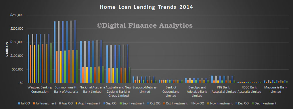
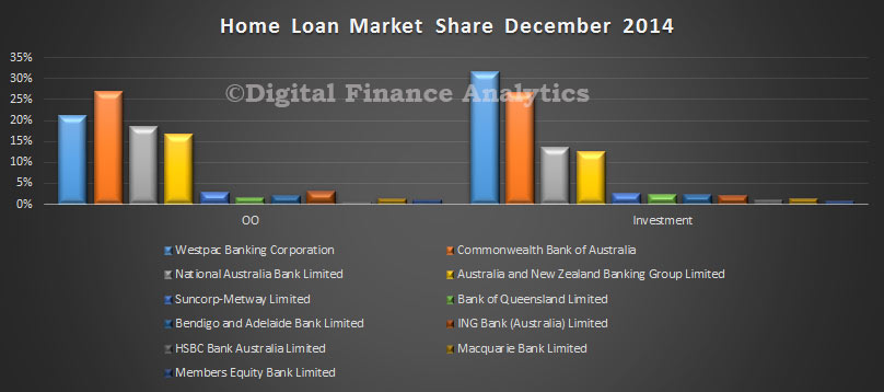 Looking at the trend data, we see stronger investment lending growth at WBC, and to a lesser extent at the other majors.
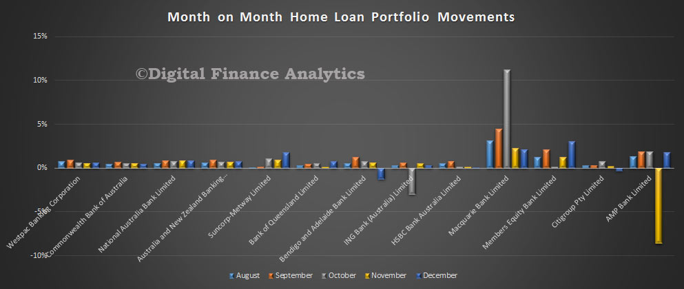
 In portfolio percentage terms, Members Equity registered 3% growth, with Macquarrie at 2% and Suncorp and AMP at 1.8%, all above system growth.
 Turning to deposits, we saw growth of 1.37% in the month, to $1.8 trillion. CBA holds the largest share of deposits, with WBC and NAB following.
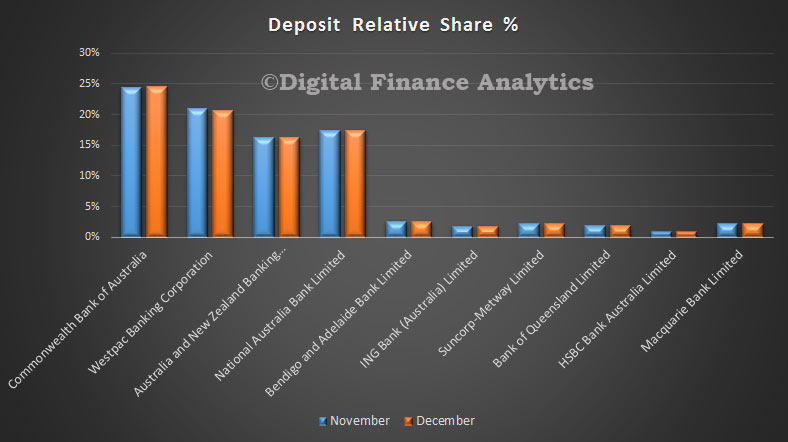 Looking at the monthly portfolio movements, we see CBA recorded portfolio growth of 1.6%, whilst WBC was 0.29%. Rabbobank grew their portfolio by 1.69%, whilst Macquarie and ING both grew their portfolios by 1.55%. We suspect some players are actively managing their deposits preferring to use wholesale funding alternatives, as we have discussed before.
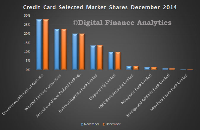
 Looking at credit cards, balances rose 1.9% to $41.8 billion. There was little overall change in portfolio mix amongst the main players, and Citigroup maintained in position at number 5.
