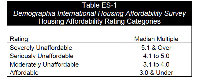
Latest On Australian Securitisers

The ABS published their data on Australian Securitisers to June 2014 today. At 30 June 2014, total assets of Australian Securitisers were $131.3b, up $2.5b (2.0%) on 31 March 2014. Still below below the pre-GFC peak of more than $250,000 million.

SecuritisersAssets-June2014During the June quarter 2014, the rise in total assets was due to an increase in residential mortgage loans (up $3.4b, 3.3%). This was partially offset by decreases in other loans (down $0.4b, 2.5%) and cash and deposits (down $0.3b, 8.0%). Residential and non-residential mortgage assets, which accounted for 82.7% of total assets, were $108.6b at 30 June 2014, an increase of $3.4b (3.2%) during the quarter.

SecuritisersHouseholds-June2014At 30 June 2014, total liabilities of Australian securitisers were $131.3b, up $2.5b (2.0%) on 31 March 2014. The rise in total liabilities was due to increases in loans and placements (up $2.1b, 14.8%) and long term asset-backed securities issued in Australia (up $1.1b, 1.2%). This was partially offset by a decrease in asset backed securities issued overseas (down $0.3b, 2.7%).

SecuritisersLiabilities-June2014At 30 June 2014, asset backed securities issued overseas as a proportion of total liabilities decreased to 9.5%, down 0.4% on the March quarter 2014 percentage of 9.9%. Asset backed securities issued domestically as a proportion of total liabilities decreased to 76.8%, down 0.7% on the March quarter 2014 percentage of 77.5%.

SecuritisersPCLiabilities-June2014The snapshot shows that the securitised sector is still in the doldrums, and that the bulk of loans are being purchased by local investors, rather than overseas. Growth is below loans system growth for the same period. Note that in this issue revisions have been made to the original series as a result of improved reporting of survey data. These revisions have impacted on the assets and liabilities for March 2014 and December 2013.

Super Balances Now Up To $1.85 trillion – APRA

APRA just published their Quarterly Superannuation Performance data to June 2014. Superannuation assets totalled $1.85 trillion at the end of the June 2014 quarter. Over the 12 months to June 2014 there was a 15.3 per cent increase in total superannuation assets. Over the June 2014 quarter, total superannuation assets increased by 2.6 per cent.

SuperJune2014 There were $27.6 billion of contributions in the June 2014 quarter, up 5.9 per cent from the June 2013 quarter ($26.1 billion). Total contributions for the year ending June 2014 were $95.0 billion. Outward rollovers exceeded inward rollovers by $531 million in the June quarter. There were $14.7 billion in total benefit payments in the June 2014 quarter, an increase of 8.3 per cent from the June 2013 quarter ($13.6 billion). Total benefit payments for the year ending June 2014 were $55.3 billion. Net contribution flows (contributions plus net rollovers less benefit payments) totalled $12.4 billion in the June 2014 quarter, an increase of 15.1 per cent from the June 2013 quarter ($10.8 billion). Net contribution flows for the year ending June 2014 were $37.3 billion.

The number of entities with assets of more than $50m fell by 3 in the last 12 months, from 213, to 210.

The self managed super fund sector, according to the ATO, accounted for 30.05% of all assets.

SuperSplitJune2014The value of assets in SMSF continues to grow, standing at $557 billion (the red area), although the absolute percentage has fallen in the past year, from 30.8% to 30.05% (the blue line).

SuperSMSFSummaryJune2014

Where Capital Growth In Property Lives

In the Opening Statement to House of Representatives Standing Committee on Economics today, Glenn Stevens made the following points:

  • not only are funding costs low, but banks want to lend and are competing to do so more actively than they have for some years;
  • net worth per household has risen by about $120,000 over the past two years;
  • the community’s monetary assets have risen by around 13 per cent – over $180 billion – over the same period;

It is worth reflecting on the fact the main reason for the increase in net worth is a bounce in the stock market, and lift in capital values of property, thanks to rising prices. After all real income is falling for many. In addition, the average hides the differences.

We have been looking at capital growth for the average household, across the states, and between the main urban centres and the rest of rest of the state. From our surveys we have been able to assess the relative growth in the value of property, over time, by marking property to market and comparing that with its purchase price. The chart below shows the relative growth in net capital value of property since 2004 (where our surveys start). It subtracts the original purchase price from the current value, to give a theoretical capital or wealth value. It shows that in the early 2000’s there was a similar level of growth in the cities and regional centres, but that more recently it has diverged. In the past 2 years, the average capital appreciation in the urban centres was $79,000, whereas in the regional centres, it was just $18,000.

AverageCapitalGrowthAllHowever there are significant variations across the states. In Sydney, households in the past 2 years, have on average enjoyed a lift in net worth of more than $230,000 thanks to price hikes, whereas Brisbane, Adelaide, and regional areas in SA and TAS have not experienced much of an increase at all.

AverageCapitalGrowth2YearsLooking at the longer term trends, across states, the situation gets even more interesting. Of course people have bought in at different times, but we can plot the overall capital growth trend. For example, In NSW, a household who bought in Sydney in 2004 and held the property would on average be nearly $300,000 better off now. If they had bought in early 2012, though they could have nearly earnt the same gain! All the action has been in the last couple of years, in Sydney itself. There have been a more gentle lift in regional NSW. Note that I have not corrected for inflation in any of the current calculations, if I did, the regional centres in NSW would have stood still.

AverageCapitalGrowthNSWIn VIC, the situation is somewhat similar. It is worth noting that compared to NSW, the correction in 2009 was less severe.

AverageCapitalGrowthVICTurning to QLD, there has been no capital growth in either Brisbane, or the regional centres since 2010. If you were to correct for inflation, it would be going backwards.

AverageCapitalGrowthQLDIn WA, growth peaked in 2010 in Perth, with a further small peak recently, whilst in the regional centres, values are falling in real terms, before inflation. We compared Perth and Sydney recently, in more detail.

AverageCapitalGrowthWALooking at SA, growth in Adelaide is back to 2011 levels, but in the regional areas, growth is still lower than in 2010.

AverageCapitalGrowthSAIn TAS, since a peak in 2010, both Hobart and regional centres are flat, before inflation.

AverageCapitalGrowthTASFinally, we look at the remaining states. Growth in Darwin has been sustained, whilst regional NT and Canberra are flatter since 2011.

AverageCapitalGrowthOtherSo, my conclusion is simple, some households especially in Sydney and Melbourne, may be experiencing the wealth effect halo of smugness, but many households across other states and regional centres are not enjoying capital growth. Indeed, for many there has been a reduction in true value, before inflation since 2011. It is unlikely therefore that we will see a sudden surge of consumer spending activity in response to the housing boom (which is not uniform across the country as we have shown). It is really a Sydney and Melbourne boom. The RBA may be waiting for a long time if they are expecting households to start spending big.


A Tale Of Two Cities – Demand and Supply In Action

Last week we reported on the ABS house stock data, which valued property at more than 5.2 trillion in Australia. We have been looking in more detail at this data, and cross relating it to information from our own household surveys. Today we compare the markets in NSW and WA, because there are some interesting observations to note. First, NSW and WA have the highest mean dwelling prices in Australia. NSW stands at more than $650,000 and WA $595,000, ahead of VIC and ACT. TAS has the lowest mean at just over $300,000.

DwellingPricesByStateJune2014In addition, when we look at the decomposition of the $5.2 trillon by state, NSW has the largest share, WA has a smaller, but significant share, behind VIC and QLD.

TotalValueDwellingsByStateJune2014But, there are some interesting differences between NSW and WA. Population growth, from all sources (migration, births, and interstate movements), shows that WA is growing faster than NSW. So, from the demand perspective, we would expect prices in WA to be responding to that demand.StatePopulationGrowthNSWandWAJune2104In fact, dwelling prices in WA have been growing at a significantly lower speed than in NSW. In fact, most recent data suggests prices in WA are going slightly backwards.

DwellingPricesNSWandWAJune2014So, whats making this happen? We need to look at the supply side of the equation. WA have been building more properties, significantly more, than NSW. So demand and supply in WA are more in balance, even taking the faster population growth into account.

ChangeInDwellingsNSWandWAJune2014We also checked out the status of property purchase by SMSF’s and the like, and there are similar trends in the two states, so that element can be discounted from the analysis. We have previously highlighted the shrinking average plot size for new developments, and noted that WA has been allowing plot sub-division and new builds on sub-250 sqm plots. So it is interesting to note NSW’s recent announcement to release land in the west for smaller development plots. Supply and demand are clearly in action, and NSW house prices won’t adjust from their stratospheric levels until substantial supply side issues are addressed.  The way to address Australia’s housing issues is to release more land, and build more houses.

NSW First Time Buyer Trends From 2002

As part of our household surveys we have been examining the state of play for NSW first time buyers since 2002. In our research we have identified the year in which they purchased, whether they subsequently refinanced, or moved on, and how many of these households are currently having difficulty in finding a lender to refinance with. To be clear, this is a snapshot, as at August 2014, across multiple cohorts.

The data shows, firstly the monthly volume of loans written for first time buyers, peaking in 2009, and now languishing at a 20 year low. Next we plot, by age of the purchase, what proportion of households have subsequently either refinanced an existing loan, or sold and bought elsewhere. Perhaps it is not surprising that loans which are older, are more likely to be churned. The yellow trend line shows the proportion of households, by year of origination who have tried, but have not so far been able to refinance their loan. We see a significant peak in loans written in the 2009 boom time (when first time buyer incentives were at their peak, both at a federal and state level in a response to the GFC). More recent loans are less likely to be churned, so we see the drop in recent month. This suggests that there are a number of households in the 2009 and 2010 cohort who are in some strife.

First-Time-Buyers-NSWWe also analysed data on their current levels of mortgage stress, and their loan to income (LTI) ratios. We found that the average LTI grew steadily through the 2007-2012 cohorts, and currently stands at close to 6 times current gross income. We also see a peak in mortgage stress, in those households who took a loan in the 2009-2012 period. The proportion in mortgage stress are lower in the cohorts before and after this period. Once again the data highlights potential issues in specific cohorts, who are highly sensitive to unemploymentfalling income or rising rates.

First-Time-Buyers-LTI-NSWThis data also is a warning, that first time buyer incentives can pull households into the market, and lay potential long term problems for them.

Real Incomes Go Backwards

The ABS published their Wage Price Index to June 2014. In seasonally adjusted terms, both the Private and Public sector wage price indexes rose 0.6%. The rises in indexes at the industry level (in original terms) ranged from 0.1% for Accommodation and food services, Public administration and safety, and Arts and recreation services to 0.9% for Mining. The trend index and the seasonally adjusted index for Australia rose 2.6% through the year to the June quarter 2014.  Rises in the original indexes through the year to the June quarter 2014 at the industry level ranged from 2.0% for both Wholesale trade and Professional, scientific and technical services to 3.2% for Education and training.

We see a consistent falling trend in income growth, since 2010.

 
Income-Growth-to-June2014Looking at the impact after adjusting for inflation, real effective incomes are now falling.

Adjusted-Income-Growth-to-June2014This is significant and serious. Many households have taken on the burden of large mortgages assuming that whilst they will experience short term pain, their incomes would grow, so easing spending pressures. This however is just not happening. Consider this updated data on household Loan To Income ratios (LTI). Some households have an effective LTI about 5 times. This is very high.

LTIAllStatesUpdatedIn our surveys, we find that some segments are particularly exposed. The worst is in our Growing segment, these are younger families, many of whom are first time buyers, or recent up graders. As a result mortgage stress is high, and growing in this group, even at current low interest rates.

LTIAllStatesGrowingUpdated2

These pressures help to explain why many households are not feeling very confident, and are reacting to rising energy, child care and school fees, falling real incomes, and rising mortgage stress. The most affluent households are least impacted.

House Price Momentum Slowing As Value Reaches $5.2 Trillion

The ABS released their latest data on Residential Property Prices today. The total value of residential dwellings in Australia was $5,196,355.9 m at the end of June quarter 2014, rising $112,598.5 m over the quarter. The mean price of residential dwellings rose $9,900 and the number of residential dwellings rose by 37,600 in the June quarter 2014. The price index for residential properties for the weighted average of the eight capital cities rose 1.8% in the June quarter 2014 and rose 10.1% through the year to the June quarter 2014. The capital city residential property price indexes rose in Sydney (+3.1%), Melbourne (+1.3%), Brisbane (+1.8%), Adelaide (+1.0%), Canberra (+0.8%), Darwin (+0.7%) and Hobart (+0.3%) and fell in Perth (-0.2%). Recent data suggest momentum is slowing, a little.

ResidentialPricesQOQJune2014Annually, residential property prices rose in Sydney (+15.6%), Melbourne (+9.3%), Brisbane (+6.8%), Adelaide (+5.6%), Hobart (+4.3%), Perth (+3.6), Darwin (+3.4%), and Canberra (+2.2%).

ResidentialPricesYOYJune2014The median price of established houses exceeds $700,000 in Sydney. Hobart and Adelaide have the lowest values. Looking at the rest of the states, beyond the capital cities, NT has the highest value, and QLD exceeds NSW and VIC. Note this data is to December 2013 only, as the ABS does not yet reprot the latest data for the past 6 months.

MedianEstablishedPricesDec2013Looking at attached dwellings, again Sydney is highest, on average, at over $550,000, whereas away from the capital cities, prices are higher in NT and QLD.

MedianHousePricesAttachedDec2013Looking at the number of transfers, momentum is clearly in Sydney and Melbourne. Brisbane is showing signs of upward movement. Note again this data is to December 2013.

NumberofTransfersDec2013Property is too highly priced, compared with income measures, and international comparisons. The long term chronic problem of poor supply, easy loans and high demand continues to be a brake on the broader economy. Household confidence is not buttressed by rising prices. Many continue be be excluded from the market.

June Finance Data – ABS

The ABS published their June lending data today, covering commercial, housing and other lending categories. Owner occupied housing rose 1.8% in seasonally adjusted terms, Personal finance fell 1.8% and commercial lending rose by 12.1% in June after a fall of 5.9% in May.

AllLendingJune-2014Looking at housing lending, investment lending remains significant (though in percentage terms it fell slightly this month). This is on a seasonally adjusted basis.

HousingLendingJune-2014Investment lending accounted for 38% of all housing including refinance, and unsecured.

InvestmentPCJune2014Looking more narrowly, the proportion of investment loans written remains close to record, at 46.3% of loans, the all time record is 46.8% (May 2014). This is calculated by removing refinance and unsecured lending.

InvestmentTrendJune2014

June Housing Finance Up 1% – ABS

The ABS published their housing finance data today to June 2014. In seasonally adjusted terms, the total value of dwelling finance commitments excluding alterations and additions rose 1.0%. The value of commitments grew faster than the number of transaction, so the average loan size is increasing.

TotalCommittmentsJune2014Growth in NSW, WA and TAS was faster than the national average.

StateMovingAverageJune2014

We see the momentum spread across the states, with WA and NSW making the largest growth contribution. VIC and QLD grew more slowly.

TotalCommittmentsValueStateJune2014

First time buyers are still at historic lows. In original terms, the number of first home buyer commitments as a percentage of total owner occupied housing finance commitments rose to 13.2% in June 2014 from 12.6% in May 2014.

FTBPCJune2014

State variations are quite marked. NSW has the lowest proportion of first time buyers, WA the highest. The VIC data shows the impact the removal of some first time buyer incentives in 2013.

FTBPCStateJune2014

Investors loans grew faster than owner occupied loans. This is consistent with the results from our household research.

OOINVSplitsJune2014The splits, after removing refinance of existing loans are 47% investment loans and 53% owner occupied loans.

OOINVPCSplitsJune2014So, momentum continues, the trends are set, growth in the investment sector, first time buyers excluded, and overall growth stimulated by rising prices. The RBA quarterly statement on monetary policy, issued today, indicates they are  comfortable with the current position:

One area where there has been a marked improvement is dwelling investment, which grew strongly in the March quarter and is clearly in an upswing. The increase in dwelling investment is being underpinned by the ongoing strength in the established housing market. Housing price inflation over 2014 to date has not been as rapid as it was over the second half of 2013, but prices continue to rise. Loan approvals are higher than they were a year ago, but have been little changed since late last year. At this level, they are consistent with growth in housing credit stabilising at a rate that is a bit faster than income growth, although the growth of investor credit has continued to outpace that of owner-occupiers. The high rate of housing price inflation has underpinned strong growth in standard measures of household wealth. Along with the very low level of interest rates, this has seen consumption growing a little faster than household income, leading to a gradual decline in the saving rate over the past 18 months or so. Nevertheless, after picking up through 2013, consumption growth looks to have slowed in the first half of this year, with weaker retail sales growth and consumer sentiment falling to below-average levels. It remains to be seen whether this slower growth of consumption is temporary. Indeed, a timely measure of consumer sentiment has rebounded recently to be back above average.

I am less sure, because we are banking on larger loans supporting the growth in house prices, despite record low interest rates, and a significant rise in investment loans. There are risks in this scenario.

Australia’s Unemployment Rate Increased to 6.4 per cent in July 2014 – ABS

According to the ABS, in data released today, Australia’s seasonally adjusted unemployment rate increased by 0.3 percentage points to 6.4 per cent in July 2014. We also note that female and male unemployment rates have converged.

UmeploymentJuly2014The seasonally adjusted labour force participation rate increased by 0.1 percentage points to 64.8 per cent in July 2014. The number of people employed decreased by 300 to 11,576,600 in July 2014 (seasonally adjusted). The decrease in employment was due to decreased part-time employment, down 14,800 people to 3,499,200. This was offset by increased full-time employment, up 14,500 people to 8,077,400. The monthly seasonally adjusted aggregate hours worked series decreased in July 2014, down 14.8 million hours (0.9%) to 1,610.7 million hours. The seasonally adjusted number of people unemployed increased by 43,700 to 789,000 in July 2014.

Looking at the state data, the average unadjusted rate  unemployment rate increased 0.1 pts to 6.1%, based on unrounded estimates. ACT still has the lowest rate, whilst TAS has the highest.

StateUnemploymentJuly2014Whilst there are some statistical reasons for the result (changes in the sample this time), the fall in aggregate hours worked indicates this is a concerning result. As such, we expect unemployment to be a drag on momentum, and it will curb enthusiasm for property amongst some segments. In our household survey results however, the largest changes in unemployment were amongst those who were classified as property inactive, closely followed by those who have purchased recently. Given the high loan to income ratios in this group, any unemployment impact may be magnified in this highly leveraged group.