RBA Holds Rates Again At 2.5%

The RBA have kept rates on hold today, and are indicating a period of rate stability.

“Monetary policy remains accommodative. Interest rates are very low and for some borrowers have edged lower over recent months. Savers continue to look for higher returns in response to low rates on safe instruments. Credit growth has picked up a little. Dwelling prices have increased significantly over the past year, though there have been some signs of a moderation in the pace of increase recently. The earlier decline in the exchange rate is assisting in achieving balanced growth in the economy, but less so than previously as a result of the higher levels over the past few months. The exchange rate remains high by historical standards, particularly given the further decline in commodity prices.

Looking ahead, continued accommodative monetary policy should provide support to demand, and help growth to strengthen over time. Inflation is expected to be consistent with the 2–3 per cent target over the next two years.

In the Board’s judgement, monetary policy is appropriately configured to foster sustainable growth in demand and inflation outcomes consistent with the target. On present indications, the most prudent course is likely to be a period of stability in interest rates.”

April Building Approvals Down – ABS

The ABS released the building approvals data for April 2014. They report that the trend estimate for total dwellings approved fell 1.6% in April and has fallen for four months.  The seasonally adjusted estimate for total dwellings approved fell 5.6% in April and has fallen for three months. Looking at private sector houses, whilst the trend estimate for private sector houses approved rose 0.5% in April and has risen for 16 months, the seasonally adjusted estimate for private sector houses fell 0.3% in April and has fallen for three months. The trend estimate for private sector dwellings excluding houses fell 4.6% in April and has fallen for five months. The seasonally adjusted estimate for private sector dwellings excluding houses fell 14.0% in April and has fallen for three months.

Here is the national seasonally adjusted trend for all units and houses across Australia. Note recent fall in the number of units, and the sustained growth in houses nationally.

BuildApprovals--April14--ALL

The trend estimate of the value of total building approved fell 5.6% in April and has fallen for five months. The value of residential building fell 1.8% and has fallen for four months. The value of non-residential building fell 12.8% and has fallen for five months. The seasonally adjusted estimate of the value of total building approved fell 17.4% in April and has fallen for four months. The value of residential building fell 7.4% and has fallen for two months. The value of non-residential building fell 36.6% and has fallen for four months.

Looking at the state data, we see some interesting variations.

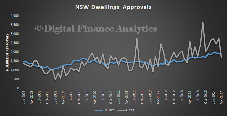
In NSW there was drop last month in unit approvals, having seen run-away growth in the past year. The number of house approvals also fell slightly. But overall, more units and high density housing was approved than houses, reflecting investment demand and affordability issues.

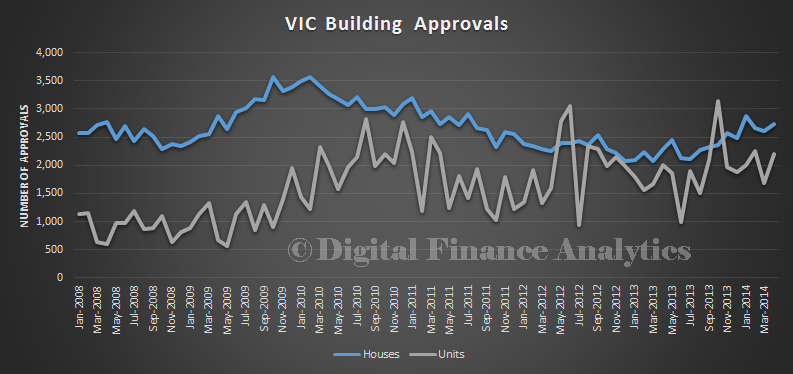
BuildApprovals--April14--NSWIn VIC house approvals is on the rise, and is still outpacing unit approvals.

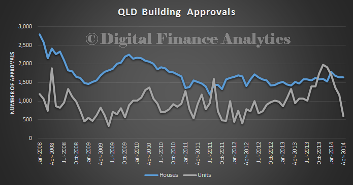
BuildApprovals--April14--VICIn QLD, unit approvals have fallen away, an house approvals are down slightly.

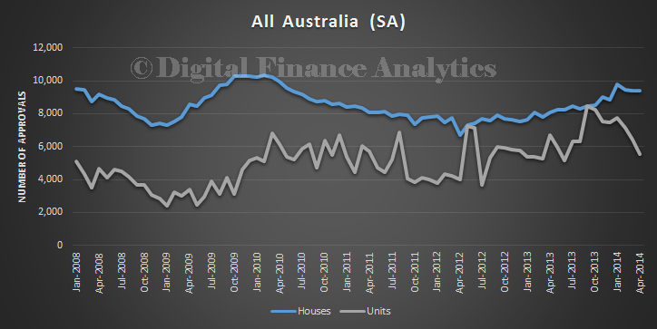
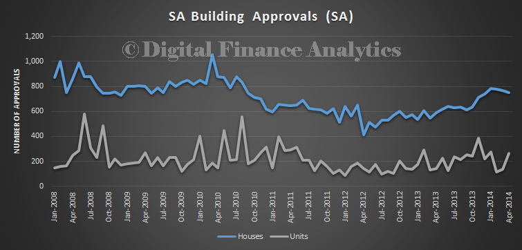
BuildApprovals--April14--QLDIn SA, house approvals are way ahead of unit approvals, though we see a slight fall in house approvals recently, and a slight rise in units.

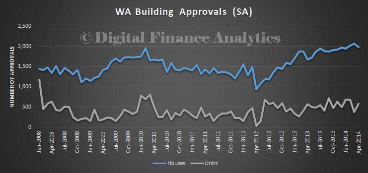
BuildApprovals--April14--SAFinally, in WA, we see growth in house approvals in recent months, but a turn down recently. Units are up slightly, but are significantly below housing approvals.

BuildApprovals--April14--WAOverall then, with approvals down, we wonder about momentum in the property market. Maybe the demand supply gap is getting bigger. To meet the demand for property, and to help ease prices, we need greater supply. We estimate that over the next three years we will need more than 900,000 new properties to meet demand

Turning Banking Economics On It’s Head

Once in a while an insight will change the world. In this months Bank of England’s Quarterly Bulletin (2014 Q1), there is an article on money creation, and an primer on money. Actually these were pre-released on 12 March, and both are worth a read.

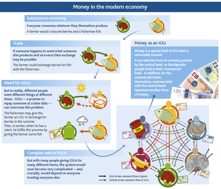
In the primer on money, we are reminded that it is essentially a trusted IOU and there are three main types, currency, bank deposits and central bank reserves. Each form is really an IOU between one sector of the economy and another. In the modern economy, most money is in the form of bank deposits, which are created by the commercial banks.

Money1You can see a video made by the bank here.

The second article though is revolutionary, in that is has the potential to rewrite economics. “Money Creation in the Modern Economy” turns things on their head, because rather than the normal assumption that money starts with deposits to banks, who lend them on at a turn, they argue that money is created mainly by commercial banks making loans; the demand for deposits follows.

“In the modern economy, most money takes the form of bank deposits. But how those bank deposits are created is often misunderstood: the principal way is through commercial banks making loans. Whenever a bank makes a loan, it simultaneously creates a matching deposit in the borrower’s bank account, thereby creating new money. The reality of how money is created today differs from the description found in some economics textbooks:
• Rather than banks receiving deposits when households save and then lending them out, bank lending creates deposits.
• In normal times, the central bank does not fix the amount of money in circulation, nor is central bank money ‘multiplied up’  into more loans and deposits.
Although commercial banks create money through lending, they cannot do so freely without limit. Banks are limited in how much they can lend if they are to remain profitable in a competitive banking system. Prudential regulation also acts as a constraint on banks’ activities in order to maintain the resilience of the financial system. And the households and companies who receive the money created by new lending may take actions that affect the stock of money — they could quickly ‘destroy’ money by using it to repay their existing debt, for instance. Monetary policy acts as the ultimate limit on money creation. The Bank of England aims to make sure the amount of money creation in the economy is consistent with low and stable inflation. In normal times, the Bank of England implements monetary policy by setting the interest rate on central bank reserves. This then influences a range of interest rates in the economy, including those on bank loans. In exceptional circumstances, when interest rates are at their effective lower bound, money creation and spending in the economy may still be too low to be consistent with the central bank’s monetary policy objectives. One possible response is to undertake a series of asset purchases, or ‘quantitative easing’ (QE). QE is intended to boost the amount of money in the economy directly by purchasing assets, mainly from non-bank financial companies. QE initially increases the amount of bank deposits those companies hold (in place of the assets they sell). Those companies will then wish to rebalance their portfolios of assets by buying higher-yielding assets, raising the price of those assets and stimulating spending in the economy. As a by-product of QE, new central bank reserves are created. But these are not an important part of the transmission mechanism. This article explains how, just as in normal times, these reserves cannot be multiplied into more loans and deposits and how these reserves do not represent ‘free money’ for banks.”

They made a video which explains some of the key concepts.

This could be seen as a self-justification for the years of QE, and low interest rates in the UK, but I think it is really a radical insight. The world of money just changed!


The Superannuation Story, part 1

In our first post for the new year, we begin a multi-part examination of superannuation, using the recently released data from APRA on industry and fund level performance to June 2013, together with DFA’s own research. Superannuation has become big business, with total assets now worth over $1.62 trillion (compare this with the $5 trillion in residential property in Australia). Last year it grew by 15,7%, or $219.8 billion. So it is important to understand the industry, how funds are performing, and to discover if there are important segmented differences. Note that this excludes the self-managed superannuation sector, which is controlled by the ATO, and runs on a different reporting cycle; and very small funds. These funds rose by 15.5% to be worth $506 billion, representing. SMSFs constitute 31% of the total. We will come back to these later, but today we look at the bigger funds.

To start the analysis, lets look at overall returns across the funds. The average performance to June 2013 was 13.7% in the last 12 months. This is the best result since the GFC in 2007, and ahead of the long term average of around 6%. But this average masks important differences, as shown on the chart below, which is a simple plot of returns ranked from lowest, to highest. This is data from nearly 300 funds, so not all the individual funds are labelled, it is the range of performance, from negative performance, through to over 20% which is interesting. It does make a difference as to which funds your money is in!
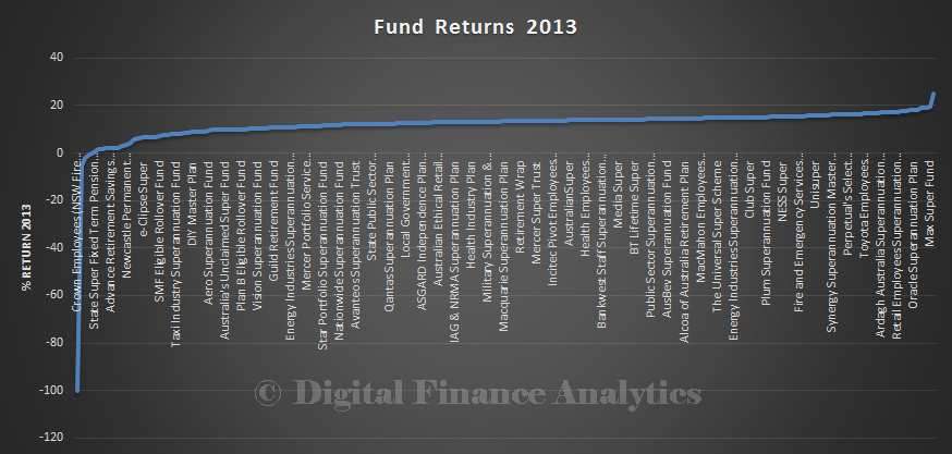
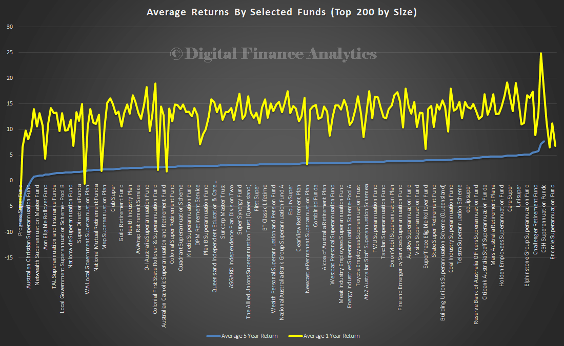
Super-2013-1We did more detailed analysis of the top 200 funds. Here we show the 1-year data, and the smoother 5-year data by fund, stack ranked from lowest to highest. Again, not all funds are labelled. We see some funds performing much better than others, and some loosing over the 5-year view.
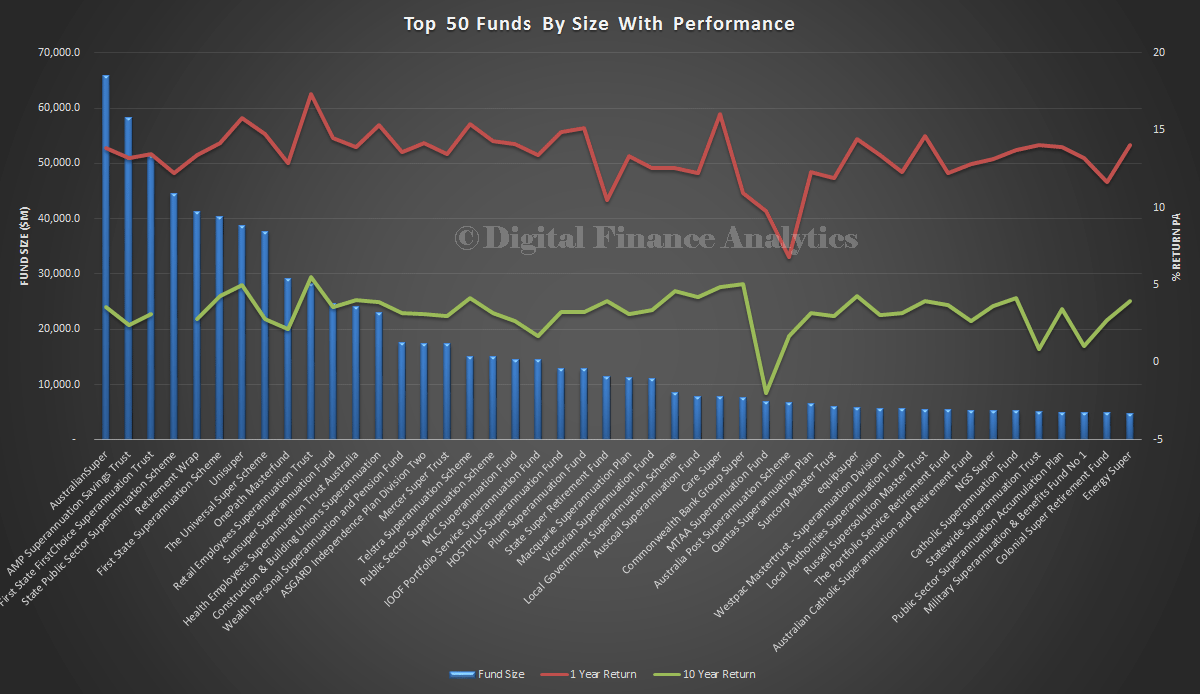
Super-2013-2If we take the top 50 funds by size, and plot the performance, we see that size does not seem to matter when it comes to performance. We have included 10-year performance data, though there are some gaps as not all funds are that old. Performance is quite often not sustained across the three time horizons as some funds appear to find it hard to maintain enduring good performance.
Super-2013-7

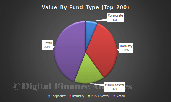
Funds are categorised by APRA into Industry Funds, Retail Funds, Public Sector Funds and Corporate Funds. The largest by value are Retail Funds (44%), then Industry Funds (34%).
Super-2013-4Membership is also spread across the fund types, with 49% in Retail Funds, and 41% in Industry funds.

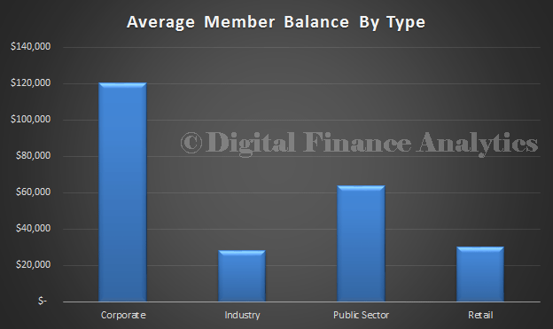
Super-2013-5The average member balance varies by fund type. The average member in an Industry fund has the lowest balance ($27,173) compared with Retail ($30,161), Corporate ($120,273) and the Public Sector ($63,889).
Super-2013-6The final picture today, is the relative performance by fund type. Retail funds, whether you look at 1 year, 5 years or 10 years, are under performing. Reasons will include the need for the entity to make returns to shareholders, commissions paid to advisors, different fee structures, and innate process inefficiency.
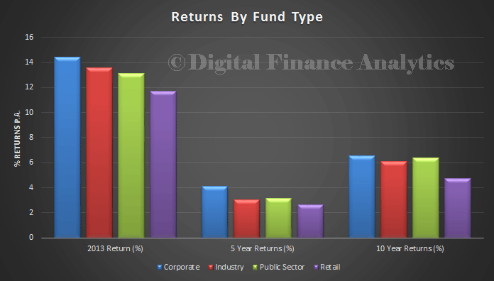
Super-2013-3One last piece of data, there are over 28 million fund members, which means that many people will hold more than one superannuation account. We will come back to the significance of this later.

So, to conclude, we see that Industry funds perform better, that the size of the fund is not correlated to performance in the short or long term, and that there are wider variations in performance across funds, and funds types. All this leads to considerable complexity when individuals are thinking about their superannuation, and later we will use data from our surveys to compare and contrast. But its clear that not all Superannuation Funds are the same, caveat emptor (let the Buyer beware)!