Employment Under The Hood – The Bed Pan Economy

The employment and wage data from the ABS last week was not flash, with job growth momentum easing, unemployment higher and wages growth continuing at glacial speed.

So its worth asking what is really going on under the hood. To do that we have looked at ABS data over the last decade to drill into the detail. And frankly its not pretty.

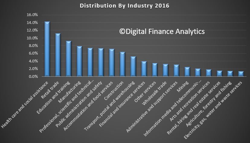
First we looked at employment across the industry sectors. Health care leads the way now at 14.2%, in terms of the number of people employed, followed by retail at 11.1%, education and training at 9.2% and manufacturing at 7.9%.  For comparison purposes, about 12 % of the U.S. workforce is employed in the health care sector.

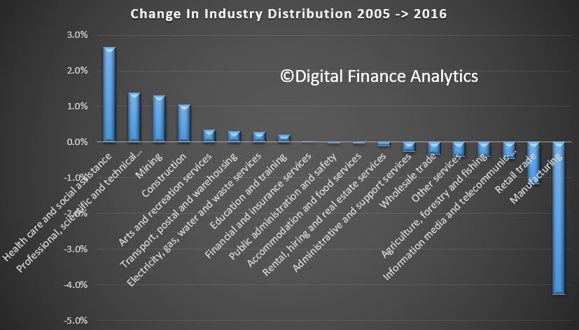
Then we compared the relative distribution by industry groups now, and back in 2005. Over that decade or so there has been a considerable shift in industry distribution.

The fastest growing sector in Health care, which have expanded relatively by 2.7%. The next largest growth sector was Professional and Technical Services at 1.4% and Mining at 1.3%. Construction grew relatively by  1.1%. At the other end of the spectrum, Manufacturing fell by a massive 4.3%, followed by Retail down 1.2% and information technology and media down 0.5%.

Or in other words, relativity more people are working in the health care sector than a decade ago. Drilling further into the data we also see a significant rise in the number of females working in this sector, as well as significant growth in part-time employment in the sector.

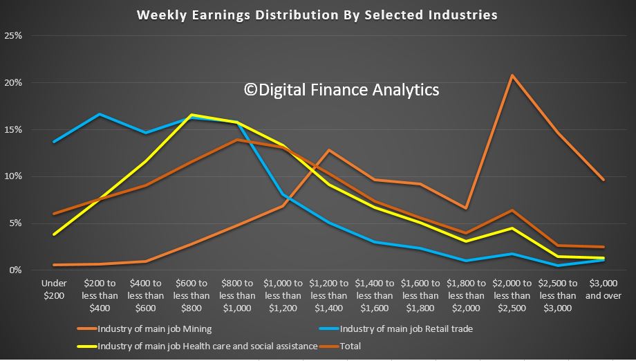
The final piece of analysis looks at relative weekly income across specific industry sectors.  More than half of all people working in retail earn less than $600 a week. More than half of people in the healthcare sector earn less than $800 a week.  Half the average of all industry sectors earns less than $1,000 a week, whilst half of those in the resource and mining sector earn more than $1,800 a week. So Retail and Health care sectors are intrinsically low paid.

Now lets put that together. All this goes some way to explain the shifts in employment and income. The health care sector has been an important generator of jobs in recent years, and health care is expected to continue to expand employment in coming years, but the jobs will continue to shift to low-paying support occupations reflecting changing demographics and greater demand.  About 40 percent of the sector’s workers are not directly involved in treating a patient; instead, they work in jobs such as office or administrative work and food preparation. Others are working in health support occupations like home care and personal assistance. These jobs are paid significant less than care practitioners.

But, the health care sector is more labour intensive than other sectors, such as manufacturing, and this translates into a relatively lower share of output. So growth in health care does not guarantee broad-based prosperity because beyond the high pay of health care practitioners, the health care jobs in highest demand pay lower-than-average wages.

In fact the truth is the growth in jobs are in sectors which are service industries, and these to not really create new value, they simply circulate money in the system , perhaps from superannuation savings to pay for medical care.

Thus the growth in jobs in not assisting overall economic growth, and the lower average wages is depressing overall wage growth. Workers in the health care sector are also less likely to press hard for pay rises.

So the bottom line is we have a structural problem in the economy, where more people are doing important work helping those needing health care assistance, but the overall economic contribution impact is net negative, hence the low GDP growth and wages growth. Or in other words, more jobs are not necessarily good or well paid jobs. And that’s a structural problem, given the current demographic shifts.  Welcome to the bed pan economy.


Auction Volumes Continue To Fall Across The Combined Capital Cities

More evidence of a slowing property market as auction clearance rates continue to fall.

From CoreLogic.

There were 2,089 homes taken to auction across the combined capital cities this week, returning a preliminary auction clearance rate of 60.3 per cent. Last week, 2,279 auctions were held and the final clearance rate dropped to 58.2 per cent, the lowest clearance rate seen since December 2015 so it will be interesting to see what happens as the final result are collected early next week. Over the same week last year, auction volumes were higher with 2,824 homes going under the hammer across the combined capital cities, returning a clearance rate of 73.1 per cent.

2018-05-21--auctionstatistics

In Melbourne, Australia’s largest auction market, a preliminary auction clearance rate of 64.2 per cent was recorded across 1,028 auctions this week, up from 59.8 per cent across 1,099 auctions last week, the lowest clearance rate the city has seen since Easter 2014. One year ago, the clearance rate was a stronger 77.9 per cent across 1,326 auctions.

Auction clearance rate

There were 669 auctions held in Sydney this week returning a preliminary auction clearance rate of 60.8 per cent, compared to 57.5 per cent across 787 last week, and 74.0 per cent across 1,075 auctions one year ago.

Across the smaller auction markets, preliminary results show that Canberra was the best performing in terms of clearance rate with a 66.2 per cent success rate across 79 auctions.

Housing costs are actually the same as in 1993, but renters still struggle

From The Conversation.

Even though house prices have risen substantially over recent decades, housing costs as a share of income have barely shifted in over 20 years. Costs relative to disposable income for housing are largely unchanged, at 17% since 1993, although there has been some increase since 2000.

There is no agreed measure for defining housing affordability, but just looking at house prices can be deceptive. Australian households are roughly equally split between purchasing, renting or owning their house outright.

There is no doubt that house prices increased substantially over recent decades. According to CoreLogic over the past 20 years the median house price in Australia increased from A$140,000 in December 1997 to A$540,000 by December 2017 – an annual increase of 7%. Relative to disposable income this represents a 68% increase over the 20-year period.

Australian households are roughly equally split between purchasing, renting or owning their house outright. Highly inflated house prices are more concerning to people wishing to move from renting to purchasing a house (mostly potential first home buyers).

Housing affordability looks very different when we look at actual housing costs relative to income, rather than just house prices. Housing costs increased substantially between 1984 and 1993.

This was a combination of weak income growth and strong increases in housing costs, particularly mortgages with interest rates increasing sharply over this period. Since peaking in 1993 costs remained relatively stable with rents increasing modestly over the past 10 years, while mortgage costs declined.

Overall, actual housing costs relative to income have remained stable since 1993 at around 16% of disposable income.

We split households into five equal groups from lowest 20% of disposable income up to highest 20%, after adjusting for type of family and household size. Clearly, low-income households spend a lot more on housing relative to their income than higher-income households. The share of housing costs for the lowest income quintile has increased in recent years but is not substantially different from longer term averages.

All other income groups have increased their share of spending relative to income since 1984. Since 1993 the changes have been mixed with the lowest income households and highest income households both spending less as a share of income, while the middle income categories have increased their spending, albeit modestly.

Housing was much more affordable in 1984 with average housing costs at just 11.3% of disposable income.

A number of important changes have occurred over the past 25 years. Interest rates are much lower, living standards have increased substantially for low, middle and high income families and savings rates have also increased – implying that housing costs are increasingly a larger share of expenditure.

Another common measure of housing affordability is housing stress. We use the “30/40” stress rule – a household paying more than 30% of their disposable income on housing costs and also in the bottom 40% of the income distribution.

Using this housing stress measure, we see a significant increase in renter stress, firstly between 1984 and 1993 and then from 2007. Mortgage stress is largely unchanged since 1988 following an increase between 1984 and 1988.

Housing stress rates are similar for major states. The highest rate is in Queensland with 13.5% of households in stress whereas the combined ACT and NT region has the lowest stress rate at 8.1%, thanks to relatively high incomes. The NSW rate is lower than both Victoria and Queensland.

Home ownership rates in Australia have slowly declined since 1984 from around 72% to around 68% by 2015-16. Ownership rates of households headed by people aged under 35 dropped from 50% in the 1980s to around 35% in 2015-16. Households headed by people aged 35 to 49 have experienced a similar percentage point decline but from a higher base.

The downward trend in ownership rates for younger households has been ongoing since 1988. Surprisingly, the house price boom between 1999 and 2005 in Australia does not appear to have made a significant difference to pre-existing trends.

However, home ownership trends are complex, and are likely driven by a range of factors such as interest rates, higher rents in the 1980s, broader societal changes such as people marrying and having children later in life and a higher divorce rates. Another possibility is a shift away from home ownership, with younger people preferring the flexibility that renting offers.

Overall, housing costs in Australia have been relatively stable as a share of disposable income since the early 1990s. This average does mask problems for low-income renters who are paying an increasing share of their income on housing costs, and rent stress levels have also increased over the long term.

Changed economic circumstances provide risks for housing affordability. Were interest rates or unemployment to increase sharply there would be risks to households and flow on effects to the broader economy.

House prices have indeed increased sharply since the late 1990s, well above incomes or inflation. This poses a problem for those wishing to move from the rental market to owning a home as higher house prices imply larger deposits.

While elevated house prices are a concern, the more pressing social problem for Australia remains the lack of affordable rental housing for lower-income families that is close to jobs and services in our capital cities. This has been an ongoing problem in Australia for a number of decades. An ageing population with potentially lower home ownership rates will add to this problem in future years

Author: Ben Phillips, Associate Professor, Centre for Social Research and Methods, Australian National University

Prospa announces IPO to raise $146m

From Australian Broker.

An online business lender is aiming to raise around $146million through an initial public offering (IPO).

Prospa is expected to list the ASX on 6 June, offering shares at an offer price of $3.64 per share. The IPO was lodged with the Australian Securities and Investments Commission (ASIC).

The majority of funds raised in the IPO will be used to fund growth in Prospa’s existing business model and for investing in new product categories and expansion into New Zealand.

While there will be no general public offering of shares, offers will include:

  • An institutional offer, which consists of an offer to Institutional Investors in Australia and certain other geographies
  • A Retail Offer, consisting of the:
    • Broker Firm Offer, which is open to Australian retail clients and sophisticated New Zealand retail clients of Macquarie Equities, Crestone and JBWere; and
    • Priority Offer, which is open to investors chosen by the Company; and
  • An Employee Offer, which is open to eligible Prospa employees.

The IPO will see long-term, London based venture capital investor Entrée Capital support the offer to maintain its 34% stake in the company.

In addition, Australian based venture capital investors Airtree has invested an additional $3m giving it a stake in the company of 8.4%, whilst SquarePeg has invested an additional $10m, increasing their holding from 3.2% to 4.4%.

Chairman Greg Ruddock said on behalf of the Prospa Board that he was pleased to offer the opportunity to become a shareholder in the company.

He added, “Prospa has flourished by offering fast, flexible loans to Australian small businesses that have historically been underserved by traditional banks. Since inception, Prospa has strategically invested in the two most important parts of our business, people and technology. This offer marks another stage of growth for the company, as we look to expand into new geographies and products.”

Co-CEO Greg Moshal said, “From the very beginning, Prospa has set out to be the market leader at what we do, lending to small businesses. And we have done this by obsessing about our customers and finding new ways to improve their chance of success by designing outstanding new customer solutions. Prospa’s success has been the result of a group of smart, talented and passionate people uniting around a common mission to change the way small businesses experience finance.”

Co-CEO Beau Bertoli added, “We started Prospa in 2012 because it was clear to us there had to be a better way. As first mover in a nascent market, Prospa has led the way in enabling small businesses to succeed. Listed life marks another milestone in our growth, however our approach to business won’t change. We are relentlessly looking for a better way to operate, continuously innovating our products and business model and using data to make great decisions and better manage risk.”

Post-IPO, Airtree and SquarePeg will be escrowed to the end of the forecast period.

Entrée Capital and Prospa’s co-founders Greg Moshal and Beau Bertoli, chairman Greg Ruddock and non-executive director, Avi Eyal (co-founder and Managing Partner of Entrée Capital) will be escrowed until the release of Prospa’s FY19 full year audited results.

Earlier this year Prospa confirmed the appointment of Greg Ruddock to the role of chairman of the board, and Gail Pemberton AO and Fiona Trafford-Walker as independent non-executive directors.

DFA Launches Podcast Service

We continue to build out the Digital Finance Analytics social media strategy with the launch of our new podcast service. We have made the first post today, an audio version of the latest property imperative weekly.

We will add additional programmes as we progress, including some exclusive content.

You can subscribe to the RSS service, or via iTunes or other podcast delivery platforms.

The service is hosted at Castos

COBA Launches New Campaign

A new campaign is encouraging Australians to ’Own Your Banking’ and to look at the benefits of customer owned banking. It includes a range of digital advertising, designed to highlight the benefits of Customer Owned Banks. We highlighted the opportunity for COBA aligned organisations in our recent post.

The Customer Owned Banking Association launched the campaign today following increased interest and demand from customers for banking they can trust.

“Own Your Banking is a direct response to our members telling us they’ve seen an uptick in customer interest and enquiries because people are shocked by stories they’ve been hearing in the Royal Commission,” COBA CEO Michael Lawrence said.

“Our model is the only alternative that can claim it is solely customer focused because 100% of profits are used to benefit customers. This is what we’re communicating through the ‘Own your Banking’ campaign.

“4 million Australians already own their banking – they are customers of mutual banks, credit unions and building societies across Australia.

“We hope ‘Own Your Banking’ will let consumers know there are plenty of alternatives in the Australian banking market that can be trusted to put them first.

“There are more than 70 mutual banks, credit unions and building societies located across Australia. We are market leaders in customer satisfaction and offer award winning home loans and low rate credit cards.

“We encourage consumers to take a look at our campaign and learn more about how to Own Your Banking.”

ASIC and RBA welcome the new BBSW calculation methodology

ASIC and the Reserve Bank of Australia (RBA) have welcomed the new BBSW calculation methodology, which commenced today.

The bank bill swap rate (BBSW) rate is a major interest rate benchmark for the Australian dollar and is widely referenced in many financial contracts. Previously, BBSW was calculated from the best executable bids and offers for Prime Bank securities. A major concern over recent years has been the low trading volumes during the rate-set window, the period over which the BBSW is measured.

The new BBSW methodology calculates the benchmark directly from market transactions during a longer rate-set window and involves a larger number of participants. This means that the benchmark is anchored to real transactions at traded prices. ASX, the administrator of BBSW, has consulted market participants on this new methodology. In addition, the ASX has recently conducted a successful parallel run of the new methodology against the existing method.

RBA Deputy Governor Guy Debelle said, ‘The new methodology strengthens BBSW by anchoring the benchmark to a greater number of transactions. This should help to ensure that BBSW remains robust.’

ASIC Commissioner Cathie Armour said, ‘A transaction-based BBSW supports the market’s trust in the robustness and reliability of BBSW.’

‘ASIC and the RBA expect all bank bill market participants – including the banks that issue the bank bills, as well as the participants that buy them – to adhere to the ASX BBSW Guidelines and support the new BBSW methodology. The rate-set window is the most liquid period in the bank bills market, and market participants are therefore likely to get the best outcomes for their institutions and their clients by trading during this time.’

‘We expect market participants to put in place procedures so that as much trading as possible happens during the rate-set window.

This change follows passage through the Parliament in March of legislation that puts in place a framework for licensing benchmark administrators. Consistent with the approach taken in a number of other jurisdictions, it also made manipulation of any financial benchmark, or products used to determine such a benchmark, a specific offence and subject to civil and criminal penalties.

ASIC intends shortly to make financial benchmark rules, on which ASIC consulted in 2017. ASIC also expects to declare BBSW, and a number of other financial benchmarks, as ‘significant benchmarks’ in Australia and to license the administrators of those significant benchmarks.

Airbnb: who’s in, who’s out, and what this tells us about rental impacts in Sydney and Melbourne

From The Conversation.

The rapid growth of the giant online accommodation-sharing platform, aka Airbnb, is creating serious concerns about equity and the impacts on our cities and neighbourhoods as we know them. Our recent research shows that the patterns of Airbnb listings in Australia’s biggest cities are highly uneven. The findings suggest impacts on rental housing are likely to be biggest in high-end areas that appeal to tourists. Low-income areas are less affected.

Our research – focusing on the Sydney and Melbourne metropolitan regions – looked into three important questions:

  • Where are the listings?
  • Who is hosting Airbnb?
  • What are the impacts on rental markets?

Where are Airbnb listings located?

The maps below show the distribution of Airbnb offerings in the Sydney and Melbourne metropolitan regions. These also show the composition of listings: entire (house/apartment, shown in red) versus partial (room only or shared room, in blue).

In Sydney (shown above), Airbnb offerings are mostly concentrated in popular tourist areas. Interestingly, partial house/apartment listings spread out more to the middle and fringe suburbs. Entire house/apartment listings are more concentrated around the city centre and eastern beaches.

We see a similar pattern in Melbourne (above). Airbnb listings aggregate around the city centre but also extend beyond the inner core to the residential outskirts. However, the composition of listings (entire versus partial) has less effect on their distribution in Melbourne than in Sydney.

Interestingly, the cities have very different Airbnb market sizes. The populations of the two regions are almost on a par, but Sydney has almost twice as many Airbnb listings as Melbourne. The difference in entire house/apartment listings is even greater.

Who is hosting Airbnb?

To understand who is participating on the Airbnb platform as host and who is not, we analysed Airbnb listings data against the Australian Bureau of Statistics Census-based SEIFA, the most widely used nationwide measure of socioeconomic status.

SEIFA is a suite of four summary measures created from Census information. For each index, every geographic area is given a SEIFA score. This shows how that area compares with others in Australia.

All areas are ordered from lowest to highest SEIFA score. This ranges from the lowest 10% of areas, which are given a score of 1, up to the highest 10%, with a score of 10.

Our analysis showed the sheer scale of inequity of Airbnb listings distribution. Over 95% of all entire house/apartment listings and about 87% of partial house/apartment listings (room only or shared room) in Sydney are in the socio-economically best-off areas (SEIFA deciles 9 and 10).

Airbnb offerings in Melbourne follow a similar pattern. Over 80% of entire house/apartment listings and about 70% of partial house/apartment listings are found in the best-off areas.

Our data analysis establishes that Airbnb hosting mainly occurs in the most affluent pockets of both regions.

What are the impacts on the rental market?

We also looked at the ratio of the size of the rental market to the size of Airbnb listings with specific attention to the socioeconomic status (using SEIFA) of each local government area in Melbourne and Sydney. This produced a few interesting observations, which help illustrate how local long term rental housing stock is, or could be, lost by conversion to Airbnb short-term listings.

In Sydney, there are no low socio-economic areas (SEIFA scores of 1-5) with high numbers of rental dwellings that also have high numbers of entire house/apartment Airbnb listings. This means that, to date, Airbnb is not displacing the rental stock in the most disadvantaged pockets of the Sydney metropolitan region.

Nevertheless, in a small number of high socio-economic areas (SEIFA scores of 8-10), the Airbnb market (entire listing only) represents sizeable proportions of the rental market. For the beachside location of Waverley (decile 10), for example, the number of Airbnb entire listings is almost equivalent to a quarter of the number of rental dwellings. Similarly, in Manly and Pittwater (both 10), Airbnb entire home listings are about 20% of the rental market size.

In other words, considering the very small size of Airbnb in comparison to the total rental market in Sydney – less than 3.5% – the overall impact can be expected to be minimal. However, the impact is not equally distributed, either geographically or socio-economically.

Indeed, the impact of Airbnb on the rental market is of concern in a limited number of areas in Sydney, mainly strategic tourism locations such as beachside areas. Although these are at the highest end of socio-economic spectrum, there is a danger of some local residents being pushed out of the most sought-after areas so tourists can move in.

The pattern in Melbourne is slightly different or, in a sense, less intense than in Sydney. Again, the general trend of high Airbnb listings in high socio-economic areas is observed.

The Melbourne CBD, which has a SEIFA score of 8, has the most Airbnb entire house/apartment listings. These listings represent the highest proportion, about 8%, when compared to the size of the local rental market. The pressure on the rental market, then, is far less than what we see in popular Airbnb spots in Sydney, such as Waverley, Manly and Pittwater.

We also see in Melbourne that popular rental areas in lower SEIFA areas have low numbers of entire house/apartment Airbnb listings. This confirms the Sydney hypothesis that the loss of rental supply is not yet a major concern at the lower end of the rental market.

The patterns we observed suggest that the pressure Airbnb puts on the rental market – at least at this point of time – is limited to a small number of high-end areas, mainly locations that are attractive to tourists. This represents a concern in terms of rental supply in these areas, where some local residents in the long-term rental market might be losing out to the short-term tourism market.

Authors: Tooran Alizadeh, Senior Lecturer, Director of Urban Design, University of Sydney; Reza Farid, Adjunct Research Fellow, Griffith University; Somwrita Sarkar, Senior Lecturer in Design and Computation, University of Sydney

Australians lost $340 million to scammers in 2017

The ACCC says that Australians lost more money to scammers in 2017 than in any other year since the ACCC began reporting on scam activity. According to the ACCC’s ninth annual Targeting scams report  more than 200,000 scam reports were submitted to the ACCC, Australian Cybercrime Online Reporting Network (ACORN) and other federal and state-based government agencies in 2017. Total losses reported were $340 million – a $40 million increase compared to 2016.

The top three most reported scam categories of 2017 were phishing, identity theft and false billing scams. Losses to investment scams reported to Scamwatch increased by 33 per cent which translates to an increase in losses of $7.6 million. Combined losses with ACORN reports brings investment scam losses to $64.6 million in 2017, an increase over the $59 million in combined losses reported in 2016. False billing scams reported to Scamwatch increased by 324 per cent, from $659 835 in 2016 to

$2.7 million in 2017.  Remote access scams reported to Scamwatch increased by 72 per cent representing an increase in losses of $1 million.

Targeting scams report 2017 infographic

This is the first time reported losses to scams have totalled more than $300 million and demonstrates the increasing impact of scams on Australians. Investment scams topped the losses at $64 million, an increase of more than 8 per cent. Dating and romance scams caused the second greatest losses at $42 million.

“It’s very worrying that Australians are losing such extraordinary amounts to scammers. Based on just the reports provided to the ACCC, victims are losing an average of $6500. In some cases people have lost more than $1 million,” ACCC Deputy Chair Delia Rickard said.

“Some scams are becoming very sophisticated and hard to spot. Scammers use modern technology like social media to contact and deceive their victims. In the past few years, reports indicate scammers are using aggressive techniques both over the phone and online.”

Today marks the beginning of Scams Awareness Week 2018 and this year Scamwatch is asking people to “Stop and check: is this for real?” when they’re contacted by scammers who are pretending to be from well-known government organisations or businesses.

Scamwatch received almost 33,000 reports of these threat-based impersonation scams in 2017. Over $4.7 million was reported lost and more than 2800 people gave their personal information to these scammers.

“These scams can be very frightening. For example, scammers will impersonate the Australian Taxation Office and threaten people with immediate arrest unless they pay an outstanding tax bill. They may pretend to be from Telstra to try to hack into your computer or from Centrelink promising extra payments in return for a ‘fee’,” Ms Rickard said.

“Scammers scare us or butter us up with promises of cash because they know it clouds our judgement. People get so worried about being arrested they don’t question if the person threatening them is genuine.”

“If you’re being threatened, take a deep breath, and ask yourself if the call makes sense. The ATO will never threaten you with immediate arrest; Telstra will never need to access your computer to ‘fix’ a problem; and Centrelink will never require a fee to pay money it owes you. Finally, none of these organisations will ask you to pay using iTunes gift cards,” Ms Rickard said.

“If something doesn’t feel right, hang up the phone or hit delete. If the person said they were, for example, from Telstra or the ATO, find the phone number for that organisation online or in the phone book, call them and let them know about the call you received. They’ll let you know if it’s genuine or a scam.”

The ACCC encourages people to visit www.scamwatch.gov.au (link is external) to report scams so we can warn others about them and learn more about what to do if they’re targeted by scams.

Equity markets a ‘house of cards’: FIIG

With US 10-year bond yields at a seven-year high, a relatively minor shock could be enough to trigger forced selling on equity markets, says FIIG via InvestorDaily.

The yield on 10-year US treasuries closed at 3.11 per cent overnight on Friday, a seven-year high that prompted speculation about a shift out of equities.

Speaking to InvestorDaily, FIIG NSW state manager Jon Sheridan said that if the 10-year holds at this level it will have broken the long-term secular downtrend in yields.

While he did not profess to be a “massive believer” in technical analysis, he said it is important to realise that many of the people trading in markets do.

And with high levels of margin debt and stretched valuations on the S&P 500 index, equity markets are looking like a “bit of a house of cards at the moment”, Mr Sheridan said.

“A strong gust, whatever that might be – it might be a geopolitical thing, or Facebook getting regulated, or Tesla raising capital – could break the fragile confidence,” he said.

“And then it all comes tumbling down and then you’ve got algorithmic selling, and margin debt being called and forced selling – all the waterfall effects that you don’t want to see if you’re an equity investor.”

There are three indicators that have Mr Sheridan worried about the future trajectory of the current US equity bull run.

First, the three-month US treasury bill is now above the yield on the S&P 500. In other words, he said, investors can get a higher (and risk-free) yield on three-month treasuries than they can get from the dividend yield of the stocks on the S&P 500.

Second, the 10-year treasury yield, at 3.11 per cent, is above the terminal US Federal Reserve funds rate of 2.75-3 per cent – something that has never happened before (at least “sustainably”).

“What that means is that if you think history will play out again, you should actually be a buyer of longer-dated bonds, because the chances are that yields aren’t going any higher from here. And in fact may even go lower,” Mr Sheridan said.

Finally, the spread between the US 10-year and 2-year yields has fallen to 51 basis points (down from 1 per cent a year ago, and from 2.62 per cent in December 2013).

When the spread goes negative (i.e, ‘inverts’) it means 2-year yields are higher than their 10-year counterparts.

“Every time since World War Two there has been a recession within 1 to 3 years from that inversion,” Mr Sheridan said.

“That’s the main signalling influence that the yield curve has in terms of the general economic outlook, and of course recession is terrible for stocks and property, because they’re risk-on assets,” he said.