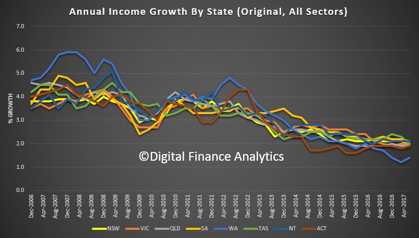
Household Incomes are growing at the slowest rate for two decades, putting more strain on family budgets who are wrestling with rising costs and bigger mortgages and battling the debt monster.
 What the implications for home prices, and the broader economy? Welcome the Property Imperative weekly to 19th August 2017, as we look at the latest finance and property news.
Last week we saw auction clearance rates accelerate. According to CoreLogic they rose to 2,011, compared with 1,857 over the previous week. This was the largest number of auctions held since the last week of June 2017 and one third higher compared with the same week a year ago. Melbourne has held the record for the largest number of sales, but Sydney achieved a higher clearance rate at 72%. So not much sign of the property market flagging.
More data came from the RBA when Assistant Governor Christopher Kent discussed insights from a dataset which covers about 280 ‘pools’ of securitised assets and has information on 1.6 million individual mortgages with a total value of around $400 billion. Currently, this accounts for about one-quarter of the total value of home loans outstanding in Australia.
A couple of caveats. While the dataset covers a significant share of the market for housing loans, it may not be entirely representative across all its dimensions. In particular, the choice of assets in the collateral pool may be influenced by the way that credit ratings agencies assign ratings and by investor preferences. Also, in practice it may take quite a while until new loans enter a securitised pool.
But the first thing to note is that rates on owner-occupier loans and investor loans used to be similar, but investor loans became relatively more expensive from the latter part of 2015. In fact, up until most recently, actual rates paid on interest-only loans have been lower than those on principal-and-interest loans. But now, interest only loans are significantly more expensive for both owner-occupied and investor borrowers. This is reflecting recent bank repricing as they seek to repair margins and throttle back interest only lending in response to regulatory pressure. Monthly repayments are on the rise, and on large loans this is a significant impost.
Looking at loan to value ratios, we see that there is a large share of both owner-occupier and investor loans with current LVRs between 75 and 80 per cent. That is consistent with banks limiting the share of loans with LVRs (at origination) above 80 per cent. Also, borrowers have an incentive to avoid the cost of mortgage insurance, which is typically required for loans with LVRs (at origination) above 80 per cent. This is consistent with the DFA market model, and suggests that a common held view that the average LVR is circa 50% is not correct any more. Bigger loans, lower equity, larger repayments.

Finally, they looked at offset accounts, which showed strong growth up to 2015 probably related to the rise in the share of interest-only loans, with the two being offered as a package. Interestingly, we saw a significant slowing in growth in offset balances around the same time as growth in interest-only housing loans started to decline. Offset balances provide some security for borrowers in times of finance stress. But the RBA highlights that for investor loans, even after accounting for offset balances, there is still a noticeable share of loans with current LVRs of between 75 and 80 per cent. And for both investor and owner-occupier loans, adjusting for offset balances leads to only a small change in the share of loans with current LVRs greater than 80 per cent. This suggests that borrowers with high current LVRs have limited repayment buffers.
Oh, and note there was no analysis at all on the most critical metric – loan to income ratios, which as we have been highlighting is a more reliable risk assessment tool, but one which in Australia we appear loathe to discuss.
This becomes important when we consider that home prices continue to rise in most states. Separate analysis from CoreLogic showed that the cost of housing has continued to rise across most parts of the country over the past 12 months, pushing the proportion of homes selling for at least one million dollars to new record highs. Bracket creep should come as no surprise in markets like Sydney and Melbourne where dwelling values have increased by 77% and 61% respectively over the past five years. While the rise in housing values has been most pronounced in Sydney and Melbourne, most other capital cities and regional areas have also seen a proportional lift in home sales over the million-dollar mark.
The banks continue to lend strongly in the mortgage sector, with system growth still sitting around 6% over the past year. ANZ, who reported their third quarter results this week revealed that they had grown their owner occupied lending at 1.3 times system growth, whilst investor loans grew at 0.8%. Lenders are still banking on mortgage credit growth.
The RBA minutes were more muted this month, perhaps because of the reaction to the 2% rate lift to neutral last month, which was hurriedly walked back subsequently! They mentioned concerns about high household debt again, and that inflation is running below 2%. They also mentioned that the Australian Bureau of Statistics intends to update the weights in the CPI in the December quarter 2017 CPI release, to reflect changes in consumers’ spending behaviour over recent years. This is expected to lead to lower reported CPI inflation because the weights of items whose prices had fallen were likely to be higher, whereas the weights of items whose prices had risen were likely to be lower.
Underlying inflation was expected to be close to 2 per cent in the second half of 2017 and to edge higher over the subsequent two years. Retail electricity prices were expected to increase sharply in the September quarter. They said “ongoing low wage growth and the high level of debt on household balance sheets raised the possibility that consumption growth could be lower than forecast”.
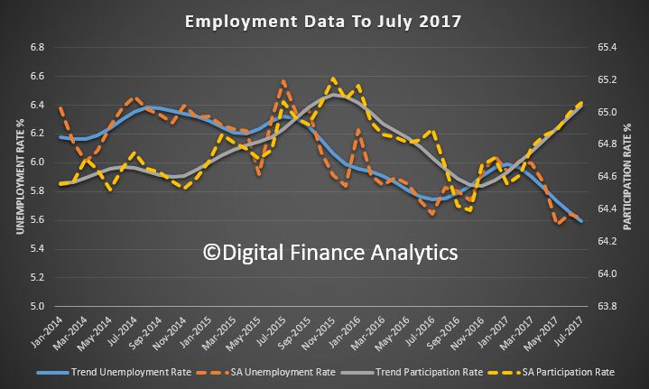
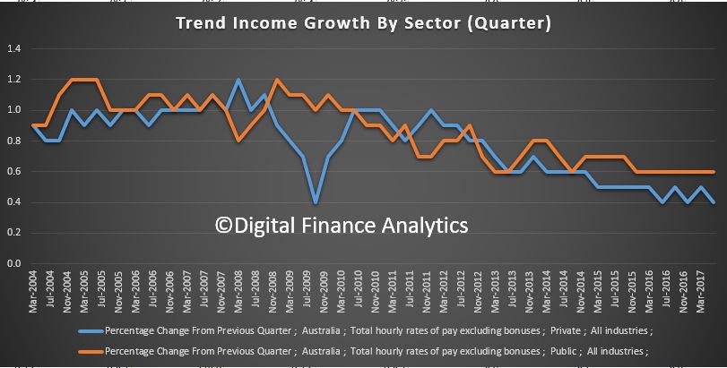
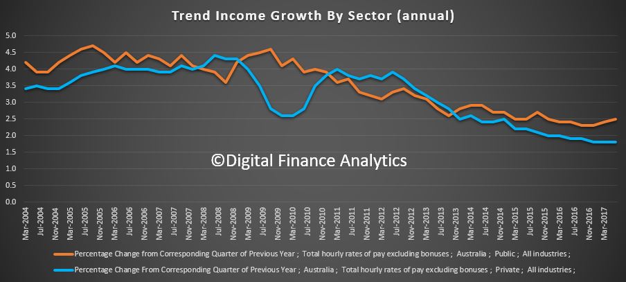
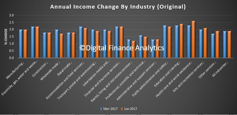
The income data from the ABS confirmed low wage growth, with seasonally adjusted, private sector wages up just 1.8 per cent and public sector wages up 2.4 per cent through the year to June quarter 2017. So wages for those not fortunate enough to work in the public sector continues to be devalued in real terms. Also, whilst more jobs were created in July, the employment rate is still quite high, and underemployment remains a significant factor – one reason why wages growth is unlikely to shift higher.
So, what are the consequences of home lending rising 6%, inflation 2% and incomes below this? The short answer is more debt, and mostly mortgage debt.
To get a feel for the impact of this, look at our recent focus group results. Around two thirds of the households in the session held a basic assumption that high debt levels were normal. They had often accumulated debts through their education, when they bought a house, and running credit cards. Even more interestingly, their concern from a cash flow perspective was about servicing the debts, not repaying them. One quote which struck home was “once I am dead, my debts are cancelled, I just keep borrowing until then”.
Debt, it seems has become part of the furniture, and will remain a spectre at the feast throughout their lifetime. The banks will be happy!
So it is worth looking at some long term trends, as we did on Friday using RBA data.
The traditional argument trotted out is that household wealth is greater than ever, this despite low income growth and rising debt. But of course wealth is significantly linked to home prices, which in turn is linked to debt, so this is a circular argument. You get a different perspective by looking at some additional trends. And if property prices fell it would all turn sour.
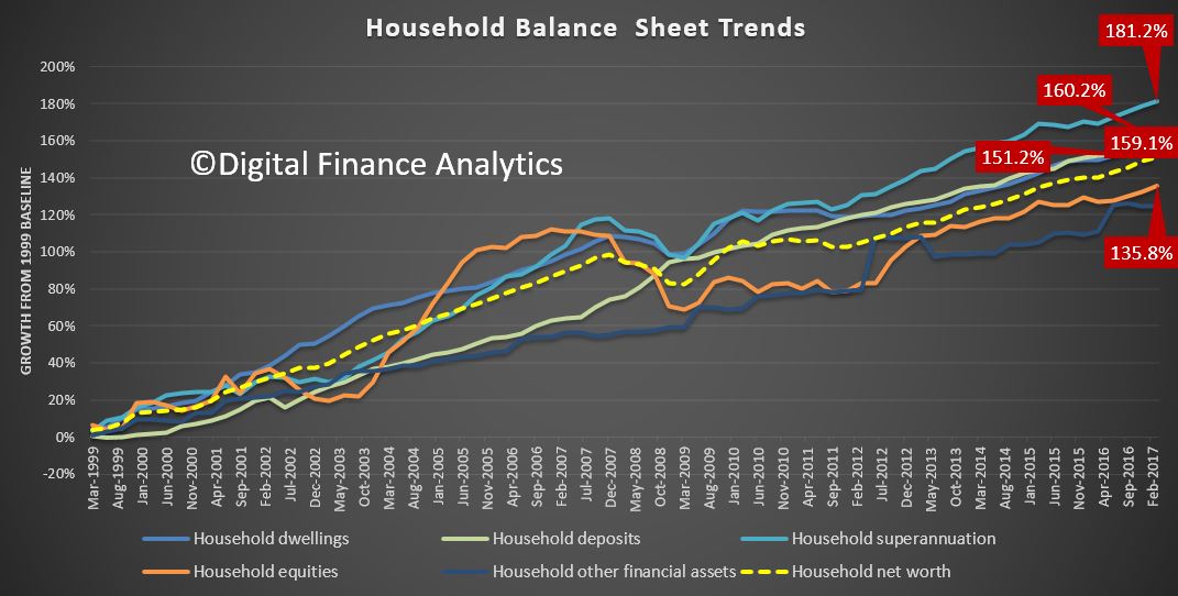
But let’s start with the asset side of the ledger. Since 1999, superannuation has grown by 181.2%, and at the fastest rate. But it is arguably the least accessible asset class.
Residential property values rose 160.2% over the same period, and grew significantly faster than equities which achieved 135.8% growth, so no wonder people want to invest in property – the capital returns have been significantly more robust. Deposit savings grew 159.1% (but the savings ratio has been declining recently). Overall household net worth rose 151.2%. So the story about households being more affluent can be supported on this view of the data. But it is myopic.
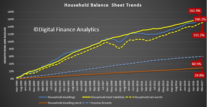
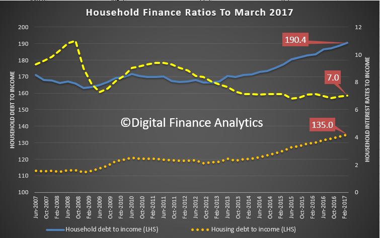
Overall household debt rose 161.9%, a growth rate which is higher than residential property values, at 160.2% and above overall household net worth at 151.2%.
But the growth in income, which is a puny 60.5%, under half the asset growth. OK, interest rates are lower now, but this increase in leverage is phenomenal – and explains the “debt is normal” findings from our focus groups. I accept debt is not equally spread across the population, but there are significant pockets of high borrowing, as can be seen from our mortgage stress analysis – and it’s not just among battling urban fringe mortgage holders.
Finally, it is worth noting the growth in the number of residential properties rose by just 29.8% over the same period. So the average value of individual properties has increased significantly. On paper.
To me this highlights we have learned nothing from the GFC. Our appetite for debt, supported by the low interest rate monetary policy, significant tax breaks, and salted by population growth has created a debt monster, which has the capacity to consume many if interest rates were to rise towards more normal levels. Unlike Governments, household debt has to be repaid, eventually.
This data series shows clearly the relationship between more debt and home prices, they feed of each other, and this explains why the banks have enjoyed such strong balance sheet growth. But the impact on households is profound, and long term. Our current attitude to debt will be destructive eventually.
If you are interested in this debate, try to watch ABC Four Corners on Monday night, as they will be looking at the housing bubble and mortgage stress, and using some of our data in the programme.
And that’s the Property Imperative to 19th August 2017. If you found this useful, do subscribe to get updates, and check back for next week’s installment. Thanks for watching.