Suncorp FY17 Results – Margin Still Under Pressure

Suncorp Group Limited today reported NPAT of $1,075 million (FY16: $1,038 million) for the 12 months to 30 June 2017, an increase of 3.6%. They announced a a final dividend of 40 cents per share fully franked, bringing the total dividend to 73 cents per share (FY16: 68 cents) which represents a payout ratio of 81.9% of cash earnings. The results were helped by overall lower provisions. The repricing of mortgages helped also, but despite this bank NIM fell and home lending past due rose a little. So, its still a tough gig!

Suncorp is a complex portfolio of businesses, with a significant concentration in Queensland, so you have to look at each element. Given our focus on retail banking we will dive a little deeper there.

The Insurance business delivered NPAT of $723 million, up 30%, due to strong top-line growth and lower claims costs. The General Insurance business continued to see strong progress in remediating claims cost issues in the Home and Motor portfolios. GWP increased by 3.9% following strong growth in New South Wales CTP, premium increases in Home and Motor products and the successful entry into the South Australian CTP scheme. Commercial insurance GWP reduced 2.2% as pricing increases and strong retention in the SME segment was offset by lower retention in the Corporate segment. Reserve releases of $301 million (FY16: $348 million) remain well above long-term expectations of 1.5% of Group net earned premium (NEP). Life Insurance planned margins and underlying profits remained stable.

Suncorp’s additional reinsurance aggregate cover purchased for FY17 created significant shareholder value and increased resilience to natural hazards. Given the success in FY17, a similar cover has been purchased for FY18. The new cover provides $300 million of cover once the retained portion of natural hazard events greater than $10 million exceeds a total of $475 million. The retained natural hazards allowance has increased to reflect the higher natural hazards costs experienced in recent years.
The upper limit on Suncorp’s main catastrophe program, which covers the Group’s Home, Motor and Commercial Property portfolios for major events, will remain unchanged at $6.9 billion for the 2018 financial year.

The Banking & Wealth business delivered NPAT of $400 million, impacted by investment in the Core Banking and Wealth platforms to support Suncorp’s strategy.

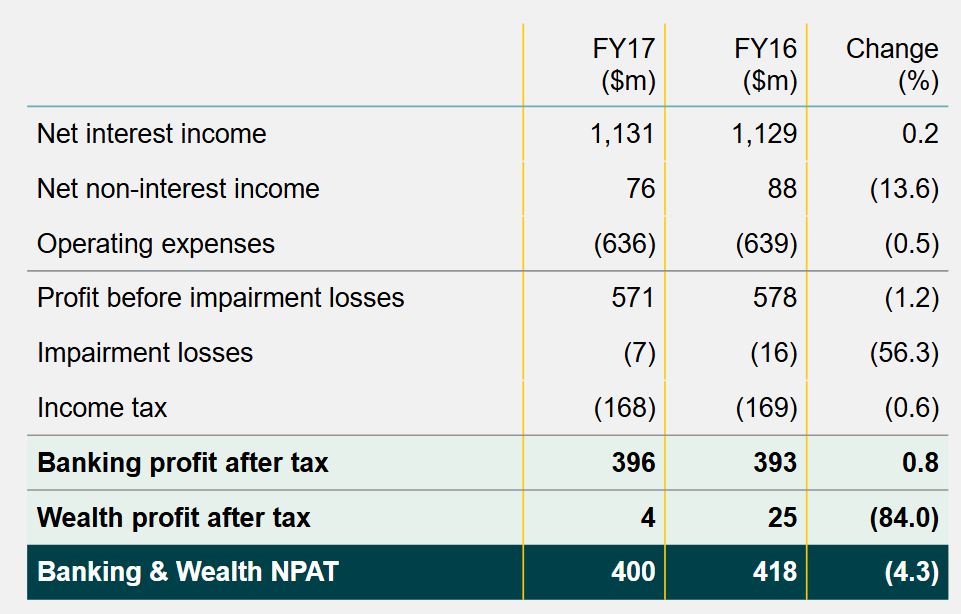
The Banking business achieved NPAT of $396 million with a focus on sustainable profitable growth while adapting to changing economic and regulatory dynamics.

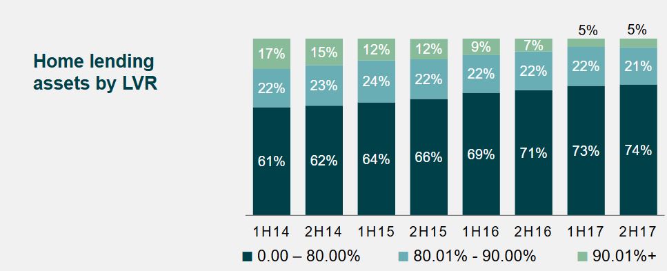
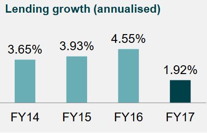
Lending growth of 1.9% reflected improved momentum in the second half of the financial year. They have throttled back on higher LVR loans.

Home lending remains a large part of the business, with about three quarters of loans principal and interest, and with a concentration in Queensland.

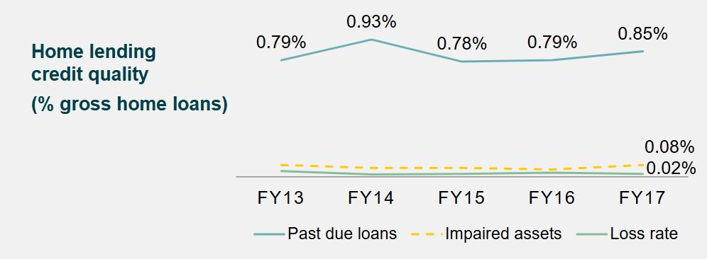
The past due has risen this past year.

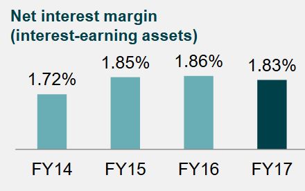
NIM of 1.83% reflects targeted repricing of mortgage rates, but is still down on FY16.


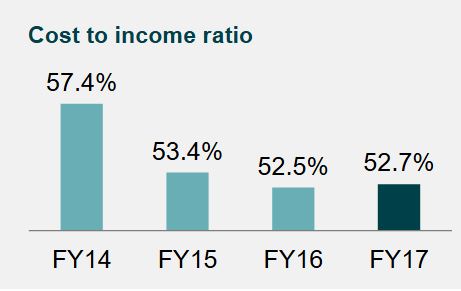
The cost to income ratio of 52.7% was a result of stable operating expenses and the subdued growth environment.

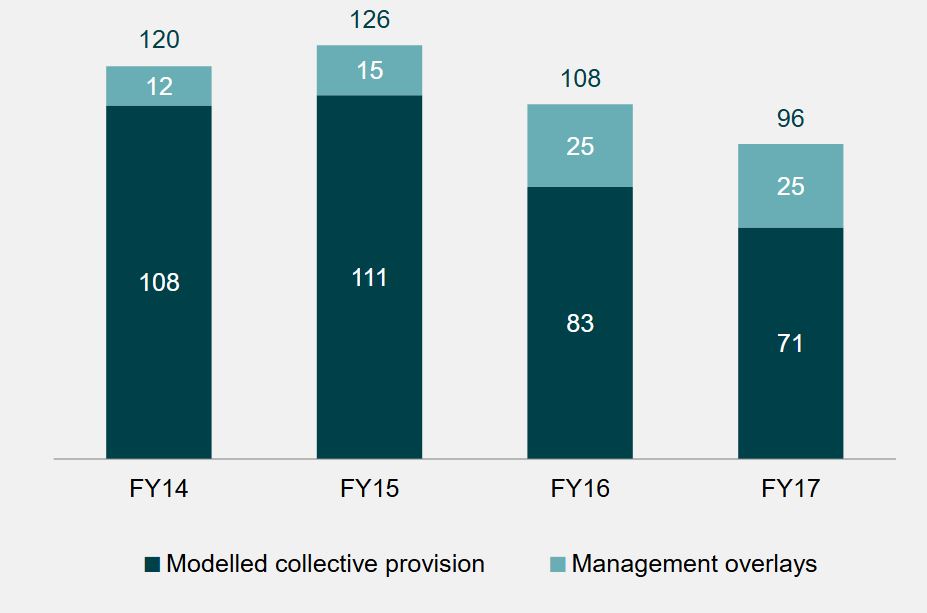
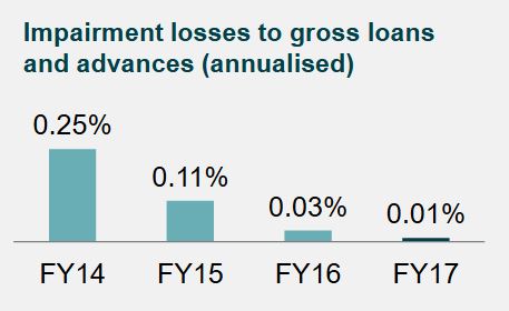
Impairment losses reduced to $7 million, representing 1 basis point of gross loans and advances.

The Wealth business NPAT of $4 million reflects the cost of completing the Super Simplification Program and lower investment returns. Funds under management and administration increased by 0.8%.

They continue to drive “Project Ignite” (migration of core banking to its new Oracle platform), but said they would halt the migration of deposits and transaction banking products while it waits on upgrades from the vendor.

New Zealand achieved NPAT of A$82 million, impacted by claims costs associated with the Kaikoura earthquake and the associated reinsurance reinstatement expense. New Zealand General Insurance profit reduced to A$45 million, however underlying ITR was above the Group’s target of 12%. GWP growth of 6.3% was primarily driven by the Motor and Home portfolios. New Zealand Life Insurance delivered NPAT of A$37 million with a stable underlying profit of A$39 million, offset by negative market adjustments. During the financial year, the New Zealand business disposed of its Autosure motor insurance business. The sale resulted in a release of capital of A$30 million and will be accretive to the New Zealand long-term return on equity. A goodwill write-off of A$25 million has been included as a non-cash item in the Group result.

Capital and Dividend
The Board has determined a fully franked final dividend of 40 cents per share. This brings total ordinary dividends for the 2017 financial year to 73 cents per share, up 7.4%. This represents a dividend payout ratio of 81.9% of cash earnings, slightly above the top end of the 60% to 80% dividend payout range and reflects the Board’s confidence in the outlook for the Group.

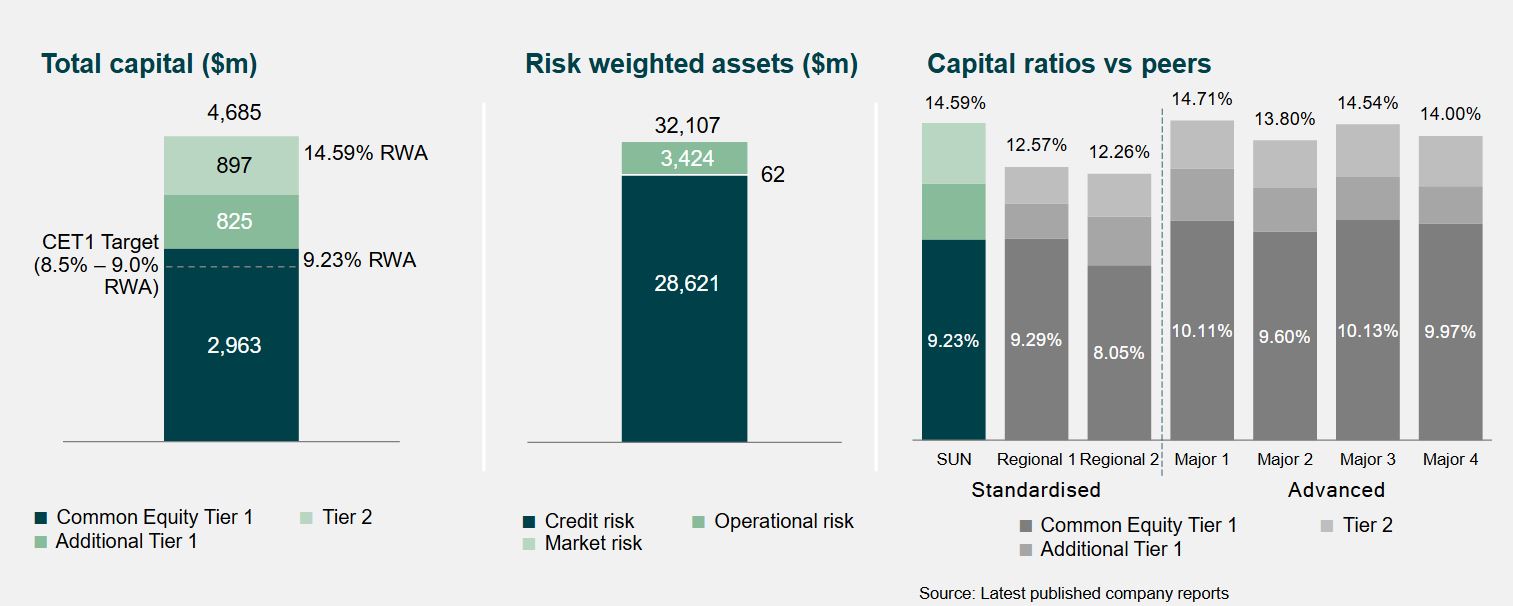
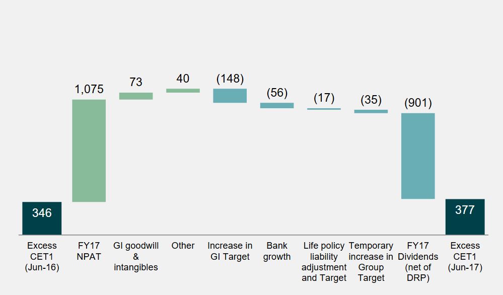
After accounting for the final dividend, the Suncorp Group’s Common Equity Tier 1 (CET1) is $377 million above its operating targets.

The General Insurance CET1 is 1.32 times the Prescribed Capital Amount and Bank CET1 is 9.23% are above the top end of their target ranges.
The Group has $235 million of franking credits available after the payment of the final dividend. It has a strong capital position.


Foreign Investors in Sydney paying almost four times as much stamp duty as locals

The HIA says recent changes to stamp duty in NSW mean that foreign investors now pay almost $100,000 in transaction taxes to acquire a standard apartment in Sydney – almost four times as much as local buyers.

This remarkable finding is contained in the latest Stamp Duty Watch report which has just been released by the Housing Industry Association.

The average stamp duty bill in Australia paid by resident owner occupiers is also up by 16.4 per over the year to $20,725, even though dwelling prices increased by just 10.5 per cent .

On the owner occupier side, stamp duty drains family coffers of $107 each and every month over a 30-year mortgage term. For owner occupiers, the typical stamp duty bill now amounts to $20,725 – an increase of some 16.4 per cent on a year ago.

Shelling out so much in stamp duty drains the household piggy bank of vital funds for their home deposit. Families are then forced to take out larger mortgages and incur heavier mortgage insurance premiums.

Foreign investors are a vital component of rental supply in cities like Sydney and Melbourne. With rental market conditions now so tight in Australia’s two biggest cities, should we really be placing more and more barriers in the way of new supply?

Virgin Money introduces raft of rate changes

From Australian Broker.

Effective 8 August, Virgin Money will introduce multiple rate changes across a raft of mortgage products.

A new broker note released today listed these changes which include:

  • Increasing the standard variable rates for owner occupied and investment interest only loans for new and existing customers
  • Increasing the fixed interest only rates for both owner occupied and investment loans
  • The lender no longer accepting Rate Lock requests for pre-approvals or for off-the-plan purchases

The standard variable interest only rates will be raised by 25 basis points for new and existing customers.

Reference Rate Rate (p.a.)
Virgin Money variable interest only rate (owner occupied) 4.89%
Virgin Money variable investment interest only rate (investment) 5.19%

For new owner occupied interest only customers, the rates will be as follows:

Current rate (p.a.) New rate (p.a.) Change
Borrowings $75,000 to $499,999
LVR less than or eual to 70% 4.14% 4.39% +0.25%
Borrowings $500,000 to $749,999
LVR less than or eual to 70% 4.09% 4.34% +0.25%
Borrowings $750,000 and above
LVR less than or eual to 70% 4.04% 4.29% +0.25%

For new investment interest only loans, the rates will be as follows:

Current rate (p.a.) New rate (p.a.) Change
Borrowings $75,000 to $499,999
LVR less than or eual to 70% 4.14% 4.39% +0.25%
Borrowings $500,000 to $749,999
LVR less than or eual to 70% 4.09% 4.34% +0.25%
Borrowings $750,000 and above
LVR less than or eual to 70% 4.04% 4.29% +0.25%

Virgin Money will also be changing its fixed interest only rates as follows:

Owner occupied – LVR 70% and under
Term Current rate (p.a.) New rate (p.a.) Change
1 year 4.24% 4.39% +0.15%
2 year 3.99% 4.39% +0.40%
3 year 3.99% 4.49% +0.50%
4 year 4.34% 4.69% +0.35%
5 year 4.49% 4.79% +0.30%


Investment – LVR 80% and under
Term Current rate (p.a.) New rate (p.a.) Change
1 year 4.34% 4.49% +0.15%
2 year 4.05% 4.49% +0.44%
3 year 4.14% 4.49% +0.35%
4 year 4.44% 4.89% +0.45%
5 year 4.59% 4.99% +0.40%

Finally, Virgin Money will not be accepting rate lock for pre-approval applications or for off-the-plan purchases. Once a property has been found for a pre-approval application, then rate lock can be requested however.

Teachers Mutual Bank Tweaks Mortgage Rates

Effective 1 August Regional lender Teachers Mutual Bank (TMB), along with its subsidiaries Unibank and Firefighters Mutual Bank, have announced a series of rate changes “in line with our regulatory obligations and current rates available across the market”. They sayDue to business and prudential requirements, we have placed restrictions on certain interest only home loans“.

Once again we see a differential shift, with interest only loan rates being lifted, whilst rates on some owner occupied principal and interest loans below specific LVR’s and value are reduced. This underlines the current behaviour where specific types of “low risk” borrowers are being recognised. Expect more of the same from other market participants.

This also means if you are the right type of borrower, there are some good rates available, whereas others, especially interest-only borrowers will not be so fortunate. We are seeing risk-based pricing emerging via the back door!

The bank increased the interest only variable rate by 20 basis points to 5.66% p.a. (comparison rate 5.71% p.a.). Interest only rates for the Solution Plus Home Loan rose by between 30 and 50 basis points depending on the LVR. Rates span between 4.49% p.a. (comparison rate 4.74% p.a.) and 4.67% p.a. (comparison rate 4.29%).

Rates for the principal & interest Solutions Plus Home Loan were decreased by 15 basis points to 4.39% p.a. (comparison rate 4.64% p.a.) for those borrowing between $240,000 and $499,999 where the LVR is greater than 80% and less than or equal to 90%.

All Hands on Deck: Confronting the Challenges of Capital Flows

From The IMF Blog.

The global financial crisis and its aftermath saw boom-bust cycles in capital flows of unprecedented magnitude. Traditionally, emerging market economies were counselled not to impede capital flows. In recent years, however, there has been growing recognition that emerging market economies may benefit from more proactive management to avoid crisis when flows eventually recede. But do they adopt such a proactive approach in practice?

In recent research, we analyze the policy response of emerging markets to capital inflows using quarterly data over 2005–13. Our analysis shows that emerging markets do react to capital flows—most commonly through foreign exchange intervention and monetary policy, but also using macroprudential measures and capital controls. Ironically, the most commonly prescribed instrument for coping with capital flows—tighter fiscal policy—is the least deployed in practice.

Menu of policies

Policymakers in emerging market economies have potentially five tools to manage capital flows: monetary policy; fiscal policy; exchange rate policy; macro-prudential measures; and capital controls. In deploying these, there is a natural correspondence (or mapping) between risks and instruments.

Monetary and fiscal policies can help address the inflation and economic overheating concerns raised by capital inflows. When the currency is not undervalued, foreign exchange intervention can be used to limit currency appreciation that threatens competitiveness; and macroprudential measures (such as reserve requirements, capital adequacy ratios, dynamic loan loss provisioning, etc.) can be applied to curb excessive credit growth and related financial stability risks.

Capital inflow controls can buttress these policies by limiting the volume of capital inflows or by tilting the composition of flows toward less risky types of liabilities. Countries with controls on capital outflows can also relax these restrictions to lower the volume of net flows, reducing overheating and currency appreciation pressures.

Proactive central bank response

Capital flows to emerging markets have been particularly volatile over the last decade. But emerging markets’ central banks have not been indifferent to this volatility.

Foreign exchange intervention, for example, follows the ebbs and flows of capital, with a strong correspondence between reserve accumulation and net inflows. On average, emerging markets’ central banks purchase some 30–40 percent of the inflow, but some central banks, especially those in Asia (such as India, Indonesia, Malaysia) and Latin America (Brazil, Peru) tend to intervene more heavily, while others (such as Mexico and South Africa) tend to intervene less.

In terms of monetary policy, capital inflows elicit higher policy rates in emerging markets on average, though the impact depends on the behavior of inflation, the output gap (a measure of economic slack), and the real exchange rate. Policy rates are thus raised in response to higher inflation or a larger output gap—implying a counter-cyclical monetary policy stance—but lowered in response to real exchange rate appreciation.

Procyclical fiscal policy

When it comes to fiscal policy, however, the stance is strongly procyclical in the face of capital inflows. Thus, government consumption expenditure rises as capital inflows surge, and falls as capital inflows decrease—presumably because of political economy constraints, and/or because emerging markets face difficulty in accessing international credit markets in bad times.

Less orthodox policies

Turning to macroprudential measures and capital controls on inflows, our analysis shows that these measures are generally tightened as inflows surge and relaxed when flows recede. There is, however, considerable cross-country variation in response. Some countries, such as Brazil, Korea, Turkey, tend to use these measures more often than others.

For capital outflow controls, the reverse is true. Measures are relaxed when inflows surge—though it is only countries without fully open capital accounts, for example, India and South Africa, that tend to do so.

Natural mapping

Not only do emerging markets respond to inflows through various tools, their choice of the policy instrument also corresponds to the nature of the risk posed by capital flows.

Thus, foreign exchange intervention is generally used when the real effective exchange rate is appreciating, while what matters more for monetary policy tightening is the output gap. Macroprudential measures are typically deployed in the face of rapid domestic credit growth, while inflow controls are tightened when both credit growth and currency appreciation combine as a concern.

Bottom line

Following the repeated boom-bust cycles in capital flows, many emerging markets have internalized the lessons that they must manage capital flows if they are to reap the benefits of financial globalization, while minimizing the risks. They typically deploy a combination of instruments, with some correspondence between the nature of the risk and the tool deployed.

Nevertheless, there are important differences in policy response across countries, even in similar macroeconomic circumstances. This suggests that structural characteristics and political economy considerations may be at play in shaping a country’s specific policy response. An equally relevant question is whether the active policy management pursued by emerging economies has contributed to fewer financial crises in recent years. We hope that future research can shed light on these issues.

Wells Fargo’s Auto Insurance Practices

From Moody’s

Last Thursday, Wells Fargo & Company announced an $80 million remediation plan for auto loan customers that it had incorrectly charged for collateral protection insurance (CPI) between 2012 and 2017. The announcement is credit negative for Wells Fargo. The remediation costs are relatively immaterial at approximately 1% of its pre-tax quarterly earnings, but the announcement is yet another negative reputational headline for the bank. Despite the limited financial effect, we expect that the announcement will exacerbate the damage to Wells Fargo’s reputation in this past year.

Wells Fargo requires auto loan customers to maintain comprehensive and collision insurance for financed autos during the term of the loan. The bank’s CPI program purchased auto insurance on the customer’s behalf from a third party if proof of auto insurance had not been provided. Wells Fargo’s review of its CPI program and related third-party vendor practices, which began in July 2016 and was prompted by customer concerns, found that approximately 570,000 customers may have been negatively and incorrectly affected.

Roughly 490,000 customers were incorrectly charged for CPI despite having satisfactory auto insurance of their own. Approximately 60,000 customers did not receive adequate notification and disclosure information from the vendor before the bank’s purchase of CPI on their behalf. Finally, for 20,000 customers, the required payments for the incorrectly placed CPI may have contributed to the default of their loan and repossession of their vehicle. Wells Fargo’s $80 million remediation plan intends to rectify financial harm to these customers. As a result of its initial findings, Wells Fargo discontinued its CPI program in September 2016.

Wells Fargo historically had strong customer satisfaction scores and a reputation for sound risk management. In September 2016, its lead bank subsidiary agreed to pay $185 million to federal regulators and the Office of the Los Angeles, California, City Attorney to settle sales practice issues. The settlement revealed that Wells Fargo’s retail banking incentive structure had led to pervasive inappropriate sales practices. The fallout from revealing the sales practices deficiencies resulted in a hit to Wells Fargo’s customer loyalty measure, shown in the exhibit below. Although the metric has improved from its fourthquarter 2016 low, the latest announcement could add pressure. However, on the positive side, there has been no significant sign of client attrition, despite the negative effect on customer loyalty metrics.

Furthermore, any resulting regulatory investigations, lawsuits or political inquiries could add to the bank’s costs, particularly for litigation. In particular, we have previously noted that the high end of Wells Fargo’s range for reasonably possible potential litigation losses in excess of its established liability was $2.0 billion at the end of the first quarter, up from $1.8 billion at year-end 2016 and $1.3 billion at year-end 2015. On the bank’s second-quarter earnings call, before this announcement, management indicated the high end of this range could grow by another $1.3 billion. Although these potential litigation costs are manageable given Wells Fargo’s robust pre-tax earnings, this recent announcement adds to profitability challenges the bank continues to face.

Here’s why it’s so hard to say whether inequality is going up or down

From The Conversation.

Is inequality rising or falling? The answer, if recent public debate is anything to go by, may appear at first to depend on who you ask.

Part of the reason why we get such conflicting narratives about whether it’s rising or falling is that economic inequality can be measured in different ways, using different data sets.

And you might get a different answer depending on whether you’re talking about income inequality or wealth inequality. Income is the flow of economic resources over a certain time period, while wealth is the stock of resources built up over time.

We can draw some insights from the newly released Household Incomes and Labour Dynamics in Australia (HILDA) 2017 report, which reveals the latest results of a longitudinal study that has been running since 2001.

But it doesn’t show the whole story. Combining HILDA’s results with data from the Australian Bureau of Statistics’ income surveys gives a more comprehensive picture of trends in economic inequality in Australia.

HILDA data show lower income inequality than the ABS

Firstly, you need to know that when we are talking about income, most people are referring to the disposable income of the household, not individuals.

That’s all the income that members of a household receive from various sources, minus tax. You can then then adjust for the number of people in the household, accounting for the differing needs of adults and children to get what economists call “equivalised household disposable income”.

The HILDA survey, funded by the Department of Social Services and conducted by the Melbourne Institute, has followed some 17,000 individuals every year since 2001. (The most recent ABS income survey final sample consists of 14,162 households, comprising 27,339 persons aged 15 years old and over.)

One commonly used way to measure inequality is called the Gini coefficient, which varies between zero (where all households have exactly the same income) and one (where all the income is held by only one household). The Gini coefficient for equivalised household disposable income varies between about 0.244 in Iceland to 0.397 in the United States (with most other high income OECD countries falling between these two levels), but is as high as 0.46 in Mexico and 0.57 in South Africa.

The latest HILDA report puts Australia’s Gini coefficient at 0.296 and notes that it has “remained at approximately 0.3 over the entire 15 years of the HILDA Survey.”

The HILDA surveys show a lower level of income inequality than the ABS figures do. Some of the differences between these estimates will reflect the broader definition of income used by the ABS, and the significant changes in this definition over time.

In a sense, the HILDA longitudinal survey is like a video where the same people are interviewed every year, whereas the ABS surveys are like a snapshot of the Australian population taken every two years.

But there are also problems with longitudinal surveys because participants often drop out of the survey over time. Also the survey is based on people who were living in Australia in 2001, thus leaving out immigrants who have arrived since that time. While the survey has refreshed the sample in 2011 to address this problem, this attrition may reduce the representativeness of the sample. In addition, the sample size of the ABS surveys is about 50% greater than HILDA, which will reduce sampling errors.

ABS data show inequality has risen

The Australian Bureau of Statistics (ABS) has conducted income surveys since the late 1960s, although it is only surveys since 1982 that are comprehensive and available for public analysis. These ABS surveys are also used in most of the international data sources that compare income inequality across countries – the OECD Income Distribution database and the Luxembourg Income Survey.

The ABS data show a clear increase in both wealth and income inequality over the mid- to long run.

The chart below shows two long series of estimates from the ABS surveys – those published in 2006 by researchers David Johnson and Roger Wilkins (who now oversees the HILDA survey) from 1981-82 to 1996-97, and official figures prepared by the ABS, from 1994-95 to 2013-14.

Despite the differences in income measures and equivalence scales, the long run trend from the ABS figures is clear.

There are periods in which inequality fell, but overall inequality rose over the whole period – including in the most recent period to 2013-14. The Gini coefficient in 2013-14 is a little lower than its peak just before the Global Financial Crisis, but the difference is not large.

True, there have been changes in the ABS’ survey methodology over the years but these changes should not have an effect after 2007-08, as income definitions haven’t changed in a major way since then.

Wealth is much more unequally distributed than income

The ABS also publish information on the distribution of net worth – that’s household assets minus liabilities. Wealth is much more unequally distributed than income.

According to the ABS, the Gini coefficient for net worth in 2013-14 was 0.605 (compared to a Gini coefficient for income of 0.333). This is a clear increase from a Gini of 0.573 in 2003-04.

Put another way, ABS data show a high income household in the richest 20% of the income distribution has an income around 5.4 times as high as the average household in the bottom 20% of the income distribution, as this chart demonstrates:

In contrast, ABS data show that on average households in the richest 20% of the distribution of net worth have wealth of around $2.5 million or more than 70 times higher than the net worth held on average by households in the bottom 20% of the wealth distribution, as this chart demonstrates:

Somewhat surprisingly, however, the Credit Suisse Global Wealth Report puts wealth inequality in Australia at below the world average (and the mean and median levels of net worth at among the highest in the world).

This largely reflects the still high level of home ownership in Australia and the high levels of wealth in home ownership, which accounts for nearly half of total net worth on average.

Reconciling conflicting trends

While these two major sources of data show conflicting trends on income inequality, the ABS sample size is much greater. Ultimately, however, the reasons for the differences between the findings of the ABS and the HILDA survey are not obvious.

One way forward would be for the ABS and the Melbourne Institute to jointly analyse the differences between their findings to identify why their estimates of inequality diverge.

Author: Peter Whiteford, Professor, Crawford School of Public Policy, Australian National University

Liberty Financial buys National Mortgage Brokers (nMB) from Aussie Home Loans

From Australian Broker.

Leading non-major lender Liberty Financial announced today the acquisition of wholesale aggregator National Mortgage Brokers (nMB) from Aussie Home Loans, effective 2 August 2017.

“We have tremendous admiration for nMB which, under Aussie’s ownership, has grown to a team of over 400 brokers and a loan book of almost $14bn,” James Boyle, chief executive of Liberty, said.

“Liberty has successfully developed a thriving retail distribution channel, Liberty Network Services, over the past five years. The acquisition of nMB expands our distribution capabilities and creates unique growth opportunities for both organisations.

“There is a strong alignment of vision and values, with both nMB and LNS focusing on their distinctive value propositions which share a commitment to providing the highest quality of professional mortgage broker services to consumers,” Boyle said.

According to nMB managing director Gerald Foley, “nMB has constantly evolved since our inception in 2001 and I am excited about the depth of resources that Liberty can bring to our fast growing business. I look forward to continuing my leadership of nMB and I would also like to thank Aussie for its support since it acquired the business in 2012.”

Chief executive officer of Aussie, Mr James Symond, said “nMB is one of Australia’s longest established mortgage aggregators and a genuine leader in the wholesale aggregator market. While nMB has been a very positive contributor to the success of the Aussie Group, the future of Aussie’s long-term strategy is to concentrate solely on our own branded distribution footprint.

“Liberty is a long term partner of both Aussie and nMB and I am confident that it is the right business and leadership team to facilitate nMB’s next phase of growth.

“Aussie will retain its strategic partnership with nMB for many years to come and we wish them well as an important part of the very successful Liberty group,” Symond said.

Building Approvals Just A Little Stronger

The number of dwellings approved rose 0.1 per cent in June 2017, in trend terms, after falling for three months, according to data released by the Australian Bureau of Statistics (ABS) today.

Dwelling approvals increased in June in the Australian Capital Territory (5.9 per cent), South Australia (3.2 per cent), Western Australia (1.7 per cent), Queensland (1.1 per cent) and Tasmania (0.7 per cent), but decreased in the Northern Territory (2.7 per cent) and Victoria (1.9 per cent) in trend terms. Dwelling approvals were flat in New South Wales.

In trend terms, approvals for private sector houses rose 0.8 per cent in June. Private sector house approvals rose in Queensland (1.8 per cent), New South Wales (1.1 per cent) and Victoria (0.5 per cent), but fell in Western Australia (0.6 per cent) and South Australia (0.1 per cent).

In seasonally adjusted terms, dwelling approvals increased by 10.9 per cent in June, driven by a rise in total dwellings excluding houses (20.1 per cent), while total house approvals rose 4.0 per cent.

The value of total building approved rose 1.3 per cent in June, in trend terms, and has risen for five months. The value of non-residential building rose 3.4 per cent while residential building fell 0.1 per cent.

“Dwelling approvals have been relatively stable in trend terms over the first six months of the year, after falling from record highs in mid-2016,” said Daniel Rossi, Director of Construction Statistics at the ABS. “The June 2017 data showed that the number of dwellings approved is now 15 per cent below the peak in May 2016”.

Some Falls In New Personal Insolvencies For June 17 Quarter

The Australian Financial Security Authority (AFSA) released regional personal insolvency statistics for the June quarter 2017.

There were 7,729 debtors who entered a new personal insolvency in the June quarter 2017 in Australia. This is a fall of 311 debtors (3.9%) compared to the March quarter 2017. Victoria and Queensland had the strongest falls, falling by 131 and 111 debtors respectively. Both of these states had falls in the number of debtors in both the capital city and the rest of the state.

Regional Queensland has the highest relative proportion of debtors, and the were also more in regional NSW compared with those in the City.

Personal insolvency in Australia: capital cities compared to rest of state

New South Wales

There were 1,297 debtors who entered a new personal insolvency in Greater Sydney in the June quarter 2017. The regions with the highest number of debtors were Campbelltown (83), Wyong (74) and Penrith (71).

There were 892 debtors who entered a new personal insolvency in rest of New South Wales in the June quarter 2017. The regions with the highest number of debtors were Newcastle (43), Tamworth – Gunnedah (42) and Shoalhaven (42).

Victoria

There were 1,045 debtors who entered new personal insolvencies in Greater Melbourne in the June quarter 2017. The regions with the highest number of debtors were Casey – South (76), Wyndham (71) and Whittlesea – Wallan (70).

There were 410 debtors who entered a new personal insolvency in rest of Victoria in the June quarter 2017. The regions with the highest number of debtors were Geelong (59), Ballarat (45) and Bendigo (29).

Queensland

There were 1,023 debtors who entered a new personal insolvency in Greater Brisbane in the June quarter 2017. The regions with the highest number of debtors were Springfield – Redbank (71), Browns Plains (70) and Ipswich Inner (55).

There were 1,272 debtors who entered a new personal insolvency in rest of Queensland in the June quarter 2017. The regions with the highest number of debtors were Townsville (116), Ormeau – Oxenford (95) and Mackay (91).

South Australia

There were 378 debtors who entered a new personal insolvency in Greater Adelaide in the June quarter 2017. The regions with the highest number of debtors were Onkaparinga (67), Playford (53) and Salisbury (41).

There were 115 debtors who entered a new personal insolvency in rest of South Australia in the June quarter 2017. The regions with the highest number of debtors were Eyre Peninsula and South West (29), Limestone Coast (20) and Murray and Mallee (12).

Western Australia

There were 755 debtors who entered a new personal insolvency in Greater Perth in the June quarter 2017. The regions with the highest number of debtors were Wanneroo (86), Rockingham (77) and Swan (74).

There were 161 debtors who entered a new personal insolvency in rest of Western Australia in the June quarter 2017. The regions with the highest number of debtors were Bunbury (43), Wheat Belt – North (21), Augusta – Margaret River – Busselton (18), Mid West (18) and Pilbara (18).

Tasmania

There were 84 debtors who entered a new personal insolvency in Greater Hobart in the June quarter 2017. The regions with the highest number of debtors were Hobart – North West (38), Hobart – North East (16) and Hobart – South and West (12).

There were 98 debtors who entered a new personal insolvency in rest of Tasmania in the June quarter 2017. The regions with the highest number of debtors were Launceston (33), Devonport (16) and Burnie – Ulverstone (14).

Northern Territory

There were 52 debtors who entered a new personal insolvency in Greater Darwin in the June quarter 2017. The regions with the highest number of debtors were Palmerston (19), Darwin Suburbs (16) and Darwin City (9).

There were 30 debtors who entered a new personal insolvency in rest of Northern Territory in the June quarter 2017. The regions with the highest number of debtors were Alice Springs (14) and Katherine (11).

Australian Capital Territory

In the June quarter 2017, 89 debtors entered new personal insolvencies in the Australian Capital Territory. The regions with the highest number of debtors were Tuggeranong (31), Gungahlin (22) and Belconnen (20).