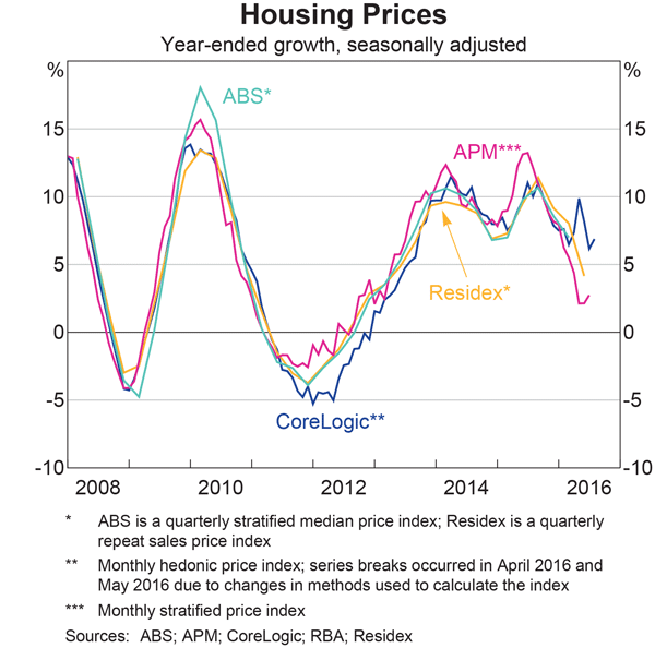
The statistical “fog of war” appears to have descended on Australian home prices, partly fueled by the RBA’s recent statements, and the latest chart pack data. Because of perceived issues with the CoreLogic data series, we see plots from a number of data providers, including the ABS (whose June 2016 data should be out later on – they are disgracefully slow on releasing their quarterly price data).
 Now, we see there are some significant variations between the series, and of course in turn mask the significant differences between locations. CoreLogic has been tweaking their series, and the RBA specifically mentioned this in their recent report. These differences are driven by different methodologies, as well as some series breaks.
So, what is the truth about home price momentum? Of course the RBA wants to show prices growing more slowly despite the cut in the cash rate, thanks to their careful management; whilst others want to talk up the positive movements, to encourage more transactions. Our surveys suggest demand is still quite strong.
As best we can tell, price momentum did moderate in recent months, but now is on the rise again, thanks to low rates, and ongoing interest from investors. Somewhere between 2.5% and 7.5%! The high auction clearance rates appear to confirm this.
But, the real amount of the movement is uncertain. Yet another example of the problems we have getting meaningful, prompt and reliable statistics in Australia.

2 thoughts on “So Just How Much Are Home Prices Rising?”