How incomes, taxes and benefits work out for Australians

From The Conversation.

The Australian Bureau of Statistics has just released its latest analysis of the effects of government benefits and taxes on household income. Overall, it shows government spending and taxes reduce income inequality by more than 40% in Australia. Disparities between the richest and poorest states are also greatly reduced.

The ABS analysis provides the most up-to-date (to 2015-16) and comprehensive figures on the impacts of government spending and taxes on income distribution. As well as direct taxes and social security benefits, it estimates the impact of “social transfers in kind” – goods and services that the government provides free or subsidises. These include government spending on education, health, housing, welfare services, and electricity concessions and rebates.

The figures also include a wide range of indirect taxes. Among these are GST, stamp duties and excises on alcohol, tobacco, fuel and gambling.

The 2015-16 results are the seventh in a series published every five to six years since 1984. The methodology is based on similar studies by the UK Office of National Statistics since the 1960s. The latest UK analysis coincidentally also came out on Wednesday.

How do the calculations work?

The ABS analyses income distribution in a number of stages.

First, it calculates the distribution of “private income”. This includes wages and salaries, self-employment, superannuation, interest, dividends and income from rental properties, among other items. It also includes net imputed rent from owner-occupied dwellings and subsidised private rentals.

Next the ABS adds social security benefits, such as the Age Pension, unemployment and family payments, to give “gross income”.

Then it deducts direct taxes – primarily income tax – to give “disposable income”.

The next stage is to add the estimated value households derive from government services. This is mainly the value of public health care and education spending.

The final stage is to deduct the estimated value of indirect taxes.

So what are the impacts on income inequality?

It is possible to calculate measures of economic inequality at different stages in this process. By implication, the difference between inequality measures is the result of the different government policies taken into account.

Figure 1 shows the Gini coefficient, which ranges between zero – where all households have exactly the same income – and 100% – where one household has all of the income. The Gini coefficient for private income in 2015-16 was 44.2. The addition of social security benefits, which mainly increase the incomes of low-income groups, reduces the coefficient by 8.1 percentage points.

Deducting income taxes – which are progressive – further reduces inequality by 4.5 points. Government non-cash benefits reduce the Gini coefficient by nearly as much as the social security system. However, indirect taxes slightly increase income inequality.

The Gini coefficient for final income is 24.9. So, compared to a coefficient of 44.2 for private income, government spending and taxes reduce overall income inequality by more than 40%.

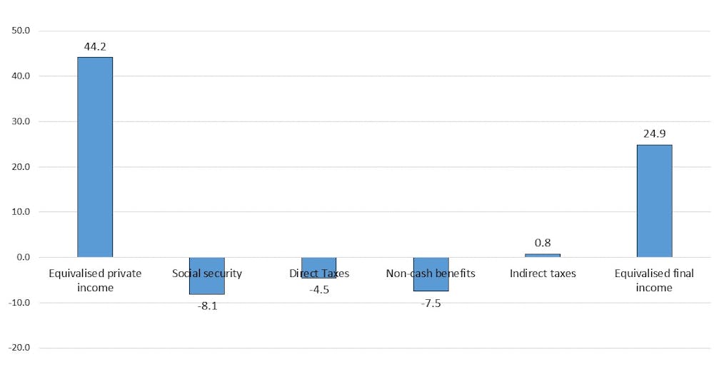
Figure 1: Effects of government spending and taxes on income inequality, measured by Gini coefficient Australia 2015-16. Data source: ABS Government Benefits, Taxes and Household Income, Australia, 2015-16, Author provided

While most of the reduction in inequality is due to government spending, taxes are obviously important to pay for this spending.

The social security system reduces income inequality (and poverty) because Australia targets benefits to the poor more than in any other high-income country.

Figure 2 shows the distribution of social security benefits and government services across income groups, from the poorest 20% to the richest 20% of households. The poorest 20% receive about seven times as much in benefits as the richest 20%. The average for OECD countries is close to one, with rich and poor receiving about the same amount.

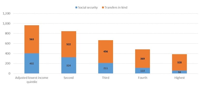
Figure 2: Distribution of social spending ($ per week) by equivalised disposable household income quintiles, Australia 2015-16. Data source: ABS Government Benefits, Taxes and Household Income, Australia, 2015-16, Author provided

Government spending on social services is also progressively distributed. This spending is considerably greater than social security spending and includes both Commonwealth and state spending on education and health.

The poorest 20% receive about 70% more in non-cash benefits than do the richest. This is not due to income-testing. Instead, it’s largely a result of the greater value of public health spending on hospitals and Medicare for older people, who tend to be in the bottom half of the income distribution.

Taxes, of course, work to reduce income inequality, as high-income groups pay a higher share than low-income groups. Figure 3 shows that the poorest 20% pay about 5% of their disposable income in direct taxes, while the richest 20% pay about 30% of their disposable income.

In contrast, indirect taxes – particularly those on tobacco and gambling – are regressive. Low-income groups pay more than high-income groups as a share of their disposable income. However, the undesirable effects of smoking and gambling on the wellbeing of low-income households need to be borne in mind.

When direct and indirect taxes are added together the overall tax system is less progressive, but the richest 20% still pay nearly twice as much of their disposable income as do the poorest 20%.

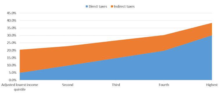
Figure 3: Distribution of direct and indirect taxes (% of disposable income) by equivalised disposable household income quintiles, Australia 2015-16. Data source: ABS Government Benefits, Taxes and Household Income, Australia, 2015-16, Author provided

Redistribution also happens between age groups and states

In addition to reducing inequalities between income groups, government spending and taxes redistribute across age groups. Government spending is much higher for households of Age Pension age than for younger households. This is because of both the Age Pension and older households’ use of the healthcare system.

For example, households where the reference person is 75 or older receive on average just over $1,000 a week in government spending but pay about $180 a week in direct and indirect taxes. Households with a person aged 45 to 54 pay the highest taxes on average – about $800 per week – and on average receive about $620 a week in social spending.

There is also redistribution across states and territories. For example, average private income is about 65% higher in Western Australia than in Tasmania. However, on average, Western Australian households receive about two-thirds of the social security benefits that Tasmanian households get. This reduces the disparity in gross income to about 45%.

Western Australian households pay about twice as much in income taxes as Tasmanians, reducing the disparity to 35%. Households in the West receive only about 3% more in spending on social services than in Tasmania, which reduces the disparity in average incomes to 28%. West Australian households also pay about 20% more in indirect taxes than Tasmanian households (although as a percentage of disposable income, this is a higher share in Tasmania).

These figures suggest that while the financing of fairly equal social services across most parts of Australia reduces inequality between states, the income tax and social security systems also significantly reduce disparities. This is because income tax and social security are national systems and because Tasmania is the poorest state largely due to the higher share of age pensioners in its population.

Overall, this publication provides an invaluable picture of how government spending and taxes affect household economic well-being. Its results are relevant not only to the political debate about tax cuts, but also to long-term policy development to prepare Australia for an ageing population.

Author: Peter Whiteford, Professor, Crawford School of Public Policy, Australian National University

Property Prices Slide – ABS

It’s official, prices are sliding in the major centres. The data from the ABS charting home price movements confirms what what we already knew.  In addition, the number of property transfers are significantly down and the the total value of Australia’s 10 million residential dwellings decreased $22.5 billion to $6.9 trillion.  This is just the start, in our view.

Residential property prices fell 0.7 per cent in the March quarter 2018, according to figures released today by the Australian Bureau of Statistics (ABS).

ABS Chief Economist Bruce Hockman said Australia’s two largest cities led the fall: “Sydney recorded the third consecutive quarter of falling property prices (-1.2 per cent) and the first annual price fall (-0.5 per cent) since the March quarter 2012, while Melbourne property prices fell 0.6 per cent, the first quarterly price fall since September quarter 2012.”

“Regulatory changes and tighter lending conditions have continued to affect investors, who are more active in the Sydney and Melbourne property markets. These cities have seen strong price growth over recent years particularly in detached dwellings.”

Through the year growth in residential property prices continued to moderate (2.0 per cent) in the March quarter 2018. Most capital cities have shown declines in annual growth rates since September quarter 2017, except Hobart (+14.1 per cent), which has continued to see strong rises in residential property prices.

“Positive economic conditions in Hobart, such as, solid jobs growth, rising employment, and an increase in net interstate migration, are underpinning demand for property,” Mr Hockman said. “Hobart has continued to experience consistently tight housing supply, which is leading to a strong rise in residential property prices.”

Also,  the number of property transfers are down, nationally by 29% on the last quarter, 31% in Sydney and 42% in Melbourne to March 2018. While we tend to see a drop in the first quarter because of the holiday period, these falls are unprecedented, and mirrors the falls in auction values we discussed recently.


The total value of Australia’s 10 million residential dwellings decreased $22.5 billion to $6.9 trillion. The mean price of dwellings in Australia is now $687,700.


Employment Data Looks OK, Until…

The ABS released their May 2018 employment data today.  The Labour force statistics top line story looks pretty good, with an increase in the total number of jobs, and a fall in the seasonally adjusted rate of employment from 5.6% last month to 5.4% in May.  But in fact we think this is another soft result, thanks to a slide in the number of hours worked, anemic and falling jobs growth, a further shift to part time employment, and a rise in underemployment.

The monthly trend unemployment rate remained steady at 5.5 per cent in May 2018, according to latest figures released by the Australian Bureau of Statistics (ABS) today.

Actually, it fell just a tad, from 5.48% to 5.46%, but then who’s counting, given the lack of precision in the data set. So lets agree with the ABS,  trend, no change.

The trend participation rate decreased by less than 0.1 per cent to 65.5 per cent in May 2018, after the April figure was revised down. Over the past year, trend employment increased by 318,000 persons or 2.6 per cent, which was above the average year-on-year growth over the past 20 years (2.0 per cent).

In fact, its the fall in the participation rate which explains the fall in the unemployment rate stats.  We are not seeing such strong growth in jobs, as we saw a few months back in fact.

The underlying trend really shows that underemployment is still very high.     

The ABS said that over the year to May, the unemployment rate declined 0.2 per cent, while the underemployment rate also fell by 0.2 per cent over the year to 8.5 per cent. The underemployment rate, which is the proportion of people who are working but would like to work more hours, remains below the peak of 8.7 per cent seen in 2017. “The latest data tells us that over the past year both the trend unemployment rate and underemployment rate declined by 0.2 per cent, resulting in the underutilisation rate declining 0.4 per cent to 13.9 per cent”.

But the troubling thing is that there continues to be a slide towards more part time jobs, with trend employment increasing by around 16,000 persons in May 2018, with part-time employment increasing by 12,000 persons and full-time employment by 4,000 persons. This continued the recent slowing of employment growth, particularly full-time employment growth.

This is further evidence, as we discussed yesterday from our household survey results, that more and more people are in fractured or casual employment.

The net increase of 16,000 persons comprised of well over 300,000 people entering employment, and more than 300,000 leaving employment in the month. This was below the modest 19,000 increase expected by economists.

The trend monthly hours worked increased by 2.8 million hours or 0.2 per cent in May 2018, and by 2.7 per cent over the past year.

Over the past year, the states and territories with the strongest annual growth in trend employment were New South Wales (3.6 per cent), Queensland (2.9 per cent) and South Australia (2.4 per cent). NSW has led the growth in jobs. We see that NSW has an unemployment rate of 4.9%, in trend terms, just higher than the ACT at 3.7% and the Northern Territory at 4%. Victoria is sitting at 5.1%, South Australia at 5.7%, and Queensland plus Tasmania and Western Australia all well above 6%.

The longer term trends are also worth looking at, with Western Australia at the top of the list with highest rate, and trending higher, with Victoria and New South Wales in the middle of the pack, and the ACT and Northern Territories with the lowest rates of unemployment.

Also note the higher figures among younger Australians, with those between 15 and 24 sitting at 13% for males and 11% for females.

So, this suggests there is no reason to expect the employment rate to fall toward the “magic 5%” when the RBA says wages should start to rise. We think if anything unemployment may rise in the months ahead as jobs growth slows further.

As you know we question the basis of the employment calculations, as even working for an hour or two takes people out of the count. The Roy Morgan alternative basis of calculation shows a much higher, and rising rate. This chart from Macquarie shows that there is a lagged relationship between the official figures and the Roy Morgan trends, and if this is true, then the unemployment rate is set to rise for the next few months.

Overall, even if the pace of job creation picks up again in the coming months, the excess slack and other structural forces are likely to prevent wage growth from increasing much above its current rate of 2.1% this year.  This will continue to weigh on household spending and house prices and hamper the recovery.

This probably puts an RBA inspired rate hike further down the track, but the US rate hike overnight means that there will be more pressure on international capital markets.  The bond market moved higher.  Specifically, a few of the Fed members who’d been holding out for slightly lower rates in 2018 moved their forecasts up enough to increase the odds of a 4th rate hike by December.  This was already a strong possibility, but before today, those in the “3 hike” camp had a stronger case.

The FED said that in May the labor market has continued to strengthen and that economic activity has been rising at a solid rate. Job gains have been strong, on average, in recent months, and the unemployment rate has declined.

In fact the May 2018 figure has a three in front of it, a significantly lower number than our own, even allowing for a different basis of calculation.

The FED says …recent data suggest that growth of household spending has picked up, while business fixed investment has continued to grow strongly. On a 12-month basis, both overall inflation and inflation for items other than food and energy have moved close to 2 percent. Indicators of longer-term inflation expectations are little changed, on balance.

In view of realized and expected labor market conditions and inflation, the Committee decided to raise the target range for the federal funds rate to 1.75 to 2 percent. The stance of monetary policy remains accommodative, thereby supporting strong labor market conditions and a sustained return to 2 percent inflation.

But the kicker is probably another 2 hikes later in the year. US Mortgage Rates were higher again.

Watch for higher BBSW rates, which will be a harbinger of higher mortgage rates in Australia, despite the Reserve Bank and higher unemployment in the local market.

Home Lending Volumes Shrink

The ABS released the latest housing finance statistics to April 2018. They confirm the macro trends we already reported. Lending volume flows are solidly down, and the trends suggest more in the months ahead. We are entering a new phase in the credit cycle, and this will put further pressure on home prices.

The total number of first time buyer loans in the month fell by 8%, from the previous month, down, 740.

These are original numbers, so they move around, but this is the lowest volume since January. And the volume was equivalent to 17.6% of all buyers, up from 17.4% last month. The number of fixed rate loans also fell.

A fall in number of first time buyers registered across all states, with the largest number in Victoria, at 2,677, down 6% on the prior month, New South Wales was down 8.6% and Queensland was down 11.3%. So this suggests that the first time buyer incentives are running out of puff.

The number of investor first time buyers also fell and when we overlay this onto the overall first time buyer trends we see a significant drop in flows from a couple of months back. So first time buyers are not going to keep the market up!

Turning to the overall lending flows, and looking at the trends, we see a fall in pretty much all categories. The proportion of investor loans also fell, down to 42.8 percent of loans approved, excluding refinancing of existing loans, compared with a high of 53% in 2014.

Across the individual categories, owner occupied lending for construction fell 2.2%, down $41 million, and refinancing of existing dwellings was down just $1 million. However, the purchase of new owner occupied homes rose 0.4% to $4.7 million and the purchase of established dwellings was up 0.1% to $9 million.

On the investment side of the house lending for investment construction fell 3.4% down $37 million while borrowing by individual investors fell 1.4% or $131 million and other investors (such as super funds) fell 5.3%, down $55 million.  Overall then investor flows were down 2%, or $224 million and owner occupied lending was down 0.2% or $27 million.

The overall trends are down, as the rolling three month shows, and the trajectory appears lower ahead.

The longer term rolling trend also shows the momentum ebbing, with investor lending flows leading the way down, and refinance also slowing. Note these are based on the trend data which irons out the bumps.

Finally, the original stock data rose by $2.8 billion, or 0.17%, to $1.66 trillion. Within that owner occupied stock rose by 0.27% or 2.9 billion to 1.09 trillion, and investment lending stock fell by $123 million to $562 billion. Investment lending therefore fell to 33.9% of stock, the lowest since 2012.

The long term trend tells the story, we are moving into uncharted lending territory, as volumes fall, and this suggests that unlike the large mini clamp-down on mortgage lending in 2016, which lasted just a few months before recovering firmly, the various conditions in the lending market are going to dampen growth further.

What we do not have is picture of the non-bank sector, which we suspect is picking up some of the slack. Another problem with the myopic data the authorities choose to release.

But the bottom line is there will further contractions in lending in the months ahead, as lending standards get ever tighter, and this will translate into lower home prices ahead.

The real estate boom is firmly over.

Retail Sales Trend Growth Steady at 0.3%

The ABS released the latest retail turnover data, which rose 0.3 per cent in April 2018 following a rise (0.3 per cent) in March 2018. Compared to April 2017 the trend estimate rose 2.6 per cent. The less reliable seasonally adjusted turnover rose 0.4 per cent in April 2018, seasonally adjusted, which follows a relatively unchanged result (0.0 per cent) in March 2018.

Across the categories,  food retailing was up 0.4%, household good up 4%, other retailing 0.2%, Cafes and takeaway food 0.1%, department stores down 0.1%, clothes and footwear down 0.2%.

Across the states, the trends were strongest in NT up 0.7%, ACT up 0.6%, NSW and VIC up 0.4%, TAS up 0.2%, QLD 0.1% and SA fell 0.1%.

Online retail turnover contributed 5.4 per cent to total retail turnover in original terms in April 2018, a rise from 5.1 per cent in March 2018. In April 2017 online retail turnover contributed 3.4 per cent to total retail.

Building Approvals Fell In April 2018

The ABS reports that the number of dwellings approved in Australia fell by 0.1 per cent in April 2018 in trend terms.  We see a fall  in units, somewhat offset by a rise in houses approved. The seasonally adjusted numbers show a more significant drop.

“The total dwellings series has been relatively stable for the past eight months, with around 19,000 dwellings approved per month,” said Justin Lokhorst, Director of Construction Statistics at the ABS.The strength in approvals for houses is being offset by weakness in semi-detached and attached dwelling approvals.”

Among the states and territories, dwelling approvals fell in April in Tasmania (3.7 per cent), Victoria (2.3 per cent) and Western Australia (2.2 per cent) in trend terms.

Dwelling approvals rose in trend terms in the Australian Capital Territory (14.8 per cent), the Northern Territory (6.7 per cent), South Australia (1.7 per cent), New South Wales (0.9 per cent) and Queensland (0.7 per cent).

In trend terms, approvals for private sector houses rose 0.9 per cent in April. Private sector house approvals rose in Queensland (1.6 per cent), Victoria (1.5 per cent) and New South Wales (0.6 per cent), but fell in Western Australia (0.9 per cent) and South Australia (0.4 per cent).

In seasonally adjusted terms, total dwellings fell by 5.0 per cent in April, driven by a 11.5 per cent decrease in private sector dwellings excluding houses. Private sector houses rose 0.1 per cent in seasonally adjusted terms.

The value of total building approved fell 0.7 per cent in April, in trend terms, and has fallen for six months. The value of residential building fell 0.5 per cent while non-residential building fell 1.0 per cent.

The HIA managed to put a positive spin on the results saying “Detached House Approvals Strongest in 15 Years”.

The performance of the detached house building market is remarkable. The volume of house approvals during the three months to April was 9.9 per cent higher than a year ago – a time when it was already elevated,” said Shane Garrett, HIA’s Senior Economist.

Strong demand for new houses is being sustained by healthy rates of population growth – itself a product of robust labour markets in Australia’s largest cities. While it’s a virtuous circle for detached house building at the moment, there are risks on the horizon.

Employment Under The Hood – The Bed Pan Economy

The employment and wage data from the ABS last week was not flash, with job growth momentum easing, unemployment higher and wages growth continuing at glacial speed.

So its worth asking what is really going on under the hood. To do that we have looked at ABS data over the last decade to drill into the detail. And frankly its not pretty.

First we looked at employment across the industry sectors. Health care leads the way now at 14.2%, in terms of the number of people employed, followed by retail at 11.1%, education and training at 9.2% and manufacturing at 7.9%.  For comparison purposes, about 12 % of the U.S. workforce is employed in the health care sector.

Then we compared the relative distribution by industry groups now, and back in 2005. Over that decade or so there has been a considerable shift in industry distribution.

The fastest growing sector in Health care, which have expanded relatively by 2.7%. The next largest growth sector was Professional and Technical Services at 1.4% and Mining at 1.3%. Construction grew relatively by  1.1%. At the other end of the spectrum, Manufacturing fell by a massive 4.3%, followed by Retail down 1.2% and information technology and media down 0.5%.

Or in other words, relativity more people are working in the health care sector than a decade ago. Drilling further into the data we also see a significant rise in the number of females working in this sector, as well as significant growth in part-time employment in the sector.

The final piece of analysis looks at relative weekly income across specific industry sectors.  More than half of all people working in retail earn less than $600 a week. More than half of people in the healthcare sector earn less than $800 a week.  Half the average of all industry sectors earns less than $1,000 a week, whilst half of those in the resource and mining sector earn more than $1,800 a week. So Retail and Health care sectors are intrinsically low paid.

Now lets put that together. All this goes some way to explain the shifts in employment and income. The health care sector has been an important generator of jobs in recent years, and health care is expected to continue to expand employment in coming years, but the jobs will continue to shift to low-paying support occupations reflecting changing demographics and greater demand.  About 40 percent of the sector’s workers are not directly involved in treating a patient; instead, they work in jobs such as office or administrative work and food preparation. Others are working in health support occupations like home care and personal assistance. These jobs are paid significant less than care practitioners.

But, the health care sector is more labour intensive than other sectors, such as manufacturing, and this translates into a relatively lower share of output. So growth in health care does not guarantee broad-based prosperity because beyond the high pay of health care practitioners, the health care jobs in highest demand pay lower-than-average wages.

In fact the truth is the growth in jobs are in sectors which are service industries, and these to not really create new value, they simply circulate money in the system , perhaps from superannuation savings to pay for medical care.

Thus the growth in jobs in not assisting overall economic growth, and the lower average wages is depressing overall wage growth. Workers in the health care sector are also less likely to press hard for pay rises.

So the bottom line is we have a structural problem in the economy, where more people are doing important work helping those needing health care assistance, but the overall economic contribution impact is net negative, hence the low GDP growth and wages growth. Or in other words, more jobs are not necessarily good or well paid jobs. And that’s a structural problem, given the current demographic shifts.  Welcome to the bed pan economy.


Unemployment Higher In April 2018

The latest data from the ABS covers April 2018 employment. The trend unemployment rate rose from 5.53 per cent to 5.54 per cent in April 2018 after the March figure was revised down, while the seasonally adjusted unemployment rate increased 0.1 percentage points to 5.6 per cent. In fact employment growth is stalling.

The trend participation rate increased to a further record high of 65.7 per cent in April 2018 and in line with the increasing participation rate, employment increased by around 14,000 with part-time employment increasing by 8,000 persons and full-time employment by 6,000 persons in April 2018. This continued the recent slowing of employment growth, particularly full-time employment growth. and the seasonally adjusted labour force participation rate increased slightly to 65.6 per cent.

Over the past year, trend employment increased by 355,000 persons or 2.9 per cent, which was above the average year-on-year growth over the past 20 years (2.0 per cent).

The trend hours worked increased by 4.7 million hours or 0.3 per cent in April 2018 and by 3.3 per cent over the past year.

Over the past year, the states and territories with the strongest annual growth in trend employment were New South Wales (3.8 per cent), Queensland (3.5 per cent) and the Australian Capital Territory (2.7 per cent). But unemployment is highest in WA at 6.4 per cent, QLD 6.3 per cent, TAS 6.0 per cent and SA at 5.9 per cent.

The critical perspective is looking at underutilisation – or those in work who want more work. This is essentially unused space capacity. The latest data for April shows the highest rate of underutilisation resides in WA (where unemployment is also highest). TAS and SA are also quite high, while VIC and ACT have the lowest rates.

And the trends really have hardly improved at all, taking account of seasonal variations.

It is this underutilisation which explains the relatively how unemployed number, and the low wage growth we discussed yesterday.

Finally, it is worth noting that as the ABS shift their samples, as they do each quarter, there is some variability in the baseline data, which introduces statistical noise into the system.

But the bottom line is there is nothing here to suggest we are going to see unemployment falling below 5%, which many believe is the rate at which wages growth may start to trend higher.

We are trapped in a low growth, low wage, high underutilised situation, and there is no easy way out given the current economic settings.


Wages Growth Anemic In March Quarter

Yesterday the RBA said that the trajectory of income growth was uncertain (they were less bullish than previously), and today the latest ABS data on wages growth showed a further fall compared with last time.

In fact you can mount an argument the federal budget is already shot as a result.

The seasonally adjusted Wage Price Index (WPI) rose 0.5 per cent in March quarter 2018 and 2.1 per cent through the year.

Seasonally adjusted, private sector wages rose 1.9 per cent and public sector wages grew 2.3 per cent through the year to March quarter 2018.

In original terms, through the year wage growth to the March quarter 2018 ranged from 1.4 per cent for the Mining industry to 2.7 per cent for the Health care and social assistance industry.

Victoria and Tasmania both recorded the highest through the year wage growth of 2.3 per cent and the Northern Territory recorded the lowest of 1.1 per cent.

And bear in mind this weak result comes despite the Fair Work Commission’s June 2017 decision which lifted the minimum wage 3.3%  and to $18.29 from July and flowed to ~2.3 million workers. This means the annual wages growth number contains this artificial artifact which means the underlying would be even lower.

And by the way you can argue this metric overstates the true picture as we see a lift in low paid jobs away from higher paid areas, like mining, and the ABS data does not adjust for this.

For comparison, the Average Compensation of Employees from the national accounts which is to December 2017 is tracking even lower circa 1.3%.

Either way, more mortgage stress ahead…


Home Lending Slides In March

The ABS released their housing finance data today to March 2018. The trends are pretty clear, lending is slowing, and bearing in mind our thesis that lending and home prices are inextricably linked, this signals further home price falls ahead, which will be exacerbated by even tighter lending standards we think are coming. Debt is still rising faster than inflation or wages.

Starting with the original first time buyer data we see a rise in volumes, reflecting the incentives in NSW and VIC. On a rolling average basis, volumes are strongest in VIC.

Overall volumes were 17.4% of new loans written compared with 17.9% in February, which is a little higher than 2016, but is appears to be drifting lower now, suggesting that ahead volumes of new loans may fall a little.

Looking at the FTB month on month movements, we see a 5.9% uplift in flows which equates to an extra 515 loans last month. The average loan size rose by 2.3% to$335,400.

Looking at our overall first time buyer tracker, we see a fall in overall volumes, as the number of first time buyer investors falls away, as captured in our household surveys.

Turning to the 12 month rolling trend, we see that both owner occupied and investor loan flows are slowing, with investor lending shrinking faster.

The proportion of investor loan flows slid again (excluding refinance) to 43.6%.

Looking in more details at the moving parts, in trend terms, lending for owner occupied construction fell 1.1%, owner occupied purchase of new dwellings fell 0.2%, and purchase of other established dwellings rose 0.2%. So overall, owner occupied lending flows, excluding refinance, were flat at $14.8 billion.

Refinance of existing owner occupied loans rose by 0.5% to $6.4 billion, and on the investor side, construction of new property for investment purposes fell 3.8%, purchase of existing property for investment purposes fell 0.7% and purchase of existing property for investment by other entities (e.g. super funds) fell 0.2%. So overall investment flows fell 0.9% to $11.5 billion.

Finally, the total of all finance trend fell overall 0.2% to 32.7 billion.

And in original terms, the stock of all housing loans rose $6.7 billion, or 0.4% in the month, which equates to 4.9% annualised, still well above inflation or wages growth which is at 2%.

So, the overall growth of lending for housing is still sufficient to lift household debt even higher. So far from losing lending controls, regulators should be seeking to tighten further. There is no justification for growth above inflation or wages, because stronger momentum will only lift the burden on households even further, and inflate the banks’ balance sheets, which flatters their performance.