Here’s why it’s so hard to say whether inequality is going up or down

From The Conversation.

Is inequality rising or falling? The answer, if recent public debate is anything to go by, may appear at first to depend on who you ask.

Part of the reason why we get such conflicting narratives about whether it’s rising or falling is that economic inequality can be measured in different ways, using different data sets.

And you might get a different answer depending on whether you’re talking about income inequality or wealth inequality. Income is the flow of economic resources over a certain time period, while wealth is the stock of resources built up over time.

We can draw some insights from the newly released Household Incomes and Labour Dynamics in Australia (HILDA) 2017 report, which reveals the latest results of a longitudinal study that has been running since 2001.

But it doesn’t show the whole story. Combining HILDA’s results with data from the Australian Bureau of Statistics’ income surveys gives a more comprehensive picture of trends in economic inequality in Australia.

HILDA data show lower income inequality than the ABS

Firstly, you need to know that when we are talking about income, most people are referring to the disposable income of the household, not individuals.

That’s all the income that members of a household receive from various sources, minus tax. You can then then adjust for the number of people in the household, accounting for the differing needs of adults and children to get what economists call “equivalised household disposable income”.

The HILDA survey, funded by the Department of Social Services and conducted by the Melbourne Institute, has followed some 17,000 individuals every year since 2001. (The most recent ABS income survey final sample consists of 14,162 households, comprising 27,339 persons aged 15 years old and over.)

One commonly used way to measure inequality is called the Gini coefficient, which varies between zero (where all households have exactly the same income) and one (where all the income is held by only one household). The Gini coefficient for equivalised household disposable income varies between about 0.244 in Iceland to 0.397 in the United States (with most other high income OECD countries falling between these two levels), but is as high as 0.46 in Mexico and 0.57 in South Africa.

The latest HILDA report puts Australia’s Gini coefficient at 0.296 and notes that it has “remained at approximately 0.3 over the entire 15 years of the HILDA Survey.”

The HILDA surveys show a lower level of income inequality than the ABS figures do. Some of the differences between these estimates will reflect the broader definition of income used by the ABS, and the significant changes in this definition over time.

In a sense, the HILDA longitudinal survey is like a video where the same people are interviewed every year, whereas the ABS surveys are like a snapshot of the Australian population taken every two years.

But there are also problems with longitudinal surveys because participants often drop out of the survey over time. Also the survey is based on people who were living in Australia in 2001, thus leaving out immigrants who have arrived since that time. While the survey has refreshed the sample in 2011 to address this problem, this attrition may reduce the representativeness of the sample. In addition, the sample size of the ABS surveys is about 50% greater than HILDA, which will reduce sampling errors.

ABS data show inequality has risen

The Australian Bureau of Statistics (ABS) has conducted income surveys since the late 1960s, although it is only surveys since 1982 that are comprehensive and available for public analysis. These ABS surveys are also used in most of the international data sources that compare income inequality across countries – the OECD Income Distribution database and the Luxembourg Income Survey.

The ABS data show a clear increase in both wealth and income inequality over the mid- to long run.

The chart below shows two long series of estimates from the ABS surveys – those published in 2006 by researchers David Johnson and Roger Wilkins (who now oversees the HILDA survey) from 1981-82 to 1996-97, and official figures prepared by the ABS, from 1994-95 to 2013-14.

Despite the differences in income measures and equivalence scales, the long run trend from the ABS figures is clear.

There are periods in which inequality fell, but overall inequality rose over the whole period – including in the most recent period to 2013-14. The Gini coefficient in 2013-14 is a little lower than its peak just before the Global Financial Crisis, but the difference is not large.

True, there have been changes in the ABS’ survey methodology over the years but these changes should not have an effect after 2007-08, as income definitions haven’t changed in a major way since then.

Wealth is much more unequally distributed than income

The ABS also publish information on the distribution of net worth – that’s household assets minus liabilities. Wealth is much more unequally distributed than income.

According to the ABS, the Gini coefficient for net worth in 2013-14 was 0.605 (compared to a Gini coefficient for income of 0.333). This is a clear increase from a Gini of 0.573 in 2003-04.

Put another way, ABS data show a high income household in the richest 20% of the income distribution has an income around 5.4 times as high as the average household in the bottom 20% of the income distribution, as this chart demonstrates:

In contrast, ABS data show that on average households in the richest 20% of the distribution of net worth have wealth of around $2.5 million or more than 70 times higher than the net worth held on average by households in the bottom 20% of the wealth distribution, as this chart demonstrates:

Somewhat surprisingly, however, the Credit Suisse Global Wealth Report puts wealth inequality in Australia at below the world average (and the mean and median levels of net worth at among the highest in the world).

This largely reflects the still high level of home ownership in Australia and the high levels of wealth in home ownership, which accounts for nearly half of total net worth on average.

Reconciling conflicting trends

While these two major sources of data show conflicting trends on income inequality, the ABS sample size is much greater. Ultimately, however, the reasons for the differences between the findings of the ABS and the HILDA survey are not obvious.

One way forward would be for the ABS and the Melbourne Institute to jointly analyse the differences between their findings to identify why their estimates of inequality diverge.
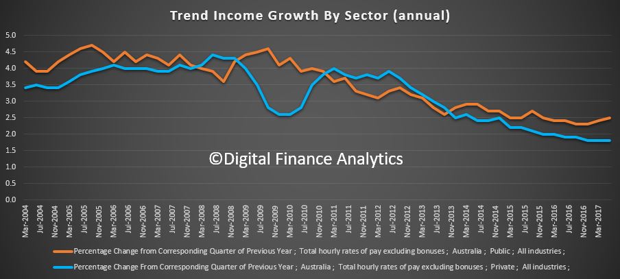
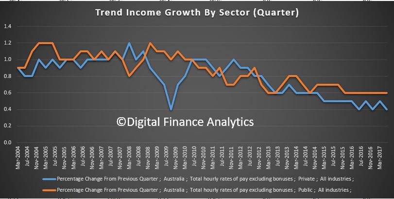
Author: Peter Whiteford, Professor, Crawford School of Public Policy, Australian National University

Building Approvals Just A Little Stronger

The number of dwellings approved rose 0.1 per cent in June 2017, in trend terms, after falling for three months, according to data released by the Australian Bureau of Statistics (ABS) today.

Dwelling approvals increased in June in the Australian Capital Territory (5.9 per cent), South Australia (3.2 per cent), Western Australia (1.7 per cent), Queensland (1.1 per cent) and Tasmania (0.7 per cent), but decreased in the Northern Territory (2.7 per cent) and Victoria (1.9 per cent) in trend terms. Dwelling approvals were flat in New South Wales.

In trend terms, approvals for private sector houses rose 0.8 per cent in June. Private sector house approvals rose in Queensland (1.8 per cent), New South Wales (1.1 per cent) and Victoria (0.5 per cent), but fell in Western Australia (0.6 per cent) and South Australia (0.1 per cent).

In seasonally adjusted terms, dwelling approvals increased by 10.9 per cent in June, driven by a rise in total dwellings excluding houses (20.1 per cent), while total house approvals rose 4.0 per cent.

The value of total building approved rose 1.3 per cent in June, in trend terms, and has risen for five months. The value of non-residential building rose 3.4 per cent while residential building fell 0.1 per cent.

“Dwelling approvals have been relatively stable in trend terms over the first six months of the year, after falling from record highs in mid-2016,” said Daniel Rossi, Director of Construction Statistics at the ABS. “The June 2017 data showed that the number of dwellings approved is now 15 per cent below the peak in May 2016”.

Inflation subdued in the June quarter

The Consumer Price Index (CPI) rose 0.2 per cent in the June quarter 2017, the latest Australian Bureau of Statistics (ABS) figures reveal. This follows a rise of 0.5 per cent in the March quarter 2017.

So nothing here to reinforce the need to raise the cash rate! However, our data suggests many households are experiencing much faster price growth, especially for power and child care.

The most significant price rises for the quarter were medical and hospital services (+4.1 per cent), new dwelling purchase by owner-occupiers (+0.9 per cent) and tobacco (+1.0 per cent). These rises are partially offset by falls in domestic holiday travel and accommodation (-3.2 per cent) and automotive fuel (-2.5 per cent).

The CPI rose 1.9 per cent through the year to June quarter 2017 having increased to 2.1 per cent in the March quarter 2017.

Chief Economist for the ABS, Bruce Hockman, said: “Inflation in Australia remains low. Price falls for automotive fuel; and ongoing competition in the clothing and food retail markets has contributed to this quarter’s result. In addition, the ABS continues to closely monitor the impact of Cyclone Debbie on fruit and vegetable prices. While strong price rises were recorded for select fruit and vegetables such as tomatoes, beans, cucumbers, melons, berries and bananas in the June quarter 2017 – these rises were offset by falls in seasonally available fruits such as oranges, mandarins and apples.”

Trend full-time employment growth continues

Monthly trend full-time employment increased for the ninth straight month in June 2017, according to figures released by the Australian Bureau of Statistics (ABS) today. The trend unemployment rate in Australia decreased by less than 0.1 percentage points to 5.6 per cent in June 2017.

This is good news, in that more people are employment, but of course household income growth is still sluggish and underemployment remains a continuing issue.

Full-time employment grew by a further 30,000 persons, while part-time employment decreased by 4,000 persons, underpinning an increase in total employment of 26,000 persons.

The state by state data (based on original stats) shows an improvement in SA, but a fall in ACT. The smaller states tend to be more volatile.

“Full-time employment has increased by around 187,000 persons since September 2016, with particular strength over the past five months, averaging around 30,000 persons per month,” Chief Economist for the ABS Bruce Hockman said. “Full-time employment now accounts for about 68 per cent of employment, however this is down from around 72 per cent a decade ago.”

Over the past year, trend employment increased by 227,000 persons (or 1.9 per cent), which is the same as the average year-on-year growth over the past 20 years. It has increased since December 2016, when the year-on-year growth was at 0.8 per cent and reflected relatively low employment growth through most of 2016.

The trend monthly hours worked increased by 6.2 million hours (0.4 per cent) to 1,691.5 million hours in June 2017. Most of this increase was hours worked by full-time workers.

The trend unemployment rate in Australia decreased by less than 0.1 percentage points to 5.6 per cent in June 2017.

Trend series smooth the more volatile seasonally adjusted estimates and provide the best measure of the underlying behaviour of the labour market.

The seasonally adjusted number of persons employed increased by 14,000 in June 2017. The seasonally adjusted unemployment rate remained steady at 5.6 per cent, after the May 2017 number was revised up to 5.6 per cent, and the seasonally adjusted labour force participation rate increased to 65.0 per cent.

Finance Momentum Sags

The ABS published the final piece of their May 2017 finance data, showing the flows to May 2017.  It really is a rather sad tale. Owner Occupied housing apart, all other lending flows were lower, whether you look at the trend or seasonally adjusted figures.

Looking at the moving parts, Secured housing flows rose 0.4% or $80 million, whilst secured housing alterations rose 1.9% or $5m.

Personal credit continues to fall, the flows fell 3.2% of $193 million, with similar rates of decline across both fixed and revolving loans.

Total commercial lending fell 0.8% of $314 million. Within that lending for investment housing fell 1.5% or $194 million, whilst other fixed commercial lending fell 0.5% or $96 million. Revolving commercial credit fell 0.3% or $24 million.  If business confidence is really so strong, why no growth in borrowing – something does not add up!

As a result, the total proportion of business lending to total lending stood at 29.9% down from a peak of 30.9% in December 2016. The proportion of investment property lending flows slipped to 18.1% of all lending, and 37.4% of all housing lending.

So whilst the regulatory tightening is crimping demand for investor finance, it is not being replaced with a rise in productive business lending, so commercial finance has fallen. This will put downward pressure on growth, at a time when mortgage interest rates are rising. We cannot see how the future growth expectations from the RBA are going to be met on these figures.

It is clear however, that secured lending for owner occupation which is up a little, will not fill the void. Interestingly the state by state figures show that investor lending remains strongest in the two overheated markets of Sydney and Melbourne. Much of the fall in investment sector lending resides in the other states, who are already experience economic pressure.

The total value of owner occupied housing commitments excluding alterations and additions rose 0.4% in trend terms, and the seasonally adjusted series rose 2.9%.

The trend series for the value of total personal finance commitments fell 3.2%. Fixed lending commitments fell 3.2% and revolving credit commitments fell 3.1%.

The seasonally adjusted series for the value of total personal finance commitments fell 0.5%. Revolving credit commitments fell 3.1%, while fixed lending commitments rose 1.2%.

The trend series for the value of total commercial finance commitments fell 0.8%. Fixed lending commitments fell 0.9% and revolving credit commitments fell 0.3%.

The seasonally adjusted series for the value of total commercial finance commitments fell 6.4%. Revolving credit commitments fell 12.5% and fixed lending commitments fell 4.9%.

The trend series for the value of total lease finance commitments fell 3.3% in May 2017 while the seasonally adjusted series rose 1.1%, following a rise of 4.3% in April 2017.

Building Activity Tanks

The latest data from the ABS showing building activity to March 2017 shows a fall in residential activity, if from a high reading.

The trend estimate of the value of total building work done fell 1.0% in the March 2017 quarter whilst the seasonally adjusted estimate of the value of total building work done fell 2.4% to $26,410.4m in the March quarter, following a rise of 2.2% in the December 2016 quarter.

The trend estimate of the value of new residential building work done fell 1.5% in the March quarter. The value of work done on new houses fell 1.2% while new other residential building fell 1.9%. However, the seasonally adjusted estimate of the value of new residential building work done fell 4.4% to $15,290.7m. Work done on new houses fell 2.5% to $8,198.9m, while new other residential building fell 6.5% to $7,091.8m.

The trend estimate of the value of non-residential building work done was flat in the March quarter. The seasonally adjusted estimate of the value of non-residential building work done in the quarter rose 1.7%, following a rise of 3.1% in the December 2016 quarter.

First Time Buyers Up, Investors Down

The ABS released their Housing Finance data to May 2017 today. Overall, trend housing finance owner occupied housing commitments rose 0.4%, while investment housing commitments fell 1.5%. The trend estimate for the total value of dwelling finance commitments excluding alterations and additions fell 0.3%.

First, there was a rise in the number of first time buyers in May. The original data (no seasonal adjustments) is always volatile but the percentage rose a little to 14.0% from 13.8% in April 2017.

The month on month movements show a rise in the number of loans, up nearly 2,000 and also a rise in the number of refinanced loans.

Overlaying data from our surveys to capture investor first time buyers, we see the combined trend is rising. We expect a further kick in July when the new FTB incentives kick in.

Next we look at the owner occupied changes across the months. We see an inflection in refinanced loans, but still falling, whilst other categories of loans are relatively stable or falling slightly.

Next we look at flow by category. Owner occupied purchase of established dwellings rose the strongest, with the owner occupied construction and new purchases also up. The value of refinancing fell as did all categories of investor loans.  We can conclude the regulatory tightening and lower expectations of investors are having a cooling impact on the market. Hence all the repricing across the market we have seen in recent weeks.

Comparing the flows across new owner occupied and investment loans we see the value of the latter falling, whilst the former is up just a little.

Analysis of the more detailed splits shows the proportion of investor loans fell to below 38% and this falling trend is set to continue.  Owner occupied purchase of established dwellings rose. In trend terms, while the number of commitments for the construction of dwellings rose 1.0% and the number of commitments for the purchase of new dwellings rose 0.4%, the number of commitments for the purchase of established dwellings fell 0.6%.

Movements by lender type shows the bulk of lending is being done by the banks, although the mutuals showed a small rise.

Finally, the trend lending stock to May showed another rise, with the proportion of investor loans slipping to below 35%, the lowest since 2014.

So we can conclude that lending momentum is changing, there is clearly a focus on owner occupied refinance and first time buyers. But given the still firm auction clearance rates reported through June and July, it will be interesting to see just how weak the investment sector goes.


Trend dwelling approvals fall 1.9 per cent in May

The number of dwellings approved fell 1.9 per cent in May 2017, in trend terms, and has fallen for three months, according to data released by the Australian Bureau of Statistics (ABS) today.

The peak in multi-unit construction is well and duly done, down 27% on a year ago. We are looking at approvals, and of course there is significant building underway at the moment, but this may ease later.

“Dwelling approvals continue to weaken in trend terms, falling by around 700 dwellings over the past three months,” said Daniel Rossi, Director of Construction Statistics at the ABS. “The May 2017 data showed that the number of dwellings approved is now 18 per cent below the peak in May 2016”.

Dwelling approvals decreased in May in the Australian Capital Territory (8.2 per cent), Victoria (3.9 per cent), Western Australia (3.7 per cent) and New South Wales (2.6 per cent), but increased in Queensland (2.2 per cent), Northern Territory (2.1 per cent), South Australia (1.6 per cent) and Tasmania (1.5 per cent) in trend terms.

In trend terms, approvals for private sector houses were flat in May. Private sector house approvals rose in South Australia (1.0 per cent), New South Wales (0.4 per cent) and Victoria (0.2 per cent), but fell in Queensland (0.9 per cent) and Western Australia (0.6 per cent).

In seasonally adjusted terms, dwelling approvals decreased by 5.6 per cent in May, driven by a fall in total dwellings excluding houses (12.6 per cent), while total house approvals rose 0.4 per cent.

The value of total building approved rose 0.8 per cent in May, in trend terms, and has risen for five months. The value of non-residential building rose 4.6 per cent while residential building fell 1.5 per cent.

The working poor: one-in-five households being left behind

From The New Daily.

It was heartening on Thursday to see job ads continue to tick up, rising 1.7 per cent in the three months to the end of May, or 9.2 per cent in the past year.

But before we get too excited, this week’s census data raises real concerns that the kinds of jobs being created aren’t paying enough for workers to live on.

The alarming fact is that one-fifth of households in 2016 recorded a gross income, including all government benefits, of less than $650 a week.

To put that in context, that’s less than the full couple rate for the aged pension ($670 a week) and less than a full-time worker on the minimum wage ($673).

Think about that for a minute. If 800,000 households say they have income of less than $650, and if that figure by definition excludes retiree couples living on the full pension, or on a higher combination of pension and super, we’ve got a huge problem.

The census, for some reason, compares the number of households on $650 or less with households falling under the same threshold five years ago.

That’s a bit strange, because the consumer price index has risen a cumulative 9.85 per cent in that time. So you’d need $714 today to buy the same goods and services as in 2011.

For middle Australia, that’s proving less of a problem – real wages are not rising as quickly as GDP growth, which means companies are taking a larger share of growth as profits, but at least they’re ahead of inflation.

So while the economy expanded 6.2 per cent in real terms over five years, the median personal income was up 4.6 per cent , and median household incomes are up 6.1 per cent. Not great, but a lot better than for the sub-$650 group.

The Australian Council of Social Services estimates that 800,000 households are in housing stress – spending more than 30 per cent of their income on housing – and while that’s not an exact fit with the sub-$650 group, the overlap would be very large.

 Who are we forgetting?

When Bob Menzies spoke of a ‘forgotten people’ in his famous 1942 speech, he meant a middle class who were not wealthy, but neither backed by the then-huge union movement.

Well, times change. The census reveals an alarmingly large cohort of people forgotten for other reasons.

They are left behind by a skyrocketing housing market, stuck in the rut of under-employment, attacked as a drain on the budget or for not paying more tax, seeing their penalty rates cut, or forced to jump through undignified job-seeker hoops.

So yes, it’s natural for the political and media classes to welcome an uptick in job ads. But we have to ask if that’s going to do anything to lift the fortunes of the gradually swelling ranks of working poor.

This year’s census summary was released under the headline “Census reveals: we’re a fast changing nation”.

When one in five households live on less that the age pension and less than a single minimum wage, “a fast polarising nation” might be more apt.

Home ownership remains strong in Australia but it masks other problems: Census data

From The Conversation.

The great Australia dream of owning your own home is still alive despite the various problems plaguing housing affordability, new Census data shows. Even though the overall home ownership trend remains strong, it’s masking other issues.

The latest 2016 Census data assesses what the national home ownership and rental rates are and how these vary location. It also gives us a picture of mortgage and rental costs.

Comparing home ownership rates since the 2011 Census, there’s a slow but steady decline in home ownership rates overall – down by 2.9% from 64.9% of all Australian households in 2006, to 62.0% in 2016. However, 7.4% of households did not state their housing tenure in the 2016 Census. This accounts for some of the variation in reported rates of home ownership decline.

This contraction is nowhere of the scale of equivalent falls in home ownership in the US and UK and New Zealand over the same period.


What’s more interesting than the overall trend, is the greater decline in outright home ownership, involving no mortgage debt, from 31.0% to 29.6% between 2011 and 2016. There’s also a lesser decline in home owners who are purchasing with mortgage debt 33.3% in 2011 compared with 32.4% in 2016.

The opportunity households now have to borrow against their mortgage loans for spending undoubtedly accounts for some of this change. Also contributing to this is home purchasers are less likely to reach retirement age with no remaining mortgage debt, in the same numbers as previous eras.

Another aspect of housing affordability is masked by these numbers – the wide variation in being able to purchase a home according to age and income. Recent evidence indicates would-be-home-owners try various means including very high mortgage debt and moving to outer urban locations away from employment and into smaller dwellings, to be able to buy a house. Some even delay having kids.

Census figures show that for people wanting to purchase a home, a change in state or city location may be an option. According to the data Darwin was the most expensive city to buy in, whereas Hobart was the cheapest for home purchasers.


For households across the income spectrum, 7.2% of purchasers are paying more than 30% of their income on mortgage costs, the data shows. This figure is likely to be far higher among the lowest income (40% of households) for whom such costs place them in housing poverty.

Given the national obsession with investment in private rental, it’s no surprise that the proportion of all Australian households now renting has also increased. Census 2016 results show the private rental sector grew in size, from 20.2% in 2006, to 22.0% in 2011 and to 23.6% in 2016.


In 2016 a total of 2,089,633 Australian households rented privately, either from real estate agents or private landlords.

The growth of the private rental sector largely reflects the high costs of home purchase. Many households who rent have a relative lack of security and control over rental increases.

For those unable to pay rent in the private market, social housing is likely to provide little relief. Census data shows overall rates of social housing declining from 4.7% in 2006 to 4.0% in 2016. In this context, the growth in rates of homelessness in the last decade is perhaps not surprising.

For Indigenous Australians, the housing picture is different. Census 2016 data show among households in which at least one resident is Aboriginal and/or Torres Strait Islander, 12.2% are outright owners, 25.9% are purchaser owners, 32.4% are renting privately. Around a fifth of households, 21.5%, live in social housing, reflecting targeted social housing programs in metropolitan, rural and regional areas.

Overall, home ownership has not changed as dramatically in the last decade, as some would have anticipated. However, it’s likely with the labour market being what it is and the adaptations people are making to try and buy a home, there may be longer-term problems to be seen in future.

Excessive household debt, polarisation of cities into low and high income earning areas and deepening family housing constraints indicate these Census figures likely mask bigger problems. This may translate over time into a more costly social problem, as increasing proportions of households require housing assistance of some form. Australian society could become even more divided on the basis of housing wealth and opportunity, if these trends continue, as we expect they will.

Authors: Wendy Stone, Associate Professor, Centre for Urban Transitions, Swinburne University of Technology; Kath Hulse, Research Professor, Centre for Urban Transitions, Swinburne University of Technology; Margaret Reynolds, Researcher, Centre for Urban Transitions, Swinburne University of Technology; Terry Burke, Professor of Housing Studies, Centre for Urban Transitions, Swinburne University of Technology