The Art Of Credit Creation

Today we discuss how banks lend, and why the idea that bank deposits limit bank lending is plain wrong and helps to explain why home prices have exploded in recent years.

The correlation between home prices and credit availability are clear to see. We have updated this chart to take account of 2018 data. As credit rose from 2012 onward, home prices did too. It also suggests that if credit availability is tightened, we should expect prices to fall – take note, given the current tighter underwriting standards now in force. This is why I predict ongoing falls in property prices.

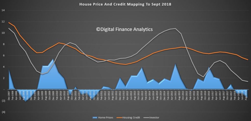
And more specifically, credit for property investment is even more strongly correlated. As we know investors are attracted by the capital growth, and also the capital gains and negative gearing tax breaks available.

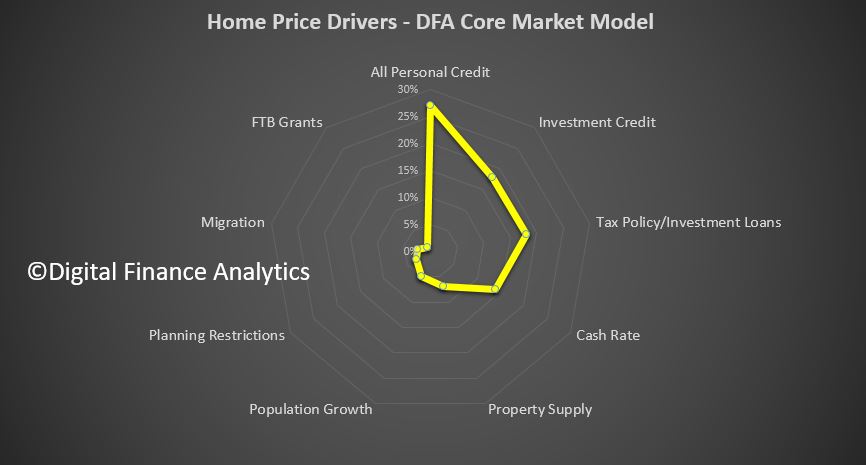
What’s most interesting is the relative weight of these different factors in driving home prices. The four most powerful levers in terms of home prices is first overall growth in personal credit, including mortgages and other loans at 27% of total impact. Investment lending contributed a further 18%, followed by tax policy for investment property at 17% and the cash rate at 14%. The other factors, the ones which are spoken about the most, property supply, population growth, planning restrictions and migration, together make up just 22% of total impact. Or in other words, without addressing the credit elephant in the room, tax policy and interest rates, the chances of taming prices is low. First time buyer incentives were less than 1%!

So the greatest of these is credit policy, which has for years allowed banks to magic money from thin air, to lend to borrowers, to drive up home prices, to inflate the banks balance sheet, to lend more to drive prices higher – repeat ad nauseam! Totally unproductive, and in fact it sucks the air out of the real economy and money directly out of punters wages, but make bankers and their shareholders richer. Plus, the second order impacts to the construction sector.

Two final observations. First the GDP calculation we use in Australia is flattered by housing growth (triggered by credit growth) and construction activity. The second driver of GDP growth is population growth.  But in real terms neither of these are really creating true economic growth, as seen in the per capita data.

Second, the capital regulatory framework from the Bank For International Settlements is still a hangover from the days when deposits were thought to drive loans – so holding a ratio of assets to protect deposits made sense. But given the multiplier effect available to banks via their ability to issue bonds and the like increase their loan books, the BIS rules as currently formulated are ineffective. In fact by applying low risk weights to mortgage loans, they encourage to banks to leverage up more – in Australia our major banks have only about 5%of shareholder capital at risk. This is way too low.

To, conclude, to solve the property equation, and the economic future of the country, we have to address credit. But then again, I refer to the fact that most economists still think credit is unimportant in macroeconomic terms!

The alternative is to continue to let credit grow well above wages, and lift the already heavy debt burden even higher. In fact, some are calling for a reversal of recent credit tightening to resurrect home price growth. But, that is, ultimately unsustainable, and why there will be an economic correction in Australia, and quite soon.

Money Creation In The Modern Economy

The Housing Affordability Myth:

Latest DFA Live Stream Q&A Recording From 16 October 2018 Now Available

We have posted the trimmed version on last night’s discussion on property and finance, where we discussed our home price scenarios, and a bunch of other issues, from bail-in, financial security, through to the banking system.

In addition here is the original version with the live chat (and a missing slide show, thanks to operator error!!).

Thanks to all those who took part, it was an interesting, and hopefully illuminating discussion. We will schedule another session next month.


Estimating Future Home Lending Growth

One of my clients asked me to share my thoughts on the trajectory of future home loan growth, in the light of the current market dynamics. We run a series on this in our Core Market Model, and it is updated each time we get data from our surveys, APRA, ABS or RBA.

So I included the data from the ABS in terms of lending flows, factored in deep discounting and rate cuts from some lenders (like ANZ) and the ability of some lenders, like Macquarie, HSBC and some Credit Unions, to fly higher than the APRA imposed cap on investor loan growth.

In fact we run three scenarios, a base case, which we will discuss in a moment, an aggressive growth case, and a lower bounds case. We have assumed no move in the RBA cash rate over the next 18 months, a continued fall in the pressure on the BBSW rate, and some continued momentum from first time buyers.  We also factored in the ongoing shift from interest only loans to principal and interest loans, and appetite for finance from some household sectors, especially those seeking to refinance, including those seeking to assist their offspring to buy via the banks of Mum and Dad.  Our model has been tracking close to the RBA data in recent months, so we are pretty confident about the trends.  But it is only a projection, and it will be wrong!

The first chart shows the overall value of housing loan portfolios, split between owner occupied and investor loans. The astonishing momentum in investor lending up until mid 2017, when APRA’s new regulations kicked in, eases back, and the current growth in investor loans portfolios is pretty flat. In fact we expect a small rise in the months ahead, as some non-bank lenders have to compete harder with the APRA “approved” lenders who can go above the cap.  Remember though lenders still have tighter underwriting standards than before, so there is not going to be a massive resurgence in my view, at least until the Royal Commission reports.  Owner occupied loans will continue to lift, as first time buyers are still active, and attracted by the lower property prices.

Refinancing of existing loans does continue, though some are having difficulty finding a loan, as we discussed yesterday.

Turning to the percentage change, our base case is for a slow rise in investor lending and a slow fall in owner occupied loans, with an overall growth still well above inflation at between 5-6%.

This suggests that the lenders will need to compete hard for business which is available, continue with more rigorous loan assessments and manage tighter margins as a result.

As a result, we think property prices will continue to go lower through 2019, but does not as yet signal a crash.

This could all change if funding costs go higher, or the banks get slugged with more costs relating to poor practice, or even face criminal cases relating to charging fees for no service, or making unsuitable loans to borrowers.

As a result there is significantly more downside risk than upside gain at the moment.  Our worst case scenario actually sees the overall lending portfolio shrink. If this were to happen, then all bets are off, and we must expect significantly more property price falls through 2019. Actually we do not think, as some are saying, that the worst is over. Rather its just the end of the beginning!


Pay Day Lending Still Running Hot

We monitor Pay Day lending – or Small Amount Credit Contracts (SACC) – as they should be called, via our surveys. We have just run our 2017 updates, and we find that SACC lending is still growing, and well above inflation and wage growth. A symptom of financial stress in the community .

Watch the video, or read the post.

But SACC lenders are targeting different borrowers now, and mainly via online channels.

This first chart shows the relative lending flows split by distressed households and stressed households. Stressed households, we define as those with cash flow problems (often thanks to poor budgeting or over commitment) but many will have other financial assets, and even may own property.  Most will be in employment. Lenders are targeting this group (especially using TV, radio and online channels) and there has been substantial growth.

Distressed households are those under financial pressure, often with limited employment, and are very likely to be on Government assistance. Recent tightening of the lending rules has reduced the share of lending to these distressed groups – which is a good thing.

The overall net effect is the total lending from Pay Day providers, including the many online players – has risen to around $842m flow and $994m stock. Growth in 2015 -2016 was 10.7% and 2016-17 was 14.5%. We expect growth at least 10% in 2018, perhaps higher.

The share of loans originated online continues to rise, from 48% in 2015, to more than 75% now, and it will continue to rise further. These online services are easy to access, and borrowers, once they sign up can get “special” deals.

The online environment is of course hard to police, but the interest rates offered by many players are right at the top end of the allowable range.

The latest changes to the SACC legislation are still in the works.  But we think there should be a further review looking at the online lending environment. This is clearly where the action (and risks) are.   By plugging the lending to our most vulnerable households, the industry has regrouped around more affluent but needy connected households. There are more to target, and the prospect of substantial growth.

For an outline and critique of the proposed payday lending* reforms, see the following articles by Gill North (Professor of Law at Deakin University and Joint Principal of Digital Finance Analytics)

  • ‘Small Amount Credit Contract Reforms in Australia: Household Survey Evidence & Analysis’ (2016) 27 Journal of Banking and Finance Law and Practice 203
  • ‘Small Amount Credit Contract Reforms: Will the Affordability Cap Achieve Its Intended Objectives Without Unintended Adverse Consequences?’ (2017) 32 Australian Journal of Corporate Law 1
  • ‘Small Amount Credit Contract Reforms: Have Transparency and Competition Concerns Been Forgotten?’ (2017) 25 Competition & Consumer Law Journal 101

Draft versions of these papers are available at https://ssrn.com/author=905894

Defined as “small amount credit contracts” in the National Consumer Credit Protection Act 2009 (Cth)

Getting Deep and Dirty On Mortgage Risk

We have been busy adding in new functionality to our Core Market Model, which is our proprietary tool, drawing data from our surveys and other public and private data sources to model and analyse household finances.

We measure mortgage stress on a cash flow basis – the October data will be out next week – and we also overlay economic data at a post code level to estimate the 30-day risk of default (PD30). But now we have added in 90-day default estimates (PD90) and the potential value which might be written off, measured in basis points against the mortgage portfolio. We also calibrated these measures against lender portfolios.

So today we walk though some of the findings, and once again demonstrate that granular analysis can provide a rich understanding of the real risks in the portfolio. Risks though are not where you may expect them!

First we look risks by by state. This chart plots the PD30 and PD90 and the average loss in basis points. WA leads the way with the highest measurement, then followed by VIC, SA and QLD. The ACT is the least risky area.

So, looking at WA as an example, we estimate the 30-day probability of  default in the next 12 months will be 2.5%, 90-day default will be 0.75% and the risk of loss is around 4 basis points. This is about twice the current national portfolio loss, which is sitting circa 2 basis points.

Turning to our master household segmentation, we find that our Multicultural Establishment segment has the highest basis point risk of loss, at around 3 basis points, followed by Young Affluent, Exclusive Professionals and Young Growing Families. This immediately shows that risk and affluence are not totally connected. In fact our lower income groups, are some of the least risky. The PD30 and PD90 follows this trend too.

The Loan to Value bands show some correlation to risk, although the slope of the curve is not that aggressive, indicating that LVR as a risk proxy is not that strong. This is because in a rising market, LVRs will rise automatically, irrespective of serviceability.

A more sensitive measure of risk is Loan To Income (which APRA mentioned yesterday for the first time!). Here we see a significant rise in risk as LTI rises. Above 6 times income the risk starts to rise, moving from around 3 basis points, to 6 basis points at an LTI of 10, and 12 basis points at an LTI of 15+. So rightly LTI should be regarded as the leading risk indicator, yet many lenders are yet to incorporate this in their models. It is better because in the current flat income environment, income ratios are key.

Age is a risk indicator too, with households below 40 showing a higher risk of loss (3 basis points) compared with those over 50 (2.25). Even those into retirement will still represent some level of risk.

Finally, and here it gets really interesting, we can drill down into post codes. We plotted the top 20 most risky post codes across the country from a basis points loss perspective. What we found is that in the top 20 there is a high representation of more affluent post codes, especially in WA, with Cottlesloe, Nedlands and City Beach all registering. We also find places like Double Bay and Dover Heights in Sydney, Hinchenbrook  in QLD and Caulfield in VIC appearing. These are, on a more traditional risk view, not areas which would be considered higher risk, but when we take the size of the loans and cash flows into account, they currently carry a higher risk profile from an absolute loss perspective.

So, we believe the time has come for more sophisticated, data driven analysis of mortgage risks. And risks are not where you might think they are!

Digital Finance Analytics – Quenching The Thirst For Accurate Household Mortgage Data

Digital Finance Analytics Core Market Model is now being used by a growing number of financial services companies and agencies who want to understand the true dynamics of the current mortgage market and the broader footprint of household finances across Australia.

The DFA Approach

By combining our household survey data, with private data from industry participants as well as public data from government agencies we have created a unique statistically optimised 52,000 household x 140 field resource which portrays the current status of households and their financial footprint. Because new data is added to each week, it is the most current information available. We also estimate the extent of future mortgage defaults, thanks to the data on household mortgage stress.

Posts on the DFA blog uses data from this resource.  Momentum in our business has picked up significantly as concerns about the state of household finances grow and the thirst for knoweldge grows. We plug some of the critical gaps in the currently available public data which is in our view both limited and myopic.

A Soft Sell

The complete data-set is available purchase, either as a one-off transaction, or by way of an annual subscription which includes the full current data plus eleven subsequent monthly updates.

Other clients prefer to request custom queries which we execute on a time and materials basis.

In this video you can see an example of the core model at work. We show how data can be manipulated to get a granular (post code and segment) understanding of the state of play.  This is important when the situation is so variable across the states, and across different household groups.

We Hold Granular Data

  • Household Demographics (including age, education, structure, occupation and income, location, etc.)
  • Household Property Footprint (including residential status, type of property, current value of property, whether holding investment property, purchase intentions, etc.)
  • Household Finances (including outstanding mortgages and other loans, credit cards, transaction turnover, deposits, superannuation and SMSF, and other household spending)
  • Household Risk Assessment (including loan-to-value, debt servicing ratio, loan-to-income ratio, level of mortgage stress, probability of default, etc.)
  • Household Channel Preferences (including preferred channel, time on line, use of financial adviser, use of mortgage broker, etc.)
  • Segmentation (derived from our algorithms; for household, property, digital and others)

Request More Information

You can get more information about our services by completing the form below, where you can also request access to our Lexicon which describes in detail the data available.

You should get confirmation your message was sent immediately and you will receive an email with the information attached after a short delay.

Note this will NOT automatically send you our ongoing research updates, for that register here.

[contact-form to=’mnorth@digitalfinanceanalytics.com’ subject=’Request Details of DFA Core Market Model’][contact-field label=’Name’ type=’name’ required=’1’/][contact-field label=’Email’ type=’email’ required=’1’/][contact-field label=’Email Me The Information’ type=’radio’ options=’Yes Please’ required=’1′ /][contact-field label=’Email Me The Lexicon (option)’ type=’radio’ options=’Yes Please’ required=’0′ /][contact-field label=’Comment If You Like’ type=’textarea’/][/contact-form]


What The Mortgage Stress Data Tells Us

Following the initial release yesterday, and the coverage in the AFR, today we drill down further into the latest mortgage stress results.

By way of background, we have been tracking stress for years, and in 2014 we set out the approach we use. Other than increasing the sample, and getting more granular on household finance, the method remains the same, and consistent. We can plot the movement of stress over time.

Remember that the recent RBA Financial Stability review revealed that 30% of households were under pressure with no mortgage buffer, and a recent Finder.com.au piece suggested more than 50% were unable to cope with a $100 a month rise. So we are not alone in suggesting households are under greater financial pressure.

For this analysis we plot the number of households in mild stress (making mortgage repayments on time but tightening their belts so to do); severe stress (insufficient cash flow to pay the mortgage), and also an estimation of the number of households who may hit a 30-day default within the next 12 months. This is calculated by adding in a range of economic overlays into the stress data. This is all done in our core market model, which contains data from our rolling surveys, private data from lenders and other sources, and public data from the RBA, APRA and ABS.  This model is unique in the Australian context because it runs at a post code and household segment level, allowing us to drill into the detail. This is important because averaging masks significant variations.

The analysis shows that there are more severely stressed households in NSW than other states, and that around 13,000 households risk default in the next year, a similar number to VIC. WA is third on this list, with the number of defaults lower elsewhere.

Another lens is by the locations of households, in the residential zones around our major cities. The highest risk of default resides in the our suburbs, where a higher proportion of households are in severe stress. Households in inner regional Australia are next, followed by the inner suburbs, where again more households are in severe stress.

Our core household segmentation shows that the highest count of defaults are likely among the suburban mainstream, then the disadvantaged fringe, followed by mature stable families and young growing families. It is also worth noting that the young affluent and exclusive professional, the two most affluent segments contain a number of severe stressed households. This have larger mortgages and lifestyles, but not necessarily more available cash.

Finally, for today, here is the mapping across the regions. No surprise that the largest number of stressed households are in the main urban centres of  Melbourne and Sydney.

Next time we will look at post codes across the country.


More On Negative Gearing Distribution – The Wealthy Benefit The Most

Last week we discussed data from our core market model on negative gearing, and using our segmentation demonstrated that some, and more wealthy segments, benefit the most.  There is room to trim the excesses, without necessarily removing gearing overall.

Today we look at another perspective, which supports this argument. We estimate that 61.7% of households with investment property are negatively geared – this has been rising significantly, as investment property penetration as risen.  Around 2.4 million households hold investment property, but not all is mortgaged or geared.

The first chart shows the value of investment property mortgages mapped to the value bands of investment property held. The orange area are households who negatively gear, the blue those who do not. This shows that the larger value portfolios have more gearing, and therefore get the greater tax benefits.  Note also the small, but important peak in portfolio values above $2m. We are seeing the rise in the “professional” investor class, or Portfolio Investors as we call them.

Another way to look at the value distribution is by the number of properties held in the investment portfolio. Again the orange area is property negatively geared, the blue, not geared.  We see a significant spike in gearing above 5 properties, as well an an expected strong distribution in one or two properties. Our modelling shows around 79% of households have one or two properties.

The overall costs of negative gearing and capital gains tax concessions are an estimated $7.7 billion annually, and three-quarters of the capital gains tax concessions are enjoyed by the top 10 per cent of income earners.

So, in our view, the Government should be looking to curtail the gearing available to multiple property holders, and limit the total amount which can be geared. Those two simple measures would take heat out of the market, reduce the tax burden and still allow “mum and dad” investors to benefit.

A categorical “NO” to negative gearing reform is a major mistake. Treasurer, please note! As it stands, as mortgage rates rise, and investment loans will bear the brunt of these rises, actually the poor tax payer pays for this, insulating geared investors from the extra costs. Treasury should be modelling the extra impost this will be on the budget.


Investor Property Footprints And Negative Gearing

The argument trotted out to defend negative gearing from reform is that the bulk of investors are “typical mum and dad” households.

Of course it depends on how you look at the data, but lets look at output from our core market model.

What we have here is the relative VALUE distribution of investment property held by our core household segments, based on marked to market values.  We see that whilst some households in most segments are represented, the relative value is massively skewed towards more wealthy segments. Exclusive Professionals, our most wealthy segment holds 27% of all investment property by value, Mature Stable families hold 18%, Suburban Mainstream 15% and Wealthy Seniors 9%.

Another way to look at the data is through the lens of our property segmentation. Here investor only segments (they have no owner occupied property) hold 33% of investment property. Within that Portfolio Investors who hold multiple properties hold 3% by value. Those holding property but with no plans to move – Holders – have 20% by value, whilst those trading down hold 19%.

When we look at households by employment type, we see that employed workers hold 62% by value, whilst 17% are help by those not working, 10% managers, 9% expert professionals, and 2% by executives.

But if we look at the use of negative gearing, we see that three segments, by value have the largest footprint. Exclusive Professionals have 42% of negatively geared property, Mature Stable Families 27%, and Wealth Seniors 14%. Other segments are much less likely to negatively gear.

Looking again by Property Segments, Investors and Portfolio Investors have 32% of all negative gearing by value, but other segments also use this technique.

From this we conclude that it is important to separate the holding of an investment property from the use of negative gearing against that property. In fact we think negative gearing is predominately used by more affluent households, and they get the biggest tax breaks as a result, which of course other tax-payers have to subsidise.

There is, in our view, overwhelming evidence that curtailing the excesses in negative gearing (for example, a $ limit) would assist in cooling the market and inject needed cash into the budget.

But as we pointed out the other day, if the political agenda wins out, this just will not happen.

Property And Household Financial Footprints

Data from the Digital Finance Analytics Core Market Model tells an interesting story when we look at households dependence on wealth from property.

To illustrate the point, here are three charts, looking at different household groups. The first is the owner occupied mortgage group.

The blue area represents the distribution of households by age bands. The yellow line shows the relative value of total net worth (assets less debt, including superannuation). The green dotted line shows the value of property, in today’s terms, and the red line the current mortgage. It is very clear that older Australians have greater net assets and smaller mortgages. It is also clear that much of that worth is from paper profits relating to property. They would take a bath if prices were to fall.

Households without a mortgage have greater worth in other savings vehicles, including shares, deposits and property. They are more insulated from property value falls, and of course would not be hit by rising mortgage rates directly.

Finally, those who rent have a lower average net worth. Younger renters have little in the way of assets, whereas older renters on average hold higher balances, partly thanks to superannuation.

The analysis reconfirms how critical property values are to overall net worth. As a nation, we are highly exposed to future price movements. Any correction, whilst it might make property accessible for first time buyers, will seriously erode the net worth of households, especially those in the older age bands. The on-flow to economic outcomes suggests the risks are real, as Phillip Lowe said last night.