How Tourism Affects China’s Current Account Surplus

From The St. Louis Fed Economic Synopsis.

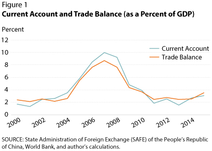
China has been running a current account surplus since 2000, which has been a policy issue regarding exchange rates and currency manipulation. A current account surplus means that China has been a net lender to the rest of the world. China’s current account surplus reached 10 percent of gross domestic product (GDP) in 2007 and then started to decline until 2011, when it fell to 1.8 percent of GDP. The current account surplus has been stable since then, with a slight tendency to increase in more recent years. In particular, in 2015, the current account was around 3 percent of China’s GDP, but it has not returned to the high levels reached in 2007. What are the main factors behind the decline?

The current account is composed of three main categories: (i) the trade balance (net earnings on exports of goods and services minus payments on imports of goods and services); (ii) the net income to foreign factors (compensation of employees, investment income); (iii) and transfers.

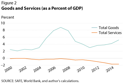
In China’s case, the main component behind the current account trend is a decline in its trade surplus. A trade surplus indicates that China has been earning more on its exported goods and services than it has been paying for its imports (i.e., it has had positive net exports). As Figure 1 shows, net exports in China, as a percentage of GDP, closely track the current account and have been declining since 2007. Indeed, the trade surplus was around 9 percent of GDP in 2007 and fell to 3.5 percent of GDP in 2015. This decline has been driven by both a decline in the surplus of traded goods and an increase in the deficit of traded services (Figure 2). However, the goods surplus has picked up again since 2011, while the services deficit has become more pronounced. Interestingly, trade in services was roughly balanced between 2000 and 2007 and later became a deficit, reaching around –1.7 percent of GDP by 2015. Thus, even though the value of China’s exported goods has exceeded the costs of its imports, China has been importing more services than it has been exporting. Even more interesting is the fact that the increase in China’s services deficit has prevented its current account surplus from rising despite the increased trade surplus in goods.

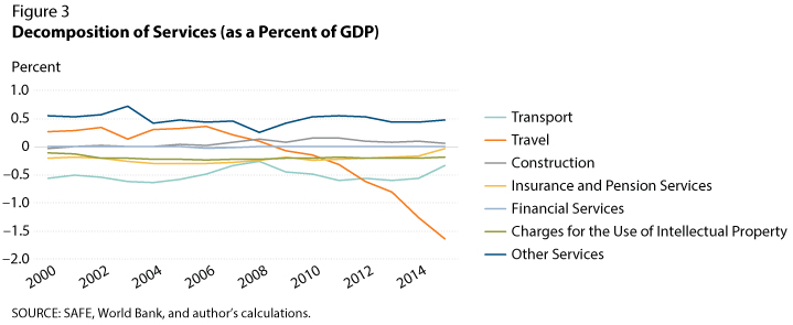
Figure 3 shows the main categories of China’s international trade in services. One category stands out: travel services, which includes mainly tourism. China’s increasing services deficit has been driven mainly by overseas tourism- related consumption. According to a recent report, two population groups in China have been driving tourism: Millennials (young people 15 to 35 years of age) and a growing middle class. The report indicates two primary reasons for increased tourism by these two groups. On the one hand, young people travel for exposure to overseas experiences. On the other hand, Chinese travel for shopping, which accounted for 30 percent of overseas Chinese spending in 2015. The prime shopping destination currently is Hong Kong, but new destinations such as Japan, Korea, and Europe are expected to become increasingly popular.

Overall, the increasing trade deficit in services, spurred mainly by the rise in tourism, seems to be an important factor in the recent trend in China’s current account. As a result, the current account surplus is increasing only slightly despite a larger increase in net exported goods in recent years. What factors could change this trend? Fluctuations in exchange rates in the main destinations for Chinese tourists could affect tourism. For instance, a depreciation of the yuan could slow the increase in the travel services deficit while concurrently increasing the earnings in exports of goods—all of which could generate a larger current account surplus.

Aging and Wealth Inequality

Interesting piece from the St. Louis Federal Reserve looking at the connection between age and wealth and its implications for aging and wealth inequality.

An individual’s wealth varies with age. Most people are born with little to no financial wealth and, as they age, they save part of their income to accumulate wealth or sometimes borrow to finance education, which creates debt. Once people reach retirement, they stop accumulating wealth and start spending down their savings. Thus, the richest people can often be found among those who are about to retire.

Age is not the only determinant of wealth. People’s wealth varies with how much they are given by their parents, their income, and their decisions on how much to consume or save and how to invest their wealth.

In this essay, however, we focus on the connection between age and wealth and its implications for aging and wealth inequality. The issue is salient because the U.S. population is aging and inequality is a frequent concern. Today, less than 15 percent of the overall population is 65 years of age or older, and that share is projected to rise above 30 percent by 2030. Is this going to exacerbate or mitigate wealth inequality in the United States?

The figure shows wealth per capita (black line) by age group in 2010. As indicated earlier, the richest people tend to be 65 to 74 years of age. The figure also shows the fraction of wealth (dashed line) held by households, ranked by the age of the head of household. A key message is that age is a significant source of inequality: The largest and youngest groups hold the least wealth—those under 35 years of age (blue line) represent over 25 percent of the population but hold only about 5 percent of total wealth. If the dashed and blue lines overlapped, each group’s share of the population and share of wealth would be the same and age would not contribute to wealth inequality. In this case, the black line would be flat: Each individual would hold the same amount of wealth, regardless of age.

One can examine the effect of the age distribution using a standard measure of wealth inequality: the Gini index (sometimes called the Gini coefficient), which varies from 0 to 1. A value of 0 indicates no inequality—everyone holds the same wealth. A positive Gini index indicates some inequality. If one individual held all the wealth—maximal inequality—the Gini index would equal 1. In the United States, for example, the richest 1 percent of the population holds 42 percent of total wealth.1 As the figure shows, the age group with the highest share of wealth—those 55 to 64 years of age—holds almost 31 percent of the wealth but represents only about 16 percent of the population. The Gini coefficient implied by the figure is 0.385.2 Because this Gini coefficient measures only the dispersion of wealth by age group, it omits additional sources of wealth inequality and therefore understates the true Gini coefficient for the United States.

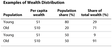
A simple example helps illustrate that wealth inequality by age contributes to overall wealth inequality: Consider an economy, as shown in the table, with 100 people. Each young person holds $1 of wealth, while each old person holds $10 of wealth (top panel). The population shares of young and old are 80 percent and 20 percent, respectively. Note that this panel represents, in a stylized way, the features of the U.S. economy displayed in the figure: There are many more young people than old people, but the old hold more wealth than the young. The total wealth of this economy is $280, where the young collectively hold $80 and the old collectively hold $200. The young’s share of total wealth is (80/280) = 29 percent, which is noticeably less than their 80 percent share of the population. The Gini coefficient associated with this distribution of wealth is 0.51.

Suppose now that the economy ages and there are 50 old people and 50 young people (bottom panel). Because older people have more money, total wealth in the economy rises from $280 to $550. If each young person still holds $1 of wealth, their share of total wealth becomes (50/550) = 9 percent instead of 29 percent—a decline of 20 percentage points. But their share in the population decreased by 30 percentage points, from 80 percent to 50 percent, so the Gini coefficient declines from 0.51 to 0.41.

So the aging of the population, per se, is a factor that can reduce wealth inequality. This example, however, must be interpreted with caution. It does not imply that the forecasted aging of the U.S. population will be accompanied by a reduction in wealth inequality. As mentioned in the introduction, the calculation presented here abstracts from other forms of inequality not related to age. It is conceivable that these other forms of inequality may increase as the population becomes older and offset the effects described here.

US Financial Accounts 4Q 2016 Shows Household Debt Higher

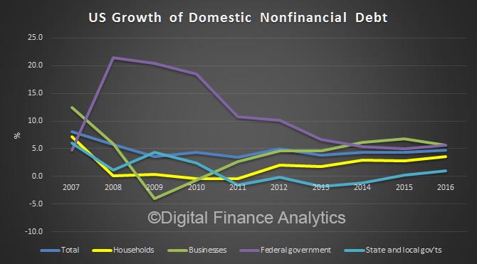
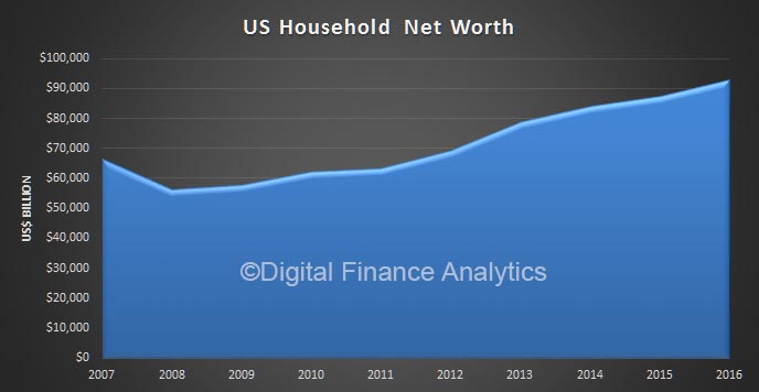
The Fed released the US Accounts to Dec 2016.  It shows growth in household debt, but a lowering of business investment and government debt down from the 2008 highs.

Domestic nonfinancial debt outstanding was $47.3 trillion at the end of the fourth quarter of 2016, of which household debt was $14.8 trillion, nonfinancial business debt was $13.5 trillion, and total government
debt was $19.1 trillion.

Domestic nonfinancial debt growth was 2.9 percent at a seasonally adjusted annual rate in the fourth quarter of 2016, down from an annual rate of 5.8 percent in the previous quarter.

Household debt increased at an annual rate of 3.8 percent in the fourth quarter of 2016. Consumer credit grew 6.2 percent, while mortgage debt (excluding charge-offs) grew 3.1 percent at an annual rate. Percentage changes calculated as seasonally adjusted flow divided by previous quarter’s seasonally adjusted level, shown at an annual rate

Nonfinancial business debt rose at an annual rate of 2.6 percent in the fourth quarter, down from an annual rate of 6.3 percent in the previous quarter.

Federal government debt increased 2.9 percent at a seasonally adjusted annual rate in the fourth quarter of 2016, down from an annual growth rate of 8.2 percent in the previous quarter.

State and local government debt rose at an annual rate of 0.2 percent in the fourth quarter of 2016, down from an annual growth rate of 0.7 percent in the previous quarter.

The net worth of households and nonprofits rose to $92.8 trillion during the fourth quarter of 2016. The value of directly and indirectly held corporate equities increased $728 billion and the value of real estate rose
$557 billion.


U.S., European Economies and the Great Recession

From The St. Louis Fed Blog.

As the U.S. economy has gotten stronger, labor markets across the country have improved substantially, albeit slowly, from the shocks they suffered during the Great Recession. Here, we highlight the unemployment rate dynamics in the U.S. and across Europe during and after the Great Recession and global financial crisis.

As the figure below shows, the U.S. unemployment rate increased rapidly in 2008 and 2009.

Unemployment Rates

The U.S. unemployment rate rose from 5 percent in January 2008 to its peak of 10 percent in October 2009, with the year-over-year changes being at least 3 percentage points for 10 consecutive months. Since then, however, the unemployment rate has declined at a mostly consistent average year-over-year pace of 0.6 percentage points, reaching 4.7 percent in December 2016.

The experiences of the United Kingdom and Germany were somewhat similar, with a quick uptick and a prolonged decline in the unemployment rate. It is important to note that Germany’s unemployment rate had already been declining from a prior peak in the early 2000s, and the U.K.’s hovered around 8 percent for about four years before it started declining.

But the experience for countries in Europe’s periphery, like Spain and Italy, was quite different. Spain and Italy both had a second prolonged rise in the unemployment rate well after the financial crisis, as their economies struggled to recover. This is highlighted in the figure below, where the real GDP growth in both of these countries quickly slowed and dipped back into negative territory for a second time in 2011, and this time for a much longer period.

Real GDP Growth

The final figure below shows how Italy’s economy has struggled to grow back to its pre-recession level, explaining why its unemployment rate has remained elevated for several years.

real gdp indexed

On the other hand, Spain’s economy has just recently reached its pre-recession level, and it has grown at an average pace of 3.2 percent over the past two years. Spain’s recent growth has had a positive impact on its unemployment rate, which declined at an average year-over-year pace of 2.4 percentage points in 2015 and 2016.

Finally, the U.S., the U.K. and the German economies have grown and surpassed their pre-recession levels, pointing to why their unemployment rates have declined considerably

The Impact of the Dodd-Frank Act

From The St.Louis Fed Blog.

One of the outcomes of the 2008 financial crisis was recognizing the cascading effects that the severe financial stress or failure of a large institution can have on financial markets and the economy at large. A primary goal, therefore, of post-crisis financial reform was heightened supervision and regulation of those institutions whose sheer size or risk-taking posed the greatest threat to financial stability.

These reforms were primarily codified in the Dodd-Frank Wall Street Reform and Consumer Protection Act of 2010. Under the Dodd-Frank Act, US financial institutions with $50 billion or more in assets are subject to enhanced prudential regulatory standards. These standards are designed to accomplish two primary objectives:

  • Improve an institution’s resiliency to both decrease its probability of failure and increase its ability to carry out the core functions of banking
  • Reduce the effects of a bank’s failure or material weakness on the financial system and the economy at large

To meet these objectives, the Federal Reserve employs a number of tools to monitor institutions and reduce the risks they pose to the U.S. financial system.

Capital Stress Testing

The Fed annually assesses all bank holding companies with more than $50 billion in assets to ensure they have sufficient capital to weather economic and financial stress. This exercise, called the Comprehensive Capital Analysis and Review (CCAR), also allows the Fed to look at the impact of various financial scenarios across firms.

If the Fed determines that an institution cannot maintain minimum regulatory capital ratios under two sets of adverse economic scenarios, the institution may not make any capital distributions such as dividend payments and stock repurchases without permission.

A complementary exercise to CCAR is Dodd-Frank Act stress testing (DFAST). The DFAST exercise is conducted by the financial firm and reviewed by the Fed. It aids the Fed in assessing whether institutions have sufficient capital to absorb losses and support operations during adverse economic scenarios. This forecasting exercise applies to banks and bank holding companies with more than $10 billion in consolidated assets.

Liquidity Stress Testing

The financial crisis made it clear that a firm’s liquidity, or ability to convert assets to cash, is important during periods of financial stress. In response, the Fed launched the Comprehensive Liquidity Assessment and Review (CLAR) in 2012 for the country’s largest financial firms.

CLAR allows the Fed to assess the adequacy of the liquidity positions of the firms relative to their unique risks and to test the reliability of these firms’ approaches to managing liquidity risk.

Resolution and Recovery Plans

Banking organizations with total consolidated assets of $50 billion or more are also required to submit resolution plans to the Fed and the Federal Deposit Insurance Corp. Each plan must describe the organization’s strategy for rapid and orderly resolution in the event of material financial distress or failure.

Have these tools made a difference? The answer is clearly “yes,” as shown in the figure below.

Capital Ratios

The capital ratios of the country’s largest firms (those with more than $250 billion in assets) have shown solid positive progress. In fact, one important measure of capital strength for this group of institutions, the average Tier 1 risk-based capital ratio, has increased 48.1 percent since 2007.

Some in the industry and in Washington, D.C., are calling for a re-evaluation of the Dodd-Frank Act provisions. While modifications for smaller, non-systemic firms would be welcomed by many, the damage from the financial crisis makes it sensible to continue strong expectations for the largest firms.

Why Does Economic Growth Keep Slowing Down?

From The St. Louis Fed Blog.

The U.S. economy expanded by 1.6 percent in 2016, as measured by real gross domestic product (GDP). Real GDP has averaged 2.1 percent growth per year since the end of the last recession, which is significantly smaller than the average over the postwar period (about 3 percent per year).

These lower growth rates could in part be explained by a slowdown in productivity growth and a decline in factor utilization.1 However, demographic factors and attitudes toward the labor market may also have played significant roles.

The figure below shows a measure of long-run trends in economic activity. It displays the average annual growth rate over the preceding 40 quarters (10 years) for the period 1955 through 2016. (Hence, the first observation in the graph is the first quarter of 1965, and the last is the fourth quarter of 2016.)

Real GDP

Long-run growth rates were high until the mid-1970s. Then, they quickly declined and leveled off at around 3 percent per year for the following three decades.

In the second half of the 2000s, around the last recession, growth contracted again sharply and has been declining ever since. The 10-year average growth rate as of the fourth quarter of 2016 was only 1.3 percent per year.

Total output grows because the economy is more productive and capital is accumulated, but also because the population increases over time. The next figure compares long-run growth rates of real GDP and real GDP per capita. Both series display similar behavior.

RealGDPperCapita

Although population growth has been slowing, the effect is not big enough to change the qualitative results described above.

The third figure adds long-run growth rates of real GDP divided by the labor force.2 Dividing by the labor force instead of the total population accounts for the effects of changing demographics and labor market attachment.

RealGDPLaborForce

From the 1970s until the 2000s, long-run growth rates of real GDP divided by the labor force remained well below those of real GDP per capita. There are two main factors that explain this:

  • Lower fertility and longer lifespans steadily increased the potential labor force relative to the total population.
  • Labor force participation increased significantly from the 1960s until 2000, largely driven by increased female labor force participation.

When accounting for both of these factors, economic activity from 1975 to 1985 looks more depressed than in the two decades that followed. This seems consistent with the negative effects that the 1970s oil shocks and efforts to reduce inflation in the early 1980s3 had on the economy.

The trend in labor force participation reversed in 2000, as participation rates have been steadily decreasing since then. This explains why real GDP divided by labor force growth rates are now higher than real GDP per capita growth rates.

Having accounted for the long-term effects of changes in demographics and labor market attitudes, we can now look at the effects of productivity growth and factor utilization. The final figure compares long-run growth rates in real GDP divided by the labor force with long-run growth rates in total factor productivity and long-run averages of capacity utilization (i.e., the actual use of installed capital relative to potential use).4 Note that data for capacity utilization are only available since 1967.

Capacity

The poor long-run performance of 1975-1985 can be attributed to low productivity growth and a decline in capacity utilization. Afterwards, long-run growth rates in output started to pick up, first associated with an increase in capacity utilization and then with increased productivity growth.

The current path of decline in output growth follows from both a slowdown in productivity growth and lower capacity utilization, though the latter factor started earlier and may have leveled off sooner.

Notes and References

1 As argued by St. Louis Fed President James Bullard, we seem to be currently in a low productivity-growth regime. See Bullard, James. “The St. Louis Fed’s New Characterization of the Outlook for the U.S. Economy,” announcement, June 17, 2016.

2 The labor force includes all persons classified as employed or unemployed in the Bureau of Labor Statistics’ Current Population Survey.

3 For more on the monetary policy actions of the early 1980s, see Medley, Bill. “Volcker’s Announcement of Anti-Inflation Measures,Federal Reserve History, November 22nd, 2013.

4 The series for total factor productivity is taken from the Federal Reserve Bank of San Francisco. Capacity utilization is published by the Federal Reserve’s Board of Governors and covers only the industrial sector of the economy (manufacturing, mining, utilities and selected high-tech industries).

Is Local Unemployment Related to Local Housing Prices?

From The St. Louis FED.

The U.S. national labor market has recovered from the effects of the 2007-2009 recession; however despite the national labor market recovery, significant regional variation remains. Recent economic research highlights links between regional labor and housing markets. In their article, “ The Recent Evolution of Local U.S. Labor Markets, ” Authors Maximiliano Dvorkin and Hannah Shell examined the recession and recovery by reviewing the correlation between county-level unemployment rates and changes in housing prices.

National unemployment reached a pre-recession low in December 2007; by October 2009 the unemployment rate in most counties increased between 4 and 20 percentage points. The authors found that areas with higher unemployment rates before the recession experienced larger increases in unemployment during the recession, and those areas with lower unemployment rates before the recession experienced smaller upticks in unemployment during the recession.

The authors theorized that one reason for the disparity in unemployment rate increases could be related to the housing supply. Specifically, the unemployment rates in Arizona, New Mexico, Nevada and Utah remained above their pre-recession levels; these are also areas where housing prices dropped significantly.

When they examined the percent change in county house prices with the change in the county unemployment rate, the results showed a strong negative correlation, meaning that counties with larger decreases in housing prices experienced larger increases in the unemployment rate, perhaps because larger house price declines during downturns are leading to larger declines in local consumption spending that further depress the local economy.

FED Sets Up Parameters For 2017 Dodd-Frank Stress Tests

The Federal Reserve Board on Friday released the scenarios to be used by banks and supervisors for the 2017 Comprehensive Capital Analysis and Review (CCAR) and Dodd-Frank Act stress test exercises and also issued instructions to firms participating in CCAR.

CCAR evaluates the capital planning processes and capital adequacy of the largest U.S.-based bank holding companies, including the firms’ planned capital actions such as dividend payments and share buybacks and issuances. The Dodd-Frank Act stress tests are a forward-looking assessment to help assess whether firms have sufficient capital. Stress tests help make sure that banks will be able to lend to households and businesses even in a serious recession by ensuring that they have adequate capital to absorb losses they may sustain.

This year, 13 of the largest and most complex bank holding companies will be subject to both a quantitative evaluation of their capital adequacy and a qualitative evaluation of their capital planning capabilities. As announced earlier this week by the Board, 21 firms with less complex operations will no longer be subject to the qualitative portion of CCAR, relieving them of significant burden.

Financial institutions are required to use the scenarios in both the stress tests conducted as part of CCAR and those required by the Dodd-Frank Act. The outcomes are measured under three scenarios: severely adverse, adverse, and baseline.

For the 2017 cycle, the severely adverse scenario is characterized by a severe global recession in which the U.S. unemployment rate rises by about 5.25 percentage points to 10 percent, accompanied by a period of heightened stress in corporate loan markets and commercial real estate markets. The adverse scenario features a moderate recession in the United States, as well as weakening economic activity across all countries included in the scenario. The adverse and severely adverse scenarios describe hypothetical sets of events designed to assess the strength of banking organizations and their resilience. They are not forecasts. The baseline scenario is in line with average projections from surveys of economic forecasters. It does not represent the forecast of the Federal Reserve.

Each scenario includes 28 variables–such as gross domestic product, unemployment rate, stock market prices, and interest rates–encompassing domestic and international economic activity. Along with the variables, the Board is publishing a narrative that describes the general economic conditions in the scenarios and changes in the scenarios from the previous year.

As in prior years, six bank holding companies with large trading operations will be required to factor in a global market shock as part of their scenarios. Additionally, eight bank holding companies with substantial trading or processing operations will be required to incorporate a counterparty default scenario.

The Board is also releasing several letters with additional information on its stress testing program. One letter describes the reduced data required from the 21 firms that have been removed from the qualitative portion of CCAR; a second details enhancements and changes made to certain supervisory loss models; and a third provides an overview of the stress testing program and its expectations for foreign firms that are beginning the stress testing program this year, but are not yet required to publicly report their results under the Board’s rules.

Bank holding companies participating in CCAR are required to submit their capital plans and stress testing results to the Federal Reserve on or before April 5, 2017. The Federal Reserve will announce the results of its supervisory stress tests by June 30, 2017, with the exact date to be announced later.

Firm Removed from qualitative portion of CCAR New to CCAR 2017 Subject to global market shock Subject to counterparty default
Ally Financial Inc. X
American Express Company X
BancWest Corporation X
Bank of America Corporation X X
The Bank of New York Mellon Corporation X
BB Corporation X
BBVA Compass Bancshares, Inc. X
BMO Financial Corp. X
Capital One Financial Corporation
CIT Group Inc. X X
Citigroup Inc. X X
Citizens Financial Group, Inc. X
Comerica Incorporated X
Deutsche Bank Trust Corporation X
Discover Financial Services X
Fifth Third Bancorp X
The Goldman Sachs Group, Inc. X X
HSBC North America Holdings Inc.
Huntington Bancshares Incorporated X
JPMorgan Chase & Co. X X
KeyCorp X
M Bank Corporation X
Morgan Stanley X X
MUFG Americas Holdings Corporation X
Northern Trust Corporation X
The PNC Financial Services Group, Inc.
Regions Financial Corporation X
Santander Holdings USA, Inc. X
State Street Corporation X
SunTrust Banks, Inc. X
TD Group US Holdings LLC
U.S. Bancorp
Wells Fargo & Company X X
Zions Bancorporation X

FED Holds Rate This Month

The FED held their benchmark rate today, whilst still leaving the door open for rises later.

Information received since the Federal Open Market Committee met in December indicates that the labor market has continued to strengthen and that economic activity has continued to expand at a moderate pace. Job gains remained solid and the unemployment rate stayed near its recent low. Household spending has continued to rise moderately while business fixed investment has remained soft. Measures of consumer and business sentiment have improved of late. Inflation increased in recent quarters but is still below the Committee’s 2 percent longer-run objective. Market-based measures of inflation compensation remain low; most survey-based measures of longer-term inflation expectations are little changed, on balance.

Consistent with its statutory mandate, the Committee seeks to foster maximum employment and price stability. The Committee expects that, with gradual adjustments in the stance of monetary policy, economic activity will expand at a moderate pace, labor market conditions will strengthen somewhat further, and inflation will rise to 2 percent over the medium term. Near-term risks to the economic outlook appear roughly balanced. The Committee continues to closely monitor inflation indicators and global economic and financial developments.

In view of realized and expected labor market conditions and inflation, the Committee decided to maintain the target range for the federal funds rate at 1/2 to 3/4 percent. The stance of monetary policy remains accommodative, thereby supporting some further strengthening in labor market conditions and a return to 2 percent inflation.

In determining the timing and size of future adjustments to the target range for the federal funds rate, the Committee will assess realized and expected economic conditions relative to its objectives of maximum employment and 2 percent inflation. This assessment will take into account a wide range of information, including measures of labor market conditions, indicators of inflation pressures and inflation expectations, and readings on financial and international developments. In light of the current shortfall of inflation from 2 percent, the Committee will carefully monitor actual and expected progress toward its inflation goal. The Committee expects that economic conditions will evolve in a manner that will warrant only gradual increases in the federal funds rate; the federal funds rate is likely to remain, for some time, below levels that are expected to prevail in the longer run. However, the actual path of the federal funds rate will depend on the economic outlook as informed by incoming data.

The Committee is maintaining its existing policy of reinvesting principal payments from its holdings of agency debt and agency mortgage-backed securities in agency mortgage-backed securities and of rolling over maturing Treasury securities at auction, and it anticipates doing so until normalization of the level of the federal funds rate is well under way. This policy, by keeping the Committee’s holdings of longer-term securities at sizable levels, should help maintain accommodative financial conditions.

The Financing of Nonemployer Firms

From The St. Louis Fed Blog.

Nonemployer firms that applied for financing were more likely to operate at a loss, according to the recently released 2015 Small Business Credit Survey: Report on Nonemployer Firms.

This report, produced jointly by the Federal Reserve banks of St. Louis, Atlanta, Boston, Cleveland, New York, Philadelphia and Richmond, examined trends in businesses with no employees other than the owners. As the report noted, these businesses make up nearly 80 percent of all U.S. firms.

Applying for Financing

The report noted that 32 percent of survey respondents said they applied for financing in the previous 12 months. Among those who applied, the most common reason (66 percent) was to expand the business or to take advantage of a new opportunity. The next most common reason (38 percent) was to cover operating expenses. (Respondents could select multiple answers.)

Among those businesses that did not apply for financing, the top three reasons were:

  • Debt aversion (33 percent)
  • Already had sufficient financing (30 percent)
  • Believed they would be turned down (25 percent)

Profitability: Applicants vs. Nonapplicants

As the report noted: “Collectively, applicants were less profitable than the nonapplicants.” The figure below shows the difference.

profitability of small businesses that applied for financing

Financing Approval

Among firms that applied for financing, 41 percent were not approved for any of the funding they sought. The percentages of firms not receiving any funding grew smaller as firms grew larger: 48 percent of firms with less than $25,000 in revenue did not receive any funding, while only 28 percent of firms with revenues greater than $100,000 did not receive funding.

About 71 percent of firms received less financing than the amount sought. When asked about the primary impact of this financing shortfall, the top response (33 percent) said the firm had to delay expansion. Other top answers were that they used personal funds (22 percent), were unable to meet expenses (18 percent) and passed on business opportunities (13 percent).

Additional Resources