Don’t believe what they say about inequality

From The Conversation.

If you were going to reduce a 150-page Productivity Commission examination of trends in Australian inequality to a few words, it would be nice if they weren’t “ALP inequality claims sunk”, or “Progressive article of faith blown up” or “Labor inequality myths busted by commission”.

The editorial in the Australian Financial Review of August 30 says questions about whether inequality is increasing are “abstract”, taught in universities as “an article of faith”, and a “political truncheon”.

Here I should disclose that I teach courses covering inequality as well as undertaking research on the topic. Also, I was one of the external referees for this week’s Productivity Commission report.

It adds to a growing pile of high quality research on trends in income distribution in Australia, including a recent Australian Council of Social Service (ACOSS) and University of New South Wales study using data from the Australian Bureau of Statistics (ABS) that provides an in-depth analysis of income and wealth inequality in 2015-16 and an analysis of trends since 2000.

Also released at the end of July was the latest HILDA Statistical Report that analyses how things have changed over time for individuals between 2001 and 2016.

The Productivity Commission survey takes the deliberately ambitious approach of assessing a wider range of outcomes than income, including indicators of household consumption and wealth, their components, and changes over time and in response to events such as transitions to work, divorce and retirement.

Rising inequality? A stocktake of the evidence, Productivity Commission 2018, CC BY

Much of the reporting seems to have misread the messages the survey and the Chairman’s speech to the National Press Club were trying to emphasise. For example, the editorial in the Financial Review argues the Commission’s report shows “economic growth has made everyone in Australia in every income group better off”.

Well, no, it doesn’t.

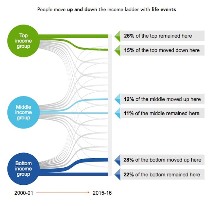
The finding that every income group has benefited from income growth should not be interpreted as meaning every person in Australia is better off. The discussion of mobility in the report makes the point that the incomes of households and individuals fall as well as rise.

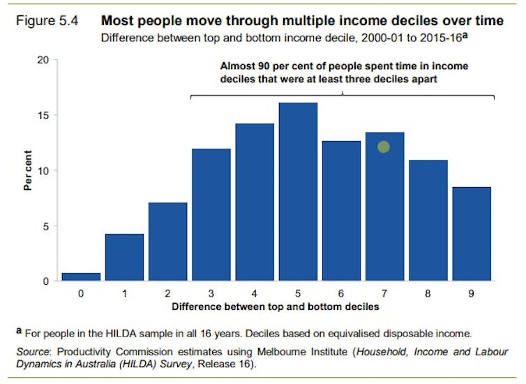
Put simply, not everyone – in fact very few (about 1%) – stay in exactly the same place. Table 5.1 (page 96) shows more than 40% of the Australian population were in a lower income group in 2016 than they had been in 2001, for reasons ranging from retirement to disability to unemployment to family breakdown.

Productivity Commission, CC BY

Single adults on Newstart, although not the same people, have fallen down the income distribution over the past 25 years, from around the bottom 10% to the bottom 5%. As another example, someone who worked on a manufacturing production line until it was closed and then got a job as a sales assistant would be better paid than a sales assistant used to be but most certainly not better paid than they used to be. They would have little reason to believe the Financial Review.

And as the Commission was at pains to point out, the stabilisation and slight decline in overall inequality over the past decade is to a large extent the result of specific government decisions.

One of the most important was the one-off increase in age pensions by the Rudd government in 2009. The 2016 ACOSS report on poverty found the relative poverty rate (before housing costs) for people aged 65 and over fell from around 30% in 2007-08 to 11% in 2013-14, due to the “historic increase” in pension rates.

ABS income surveys show the average incomes of households headed by people aged 65 and over climbed by 16% in real terms between 2007-08 and 2015-16, while for the population as a whole the increase was about 3%. As a result, the average incomes of older households jumped from 69% to 78% of those of households generally.

While economic prosperity was needed to fund that increase, it didn’t automatically fund it. That needed deliberate government intervention.

In his speech releasing the report, Commission chairman Peter Harris specifically noted “growth alone is no guarantee against widening disparity between rich and poor”.

Some forms of poverty for children “have actually risen”.

The slide in inequality resulting from the increase in the age pension is likely to have disguised increases in inequality elsewhere.

According to the Bureau since the global financial crisis the number of workers who are underemployed – working part time and wanting more hours – has climbed from about 680,000 to 1.1 million; from 6.3% to 8.9% of the workforce.

And the ABS finds wage disparities have increased. The ratio of the earnings of a worker at the 90th percentile (earning more than 90% of workers) to the earnings of a worker at the tenth percentile grew from 7.75 times in 2008 to 8.24 times in 2016. This was due to widening wage differentials for both full-time and part-time workers and an increase in the proportion of part-time workers

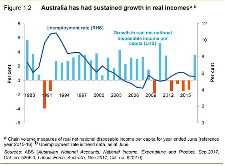
We often hear about Australia as a “miracle economy” enjoying 27 years of economic growth. In fact, the Commission report (Figure 1.2 page 13) shows real net national disposable income per person – a better measure of individual economic well-being than GDP – actually fell in six out of the last 27 years.

Productivity Commission

The income survey data show an even more mixed record. The Our World in Data database shows that by 2003 the real income of the median Australian household was only about 5% higher in real terms than in 1989, while the second and third decile households – mainly headed by those on low wages and some on social security – were actually no better-off than in 1989, largely due to the effects of the early 1990s recession.

Virtually all of the increase in real disposable household incomes enjoyed since 1989 (or 1981 for that matter) came in one five-year period, between 2003 and 2008 during the first mining boom.

What is striking about Australia compared to other countries is that since the global financial crisis we have largely maintained the income lift from the boom.

Will we be blessed by another boom to pump up the figures? Or might we be less lucky?

Despite the way it’s been spun, the Commission’s main message is that in the decades ahead we will need both policies that generate economic growth and policies that ensure it’s well spread. One without the other could leave many of us worse off.

Author: Peter Whiteford, Professor, Crawford School of Public Policy, Australian National University

Bad data collection means we don’t know how much the middle class is being squeezed by the wealthy

From The Conversation.

Australia is falling behind other nations and international bodies in measuring inequality, particularly the concentration of wealth. This also means we are in the dark about the trends affecting Australia’s middle class.

The main source of local data is the Australian Bureau of Statistics (ABS), which publishes a Survey of Income and Housing every two years. The survey provides no information on the wealth of Australia’s top 10%, let alone the top 1% or the top 0.1%. Nor does it quantify the bottom 50%.

The ABS also publishes an index known as the “Gini coefficient”, but as the recent World Inequality Report points out, this indicator can produce the same score for radically different distributions of wealth and downplays the distribution’s top end.

Studying the different groups (such as the top 10%, the middle 40% and the bottom 50%) has become standard in the flourishing international literature on inequality. It has also been embraced by international agencies such as the Organisation for Economic Co-operation and Development (OECD), the International Monetary Fund, the World Bank and increasingly, the United Nations.

As a sign of how far Australia has slipped behind, when we reported on wealth inequality in 2016, we had to draw on data for the top 10% that the ABS had supplied to the OECD but which were not published here in Australia.

Why looking at the middle class matters

The World Inequality Report finds that the share of the world’s wealth owned by the richest 10% of adult individuals is now over 70%. Meanwhile the poorest 50% of people owns under 2% of the total wealth. This is extreme economic inequality.

Changes in recent decades have been driven by a surge in wealth accumulation at the very top of the distribution. Worldwide, the wealthiest 1% now owns 33% of the total, up from 28% in 1980. In the United States, the top 1% share has risen from a little over 20% to almost 40%.

This is not a simple story of growing extremities between the global rich and poor. On the contrary, the wealth-share of the bottom 50% has barely changed since 1980.

This means the rise in the top share has come at the expense of that held by the middle class, defined as the 40% of people whose wealth-share lies between the median and the top 10%.

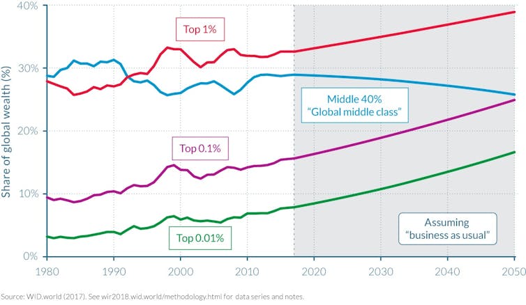
This middle-class squeeze is a long-established trend. The wealth of the top 1% exceeded that of the middle class in the early 1990s, and is projected to reach almost 40% by 2050.

Most gains have accrued to the top 0.1%, a tiny elite whose wealth is projected to equal that of the middle class around the same year. This crossing point has already been reached in the United States, where the top 0.1% now has about the same wealth-share as the bottom 90%.

The squeezed global wealth middle class, 1980-2050

Facundo Alvaredo, Lucas Chancel, Thomas Piketty, Emmanuel Saez and Gabriel Zucman, _World Inequality Report 2018, World Inequality Lab. 2017, Figure E9, p. 13

Better data collection

There is a glaring need to reform Australia’s archaic wealth inequality statistics to make them commensurate with international practice. The political implications are significant.

If there is a squeeze on middle-class wealth, as is happening in many other countries, it is likely to create greater political volatility. Access to more and better data is the key to understanding the trends, and will help ground debate, deliberations and policy decisions. The ABS’ household survey needs to be restructured and integrated with the national accounts and, ideally, tax data.

Perhaps the current Australian government, responsible for funding the ABS, is unconcerned. In that case, it is worth remembering that the ABS is charged with servicing both the Commonwealth and the states, most of whom transferred their statistical agencies to the national body in the 1950s on the understanding that their data requirements would continue to be met. The limitations in the existing data hinder the ability of the states to frame policies for their vital housing, education and health services.

The Council of Australian Governments could be a suitable forum to advance reform, particularly in the event of continued federal inertia. Alternatively, given the revolutionary advances in data collection since the 1950s, it might be feasible for the states to again think about establishing their own statistical agencies to ensure their needs – which is to say, our needs – are properly met.

Authors:Christopher Sheil, Visiting Fellow in History, UNSW; Frank Stilwell, Emeritus Professor, Department of Political Economy, University of Sydney

Global inequality is on the rise – but at vastly different rates across the world

From The Conversation.

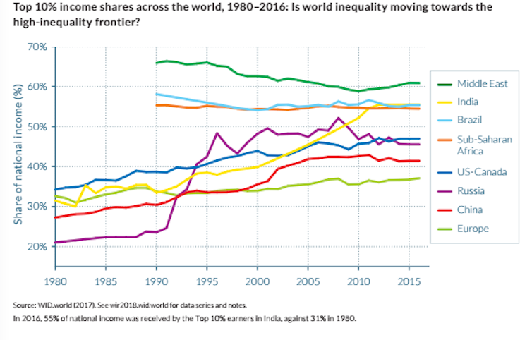
Inequality is rising almost everywhere across the world – that’s the clear finding of the first ever World Inequality Report. In particular, it has grown fastest in Russia, India and China – places where this was long suspected but there was little accurate data to paint a reliable picture.

Until now, it was actually very difficult to compare inequality in different regions of the world because of sparse or inconsistent data, which lacked credibility. But, attempting to overcome this gap, the new World Inequality Report is built on data collection work carried out by more than a hundred researchers located across every continent and contributing to the World Wealth and Income Database.

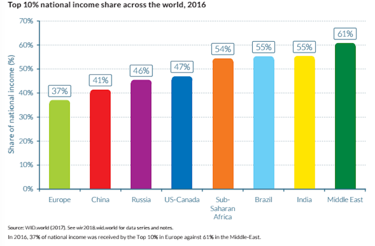
Europe is the least unequal region of the world, having experienced a milder increase in inequality. At the bottom half of the table are Sub-Saharan Africa, Brazil and India, with the Middle East as the most unequal region.

Since 1980, the report shows that there has been rising inequality occurring at different speeds in most parts of the world. This is measured by the top 10% share of income distribution – how much of the nation’s income the top 10% of earners hold.

Places where inequality has remained stable are those where it was already at very high levels. In line with this trend, we observe that the Middle East is perhaps the most unequal region, where the top 10% of income earners have consistently captured over 60% of the nation’s income.

Inequality is always a concern

Even in Europe, where it is less pronounced, equality always raises ethical concerns. For example, in Western Europe, many do not receive a real living wage, despite working hard, often in full-time employment. Plus, the data shows that the top 10% of earners in Europe as a whole still hold 37% of the total national income in 2016.

Rising income inequality should be focal to public debate because it is also a factor which motivates human behaviour. It affects how we consume, save and invest. For many, it determines whether one can access the credit market or a good school for our children

This, in turn, may affect economic growth, raising the question of whether it is economically efficient to have unequal societies.

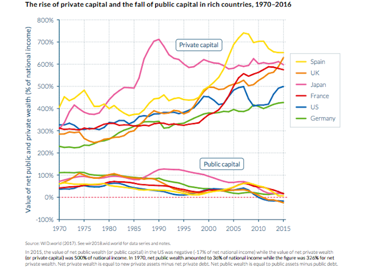
Going into the details of what drives the rise in income inequality, the report shows that unequal ownership of national wealth is an important force. National wealth can be either publicly owned (for example, the value of schools, hospitals and public infrastructure) or privately owned (the value of private assets).

Since 1980, very large transfers of public to private wealth occurred in nearly all countries, whether rich or emerging. While national wealth has substantially increased, public wealth is now negative or close to zero in rich countries. In particular, the UK and the US are countries with the lowest levels of public capital.

Arguably, this limits the ability of governments to tackle inequality. Certainly, it has important implications for wealth inequality among citizens. It also indicates that national policies shaping ownership of capital have been a major factor contributing to the rise of inequality since 1980.

Inequality in the developing world

Resource rich economies are traditionally considered to be prone to conflict or more authoritarian in terms of how they are governed. What this new report tells us is that some resource rich economies, such as “oil economies”, are also extremely unequal. This was often suspected because natural resources are often concentrated in the hands of a minority. Until this report, however, there was no clear evidence.

The World Inequality Report appears to show us that the Middle East region may be even more unequal than Central and South America, which have long been held up as some of the most unequal places on Earth.

Another significant finding is that countries at similar stages of development have seen different patterns of rising inequality. This suggests that national policies and institutions can make the difference. The trajectories of three major emerging economies are illustrative. Russia has an abrupt increase, China a moderate pace and India a gradual one.

The comparison between Europe and the US provides an even more striking example – Western Europe remains the place with the lowest concentration of national income among the top 10% of earners.

Compared with the US, the divergence in inequality has been spectacular. While the top 1% income share was close to 10% in both regions in 1980, it rose only slightly to 12% in 2016 in Western Europe, while it shot up to 20% in the US. This might help explain the rise in populism. Those left behind grow impatient when they do not see any tangible improvement (or even a worsening) in their living conditions.

It is not just important to reduce inequality to make society more fair. Equal societies are associated with other important outcomes. As well as political and social stability, education, crime and financial stability may all suffer when inequality is high.

With this new data at our fingertips, we can now act to learn from the policies of more equal regions and implement them to reduce inequality across the world.

Author: Antonio Savoia, Lecturer in Development Economics, University of Manchester

Egalitarian or Edwardian? The rising wealth inequality in Australia

From The Conversation.

Recent commentary on levels of inequality exposes the myth that Australia is an egalitarian society in which the privileges of birth have little currency.

Focusing on inequality in the distribution of incomes ignores an equally important dimension of inequality: wealth. Wealth is much more unequally distributed than income. Therefore, ignoring wealth inequality skews perceptions of social inequality.

Perceptions of the levels of income and wealth inequality are derived from our day-to-day experiences. This means that not mixing with people from the other end of the wealth distribution can colour our perceptions of inequality.

The lack of official data on the wealth holdings of Australians hampers research into trends in wealth inequality. Between 1915 and 2003-04, there is almost no official wealth data to examine.

In 2003-04, the wealthiest 20% of Australian households held 58.6% of total household wealth, and the poorest 20% of households held just 1.4% of total household wealth. In 2013-14, the wealthiest 20% of households held 61% of total household wealth, and the poorest 20% of households held just 1% of total household wealth.

These figures indicate that wealth inequality increased over the decade to 2013-14.

The table below details trends over time in various measures of wealth inequality. The P90 to P10 ratio compares the wealth of households at the 90th percentile with that of households at the tenth percentile. A larger ratio indicates greater levels of inequality.

In 2003-04, households at the 90th percentile held 45 times as much wealth as households at the tenth percentile. In 2013-14, households at the 90th percentile of the distribution held 52 times as much wealth as households at the tenth percentile. This indicates that wealth inequality increased in that decade.

Using the mean and median household wealth figures, it is possible to calculate the ratio of median to mean wealth.

The closer this ratio is to one, the lower the level of inequality. In 2003-04, the ratio was 0.63. In 2013-14, it was 0.57. This also indicates that wealth inequality increased.


The distribution of household wealth also varies between Australia’s state and territories, and by location within states and territories.

Households in the ACT recorded the highest mean household wealth (A$890,100). Households in Tasmania recorded the lowest mean household wealth ($595,600).

When these figures are disaggregated by location into capital city households and households located in the rest of the state, the largest wealth gap occurs in New South Wales. The mean wealth of households in Sydney was $971,700, whereas the mean wealth of households in the rest of NSW was $534,700.

The median-to-mean-wealth ratios show wealth was most unequally distributed in Brisbane and Perth.


Given a relatively large proportion of household wealth is held in the form of property assets, the recently released Household, Income and Labour Dynamics in Australia Survey report identifies property as the key driver of increasing wealth inequality.

The percentage of 18-to-39-year-olds with property declined by 10.5 percentage points between 2002 and 2014. And the level of debt of those with a mortgage doubled in real terms.

So, fewer young adults have mortgages now compared to a decade ago, and those who do have mortgages have higher levels of debt.

Two other sources of publicly available data on wealth are the lists of the super-wealthy published annually by the Business Review Weekly in Australia and Forbes in the US.

Figures published in the Business Review Weekly show that, after adjusting for inflation, in 1984 the wealthiest 20 Australians held $8.25 billion in assets. In 2017, the wealthiest 20 Australians held $104 billion.

Forbes’ lists of billionaires (in $US) show that the number of billionaires living in Australia increased from two to 26 between 1987 and 2014.

Having an increasing number of billionaires would not be an issue if all Australians’ wealth was increasing at a similar rate. However, if the gap between the wealth of the billionaires and that of the average residents increases dramatically, there is likely to be discontent.

Drawing on figures published in the Credit Suisse Wealth Report, it is possible to compare the wealth of the billionaires with that of average Australians.

In 2014, the wealth of the 26 Australian billionaires was equivalent to 214,914 adults with average wealth.

Recent turmoil in the UK and the US may be an indicator that the “peasants are revolting” and are not willing to return to the 19th century, when the very rich lorded over the masses.

Australia has yet to experience mass demonstrations and voter backlashes. But events overseas should be ringing alarm bells among our politicians in Canberra.

Author: Jennifer Chesters , Research Fellow, Youth Research Centre, University of Melbourne