We have pulled out the latest data on residential mortgaged households, incorporating the latest mortgage increases and market valuations. So today we run over the top-level vital statistics.
To explain, our market model replicates the industry, across all lenders banks and non-banks and looks beyond the performance of just the securitised mortgage pools (as some of the ratings agencies report). It is looking from a “household in” perspective, not a “lender out” point of view.
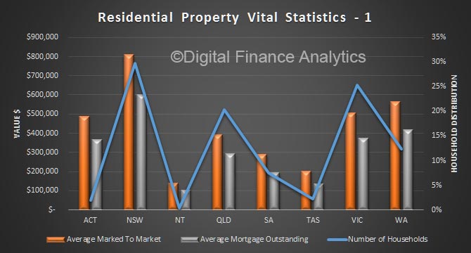
To start, we look at the average home price, and average mortgage outstanding across the states, plotted against the relative number of households borrowing. NSW has the largest values, and thus mortgages, on average. But note that WA runs ahead of VIC though in the west prices are falling.
Next we look at average loan to value (LVR) marking the market value to market, and the latest loan outstanding data. NSW has the highest LVR on average, at ~75%. We also plot the average loan to income (LTI) and again NSW has the highest – at more than 6x income.
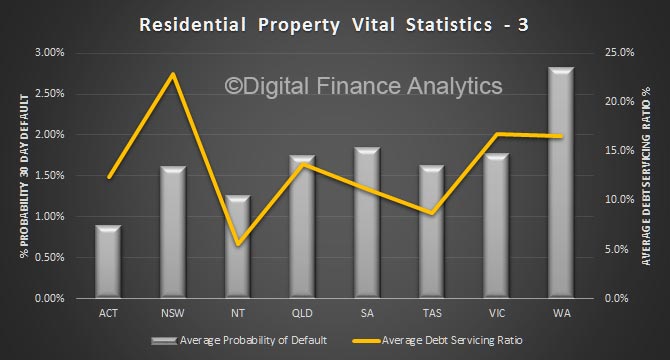
 Then we look at debt servicing ratios, where again NSW leads the way on average at more than 23% of income, even at these low rates. VIC and WA are a little lower but still extended. Finally, we look at estimated probability of 30-day default, projecting forward to take account of expected economic conditions, interest rates and employment. WA has the highest score, followed by SA. NSW is a little lower, thanks to relatively buoyant economic conditions. That could all change quite quickly, and as highlighted the high leverage in NSW suggests that risks could become more elevated here.
 We will update the market model again next month, and track movements across the states. Be warned, averages of course tell us something, but the relative spreads across segments and locations are more important. But that, as they say, is another story!

